Community hub
Fred Troller
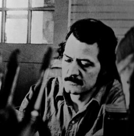
View on WikipediaFred Troller (December 12, 1930 – October 11, 2002) was a Swiss American artist and designer known for his bold graphic style. He was a prominent figure in the world of graphic design, particularly renowned for his contributions to the field of advertising.
Key Information

Early years
[edit]Fred Troller was born in Zürich, Switzerland on December 12, 1930. He attended Kunstgewerbeschule Zürich, now known as Zurich University of the Arts graduating in 1950.[1]
Prior to moving to the United States, Fred and his wife Beatrice Troller starred in Louis de Rochemont’s 1955 release titled, Cinerama Holiday.
Career
[edit]Troller's career spanned several decades, during which he worked at the Geigy chemical corporation prior to starting his own firm, Troller Associates. His clients included major corporations such as American Airlines, General Electric, Exxon, and IBM.[2]
Not long after establishing a name for himself in the graphic design realm, Troller became friends with other well known designers such as Paul Rand, Milton Glaser, Rudolph de Harak, and Massimo Vignelli.[3]
Troller was a professor at the School of Visual Arts and Cooper Union in NYC, the State University of New York, Purdue University, Philadelphia College of Art, Ohio State University, Southeastern University (Florida), Rhode Island School of Design, and lastly, he was chairman of design at Alfred University, NY.[4]
Legacy
[edit]Regarding Troller's work, Massimo Vignelli was quoted as saying, "His designs successfully combined Swiss rigorousness with American vitality."[2]
Troller is widely regarded as having popularized the minimalist typographic style known as Swiss New Typography in the United States.[citation needed] Graphic design writer Steven Heller, the author of Troller's New York Times obituary, wrote that Troller's personal approach to the minimalist Swiss graphic design style was to "incorporate geometric forms, jarring juxtapositions of large and small types and visual puns formed from the fonts themselves."[2]
Troller championed the use of bold graphic style in advertising. He believed in the power of visual communication and sought to create designs that would captivate audiences and leave a lasting impression.[2]
References
[edit]- ^ https://aura.alfred.edu/server/api/core/bitstreams/9c89b49d-da8b-41a7-8b97-c4c870a1f924/content
- ^ a b c d Heller, Steven (2002-10-24). "Fred Troller, 71, Champion of Bold Graphic Style". The New York Times. ISSN 0362-4331. Retrieved 2025-06-08.
- ^ Drew, Ned; Sternberger, Paul (August 7, 2005). By Its Cover: Modern American Book Cover Design. Princeton Architectural Press. ISBN 978-1568984919.
- ^ Fred Troller (1974): American Airlines poster (1969) - Alliance Graphique Internationale. Retrieved 4 March 2024.