
Community hub
Recent from talks
Contribute something
Nothing was collected or created yet.
Erbar
View on Wikipedia | |
| Category | Sans-serif |
|---|---|
| Classification | Geometric |
| Designer | Jakob Erbar |
| Foundry | Ludwig & Mayer |
| Date released | 1922-30 |
| Re-issuing foundries | Linotype, Continental Type Founders Association |
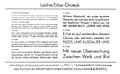
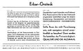
Erbar or Erbar-Grotesk is a sans-serif typeface in the geometric style, one of the first designs of this kind released as type.[1] Designer Jakob Erbar's aim was to design a printing type which would be free of all individual characteristics, possess thoroughly legible letter forms, and be a purely typographic creation. He concluded that this could only work if the type form was developed from a fundamental element, the circle.[2] Erbar-Grotesk was developed in stages; Erbar wrote that he had originally sketched out the design in 1914 but had been prevented from working on it due to the war. The original version of Erbar was released in 1926, following Erbar's "Phosphor" titling capitals of 1922 which are very similar in design.[3][4]
The typeface first explored Bauhaus geometric letterforms with centered text and compact layouts.[5] Under Jakob Erbar's influence, it then evolved to look similar to Bauhaus principles and asymmetrical design of New Typography.[5]
Font
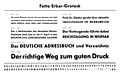
[edit]Erbar was originally cast by the Ludwig & Mayer foundry of Frankfurt, Germany, with machine composition matrices later being offered by German and then American Linotype.[6][7] Erbar was later exported to the United States and sold by the Continental Type Founders Association.[8] A digital version is sold today by Linotype.
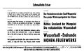
Erbar was cast in four weights with italic and condensed faces. Other variants were offered:
Gallery
[edit]-
 Light weight
 -
 Regular weight
 -
 Regular weight
 -
 Bold weight
 -
 Bold weight
 -
 Condensed weight
 -
 Condensed bold


Influence on other typefaces
[edit]The success of Erbar inspired the creation of many new geometric sans-serif faces by competing foundries, including Futura, Metro, Vogue, Spartan and Twentieth Century among others. Of those, Futura proved to be the most successful. That, Jakob Erbar's early death, the small size of Erbar's Ludwig & Mayer Foundry and the international reach of Futura's Bauer Type Foundry led to Erbar becoming less well known than Futura.
Phosphor, an ultra-bold and inline display that was design similar to Erbar but was released first, was particularly popular, and several imitations and revivals were created.
Zhurnalnaya roublennaya (Журнальная рубленая), or Journal Grotesque, was a Russian sans-serif that was created in the Soviet Union by Anatoly Schukin and others and released from 1947 onwards, was quite loosely inspired by Erbar and with Cyrillic and later Latin characters.[9][10][11]
Digitisations
[edit]
A leading unofficial Erbar digitisation is Dunbar, released by CJ Dunn in late 2016 as an unofficial digitisation in a choice of x-heights named Dunbar Low, Dunbar Text and Dunbar Tall.[12] It is also offered as a variable font, in which the x-height and the weight can be varied smoothly, and as such is the first variable font on sale.
As of 2016, several Erbar digitisations exist under this name. URW++ has released a revival of seven weights (of the normal width only), and a "Neo Mini" digitisation optimised for small sizes, with an enlarged x-height and solid weight.[13][14] Linotype has digitised light and bold weights of the condensed style.[15]
Stephen Coles, an expert on digital fonts, has been critical of the Erbar digitisations on the market, writing that "there is no recommendable digital version...existing revivals neither capture the spirit or breadth of the original family. Still, if you really have a Erbar hankering, URW’s version is the most complete."[16]
Because of Phosphor's popularity, several revivals exist independently of the latter Erbar rereleases (none of which include it), by Monotype and others.[17] Phosphate, an unofficial revival created by Red Rooster Fonts, is bundled with OS X.[18] Zamenhof, by CastleType, is a large revival inspired by Russian adaptations of the style.[19]
Zhurnalnaya roublennaya has itself been digitised by Grilli Type as GT Eesti and (much more loosely) for ParaType as Journal Sans by Olexa Volochay, Maria Selezeneva and Alexandra Korolkova.[9][10][11]
See also
[edit]- Kabel (typeface), a popular typeface resembling Erbar
References
[edit]- ^ Kupferschmid, Indra. "On Erbar and Early Geometric Sans Serifs". CJ Type. Retrieved 20 October 2016.
- ^ Tracy, Walter.Letters of Credit: a View of Type Design. Gordon Fraser, 1998
- ^ Christopher Burke (December 1998). Paul Renner: The Art of Typography. Princeton Architectural Press. p. 100. ISBN 978-1-56898-158-1.
- ^ Walter Tracy (2003). Letters of Credit: A View of Type Design. D.R. Godine. pp. 92–4. ISBN 978-1-56792-240-0.
- ^ a b George, Tanya (2022-04-28). "Typefaces Inspired by the Bauhaus". Letterform Archive. Retrieved 2024-12-06.
- ^ a b Jaspert, Pincus, Berry and Johnson.The Encyclopedia of Type Faces. Blandford Press Lts.: 1953, 1983. Pp. 269-70
- ^ Neil Macmillan (2006). An A-Z of Type Designers. Yale University Press. p. 78. ISBN 0-300-11151-7.
- ^ Specimen Book of Continental Types, Continental Type Founders Association, N.Y.C., 1929.
- ^ a b Sakk, Ivar. "Zhurnalnaya Roublennaya: A Poor Man's Futura". Fonts In Use. Retrieved 23 June 2016.
- ^ a b Korolkova, Alexandra; Selezeneva, Maria. "Journal Sans New". MyFonts. ParaType. Retrieved 23 June 2016.
- ^ a b "GrilliType Eesti". Grilli Type. Retrieved 23 June 2016.
- ^ Dunn, CJ. "Dunbar". CJ Type. Retrieved 20 October 2016.
- ^ "URW++ Erbar". MyFonts. URW++. Retrieved 23 June 2016.
- ^ "Erbar Neo Mini". MyFonts. URW++. Retrieved 23 June 2016.
- ^ "Erbar LT". MyFonts. Linotype. Retrieved 23 June 2016.
- ^ Coles, Stephen. "Alternatives to Futura". Fontshop. Archived from the original on March 16, 2015. Retrieved 2 October 2015.
- ^ "Phosphor MT". MyFonts. Monotype. Retrieved 23 January 2016.
- ^ "Phosphate". MyFonts. Red Rooster Collection. Retrieved 23 January 2016.
- ^ "Zamenhof". MyFonts. CastleType. Retrieved 23 June 2016.
- Friedl, Ott, and Stein, Typography: an Encyclopedic Survey of Type Design and Techniques Throughout History. Black Dog & Levinthal Publishers: 1998. ISBN 1-57912-023-7.
- Jaspert, W. Pincus, W. Turner Berry and A.F. Johnson. The Encyclopedia of Type Faces. Blandford Press Lts.: 1953, 1983. ISBN 0-7137-1347-X.