Recent from talks
Nothing was collected or created yet.
Style sheet language
View on Wikipedia
A style sheet language, or style language, is a computer language that expresses the presentation of structured documents. One attractive feature of structured documents is that the content can be reused in many contexts and presented in various ways. Different style sheets can be attached to the logical structure to produce different presentations.
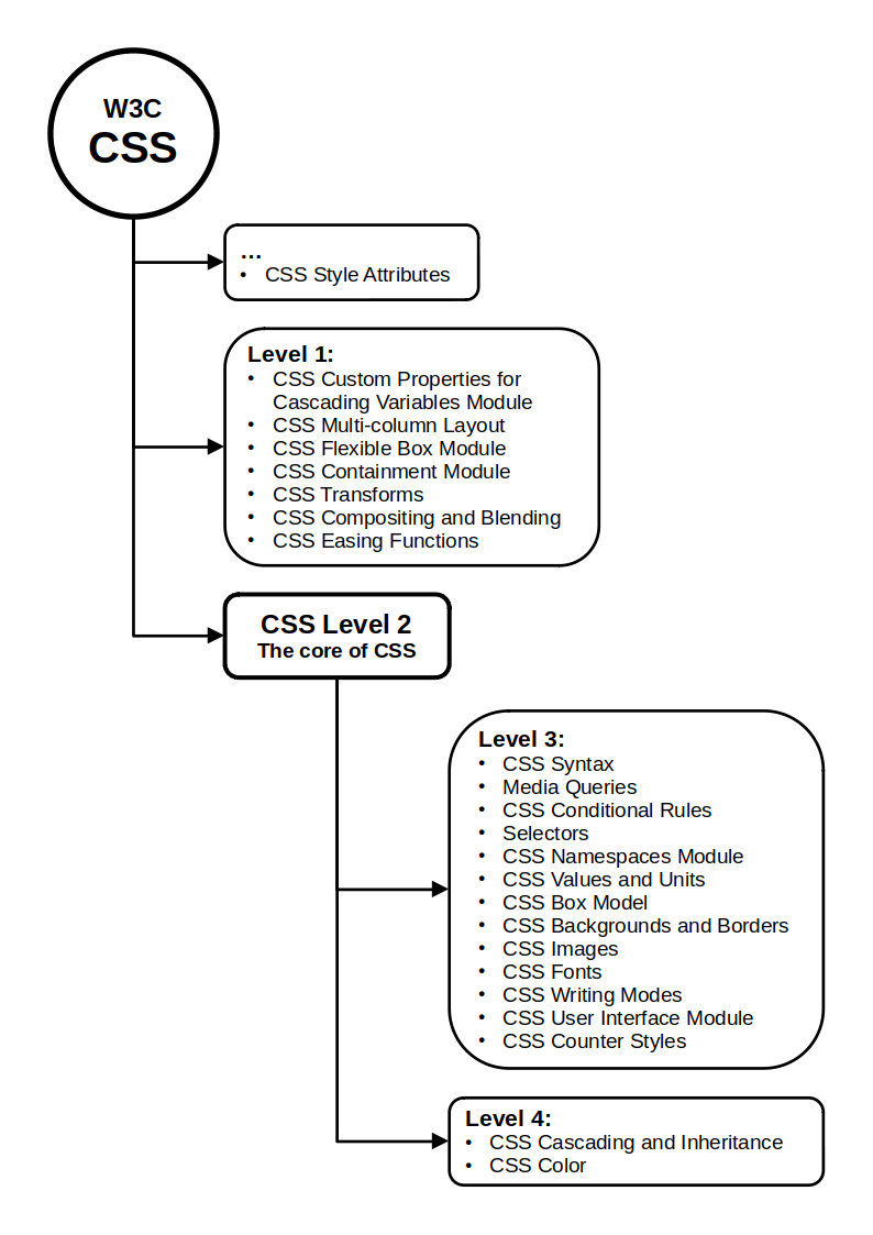
One modern style sheet language with widespread use is Cascading Style Sheets (CSS), which is used to style documents written in HTML, XHTML, SVG, XUL, and other markup languages.
For content in structured documents to be presented, a set of stylistic rules – describing, for example, colors, fonts and layout – must be applied. A collection of stylistic rules is called a style sheet. Style sheets in the form of written documents have a long history of use by editors and typographers to ensure consistency of presentation, spelling and punctuation. In electronic publishing, style sheet languages are mostly used in the context of visual presentation rather than spelling and punctuation.
Components
[edit]All style sheet languages offer functionality in these areas:
- Syntax
- A style sheet language needs a syntax in order to be expressed in a machine-readable manner. For example, here is a simple style sheet written in the CSS syntax:This says that headings on level 1 should be displayed in a font size of 1.5 times the font size of the surrounding text.
h1 { font-size: 1.5em }
- Selectors
- Selectors specify which elements are to be influenced by the style rule. As such, selectors are the glue between the structure of the document and the stylistic rules in the style sheets. In the example above, the "h1" selector selects all h1 elements. More complex selectors can select elements based on, e.g., their context, attributes and content.
- Properties
- All style sheet languages have some concept of properties that can be given values to change one aspect of rendering an element. The "font-size" property of CSS is used in the above example. Common style sheet languages typically have around 50 properties to describe the presentation of documents.
- Values and units
- Properties change the rendering of an element by being assigned a certain value. The value can be a string, a keyword, a number, or a number with a unit identifier. Also, values can be lists or expressions involving several of the aforementioned values. A typical value in a visual style sheet is a length; for example, "1.5em" which consists of a number (1.5) and a unit (em). The "em" value in CSS refers to the font size of the surrounding text. Common style sheet languages have around ten different units.
- Value propagation mechanism
- To avoid having to specify explicitly all values for all properties on all elements, style sheet languages have mechanisms to propagate values automatically. The main benefit of value propagation is less-verbose style sheets. In the example above, only the font size is specified; other values will be found through value propagation mechanisms. Inheritance, initial values and cascading are examples of value propagation mechanisms.
- Formatting model
- All style sheet languages support some kind of formatting model. Most style sheet languages have a visual formatting model that describes, in some detail, how text and other content is laid out in the final presentation. For example, the CSS formatting model specifies that block-level elements (of which "h1" is an example) extend to fill the width of the parent element. Some style sheet languages also have an aural formatting model.[1]
References
[edit]- ^ Lie, Håkon (29 March 2005). "Cascading Style Sheets".
Style sheet language
View on GrokipediaOverview
Definition
A style sheet language is a formal computer language used to express the presentation and layout of structured documents, enabling the separation of content from design in markup-based systems such as those using HTML or XML.[4][6] This approach allows authors to define visual, aural, or other rendering instructions independently of the document's structural markup, promoting reusability and maintainability across different media.[4] Key characteristics of style sheet languages include their declarative nature, where rules specify the desired outcome—such as element appearance or positioning—without prescribing the underlying implementation details.[6] They are inherently tied to markup languages like HTML or XML, applying styles to elements based on their type, attributes, or hierarchy to control aspects like fonts, colors, spacing, and layout.[4] The primary focus is on rendering for various outputs, including visual displays on screens, printed pages, or aural presentations via speech synthesizers.[6] The term "style sheet language" originated in the context of SGML (Standard Generalized Markup Language) and early web standards during the 1990s, with influences from efforts to standardize document styling beyond inline markup.[7] This period saw the development of precursors like DSSSL, an ISO standard for SGML-based styling, which informed subsequent web-oriented languages.[7] A basic syntax in many style sheet languages consists of rules structured as a selector targeting elements, followed by a block of property-value declarations enclosed in braces. For example:h1 {
color: green;
font-size: 24pt;
}
h1 {
color: green;
font-size: 24pt;
}
Purpose and Benefits
Style sheet languages primarily serve to separate the structural content of documents from their visual presentation, allowing markup languages like HTML or XML to focus solely on semantics while styles handle layout, colors, fonts, and other formatting aspects.[1] This separation of concerns simplifies document creation and maintenance by enabling developers to modify presentation independently of content changes.[8] Additionally, these languages facilitate consistent styling across multiple documents, ensuring a uniform appearance for related content such as corporate websites or publication series.[8] A key benefit of style sheet languages is enhanced maintainability through centralized control, where alterations to styles—such as updating colors or typography—can be applied site-wide by editing a single file, rather than revising individual documents.[1] They also improve accessibility by supporting adaptations for various user needs, including media-specific rules for screen readers or high-contrast modes that allow users to override default styles.[8] Performance gains arise from reduced document bloat, as external style sheets minimize inline markup and can be cached by browsers, leading to faster loading times.[1] Furthermore, reusability across devices is achieved through features like media types, which tailor presentations for screens, printers, or mobile interfaces without altering the source content.[1] In professional workflows, style sheet languages enable non-technical authors to concentrate on content creation while designers manage presentation separately, streamlining collaboration in environments like web development or XML-based publishing.[9] For instance, in large-scale publishing projects, such as generating reports from XML data, style sheets eliminate redundancy by applying uniform formatting rules to thousands of documents, reducing manual effort and errors compared to embedded styles. This approach, exemplified in languages like CSS for web documents and XSL for XML transformations, supports diverse output formats including print and digital media.[9]History
Early Developments
The origins of style sheet languages trace back to pre-web document processing systems, where the need for separating content from presentation emerged in complex typesetting and markup environments. In 1978, Donald E. Knuth developed TeX, a sophisticated page-formatting language designed to produce high-quality typography for mathematical and scientific documents, allowing authors to specify layout and styling instructions independently of the content structure.[10] This system addressed the limitations of earlier computer-assisted typesetting by providing device-independent output, influencing later efforts to standardize formatting for digital documents. Similarly, the 1980s saw the rise of the Standard Generalized Markup Language (SGML), standardized by ISO in 1986 (ISO 8879:1986), which enabled structured document representation through Document Type Definitions (DTDs) and paved the way for external formatting controls. Early SGML tools, such as the Formatting Output Specification Instance (FOSI) developed by the U.S. Department of Defense in the late 1980s as part of the Computer-aided Acquisition and Logistics Support (CALS) initiative, introduced stylesheet-like mechanisms to specify output formatting for SGML documents, supporting consistent rendering across printers and displays.[11] These foundational systems highlighted key challenges in document styling, particularly the demand for device-independent presentation in emerging hypertext environments. As hypertext systems proliferated in the late 1980s and early 1990s, ad-hoc formatting in markup languages led to inflexible, medium-specific outputs that hindered portability and user customization; for instance, early HTML relied on inline tags for styling, creating conflicts between author intent and reader preferences while lacking support for non-visual media like speech synthesizers.[12] Style sheets were seen as essential to resolve these issues by enabling reusable, cascadable rules that could adapt to diverse devices and allow balanced control between document creators and consumers.[13] A pivotal early proposal came in 1994 from Håkon Wium Lie, then at CERN, who outlined "Cascading HTML Style Sheets" to extend HTML with a declarative styling mechanism. This scheme proposed mapping HTML elements to presentation hints via external sheets, incorporating cascading to merge author, user, and browser defaults, thereby addressing the web's growing need for flexible, hypertext-aware formatting without embedding styles directly in markup.[12] Lie's work built on SGML traditions while targeting the web's unique requirements, such as progressive rendering and link-specific styles, marking a shift toward web-centric style languages. Among the first formal implementations was the Document Style Semantics and Specification Language (DSSSL), ratified as an ISO standard in 1996 (ISO/IEC 10179:1996), which provided a comprehensive stylesheet language for SGML documents. DSSSL combined transformation and formatting capabilities, using a Scheme-based syntax to define flow objects, areas, and over 200 properties for typographic control, enabling device-independent output for print and electronic media.[14] Though complex and print-oriented, it demonstrated the viability of declarative style rules for structured hypertext, influencing subsequent web standards by proving the value of separating semantics from presentation in large-scale document processing.[13]Standardization and Evolution
The World Wide Web Consortium (W3C) played a pivotal role in advancing web-focused style sheets with Cascading Style Sheets (CSS). CSS Level 1 became the W3C's first Recommendation on December 17, 1996, defining core mechanisms for styling HTML documents, such as fonts, colors, and margins.[15] This was followed by CSS Level 2, recommended on May 12, 1998, which extended support for multiple media types (e.g., print and screen) and introduced content positioning features like relative and absolute layouts.[16] A significant evolutionary shift occurred with CSS Level 3, which adopted a modular structure starting with initial working drafts in June 1999 to allow independent development and faster iteration of features.[17] This approach enabled the introduction of advanced layout and presentation modules, including the CSS Flexible Box Layout Module (flexbox) for one-dimensional layouts, advanced to Candidate Recommendation in September 2012;[18] the CSS Grid Layout Module for two-dimensional grid-based designs, advanced to Candidate Recommendation in February 2017;[19] and the CSS Animations Module for keyframe-based transitions and effects, introduced as a Working Draft in 2009.[20] Concurrently, the W3C addressed XML-based styling through XSL Transformations (XSLT) 1.0, a Recommendation issued on November 16, 1999, specifically for transforming XML documents into other formats while separating presentation concerns.[21] By the 2020s, style sheet evolution emphasized responsiveness and global accessibility, with W3C modules like CSS Containment Level 3 (Working Draft 2022), which introduced container queries later advanced in the CSS Conditional Rules Module Level 5 (Working Draft as of October 2025) to enable component-level responsive styling independent of viewport size.[22][23] Advancements in CSS Logical Properties and Values Level 1, first published as a Working Draft in 2017, further supported internationalization by allowing direction-agnostic layout controls (e.g., inline-start instead of left), facilitating adaptation to right-to-left and vertical writing systems.[24] As of 2025, the W3C continues this modular progression without a monolithic "CSS4," instead issuing annual snapshots like the CSS Snapshot 2025 to consolidate stable features across specifications.[25]Types and Examples
Declarative Style Sheet Languages
Declarative style sheet languages operate by specifying presentation rules that map markup elements, such as those in HTML or XML, to visual or formatting properties without altering the underlying document structure.[26] These languages employ a rule-based paradigm where selectors target elements and assign values to properties like color, font size, and layout, enabling separation of content from styling.[27] This declarative approach focuses on describing the desired output rather than procedural instructions for achieving it, facilitating maintainable and reusable style definitions.[28] The most prominent example is Cascading Style Sheets (CSS), a standard developed by the World Wide Web Consortium (W3C) for styling web documents.[29] CSS uses syntax likeselector { property: value; } to define rules, supporting features such as media queries for responsive design across devices (e.g., @media screen and (max-width: 600px) { ... }) and vendor prefixes for experimental properties (e.g., -webkit-border-radius).[6] These elements allow CSS to adapt styles conditionally based on user agents or environments while ensuring progressive enhancement in browsers.
Another early declarative system is the Formatting Output Specification Instance (FOSI), designed for SGML documents by the U.S. Department of Defense in the 1980s.[30] FOSI specifies formatting through an SGML-based stylesheet that defines pagination, layout, and rendering rules for tagged elements, similar to CSS but tailored for print-oriented technical documentation.[31] Like CSS, FOSI is declarative, describing output specifications without transforming the source markup.[32]
These languages excel in simplicity for visual styling tasks, as their rule-mapping model reduces complexity compared to imperative alternatives, and CSS in particular benefits from near-universal browser implementation, enabling consistent rendering across platforms.[6] Their cascading mechanism, which resolves conflicts among multiple rules by priority and specificity, further enhances flexibility in large-scale document styling.
Transformational Style Sheet Languages
Transformational style sheet languages are designed to process and restructure input markup documents, such as XML or SGML, before applying stylistic formatting, enabling the generation of new output structures like alternative document formats or presentation media.[9] Unlike purely declarative approaches, these languages incorporate transformation mechanisms to manipulate content hierarchies, reorder elements, or extract subsets, often producing intermediate representations such as tree structures for further processing.[33] This paradigm supports complex document workflows where styling is intertwined with content adaptation, facilitating outputs tailored to specific devices or publication needs. A primary example is the Extensible Stylesheet Language (XSL), standardized by the World Wide Web Consortium (W3C) in 1999, which separates transformation from formatting to handle XML documents comprehensively. XSL comprises XSL Transformations (XSLT), a language for restructuring XML into other XML forms or formats like HTML, and XSL Formatting Objects (XSL-FO), an XML vocabulary for specifying layout and presentation details. XSLT operates via template-based rules that match input patterns and generate output trees, allowing programmatic control over document flow while preserving XML's extensibility.[33] This split enables modular pipelines where transformations precede styling, drawing inspiration from earlier standards to address web-oriented document processing.[9] Another influential example is the Document Style Semantics and Specification Language (DSSSL), an International Organization for Standardization (ISO) standard (ISO/IEC 10179:1996) developed for styling SGML documents.[34] DSSSL employs flow object trees as an abstract representation of formatted output, transforming source markup into structured sequences of objects that can be rendered across media like print or screen.[35] Its transformation language supports querying and modifying document trees, while style rules define semantic mappings to flow objects, providing a foundation for high-level document composition. DSSSL's approach influenced subsequent languages by emphasizing semantic specification over low-level formatting details.[9] These languages find application in converting XML documents to HTML for web display or to PDF for print-ready outputs, streamlining complex pipelines in publishing and data interchange.[36] For instance, XSLT is commonly used to adapt structured content for browser rendering or archival formats, ensuring compatibility across diverse systems without altering the original markup. Such transformations enable scalable document processing in environments like technical documentation or dynamic web content generation.[33]Preprocessors and Extensions
Preprocessors and extensions for style sheet languages are tools that extend the capabilities of standard style sheets, such as CSS, by introducing enhanced syntax and features that are compiled or transformed into compliant code before deployment. These meta-languages address limitations in core style sheets by supporting programming-like constructs, including variables for reusable values, nesting for hierarchical rule organization, and mixins for code reuse, which streamline development for complex projects.[37][38] One of the earliest and most influential preprocessors is Sass (Syntactically Awesome Style Sheets), released in 2006, which compiles its indented syntax or SCSS variant into standard CSS. Sass introduces variables to store colors, fonts, or measurements (e.g.,$primary-color: #blue;), nesting to embed selectors within parent rules (e.g., nav { ul { margin: 0; } }), mixins for parametric reusable blocks (e.g., @mixin border-radius($radius) { border-radius: $radius; }), and inheritance via the @extend directive to share styles across selectors.[37][39]
Less, introduced in 2009, offers a similar extension to CSS with a focus on dynamic properties and client-side or server-side compilation. It supports variables (e.g., @color: #4E6C50;), mixins with optional parameters (e.g., .rounded-corners(@radius: 5px) { border-radius: @radius; }), and operations on values like colors or numbers (e.g., @light-color: lighten(@color, 20%);), enabling more flexible and maintainable stylesheets.[40][39]
Other notable extensions include Stylus, launched in 2010, which emphasizes an indentation-sensitive syntax reminiscent of Python for concise rule definition, while supporting variables, mixins, and functions without mandatory braces or semicolons. PostCSS, released in 2013, differs by acting as a post-processor that applies JavaScript-based transformations via plugins, such as adding vendor prefixes with Autoprefixer or enabling future CSS features through Preset Env, without altering the authoring syntax.[41][42][43]
The popularity of these preprocessors and extensions surged in the 2010s, driven by the demands of modular CSS in large-scale web projects, exemplified by frameworks like Bootstrap, which initially relied on Less for versions 2 and 3 before switching to Sass in version 4 to leverage its advanced features for customizable theming. This shift contributed to Sass becoming the dominant choice, with widespread adoption in modern build tools and ecosystems requiring scalable, maintainable styles.[44][39][45]
Key Components
Selectors
Selectors in style sheet languages are patterns designed to match and identify specific elements, attributes, or states within a document's tree structure, enabling the targeted application of formatting rules. This mechanism allows authors to specify styles for particular parts of a markup document, such as HTML or XML, without altering the underlying content. In declarative languages like CSS, selectors form the left-hand side of a style rule, binding properties to matched elements; in transformational languages like XSL, they use pattern-matching expressions, often based on XPath, to select nodes for processing or output generation.[46][47] Basic selectors target elements by their type, unique identifiers, or class assignments. A type selector matches all instances of a given element name, such asp for paragraphs in HTML. ID selectors, denoted by #, target a single unique element, like #header for an element with id="header". Class selectors, using ., apply to elements sharing a common class attribute, for example .warning for elements marked with class="warning". These form the foundation for simple targeting across languages, though syntax varies; in DSSSL, selection might involve functional queries like (element H1 ...) to match heading elements.[48][49]
Combinators extend basic selectors by defining relationships between elements in the document tree. The descendant combinator (space) selects elements nested anywhere within another, as in div p for paragraphs inside divisions. The child combinator (>) targets direct children, such as ul > li for list items immediately under unordered lists. Adjacent sibling (+) and general sibling (~) combinators select following elements, like h2 + p for paragraphs right after headings. In XSL patterns, similar hierarchies use slashes, e.g., chapter/title for direct child titles. Attribute selectors further refine matches, such as [type="text"] for inputs with a specific attribute value, or .class[attribute=value] for combined class and attribute targeting in CSS, allowing precise control over styled elements.[50][47]
Pseudo-classes and pseudo-elements address dynamic states and abstract parts of elements. Pseudo-classes, prefixed with :, select based on conditions like user interaction or position; :hover targets elements under the cursor, while :nth-child(2) matches the second child of its parent. Pseudo-elements, using ::, style portions like ::before to insert content before an element or ::first-line for the initial line of text. These enhance interactivity and layout without markup changes, primarily standardized in CSS but adaptable in other contexts.[51][52]
Specificity rules determine which selector prevails when multiple rules target the same element, preventing conflicts in cascading systems like CSS. Specificity is computed as a three-part value (a, b, c), where a counts ID selectors, b counts classes, attributes, and pseudo-classes, and c counts element types and pseudo-elements; higher values win, with inline styles adding a leading 1,0,0,0. For instance, #id .class has specificity (1,1,0), outranking div.warning at (0,1,1). This weighted system ensures predictable style resolution, though transformational languages like XSL prioritize template match patterns differently, often by document order or explicit precedence.[53]
Properties and Values
In style sheet languages, properties represent the stylistic attributes that can be applied to document elements, such as color, font size, or margins, while values provide the specific settings for these properties, typically in the form of keywords (e.g., "bold"), lengths (e.g., "1em"), percentages, or functional notations (e.g., "rgb(255, 0, 0)").[4] This declaration syntax, where a property name is followed by a colon and its value, allows authors to precisely control presentation without altering the underlying document structure. Properties in style sheet languages are often categorized by their functional purpose, including visual properties for backgrounds and borders (e.g.,background-color and border-style), layout properties for positioning and display (e.g., display and position), and typography properties for text rendering (e.g., font-family and line-height).[54] These categories are defined across modular specifications to facilitate targeted styling; for instance, visual properties handle aesthetic elements like shading and outlines, while layout properties manage spatial arrangement.
Values for properties commonly use standardized units and data types to ensure consistency and device independence. Absolute units include physical measures like centimeters (cm), points (pt), and pixels (px), where 1 inch equals 96 pixels.[55] Relative units, such as em (relative to font size), percentages (relative to parent dimensions), and viewport units like vh (viewport height), allow adaptive scaling.[56] Data types extend to numeric values like integers or numbers, and more complex types such as positions or images, enabling flexible computations via functions like calc().[57]
Color values, a key data type for visual properties, support formats including hexadecimal notation (e.g., #ff0000 for red), the HSL model (hue, saturation, lightness), and the RGB functional notation (e.g., rgb(100%, 0%, 0%)).[58] These enable precise color specification and interpolation for gradients or transitions.[59]
Inheritance behaviors determine how property values propagate from parent to child elements; for example, the typography property font-weight: bold; sets bold text and is inherited by default, ensuring child elements adopt the parent's boldness unless overridden.[60] This mechanism, applicable to properties like color and font-family, promotes efficient styling of nested structures.[61]
Rules and Cascading
In style sheet languages, rules define how elements are styled by associating selectors with sets of declarations, where each declaration assigns a value to a property. A typical rule structure includes a selector targeting specific elements, followed by a declaration block enclosed in curly braces containing one or more property-value pairs, such ascolor: [red](/page/Red);. At-rules extend this structure by enabling conditional application or external inclusion of styles; for instance, the @media at-rule applies declarations only when media queries are met, like @media print { body { font-size: 12pt; } }, while @import incorporates styles from another stylesheet, as in @import url("styles.css") screen;, which must precede other rules to ensure proper loading.[62]
The cascading algorithm resolves conflicts when multiple rules apply to the same element by prioritizing declarations based on four key factors: origin and importance, specificity, and order of appearance. Origins include author styles (from the document's stylesheet), user styles (customized by the user), and user-agent styles (browser defaults), with transitions and animations having their own transient origins; importance is marked by the !important declaration, which elevates priority within its origin and inverts the typical origin order—for example, a user !important declaration overrides an author !important one. Specificity measures selector precision, with inline styles having the highest (1,0,0,0), followed by ID selectors (0,1,0,0), class/attribute/pseudo-class (0,0,1,0), and element/pseudo-element (0,0,0,1); ties are broken by document order, where later rules prevail.[63][64]
Conflict resolution proceeds stepwise: first, declarations are filtered by origin and importance, discarding lower-priority ones (e.g., normal author styles yield to important user styles); second, within the same origin/importance, they are sorted by specificity, favoring higher values; third, equal specificity declarations are resolved by source order, applying the last one encountered. This process yields a single cascaded value per property per element, which is then defaulted if unspecified. For example, consider an element with conflicting color rules: a browser default color: black;, an author rule p { color: [blue](/page/Blue) !important; }, and a later user rule p { color: green; }—the final computed style is blue, as the author !important declaration has higher priority than the user normal declaration (and the browser default is lowest). However, if the user rule used !important, then green would apply, as user !important overrides author !important.[65][66]
Cascade layers, introduced in the CSS Cascading and Inheritance Level 5 specification, enhance this algorithm by allowing authors to explicitly group rules into named or anonymous layers via the @layer at-rule or @import layer(), providing a new dimension of control that precedes specificity and order within origins. Layers are ordered by first appearance, with later layers overriding earlier ones for normal declarations (reversed for !important), and unlayered styles treated as a final default layer; for instance, @layer framework { button { padding: 1em; } } @layer theme { button { padding: 2em; } } results in padding: 2em for buttons, as the theme layer follows framework. This feature, reaching Candidate Recommendation status in 2022, mitigates specificity wars in large stylesheets without altering core cascade rules.[67][68]
Applications
Web Development
Style sheet languages, particularly declarative ones like CSS, play a central role in web development by defining the visual presentation and layout of HTML documents, separating content from design to facilitate maintainable and scalable interfaces.[6] Integration with HTML occurs primarily through external linking via the<link> element in the document's <head>, which references a separate .css file, or by embedding styles directly using the <style> element within the HTML. This approach enables responsive design, where media queries adjust properties such as widths, fonts, and layouts based on device characteristics like screen size and orientation, ensuring optimal user experience across desktops, tablets, and mobiles.
Key practices in web development emphasize mobile-first methodologies, where developers start with base styles optimized for smaller screens and progressively enhance them using min-width media queries for larger viewports, promoting faster load times and better performance on resource-constrained devices.[69] Frameworks such as Tailwind CSS, introduced in its first stable release on May 13, 2019, adopt a utility-first paradigm by providing low-level classes like flex, p-4, and text-center that can be composed directly in HTML markup, accelerating custom design creation without traditional semantic class names.[70] This utility approach reduces the need for custom CSS writing while maintaining flexibility for complex layouts.[71]
Challenges in web development include cross-browser compatibility, where default rendering differences—such as margins, padding, and font rendering—can lead to inconsistent appearances; solutions like normalize.css address this by providing a modern baseline that standardizes these elements across browsers like Chrome, Firefox, and Safari without removing all defaults.[72] Performance optimization involves techniques like critical CSS, which extracts and inlines above-the-fold styles to minimize render-blocking resources, allowing browsers to paint initial content faster and improving metrics such as Largest Contentful Paint.[73] Tools and build processes, including PurgeCSS integrated with frameworks, further purge unused styles to reduce file sizes.
As of 2025, current trends highlight deeper integration of style sheet languages with JavaScript for dynamic styling, where CSS-in-JS solutions like Styled Components or Emotion enable runtime generation of styles based on props, themes, or state, supporting modular and themeable components in modern frameworks such as React.[74] Additionally, Web Components leverage Shadow DOM encapsulation to scope styles locally within custom elements, preventing global leaks and facilitating reusable, styled UI pieces across applications without framework dependencies.[75] These advancements align with a shift toward native browser capabilities, reducing reliance on external polyfills for enhanced interoperability.[76]
Document Processing
Style sheet languages facilitate the transformation and formatting of structured documents, such as those in XML or SGML, into printable outputs like PDFs, enabling precise control over layout in non-web environments.[77] In document processing, these languages separate content from presentation, allowing structured data to be rendered into professional print media through declarative or transformational specifications.[78] A prominent example is XSL Formatting Objects (XSL-FO), a component of the Extensible Stylesheet Language family, which serves as a vocabulary for describing paginated layouts from XML sources. XSL-FO is commonly used to generate PDFs or print-ready documents by defining page geometry, regions for headers and footers, and content flow, often following an initial transformation of source XML via XSLT.[79] This approach supports high-fidelity rendering of complex documents, such as reports or manuals, where content is mapped to formatting objects that processors like FOP or commercial engines interpret into final output.[77] In publishing workflows, tools such as Antenna House Formatter leverage XSL-FO to produce high-quality typesetting for books and journals, processing XML inputs into paginated PDFs with advanced typographic features.[80] Similarly, Prince XML integrates with structured data pipelines to create print layouts, though it primarily employs CSS for paged media, complementing XSL-FO in hybrid environments for professional document production.[81] These tools enable publishers to handle large-scale document assembly, ensuring consistent formatting across volumes like technical books or academic journals.[82] For legacy and niche applications, the Document Style Semantics and Specification Language (DSSSL) has been instrumental in DocBook-based technical documentation, converting SGML or XML markup into formatted outputs like PostScript or HTML for conversion to print.[83] Developed in the 1990s, DSSSL stylesheets for DocBook allow authors to generate device-independent representations of manuals and specifications, facilitating workflows in open-source and standards documentation projects.[84] Key advantages of these style sheet languages in document processing include precise control over pagination, where properties define page breaks, sequences, and margins to manage content flow across sheets.[77] Footnotes are handled through dedicated elements that position markers inline and bodies in reserved regions, ensuring proper placement even in flowing text.[77] Multi-column layouts are supported via column-count specifications, dividing page regions into balanced or variable-width columns for newspaper-style or reference document designs, enhancing readability and space efficiency in print media.[77] These features provide superior granularity compared to simpler markup, making style sheets essential for professional typesetting where visual hierarchy and structural integrity are paramount.[78]Comparison with Other Technologies
Versus Markup Languages
Style sheet languages and markup languages serve complementary roles in document creation, with markup languages primarily concerned with defining the structure and semantics of content, while style sheet languages handle the presentation and visual formatting. For instance, in web development, HyperText Markup Language (HTML) uses tags such as<h1> for headings or <p> for paragraphs to establish a hierarchical and semantic framework, independent of how the content appears on screen. In contrast, Cascading Style Sheets (CSS), a prominent style sheet language, specifies aspects like font sizes, colors, and spacing to render that structure visually appealing and consistent across devices. This separation enhances maintainability, as changes to layout do not require altering the underlying content structure.[85]
Style sheet languages are inherently dependent on markup languages, as they require structured elements to target and apply rules; without a markup foundation, style declarations lack contexts to operate upon. Markup provides the essential nodes—such as elements, attributes, and classes—that selectors in style sheets reference to apply properties. For example, CSS rules cannot exist in isolation but must link to HTML elements via mechanisms like class or ID selectors, ensuring that presentation enhances rather than defines the document's meaning. This interdependence promotes a layered approach to document authoring, where semantics remain portable even if visual styles vary.[86]
Historically, early HTML versions integrated presentation directly into markup through inline elements and attributes, such as the <font> tag introduced in Netscape extensions around 1995 for controlling text appearance, which blurred the lines between structure and style. This approach led to cluttered, non-reusable code, prompting the development of CSS to externalize styling. Proposed in 1994 by Håkon Wium Lie at CERN and Bert Bos, CSS achieved its first W3C Recommendation status in December 1996, formalizing the separation of concerns and deprecating presentational markup in favor of dedicated style sheets.[7][87]
Markup languages alone are limited in achieving sophisticated layouts and visual effects, often relying on style sheets for dynamic positioning, responsive design, and multimedia integration. While HTML can imply basic formatting through semantic tags, complex arrangements like multi-column layouts or animations require the declarative power of style sheets to interpret and render the structure effectively. This reliance underscores the evolution toward modular web technologies, where markup provides the skeleton and styles add the flesh.[88]
