
Recent from talks
Concrete poetry
Knowledge base stats:
Talk channels stats:
Members stats:
Concrete poetry
Concrete poetry is an arrangement of linguistic elements in which the typographical effect is more important in conveying meaning than verbal significance. It is sometimes referred to as visual poetry, a term that has now developed a distinct meaning of its own. Concrete poetry relates more to the visual than to the verbal arts although there is a considerable overlap in the kind of product to which it refers. Historically, however, concrete poetry has developed from a long tradition of shaped or patterned poems in which the words are arranged in such a way as to depict their subject.
Though the term 'concrete poetry' is modern, the idea of using letter arrangements to enhance the meaning of a poem is old. Such shaped poetry was popular in Greek Alexandria during the 3rd and 2nd centuries BCE, although only the handful which were collected together in the Greek Anthology now survive. Examples include poems by Simmias of Rhodes in the shape of an egg, wings and a hatchet, as well as Theocritus' pan-pipes.
The post-Classical revival of shaped poetry seems to begin with the Gerechtigkeitsspirale (spiral of justice), a relief carving of a poem at the pilgrimage church of St. Valentin, Kiedrich. The text is carved in the form of a spiral on the front of one of the church pews and created in 1510 by master carpenter Erhart Falckener. But the heyday of the revival of shaped poetry came in the Baroque period when poets, in the words of Jeremy Adler, "did away with the more-or-less arbitrary appearance of the text, turned the incidental fact of writing into an essential facet of composition, and thereby…created a union of poetry with the visual arts". There were already precedents for this in Micrography, a technique for creating visual images used by Hebrew artists, which involves organizing small arrangements of Biblical texts such that they form images which illustrate the subject of the text. Micrography allowed the creation of images of natural objects by Jews without directly breaking the prohibition of creating "graven images" that might be interpreted as idolatry. The technique is now used by both religious and secular artists and is similar to the use of Arabic texts in Islamic calligraphy.
Early religious examples of shaped poems in English include "Easter Wings" and "The Altar" in George Herbert's The Temple (1633) and Robert Herrick's "This crosstree here", which is set in the shape of a cross, from his Noble Numbers (1647). Secular examples include poems on the subject of drinking in the shape of wine flagons by Rabelais and Charles-François Panard (1750), supplemented by the elaborate goblet of Quirinus Moscherosch (1660), the playful "A Toast" (Zdravljica, 1844) by France Prešeren, with stanzas in the shape of wine-glasses, and "The Mouse's Tale", a shaped poem published in 1865 by Lewis Carroll.
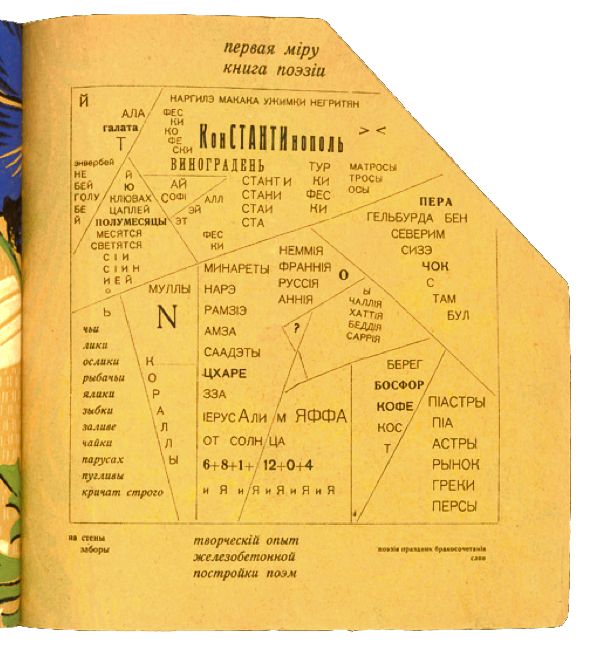
The approach reappeared at the start of the 20th century, initially in the Calligrammes (1918) of Guillaume Apollinaire, with poems in the shape of a necktie, a fountain, and raindrops running down a window, among other examples. In that era also there were typographical experiments by members of avant-garde movements such as Futurism, Dada, and Surrealism in which layout moved from an auxiliary expression of meaning to artistic primacy. Thus the significance of the sound poetry in Marinetti's Zang Tumb Tumb (1912) is expressed through pictorial means. Similarly in Germany, Raoul Hausmann claimed that the typographic style of his "Phonemes" allowed the reader to recognize what sound was intended. In Russia the Futurist poet Vasily Kamensky went so far as to term the typography of his Tango with Cows, published in 1914, "ferro-concrete poems" (zhelezobetonnye poemy), long before the name became current elsewhere.
A further move away from overt meaning occurred where "poems" were simplified to a simple arrangement of the letters of the alphabet. Louis Aragon, for example, exhibited the sequence from A to Z and titled it "Suicide" (1926), while Kurt Schwitters' "ZA (elementary)" has the alphabet in reverse, and the Catalan writer Josep Maria Junoy (1885–1955) placed just the letters Z and A at the top and bottom of the page under the title "Ars Poetica".
During the early 1950s two Brazilian artistic groups producing severely abstract and impersonal work were joined by poets linked to the São Paulo magazine Noigandres who began to treat language in an equally abstract way. Their work was termed "concrete poetry" after they exhibited along with the artists in the National Exhibition of Concrete Art (1956/57). The poets included Augusto de Campos, Haroldo de Campos and Décio Pignatari, who were joined in the exhibition by Ferreira Gullar, Ronaldo Azeredo and Wlademir Dias Pino from Rio de Janeiro. In 1958 a Brazilian concrete poetry manifesto was published and an anthology in 1962.
Dom Sylvester Houédard claimed that it was the 1962 publication in The Times Literary Supplement of a letter from the Portuguese E.M. de Melo e Castro that awakened British writers such as himself, Ian Hamilton Finlay and Edwin Morgan to the possibilities of Concrete Poetry. However, there were by this time other European writers producing similar work. In 1954 the Swedish poet and visual artist Öyvind Fahlström had published the manifesto Hätila Ragulpr på Fåtskliaben. Similarly in Germany Eugen Gomringer published his manifesto vom vers zur konstellation (from line to constellation), in which he declared that a poem should be "a reality in itself" rather than a statement about reality, and "as easily understood as signs in airports and traffic signs". The difficulty in defining such a style is admitted by Houédard's statement that "a printed concrete poem is ambiguously both typographic-poetry and poetic-typography".
Hub AI
Concrete poetry AI simulator
(@Concrete poetry_simulator)
Concrete poetry
Concrete poetry is an arrangement of linguistic elements in which the typographical effect is more important in conveying meaning than verbal significance. It is sometimes referred to as visual poetry, a term that has now developed a distinct meaning of its own. Concrete poetry relates more to the visual than to the verbal arts although there is a considerable overlap in the kind of product to which it refers. Historically, however, concrete poetry has developed from a long tradition of shaped or patterned poems in which the words are arranged in such a way as to depict their subject.
Though the term 'concrete poetry' is modern, the idea of using letter arrangements to enhance the meaning of a poem is old. Such shaped poetry was popular in Greek Alexandria during the 3rd and 2nd centuries BCE, although only the handful which were collected together in the Greek Anthology now survive. Examples include poems by Simmias of Rhodes in the shape of an egg, wings and a hatchet, as well as Theocritus' pan-pipes.
The post-Classical revival of shaped poetry seems to begin with the Gerechtigkeitsspirale (spiral of justice), a relief carving of a poem at the pilgrimage church of St. Valentin, Kiedrich. The text is carved in the form of a spiral on the front of one of the church pews and created in 1510 by master carpenter Erhart Falckener. But the heyday of the revival of shaped poetry came in the Baroque period when poets, in the words of Jeremy Adler, "did away with the more-or-less arbitrary appearance of the text, turned the incidental fact of writing into an essential facet of composition, and thereby…created a union of poetry with the visual arts". There were already precedents for this in Micrography, a technique for creating visual images used by Hebrew artists, which involves organizing small arrangements of Biblical texts such that they form images which illustrate the subject of the text. Micrography allowed the creation of images of natural objects by Jews without directly breaking the prohibition of creating "graven images" that might be interpreted as idolatry. The technique is now used by both religious and secular artists and is similar to the use of Arabic texts in Islamic calligraphy.
Early religious examples of shaped poems in English include "Easter Wings" and "The Altar" in George Herbert's The Temple (1633) and Robert Herrick's "This crosstree here", which is set in the shape of a cross, from his Noble Numbers (1647). Secular examples include poems on the subject of drinking in the shape of wine flagons by Rabelais and Charles-François Panard (1750), supplemented by the elaborate goblet of Quirinus Moscherosch (1660), the playful "A Toast" (Zdravljica, 1844) by France Prešeren, with stanzas in the shape of wine-glasses, and "The Mouse's Tale", a shaped poem published in 1865 by Lewis Carroll.
The approach reappeared at the start of the 20th century, initially in the Calligrammes (1918) of Guillaume Apollinaire, with poems in the shape of a necktie, a fountain, and raindrops running down a window, among other examples. In that era also there were typographical experiments by members of avant-garde movements such as Futurism, Dada, and Surrealism in which layout moved from an auxiliary expression of meaning to artistic primacy. Thus the significance of the sound poetry in Marinetti's Zang Tumb Tumb (1912) is expressed through pictorial means. Similarly in Germany, Raoul Hausmann claimed that the typographic style of his "Phonemes" allowed the reader to recognize what sound was intended. In Russia the Futurist poet Vasily Kamensky went so far as to term the typography of his Tango with Cows, published in 1914, "ferro-concrete poems" (zhelezobetonnye poemy), long before the name became current elsewhere.
A further move away from overt meaning occurred where "poems" were simplified to a simple arrangement of the letters of the alphabet. Louis Aragon, for example, exhibited the sequence from A to Z and titled it "Suicide" (1926), while Kurt Schwitters' "ZA (elementary)" has the alphabet in reverse, and the Catalan writer Josep Maria Junoy (1885–1955) placed just the letters Z and A at the top and bottom of the page under the title "Ars Poetica".
During the early 1950s two Brazilian artistic groups producing severely abstract and impersonal work were joined by poets linked to the São Paulo magazine Noigandres who began to treat language in an equally abstract way. Their work was termed "concrete poetry" after they exhibited along with the artists in the National Exhibition of Concrete Art (1956/57). The poets included Augusto de Campos, Haroldo de Campos and Décio Pignatari, who were joined in the exhibition by Ferreira Gullar, Ronaldo Azeredo and Wlademir Dias Pino from Rio de Janeiro. In 1958 a Brazilian concrete poetry manifesto was published and an anthology in 1962.
Dom Sylvester Houédard claimed that it was the 1962 publication in The Times Literary Supplement of a letter from the Portuguese E.M. de Melo e Castro that awakened British writers such as himself, Ian Hamilton Finlay and Edwin Morgan to the possibilities of Concrete Poetry. However, there were by this time other European writers producing similar work. In 1954 the Swedish poet and visual artist Öyvind Fahlström had published the manifesto Hätila Ragulpr på Fåtskliaben. Similarly in Germany Eugen Gomringer published his manifesto vom vers zur konstellation (from line to constellation), in which he declared that a poem should be "a reality in itself" rather than a statement about reality, and "as easily understood as signs in airports and traffic signs". The difficulty in defining such a style is admitted by Houédard's statement that "a printed concrete poem is ambiguously both typographic-poetry and poetic-typography".
Recent media