Hubbry Logo
Affinity diagramAffinity diagramMain
Open search
Affinity diagram
Community hub
Affinity diagram
logo
8 pages, 0 posts
0 subscribers
Be the first to start a discussion here.
Affinity diagram
Affinity diagram
from Wikipedia
Affinity wall diagram

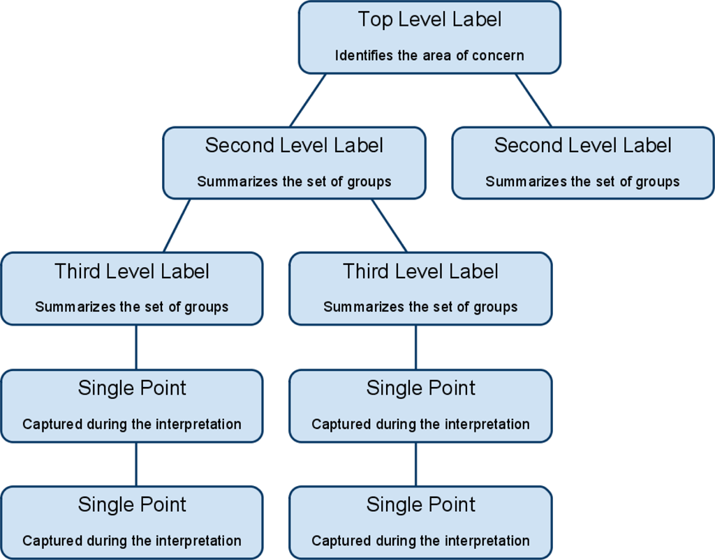
The affinity diagram is a business tool used to organize ideas and data. It is one of the Seven Management and Planning Tools. People have been grouping data into groups based on natural relationships for thousands of years; however, the term affinity diagram was devised by Jiro Kawakita in the 1960s[1] and is sometimes referred to as the KJ Method.

The tool is commonly used within project management and allows large numbers of ideas stemming from brainstorming[2] to be sorted into groups, based on their natural relationships, for review and analysis.[3][4] It is also frequently used in contextual inquiry as a way to organize notes and insights from field interviews. It can also be used for organizing other freeform comments, such as open-ended survey responses, support call logs, or other qualitative data.

Process

[edit]

The affinity diagram organizes ideas with following steps:

  1. Record each idea on cards or notes.
  2. Look for ideas that seem to be related.
  3. Sort cards into groups until all cards have been used.

Once the cards have been sorted into groups the team may sort large clusters into subgroups for easier management and analysis.[5] Once completed, the affinity diagram may be used to create a cause and effect diagram.[6]

In many cases, the best results tend to be achieved when the activity is completed by a cross-functional team, including key stakeholders. The process requires becoming deeply immersed in the data, which has benefits beyond the tangible deliverables.

Citations

[edit]
  1. ^ Improving Performance Through Statistical Thinking By Galen C. Britz
  2. ^ Affinity Diagram - Kawakita Jiro or KJ Method, Retrieved June 6, 2010
  3. ^ "Using Affinity Diagrams to make sense from brainstorming". Archived from the original on 2020-11-05. Retrieved 2007-06-12.
  4. ^ Project Management Institute 2021, Glossary §3 Definitions.
  5. ^ Value: Its Measurement, Design and Management By M. Larry Shillito
  6. ^ "NHS Improvement network". Archived from the original on 2016-03-03. Retrieved 2007-06-12.

References

[edit]
[edit]
Revisions and contributorsEdit on WikipediaRead on Wikipedia
from Grokipedia
An affinity diagram is a collaborative tool for organizing large volumes of ideas, data, or observations into natural groupings based on thematic similarities, often serving as a structured output from brainstorming sessions. Also known as the KJ method or affinity mapping, it was developed in the 1960s by Japanese anthropologist Jiro Kawakita to help consolidate subjective data and achieve consensus on complex topics. The method typically involves recording individual ideas on or cards, silently grouping them into clusters of 5-10 related items (with 40-60 total items being common), and then discussing and labeling each group with a header card to define overarching themes. These clusters can further be combined into "supergroups" for higher-level analysis, promoting intuitive without predefined categories. The process emphasizes silent initial sorting to minimize bias and encourage diverse input, followed by verbal refinement to build team alignment. Affinity diagrams are widely applied in , , and (UX) design to make sense of chaotic or unstructured information, such as survey results, ethnographic data, or design concepts. In quality improvement, they support the Seven Management and Planning Tools by facilitating problem-solving and process analysis. In UX research, they help sort user insights or prototype ideas into actionable themes, enhancing collaborative across project stages. Overall, the tool fosters creativity, reduces overwhelm from large datasets, and reveals hidden relationships to inform .

Overview

Definition

An affinity diagram is a collaborative tool for organizing large volumes of qualitative data or ideas into thematic groups based on their natural relationships and affinities. It serves as a visual method to synthesize brainstorming outputs, observations, or complex information, revealing underlying patterns without predefined categories. Also known as the KJ method—named after Japanese anthropologist Jiro Kawakita, who developed it in the 1960s—affinity diagrams are alternatively called affinity maps or affinity wall diagrams. The key components consist of individual ideas captured concisely on notes, cards, or ; these are then clustered into groups that represent shared themes, with header labels summarizing each cluster and optional hierarchical arrangements to show broader relationships. In contrast to mind maps, which employ a radial, hierarchical structure emanating from a central concept, affinity diagrams start with unrelated items and inductively form groupings through intuitive .

Purpose

The affinity diagram serves as a tool to synthesize generated from brainstorming sessions, enabling teams to identify patterns and themes within large volumes of qualitative information. By clustering related ideas, it reduces the complexity of datasets, transforming chaotic inputs into coherent categories that highlight key insights and priorities. This process fosters team consensus by providing a visual framework for aligning diverse perspectives on problem-solving or . In the context of , the affinity diagram facilitates the transition from divergent idea generation to , where disparate items are grouped based on natural affinities rather than preconceived categories. This approach leverages to reveal underlying relationships, moving beyond linear logic to uncover emergent themes that might otherwise remain obscured. Originating from the KJ method's anthropological roots in organizing ethnographic data, it emphasizes intuitive to interpret complex, non-repetitive information. Collaboration is enhanced through techniques like silent sorting, which minimizes from dominant voices and promotes equal participation among team members. This democratic process encourages broader input, building shared understanding and ownership of outcomes without hierarchical influence. Affinity diagrams are particularly ideal for scenarios involving 20 or more ideas, ambiguous problems requiring thematic synthesis, or multidisciplinary teams seeking to align on insights from research or ideation. They prove effective in handling datasets up to 100–200 items, such as post-brainstorming outputs or survey analyses, where traditional outlining fails to capture relational nuances.

History

Origins and Development

The affinity diagram, also known as the KJ method, was developed in the 1960s by Jiro Kawakita, a Japanese , educator, and explorer. Kawakita created the technique to address the challenges of organizing complex qualitative data gathered during anthropological fieldwork, where traditional deductive approaches often imposed preconceived categories that obscured indigenous perspectives. This inductive method emerged as a practical tool for making sense of unstructured information without relying on quantitative analysis, reflecting Kawakita's emphasis on intuitive, bottom-up reasoning inspired by ethnographic principles. Kawakita's innovation stemmed directly from his extensive fieldwork in remote regions, including the and , with major expeditions in the and ongoing work into the . During these expeditions, he collected vast amounts of qualitative data through interviews with local communities and direct observations of cultural practices, often under resource-constrained conditions far from academic support. The sheer volume and diversity of field notes—comprising anecdotes, sketches, and observations—posed significant difficulties for , as Western-style categorization failed to capture the nuanced, context-dependent meanings inherent in non-Western cultures. To overcome this, Kawakita devised a process of physically sorting notes on large sheets of , grouping them based on emergent affinities or shared essences rather than superficial similarities, thereby fostering a deeper, empathetic understanding of the data. The KJ method, named after Kawakita's initials, was first systematically described in his 1967 book Hassōhō (translated as Abduction or The Power to Think), where he outlined it as a technique for inductive grouping of qualitative insights. In this work, Kawakita emphasized the method's role in transforming chaotic field data into coherent patterns through iterative comparison and group consensus, avoiding rigid frameworks to preserve the authenticity of observations. This publication marked the initial formalization of the approach, positioning it as a cornerstone of qualitative analysis in and laying the groundwork for its broader recognition.

Adoption and Evolution

The affinity diagram entered practices in during the 1970s, where it was adopted by leading firms as part of efforts to enhance problem-solving and continuous improvement within frameworks. Building on the original KJ method principles of grouping related ideas, the tool was formalized as one of the Seven Management and Planning Tools by the Union of Japanese Scientists and Engineers (JUSE) in 1976, promoting its use for organizing complex data in industrial settings. The diagram's global spread accelerated in the 1980s, as it was introduced to Western audiences through the dissemination of Japanese quality circles and methodologies, which emphasized team-based idea generation and refinement. Over time, the affinity diagram evolved from traditional paper-based applications to digital formats, particularly in the 2000s with the emergence of that enabled real-time grouping of ideas. Platforms like Miro and facilitated this shift by providing virtual and clustering features, making the method more scalable for distributed teams. Post-2020, adaptations for remote further refined the tool, incorporating video integration and asynchronous to support hybrid work environments amid the global shift to virtual operations. By the 2010s, the affinity diagram had integrated into agile methodologies and (UX) design frameworks, where it aids in synthesizing insights and prioritizing features during iterative sprints.

Construction Process

Preparation and Idea Generation

The preparation phase for an affinity diagram involves assembling a multidisciplinary of 4 to 10 participants to foster diverse input during the collaborative session, with a designated guiding the process to promote inclusivity and prevent dominance by any individual. This setup ensures that all voices contribute to generating raw ideas without initial critique, aligning with the diagram's goal of organizing unstructured thoughts into natural relationships. Idea generation typically occurs through structured brainstorming or by compiling existing data sources, such as user feedback, interview transcripts, or survey responses, emphasizing a non-judgmental environment to encourage free expression. Participants aim to produce a substantial volume of ideas—often dozens to over a hundred—to capture the full breadth of perspectives, using methods like traditional verbal sharing or silent individual reflection until ideas are exhausted. Each idea must be recorded independently on separate , index cards, or digital equivalents to facilitate later manipulation, with phrasing limited to concise, neutral statements of 3 to 7 words for clarity and objectivity. This approach avoids that could grouping and ensures every contribution stands alone. Practical preparations include securing a large, unobstructed workspace such as a , , or table to accommodate the spread of notes, along with supplies like markers for legibility. Ground rules are established upfront, notably requiring during the initial posting of ideas to minimize premature and allow organic emergence of patterns. These elements create an efficient foundation for the diagram's divergent phase.

Grouping and Organization

The grouping phase of affinity diagramming, also known as the KJ method, begins with silent sorting, where participants independently move individual notes or cards into tentative clusters on a large surface based on intuitive similarities and natural affinities, without any discussion to minimize and premature judgments. This non-verbal approach allows for organic , permitting notes to be duplicated or left as outliers if they do not fit neatly into one group, ensuring all ideas are considered without forcing artificial categories. Following silent sorting, the team engages in collaborative refinement, discussing the emerging clusters to assess relationships, resolve ambiguities, and adjust groupings through consensus, such as merging closely related notes or splitting overly broad ones until natural themes solidify, often resulting in 5-10 distinct groups. This discussion phase encourages diverse perspectives, allowing participants to challenge or relocate notes that span multiple clusters, fostering a balanced and iterative convergence on coherent categories. Once clusters are refined, labeling occurs by assigning descriptive header cards—typically in a contrasting color—to each group, capturing the overarching theme or essence, such as " Challenges" for related ideas on design flaws. Optionally, higher-level super-groups can be formed by grouping these headers under broader umbrellas if evident patterns warrant it, further synthesizing the structure. Finalization involves arranging the labeled groups hierarchically on the surface for visual clarity, with lines or arrows optionally added to denote evident relationships between clusters, such as causal links, to highlight interconnections without altering the core groupings. This step ensures the diagram serves as a stable, actionable framework derived from the initial brainstormed ideas.

Applications

In Quality Management and Business

In quality management, affinity diagrams serve as a key tool for root cause analysis by organizing brainstormed ideas related to defects or process inefficiencies in and service environments. For instance, teams can generate a large set of potential causes for production defects, such as equipment failures or operator errors, and then cluster them into natural groupings like "human factors" or "material issues" to prioritize investigative efforts. This approach facilitates a structured identification of underlying problems, enabling more targeted improvements in processes. In , affinity diagrams are employed to synthesize stakeholder requirements and data, helping to uncover priorities for product development initiatives. Analysts collect diverse inputs from customers, executives, and end-users—such as feature requests or pain points—and group them thematically, for example, into categories like " enhancements" or "cost reductions," to reveal consensus-driven opportunities and reduce misalignment in . This method promotes collaborative refinement of business needs, ensuring that development efforts align with validated priorities rather than isolated opinions. For project planning, affinity diagrams cluster risks, tasks, or team inputs to support methodologies like agile retrospectives and SWOT analysis, fostering clearer roadmaps and mitigation strategies. In agile settings, post-sprint feedback on successes and challenges can be organized into affinity groups such as "process bottlenecks" or "resource gaps," aiding retrospectives in actionable insights for future iterations. Similarly, during SWOT exercises, ideas on strengths, weaknesses, opportunities, and threats are grouped to highlight strategic themes, enhancing decision-making in complex projects. A notable application occurs in events, where affinity diagrams group employee suggestions to streamline operations, originating from Japanese management practices.

In Design, Research, and Education

In (UX) and (UI) design, affinity diagrams serve as a collaborative tool for synthesizing qualitative data from user interviews, , and field observations into thematic clusters, which inform the creation of user personas and customer journey maps. Affinity diagramming (also called affinity mapping) is generally more efficient than formal thematic analysis for synthesizing usability testing feedback in UX research. It enables quick, visual, collaborative grouping of observations into themes, making it faster for teams to identify patterns in qualitative data from usability tests. Thematic analysis offers a more systematic, rigorous coding process but is often more time-intensive and less collaborative in practice. This process allows design teams to identify patterns in user behaviors and pain points, transforming raw insights into actionable design strategies that prioritize user needs. For instance, observations from sessions are written on and grouped by similarity, revealing emergent themes such as frustrations or barriers that guide interface refinements. In qualitative research fields like anthropology and social sciences, affinity diagrams enable researchers to organize ethnographic data—such as field notes, interview transcripts, and cultural observations—into natural groupings that highlight relational patterns and cultural themes. Similarly, social scientists apply it to sort survey responses or focus group outputs, fostering a deeper understanding of societal trends like community resilience or identity formation. Educators in research contexts also employ affinity diagrams to analyze student feedback on teaching methods, grouping comments into categories like engagement strategies or resource needs to refine curriculum development. Within educational settings, affinity diagrams facilitate student-led brainstorming on multifaceted topics, such as categorizing historical events by causes and impacts or scientific concepts by underlying principles, promoting active learning and critical thinking. In classrooms, students generate ideas on sticky notes during group activities, then collaboratively sort them into clusters, which helps visualize connections and encourages ownership of the learning process. This approach is particularly effective for inclusive environments, where it supports diverse learners in organizing complex information, such as sorting literature themes or project ideas, to build collective knowledge. Affinity diagrams in UX have been popularized by design firms like for clustering observations from field studies to extract insights. Digital adaptations, such as online whiteboards, extend this method to remote design and teams for real-time .

Advantages and Limitations

Key Benefits

Affinity diagrams enhance among team members by allowing silent, individual input during the grouping phase, which equalizes participation and minimizes the influence of dominant voices in discussions. This approach fosters a more inclusive environment where all participants contribute equally, leading to greater consensus and shared ownership of the resulting categories. The tool excels in pattern recognition by revealing hidden relationships and natural affinities within large volumes of unstructured data, typically ranging from 40 to 200 items, thereby aiding in the identification of overarching themes and prioritization of key issues. This inductive process uncovers connections that might otherwise remain obscured in linear analysis methods, providing a clearer roadmap for . Affinity diagrams stimulate through their bottom-up, intuitive grouping mechanism, which encourages participants to form novel connections between ideas and break free from conventional thinking patterns. This fosters innovation by promoting divergent idea generation followed by convergent synthesis, making it particularly effective for complex problem-solving. In terms of efficiency, affinity diagrams enable rapid organization of extensive datasets into manageable clusters, significantly reducing the time required compared to sequential sorting techniques. By streamlining the synthesis of qualitative into actionable categories, the method accelerates the transition from raw ideas to structured insights.

Potential Drawbacks

Affinity diagrams, while effective for organizing qualitative ideas, are inherently subjective due to their reliance on participants' and personal interpretations during the grouping phase, which can result in biased or inconsistent categorizations if the team lacks diverse perspectives. This subjectivity arises because there are no rigid rules for affinity, allowing individual biases to influence how items are clustered, potentially overlooking alternative groupings that might emerge from broader viewpoints. To mitigate this, facilitators can enforce silent sorting periods initially to encourage independent contributions before discussion, and ensure team diversity to balance interpretations. Scalability poses another challenge, as affinity diagrams become less effective and more cumbersome with very large datasets—typically those exceeding 200 items—where the physical or visual management of overwhelms participants and extends session times considerably. They are particularly time-intensive for novices unfamiliar with the process, requiring extended to handle even moderate volumes efficiently, and prove inadequate for highly quantitative that demands statistical rather than thematic clustering. Digital tools, such as collaborative online whiteboards, can address scalability by enabling virtual rearrangement and asynchronous input; as of 2025, many virtual whiteboard tools incorporate (AI) to automatically identify themes from , further improving efficiency for larger or distributed teams. While affinity diagrams produce clusters that can be combined into supergroups for higher-level , they lack built-in mechanisms for delineating priorities, causal , or detailed sub-level relationships among categories, often requiring additional tools for deeper or . For instance, while groups identify themes, they do not indicate which are most critical or interconnected, necessitating follow-up methods like tree diagrams to impose structure and explore dependencies. This can be mitigated by integrating voting techniques, such as dot voting, immediately after grouping to democratically assign priorities to clusters, thereby enhancing without overhauling the core process.

References

Add your contribution
Related Hubs
User Avatar
No comments yet.