Hubbry Logo
IntertitleIntertitleMain
Open search
Intertitle
Community hub
Intertitle
logo
8 pages, 0 posts
0 subscribers
Be the first to start a discussion here.
Intertitle
Intertitle
from Wikipedia
The Cabinet of Dr. Caligari (1920) used stylised intertitles
Cinema etiquette title card (c. 1912)

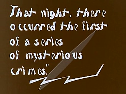
In films and videos, an intertitle, also known as a title card, is a piece of filmed, printed text edited into the midst of (hence, inter-) the photographed action at various points. Intertitles used to convey character dialogue are referred to as "dialogue intertitles", and those used to provide related descriptive/narrative material are referred to as "expository intertitles".[1] In modern usage, the terms refer to similar text and logo material inserted at or near the start or end of films and television shows.

Silent film era

[edit]

In the silent film era, intertitles were mostly called "subtitles", but also "leaders", "captions", "titles", and "headings", prior to being named intertitles,[2] and often had Art Deco motifs. They were a mainstay of silent films once the films became of sufficient length and detail to necessitate dialogue or narration to make sense of the enacted or documented events. The British Film Catalogue credits the 1898 film Our New General Servant by Robert W. Paul as the first British film to use intertitles.[3] Film scholar Kamilla Elliott identifies another early use of intertitles in the 1901 British film Scrooge, or, Marley's Ghost.[4] The first Academy Awards presentation in 1929 included an award for "Best Writing – Title Cards" that went to Joseph W. Farnham for the films Fair Co-Ed; Laugh, Clown, Laugh; and Telling the World.[5] The award was never given again, as intertitles went out of common use due to the growing popularity of the "talkies".[6]

Modern use

[edit]

In modern use, intertitles are used to supply an epigraph, such as a poem, or to distinguish various "acts" of a film or multimedia production by use as a title card. However, they are most commonly used as part of a historical drama's epilogue to explain what happened to the depicted characters and events after the conclusion of the story proper.

The development of the soundtrack slowly eliminated their utility as a narrative device (they were common for providing narration, but not dialogue, well into the 1930s), but they are occasionally still used as an artistic device. For instance, intertitles were used as a gimmick in Frasier. The BBC's drama Threads uses them to give location, date and information on distant events beyond Sheffield. Law & Order and its related spinoffs used them to give not only the location, but also the date of the upcoming scene. Guy Maddin is a modern filmmaker known for recreating the style of older films, and uses intertitles appropriately. Some locally produced shows, such as quiz bowl game shows, use animated variations of intertitles to introduce the next round. In the show Invincible the title card is used for comedic effect, such as interrupting a character with the title card whenever they say the titular protagonist's name, often exploited for comedic purposes such as one instance where a character is interrupted multiple times.

Amateur use

[edit]

Intertitles have also had a long history in the area of amateur film. The efforts of home movie aficionados to intertitle their works post-production led to the development of a number of innovative approaches to the challenge. Frequently lacking access to high-quality film dubbing and splicing equipment, amateur film makers must plan ahead when making a film to allow space for filming an intertitle over the existing film. Intertitles may be printed neatly on a piece of paper, a card, or a piece of cardboard and filmed, or they may be formed from adhesive strips and affixed to glass. In the early 1980s, digital recording technology improved to the point where intertitles could be created in born-digital format and recorded directly onto the film. Several specialty accessories from this period such as Sony's HVT-2100 Titler and cameras such as Matsushita's Quasar VK-743 and Zenith VC-1800 could be used to generate intertitles for home movies.[7]: 20  Early 1980s video game consoles and applications catering to the demo scene were also adapted for the generation and recording of intertitles for home films. Among these were included the ColecoVision, the Magnavox Odyssey² (using programs such as the Type & Talk cartridge and the Voice module), the Bally Astrocade (using the built-in Scribbling program or the more advanced Creative Crayon cartridge), and the intertitle-specialized Famicom Titler.[7]: 21 

See also

[edit]

References

[edit]
Revisions and contributorsEdit on WikipediaRead on Wikipedia
from Grokipedia
An intertitle is a piece of filmed, printed text edited into a motion picture between scenes, primarily used in silent films to provide narrative exposition, character dialogue, or contextual details essential to the story. These text inserts, often called title cards, originated in early cinema around 1902 with simple expository titles that summarized plot points, evolving by 1904 to include dialogue titles representing spoken words. As films lengthened in the 1910s, intertitles became standardized, with production companies creating them from photographed placards—typically cardboard with block lettering—for clarity and consistency across audiences. They served two main types: expository titles offering third-person narrative guidance and dialogue titles presenting first-person character speech, sometimes incorporating diegetic elements like letters or newspapers to enhance realism. By the mid-1910s, intertitles were integral to feature-length films, with over 90 screenwriting manuals published between 1910 and 1922 detailing their placement, timing (one second per word plus extras for readability), and stylistic norms to bridge the absence of sound. In later silent cinema, they shifted toward more artistic typography and creative formats, reducing reliance on live narrators and ensuring universal comprehension, though errors arose in multilingual versions. Although largely supplanted by sound in the late 1920s, intertitles persist in modern films for stylistic effect, such as denoting time shifts or quoting sources.

Definition and Fundamentals

Definition and Purpose

An intertitle is a piece of filmed, printed text edited into the midst of a film's photographed action, typically featuring white lettering on a black background, to convey dialogue, exposition, narrative transitions, or other information without relying on spoken words. These inserts, also known as title cards, function as standalone shots that interrupt the visual flow to provide essential textual elements directly to the audience. The primary purposes of intertitles include advancing the plot by summarizing off-screen events, revealing character thoughts or inner monologues, and establishing scene settings or temporal shifts. They commonly served as proxies for unspoken , allowing filmmakers to communicate spoken exchanges through text alone, as in title cards depicting conversations between characters. This narrative role enabled clearer storytelling in the absence of synchronized sound, ensuring viewers could follow complex sequences without auditory cues. Intertitles generally fall into two categories: expository titles providing third-person narrative guidance and titles presenting first-person character speech. Intertitles differ fundamentally from , which are overlaid text—often at the bottom of the screen—intended to translate foreign-language or provide captions for spoken audio in sound films. Instead, intertitles act as deliberate narrative breaks, occupying the full frame and pausing the action to deliver standalone information rather than synchronizing with ongoing visuals or . The term "intertitle" emerged in the to specifically denote these textual inserts within silent cinema, setting them apart from main titles that open or close a . This nomenclature reflected the growing complexity of films during that decade, where intertitles became integral to structuring longer .

Technical Characteristics

Intertitles are characteristically designed as static visual inserts, consisting of plain backgrounds—often black with white text or vice versa—to ensure and from a distance in theater settings. The text is typically centered, employing fonts such as Gothic styles prevalent in early cinema or modern equivalents like for clarity, with line lengths limited to avoid overcrowding the frame. These cards often incorporate simple borders or minimal embellishments, and transitions such as fade-ins and fade-outs are applied during to smoothly integrate them into the flow without jarring the viewer. Display duration is typically 6-8 seconds on average, allowing audiences sufficient time to read 12-20 words while preserving pacing, as longer exposures risk disengagement. In terms of production, early intertitles were created by hand-lettering or text onto cards, glass plates, or sheets, which were then photographed using an animation stand or similar rig to produce a series of identical frames. This was subsequently spliced directly into the film's negative or positive print during , ensuring seamless integration with live-action sequences. For more complex effects, such as superimpositions or color variations, optical techniques were employed to composite the title elements onto the main , a method that became standardized by the for professional productions. Timing and pacing of intertitles are calibrated to the film's , which varied from 16 to 24 in the silent era, requiring precise frame counts to match projection speeds and prevent or rushed reading. Brevity is a core principle, with guidelines recommending no more than one second per word for initial lines to sustain momentum, and overall exposure kept under 10 seconds to minimize interruption of visual storytelling.

Historical Development

Origins in Early Cinema

The origins of intertitles can be traced to precursors in pre-cinematic visual entertainments, particularly shows and theater programs from the 17th to 19th centuries. projectors, invented around the , used painted or photographic slides to project images, often incorporating text slides for , titles, or explanatory captions to guide through stories or lectures. These text elements provided contextual identification and narrative cues, much like later intertitles, and influenced early filmmakers who adapted similar projection techniques for motion pictures. Theater programs also served as analogs, offering printed summaries or hints to enhance audience comprehension of live performances, a practice that carried over into cinema exhibitions where showmen initially inserted explanatory slides between film segments. Intertitles emerged as a distinct cinematic device in the late 1890s to early 1900s, coinciding with the shift from single-shot actualities to multi-scene narratives. Early experiments by pioneers like and the brothers focused on short films (typically 30 seconds to 2 minutes) that documented real-life events without complex storytelling, relying instead on live narration or simple on-screen identification text for film titles rather than inserted explanatory cards. The first filmed intertitles appeared around 1903 in Edwin S. Porter's , where brief title cards were inserted between scenes to convey key plot points and dialogue, marking a breakthrough in using text to bridge action in short films under 10 minutes. , known for his fantasy shorts like (1902), experimented with minimal text overlays or main titles in some works but primarily depended on visual effects and live showmen narration, as his films lacked embedded intertitles in their original form. These early uses were rudimentary, often consisting of filmed cardboard cards with block lettering, added to aid comprehension in silent projections. The adoption of intertitles faced limitations in the pre-1910s era due to the brevity of films and technological constraints, but it accelerated with the rise of longer narratives. Short films, constrained to under 10 minutes by 35mm and projection equipment, employed minimal text—typically one or two cards per —to avoid disrupting the visual flow, focusing instead on actualities or simple vignettes. Growth occurred post-1906 with the advent of multi-reel features, enabling greater complexity in plotting and character development without sound. A key milestone in standardization came between 1908 and 1910, as studios like and American and Biograph transitioned from single-reel actualities to story-driven films, institutionalizing intertitles as essential narrative tools. pioneered multilingual title cards around 1903 and refined them by 1908 for international distribution, while Biograph, under D.W. Griffith's influence from 1908, integrated expository intertitles to clarify actions in multi-scene dramas, setting industry norms for text insertion. This period marked intertitles' evolution from ad-hoc showman additions to professionally produced elements, filmed separately and spliced in, as cinema emphasized structured storytelling over raw documentation.

Prominence in Silent Films

During the of silent cinema in the and 1920s, intertitles assumed a dominant role in narrative construction, often accounting for a significant portion of a feature film's runtime to compensate for the absence of spoken . These cards served multiple functions, including expository titles that established plot points and context, dialogic titles that conveyed character conversations, and transitional titles that bridged scene changes and maintained pacing. By interrupting the visual flow, intertitles ensured clarity in , allowing directors to elaborate on motivations, settings, and events that might otherwise be ambiguous through action alone. Prominent examples highlight the innovative and sometimes excessive reliance on intertitles. D.W. Griffith's (1915) exemplified this approach with a large number of intertitles, using them to weave a sprawling historical epic across the and Reconstruction eras, where text provided detailed exposition and ideological commentary. In contrast, Charlie Chaplin's comedies, such as The Kid (1921) and (1925), incorporated witty and ironic intertitles to amplify humor and pathos, often employing clever phrasing to underscore the Tramp's ironic predicaments or social satire without overwhelming the visual gags. These uses demonstrated intertitles' versatility, from epic narration to comedic punctuation. Intertitles' cultural impact extended beyond domestic audiences, enabling silent films' broad international appeal by facilitating straightforward translation of text into local languages, thus bypassing spoken-word barriers and allowing global distribution with minimal alteration to visuals. Hollywood's further standardized intertitle design in the , with major studios like establishing guidelines for legible fonts—often or hand-lettered styles like for readability—and consistent spacing to ensure quick comprehension under projection conditions. However, this prominence introduced challenges: actors received specialized training to deliver exaggerated pauses and gestures during filming, anticipating the insertion of intertitles in to synchronize beats. Additionally, films presupposed literacy in Western markets, potentially alienating less-educated or non-native viewers despite visual aids, though this assumption aligned with rising literacy rates in urban theaters.

Evolution with Sound and Color

Adaptation to Talking Pictures

The advent of synchronized sound in the late 1920s precipitated a rapid decline in the use of intertitles within feature films. The release of in , which featured only about two minutes of spoken dialogue amid extensive reliance on intertitles for the remainder, catalyzed industry-wide adoption of sound technology and signaled the obsolescence of traditional silent-era narration methods. By 1930, most Hollywood productions had fully transitioned to talkies, eliminating intertitles from the core narrative structure, though they lingered in ancillary roles such as prologues or to display song lyrics in musical sequences. Early sound films frequently adopted hybrid formats, blending audible dialogue with limited intertitles to bridge gaps in the nascent technology. For example, (1929), MGM's pioneering musical and the first to win the Academy Award for Outstanding Picture, incorporated synchronized songs and spoken lines while employing sparse intertitles for non-dialogue exposition or scene transitions, reflecting the transitional challenges of integrating sound without disrupting visual flow. This approach allowed filmmakers to leverage sound's novelty while retaining familiar silent-era tools for clarity. The shift away from intertitles stemmed primarily from the practical advantages of synchronous sound recording, which enabled direct capture of dialogue and effects during filming, obviating the need for separate title card production and insertion. Intertitles had demanded additional time-intensive steps, including scriptwriting, , filming blank backgrounds, and precise synchronization, inflating costs and complicating . In contrast, systems, standardized by 1930, streamlined workflows and enhanced narrative efficiency, rendering intertitles redundant for most storytelling functions. Intertitles persisted in niche applications amid the sound era's dominance. For international distribution, studios produced versions of early talkies where original tracks were muted and replaced with local-language intertitles accompanied by music, circumventing the era's rudimentary capabilities. In , such as Walt Disney's (1928), intertitles supplemented synchronized music and effects to convey key actions, preserving their utility in concise, visual-heavy formats. These holdovers underscored intertitles' adaptability even as spoken sound reshaped cinema._Intertitle.jpg)

Influence of Color and Special Effects

The introduction of three-strip in the 1930s revolutionized intertitle aesthetics by enabling vibrant, full-color presentations that integrated text more seamlessly with narrative visuals, moving beyond the limitations of earlier decades. During the era (1930s–1950s), designers employed tinted titles to emphasize key elements and improve contrast against dynamic backgrounds; for instance, in (1939), the were processed in sepia tone using MGM's Sepia Platinum method to align with the monochromatic sequences, enhancing thematic cohesion before the shift to full color. This approach not only boosted readability on colored sets but also allowed for selective tinting, such as two-tone and drop shadows, which prevented text from blending into elaborate environments. Special effects integration further transformed intertitles, with optical printing techniques facilitating animated and superimposed text that replaced static cards with dynamic overlays. By the 1950s, optical printers enabled the of titles over live-action , as seen in epic productions where scrolling credits were rephotographed frame-by-frame to create smooth motion against panoramic scenes. This shift favored superimposed text for its flexibility in color films, allowing titles to appear integrated within the action rather than as interruptions. Mid-century advancements in widescreen formats, such as introduced in 1953 with , necessitated adaptations in intertitle design, including larger, bolder fonts to maintain legibility across expansive aspect ratios up to 2.55:1. In sci-fi genres, experimental effects like animated, glowing text inserts evoked futuristic themes, utilizing optical to simulate holographic projections in films such as (1955). These innovations prioritized visual scale and immersion, aligning text with the era's emphasis on . Technical evolution during this period saw a transition from physical title cards to overlays and matte , which reduced reliance on bulky props and enabled precise control over text placement in color sequences. Matte techniques, involving painted glass elements combined via optical printers, allowed for complex backgrounds behind titles without reshooting entire scenes, streamlining production for color epics and effects-heavy narratives. This methodological shift marked a pivotal step toward more fluid intertitle integration in post-silent cinema.

Contemporary Applications

In Professional Film and Television

In contemporary professional film production, intertitles have seen a revival in indie and art-house cinema, often employed for postmodern irony, stylistic homage to silent-era aesthetics, or to structure narratives in unconventional ways. The film The Artist, directed by , exemplifies this trend by utilizing full silent-style intertitles throughout its black-and-white runtime to convey and advance the plot, serving as a deliberate tribute to early 20th-century cinema while critiquing the transition to sound films. Similarly, Edgar Wright's (2010) incorporates comic-book-inspired intertitles as chapter breaks—such as "Round 1: Scott Pilgrim vs. the World"—to delineate fight sequences and character arcs, blending visuals with live-action to heighten the film's playful, meta energy. In television, particularly prestige scripted series, intertitles appear more sparingly due to the medium's emphasis on dense and continuous pacing, but they are strategically inserted for recaps, legal disclaimers, or contextual notes to clarify complex timelines or historical elements. This limited application contrasts with film's flexibility, as TV's episodic format prioritizes verbal exposition, though intertitles prove effective in or limited series where brevity enhances immersion. Screenwriting resources advise formatting intertitles in scripts as centered, bold elements to signal their function without overcomplicating dialogue-heavy scenes. Post-2010, a notable trend in prestige television involves increased use of intertitles to support non-linear , where they orient audiences amid time shifts or fragmented plots. This approach, influenced by cinematic revivals, allows creators to evoke tension and mystery while adhering to tight runtimes, marking a shift from overt exposition to subtle visual cues in high-production-value dramas. As of 2025, this persists in series employing stylized text for temporal navigation, though specific guidelines remain general to production rhythm rather than prescriptive for intertitles.

In Digital and Streaming Media

In digital and since the , intertitles have evolved into on-screen text overlays and chapter titles, providing narrative breaks in online videos and series. On platforms like , creators frequently use text overlays to insert explanatory or transitional content, enhancing viewer engagement without relying on audio. Similarly, series such as employ chapter titles displayed as prominent text cards at the start of episodes, echoing the expository role of traditional intertitles while fitting the episodic structure of streaming content. For , HTML5 video elements enable dynamic text integration, allowing intertitle-like overlays to be rendered directly in browsers for seamless playback across devices. Interactivity has further transformed intertitles in streaming, particularly in choose-your-own-adventure formats where clickable text prompts guide viewer decisions. The 2018 Netflix production exemplifies this, using on-screen text choices as interactive intertitles that branch the narrative based on user input, blending traditional title card aesthetics with hyperlinked functionality. In video-on-demand (VOD) contexts, intertitles differ from by focusing on narrative advancement rather than dialogue translation; subtitles handle linguistic barriers, while intertitles insert standalone story elements like scene summaries or transitions. Accessibility features have integrated intertitle principles into digital platforms, with auto-generated text cards supporting silent or muted viewing modes. Streaming services increasingly offer these for users in quiet environments or with hearing impairments, converting audio narratives into readable overlays akin to intertitles. This trend surged with short-form content on from 2016 onward, where text overlays serve as concise intertitles to convey punchy messages, boosting retention in sound-off scenarios common on mobile devices. Technically, intertitles in digital media prioritize sharp font rendering in high-definition (HD) and 4K resolutions to maintain legibility across screens. Editing software like Adobe Premiere Pro facilitates this through the Essential Graphics panel, enabling customizable text layers with precise timing and effects for overlays. Algorithms for auto-insertion, powered by AI transcription, streamline the placement of text elements, though manual refinement ensures narrative accuracy for intertitle applications.

Amateur and Independent Uses

Tools for Creation

Non-professionals creating intertitles have access to several options that simplify the process of generating and integrating text overlays into video projects. , developed by since its initial release in 2004, provides a comprehensive free version featuring built-in title generators and the MultiText tool, which allows users to create and composite multiple text layers with customizable styles directly within the editing timeline. Blender, a free open-source 3D creation suite maintained by the , supports the animation of text objects through keyframing and modifiers, enabling dynamic intertitles that can be rendered and exported for video integration. Mobile applications further lower the barrier for amateur intertitle production by offering intuitive interfaces on everyday devices. CapCut, launched by ByteDance in May 2019, includes features like in-app font libraries, pre-built templates, and keyframe animation tools for adding and styling text overlays quickly during mobile video editing. Similarly, iMovie, Apple's consumer-grade video editor available on iOS and macOS devices, facilitates the insertion of text and titles onto clips or backgrounds with options for basic customization, such as font selection and positioning. In terms of hardware, smartphones and basic personal computers are sufficient for running these tools, as they leverage standard processors, integrated graphics, and minimal RAM—typically 8 GB or more—without requiring specialized cameras or equipment, a stark contrast to the optical printers and needed in the silent era. The for these applications is manageable for beginners, supported by extensive official documentation and user-generated tutorials on platforms like that cover intertitle workflows from text creation to integration. Users should prioritize export settings for compatibility, such as MP4 format with embedded or burned-in text, to ensure seamless playback across devices.

Creative and Experimental Approaches

In amateur filmmaking, intertitles have been repurposed in to evoke abstract poetry and non-linear narratives, often by fan creators recreating silent-era aesthetics on platforms like since the . These experimental works use text cards not merely for but as to layer meaning over visual , drawing on the form's historical flexibility to challenge conventional storytelling. Web series and vlogs produced by independent creators frequently employ intertitles for humorous inserts, such as meme-style asides or punchy commentary, particularly in genres like and RPG videos where may be limited. In productions, text overlays are used to deliver comedic elements through ironic or exaggerated phrasing, allowing creators to punctuate action with witty commentary. Multilingual experiments further innovate this approach, enabling global accessibility by overlaying intertitles in multiple languages to reach diverse audiences without costs. Community-driven trends since 2020 have popularized intertitles in parodies, with amateur creators participating in online challenges that homage classic cinema through exaggerated gestures and textual narration. These parodies often integrate intertitles to heighten comedic effect, transforming everyday scenarios into mock-dramatic vignettes shared across video platforms. Additionally, some experiments combine intertitles with (AR) filters, creating hybrid visuals where text interacts dynamically with digital overlays for surreal . The use of intertitles in these contexts addresses key challenges while offering significant benefits, particularly for hearing-impaired creators who leverage text-based narration to bypass expenses in low-budget projects. During the era, intertitles inherently supported accessibility for deaf audiences by conveying essential narrative and dialogue information visually, a revived in modern work to empower creators with . filmmaking technologies have thus provided hearing-impaired individuals a "voice" through visual and textual means, fostering inclusive without financial barriers to audio production.

References

Add your contribution
Related Hubs
User Avatar
No comments yet.