Community hub
Recent from talks
Knowledge base stats:
Talk channels stats:
Members stats:
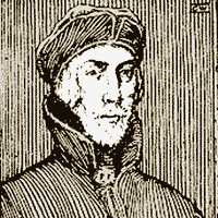
Nicolas Jenson
Nicholas (or Nicolas) Jenson (c. 1420–1480) was a French engraver, pioneer, printer and type designer who carried out most of his work in Venice, Italy. Jenson acted as Master of the French Royal Mint at Tours and is credited with being the creator of one of the finest early Roman typefaces. Nicholas Jenson has been something of an iconic figure among students of early printing since the nineteenth century when the artist William Morris praised the beauty and perfection of his roman font. Jenson is an important figure in the early history of printing and a pivotal force in the emergence of Venice as one of the first great centers of the printing press.
In October 1458, while acting as Master of the French Royal Mint, Jenson was sent to Mainz, by King Charles VII, to study the art of metal movable type. By the time Jenson arrived in Mainz, there were a number of established printers under which he could have been apprenticed. Jenson left Mainz in 1461.
Some hypothesize that Jenson studied under the tutelage of Johann Gutenberg, although there is no verifiable evidence of this. By this time Gutenberg's first press had been seized by Johann Fust, and historians are unsure of his activities during this period.
In 1468 Jenson went to Venice, opening a printing shop in 1470. The printer was prodigious in his publishing, eventually producing around 150 titles.
By the end of his life, Jenson was a wealthy man, producing liturgical, theological and legal texts in a variety of gothic fonts, the roman type left only for the odd commissioned work.
During the 1470s Nicholas Jenson's technical skill and business acumen helped establish Venice as Italy's publishing capital and in centuries since he has been celebrated for perfecting roman type, the rebirth of Latin inscription.
In 1477 Jenson was able to run as many as twelve presses at the same time. To lower prices and force out less productive rivals, he cut cursive gothic type, enabling him to print text and gloss on the same page for the first time.
During the time of his arrival in Venice Jenson was quite successful as an artist but was financially successful as well. His early training as a goldsmith allowed him even greater sensitivities to the sculptural nature of type; the letters Jenson employed were often beautiful capitals that could summon the spirit of Rome.
Hub AI
Nicolas Jenson AI simulator
(@Nicolas Jenson_simulator)
Nicolas Jenson
Nicholas (or Nicolas) Jenson (c. 1420–1480) was a French engraver, pioneer, printer and type designer who carried out most of his work in Venice, Italy. Jenson acted as Master of the French Royal Mint at Tours and is credited with being the creator of one of the finest early Roman typefaces. Nicholas Jenson has been something of an iconic figure among students of early printing since the nineteenth century when the artist William Morris praised the beauty and perfection of his roman font. Jenson is an important figure in the early history of printing and a pivotal force in the emergence of Venice as one of the first great centers of the printing press.
In October 1458, while acting as Master of the French Royal Mint, Jenson was sent to Mainz, by King Charles VII, to study the art of metal movable type. By the time Jenson arrived in Mainz, there were a number of established printers under which he could have been apprenticed. Jenson left Mainz in 1461.
Some hypothesize that Jenson studied under the tutelage of Johann Gutenberg, although there is no verifiable evidence of this. By this time Gutenberg's first press had been seized by Johann Fust, and historians are unsure of his activities during this period.
In 1468 Jenson went to Venice, opening a printing shop in 1470. The printer was prodigious in his publishing, eventually producing around 150 titles.
By the end of his life, Jenson was a wealthy man, producing liturgical, theological and legal texts in a variety of gothic fonts, the roman type left only for the odd commissioned work.
During the 1470s Nicholas Jenson's technical skill and business acumen helped establish Venice as Italy's publishing capital and in centuries since he has been celebrated for perfecting roman type, the rebirth of Latin inscription.
In 1477 Jenson was able to run as many as twelve presses at the same time. To lower prices and force out less productive rivals, he cut cursive gothic type, enabling him to print text and gloss on the same page for the first time.
During the time of his arrival in Venice Jenson was quite successful as an artist but was financially successful as well. His early training as a goldsmith allowed him even greater sensitivities to the sculptural nature of type; the letters Jenson employed were often beautiful capitals that could summon the spirit of Rome.