
Community hub
Russian cursive
View on WikipediaThis article has multiple issues. Please help improve it or discuss these issues on the talk page. (Learn how and when to remove these messages)
|

Russian cursive is a variant of the Russian alphabet used for writing by hand. It is typically referred to as (ру́сский) рукопи́сный шрифт (rússky) rukopísny shrift, "(Russian) handwritten font". It is the handwritten form of the modern Russian Cyrillic script, used instead of the block letters seen in printed material. In addition, Russian italics for lowercase letters are often based on Russian cursive (such as lowercase т, which resembles Latin m). Most handwritten Russian, especially in personal letters and schoolwork, uses the cursive alphabet. In Russian schools most children are taught from first grade how to write in this script.
History
[edit]_No.1736_20_december_1699.jpg)
The Russian (and Cyrillic in general) cursive was developed during the 18th century on the base of the earlier Cyrillic tachygraphic writing (ско́ропись, skoropis, "rapid or running script"), which in turn was the 14th–17th-century chancery hand of the earlier Cyrillic bookhand scripts (called ustav and poluustav). It became the handwritten counterpart of so-called "civil" (or Petrine) printed script of books. In order,[clarification needed] modern Cyrillic italic typefaces are based (in their lowercase part) mostly on the cursive shape of the letters.[citation needed]

The resulting cursive bears many similarities with the Latin cursive.[1] For example, the modern Russian cursive letter "п" may coincide with Latin cursive "n" (𝓃) (despite having completely different sound values); both upright and italic printed typefaces demonstrate less similarity.[citation needed]
One must not confuse the historical Russian chancery hand (ско́ропись, skóropis' ), the contemporary Russian cursive (рукопи́сное письмо́, rukopísnoe pis'mó) and the contemporary Russian stenography. The latter is completely different from the other two, though it is sometimes called ско́ропись, skóropis' , like the former.[citation needed]
Features
[edit]Russian cursive is much like contemporary English and other Latin cursives. But unlike Latin handwriting, which can range from fully cursive to heavily resembling the printed typefaces and where idiosyncratic mixed systems are most common, it is standard practice to write in Russian cursive almost exclusively.
Ambiguities
[edit]There exists some ambiguity from the fact that several lowercase cursive letters consist (entirely or in part) of the element that is identical to the dotless Latin cursive letter ı, the cursive Greek letter ι or a half of the cursive letter u, namely и, л, м, ш, щ, ы. Therefore, certain combinations of these Russian letters cannot be unambiguously deciphered without knowing the language or without a broader context. For example, in the words волшебник, "magician" and домик, "little house" the combinations лш and ми are written identically. The word лишишь, "you will deprive" written in cursive consists almost exclusively of these elements. There are examples of different words that become absolutely identical in their cursive form, e.g. мщу "I avenge" and лицу (dative of лицо "face"). The most radical form of this, though not well known, is the Tajik word миллии meaning 'national'. It consists only of these elements.
Some words in Russian may pose a challenge due to the similarities between the letters Ш, Щ, И, Л, М in cursive.
-
 The word Шиншилла (shinshilla), which means "Chinchilla". In red, a decomposition of the handwritten text showing the block letter equivalent.
 -
 The word Лишишь (lishish), which means "you will deprive". In red, a decomposition of the handwritten text showing the block letter equivalent.


Variants, use of diacritics
[edit]
In some forms of cursive, the distinction between т and ш may become elusive because both are written in the shapes of either 𝑚 or ɯ. To alleviate this case of ambiguity, a horizontal bar can be written above the character (like m̅ or rarely ɯ̅) if it is т, or below (like ɯ̲ or rarely m̲) if it is ш. Also, writing т in its printed form (the T shape) rather than its usual 𝑚 shape is common.
The letter д may also be written in the shape of ꝺ or ∂. The letter х is sometimes written identical to block lowercase Latin x.
Differences to Serbian and Macedonian cursives
[edit]
Several letters in Russian cursive are different from the cursive used in the Serbian and Macedonian languages. Thus, Serbian/Macedonian cursive lowercase г looks the same as in Russian with additional macron, п is written like the cursive Latin u with macron (ū), and the letter т is written in the shape of ɯ̅.[2][3] Serbian uppercase Д resembles the shape of Ձ. The letters б, д, з, Б, Н can also be written differently from their Russian counterparts.[4]
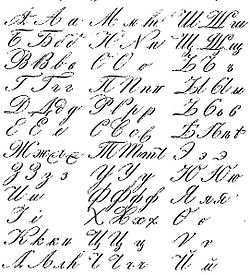
Charts
[edit]-
 Modern Russian cursive
 -
 Varieties of Russian calligraphic cursive from an 1835 dictionary
 -
 Pre-reform Russian calligraphic cursive from a 1916 schoolbook


See also
[edit]References
[edit]- ^ Белоконь, Е. А. (2001). Характеристика почерков XVIII-XIX вв. и термины в описаниях собраний рукописей [Characteristic handwriting XVIII-XIX centuries. and terms in descriptions of manuscript collections]. Вспомогательные исторические дисциплины: специальные функции и гуманитарные перспективы ; тезисы докладов и сообщений XIII научной конференции [Auxiliary Historical Disciplines: Special Functions and Humanitarian Perspectives; Abstracts of Reports and Communications of the XIII Scientific Conference] (in Russian). Moscow.
Термины «скоропись» и «курсив» в русской палеографии применяются параллельно, в то же время, в развитии русской скорописи намечаются тенденции, позволяющие выделить новый тип письма, схожий с латинским курсивным письмом, близким к современному. Если в частной сфере применения и в каллиграфии быстрее произошел переход к использованию курсивного письма, то в делопроизводственной традиции эти типы письма довольно долго сосуществовали.
≈ "Terms 'tachygraphy' and 'cursive' coexist in the Russian palaeography; meanwhile, in the development of the Russian tachygraphy there are tendencies that allow us to separate a new type of writing, one closer to the Latin cursive similar to its modern form. In the private sphere and in calligraphy, transition to the cursive writing occurred faster, but in the tradition of record keeping, these types of writing coexisted for a long time.{{cite book}}: CS1 maint: location missing publisher (link) - ^ Peshikan, Mitar; Jerković, Jovan; Pižurica, Mato (1994). Pravopis srpskoga jezika. Beograd: Matica Srpska. p. 42. ISBN 86-363-0296-X.
- ^ Pravopis na makedonskiot jazik (PDF). Skopje: Institut za makedonski jazik Krste Misirkov. 2017. p. 3. ISBN 978-608-220-042-2.
- ^ Serbian Cyrillic Letters BE, GHE, DE, PE, TE Archived 2008-08-21 at the Wayback Machine
Types of handwritten European scripts | ||
|---|---|---|
| Ancient and medieval |  | |
| Modern | ||
| Teaching scripts | ||
Russian cursive
View on GrokipediaHistory
Origins in Cyrillic Script
The Cyrillic alphabet, the foundation of Russian cursive, emerged in the 9th and 10th centuries as a script tailored for Slavic languages, particularly Old Church Slavonic, which served as the liturgical and literary medium for early Slavic Christian communities.[6] While Saints Cyril and Methodius are credited with inventing the precursor Glagolitic script around 863 CE to translate religious texts into the Slavic vernacular, the Cyrillic system was developed shortly thereafter by their disciples in the First Bulgarian Empire, blending practical phonetics with established writing traditions to facilitate broader dissemination of Slavic literacy.[7] This innovation addressed the phonetic needs of Slavic sounds absent in Greek or Latin, enabling the transcription of biblical and liturgical works that would underpin Russian manuscript culture.[8] The script's initial forms drew heavily from Greek uncial writing, a rounded, majuscule style used in Byzantine manuscripts, which provided the visual basis for Cyrillic letter shapes, while Glagolitic contributed specific phonetic elements and ligature-like constructions for complex sounds.[7] These influences fostered early tendencies toward fluidity in handwriting, as Greek uncials already incorporated cursive elements for efficiency in copying sacred texts, and Glagolitic's intricate, interconnected letter designs hinted at connected forms to represent Slavic affricates and diphthongs.[8] In medieval Russian contexts from the 11th to 17th centuries, this evolved through stages: the solemn ustav (uncial) script, characterized by large, geometric letters with minimal connections, gradually transitioned to poluustav (semi-uncial), introducing smaller, slanted forms and initial ligatures for faster production of non-liturgical texts amid growing demand for administrative and educational manuscripts.[4] Key artifacts from Old Church Slavonic texts illustrate these nascent cursive elements, such as the Ostromir Gospels (1056–1057), an early Cyrillic manuscript in ustav that displays rigid yet proportionally balanced letters occasionally linked through subtle superscript abbreviations, reflecting the shift toward practicality.[4] Similarly, the Svyatoslav Izbornik (1073) exemplifies ustav's ornamental restraint but includes isolated ligatures for numerals and common phrases, influenced by Glagolitic prototypes like the Codex Zographensis (late 10th–early 11th century), where letters such as Ⰱ (a ligature of Greek μπ for "mp") demonstrate connected forms that carried over into Cyrillic adaptations.[9] These manuscripts, primarily from Kievan Rus' scriptoria, highlight how early ligatures and partial connections served to economize space and enhance readability in parchment-bound volumes, laying groundwork for more fluid handwriting styles.[7]Development and Reforms
The development of Russian cursive handwriting accelerated in the 18th century, building on the skoropis' script that emerged in the 16th century as an early cursive style prioritizing speed. Skoropis', used primarily for administrative and legal documents, featured connected letters, ligatures, and improvisational flourishes, allowing for quicker writing than previous scripts like poluustav while introducing more fluid connections that influenced subsequent handwriting practices.[3] Peter the Great's civil script reform of 1708–1710 simplified the Cyrillic alphabet for secular use, reducing the number of letters from 43 to 38 and adopting rounder, more legible forms inspired by Latin typography, which facilitated the emergence of new cursive models derived from Latin calligraphic styles.[5][10] During the 18th and 19th centuries, Russian cursive evolved through handwriting manuals and integration into school curricula, emphasizing connected letter forms for efficiency and speed. Mikhail Lomonosov's Russian Grammar (1755) contributed to this standardization by establishing orthographic principles that supported consistent secular writing practices, influencing the adoption of cursive in educational settings.[5][11] Manuals such as N. Gradoboyev's works from 1858 and 1884 promoted a slanted, pointed-pen style influenced by English Roundhand, establishing connected forms as the norm for personal and official correspondence.[5] In the Soviet era, cursive underwent further standardization amid 20th-century literacy drives and orthographic changes. The 1918 orthographic reform simplified spelling rules to boost literacy, indirectly supporting the persistence of civil script-based cursive in education despite typeface shifts.[12] Post-1917 likbez campaigns, aimed at eradicating illiteracy, embedded cursive handwriting in mass education programs, teaching millions to write in connected forms using standardized copybooks.[5] By the 1920s–1930s, attempts at Latinization were abandoned, preserving Cyrillic cursive with a reduced slope; a monolinear variant emerged in the 1960s for school use.[5]Characteristics
Letter Forms and Shapes
Russian cursive handwriting employs stylized letter forms that markedly differ from the block Cyrillic used in print, especially in lowercase variants, to facilitate fluid pen movement and rapid writing. These shapes evolved from 18th-century adaptations of earlier Cyrillic scripts, incorporating curves and loops that simplify strokes while maintaining legibility in connected text.[2] Lowercase letters dominate in Russian handwriting, as they are designed for seamless integration within words, whereas uppercase letters generally retain closer resemblance to printed forms but often include elongated or slanted elements for aesthetic flow. This distinction emphasizes the practical focus on lowercase for everyday use, with uppercase reserved for sentence beginnings or emphasis. The prevalence of lowercase cursive stems from its efficiency in prolonged writing sessions, such as note-taking or personal correspondence.[13] Writing speed and continuous flow profoundly shape these forms, leading to rounded, simplified strokes that reduce pen lifts and enhance rhythm. Letters like д typically feature a looped descender or ascender for quick execution, while г incorporates a curve that mirrors the hand's natural motion, allowing scribes to maintain momentum without pausing. Such adaptations prioritize legibility under haste, though rapid writing can occasionally blur distinctions between similar shapes.[2] Key transformations in individual letters highlight these deviations. The following table illustrates selected examples, comparing printed and cursive lowercase forms (uppercase cursive largely mirrors print unless noted):| Printed Lowercase | Cursive Lowercase Description | Key Difference from Print |
|---|---|---|
| а | A small loop with a curved tail, resembling Latin "a". | More enclosed and rounded, less angular than the printed triangle.[2] |
| б | Bow between baseline and midline, with an ascending stroke from baseline to headline curving right. | Curves rightward along headline, unlike д's leftward curve.[2] |
| в | Two stacked bows, similar to printed but with fluid curves. | Slightly more open loops for easier connection.[13] |
| г | Rising stroke from near midline to midline, dropping to baseline in a minim, curving up into next. | More rounded with no hook, simpler than print's hooked form.[2] |
| д | A looped descender resembling Latin "g" or an ascender curving left. | Adds loops for flow, absent in print's straight lines.[2] |
| е | Loop between baseline and midline, starting left and dropping right, like Latin "e". | Formed as a simple loop rather than barred structure.[2] |
| ж | A curved line with a tail, akin to printed but elongated. | Extended for connection, more serpentine.[2] |
| з | Semi-bow right from midline to baseline, descender loops right-to-left, rising above baseline. | More compact loop than print's extended form.[2] |
| и | Two connected minims at the baseline, like Latin "u". | Dots omitted, forming a continuous wave unlike dotted print.[2] |
| к | Upward stroke curving under to a leg, fluid version of print. | More arched for handwriting rhythm.[2] |
| л | A minim with a looped tail, resembling Latin "n". | Adds loop below baseline, simplifying print's angles.[13] |
| м | Two minims with a hook, rounded like connected "n"s. | Softer curves, less peaked than print.[2] |
| п | A descender with an open bow, like Latin "n". | Inverted from print, for baseline flow.[13] |
| т | Three connected minims at midline, resembling Latin "m". | Horizontal flow replaces print's vertical stem.[2] |
| у | A descender with a curve, like Latin "y". | More hooked tail for speed.[13] |
| ш | Three minims connected at baseline, like Latin "w". | Triple curves simplify print's complex hooks.[2] |