

Community hub
Recent from talks
Contribute something
Nothing was collected or created yet.
Teaching script
View on WikipediaThe examples and perspective in this article may not represent a worldwide view of the subject. (May 2020) |

A teaching script is a sample script that serves as a visual orientation for learning to write by hand. In the sense of a guideline or a prototype, it supports the demanding process of developing handwriting skills and abilities in a visual and illustrative way.
Teaching scripts are represented as alphabets (upper and lower case letters), which are generally accompanied by numbers and punctuation marks. For detailed information on the execution of movements and the design of individual letters and their incorporation into words, various learning materials such as writing exercise sheets or corresponding exercise books are usually provided.
Historical context
[edit]Historically, the older approach was to provide students with a beautiful, readable, and efficient cursive as a standard script for learning. Students were supposed to bring their writing closer and closer to this perfect model. In the first third of the 20th century, type teachers such as Rudolf von Larisch[1] and Ludwig Sütterlin[1] changed this traditional approach by defining the teaching script as a starting point instead of a target model.
The teaching script does not represent a desired target script. It therefore does not have to be particularly beautiful or efficient, but above all simple and clear. The students should develop an individual handwriting from it. The fact that this goal is not always achieved does not change the popularity of the concept.[citation needed]
In 1916, the writing pedagogue Fritz Kuhlmann took an even more far-reaching approach: the students should develop an individual handwriting from block letters rather than from a teaching cursive. The urge for speed should lead the pupil to invent combinations of letters and fluid, uninterrupted strokes himself.[1] This approach did not prove successful at the time, but it was revived in 2011 under the name Grundschrift ("basic script") and has been tested again since then.
Basics
[edit]
The following information is included in a teaching script:
- the character of the line as a formative element (for example, a monoline nib stroke, a broad nib stroke or a pointed nib stroke),
- the ratio of line width to font size,
- the design of the characteristic features of the individual characters,
- the size and width proportions of the letters and their shape elements,
- the position of their main axes (inclination angle),
- the connections and ligatures and
- the execution of movements in detail and as a whole (ductus).
In Germany, teaching scripts are part of the curriculum for German lessons. It contains statements about the binding nature of the respective template.
Furthermore, teaching scripts have the function of illustrating the coordination of the individual aspects of the design (angle of inclination, proportions of size and width, reversal of movement in the form of angles, arcs, cover lines or loops, letter spacing and connections). In this way, teaching scripts demonstrate a certain style principle that helps learners not only to give the individual letters an unmistakable shape, but also to establish a certain visual order in the script. Such an order is aimed at combining the parts into an easily comprehensible whole and is an essential prerequisite for the legibility of the scripts. Lineaments are an aid in the difficult process of ordering. There are different views on the use of lineages when learning to write.
The design of teaching scripts represents the interface between type design and the didactics of native speaker teaching. Learning to write by means of graphomotor skills is one aspect of the very complex process of learning to write in primary school. In the history of writing education, the concepts of how to structure the process of acquiring skills and abilities in handwritten writing have undergone major changes. This has an impact on the form of the respective teaching scripts.
Development in German-speaking countries
[edit]Holy Roman Empire
[edit]In the German-speaking parts of the Holy Roman Empire, after the Carolingian minuscule (9th–12th centuries), a cursive writing style had prevailed, building on the Gothic cursive (from the 14th century) – an italic form of Gothic writing in everyday use (from the 12th century). This development was continued by the Nuremberg master scribe Johann Neudörffer (1497–1563), who had played a decisive role in the creation of Fraktur. In his writing book "Eine gute Ordnung und kurze unterricht [...]" (Nuremberg, 1538), he created a unified style from letters of German cursive scripts – more precisely German Kurrent scripts – which has been around for a long time. With the spread of the school system from the 16th century onwards, reading and writing skills became commonplace among ever more diverse classes.
Alongside the German Kurrent, the humanistic cursive developed as a script for Latin and non-German texts, and from this the Latin cursive evolved. In the German-speaking world it was necessary and common for educated people to learn two scripts, the German and the Latin script.
Germany
[edit]Standard and teaching scripts until 1941
[edit]In 1714, a decree in Prussia for the first time introduced a standard script, which is said to go back to the Berlin teacher Hilmar Curas (Joachimsthalsches Gymnasium).[1] Its pointed, right-leaning forms, which largely avoided curves, also became naturalized in other German territories and became characteristic of German Kurrent scripts.
The Berlin graphic artist Ludwig Sütterlin (1865–1917) changed this typical style of the German Kurrent script. He relied entirely on the concept of the teaching script – which as such need be neither beautiful nor efficient, but above all clear and simple – as well as the monoline nib for beginners. He developed his own typeface, which stood vertically on the line, divided ascenders, corpus size and descenders in a 1:1:1 ratio, and had geometric-looking spikes and curls. The Sütterlin script – which existed in two variants, as German (Kurrent) and Latin script – was used in Prussian schools in 1924 and from 1930 in most other German countries as the school teaching script.
In Hesse, another typeface pedagogue, Rudolf Koch, developed his own concept, which he presented in 1927: the Offenbacher Schrift. Koch rejected Sütterlin's monoline nib and teaching-script principle. His script – which also existed as German (Kurrent) and Latin script – was written with the broad nib and was in principle to be retained in later life, although it also took on personal traits.[1] However, with the introduction of Sütterlin's script in Hesse in 1930, the Offenbach script remained unused. Likewise, the Stäbchenschrift developed by Maximilian Schlegl in the 1930s did not become established.
In the Third Reich, the Nazi Party Gauleiter Hans Schemm introduced his own teaching script in Bavaria in 1933: the Bavarian "Volksschrift". This contained numerous changes compared to the German Sütterlin script, such as the replacement of the small loops by U-shaped arcs, clear differences in the c, C, d, y, I, J, T and Y, vertical umlaut strokes, the number 7 and curls in the number 0 as well as in the O. The Reich Ministry of Education liked this script, but wanted uniformity throughout the Reich. With a decree of 7 September 1934, which came into force at the beginning of the school year 1935/36, the "Verkehrsschrift" was introduced throughout the Reich. This was a variant of the Bavarian "Volksschrift", in which the writing was slightly tilted to the right. This was possibly a consequence of the realization that in practice not all pupils reached their own handwriting in accordance with the original idea of the original script and that the stencil-like forms of Sütterlin's original script were still to be found in the handwriting of young people.[1]
-
 Example of Hilmar Curas, 1714, who shaped the Prussian standard script (Kurrent)
 -
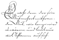
 Alphabet of Kurrent writing, c. 1865 (the penultimate line shows the umlauts ä, ö, ü and the corresponding capital letters Ae, Oe, Ue; the last line shows the ligatures ch, ck, th, sch, sz and st)
 -
 German Sütterlin script, from 1924
 -
 Latin Sütterlin
 -
 The Offenbach script by Rudolf Koch, German alphabet, 1927
 -
 The Offenbach script – Latin alphabet


Teaching scripts since 1941
[edit]Deutsche Normalschrift
[edit]
In 1941, all broken and Kurrent scripts were abolished by the Normalschrifterlass ("standard script decree") on behalf of Adolf Hitler. Now only the Latin script was taught in schools and everything was changed over to it. For this purpose, a new teaching script was created, which was called "Deutsche Normalschrift". It was developed on the basis of the Latin Sütterlin script, with a right slant, more pleasing forms and simplifications such as the abolition of the loops in the x, X and T and the descender length in the z, Z, F and H, but also the addition of loops in the capital letters C, D and L. The long s was no longer contained in it. The letters N, M, P, T and X, but not V, W and Y, are, similar to the Offenbach script, more closely based on the Antiqua, the P has no descender, and X and Z were given a horizontal line. The number 7 was again written with a diagonal line.
Lateinische Ausgangsschrift
[edit]
The Lateinische Ausgangsschrift (LA) was developed by the Iserlohner Schreibkreis from the Deutsche Normalschrift and was introduced on 4 November 1953 by the decree of the Conference of Ministers of Education and Cultural Affairs as the school teaching script in the Federal Republic of Germany. In Bavaria, the LA was only introduced in 1966. The Lateinische Ausgangsschrift shows only minor changes compared to the Deutsche Normalschrift. The letter S was given a shape similar to the L, some small loops were turned to pointed turns, x and X got their loops back.
Schulausgangsschrift and Vereinfachte Ausgangsschrift
[edit]In the German Democratic Republic (GDR), a teaching script was initially used which was essentially the same as the LA, with only minor changes such as the letter t or the omission of the horizontal line of the Z.
In connection with the introduction of a new syllabus, this teaching script was changed in 1968. Both didactic and aesthetic reasons were decisive for this. In order to be able to start learning to read block letters at the same time as learning to write cursive, the capital letters were simplified. The sequence of movements in the lower case letters was streamlined. This Schulausgangsschrift (SAS) was partially adopted in the old federal states in 1991.
At the same time, the Vereinfachte Ausgangsschrift (VA) was developed in the Federal Republic of Germany in 1969 to overcome difficulties in the use of the Lateinische Ausgangsschrift. Similar to the SAS, the forms of the VA were brought more into line with the printed letters. For this purpose, it was implemented that almost all lowercase letters begin and also end at the upper middle band, which should standardize the joining of the letters and thus simplify writing. The letter z was given back its descender in the VA. It has been tested since 1972.
-
 Teaching script of the GDR from 1958
 -
 Schulausgangsschrift, in the GDR since 1968
 -
 Vereinfachte Ausgangsschrift, since 1972


Grundschrift
[edit]
Since 2011, interested schools in some federal states have been testing a new concept for teaching writing with the Grundschrift, which was developed by a group of experts on behalf of the Grundschulverband. The idea behind the Grundschrift is that cursive is no longer taught in any form whatsoever and that only a printed script is used as the teaching script. The pupils should develop a personal handwriting from the printed script completely independently and without any references.
Today
[edit]in Germany the Lateinische Ausgangsschrift, the Vereinfachte Ausgangsschrift, the Schulausgangsschrift and the Grundschrift are used. It is the task of the respective federal states to issue rules for the use of the scripts, whereby either no script is prescribed, several scripts are available for selection or one script is made mandatory.
Austria
[edit]

Until the school year 1938/1939, the Kurrent script, established as the "official and protocol script" in the Austrian Empire, was taught and taught as the first script in elementary school. The schoolbooks were set in Fraktur and Kurrent script.
The oldest Austrian Schulschrift dates back to 1775 and was designed by Johann Ignaz von Felbiger ("Anleitung zum Schönschreiben [...] zum Gebrauch der deutschen Schulen in den k.k. Staaten", Vienna 1775) under Empress Maria Theresia. The next standardization dates from 1832, but hardly anyone followed these rules, teachers designed their own templates, sometimes even within a school.
The "Richtformen 1924" were declared binding by the Vienna City School Board, while the other provinces used their own teaching scripts before and also afterwards, in part.[2]
After the annexation of Austria by the Nazi Germany in 1938, attempts were made to replace the Kurrent script by the Sütterlin script, which was already in use in Germany. In 1941, Austria was also affected by the Reich-wide introduction of the "Deutsche Normalschrift".
Under a decree issued by the Federal Ministry of Education on 22 May 1951, the Kurrent script was reintroduced in Austrian schools, this time as a secondary script for "Schönschreiben" (calligraphic writing). By that time, the Kurrent script was rarely practised in daily life.
The "Lateinische Ausgangsschrift" (LA), which was introduced in the FRG in 1953, was also introduced in Austria's elementary schools in 1963 with largely identical letters. "P" and "R", however, were written in Austria in one go, i.e. with a loop running continuously upwards on the left. The "r" was continued after the stroke down to the baseline from there with a small right-turning loop (standing on the baseline) and was thus very similar to the previously used Kurrent script.
The "Österreichische Schulschrift" adopted in 1967/1970 largely followed the Austrian variant of the Lateinische Ausgangsschrift, simplifying the loop to a small arc and a second pointed reversal on the baseline. Around 1970, it was further simplified to a single pointed reversal – as already done in 1953 in the FRG.
In 1995 a new version of the "Österreichische Schulschrift" was adopted. It removed the loops inside the letters a, d, g, o and in many capital letters. The P and R are no longer written in one stroke, the X resembles the Antiqua-X and the numbers are more straightforward. Since the 1995/96 school year, teachers have had a free choice: during the writing course, either the new "Österreichische Schulschrift 1995" or the older "Österreichische Schulschrift 1969" can be used as the teaching script.[3]
Switzerland
[edit]
The currently taught Swiss Schulschrift (also known colloquially as "Schnürlischrift") was introduced in 1947.
In 2006, Hans Eduard Meier developed the no-frills Deutschschweizer Basisschrift, which is similar to the Deutsche Grundschrift, and proposed it as a contemporary alternative. In the canton of Lucerne, the Basisschrift has been approved as an alternative since 2006. Other cantons are waiting or are still discussing the use of the script. In 2008, a study by the Pädagogische Hochschule Zentralschweiz (University of Teacher Education Central Switzerland) showed that students who had learned to write with the Basisschrift were able to write more text in the same time than those who had learned the Schulschrift. In addition, the script was more legible and students more often agreed with the statement "I like writing".[4]
France
[edit]The French ronde script, a cursive script born in the late 16th century from an Italian Renaissance script, has been the traditional handwriting style in France for teaching, administration and financial documents, until the 20th century.
It was then replaced by the English round hand, a derivative of the ronde script, more suited to metal pointed nibs that had become prevalent. The round hand remained the teaching script throughout the 20th century, until 2013.
From 2013 onwards, for teaching purposes, the French Ministry of National Education recommends the modèles d'écriture scolaire A and B, which look more similar to printed scripts. These scripts were designed as part of a competition.
-
 The French ronde script (taught until the 20th century)
 -
![A sample[note 1] of the English roundhand (taught during the 20th and early 21st centuries)](//upload.wikimedia.org/wikipedia/commons/thumb/1/1f/Bickham-letter.png/120px-Bickham-letter.png) A sample[note 1] of the English roundhand (taught during the 20th and early 21st centuries)
A sample[note 1] of the English roundhand (taught during the 20th and early 21st centuries) -
 France’s Modèle d’écriture scolaire A (from 2013)
 -
 France’s Modèle d’écriture scolaire B (from 2013)

![A sample[note 1] of the English roundhand (taught during the 20th and early 21st centuries)](https://en.wikipedia.org/wiki/File:Bickham-letter.png)


Denmark
[edit]In 1875 broken scripts were abolished and replaced by a looped cursive ("løkkeskrift"). In 1952, the Formskrift of the Norwegian Alvhild Bjerkenes was introduced to Denmark by the writing and grammar school teacher Christian Clemens Hansen and became the dominant script in schools over the next 20 to 30 years.
Norway
[edit]
Around 1850 broken and Kurrent scripts were abandoned in favour of Latin cursive scripts with loops. Until around 1970 cursive scripts with loops remained dominant in schools, although Alvhild Bjerkenes' formskrift and other cursive scripts without loops were introduced from the late 1940s onwards.
In 1979 Grunnskolerådet published standardized versions of trykkskrift (print), løkkeskrift, a cursive handwriting with loops, and stavskrift, a cursive handwriting without loops. Students are usually taught trykkskrift and either løkkeskrift or stavskrift.
Sweden
[edit]

In 1959, the school board (Skolöverstyrelsen, SÖ) had the possibility of introducing a uniform writing course examined. Until then there was no binding uniform method. The teaching scripts or textbooks used were Skrivkursen Tomten, Skrivkursen Runa, Min skrivbok, Normalskriften, Funktionell handstil, Stockholmsstilen and Skrivkursen Pennan. In 1975, after a period of research and experimentation, the board introduced the Skolöverstyrelsestilen (SÖ-stilen), which was designed by calligrapher Kerstin Anckers and based on Ludovico Vicentino degli Arrighi's chancery cursive. After heavy criticism, the binding nature of this school script was revoked ten years later and some resumed using older scripts.[5][6]
Development in English-speaking countries
[edit]United Kingdom
[edit]
At the end of the 19th century, a widely used resource for handwriting teaching in British elementary schools was Henry Gordon's Handwriting and How to Teach it, originally published in the 1870s. This detailed how to develop handwriting from childish scribbles to a style based on the elaborate copperplate script. A simpler style, based on the ideas of the Arts and Crafts movement, was promoted by "Mrs Bridges" (Mary Monica Bridges), the wife of the poet Robert Bridges, which she published in A New Handwriting for Teachers (1899). However, the copperplate script continued to be taught in state-funded schools because it was required for clerks in commercial and professional offices.[7] An important influence in the teaching of handwriting in the 20th century was Marion Richardson (1892-1946), a school inspector for the London County Council, who devised a simple cursive script intended to allow children to develop their own style. It was published in Writing and Writing Patterns (1935), which was widely used in British schools and remained in print until the 1980s.[8]
Currently, there is no standardized teaching script stipulated in the various national curriculums for schools in the United Kingdom, only that one font style needs to be used consistently throughout the school.[9] There are four teaching routes a school can choose from when teaching handwriting:[9]
- Use Print script as initial handwriting style, then progress to Cursive script, finally move to Continuous Cursive script.
- Use Print script initially, then move to Continuous Cursive script.
- Use Cursive script initially, then move to Continuous Cursive script.
- Use Continuous Cursive script throughout all Key Stages.
Characteristics of Cursive and Continuous Cursive scripts:[10]
| Cursive | Continuous Cursive | |
|---|---|---|
| starting point for letters | variable | always on the writing line |
| finishing point for letters | always on the writing line (except for o, r, v and w, which have a top exit stroke) | always on the writing line (except for o, r, v and w, which have a top exit stroke) |
| single letter formation | letters taught with exit strokes only | letters taught with entry and exit strokes |
In all handwriting styles, letters are created through joining lines and curve shapes in a particular way. Once pupils have learnt how to clearly form single letters, they are taught how single letters can be joined to form a flowing script.[11] Whether Print, Cursive or Continuous Cursive is to be favoured as a teaching script remains a subject of debate in the United Kingdom. While many schools are opting to teach Continuous Cursive throughout the year groups, often starting in Reception, critics have argued that conjoined writing styles leave many children struggling with the high level of gross and fine motor coordination required.[12]
United States
[edit]The Spencerian Method was the most important standardized handwriting system in the United States since the 1840s.[13] Around 1888, the award-winning Palmer Method was developed as a simplification of Spencerian, which was supposed to be simpler and faster and soon became the most popular handwriting system.[14][15] The corresponding Palmer's Guide to Business Writing from 1894 sold one million copies in the United States in 1912. The use of the method declined in the 1950s and it was eventually superseded by the Zaner-Bloser Method by 1976, which first taught block letters and then cursive in order to enable written expression as quickly as possible and thus develop the ability to write.[16] In 1978 the D'Nealian Method was introduced which sought to alleviate the difficulties of the transition from block letters to cursive writing with the Zaner-Bloser method and returned to a more cursive style based on the Palmer script with block letters that have many similarities to cursive counterparts.[17][18] Popular newer teaching scripts include Handwriting Without Tears and the Getty-Dubay cursive italic.
-
 Spencerian script
 -
 Palmer script
 -

-
 D'Nealian script
 -
 Handwriting Without Tears


Hong Kong
[edit]In Hong Kong, primary school children learn to write using the regular script. The character shapes to be taught are defined in the Hong Kong Chinese Lexical Lists for Primary Learning (香港小學學習字詞表), published by the Regional Government Office for Education in 2009.[19]
Japan
[edit]In Japan, textbook type (教科書体) is commonly used for education purpose. It is based on regular script but with specific emphasis on clarity of strokes.[20]

Literature
[edit]- Erik Blumenthal: Schulschriften der verschiedenen Länder. Bern/Stuttgart 1957.
- Kurt Warwel: Schulausgangsschriften in deutschsprachigen Ländern. In: Spektrum der Wissenschaft 7, 1986.
- Mechthild Dehn: Die Kursiv als Ausgangsschrift. Ein Anstoß für Diskussion und Erprobung. In: Die Grundschulzeitschrift 69, 1993, pages 30, 35 and 36.
- Wilhelm Topsch: Das Ende einer Legende. Die vereinfachte Ausgangsschrift auf dem Prüfstand. Analyse empirischer Arbeiten zur vereinfachten Ausgangsschrift. Auer Verlag, Donauwörth 1996, ISBN 3-403-02855-0.
- Elisabeth Neuhaus-Siemon: Aspekte und Probleme des Schreibunterrichts. In: Hartmut Günther, Otto Ludwig (eds.): Schrift und Schriftlichkeit. Ein interdisziplinäres Handbuch internationaler Forschung. 2nd half volume, Berlin / New York 1996, ISBN 978-3-11-019413-5.
- Gabriele Faust-Siehl, Ariane Garlichs and others: Ausgangsschrift. In: Die Zukunft beginnt in der Grundschule. Arbeitskreis Grundschule. Rowohlt Taschenbuchverlag, Reinbek near Hamburg 1996, ISBN 978-3-499-60156-9.
- Wilhelm Topsch: Anfangsschriften. In: Grundkompetenz Schriftspracherwerb. Methoden und handlungsorientierte Praxisanregungen. 2. revised and extended edition. Beltz, Weinheim and others, 2005, ISBN 3-407-25368-0.
- Jürgen Hasert: Schulschriften. In: Didaktik der deutschen Sprache, volume 1. Schöningh, Paderborn 2006, ISBN 978-3-8252-8235-6.
- Wolfgang Menzel: Plädoyer für eine Schrift ohne normierte Verbindungen. In: Grundschule aktuell, number 110, May 2010, pages 23–25
External links
[edit]Notes
[edit]- ^ This heavily decorated sample is not representative of the simpler style taught in French schools.
References
[edit]- ^ a b c d e f Sonja Steiner-Welz (2003). Von der Schrift und den Schriftarten. Reinhard Welz Vermittler Verlag e.K. pp. 113, 127, 133, 135, 137, 139. ISBN 978-3-937636-47-4.
- ^ exhibition documentation school museum Klagenfurt by Brigitte Strasser
- ^ Bundesministerium für Unterricht, Kunst und Kultur GZ 38.554/32-I/1/94
- ^ tagesanzeiger.ch: Schreibt die Schnürlischrift ihr letztes Kapitel?, accessed 30 April 2011
- ^ "Vad har hänt med svensk handskrivningsundervisning?". Handskrivning : kommentarmaterial läroplan för grundskolan 80 (in Swedish). Stockholm: Utbildningsförlaget. 1989. pp. 6–9. hdl:2077/30955. ISBN 91-47-02945-5. OCLC 60929194.
- ^ Karlsson, Mats (April 2009). "Skrivstilen som havererade". Språktidningen (in Swedish).
- ^ Sassoon, Rosemary (1999). Handwriting of the Twentieth Century. London: Routledge. pp. 27–35. ISBN 978-0415178822.
- ^ "Marion Richardson Collection". www.bcu.ac.uk/arts-design-and-media. Birmingham City University, Faculty of Arts, Design and Media. Retrieved 1 February 2023.
- ^ a b Be School Ready – What Letter Font is Your Child’s School Teaching? (online), 29 August 2019, access date 30 March 2022
- ^ What's The Difference between Cursive and Continuous Cursive Handwriting Fonts? (online), 9 November 2017, access date 30 March 2022
- ^ Teach handwriting: The three handwriting stages (online), access date 30 March 2022
- ^ Angela Webb: 'Continuous Cursive: Cure or Curse?', National Handwriting Association (online), access date 30 March 2022
- ^ Tyler, Robin DVC (2010-04-12), Palmer Method of Penmanship, NYU Dead Media Archive, archived from the original on 2010-08-17, retrieved 12 April 2010
- ^ Apps-Bodilly, Susan (2013). One room schools : stories from the days of 1 room, 1 teacher, 8 grades. Wisconsin Historical Society. p. 61. ISBN 978-0-87020616-0. Retrieved 24 January 2015.
- ^ Trubek, Anne, Handwriting Is History, Pacific Standard, archived from the original on 2010-02-04, retrieved 17 December 2009
- ^ Alston, Jean; Taylor, Jane (1987), Handwriting: Theory, Research and Practice, New York: Nichols Publishing, ISBN 9780709951070
- ^ Viadero, Debra (6 October 1993). "D'Nealian Handwriting Method Abandons 'Ball-and-Stick' Approach". Education Week. Retrieved 23 January 2018.
- ^ Makala, Jeffrey. "Born to Please, Art of Handwriting Instruction, Spencerian and Palmer methods". University Libraries' Rare Books and Special Collections. University of South Carolina. Retrieved 24 January 2015.
- ^ "香港小學學習字詞表 特殊教育需要補充篇(智障學生適用)" [Hong Kong Primary Learning Word List—Special Education Supplement (for students with developmental disabilities)] (PDF). Hong Kong SAR Education Bureau. 2009. Archived from the original (PDF) on 2013-11-26. Retrieved 2022-01-24.
- ^ "気になるフォント「教科書体」".
Teaching script
View on GrokipediaTeaching script, or Lehrschrift in German, denotes the standardized model of handwriting prescribed for instruction in primary schools to guide students toward producing legible, uniform, and fluid written text. Primarily associated with German-speaking regions including Germany, Austria, and Switzerland, these scripts prioritize pedagogical efficiency by balancing aesthetic form with practical writing speed and readability.[1][2]
Historically, teaching scripts evolved from elaborate cursive traditions such as Kurrent, a Gothic-derived style prevalent until the early 20th century, which emphasized connected letters for rapid documentation but often compromised legibility for modern readers.[3] In 1915, Prussia introduced Sütterlin as a simplified variant for school use, aiming to standardize penmanship across public education while retaining cursive connectivity.[4] A pivotal shift occurred in 1941 when Nazi authorities decreed the abandonment of Kurrent and related scripts in favor of Deutsche Normalschrift, a Latin-based form intended to enhance accessibility and align with broader typographic reforms rejecting Fraktur as obscurantist.[5]
Post-World War II, divided Germany pursued divergent paths: West Germany adopted models like the Offenbach Schrift in the 1920s, refined for clarity, while the German Democratic Republic introduced successive simplifications such as the 1968 Schulausgangsschrift to streamline instruction amid resource constraints.[5] Regional variations persist, with Austria's 1995 Österreichische Schulschrift incorporating ergonomic adjustments and Switzerland favoring basic Latin cursive since 1947, reflecting ongoing empirical refinements based on child motor development and reading outcomes.[2] Debates over teaching cursive versus print letters first highlight tensions between tradition and digital-era priorities, with evidence suggesting early cursive aids cognitive processing but faces resistance amid keyboard dominance.[1][6]
Fundamentals
Definition and Purpose
A teaching script, also known as a school script or model handwriting in educational contexts, constitutes a prescribed exemplar of letter forms and connections designed to standardize the teaching of handwriting in primary education. These scripts provide a visual and structural template for students to replicate, emphasizing consistent stroke order, proportions, and ligatures to foster proficiency in manual writing. In practice, they typically transition from print-like block letters to connected cursive styles, adapting to linguistic needs such as those in German for handling umlauts and digraphs.[7][8] The primary purpose of teaching scripts is to cultivate legible and efficient handwriting from an early age, thereby supporting literacy acquisition by linking visual letter recognition with motor execution and phonological awareness. Standardized models ensure uniformity across classrooms, reducing variability in student output that could hinder readability for teachers and peers, while promoting fine motor skill development through repetitive practice. This approach historically addressed practical demands for rapid, clear written communication in administrative and personal contexts, countering the inefficiencies of idiosyncratic styles. Empirical studies underscore that explicit handwriting instruction, as embodied in these scripts, enhances overall writing fluency and cognitive processing speed compared to unstructured methods.[9][10]Core Characteristics and Variations
Teaching scripts, known as Schulschrift or Ausgangsschrift in German-speaking contexts, are standardized handwriting models designed to promote uniform, legible, and efficient writing among schoolchildren. Core characteristics include simplified letterforms with consistent proportions, such as uniform x-heights, standardized ascender and descender lengths, and rounded or oval lowercase shapes to facilitate smooth pen movements and reduce fatigue.[11] Letters are typically formed with basic strokes—verticals, horizontals, curves, and loops—emphasizing rhythm and flow over ornamental flourishes, with connections between letters enabling continuous writing without frequent pen lifts.[5] Instruction generally begins with disconnected print script (Druckschrift) in early primary years to establish basic letter recognition and formation, transitioning to connected cursive (Verbundene Ausgangsschrift) by second or third grade to develop speed and motor coordination. This progression prioritizes legibility through clear joins and moderate slant, often 5–10 degrees forward, while avoiding excessive angularity that could hinder young learners. Punctuation, numerals, and basic ligatures are integrated, with models providing exemplar alphabets for replication.[1] Variations reflect historical, regional, and pedagogical adaptations. Early 20th-century German models like Sütterlin combined angular gothic-derived elements with rounded strokes for broad-nib compatibility, while the 1941 Deutsche Normalschrift shifted to slanted, Latin-based cursive to replace older scripts amid readability concerns.[5] Postwar developments diverged: East German Schulausgangsschrift from 1968 featured semi-joined forms for simplicity, whereas West German standards evolved toward more fluid, italic-influenced styles. Austrian variants, such as the 1969 Schulschrift, favor upright postures with oval bases and medium extenders, contrasting slanted German norms.[8] In broader Europe, French models from 2013 introduce semi-cursive options with partial disconnections for enhanced clarity, diverging from fully joined traditions.[12] These differences stem from balances between tradition, print-type influence, and empirical adjustments for child development, with ongoing debates over full cursive versus hybrid forms.[7]Historical Origins
Precursors in Medieval and Early Modern Europe
The Carolingian minuscule, developed in the late 8th century under Charlemagne's patronage, marked the first major effort to standardize handwriting across much of Western Europe for improved legibility and uniformity in manuscript production. Promoted through imperial decrees and the work of scholars like Alcuin of York, this rounded, clear script replaced more varied regional hands in monastic scriptoria and emerging educational centers, serving as a model taught to scribes for copying religious and classical texts.[13][14] By the 9th century, it had become the predominant book hand in the Carolingian Empire, facilitating broader literacy among clergy and facilitating the preservation of knowledge.[15] In the High Middle Ages (c. 11th–13th centuries), scripts evolved toward more angular Gothic forms, such as textualis, which prioritized space efficiency on vellum, while cursive variants like cursiva antiquior emerged for faster administrative and legal writing in chanceries. These cursives, characterized by connected letterforms and abbreviations, were practical tools in growing bureaucratic systems but retained elements of the Carolingian base, influencing regional hands across Europe.[16] Bastarda scripts, blending formal Gothic textura with cursive fluidity from the 13th–14th centuries, further bridged bookish and everyday writing, often taught in urban schools to apprentices handling commercial records.[17] Such developments laid groundwork for later standardized teaching by emphasizing adaptable, legible forms over purely decorative ones. During the Early Modern period (c. 15th–17th centuries), Renaissance humanists in Italy rejected Gothic complexity, reviving Carolingian-inspired models from ancient Roman inscriptions to create the Italic script around 1420–1440 in Florence. This slanted, simplified cursive, pioneered by figures like Poggio Bracciolini and Niccolò Niccoli, enabled quicker writing with fewer strokes, and was disseminated through printed manuals and writing academies, marking an early shift toward formalized handwriting instruction for elites and merchants.[18][19] By the 16th century, Italic influenced broader European reforms, including secretary hands in England and Germany, where it competed with lingering medieval cursives, setting precedents for national teaching standards focused on efficiency and readability.[20]Foundations in the Holy Roman Empire
The foundations of teaching scripts in the Holy Roman Empire originated with the Carolingian reforms under Charlemagne, who in the late 8th century commissioned the development of a uniform minuscule script to standardize writing across his realms, including areas that later formed the core of the Empire. This Carolingian minuscule, refined by scholars such as Alcuin of York, featured clear, rounded letters with consistent ascenders and descenders, facilitating legibility in manuscripts, legal documents, and early educational materials. The script's adoption helped unify administrative practices in a vast, linguistically diverse territory spanning modern-day Germany, France, and beyond.[21] By the High Middle Ages, in the German-speaking principalities of the Holy Roman Empire—formally established in 962 under Otto I—the Carolingian minuscule evolved into more angular Gothic scripts for formal and printed texts, while cursive forms emerged for practical use in courts, monasteries, and schools. These cursives, building on late medieval chancellery hands, prioritized speed and connectivity, with letters often linked through loops and strokes adapted to quill pens. In the 16th century, a distinct style known as Kurrent crystallized as the predominant cursive handwriting in German territories, featuring simplified, flowing forms derived from Gothic cursive but optimized for everyday writing.[22] Kurrent's prevalence in official records and correspondence laid groundwork for later pedagogical standards, emphasizing uniformity to reduce errors in imperial bureaucracy.[23] Standardization efforts intensified in the 17th and 18th centuries amid growing administrative needs. In Prussia, a key HRE electorate elevated to kingdom in 1701 but remaining within the Empire until 1806, King Frederick William I issued a 1714 decree mandating a uniform handwriting system crafted by writing master Hilmar Curas. Curas's model refined Kurrent into a legible, standardized form suitable for military, governmental, and educational purposes, influencing practices across Prussian territories and beyond.[24] This Prussian initiative exemplified imperial trends toward scripted consistency, bridging historical cursives with modern teaching methodologies by promoting a model that balanced elegance, efficiency, and teachability in nascent school systems.Evolution in German-Speaking Countries
Germany: Pre-1941 Standards and Reforms
In the nineteenth century, German schools predominantly taught Kurrent script, a cursive style derived from late medieval Gothic handwriting that had evolved into the standard for administrative and personal writing across German-speaking regions.[22] Following the unification of the German Reich in 1871 under Prussian leadership, Kurrent—often termed deutsche Schrift—became the uniform handwriting standard in education and official documents throughout the empire.[4] Early twentieth-century reforms sought to modernize and standardize teaching scripts for improved legibility and efficiency. In 1911, the Prussian Ministry of Education commissioned graphic artist Ludwig Sütterlin to design a simplified version of Kurrent suitable for school instruction.[5] This resulted in Sütterlin script, which was introduced on a trial basis in Prussian schools in 1914 and officially adopted for teaching from 1915 onward.[25] By 1924, Sütterlin had been implemented across all Prussian schools, spreading to other German states during the Weimar Republic, and becoming the dominant form of handwriting instruction by the 1930s.[25][23] Under the Nazi regime after 1933, Sütterlin was further entrenched as the sole prescribed script in German schools by 1935, emphasizing national continuity in deutsche Schrift while rejecting Latin-based alternatives until the abrupt policy shift in 1941. Regional variations, such as the Offenbacher Schrift introduced in Hesse in 1927 by typographer Rudolf Koch, represented minor deviations but did not supplant the Prussian-influenced national standard.[26] These pre-1941 developments prioritized a connected, fluid cursive that facilitated rapid writing while preserving historical forms, though critics noted challenges in readability for non-practitioners.[5]Germany: Post-1941 Developments
On September 1, 1941, the Nazi regime issued the Normalschrifterlass, mandating the replacement of traditional German scripts like Sütterlin and Kurrent with the Deutsche Normalschrift, a slanted Latin-based cursive designed for greater legibility, particularly for international audiences.[5] This reform, effective from the 1941/42 academic year, abolished broken scripts in schools, promoting a standardized model that resembled simplified Roman cursive while retaining some connected letter forms.[25] The shift was justified by claims of the old scripts' Jewish origins and poor readability, though these assertions lacked historical substantiation. Following World War II, the divided German states pursued divergent paths in teaching script evolution. In West Germany, the 1941 Normalschrift evolved into the Lateinische Ausgangsschrift by 1953, an ornate yet legible joined-up cursive taught to children, emphasizing fluid connections between letters.[7] This model underwent minor refinements for simplification, leading to variants like the Vereinfachte Ausgangsschrift, which reduced loops and flourishes to promote faster writing while maintaining readability.[25] In East Germany, the German Democratic Republic (GDR) introduced its own standardized scripts post-1945, starting with the Ausgangsschrift der DDR in 1958, followed by the Schulausgangsschrift in 1968, which featured more angular forms and ideological emphasis on collectivist uniformity in education. By 1972, the Vereinfachte Ausgangsschrift further streamlined these, prioritizing efficiency over ornamentation in state-controlled curricula. After German reunification in 1990, West German standards largely prevailed, with federal states adopting variations of the Lateinische Ausgangsschrift, though regional differences persisted, such as Hamburg's Druckschrift introduced in 2011 for print-like legibility.[7] Contemporary debates focus on cursive's relevance amid digital tools, with some schools delaying or optionalizing its instruction, yet it remains a core skill in many primary curricula for cognitive and motor development benefits.[7]Austria
In Austria, teaching scripts transitioned from traditional Kurrent and Sütterlin forms, prevalent until the 1938 Anschluss, to Latin-based cursive following the 1941 Normalschrifterlass under Nazi administration, which mandated the Deutsche Normalschrift as the standard Ausgangsschrift.[27] Post-World War II, after the regime's collapse in 1945, schools adopted the Österreichische Schulschrift in 1946, replacing the imposed German standard to reassert national distinctiveness while maintaining legibility in connected cursive.[2] Kurrent lingered in some primary schools and gymnasiums as a calligraphy subject until the early 1960s.[3] By 1963, Austria incorporated elements of West Germany's Lateinische Ausgangsschrift, introducing modifications such as looped uppercase letters B, P, and R, and a looped lowercase r, to facilitate smoother transitions from print to cursive.[2] Further simplifications occurred between 1967 and 1970, reducing the lowercase r to a single acute inversion for efficiency. In 1969, a dedicated Österreichische Schulschrift was formalized and published as an optional model, emphasizing a softer, flowing appearance with connected letters to enhance writing rhythm after initial block and print instruction.[2][27] The 1995 revision of the Österreichische Schulschrift, developed through testing from 1985 to 1995, removed loops from letters like a, d, g, o, and q, aligning partially with German simplifications while prioritizing ease of production and reduced flourishes for modern pens.[2][27] From the 1995/96 school year, teachers gained discretion to select between the 1969 and 1995 models during cursive instruction.[2] The 2003 Volksschul-Lehrplan required legible cursive proficiency by the end of grade 2, favoring the 1995 version.[2] In 2023/24, an official decree phased out the 1969 Schulschrift from new teaching, mandating the 1995 model as the sole standard, though legacy use persists; this shift reflects adaptations to contemporary tools and pedagogy, diminishing ornate elements rooted in quill-era practices.[28][2] Proposals like the Prima typeface by educators Tiefenthaler and Nemeth suggest ongoing evolution toward hybrid digital-friendly forms.[2]Switzerland
In German-speaking Switzerland, teaching scripts evolved from early 20th-century reforms aimed at simplifying and standardizing handwriting for legibility and ease of instruction. Paul Hulliger, a Basel schoolteacher, developed the Hulliger-Schrift over a decade of work, introducing it in Basel-Stadt canton schools in 1926 after approval by a cantonal reform commission. This script emphasized upright Roman letters formed from basic geometric shapes, progressing from unconnected block letters (Steinschrift) to a slanted, connected cursive variant, reflecting pedagogical principles linking form, function, and aesthetics influenced by the school reform movement.[29] By 1936, a modified version known as the Schweizer Schulschrift was adopted by ten German-speaking cantons following decisions by education directors in 1937, representing a softened, national adaptation of Hulliger's design to address criticisms of rigidity.[30] A significant revision occurred in 1947, led by Zofingen's Eugen Kuhn and Karl Eigenmann, whose updated model—published in the 1948 journal Das Schreiben—featured more rounded, looped connections in the cursive "Schnüerlischrift" phase, intended for primary grades after initial print practice.[31] This version prioritized aesthetic flow but drew critique for oversized curves that hindered rapid, legible writing in practice.[32] The Schweizer Schulschrift remained the standard in German-speaking cantons from approximately 1940 until 2010, taught sequentially from disconnected print to fully connected cursive.[33] In response to concerns over digital literacy and handwriting efficiency, typographer Hans Eduard Meier designed the Deutschschweizer Basisschrift in 2006, a loop-free, print-dominant system emphasizing basic letterforms with optional simple connections.[34] Pilot-tested from 2007, it gained traction amid broader debates; by 2014, most cantons and the teachers' association endorsed phasing out traditional cursive, prioritizing print scripts.[35] Full adoption of the Basisschrift across all German-speaking cantons occurred by 2021, with Zurich implementing it in 2016, marking a shift toward simplified, non-cursive standards aligned with modern educational needs.[33] French-speaking (Romandie) and Italian-speaking regions historically employed distinct scripts, such as the flowing Suisse Romande Cursif with rounded, slanted letters and fluid joins, diverging from German-Swiss models due to linguistic and cultural influences.[36] These variations underscore Switzerland's federal structure, where cantonal autonomy allows tailored handwriting instruction, though recent trends favor reduced cursive emphasis nationwide.Adaptations in Other European Nations
France
In France, teaching scripts for handwriting in primary schools historically emphasized legible, fluid forms derived from Renaissance influences, transitioning from rounded styles to connected cursive by the 19th century. The ronde script, featuring oval-shaped letters and upright posture, served as a foundational model in school manuals well into the early 20th century, prized for its clarity but critiqued for slowness due to downward strokes requiring specialized pens.[37] This style, emerging in the late 16th century and refined by masters like Louis Barbedor in the 17th, influenced early modern European handwriting education but waned with the rise of fountain pens and demands for speed.[37] The cursive anglaise, a linked script originating from bâtarde forms of the Renaissance, gained prominence in French schools during the first half of the 19th century amid commercial exchanges and standardization efforts.[37] By 1926, it was formalized in pedagogical works like Gorce's Cours de Calligraphie, using fine-nibbed pens such as the Sergent-Major for precise, slanted execution.[37] Post-World War II instructions in 1945 designated cursive anglaise as the primary model for primary education, alongside limited use of ronde for non-academic tracks and emerging script variants in the 1950s tailored to ballpoint pens; the latter was short-lived in France due to readability concerns, though it persisted elsewhere like Quebec.[37]Contemporary French teaching scripts were reformed in 2013 by the Ministry of National Education, introducing Models A and B to unify cursive instruction amid debates on legibility and digital compatibility.[38] These models feature simplified, connected lowercase letters taught from the first primary year (CP), with majuscules designed to mirror printed capitals for easier transition; Model A emphasizes accentuation on capitals, while both offer straight or slanted variants and support for ligatures.[38] Official OpenType fonts, updated as of 2023, enable projection on interactive whiteboards and tablets, prioritizing motor skill development and fluid reading over ornate flourishes.[38] This shift addressed inconsistencies in prior majuscule forms, though critics argue for fuller cursive reintroduction to enhance cognitive benefits like letter recognition.[37]