Hubbry Logo
Rustic capitalsRustic capitalsMain
Open search
Rustic capitals
Community hub
Rustic capitals
logo
8 pages, 0 posts
0 subscribers
Be the first to start a discussion here.
Rustic capitals
Rustic capitals
from Wikipedia
Roman brushed capitals: Capitalis rustica

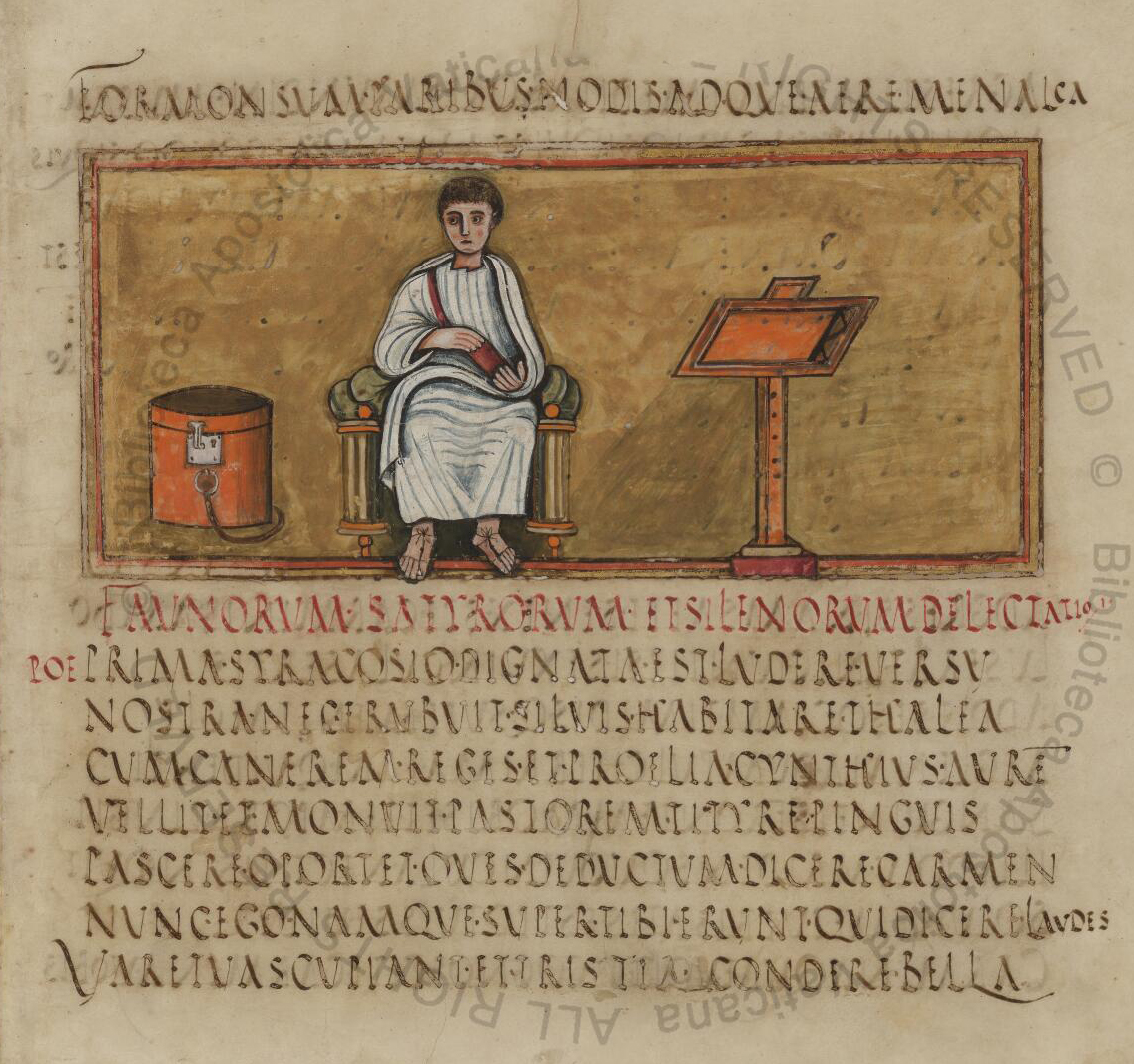
Rustic capitals (Latin: littera capitalis rustica) is an ancient Roman calligraphic script. Because the term is negatively connoted supposing an opposition to the more 'civilized' form of the Roman square capitals, Bernhard Bischoff prefers to call the script canonized capitals. The script was used for writing secular texts.[1]

Folio 14 recto of the Vergilius Romanus, author portrait of Virgil.

History

[edit]
Electoral graffiti in Pompeii

The script was used between the 1st century and the 9th century, most often between the 4th and 6th centuries. After the 5th century, rustic capitals began to fall out of use, but they continued to be used as a display script in titles and headings, along with uncial as the script of the main text.

Structure

[edit]

Rustic capitals are similar to Roman square capitals, but are less rigid, influenced more by pen and ink writing on papyrus or parchment. The letters are thinner and more compressed, use many more curved lines than do square capitals, and have descenders extending below the baseline.

Surviving works

[edit]
Page of the Codex Bembinus

About fifty manuscripts with rustic capitals survive, including four copies of works by Virgil (including the Vergilius Vaticanus and the Vergilius Romanus), one copy of a work by Terence, and one of a work by Prudentius. The script was usually used for de luxe copies of pagan authors; the only works by Christian authors which use this script are those by Prudentius and Sedulius.

See also

[edit]

References

[edit]
[edit]
Revisions and contributorsEdit on WikipediaRead on Wikipedia
from Grokipedia
Rustic capitals, also known as capitalis rustica, are an ancient Roman majuscule script developed as a bookhand for transcribing literary texts, characterized by slender, laterally compressed capital letters produced with a broad-nibbed pen in a continuous flow () without word separation or punctuation. This elegant yet practical form of writing emerged as a more fluid alternative to the formal square capitals used in monumental inscriptions, allowing for faster production while maintaining legibility. The origins of rustic capitals trace back to the late or early , with the earliest surviving examples appearing in carbonized papyrus rolls from the in , preserved by the eruption of in 79 AD, such as the epic poem Carmen de Bello Actiaco by Lucius Varius Rufus (P. Herc. 817), dated to the 1st century AD or possibly late 1st century BC. The script gained prominence as a high-status bookhand during the 4th to 6th centuries AD, when it was employed in luxury manuscripts of pagan classical literature, including renowned copies of Virgil's like the (Vat. lat. 3225, ca. 400–430 AD) and the (Vat. lat. 3867, 5th century AD). These manuscripts often featured illustrations and were produced for elite audiences, reflecting the script's association with cultural prestige rather than everyday documentation, which was handled by more forms. Christian texts in rustic capitals are exceedingly rare, with only isolated examples like the Codex Palatinus surviving from antiquity. Key features of rustic capitals include narrow, upright letterforms that fit between two horizontal guidelines, with diagonal strokes dominating letters such as A (often lacking a crossbar or rendered as a simple upright with a low cross-stroke), M (formed by two converging angled lines), and N (with a prominent diagonal). Early instances occasionally incorporated interpuncts (dots) for word division, a practice that faded by around 150 AD, emphasizing the script's evolution toward unbroken text as a marker of sophistication. Beyond books, rustic capitals appeared in informal inscriptions on walls and public surfaces in Roman cities like Pompeii and , showcasing their versatility for brush-written displays. Following the decline of rustic capitals as a primary bookhand in the —superseded by uncials and minuscules for their greater efficiency—the script persisted as an artificial display form in Carolingian and later medieval manuscripts, often reserved for titles, initials, and headings to evoke . This enduring legacy underscores rustic capitals' role in the transmission of Roman literary heritage and their influence on the visual hierarchy of Western scripts.

Origins and Historical Development

Early Emergence

Rustic capitals first appeared in the Roman world during the AD, primarily in inscriptions and early texts, as a more fluid and efficient adaptation of the formal square capitals used for monumental purposes. This evolution allowed scribes to write more quickly with a pen on perishable materials like , reducing the width of letters to conserve space while maintaining legibility for literary and administrative copying. As a precursor, square capitals provided the rigid structural foundation, but rustic forms introduced oblique, broken strokes suited to ink-based writing. The development of rustic capitals was shaped by practical writing demands in the expanding Roman bureaucracy and literary production. Among the earliest surviving examples are wall inscriptions from Pompeii and , preserved by the eruption of Vesuvius in 79 AD, which feature rustic capitals in public notices known as tituli picti. These painted announcements, often in red or black ink, display the script's characteristic undulating strokes formed by diagonal pen movements, as seen in electoral propaganda and commercial signs from the AD. A notable literary instance is the Carmen de bello Actiaco, a text from dating before 79 AD, written in rustic capitals with interpuncts for word separation, highlighting its use in high-status book production. In these initial forms, rustic capitals exhibited compressed letter shapes to fit narrower spaces, particularly in letters like A, , and , which were narrower and taller than their square capital counterparts. The A appears slender without a prominent crossbar, the is laterally compressed with elongated horizontal strokes, and the is narrowed with subtle curves at the angles, all adaptations that enhanced writing efficiency while preserving recognizability. These variations marked the script's early transition from stone-carved rigidity to the dynamic flow of .

Peak Usage and Evolution

Rustic capitals reached their zenith as the predominant bookhand for secular Latin literature during the 4th to 6th centuries AD, serving as the primary script for copying works of classical authors in high-quality codices. This period marked the script's maturity, with numerous manuscripts produced, particularly for pagan texts, reflecting its role in preserving Roman literary heritage amid the transition to Christianity. For instance, many of the surviving late antique manuscripts of Virgil's works employ rustic or square capitals, underscoring the script's dominance in transmitting authors like Virgil and Cicero. The earliest securely dated example from this era, the Vergilius Vaticanus (c. 400 AD), exemplifies this usage in an illustrated codex of Virgil's Aeneid and Georgics. During this peak, rustic capitals evolved to enhance readability and writing efficiency on , adapting from earlier forms suited to rolls. Key refinements included the increased prominence of in letters such as F and P, which extended below the baseline for better distinction, while occasionally featured a similar tail in more fluid variants. Ligatures—joined letter combinations like those linking E-T or A-V—became more common to expedite production without sacrificing legibility, allowing scribes to maintain the script's angular, broken-stroke aesthetic while accommodating the demands of formatting. These changes facilitated the shift to surfaces, where the script's narrower, laterally compressed forms filled pages more effectively than the broader square capitals. In the cultural landscape of late antiquity, rustic capitals symbolized a revival of pagan Roman traditions under emperors like Constantine, who balanced Christian reforms with patronage of classical learning. High-status codices in this script, often produced in imperial or elite workshops, elevated works by Virgil and Cicero as emblems of Roman identity, contrasting with emerging uncial scripts favored for Christian texts. This association reinforced the script's prestige, with calligraphic flourishes—such as elongated strokes and decorative shading—emerging around 400 AD to denote luxury editions.

Decline and Transition

The decline of rustic capitals as a primary began in the late 6th century, coinciding with the of the and the increasing dominance of for religious manuscripts. Primarily associated with pagan classical literature during its peak in the 4th to 6th centuries, rustic capitals saw limited adoption in Christian texts, with only one known surviving example—a copy of the four Gospels in Codex Palatinus—indicating its marginal role in the burgeoning monastic copying of biblical and liturgical works. , with its more fluid, rounded forms, gradually supplanted rustic capitals from the onward due to its superior legibility and ease of execution, making it better suited for the rapid production of sacred texts in scriptoria. In the transitional period of the 7th and 8th centuries, rustic capitals persisted in a secondary role, often appearing alongside uncials and half-uncials in mixed-script manuscripts, particularly for titles, headings, and initial letters to provide and classical prestige. This hybrid usage is evident in early Insular (Irish and Anglo-Saxon) productions, where rustic forms influenced the development of half-uncial scripts while serving decorative functions in religious codices. The shift to centralized monastic scriptoria further accelerated this transition, as scribes prioritized scripts that balanced speed with clarity for devotional reading, diminishing the need for the more angular rustic style originally designed for efficient literary copying. Additionally, disruptions from invasions in the late Roman and early medieval periods reduced the overall production of secular classical works, further marginalizing rustic capitals tied to that tradition. By the 8th and 9th centuries, rustic capitals marked their final major phase in Carolingian imitations, employed as display scripts in deluxe manuscripts to evoke Roman antiquity, often combined with square capitals, uncials, and the emerging Caroline minuscule. Examples include hierarchical text layouts where rustic lines alternate with other majuscules for emphasis in biblical and patristic volumes from scriptoria like those at Tours. This ornamental persistence until the 9th century signaled the end of rustic capitals' primary usage, as the standardization of Caroline minuscule in the Carolingian Renaissance fully eclipsed earlier majuscule hands for both body text and display.

Script Characteristics

Letter Forms and Construction

Rustic capitals form a majuscule script utilizing the 21 letters of the (corresponding roughly to modern majuscules A–Z, excluding J, U, and W), with no lowercase forms. These letters are constructed using a broad-nibbed pen held at an oblique angle, resulting in characteristically thin vertical strokes contrasted against thicker horizontal and curved elements. This stroke modulation produces a lively, uneven in the overall appearance, setting rustic capitals apart from the precise, uniform geometry of square capitals. Individual letter proportions emphasize verticality, with most forms roughly twice as tall as they are wide, fostering a slender and laterally compressed layout that enhances textual density and readability in bound volumes. Letters generally align between a baseline and an upper guideline, though certain forms like extend below the baseline with a , adding subtle variation to the script's baseline rhythm. Notable examples include the A, which frequently omits the central crossbar for a more streamlined profile or incorporates a slanted one in some variants; the M, constructed as two conjoined A's sharing a central peak; and the H, rendered with splayed legs resembling goalposts connected by a . The features a distinctive tail descending below the line. The shading features thin vertical and upward strokes contrasted with thicker diagonals descending from top-left to bottom-right, along with horizontals and curves.

Tools and Materials Influence

The primary tools for writing rustic capitals were reed pens (calamus) in earlier periods and quill pens (penna) later, applied to surfaces such as or . These instruments produced fluid, tapered strokes through varying pressure, enabling a more dynamic and less rigid form than the precise, angular cuts achieved with chisels on stone for square capitals. This pen-based approach facilitated quicker execution, making rustic capitals suitable for manuscript production while maintaining legibility for literary texts. Early rustic capitals on , a brittle and fibrous material rolled into scrolls, necessitated narrower, elongated letter forms to maximize efficiency and accommodate the medium's texture, which absorbed unevenly and limited expansive designs. By the , as classical texts transitioned from rolls to more durable codices—animal skin prepared for writing—the script evolved to support bolder curves, fuller shading, and occasional below the baseline, leveraging vellum's smoother surface for enhanced and finer detail. This material shift broadened the script's expressive range, allowing scribes to balance aesthetic appeal with practical durability in book formats. The technique for rustic capitals emphasized , with a characteristic rightward slant achieved by holding the pen at an oblique , around 50-60 degrees, to create thin upstrokes on upward movements and thicker downstrokes on descents from top left to bottom right. This shading pattern, akin to scripts, optimized speed for copying lengthy works while preserving clarity, as the contrast in stroke weight guided the eye without requiring serifs or excessive ornamentation. Such methods contrasted sharply with the labor-intensive, symmetrical of inscriptions, yielding an organic, flowing quality suited to ink's natural variability.

Applications and Contexts

Use in Manuscripts

Rustic capitals served primarily as a bookhand for copying secular Latin texts, such as and philosophical works, in the format beginning from the 4th century onward. This script was particularly favored for literary classics, including Virgil's , where it facilitated the transition from rolls to bound volumes, enabling more compact and portable books. Notable examples include the (Vatican Library, Vat. lat. 3225), a late 4th- or early 5th-century Italian containing portions of the and , and the (Vatican Library, Vat. lat. 3867), a 5th-century with elegant rustic script and extensive illustrations. In production, rustic capitals were employed by professional scribes in urban workshops, likely in , to create deluxe manuscripts for patrons, often pagan nobles who valued classical . These scriptoria produced high-quality codices on , with rustic capitals used for the body text and more formal square capitals reserved for initials and headings to enhance visual hierarchy. The Mediceus (Laurentian Library, , Plut. 45.5), a 5th-century Virgil manuscript, exemplifies this approach, showcasing the script's role in sophisticated bookmaking for educated audiences. The script's advantages lay in its suitability for extended texts: its narrower, more compressed forms with curved lines allowed scribes to write faster than with the rigid square capitals, while maintaining through a flowing pen stroke. This efficiency made it practical for lengthy works like the , reducing production time without sacrificing clarity. However, rustic capitals were rarely used for Christian texts, as the emerging proved more adaptable for biblical manuscripts, limiting their application to pagan classics during the peak period of the 4th to 6th centuries. Only a small number of such volumes survive, with approximately ten early examples documented among the oldest Latin manuscripts.

Use in Inscriptions and Documents

Rustic capitals, also known as scriptura actuaria, were prominently employed in inscriptions on durable surfaces such as stone, metal, and painted walls during the 1st to 4th centuries CE, serving practical purposes in public and commercial contexts. This script facilitated the creation of official notices, shop signs, and legal markers, with notable examples preserved in Pompeii where brush-painted advertisements and storefront identifiers utilized its flowing, informal forms for visibility and readability. In documentary applications, rustic capitals appeared on ephemeral media like wax tablets and papyri for routine administrative and personal records, often bridging formal inscriptional styles toward more fluid hands. These uses encompassed everyday notations, such as 2nd-century and dispatches, where the script's clarity supported quick transcription on portable wooden tablets coated in wax or on imported rolls. The script's adaptations for inscriptions emphasized , featuring thicker, more pronounced strokes in carved or incised examples to withstand while preserving the characteristic broken curves and rustic flow derived from brushwork. In monumental contexts, more rigid square capitals (capitalis quadrata) were preferred for imperial dedications and monuments carved in stone. Rustic capitals spread throughout the Roman provinces, from Britain to , adapting to local needs in administrative and commercial settings, including bilingual Latin-Greek inscriptions on papyri and stone in eastern regions where Greek predominated. This widespread application underscored the script's versatility in unifying diverse imperial documentation under Latin .

Surviving Examples and Preservation

Key Manuscripts

A small number of complete or fragmentary codices in rustic capitals survive, primarily dating to the 4th through 6th centuries CE and reflecting the script's peak usage for pagan literary texts. These manuscripts, often produced on vellum, demonstrate the script's application in high-quality book production during late antiquity. Among the most notable examples is the Vergilius Romanus (Vatican Library, Vat. lat. 3867), a 5th-century illustrated codex containing Virgil's Aeneid, Georgics, and Eclogues, with rustic capitals forming the main text alongside surviving pastoral and mythological illuminations by at least two artists. Similarly, the Vergilius Vaticanus (Vatican Library, Vat. lat. 3225), from the late 4th or early 5th century, preserves a partial Aeneid with 76 extant illustrations depicting epic scenes, making it one of the earliest surviving illustrated classical manuscripts. For Terence's comedies, the Codex Bembinus (Vatican Library, Vat. lat. 3226), dating to the early 9th century but employing rustic capitals as a display script copying an earlier model, is the oldest complete witness to all six plays (Andria, Eunuchus, Heauton Timorumenos, Phormio, Hecyra, Adelphoe), written in rustic capitals with marginal glosses in half-uncial. Rustic capitals appear rarely in Christian manuscripts, with only a few known survivors from antiquity, such as a 5th- or 6th-century of ' Psychomachia (Paris, BnF lat. 8084), an allegorical poem on virtues battling vices, executed in rustic capitals and preserving early illuminations of the moral conflicts; and a 6th-century fragment of Sedulius' Paschale (Turin, Biblioteca Nazionale E.IV.42), a verse retelling of the life of Christ, combining rustic capitals with uncials in a single-column format. Other notable examples include the Mediceus of (Biblioteca Medicea Laurenziana, Plut. 45.16), a 5th-century manuscript in rustic capitals. Many of these codices owe their survival to favorable conditions, such as the dry , where fragments like those of were discovered in ancient rubbish heaps, or to preservation in monastic libraries in , where they were valued for their classical content. Their condition varies widely: some, like the Vergilius Romanus, retain original illuminations and readable text despite wear, while others are fragmentary with faded ink or losses from rebinding, yet they collectively illustrate rustic capitals' elegance in late antique book arts. Many have been digitized for modern access, such as through the Vatican Library's digital collections as of 2025.

Inscriptional Evidence

Rustic capitals appear prominently in the archaeological remains of Pompeii and , where they were employed in painted inscriptions known as tituli picti on building walls, particularly along major thoroughfares like Via dell’Abbondanza in Pompeii. These 1st-century AD examples include political endorsements for local magistrates, identifications of property owners, service providers, and even poetic epigrams or private expressions, often rendered in red pigment for visibility. yields fewer such inscriptions, but surviving graffiti and signs similarly feature rustic forms, reflecting everyday urban communication in these Vesuvian towns preserved by the eruption of in AD 79. In the early 2nd century AD, rustic capitals appear alongside square capitals in monumental contexts, as seen in inscriptions associated with Trajan's Column and its surrounding forum in Rome. The column's dedicatory inscription primarily uses formal square capitals for its imperial message. Provincial inscriptions from North Africa, dating to the 2nd through 4th centuries AD, further attest to the script's adaptation in diverse regions. In North Africa, particularly at Lepcis Magna, numerous 2nd- and 3rd-century public dedications on marble slabs employ rustic capitals, evolving from early examples like IRT 352 (AD 101–103) with compact, angular letters to later mannered forms in IRT 456 (AD 264–265), including funerary stelae and civic edicts. These provincial finds encompass hundreds of stone and bronze fragments, such as 3rd-century legal codes inscribed on tablets that blend rustic capitals with cursive elements, as in idiosyncratic North African texts mixing formal letter shapes with fluid ligatures for administrative efficiency. This epigraphic corpus underscores rustic capitals' role in non-elite, practical applications across the empire, extending beyond manuscript production to durable public and private media, while revealing regional stylistic variations like the exaggerated curves in African examples.

Legacy and Modern Interpretations

Influence on Later Scripts

Rustic capitals contributed to the development of half-uncial and insular scripts during the 6th to 8th centuries, as elements of the rustic form evolved into more rounded and fluid letter shapes adapted for book production in early medieval contexts. Scholars trace a continuous line of evolution from rustic capitals and related cursive forms to half-uncial. In the Carolingian period, rustic capitals persisted as display elements, appearing in title pages and headings of minuscule manuscripts, where they provided visual distinction from the main text. This usage integrated rustic forms into the emerging script hierarchy, positioning them as a "second-order" display script below square capitals and uncials but above the primary Caroline minuscule body text, as seen in 9th-century manuscripts such as St. Gallen, Cod. Sang. 116. The hierarchy influenced subsequent medieval systems, including Gothic and initials, by establishing layered capital forms for emphasis in liturgical and literary works, with rustic-derived shapes informing the decorative versals in textualis scripts. Specific transmissions of rustic capitals occurred through 9th-century Benedictine copies, where monastic scriptoria preserved classical texts using rustic for headings in and Latin manuscripts, ensuring the script's survival amid the transition to minuscule dominance. Benedictine centers like those at Corbie and Tours played a key role in this preservation, copying ancient works and incorporating rustic elements into their hierarchical layouts. During the Renaissance, 15th-century humanists revived rustic capitals alongside square capitals and uncials for headings, studying late antique and Carolingian manuscripts to reconstruct classical typography and integrate them into the new humanistic script system. Figures like Poggio Bracciolini, associated with the development of humanistic minuscule, contributed to this revival by employing ancient capital forms, including rustic, to evoke Roman antiquity in their scribal practices. This effort transmitted rustic capitals into the script hierarchies of early printed books, where they served as secondary display types below more monumental forms.

Revival in Typography and Calligraphy

The revival of rustic capitals in the late 19th and early 20th centuries gained momentum through the Arts and Crafts movement, which sought to reconnect with historical manual arts amid industrialization. Edward Johnston's influential 1906 manual, Writing & Illuminating, & , played a pivotal role by incorporating rustic forms into its curriculum for teaching foundational techniques, thereby reintroducing the script's characteristic thin, elongated letters and undulating strokes to modern practitioners. This work, still regarded as a cornerstone of calligraphic education, emphasized rustic capitals as a practical yet of ancient Roman scripts suitable for contemporary illumination and exercises. In typography, early 20th-century designers drew inspiration from rustic capitals to create display faces for book titles and headings, adapting their compressed, angular forms for printed matter that evoked classical antiquity. By the late 20th century, digital type foundries began producing fonts simulating these historical letterforms, such as the Rustic Capitals typeface released around 2000, which faithfully reproduces the script's slim proportions and diagonal emphasis for use in historical reproductions and editorial design. These typographic revivals allowed for precise replication of the original script's space-saving qualities, originally developed in the 1st to 9th centuries for manuscript efficiency. Contemporary applications of rustic capitals extend to , where the script's bold, irregular lines provide a "handwritten" aesthetic for , covers, and that reference Roman heritage, often blending with modern sans-serifs for contrast. Artistic lettering workshops worldwide teach rustic capitals as a dynamic tool for expressive , with programs like Carol DuBosch's two-day sessions focusing on broad-edged pens to master the script's energetic flow and diagonal thick strokes. Similarly, international offerings, such as those from Calligraphy.si, explore rustic variations like dry-brush techniques to adapt the form for creative projects. In the 2020s, digital tools have further democratized access to rustic capitals, enabling artists to recreate their undulating strokes through software like for vector-based lettering and Procreate for tablet-assisted brush simulations, facilitating seamless integration into web and print media. These platforms support custom font creation and editing, allowing designers to adjust the script's thin ascenders and descenders for contemporary simulations while preserving its ancient diagonal rhythm.

References

Add your contribution
Related Hubs
User Avatar
No comments yet.