Hubbry Logo
Tab (interface)Tab (interface)Main
Open search
Tab (interface)
Community hub
Tab (interface)
logo
8 pages, 0 posts
0 subscribers
Be the first to start a discussion here.
Tab (interface)
Tab (interface)
from Wikipedia

Example of a tabbed interface with two sets of tabs: Horizontal tabs, at the top, allow navigation to different pages within the Wiktionary website. Vertical tabs, to the left, represent languages in which a given spelling occurs, where the selected tab shows the word jam ('already') in Esperanto.

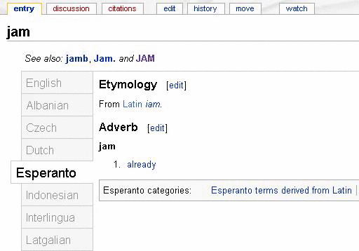
In interface design, a tab is a graphical user interface object that allows multiple documents or panels to be contained within a single window, using tabs as a navigational widget for switching between sets of documents.[1] It is an interface style most commonly associated with web browsers, web applications, text editors, and preference panels, with window managers and tiling window managers.

Tabs are modeled after traditional card tabs inserted in paper files or card indexes (in keeping with the desktop metaphor). They are usually graphically displayed on webpages or apps as they look on paper.

Tabs may appear in a horizontal bar or as a vertical list. Horizontal tabs may have multiple rows. In some cases, tabs may be reordered or organized into multiple rows through drag and drop interactions. Implementations may support opening an existing tab in a separate window or range-selecting multiple tabs for moving, closing, or separating them.[2]

History

[edit]

The WordVision word processor[3] for the IBM PC in 1982[4] was perhaps the first commercially available product with a tabbed interface.[4]

HyperTIES browser and Gosling Emacs authoring tool with pie menus on the NeWS window system

Don Hopkins developed and released several versions of tabbed window frames for the NeWS window system as free software, which the window manager applied to all NeWS applications, and enabled users to drag the tabs around to any edge of the window.[5]

The NeWS version of UniPress's Gosling Emacs text editor was another early product with multiple tabbed windows in 1988.[6] It was used to develop an authoring tool for Ben Shneiderman's hypermedia browser HyperTIES (the NeWS workstation version of The Interactive Encyclopedia System), in 1988 at the University of Maryland Human-Computer Interaction Lab.[7][8] HyperTIES also supported pie menus for managing windows and browsing hypermedia documents with PostScript applets.

While Boeing Calc already utilized tabbed sheets (as so-called word pads) since at least 1987,[9][10] Borland's Quattro Pro popularized tabs for spreadsheets in 1992. Microsoft Word in 1993 used them to simplify submenus.[4] In 1994, BookLink Technologies featured tabbed windows in its InternetWorks browser. That same year, the text editor UltraEdit also appeared with a modern multi-row tabbed interface. The tabbed interface approach was then followed by the Internet Explorer shell NetCaptor in 1997. These were followed by several others like IBrowse in 1999, and Opera in 2000 (with the release of version 4 - although an MDI interface was supported before then), MultiViews October 2000, which changed its name into MultiZilla on April 1st, 2001 (an extension for the Mozilla Application Suite[11]), Galeon in early 2001, Mozilla 0.9.5 in October 2001, Phoenix 0.1 (now Mozilla Firefox) in October 2002, Konqueror 3.1 in January 2003, and Safari in 2003. With the release of Internet Explorer 7 in 2006, all major web browsers featured a tabbed interface.

Users quickly adopted the use of tabs in web browsing and web search. A study of tabbed browsing behavior in June 2009 found that users switched tabs in 57% of tab sessions, and 36% of users used new tabs to open search engine results at least once during that period.[12]

Numerous additional browser tab capabilities have emerged since then. One example is visual tabbed browsing in OmniWeb version 5, which displays preview images of pages in a drawer to the left or right of the main browser window. Another feature is the ability to re-order tabs and to bookmark all of the webpages opened in tab panes in a given window in a group or bookmark folder (as well as the ability to reopen all of them at the same time). Microsoft Internet Explorer marks tab families with different colours.

Development

[edit]

Tab behavior in an application is determined by the underlying widget toolkit (for example Firefox uses GTK) framework. Due to lack of standardization, behavior may vary from one application to the next, which can result in usability challenges.

Tab hoarding

[edit]
The tab bar on Chromium of a browser tab hoarder.

Tab hoarding is digital hoarding of web browser tabs. Users may accumulate tabs as reminders of tasks to research or complete[13] (rather than using dedicated reminder software). They may use multiple browser windows to organize tabs or direct focus;[13] however, leaving multiple windows open can exacerbate tab clutter.[14]

Tab hoarding can lead to stress and information overload,[14] distraction, and reduced computer performance. It can develop into emotional attachment to the set of open tabs,[15] including fear of losing them upon a crash or other reboot,[13] and conversely, relief when tabs are properly restored.[16] Tab hoarders have attributed the behavior to anxiety,[17] fear of missing out,[18] procrastination,[19] and poor personal information management practices.[20][15]

The prevalence of tab hoarding is acknowledged by browser vendors such as Mozilla, and has inspired memory and tab management features in browsers and extensions.[16] Such features include tab grouping, which allows related tabs to be visually organized[21] and collapsed; conversion of tabs into a list of hyperlinks;[20] and alternative interface paradigms, such as framing high-level tasks as first-class objects instead of tabs.[22][15] A 2021 study developed UI design considerations which could enable better tools and changes to the code of web browsers that allow knowledge workers and other users to better manage and utilize their browser tabs.[15][23][further explanation needed]

Implementations

[edit]
Tabs in GNOME Text Editor
Tabs in GNOME Web

CSS frameworks which have tabs include Bootstrap,[24] Tailwind CSS[25] and Foundation.[26]

Widget toolkits which have tabs include GTK using the Notebook[27] widget as well as the Adwaita library using the TabBar[28] widget. Qt using the QTabWidget widget.[29]

See also

[edit]

References

[edit]
[edit]
Revisions and contributorsEdit on WikipediaRead on Wikipedia
from Grokipedia
A tabbed interface, also known as tabs, is a graphical user interface (GUI) element that organizes content into selectable panels or sections within a single window, allowing users to switch between them efficiently without navigating away from the main view. This design pattern typically consists of a horizontal or vertical list of labeled tabs, an active selection indicator (such as an underline or background highlight), and associated content panels that display only the chosen section at a time. Inspired by physical file folders and address books, tabs reduce visual clutter by chunking related information, making interfaces more scannable and user-friendly for tasks involving multiple related views. Tabs have been a staple in interface design for decades, originating from analog paradigms like office filing systems and evolving into digital controls to address the need for managing multiple documents or data sets in software applications. Early digital implementations appeared in productivity tools during the 1980s, with widespread adoption in the 1990s through web browsers and development environments, where they facilitated parallel workflows such as multitasking in browsing or editing. Today, tabs are ubiquitous across platforms, appearing in web applications, desktop software (e.g., Microsoft Office's ribbon tabs), and mobile apps, often adhering to accessibility standards like WAI-ARIA for keyboard navigation and screen reader compatibility. There are two primary types of tabs: navigation tabs, which load new content or pages upon selection (common in websites for switching between categories), and module tabs (or in-page tabs), which reveal pre-loaded sections on the same page to minimize load times and maintain context. Benefits include lowered cognitive load by grouping similar content and improved efficiency for users comparing options sequentially, though overuse can hinder tasks requiring side-by-side views. Best practices recommend limiting tabs to 5–7 per group with concise, action-oriented labels to avoid overwhelming users.

Fundamentals

Definition

A tabbed interface, also known as tabs in graphical user interfaces (GUIs), is a design pattern that enables users to access multiple mutually exclusive panes of content within a single window or area, using a set of selectable labels that resemble the tabs on physical file folders. This pattern draws inspiration from physical file folders and address books, providing an intuitive metaphor for organizing and quickly navigating to specific sections of related information. Core characteristics of tabs include a horizontal arrangement of clickable labels, typically positioned at the top of a content container, where selecting a tab displays its associated panel while concealing others. In module tabs (or in-page tabs), the hidden content remains preserved in memory, allowing seamless switching without reloading or reinitializing views; in navigation tabs, new content is typically loaded upon selection. Visual indicators, such as highlighting or underlining, denote the active tab to clearly signal the current view. Unlike menus, which offer hierarchical options for broader navigation or state changes across an application, or buttons, which trigger singular actions, tabs maintain the state of multiple related views within the same interface context, facilitating in-page alternation without requiring users to open or close separate windows. This distinction supports efficient content organization, reducing cognitive load by grouping related categories without disrupting the user's workflow.

Basic Components

A standard tab interface consists of a tab bar that serves as the container for multiple tabs, typically arranged horizontally along the top edge of the associated content area to provide clear visual separation from the tab panels. Individual tabs within the bar include a label for identification, often paired with an optional icon for quick recognition, and in designs supporting tab removal, a close button positioned to the right of the label. The active tab is visually distinguished through states such as a highlighted background, underline, or color change to indicate selection, while inactive tabs use subdued styling like grayscale or no emphasis to deprioritize them. Interactive behaviors in tab interfaces center on user-initiated switches between content panels. Clicking or tapping a tab activates it, displaying its corresponding panel while hiding others, ensuring immediate feedback through visual state changes. Drag-and-drop functionality allows users to reorder tabs by dragging one to a new position within the bar, enhancing customization in multi-tab scenarios. Right-clicking a tab often reveals a context menu with options such as closing the tab, detaching it to a new window, or renaming it, providing efficient access to advanced controls. Accessibility features ensure tab interfaces are navigable without a mouse. Keyboard navigation supports arrow keys to cycle through tabs (left/right for horizontal layouts), with Enter or Space activating the focused tab, and optional Home/End keys for jumping to the first or last tab. In web-based implementations, ARIA roles define the structure for screen readers: the tab bar uses role="tablist", each tab role="tab" with aria-selected for state indication, and content areas role="tabpanel", enabling clear announcements of active content and total tab count. Additional properties like aria-controls link tabs to their panels, and aria-orientation specifies horizontal or vertical arrangement. Layout variations adapt tabs to different contexts and screen constraints. Horizontal tabs, the most common orientation, align in a single row for broad visibility and quick scanning, suitable for limited tab sets. Vertical tabs stack along a sidebar, offering more space for longer labels or numerous tabs but risking oversight if not prominently placed. For overflow when tabs exceed available width, horizontal bars typically enable horizontal scrolling to access hidden tabs, maintaining a linear flow without disrupting the interface. In some designs, excess tabs are managed via a dropdown menu triggered by an overflow indicator, consolidating options into a selectable list.

Historical Development

Origins

The concept of tabbed interfaces in computing drew early inspiration from physical office tools prevalent in the 1970s and 1980s, such as manila file folders with protruding tabs and index cards organized in rolodexes or filing cabinets. These analog systems allowed users to categorize and quickly access documents by flipping between labeled tabs, providing an efficient method for managing multiple items in limited space without scattering them across a desk. This metaphor of organized, accessible sections influenced digital designers seeking to replicate familiar organizational patterns in graphical user interfaces (GUIs) to reduce cognitive load and enhance navigation. Academic and research roots of tab-like navigation trace back to mid-20th-century visions of hypertext systems, where non-linear document organization emphasized efficient access to interconnected content. In 1965, Ted Nelson proposed Project Xanadu, an early hypertext framework that envisioned a global, transclusive system for linking and viewing multiple documents simultaneously, laying conceptual groundwork for space-efficient navigation beyond linear scrolling. Early GUI research in the 1970s and 1980s further explored segmented navigation to optimize screen real estate; for instance, discussions in human-computer interaction papers highlighted the need for compact, switchable views to handle multi-document workflows without overwhelming limited display areas. The first practical digital tabbed interfaces emerged in the early 1980s in productivity software. The WordVision word processor for the IBM PC, released in 1982, was the first commercially available product to feature a tabbed interface for managing multiple documents. This allowed users to switch between open files using labeled tabs, directly adapting the physical folder metaphor to digital multi-tasking. Earlier GUI systems like Xerox PARC's Alto (1973) and Star (1981) advanced multi-document handling through overlapping, resizable windows on a single desktop, providing precursors to organized switching but without tabs. Similarly, the Apple Lisa (1983) introduced overlapping windows in a document-centric GUI, foreshadowing efficient file alternation. Tabbed interfaces evolved as an alternative to the Multiple Document Interface (MDI) paradigm in late-1980s Windows environments, where child windows nested within a parent frame often led to cluttered navigation. MDI, introduced in Windows 2.0 (1987), aimed to contain multiple documents in one application window but suffered from poor visibility and switching efficiency compared to physical tabbed analogs. Tabs offered a more intuitive refinement, using selectable labels to expose only active content while hiding others, thus improving usability in resource-constrained systems without the overlap issues of tiled or cascading windows.

Key Milestones

The adoption of tabbed interfaces in web browsers gained momentum in the late 1990s, marking a shift toward efficient multi-page management. In 1997, NetCaptor, a shell extension for Internet Explorer 4.0, introduced the first practical tabbed browsing feature, allowing users to view multiple web pages within a single window without opening separate instances. This innovation addressed the clutter of multiple browser windows, though it relied on extending Microsoft's browser rather than native implementation. By 2000, Opera 4.0 integrated native tabs directly into the browser, enabling seamless switching between pages and popularizing the concept among users seeking streamlined navigation. Netscape Navigator offered partial tab support in its version 6.0 release in 2000, building on earlier multi-document interfaces to facilitate basic tab-like organization. The 2000s saw tabs become a standard feature, expanding beyond browsers into development tools and solidifying their role in user interfaces. Mozilla Firefox 1.0, released on November 9, 2004, made tabbed browsing the default experience, emphasizing speed and extensibility, which helped it capture significant market share and influence competitors like Internet Explorer to add native tabs in version 7 by 2006. In parallel, the Eclipse IDE, launched by IBM in November 2001 as an open-source platform, integrated tabbed editors and views for code organization, revolutionizing workflows in software development by allowing developers to manage multiple files and perspectives within one workspace. This period's expansions highlighted tabs' versatility in handling complex, multi-view applications. Advancements in the 2010s focused on mobile and design standardization, adapting tabs for touch interfaces and responsive layouts. Apple's iOS 7, released in 2013, introduced a visual tab view in Safari, presenting open pages as stacked, scrollable cards for intuitive switching on smaller screens, which enhanced mobile browsing efficiency. Google's Material Design, unveiled at I/O 2014, defined tab components with elevation, ink ripples, and adaptive behaviors, influencing Android apps and web UIs to create consistent, accessible tab styles across devices. Recent developments up to 2025 have emphasized cross-platform consistency and advanced features in web technologies. The Flutter framework, first announced by Google at I/O 2017 and reaching stable release in 2018, incorporated Material Design-inspired TabBar widgets, enabling developers to build responsive tab interfaces for mobile, web, and desktop from a single codebase. Microsoft Edge introduced vertical tabs in March 2020, relocating the tab bar to the sidebar for better visibility on widescreen displays and reducing horizontal clutter in productivity scenarios. In progressive web apps (PWAs), enhancements like Chrome's tabbed application mode, rolled out starting in 2024 for ChromeOS and expanding to other platforms, allow PWAs to support multi-document tabbed interfaces natively, bridging web and app-like experiences without full browser dependencies.

Technical Aspects

Implementation Methods

Tab interfaces are commonly implemented using data structures such as arrays or lists to manage multiple content panels, where each entry stores a tab label and a reference to the corresponding panel element or identifier. Event handlers, typically attached to tab elements via mechanisms like click or keydown events, facilitate switching by updating an active index, which triggers the hiding of inactive panels and the display of the selected one through visibility toggles. Rendering in web environments relies on dynamic DOM manipulation, where JavaScript alters CSS properties—such as setting display: none for hidden panels and display: block for the active one—to switch content without full page reloads. In desktop applications, rendering employs native widget systems that stack panels in a container view, activating the desired panel by bringing it to the front or adjusting its z-order while concealing others. Performance optimizations include lazy loading of tab content, which defers the initialization and rendering of non-visible panels until user selection, thereby reducing initial memory usage and shortening the critical rendering path. For scenarios where the number of tabs exceeds the available viewport width, overflow algorithms apply techniques like progressive reduction of tab widths, addition of horizontal scrolling arrows, or integration of dropdown menus to access hidden tabs without disrupting the layout. Cross-platform development encounters challenges in DPI scaling, particularly in multi-monitor setups where varying display densities require per-monitor awareness to resize tab elements and prevent blurriness, often handled by responding to DPI change notifications rather than relying on automatic framework scaling. Theming for light and dark modes can be addressed without platform-specific code by leveraging CSS media queries like @media (prefers-color-scheme: dark) to conditionally apply color schemes to tab bars and panels, ensuring adaptive visuals based on user or system preferences.

Standards and Toolkits

The Web Accessibility Initiative - Accessible Rich Internet Applications (WAI-ARIA) 1.2 specification, published by the World Wide Web Consortium (W3C) in 2023, defines roles such as tab, tablist, and tabpanel to enable accessible tabbed interfaces in web applications, allowing screen readers to navigate and announce tab states like selection and focus. These roles ensure that tabs are operable via keyboard and integrate with assistive technologies, with the tablist containing multiple tab elements that control corresponding tabpanel regions. WAI-ARIA 1.2 aligns with updates in WCAG 2.2 (published October 2023), including refined practices for tab patterns to enhance accessibility for users with cognitive disabilities and low vision. For simpler implementations, the HTML5 <details> element, introduced in the HTML Living Standard, serves as an alternative for disclosure-based tab-like behaviors, where content is toggled via a <summary> child, though it lacks native multi-tab switching and requires CSS for tabbed styling. Custom elements in HTML5 further support extensible tab components by defining reusable behaviors. In desktop development, Qt's QTabWidget, introduced in Qt 2.0 in 1999 as part of the Qt Widgets module, provides a container for stacking widgets with tabbed navigation, supporting dynamic addition of pages and customizable tab positions. The GTK toolkit, through its GtkNotebook class (often referred to in contexts as a tab container), enables tabbed interfaces by organizing child widgets into switchable pages with labels, a feature available since GTK+ 1.0 in 1998 and refined in subsequent versions for cross-platform consistency. Similarly, Java's Swing library includes JTabbedPane, introduced in Swing 1.0 around 1998, which manages a set of components displayed via selectable tabs, with APIs for adding, removing, and selecting tabs programmatically. For mobile platforms, Apple's UIKit framework offers UITabBarController, a view controller that segments interfaces into tabbed sections, managing child view controllers and a bottom tab bar for navigation, a core component since iOS 2.0 in 2008. On Android, TabLayout, introduced in the Android Design Support Library in 2015 (version 22.2.0), integrates with ViewPager to create swipeable tabbed layouts, providing material design-compliant tabs that sync with pager adapters for efficient content switching. Emerging standards as of 2025 emphasize modular and lightweight implementations, with Web Components—leveraging custom elements, shadow DOM, and templates—enabling reusable, encapsulated tab interfaces that promote interoperability across frameworks without vendor lock-in. Additionally, advancements in CSS, including the :target pseudo-class and scoped styling techniques akin to CSS Modules, allow for JavaScript-free tab switching through anchor links and radio inputs, reducing reliance on scripting while maintaining accessibility via ARIA attributes. These approaches align with ongoing W3C efforts, such as updates to WAI-ARIA Practices for tabs in WCAG 2.2 conformance.

Applications and Usage

In Web Browsers

In the early 2000s, web browsers transitioned from single-page viewing to tabbed interfaces, enabling users to manage multiple web pages within a single window and improving multitasking efficiency. This shift gained momentum with Mozilla Firefox's release in 2004, which popularized tabs for seamless navigation, followed by widespread adoption as Internet Explorer 7 integrated the feature in 2006. Modern web browsers incorporate specific features to enhance tab usability, such as thumbnails and previews for quick identification. For instance, Google Chrome introduced tab groups in May 2020, allowing users to organize tabs thematically with colors and labels for better session management. In November 2025, Chrome added a split-view feature, enabling users to divide a single tab into two side-by-side sections for comparing content without opening additional tabs. Additionally, session restoration automatically recovers open tabs after a browser crash, a capability standard in browsers like Chrome and Firefox to minimize data loss during unexpected closures. Multi-tab workflows in browsers support advanced navigation, including the ability to bookmark all open tabs at once for easy retrieval. Private browsing modes, such as Chrome's Incognito or Firefox's Private Window, treat tabs within those sessions as isolated from regular history and cookies, promoting privacy without affecting standard tabs. Extensions further optimize these workflows; OneTab, for example, converts multiple open tabs into a compact list of URLs, reducing memory usage by up to 95% and curbing tab overload. Recent features continue to evolve tab layouts, with Firefox releasing vertical tabs in version 136 in March 2025, positioning tabs along the sidebar for improved visibility in workflows with many open pages. From a security perspective, browsers employ sandboxing to isolate each tab in a separate process, limiting the impact of malicious content in one tab from compromising the entire system or other tabs. This process-level isolation, pioneered in Chrome and adopted across major browsers, enhances protection against exploits like cross-site scripting.

In Desktop Software

In desktop software, tabs are widely used to organize multiple documents, tools, or views within a single application window, enhancing efficiency in document-centric workflows. Integrated development environments (IDEs) like Visual Studio Code employ tabs to display open files, a feature present since its initial release in April 2015, allowing developers to switch between code files without creating separate windows. Similarly, office suites such as Microsoft Office introduced ribbon tabs in 2007 with Office 2007, grouping commands into contextual tabs like Home, Insert, and Design to streamline access to formatting and layout tools across applications like Word and Excel. Workflow integration in desktop applications often includes features for managing tabs across multiple windows to support complex editing sessions. For instance, Visual Studio Code enables dragging a tab from one window to create a new floating window, introduced in version 1.85 in November 2023, which allows splitting views for side-by-side editing while maintaining file synchronization—changes in one window update across all instances of the same editor. This drag-to-new-window functionality facilitates seamless view splitting, particularly useful for comparing code or documents without duplicating content. Additionally, workspace files in tools like Visual Studio Code preserve open tabs and layouts across sessions or windows, enabling consistent workflows when reopening projects. Customization options for tabs in desktop software allow users to adapt the interface to personal or project-specific needs. In Visual Studio Code, users can theme tab colors and styles through the workbench.colorCustomizations setting in the user configuration file, enabling adjustments to active, inactive, or hovered tab appearances to match overall editor themes or highlight specific file types. Keyboard shortcuts further enhance navigation; for example, Ctrl+Tab cycles to the next tab, while Ctrl+Shift+Tab moves to the previous one, with Ctrl+Page Up/Page Down providing direct positional jumps, configurable via the Keyboard Shortcuts editor. In Visual Studio, tab colorization by project or solution is available through Tools > Options > Environment > Tabs and Windows, aiding quick identification in multi-project environments. Tabs contribute significantly to resource management by minimizing window proliferation in multi-monitor setups, where desktop real estate is abundant but taskbar clutter can impede focus. By consolidating multiple documents into tabbed interfaces, applications like IDEs reduce the need for numerous floating windows, allowing users to dedicate monitors to distinct tasks—such as code editing on one screen and debugging output on another—without overwhelming the desktop environment. This organization lowers cognitive load during multitasking.

In Mobile Interfaces

In mobile interfaces, tab designs are adapted to accommodate touch-based interactions and limited screen real estate, often positioning tabs at the bottom of the screen to optimize for thumb accessibility during one-handed use. For instance, Apple's Human Interface Guidelines recommend placing the UITabBar at the bottom of iOS screens, where it floats above content on a translucent background, facilitating easier reach for users holding devices naturally. In June 2025, Apple introduced a redesign for tab bars in iOS, featuring shrinking behavior on scroll and translucent "Liquid Glass" elements to focus on content. Similarly, Google's Material Design guidelines position bottom navigation bars at the screen's base to enable quick thumb taps across primary destinations, a pattern formalized in Material Design 2.0 in 2018 to enhance mobile ergonomics. Swipe gestures complement these fixed tab bars by allowing horizontal navigation between tabs without direct tapping, reducing cognitive load on small screens. In iOS applications, developers can implement swipe-to-switch functionality on UITabBar views, as seen in Safari where users swipe left or right on the tab bar to cycle through open tabs efficiently. On Android, Material Design supports swipe gestures for transitioning between bottom navigation peers, such as tabs, to mimic natural scrolling behaviors while maintaining app stability. Platform-specific implementations further tailor tabs to mobile constraints; iOS UITabBar typically limits items to five or fewer to prevent clutter and ensure scannable navigation, avoiding overflow mechanisms like a "More" tab that could hinder touch precision. Android's bottom navigation, introduced as a core component in Material Design 2.0, also caps at three to five destinations, each represented by icons and optional labels, to prioritize direct access from anywhere in the app without overwhelming the viewport. To address performance on battery-constrained devices, mobile tab interfaces often minimize animations during switches; studies on cross-platform UI animations show that even simple transitions can spike CPU usage to 100% and increase RAM by up to 30 MB on iOS and Android, indirectly draining battery through sustained graphics processing. As a result, developers reduce or disable non-essential animations in tab navigation for efficiency, such as fading effects in bottom bars. Hybrid approaches integrate tabs with bottom sheets, where persistent bottom navigation overlays expandable sheets for secondary content, providing a space-efficient alternative to full tab stacks on mobile without heavy rendering overhead. Accessibility features ensure inclusive tab use on mobile; iOS VoiceOver enables cycling through UITabBar items via right/left swipes, reading labels aloud for screen reader users to navigate intuitively. Both platforms enforce larger touch targets, with Apple requiring a minimum of 44x44 points for tab icons and labels to accommodate users with motor impairments, while Android recommends 48x48 density-independent pixels to prevent mis-taps.

User Experience and Challenges

Usability Benefits

Tabbed interfaces enhance space efficiency by consolidating multiple views or documents into a single window, thereby reducing desktop clutter and minimizing the need for managing numerous separate windows. This organization allows users to access diverse content without overwhelming the screen space, making it particularly valuable in environments with limited display area, such as laptops or multi-monitor setups. By facilitating quick switches between related content within the same window, tabbed interfaces support efficient task switching and preserve contextual awareness, aligning with cognitive psychology principles that highlight the costs of disrupting mental models during transitions. Unlike alt-tabbing between independent windows, which incurs higher cognitive overhead due to reorientation and loss of visual continuity, tabs enable seamless navigation that maintains user focus and reduces interruption-related delays. Studies on multitasking demonstrate that such intra-window switching lowers the psychological costs associated with task alternation, as the brain expends less effort re-establishing context. Tabbed interfaces bolster multitasking by enabling parallel workflows, such as keeping reference materials alongside primary tasks, which promotes productivity in information-intensive scenarios like research or content creation. Users can alternate between tabs for comparative analysis or iterative processes without closing or minimizing applications, fostering a more fluid handling of concurrent activities. Empirical evidence from user studies underscores these benefits; for instance, research on browser tab usage shows that tab switching is a frequent action, second only to link clicking, indicating its role in streamlining information-heavy tasks and reducing overall navigation time. In controlled experiments, enhancements to tabbed environments, such as visual cues for resumption, have demonstrated significant reductions in task resumption time— from approximately 2.4 seconds to 0.8 seconds per switch— and overall task completion time by up to 43%, highlighting tabs' contribution to efficiency gains. Additionally, findings from usability research emphasize that proper tab implementation, through content chunking, decreases cognitive load and errors in complex interfaces by directing attention to relevant sections.

Common Issues

One prevalent issue with tab interfaces is cognitive overload stemming from tab hoarding, where users accumulate numerous tabs—often 10 or more—leading to decision paralysis and heightened mental strain. Research indicates that desktop users typically keep four to seven tabs open during sessions, but heavy users frequently exceed 10, exacerbating information overload as tabs serve as makeshift memory aids for unprocessed content. This behavior, observed in surveys where 30% of participants reported a "tab hoarding problem," contributes to cognitive impairment by overwhelming working memory and delaying task completion. Visibility challenges arise when long tab labels truncate in constrained spaces, hindering quick identification of content and increasing navigation errors. In browser and software interfaces, labels often shorten with ellipses, obscuring essential details until users hover or interact further. Common mitigations include displaying full text via tooltips on hover, a practice recommended for maintaining usability in compact tab bars. Tab interfaces also impose resource strain, particularly through memory consumption by inactive tabs, which can lead to system slowdowns and leaks. For instance, each inactive browser tab may retain 100 MB or more of RAM, as modern web content loads scripts and media that persist even when not in focus, straining devices with limited resources. Features like tab suspension aim to alleviate this, but without them, multiple tabs can collectively exceed gigabytes of usage. As of 2025, emerging machine learning approaches are being developed to optimize tab management, automatically suspending or grouping tabs to reduce cognitive and resource burdens. Accessibility barriers frequently occur in custom tab implementations lacking robust keyboard support, contravening WCAG 2.1 guidelines. Specifically, violations of Success Criterion 2.1.1 (Keyboard) require all functionality to be operable via keyboard without timing constraints, while 2.1.2 (No Keyboard Trap) mandates easy focus movement in and out of components like tabs. Poor adherence traps users in navigation loops or skips logical focus order, isolating keyboard-dependent individuals from content.

References

Add your contribution
Related Hubs
User Avatar
No comments yet.