Hubbry Logo
ToolbarToolbarMain
Open search
Toolbar
Community hub
Toolbar
logo
8 pages, 0 posts
0 subscribers
Be the first to start a discussion here.
Toolbar
Toolbar
from Wikipedia
Toolbar from the text editor gedit. From left to right, the icons are for creating a new file; opening an existing file; saving a file (a floppy disk icon); printing the current file; undoing and redoing edits (grayed out since no edits have been made); cut, copy, and paste; search; search and replace.
OpenOffice.org allows its toolbars to be detached and moved between windows and other toolbars.

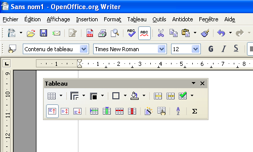
The toolbar, also called a bar or standard toolbar (originally known as ribbon),[1][2] is a graphical control element on which on-screen icons can be used. A toolbar often allows for quick access to functions that are commonly used in the program. Some examples of functions a toolbar might have are open file, save, and change font. Toolbars are usually distinguished from palettes by their integration into the edges of the screen or of other windows. This can result in wasted space if multiple underpopulated bars are stacked atop each other or interface inefficiency if overloaded bars are placed on small windows.[3]

Variants

[edit]

There are several user interface elements derived from toolbars:

  • An address bar, location bar or URL bar is a toolbar that mainly consists of a text box. It typically accepts URLs or file system addresses. They are found in web browsers and file managers.
  • A breadcrumb or breadcrumb trail allows users to keep track of their locations within a program or a file system. They are toolbars whose contents dynamically change to indicate the navigation path.
  • A ribbon was originally used to refer to a toolbar, but it now means a complex user interface which consists of multiple toolbars chosen between through tabs.
  • A taskbar is a toolbar provided by an operating system to launch, monitor and manipulate software. A taskbar may hold other sub-toolbars.

A search box is not in itself a toolbar but one may appear within a toolbar, as is the case with the address bar.

Toolbars may appear in various software. Some web browsers allow the user to customize its toolbars' contents or location. Plug-ins can be used to add new toolbars to some programs.

Sometimes trojan horse viruses will take the form of a toolbar.[4]

See also

[edit]

References

[edit]
[edit]
Revisions and contributorsEdit on WikipediaRead on Wikipedia
from Grokipedia
A toolbar is a graphical control element in user interfaces consisting of a row or panel of buttons, icons, menus, or other controls that provide quick access to frequently used commands and tools within an application. Typically positioned horizontally along the top or bottom edge of a , toolbars streamline user interactions by reducing the need to navigate through nested menus, and they often include customizable or context-sensitive options to adapt to specific tasks. The origins of toolbars trace back to pioneering graphical user interface (GUI) developments in the 1970s, with early tool-based interfaces appearing in software such as PARC's SuperPaint program, created by Richard Shoup around 1973, which featured a selection of drawing and editing tools for creation. This concept evolved into more integrated forms in the 8010 workstation, released commercially in 1981 as the first with a fully graphical interface, incorporating icon-based controls and pull-down menus that influenced subsequent toolbar designs. By the and , toolbars became a staple in desktop applications, popularized through systems like Apple's Macintosh and Microsoft's Windows, where they facilitated efficient command execution in . In the evolution of user interfaces, traditional toolbars faced challenges with scalability as applications grew more complex, leading to innovations like the ribbon interface, which introduced in Office 2007 to replace layered menus and static toolbars with tabbed, contextual panels that enhance command visibility and reduce . Today, toolbars remain essential across platforms, appearing in web browsers for and bookmarks, mobile apps for gesture-based actions, and development environments for coding shortcuts, while adapting to touch interfaces and adaptive designs for better .

Definition and Characteristics

Core Definition

A toolbar is a graphical control element in user interfaces that consists of buttons, icons, or images designed to activate specific functions or commands within an application. These elements provide users with quick, visual access to commonly used operations, such as saving a file, formatting text, or navigating content, thereby streamlining interaction without requiring navigation through layered options. Unlike menus, which typically present hierarchical, text-based lists of options that require selection and expansion, or sidebars, which offer vertical, often navigational or supplementary content, a toolbar emphasizes a linear arrangement for persistent visibility and immediate action. This placement—usually horizontal along the top or bottom edge of a or view—ensures the toolbar remains docked and accessible during active use, distinguishing it as a fixed, glanceable reference for core tasks rather than a contextual or expansive panel. The basic structure of a toolbar features a bar containing a sequence of actionable items, each representing a distinct command, often grouped by function for logical organization. These items can include standard buttons without borders, symbolic icons for space efficiency, and occasional text labels or tooltips for clarity, supporting both customization and adaptability across platforms while maintaining a compact footprint.

Key Features

Toolbars in graphical user interfaces typically feature two primary types of buttons: one-mode push buttons, which remain always visible and execute a single action upon clicking, such as saving a , and two-state toggle buttons, which switch between pressed and unpressed states to enable or disable a persistent mode, like bold text formatting. These interaction styles ensure efficient command execution for push buttons via direct clicks that send notification messages to the parent window, while toggle buttons provide visual feedback through state changes to indicate ongoing selections. Iconography in toolbars adheres to standards emphasizing recognizable, platform-consistent symbols, such as a magnifying glass for search, rendered at sizes like 16x15 pixels for bitmaps to balance space efficiency and clarity. Tooltips enhance icon clarification by displaying concise labels, such as "Print (Ctrl+P)", automatically upon hovering after a brief delay, aiding users without permanent text labels while avoiding obstruction of the interface. Related functions are grouped using separators or etches to organize commands logically, preventing clutter and supporting quick scanning, with recommended limits on ungrouped items to maintain usability. Toolbars exhibit persistence across application states, remaining visible and retaining button configurations unless explicitly hidden by the user, which supports consistent access to core commands during workflows. They respond dynamically to user actions, with hot-tracking altering button appearance on hover for immediate feedback and clicks triggering state updates or commands, ensuring intuitive interaction without disrupting the interface flow. This responsiveness extends to focus states for keyboard navigation, maintaining accessibility. Common placement at the top of application windows facilitates their persistent role in primary command access.

Historical Development

Early Origins

The origins of toolbars trace back to pioneering efforts in graphical user interfaces (GUIs) during the mid-20th century, with foundational influences emerging from research at institutions like MIT and PARC in the 1960s and 1970s. A key precursor was Ivan Sutherland's system, developed in 1963 as part of his PhD thesis at MIT. introduced interactive on the TX-2 computer, using a for direct manipulation of drawn objects and a set of push buttons and toggle switches to select drawing tools and operations, such as line drawing or circle creation. This represented an early mechanism for tool selection in a visual environment, shifting from text-based commands to graphical input and enabling users to build complex diagrams with constraints and , laying conceptual groundwork for later toolbar-like interfaces. In the , PARC advanced these ideas through the development of the , the first with a bitmapped GUI, released internally in 1973. The Alto's interface included overlapping windows, icons, and a for pointing, with applications like the program using pull-down menus and selectable icons for basic editing functions, though not yet a fixed toolbar. This system emphasized (windows, icons, menus, pointer) paradigms, influencing subsequent GUI designs by demonstrating how visual elements could replace command-line interactions. The Alto's innovations, including Ethernet networking and integration, were explored by researchers like and , who envisioned dynamic, office-oriented computing environments. By the early 1980s, these concepts materialized in commercial systems, notably Apple's Lisa computer, introduced in 1983 and heavily inspired by PARC demonstrations. The Lisa featured a with icons, folders, and a for global commands, while its applications incorporated palette-based tool selection for tasks like drawing and text editing, bridging the gap toward dedicated toolbars. This marked a pivotal transition from command-line interfaces dominant in the —such as those in UNIX or DOS—to intuitive GUIs that prioritized visual affordances. A concrete example appeared in , bundled with the Macintosh 128K in 1984, which introduced a fixed palette along the left edge of the screen containing iconic buttons for tools like the , , , and fill bucket, allowing rapid switching without menus. Developed by from his earlier LisaDraw, MacPaint's standardized tool selection in software, influencing countless applications thereafter.

Modern Evolution

The integration of toolbars into Windows began in earnest during the 1990s with the release of in 1995, which introduced Windows Explorer as the primary file management tool. This application featured a dedicated toolbar that provided quick access to common actions, such as changing view modes (e.g., large icons, small icons, list, or details) and navigating folder hierarchies, thereby streamlining user interactions with the . The toolbar's design emphasized efficiency, allowing users to perform tasks without delving into menus, and it set a for embedding such elements across Windows applications and system interfaces. A pivotal shift occurred in 2007 when applications adopted the interface, fundamentally replacing traditional static toolbars and menu bars with a more dynamic, tabbed structure. Developed through extensive prototyping to address issues like buried commands in nested menus, the organized tools into contextual groups that adapt to the user's current task, such as displaying relevant editing options when text is selected. This evolution consolidated the functionality of multiple toolbars into a single, visible pane, reducing reliance on trial-and-error exploration and improving overall productivity in . Throughout the , context-sensitive toolbars emerged as a key advancement, dynamically altering their contents based on the active to present only pertinent options and minimize . For instance, in 2000, toolbars adapted to the selected view—such as displaying message-specific buttons in email mode versus contact management tools in address book mode—enhancing and speed. This trend was amplified by the advent of web technologies, notably around 2008–2011, which standardized the <menu> element to support both toolbars (via type="toolbar") and context menus (via type="context"), enabling developers to create interactive, element-specific command sets that integrate seamlessly with browser-native behaviors. Post-2010, the proliferation of touch-enabled devices drove further adaptations, with toolbars evolving into more fluid, gesture-compatible forms to suit mobile ergonomics in operating systems like iOS and Android. In iOS, toolbars are typically positioned at the screen's bottom for easy thumb reach, offering collapsible or hideable designs that prioritize content visibility while maintaining access to essential commands through multitouch gestures like swipes. Android similarly transitioned toward gesture-based interactions, as seen in Android 10 (2019), where traditional navigation toolbars were supplanted by edge swipes for back, home, and overview functions, reducing persistent on-screen elements and fostering immersive, touch-native experiences across apps. These changes reflected a broader emphasis on minimizing visual clutter and leveraging natural hand movements for toolbar-like functionality.

Types and Variants

Traditional Toolbars

Traditional toolbars in desktop software applications are commonly positioned horizontally at the top of application windows, directly below the title bar and , but guidelines allow docking to any edge or floating as palettes for flexibility. This placement aligns with early standards, providing quick visual access to essential functions without requiring navigation through nested menus while supporting user customization. They feature fixed icons representing core commands, such as save, cut, and paste—often depicted as a , , and , respectively—sized consistently at 16x16 or 24x24 pixels to ensure uniformity across resolutions. These icons lack textual labels but include tooltips for clarification, promoting a clean, icon-only aesthetic that mirrors common edit menu options for intuitive recognition. Examples of traditional toolbars include file managers like Windows Explorer in pre-Windows 8 iterations, which incorporate horizontal toolbars with static icons for navigation commands, including back, forward, and search functions, facilitating file operations without altering the layout during use. Similarly, the options bar in displays icons and controls for tools such as selection modes and brush settings, enabling efficient workflow adjustments. These implementations prioritize core productivity tasks, with icons for actions like new folder creation or positioned in a linear sequence. Vertical toolbars, docked to the side of the window, are another traditional variant, often used in applications requiring extensive toolsets, such as image editing software, to optimize screen space. While traditional toolbars emphasize a fixed arrangement of controls for predictability and to reduce —particularly for power users relying on —many support user customization, including repositioning, resizing, hiding, or reordering through explicit settings. Buttons adhere to standard dimensions, such as 24x22 pixels at VGA resolution, with consistent spacing from edges, ensuring the toolbar remains a stable element even as window sizes change. This design philosophy supports simplicity by limiting the toolbar to frequently used commands, complementing keyboard shortcuts and allowing adaptations without automatic changes.

Specialized Variants

Ribbon toolbars represent a significant evolution from traditional fixed toolbars, integrating tabbed navigation with grouped, contextual commands to enhance discoverability and efficiency in complex applications. Introduced in , the ribbon interface replaces conventional menus and toolbars with a dynamic panel that organizes features into tabs such as , Insert, and View, each containing related command groups like or Font. Contextual tabs appear automatically based on the user's current task, such as Picture Tools when an is selected, providing task-specific options without cluttering the primary interface. This design prioritizes visual cues with icons and live previews, reducing the need for nested menus and improving workflow in productivity software. Floating or dockable toolbars offer greater flexibility than static traditional toolbars by allowing users to reposition them dynamically within the application window or detach them entirely. In integrated development environments like , these toolbars can be dragged to against any edge of the parent window—such as the top, bottom, left, or right—or floated as independent mini-frame windows for multitasking. This adaptability supports customized layouts tailored to developer preferences, with features like for easy relocation and persistence across sessions to maintain productivity. Such variants are particularly valuable in technical tools where screen real estate must accommodate multiple panels, code editors, and views simultaneously. Mini-toolbars, or quick-access bars, provide on-demand, context-sensitive functionality that emerges transiently to minimize interface disruption, differing from always-visible traditional toolbars. In , the mini-toolbar appears faintly upon text selection and becomes fully opaque on hover, offering immediate access to essential formatting options like , font size, and alignment without navigating to the full . Right-clicking selected text also summons it alongside the context menu, enabling rapid edits in document-focused workflows. This variant, introduced alongside the ribbon in Office 2007, enhances speed for common tasks while fading away to preserve focus on content.

Applications and Usage

In Desktop Applications

In desktop applications, toolbars serve as essential interfaces for streamlining user interactions, particularly in productivity suites like , where the Quick Access Toolbar enables rapid execution of file operations such as opening, saving, and printing documents, remaining accessible regardless of the active tab. This design reduces navigation time in data-heavy environments, allowing users to maintain focus on tasks without delving into layered menus. Similarly, in creative software such as , the toolbox functions as a docked panel housing selection, paint, and transform tools, facilitating quick brush selection and customization for precise workflows. These implementations prioritize icon-based controls for intuitive access, often customizable to align with user preferences in professional settings. Toolbars also integrate seamlessly with operating system-level window management features to extend functionality beyond the application window. For instance, in Windows environments, applications can incorporate thumbnail toolbars into Taskbar previews via the ITaskbarList3 interface, embedding buttons for common actions like play, pause, or volume adjustment directly in the minimized , thereby enabling control without full window restoration. This integration, introduced in , enhances multitasking efficiency in desktop setups by leveraging the 's persistent visibility. Various toolbar variants, including dockable and floating types, are commonly adapted in these contexts to balance functionality and efficiency.

In Web and Mobile Interfaces

In web browsers, toolbars often manifest as the , commonly referred to as the omnibox in , which integrates search, navigation, and extension-driven functionalities. This component allows users to enter URLs, perform searches, and receive contextual suggestions drawn from browsing , bookmarks, and open tabs, enhancing quick access without additional clicks. Extensions can extend the omnibox by registering keywords that trigger custom suggestions, such as integrating with bookmarks or history APIs to display relevant results as users type. For instance, the Chrome omnibox API enables developers to provide formatted suggestions using tags for URLs and matches, supporting features like deletable results since version 63. In mobile interfaces, toolbars adapt to touch-based interactions through bottom navigation bars, positioned at the screen's lower edge to align with natural . These bars typically feature 3 to 5 icons for primary app sections, optimizing for one-handed use where the thumb's comfortable reach—known as the "thumb zone"—covers the bottom 30-50% of the screen depending on device and grip. Apps like employ this design with icons for home, search, reels, shopping, and profile, ensuring targets are large enough (at least 48dp) for easy while minimizing strain during prolonged . This placement leverages behavioral patterns observed in mobile usage, where users hold devices in portrait mode and favor bottom interactions for efficiency. Responsive design for toolbars on web and mobile platforms presents challenges due to limited screen real estate, often requiring adaptive strategies like conditional hiding or alternative patterns. On smaller viewports, such as mobile devices under 600dp width, full toolbars may to prioritize content , with elements tucked into menus—three horizontal lines icon—to conserve space for up to five or more links. However, this approach reduces by nearly 20% and increases task completion time by 15-39% compared to visible , as users must perform an extra tap to access options. Best practices recommend visible bottom bars for core functions on mobile while using menus sparingly for secondary items, ensuring seamless transitions across breakpoints without sacrificing .

Design Principles

Usability Considerations

Toolbars significantly influence user interaction efficiency, with usability guided by principles like Jakob Nielsen's heuristics that emphasize clear feedback and consistency. The visibility of system status heuristic requires toolbars to provide immediate cues about the current state, such as highlighting the active tool or with color changes or checkmarks to confirm selections and reduce user uncertainty during tasks. Similarly, adherence to consistency and standards ensures toolbars align with platform norms, exemplified by the Ribbon's uniform icon placement and functionality across Word, Excel, and PowerPoint, which lowers the cognitive effort needed for cross-application navigation. Reducing is essential for effective toolbar design, achieved through icon standardization that leverages familiar symbols for rapid recognition without extensive mental processing. Standardized icons, like the envelope for or printer for print, minimize interpretation time and support quick action in constrained spaces such as toolbars. Avoiding further mitigates cognitive demands by limiting the number of visible options—ideally grouping related functions and hiding less frequent ones—to prevent and maintain focus on primary tasks. A/B testing reveals how toolbar placement affects practical outcomes like task completion. In e-commerce navigation experiments akin to toolbar optimizations, repositioning elements into a mega menu format increased user engagement and revenue by 53%, correlating with faster access to product categories and higher rates of successful task fulfillment such as browsing and . These tests underscore that top-placed or contextually prominent toolbars can improve completion rates in user workflows, depending on interface type.

Customization Options

Users can modify toolbars through built-in options provided by many applications, enabling intuitive adjustments without additional software. For instance, in , the browser's customization mode allows users to icons and buttons directly onto or off the toolbar, facilitating rearrangement of elements like the back button, bookmarks menu, or extensions icons to match individual workflows. Similarly, offers a toolbar customization interface accessible via settings, where users can pin, unpin, or reorder extension icons and core navigation tools. Extension ecosystems further expand customization possibilities by allowing users to add, remove, or integrate new tools into toolbars. In , the official add-ons provides extensions such as Toolbar Buttons, which introduce additional customizable icons to the toolbar palette, enabling users to tailor functionality for tasks like or media controls. Chrome's Web Store hosts similar extensions, including those that add developer tools or interface modifiers directly as toolbar buttons, supporting dynamic addition and management of features. These ecosystems promote modular design, where developers contribute plugins that integrate seamlessly with the host application's toolbar. Theme support enables aesthetic modifications to toolbars, including changes to colors, icons, and overall appearance. Applications like and Chrome allow users to apply themes that alter toolbar backgrounds, button hues, and icon styles, often through built-in stores or settings panels. Dark mode adaptations, which invert light elements to dark backgrounds for reduced , became widely implemented in toolbars during the late , following operating system updates like macOS Mojave in 2018 and Windows 10's dark theme enhancements. This feature has since proliferated across desktop and mobile interfaces, with themes ensuring consistency in low-light environments.

Implementation

In Programming Frameworks

In programming frameworks, toolbars are typically implemented as container components that allow developers to group and manage interactive elements like buttons, separators, and custom widgets, facilitating the creation of intuitive user interfaces. These implementations provide APIs for dynamically adding items, handling user interactions such as clicks, and managing state changes like visibility or orientation, enabling seamless integration into larger application windows. The Qt framework offers the QToolBar class, a movable panel designed for holding controls, which is commonly added to a QMainWindow using addToolBar(). Developers can add buttons by creating QAction objects—representing commands with icons, text, and tooltips—and inserting them via addAction(QAction*) or insertAction(QAction*, QAction*) for precise positioning. Separators are added with addSeparator(), while custom widgets integrate through addWidget(QWidget*). Event handling occurs via Qt's signal-slot mechanism; for instance, the actionTriggered(QAction*) signal emits when a button is clicked, allowing connections to slots for custom logic, and state changes like visibility trigger the visibilityChanged(bool) signal. In the Windows Presentation Foundation (WPF) within .NET, the ToolBar control serves as a container for related commands, supporting horizontal or vertical orientations and overflow modes for managing excess items. Items such as buttons are added declaratively in XAML, as in <ToolBar><Button Content="Cut" Click="OnCutClick"/></ToolBar>, or programmatically via code-behind by instantiating controls and appending them to the ToolBar.Items collection. Clicks are handled through the standard Click routed event on child controls like Button, where developers attach event handlers (e.g., button.Click += OnButtonClick;) to execute actions; state changes, such as resizing or docking, leverage properties like IsOverflowOpen for dynamic updates. Java Swing provides the JToolBar component for displaying common actions or controls, with constructors allowing specification of orientation (horizontal or vertical) and naming. Buttons are added by associating Action objects—which encapsulate command details including icons and enabled states—using add(Action), automatically creating JButton instances; separators insert via addSeparator() or addSeparator(Dimension) for sizing. Event handling relies on the ActionListener interface; actions implement it to respond to clicks in the actionPerformed(ActionEvent) method, while state changes like floatability (dragging to detach) are controlled by setFloatable(boolean) and hover effects via setRollover(boolean). For example, a button might be created and added as toolBar.add(new AbstractAction("Back") { public void actionPerformed(ActionEvent e) { /* handle click */ } });. Cross-platform considerations for toolbars involve adapting visual styles to match native platform aesthetics, such as Windows' flat, high-contrast designs versus macOS's rounded, translucent elements. In Qt, toolbars automatically adopt platform-native appearances through its style system, ensuring consistency across Windows and macOS without custom code. Swing achieves this via pluggable look-and-feel (L&F) mechanisms, where setting UIManager.setLookAndFeel(UIManager.getSystemLookAndFeelClassName()) renders JToolBar with OS-specific borders and spacing, though developers may need to handle minor layout tweaks for optimal integration. WPF's ToolBar, being Windows-centric, requires third-party frameworks like for macOS compatibility, where native-like rendering demands explicit styling adjustments to align with platform guidelines.

Accessibility Features

Toolbars incorporate various accessibility features to ensure usability for people with disabilities, including those affecting vision, motor skills, and cognition. These features align with established guidelines such as the and platform-specific standards from and Apple, emphasizing keyboard navigation, compatibility, and perceivable content. In web interfaces, toolbars use the ARIA toolbar role to convey semantic to assistive technologies, often paired with an aria-label or aria-labelledby for descriptive identification, such as "Text Formatting Toolbar." This enables screen readers like NVDA or JAWS to announce the toolbar's purpose and contents clearly. Roving tabindex management confines focus within the toolbar during navigation, preventing unintended jumps and supporting WCAG Success Criterion 2.1.1 (Keyboard). Arrow keys facilitate horizontal or vertical traversal of items, while Home and End keys move to the first or last element; Esc dismisses any associated popups or menus. Disabled items remain focusable but announce their inactive state via aria-disabled="true", alerting users without motor impairments to unavailable actions. Visual enhancements include high-contrast focus indicators, such as borders or background highlights on the toolbar container and active items, complying with WCAG 2.1 Success Criterion 2.4.7 (Focus Visible). Pop-up tooltips or labels for icons appear on hover or focus for buttons like bold or align, providing text alternatives and meeting Success Criterion 1.4.13 (Content on Hover or Focus); these persist until dismissed and do not interfere with keyboard use. For complex controls within toolbars, such as radio groups or spin buttons, specific attributes like role="radiogroup" with aria-checked states or aria-valuenow for numeric adjustments ensure live regions update dynamically for users. In desktop applications, Microsoft Windows guidelines require toolbars to expose elements via (UIA) or legacy MSAA, allowing Narrator to describe icons, states, and actions; for instance, toolbar buttons must support Enter or Space activation and arrow-key navigation. Keyboard shortcuts, like Alt to access menus integrated with toolbars, enhance operability per WCAG 2.1. Apple's for macOS mandate descriptive labels for every toolbar item, visible in text-only or icon-with-text modes, to aid screen reader navigation; toolbars must also resize responsively up to 400% zoom without losing functionality, supporting users with low vision. Both platforms emphasize avoiding reliance on color alone for state indication, using patterns or text instead to meet WCAG Success Criterion 1.4.1 (Use of Color). Customization options further bolster accessibility, such as allowing users to show text labels alongside icons or rearrange items via drag-and-drop with keyboard equivalents, reducing for those with learning disabilities. Testing with tools like WAVE or platform inspectors verifies compliance, ensuring toolbars contribute to overall application inclusivity without compromising core functionality.

References

Add your contribution
Related Hubs
User Avatar
No comments yet.