
Canadian Journey
View on Wikipedia

Canadian Journey (French: L'épopée canadienne) is the sixth series of banknotes of the Canadian dollar designed and circulated by the Bank of Canada. It succeeded the 1986 Birds of Canada banknote series. The first banknote of the Canadian Journey series issued into circulation was the $10 bill on 17 January 2001, and the last to be issued was the $50 bill on 17 November 2004. The series was succeeded by the 2011 Frontier series, the banknotes of which were first issued into circulation from 2011 to 2013.
This series introduced new security features and discontinued the use of planchettes, a security feature common since the earliest Canadian banknote series. All banknotes have tactile features to assist people who have visual impairments to identify the notes.
Designs on the reverse of each banknote in the series were based on themes of fundamental Canadian values and achievements. The $20 banknote was awarded 2004 Banknote of the Year by the International Bank Note Society.
Design
[edit]The Bank of Canada began the process for a banknote series to replace Birds of Canada in 1997[1] by establishing a currency development team.[2] It faced several constraints, including the use of a more secure substrate, addressing increased counterfeiting, improving accessibility for those with visual impairments, and ensuring a financially feasible production because of budgetary constraints.[2] The Ministry of Finance was involved in the design process, providing ideas for banknote themes for the series.[3]
The formal design of the banknotes began in 1998[2] and was performed by a team led by art director Jorge Peral at the Canadian Bank Note Company, which also had members from the British American Bank Note Company.[4][5] The team created model designs that were reviewed by focus groups.[4] The Bank of Canada had considered using portraits of famous Canadian artists and inventors, instead of those of the Queen of Canada and former prime ministers, but ultimately rejected the idea at the request of Jean Chrétien, who preferred the familiar portraits.[4]
Early prototype designs included prominent portraits and vignettes of parliamentary buildings similar to those of the final design.[5] The reverse of each denomination featured an animal indigenous to Canada in vertical portrait orientation. The set of themes that would ultimately be chosen had to adhere to modern banknote security design principles and "reflect fundamental values recognized and cherished across the country".[4] These values included Canadian culture, diversity (for example multiculturalism), achievements, and that the concepts could be rendered artistically.[4] Two elements of the design would not be changed: the portraits featured on each denomination and the dominant colour for each denomination, both of which were to be the same as those for the respective denomination in the Birds of Canada series.[6]
It was the first time the Bank of Canada involved the public in the design process for a banknote series, conducting telephone surveys in 1997 to obtain public opinion about design themes and selecting individuals to participate in focus groups to review design selections.[3][2] Children throughout Canada submitted designs to the Bank of Canada via their elementary schools, and over 4,000 Canadians participated in the design process.[3]
All banknotes in the series feature a stylised Flag of Canada in the upper right-hand corner of the obverse,[7] and measured 152.4 by 69.85 millimetres (6.000 by 2.750 in).[8] Each banknote also included an excerpt from literary works reflecting the denomination's theme.[9]
Security
[edit]Because of the increasing proliferation of affordable consumer colour photocopiers, inkjet printers, and scanners, the security features of Birds of Canada was becoming increasingly easier to circumvent.[10] As a result, the Bank of Canada undertook development of the Canadian Journey Series, during which time it also developed a new anti-counterfeiting strategy.
In addition to improving the security of the substrate and the integration of security features in the banknote designs, the Bank of Canada also launched a public education campaign, actively deterred counterfeiting by closer collaboration with law enforcement, and accelerated the removal and destruction of banknotes from older series from circulation.[11][12] Moreover, it actively discourages financial transactions using banknotes from older series.[13]
Substrate
[edit]In the mid 1990s, the Bank of Canada tested a new substrate, named "Luminus"[14] and produced by Domtar, for use in printing banknotes.[15] It printed 100,000 experimental $5 banknotes, using the Birds of Canada design, having a substrate of polymer core between two layers of cotton paper.[16][15] The notes were issued into circulation, and the test found "no major problems" with the substrate.[14] It was chosen as the substrate for the $5 and $10 banknotes in June 1998 and for all other denominations in September 1999.[14] In December 1999, the manufacturer withdrew its offer to supply the substrate because of technical production issues and its market viability.[14] The Bank of Canada found a cotton fibre substrate with "characteristics similar to those of Luminus" on which to print the $10 banknote it would issue in January 2001 and later for the $5 banknote issued in March 2002.[14] The similarity of the substrate to Luminus would enable a transition to it once production issues were resolved, as the Bank of Canada had acquired Canada-wide rights to the substrate and continued to develop it,[14] but the project was ultimately discontinued in 2002.[16][15] As a result, the Bank of Canada chose to use the standard watermarked paper, but required suppliers to include a "windowed metallic thread" in the substrate.[15]
Features
[edit]Incorporating the desired security features into the design was a "challenging aspect of the design process".[4] These features included: intaglio printing, such as the raised ink in some numerals; microprinting, such as in the descriptions adjacent to the building vignettes on the obverse of each banknote; a holographic stripe adjacent to the portrait, with iridescent maple leaves shifting from a matte to shiny gold when tilted; a watermark of the portrait and denomination's value in an empty space near the building vignettes; a see-through number with disjoint components appearing as a complete numeral when viewed with background lighting; a colour-shifting thread embedded on one side of the banknote, on which is printed the banknote's denomination; and features visible when exposed to ultraviolet light.[15][17]
Features implemented with raised ink on the obverse of each banknote include the large numeral at the bottom right, the shoulder of the portrait, and the words "Bank of Canada" and "Banque du Canada" in a vertical stripe to the left of the holographic metallic strip.[18] A genuine banknote from this series will not fluoresce when exposed to ultraviolet light except for the coat of arms and the words "Bank of Canada", "Banque du Canada", "Ten", and "Dix" over the left portion of the portrait.[19] Randomly distributed white security fibres embedded in the substrate will glow red.[20]
When a banknote is backlit, the "ghost-like" portrait in the watermark will become visible and the colour-shifting thread is revealed as a set of windows along a continuous line that shift colour when tilted.[21] The maple leaves on the holographic metallic strip appear to move when the note is tilted, and each is split by a colour change.[21]
The series also excluded former security features, such as the planchettes, green dots randomly occurring on the surface of the banknotes.[15] Planchettes were replaced by coloured fibres embedded in the paper that fluoresce when exposed to ultraviolet light.[15]
Each banknote features the EURion constellation.[22] On the obverse, the pattern occurs in a band between the portrait's shoulder and the signatures of the Governor of the Bank of Canada and deputy governor in the lower right of the banknote.[22] All but the $50 banknote also contain several instances of the constellation on the lower portion of the building vignette at the centre of the banknote.[22] On the reverse, the $5 and $10 banknotes have a visible plain yellow EURion constellation pattern. The pattern is "clearly identifiable" on the $20 and $100 banknotes, which encloses each dot of the constellation in a blank circle.[22] On the $50 banknote, the pattern is nearly undetectable, as a pattern of fine red lines masks the yellow dots; these are revealed when viewing the blue channel of a digital image of the banknote.[22]
Accessibility
[edit]
The Bank of Canada began investigating integration of accessibility features into banknotes with the passage of the Canadian Human Rights Act in 1977.[23] Its research indicated that Braille was not a viable option, as not all visually impaired individuals are able to read it, and denominations of different sizes are not financially viable.[23] It thus chose to develop features that could be identified by a banknote reader, which it implemented in the Birds of Canada series.[23]
For the Canadian Journey Series, the Bank of Canada and the Canadian National Institute for the Blind held consultations with "experts in the fields of vision and tactility perception",[1] during which several desirable features were identified.[23] The Bank of Canada concluded that accessibility features should enable an individual to identify a banknote's denomination "quickly, independently, privately, and with the note in any orientation" and that it should implement features assisting individuals with a range of vision impairments.[1] It again rejected denominations having banknotes of different size for being inconsistent with the use of banknote processing equipment[24] such as automated teller machines, vending machines, self checkout machines, slot machines, ticket and parking lot machines, and note sorting equipment.
This series was the first issued by the Bank of Canada to incorporate a tactile feature to allow individuals with visual impairments to determine a banknote's denomination.[15] This takes the form of Braille blocks consisting of six dots arranged in two parallel columns, each denomination having a different pattern of blocks, placed on the top right-hand corner when facing the obverse. The feature was developed by the Canadian Bank Note Company, which collaborated with Queen's University tactility perception expert for symbol design.[24] It produced 48 sample designs, of which six were selected for final consideration based on tactility, production techniques, and banknote thickness.[24] These were tested with collaboration of the Canadian National Institute for the Blind and the Canadian Council of the Blind by individuals with functional blindness.[23][24] The feature was considered appealing as it did not require individuals to use assistive technology in order to identify a banknote's denomination.[24]
The colour for each banknote denomination was updated to enable individuals to more easily distinguish between them, particularly the brown of the $100 banknote and the red of the $50 banknote, along with the purple of the $10 banknote and the blue of the $5 banknote.[23] The design of each denomination also included large, high-contrast numerals and a barcode, each identifying the respective denomination.[15] The numerals were about 30% larger than in the Birds of Canada series and were chosen after testing conducted by vision experts at the University of Waterloo.[24]
The electronic banknote reader distributed for Canadians requiring assistive technologies was also updated to be able to scan and identify these banknotes,[15] and was half the size and weight than that used for the Birds of Canada series.[24] It was also improved by adding tone and vibration output modes in addition to the speech synthesis voice output of the earlier model.[24] Its development cost about CA$500,000.[25]
Approximately 3% of a banknote's production cost is associated with the tactile feature.[25]
Banknotes
[edit]| Value | Main colour | Obverse | Reverse | Issued[8] | Withdrawn |
|---|---|---|---|---|---|
| $5 | Blue | Wilfrid Laurier | Children playing hockey, tobogganing, and skating; excerpt from "The Hockey Sweater" by Roch Carrier | 27 March 2002 | 15 November 2006 |
| 15 November 2006 | 7 November 2013 | ||||
| $10 | Purple | John A. Macdonald | Peacekeeping forces and war memorial; poppy field and excerpt from "In Flanders Fields" by John McCrae | 17 January 2001 | 18 May 2005 |
| 18 May 2005 | 7 November 2013 | ||||
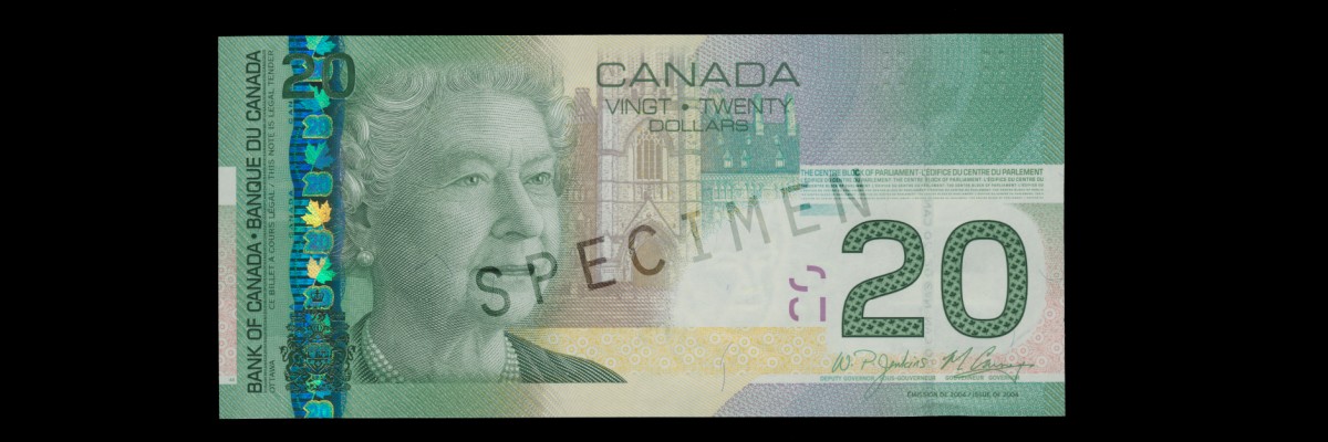
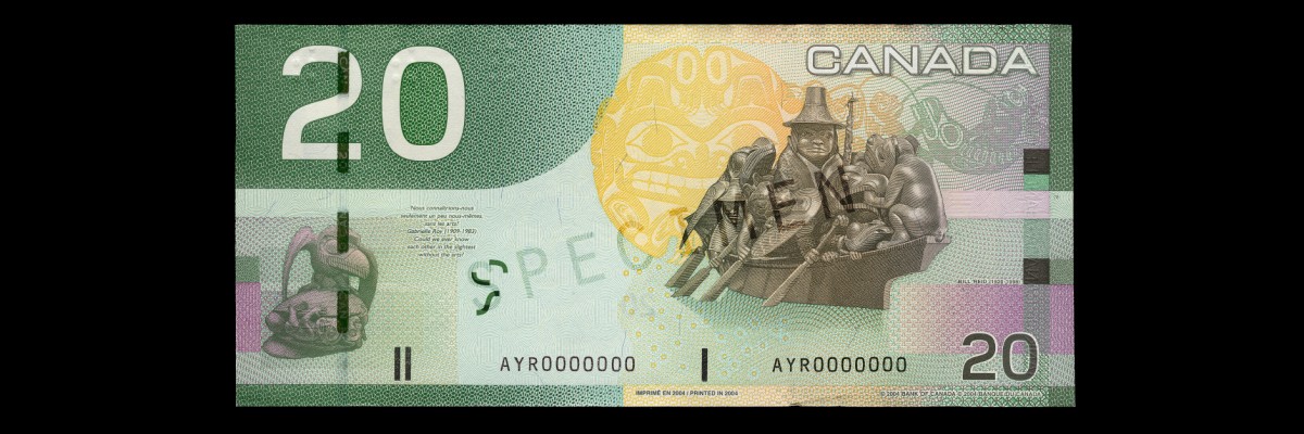
| $20 | Green | Elizabeth II | Artwork of Bill Reid and an excerpt from Gabrielle Roy's novel The Hidden Mountain | 29 September 2004 | 7 November 2012 |
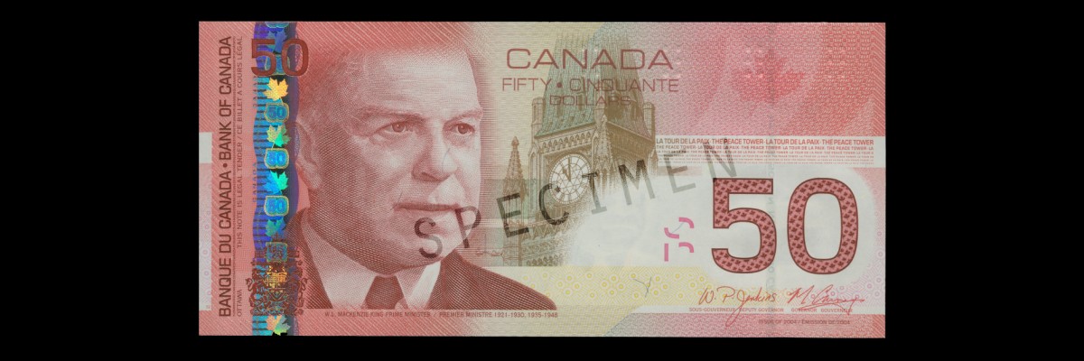
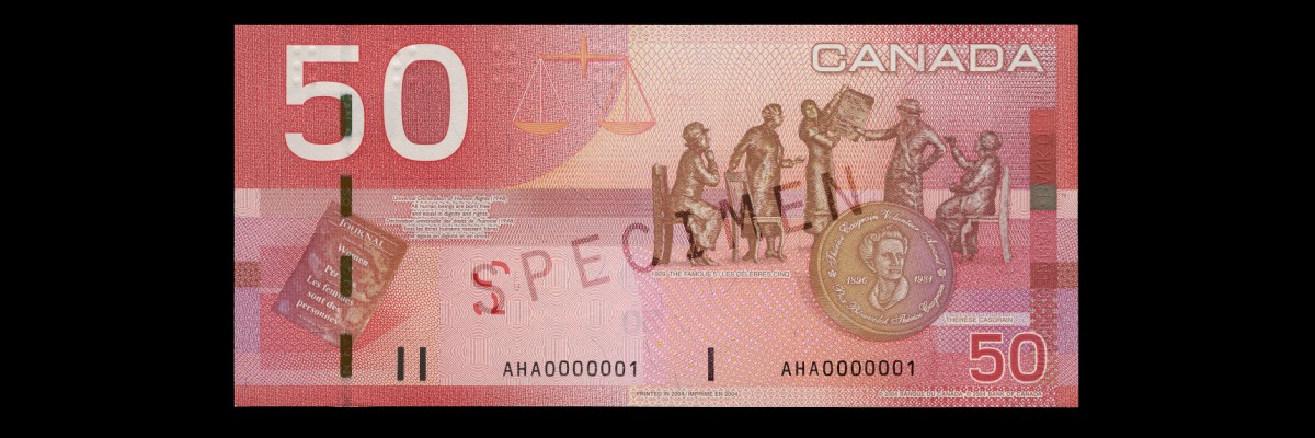
| $50 | Red | William Lyon Mackenzie King | The Famous Five and Thérèse Casgrain; quotation from the Universal Declaration of Human Rights | 17 November 2004 | 26 March 2012 |
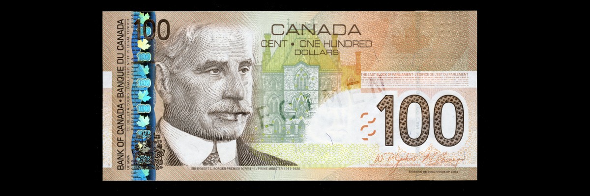
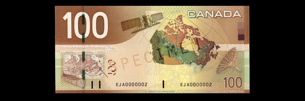
| $100 | Brown | Robert Borden | Maps of Canada and an excerpt from Miriam Waddington's poem, "Jacques Cartier in Toronto" | 17 March 2004 | 14 November 2011 |
$5 note
[edit]The theme chosen for the $5 banknote was "children at play".[4] The banknote was the second issued in the series and was first circulated in March 2002.[7] An updated version of the $5 denomination banknote, incorporating the security features introduced in the higher-denomination banknotes of this series, was issued in November 2006.[26]
The obverse has a portrait of Wilfrid Laurier, the engraving for which was created by Czesław Słania.[7] The building depicted at the centre is a vignette of the West Block of Parliament Hill.[7]
The reverse features a depiction of the banknote's theme, with images of children tobogganing, skating, and playing hockey on a frozen pond.[7] Below a white snowflake near the middle of the banknote is an excerpt from "The Hockey Sweater" by Roch Carrier.[20] It and the $10 bill were the last of the Canadian Journey banknotes to be printed, with printing ceasing in November 2013.
$10 note
[edit]The theme chosen for the $10 banknote was "remembrance and peacekeeping".[4] The banknote was the first issued in the series and was first circulated on 17 January 2001.[27][28] An updated version of the $10 denomination banknote, incorporating the security features introduced in the higher-denomination banknotes of this series, was issued in May 2005.[26]
The obverse has a portrait of John A. Macdonald, the engraving for which was created by Peral.[29] The vignette at the centre is the Library of Parliament building.[28]
The reverse features a depiction of the chosen theme. Standing in front of a large cenotaph in the background are a female Royal Canadian Navy officer and a male Canadian Army master corporal, and in the foreground are two children with Canadian Armed Forces veteran Robert Metcalfe observing Remembrance Day.[28][30] In the centre is a female Royal Canadian Air Force officer depicted in peacekeeping duties[28] wearing a combat uniform and blue beret. Adjacent to the officer are white doves in flight and the phrase "In the service of peace".[31] In the lower left corner are red poppies superimposed on a maple leaf, beside which is an excerpt from "In Flanders Fields",[28] a war poem in the form of a rondeau written by John McCrae during World War I that is now a Remembrance Day icon.[32] Underneath it is an equivalent excerpt from "Au champ d'honneur", the French translation of the poem written by Jean Pariseau.[28] The text of the poem was obtained from a manuscript hand-written by McCrae stored at Library and Archives Canada.[27] Red poppies became a symbol of remembrance for war dead because of McCrae's poem.[27] It and the $5 bill were the last of the Canadian Journey banknotes to be printed, with printing ceasing in November 2013.
$20 note
[edit]The theme chosen for the $20 banknote was "arts and culture".[4] The banknote was first circulated in September 2004.[33]
The portrait's engraving on the obverse was created by Peral based on a photograph of Elizabeth II taken by Charles Green in 2000.[34] The photograph was taken specifically for rendering an image on this banknote, which appears next to a vignette of the Centre Block of Parliament Hill.[33]
The reverse depicts the chosen theme using illustrations of artwork created by Bill Reid, an artist of maternal Haida heritage from which he draws creative inspiration.[33] To the far left is an illustration of The Raven and the First Men, a laminated yellow cedar sculpture housed at the Museum of Anthropology at the University of British Columbia, adjacent to which is an excerpt from the 1961 book La Montagne secrète by Gabrielle Roy and its English translation by Harry Binsse.[35][33] To the right is a prominent illustration of the sculpture Spirit of Haida Gwaii, with a yellow-toned background depicting the ceremonial drum sculpture Haida Grizzly Bear.[35] In the upper right-hand corner is an illustration depicting the sculpture Mythic Messengers, an 8.5 metres (28 ft) bronze frieze now installed at the Bill Reid Gallery of Northwest Coast Art.[36]
$50 note
[edit]The theme chosen for the $50 banknote was "nation building".[4] The banknote was first circulated in November 2004 and was the last of the Canadian Journey banknotes to be introduced.[33]
The obverse portrait is of William Lyon Mackenzie King created using a computer-assisted engraving process by Giesecke & Devrient.[33] The central vignette depicts the Peace Tower on Parliament Hill.[33]
The reverse features an illustration of the statue of the women known as The Famous Five fronted by an illustration of the Thérèse Casgrain Volunteer Award medallion honouring Thérèse Casgrain.[33] The text excerpt included on the left-hand side is a quotation from the Universal Declaration of Human Rights, the first draft of which was composed by Canadian human rights advocate John Peters Humphrey.[33]
$100 note
[edit]The theme chosen for the $100 banknote was "exploration and innovation".[4] Its design involved input from seven separate sources, among them Natural Resources Canada, the Canadian Space Agency, the National Archives of Canada, and the Canadian Canoe Museum.[9] The banknote was first circulated on 17 March 2004.[37]
On the obverse is a portrait of Robert Borden, based on a watercolour by Peral, engraved by Czesław Słania.[38] The vignette at the centre is of the East Block of Parliament Hill.[38]
On the reverse is a depiction of the chosen theme featuring Canadian achievements in cartography and communications.[38] In the lower left-hand corner is an illustration of a birch bark canoe and a 1632 map of New France by Samuel de Champlain, above which is a quotation from the poem Jaques Cartier in Toronto by Miriam Waddington and a French translation by Christine Klein-Letaud.[38] To the right is a satellite image of Canada, with an illustration of Radarsat-1 to its left and a communications antenna to its right.[38]
Printings
[edit]Canadian Journey Series banknotes differ based on the date they were printed. Other than the change to the $5 and $10 banknotes to update their security features, the most notable change is the combination of signatures of the Governor of the Bank of Canada and the Deputy Governor occurring on the banknotes, which were updated with every change to the executive of the Bank of Canada. The following signature combination banknotes were released:[8]
| Governor | Deputy governor | Years of printing | Denominations |
|---|---|---|---|
| Gordon Thiessen | Malcolm Knight | 2001 | $10 (2001) |
| David Dodge | Malcolm Knight | 2001–2003 | $5 (2002), $10 (2001) |
| David Dodge | Paul Jenkins | 2003–2008 | $5 (2002, 2006), $10 (2001, 2005), $20, $50, $100 |
| Mark Carney | Paul Jenkins | 2008–2010 | $5 (2006), $10 (2005), $20, $50, $100 |
| Mark Carney | Tiff Macklem | 2010–2013 | $5 (2006), $10 (2005), $20, $50, $100 |
Canadian Banknotes were printed by two different security printers until 2011: the Canadian Banknote Company and BA International Inc. The serial number prefix indicates which printer was responsible for printing the particular banknote.
Counterfeiting
[edit]The first two banknotes issued in the series introduced three security features new to Canadian banknotes.[14] These were the hidden number to the left of the portrait, the iridescent maple leaves, and the fluorescent features (embedded fibre and images over left side of the portrait).[14] These features did not deter counterfeiting.[14]
In 2003, high-quality counterfeits of the $10 banknote appeared in circulation in Ontario and Quebec.[39] In May 2006, Peel Regional Police in the Greater Toronto Area seized $50,000 worth of $20 and $50 counterfeit banknotes and received assistance from the Integrated Counterfeit Enforcement Teams division of the Royal Canadian Mounted Police to search for the production plant, which had created counterfeit banknotes with a total face value over $1,000,000.[40] In the spring of 2008, a batch of counterfeit $100 appeared in the Greater Toronto Area.[41] Reaching a peak distribution there in May, similar forgeries were later found in the Montreal area, with its peak distribution in June.[41]
In 2004, Canada had a counterfeit ratio of 470 parts per million, which decreased to 133 parts per million by 2007.[42] The banknotes in the series with the holographic metallic stripe were counterfeited by "well-organized, well-financed groups" having the resources and time to replicate the security features.[43] The $5 and $10 denominations released earlier, lacking the metallic stripe and other security features, were a common target of counterfeiters.[44] One of the largest counterfeit operations in Canada was discovered in Toronto, which by the time of its dismantling in 2006 had released counterfeit $10, $20, $50 and $100 banknotes with a face value over $9 million.[45] The operation was also beginning production of counterfeit United States Federal Reserve Notes and traded in fraudulent payment cards and identity documents.[45]
During the peak counterfeiting period in 2004, the counterfeit ratio for $10 banknotes was 1,292 parts per million, and the ratio for the $20 banknotes was 601 parts per million.[11] All banknotes in this series are now considered unfit for circulation due to their lacking any modern security features, such as a metallic stripe.[46] Financial institutions must return the banknotes to the Bank of Canada, which will destroy them.[46] Individuals may keep the banknotes indefinitely.[47]
Reception
[edit]The series was launched in January 2001 when the Bank of Canada issued the $10 banknote at a launch event in Ottawa.[48] It also made public presentations to familiarize Canadians with the new banknotes and security features.[48] The Currency Museum developed a travelling exhibition titled The Colour of Your Money that was launched on the same day.[48]
Collecting
[edit]When the $10 banknote was first issued, the Bank of Canada also announced a numismatics set for notaphilists titled Lasting Impressions.[48] This set contained two uncirculated $10 banknotes, one from this series and the other from the Birds of Canada series, with matching serial numbers.[48] In 2002, a similar set with the same title was issued for the $5 banknote.[49] Both were released in an embossed folder also containing an information booklet with the history of the respective denomination and the features of each banknote.[48][49][50]
Legacy
[edit]In The Art and Design of Canadian Bank Notes, the Bank of Canada refers to the Canadian Journey Series as "the most distinctly Canadian series of notes ever produced by the Bank".[3] It was also the first Canadian banknote series to be printed on paper sourced from a non-domestic supplier, as no Canadian company could produce the requested substrate at the time.[15]
The $20 banknote was awarded the 2004 Bank Note of the Year by the International Bank Note Society, the inaugural year for the award.[51] Amongst the qualities cited for the award were "probably the finest portrait of the mature monarch to appear on any bank note" and "well-balanced design, strong images, and advanced security features".[51]
The accessibility features were "very well received within the blind and visually impaired community" of over 100,000 Canadians.[23] A study was conducted in 2007 to assess the impact of the accessibility features in preparation for development of the next series of banknotes, the Frontier Series.[25] It found that the tactile feature was most useful to those with complete or functional blindness, but it was less useful for older individuals (with decreased tactile sensitivity) and the feature could not be detected on some banknotes owing to physical wear from use.[25] Some individuals would mitigate this problem by requesting only new banknotes during financial transactions.[52] Numeral size and the more vivid colours on the banknotes was a more useful feature for individuals with partial vision.[25] The overall impact on quality of life for visually impaired individuals was moderate.[52] The only regression in accessibility compared to the Birds of Canada series was that the Canadian Journey Series banknotes could only be read from one end in the banknote reader, whereas both ends could be read in the Birds of Canada Series.[52] The Bank of Canada's cost for distributing banknote readers to visually impaired Canadians is about $150,000 per year.[25]
With the development and release of this series, the Bank of Canada also implemented a continuous research and development program representing a "more proactive approach" toward counterfeiting and also integrated a monitoring program to assess "confidence levels and awareness" of banknote security features.[13]
When released, the $10 banknote drew complaints from Canadians who thought the excerpt from "In Flanders Field" was incorrectly quoted.[27] It was based on a common misconception about the poem.[27]
Some Canadians have modified the $5 banknotes by drawing over the portrait of Wilfrid Laurier to make it appear as the character Spock (as portrayed by Leonard Nimoy) from the fictional universe of Star Trek, or as the character Severus Snape (as portrayed by Alan Rickman) from the Harry Potter film series.[53]
Notes
[edit]- ^ a b c Samuel 2009, p. 31.
- ^ a b c d Moxley, Meubus & Brown 2007, p. 48.
- ^ a b c d The Art and Design of Canadian Bank Notes 2006, p. 97.
- ^ a b c d e f g h i j k The Art and Design of Canadian Bank Notes 2006, p. 98.
- ^ a b The Art and Design of Canadian Bank Notes 2006, p. 100.
- ^ The Art and Design of Canadian Bank Notes 2006, p. 97-98.
- ^ a b c d e The Art and Design of Canadian Bank Notes 2006, p. 108.
- ^ a b c Bank of Canada 2010.
- ^ a b The Art and Design of Canadian Bank Notes 2006, p. 99.
- ^ Toronto Star 2000.
- ^ a b Moxley, Meubus & Brown 2007, p. 52.
- ^ Moxley, Meubus & Brown 2007, p. 53.
- ^ a b Moxley, Meubus & Brown 2007, p. 54.
- ^ a b c d e f g h i Moxley, Meubus & Brown 2007, p. 50.
- ^ a b c d e f g h i j k The Art and Design of Canadian Bank Notes 2006, p. 101.
- ^ a b Brown 2011, p. 1.
- ^ The Art and Design of Canadian Bank Notes 2006, p. 107.
- ^ Wise up to counterfeiting 2012, p. 11.
- ^ Bank of Canada 2002, p. 32.
- ^ a b Small 2002.
- ^ a b Royal Canadian Mounted Police 2007, Appendix: Security Features of the Canadian Journey (stripe) Series of Bank Notes.
- ^ a b c d e Mackie 2005.
- ^ a b c d e f g Moxley, Meubus & Brown 2007, p. 51.
- ^ a b c d e f g h Samuel 2009, p. 32.
- ^ a b c d e f Samuel 2009, p. 33.
- ^ a b The Art and Design of Canadian Bank Notes 2006, p. 102.
- ^ a b c d e Los Angeles Times 2001.
- ^ a b c d e f The Art and Design of Canadian Bank Notes 2006, p. 109.
- ^ The Art and Design of Canadian Bank Notes 2006, p. 103.
- ^ "Robert Metcalfe: You Have Seen His Picture". Royal Aviation Museum of Western Canada. Retrieved May 25, 2015.
- ^ Detraz 2013, p. 67.
- ^ Holmes 2005, p. 11.
- ^ a b c d e f g h i The Art and Design of Canadian Bank Notes 2006, p. 110.
- ^ The Art and Design of Canadian Bank Notes 2006, p. 106.
- ^ a b Toronto Star 2004b.
- ^ Bill Reid Foundation.
- ^ Toronto Star 2004.
- ^ a b c d e The Art and Design of Canadian Bank Notes 2006, p. 111.
- ^ Royal Canadian Mounted Police 2007.
- ^ Black 2007.
- ^ a b Toronto Star 2009.
- ^ Royal Canadian Mounted Police 2007, Introduction.
- ^ Royal Canadian Mounted Police 2007, Technology and Methodology.
- ^ Royal Canadian Mounted Police 2007, Historical Perspective.
- ^ a b Royal Canadian Mounted Police 2007, Ontario.
- ^ a b "Unfit Bank Notes" (PDF). bankofcanada.ca. Bank of Canada. October 2012. Retrieved January 15, 2020.
- ^ CBC News 2000.
- ^ a b c d e f Bank of Canada 2002, p. 31.
- ^ a b Graham 2004, p. 294.
- ^ Graham 2004, p. 296.
- ^ a b International Bank Note Society 2004.
- ^ a b c Samuel 2009, p. 34.
- ^ The Huffington Post Canada 2013.
References
[edit]- Black, Debra (15 May 2007). "RCMP teams tackle 'business' of forgery". Toronto Star. p. A16. Retrieved 20 September 2014.
- Brown, Maura, ed. (20 June 2011). "Paying with Polymer: Developing Canada's New Bank Notes" (PDF). Bank of Canada Review (Supplement). Bank of Canada. Retrieved 7 March 2014.
- Detraz, Nicole (2013). International Security and Gender. Dimensions of Security. John Wiley & Sons. ISBN 9780745676173.
- Mackie, Brent W.J. (March 2005). "Eurion Constellations". Canadian Paper Money Society Newsletter. Canadian Paper Money Society. Retrieved 20 September 2014.
- Graham, R. J., ed. (2004). Canadian Government Paper Money 17th Edition. A Charlton Standard Catalogue (17th ed.). Charlton Press. ISBN 0889682909.
- Holmes, Nancy (2005). ""In Flanders Fields" — Canada's Official Poem: Breaking Faith". Studies in Canadian Literature. 30 (1). University of New Brunswick: 11–33. ISSN 1718-7850.
- Moxley, Jill; Meubus, Helen; Brown, Maura (Autumn 2007). "The Canadian Journey: An Odyssey into the Complex World of Bank Note Production" (PDF). Bank of Canada Review. Bank of Canada.
- Samuel, Carolyn (Winter 2009–2010). "Making Bank Notes Accessible for Canadians Living with Blindness or Low Vision" (PDF). Bank of Canada Review. Bank of Canada.
- Small, Peter (28 March 2002). "Idyllic winter scenes grace updated $5 bill; Awareness campaign aimed at counterfeiters". Toronto Star. p. A7. Retrieved 20 September 2014.
- "Annual report 2001" (PDF). Bank of Canada. 28 February 2002. ISSN 0067-3587. Retrieved 20 September 2014.
- "Canadian Journey". Bank of Canada. 11 August 2010. Retrieved 23 September 2014.
- The Art and Design of Canadian Bank Notes (PDF). Bank of Canada. 6 December 2006. ISBN 0660632462.
- "Wise up to counterfeiting: A guide for police officers" (PDF). Bank of Canada. 2012. Retrieved 1 March 2014.
- "Bill Reid's art graces the $20 banknote". Bill Reid Foundation. Retrieved 20 September 2014.
- "Spock And Snape Canadian $5 bills are sadly doomed". The Huffington Post Canada. 26 August 2013.
- "Banknote of 2004". International Bank Note Society. 2004. Retrieved 21 June 2013.
- "Flanders poppies blow up furor in Canada". Los Angeles Times. Associated Press. 11 February 2001.
- "Counterfeit Currency in Canada — December 2007". Project Sandstone. Royal Canadian Mounted Police. December 2007. Archived from the original on 1 March 2014. Retrieved 1 March 2014.
- "New bills' high tech features will aid blind, foil criminals; Birds on back 'are history,' says bank official". Toronto Star. 27 September 2000. Retrieved 18 September 2014.
- "Bill worth a gander". Toronto Star. 26 January 2004. p. A16. Retrieved 20 September 2014.
- "New $20 bill is work of art; Bill Reid's sculptures depicted Notes include new security features". Toronto Star. 27 August 2004b. p. A14. Retrieved 20 September 2014.
- "Funny money in big supply: Bank". Toronto Star. 4 January 2009. p. A4. Retrieved 20 September 2014.
- "Bank of Canada kills $1000 bill". CBC News. 26 September 2000. Retrieved 2 March 2014.
External links
[edit].svg)


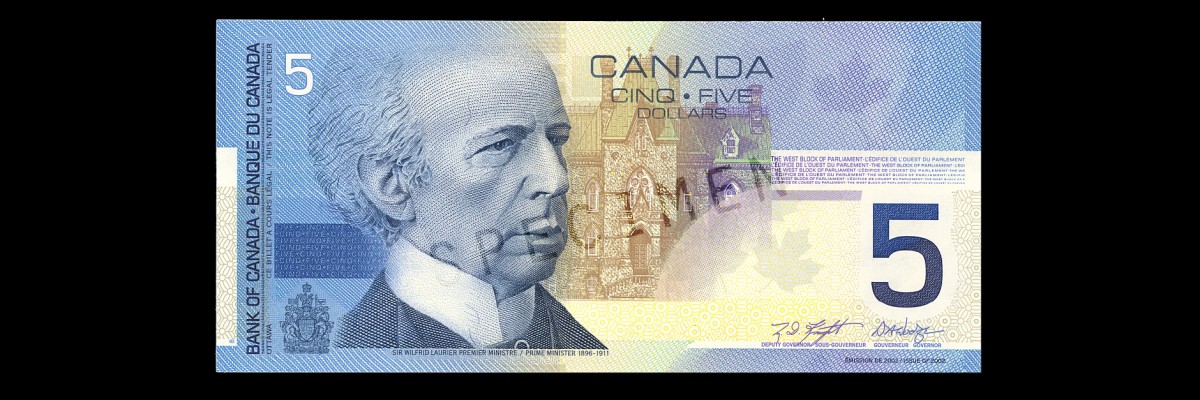
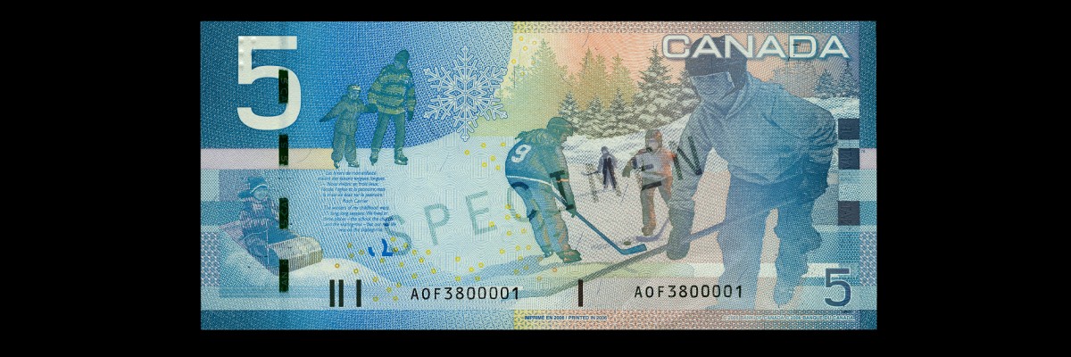
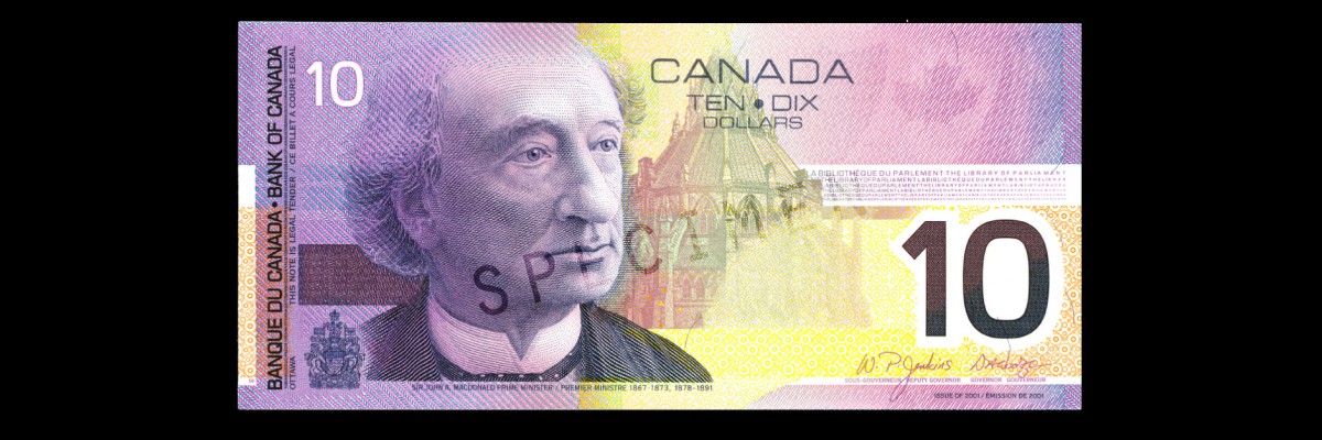
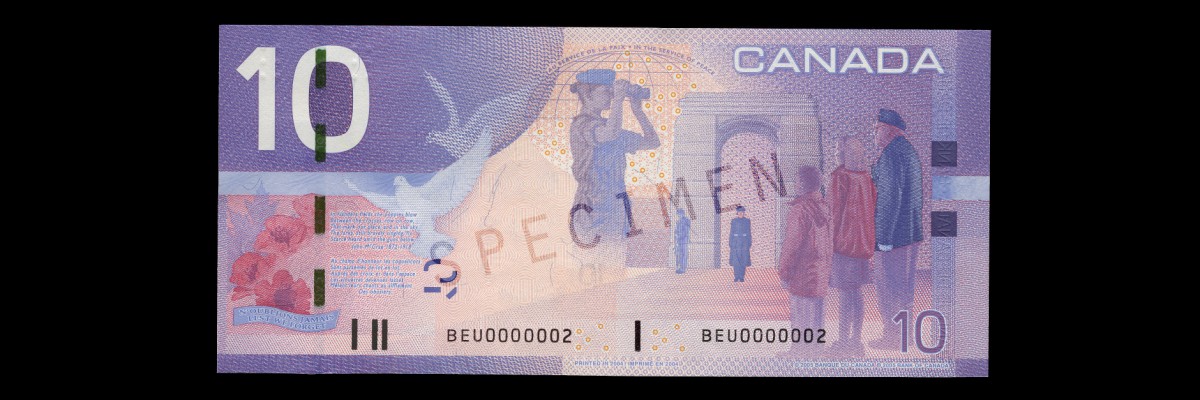
- Canadian Journey at the Bank of Canada
- 2001–2004 Series, Canadian Journey of Bank of Canada archive at Collections Canada
Canadian Journey
View on GrokipediaDevelopment and Issuance
Origins and Public Consultation
The Bank of Canada began developing the Canadian Journey series in the late 1990s amid rising counterfeiting risks posed by accessible digital technologies, including desktop scanners, printers, and image-editing software, which threatened the integrity of existing banknotes.[2] This initiative followed the Birds of Canada series (1986–1996) and aimed to integrate advanced security measures—such as transparent windows, metallic strips, and raised ink—with thematic content highlighting Canada's cultural, historical, and innovative achievements.[1] Unlike prior series, the designs were created entirely using computer software under art director Jorge Peral, enabling precise front-to-back alignment and intricate engravings for portraits.[2] In a departure from tradition, the Bank of Canada launched public consultations in 1997 to solicit input on national symbols and themes, seeking to reflect what Canadians viewed as representative of their identity and shared heritage.[4] Over 4,000 participants from diverse backgrounds contributed through focus groups and telephone surveys, suggesting motifs tied to values like innovation, security, and social progress—examples included scenes of scientific breakthroughs, peacekeeping efforts, and cultural landmarks.[5] These responses directly shaped the reverse-side vignettes, such as the $10 note's depiction of a youth memorializing wartime sacrifices and the $20 note's portrayal of arts and culture, ensuring the series resonated with public sentiment on Canada's evolving narrative.[2] The consultation process also explored innovative formats, including vertical orientations inspired by international trends, but ultimately prioritized horizontal designs for familiarity and usability after gauging public preferences.[4] This inclusive approach marked a milestone in central banknote design, prioritizing empirical feedback from citizens over solely institutional decisions, though the Bank's final selections balanced thematic input with technical and security imperatives.[2]Timeline of Releases and Production
The development of the Canadian Journey series began in the late 1990s, marking the first instance of public consultation in the Bank of Canada's banknote design process, with focus groups providing input on thematic elements representing Canadian history, culture, and achievements.[2] The formal design work, led by art director Jorge Peral at the Canadian Bank Note Company, was conducted entirely using digital tools, making it the first fully computer-generated series.[2] Production incorporated advanced engraving techniques, with portraits hand-engraved by specialists such as Czeslaw Slania for the $100 note and contributions from Giesecke & Devrient for the $50 note using computer-assisted methods.[2] The series rollout commenced with lower denominations featuring initial security features like raised ink, UV elements, and hidden numbers, followed by higher denominations and subsequent upgrades to standardize advanced features including metallic stripes, ghost images, and puzzle numbers across all notes.[1]| Denomination | Release Date | Notes |
|---|---|---|
| $10 (original) | 17 January 2001 | First note issued; purple predominant color.[1] |
| $5 (original) | 27 March 2002 | Second note; blue predominant color.[1] [6] |
| $100 | 17 March 2004 | Introduced with enhanced security; red predominant color.[1] |
| $20 | 29 September 2004 | Green predominant color.[1] |
| $50 | 17 November 2004 | Brown predominant color.[1] |
| $10 (upgraded) | 18 May 2005 | Added metallic stripe and other features for consistency.[1] |
| $5 (upgraded) | 15 November 2006 | Final issuance; aligned with higher denomination security suite.[1] |
Design and Thematic Elements
Innovative Design Process
The design process for the Canadian Journey series, initiated in the late 1990s, represented a significant evolution in Bank of Canada banknote production by fully embracing digital tools for the first time, enabling intricate and precise artwork that integrated thematic narratives with emerging security elements. Unlike prior series reliant on manual drafting and engraving, the entire visual composition—from portraits to background vignettes—was created using computer software, which facilitated rapid iterations and higher fidelity in reproducing Canadian cultural motifs, such as excerpts from national literature by authors like Gabrielle Roy and Roch Carrier.[2] [1] A key innovation was the incorporation of public consultation to guide theme selection, marking the inaugural instance where Canadian citizens directly influenced the substantive content of circulating currency. Focus groups and surveys solicited input on motifs symbolizing national values, aspirations, and accomplishments, resulting in reverse-side designs evoking a "journey" through history and culture: children's play for the $5 note, peacekeeping for the $10, arts for the $20, nation-building infrastructure for the $50, and scientific exploration for the $100. This participatory approach aimed to foster public ownership, with final approvals by the Minister of Finance ensuring alignment with broader policy objectives.[2] [1] Artistic collaboration further distinguished the process, involving specialized engravers and designers who adapted renowned works—such as Bill Reid's Spirit of Haida Gwaii sculpture for the $20 note—into intaglio printing suitable for currency, while maintaining fidelity to original proportions and textures through digital modeling. The accelerated timeline, compressing a typical six-year cycle into approximately three years to meet issuance targets starting with the $10 note on January 17, 2001, necessitated streamlined prototyping and testing phases, balancing aesthetic innovation with practical production constraints at the Canadian Bank Note Company.[1] [5]Cultural and Historical Motifs
The polymer banknotes of the Frontiers series, issued by the Bank of Canada from 2011 to 2013, incorporate cultural and historical motifs that highlight Canada's scientific innovations, exploratory heritage, military sacrifices, and northern identity, often symbolizing national resilience and global contributions. Recurring elements, such as the maple leaf—a longstanding emblem of Canadian unity and natural heritage—appear across denominations in transparent windows, reinforcing cultural symbolism derived from the country's flora and collective identity. These designs draw from verifiable historical events and achievements, prioritizing depictions of tangible accomplishments over abstract ideals, with motifs selected through consultations emphasizing empirical milestones rather than subjective narratives.[3][7] On the $5 note, motifs center on space exploration, featuring the Canadarm2 robotic arm (launched November 2001 aboard the Space Shuttle Endeavour) and the Dextre maintenance robot (deployed March 2008), alongside an astronaut figure representing Canada's 14 astronauts and contributions to the International Space Station since 1992, including over 2,500 hours of extravehicular activity by Canadian personnel. This imagery evokes themes of technological prowess and international collaboration, grounded in the Canadian Space Agency's documented role in advancing robotics for orbital research. The reverse also includes children at play with hockey sticks and skates in a snowy landscape, nodding to winter sports as a cultural staple, with 7 million Canadians participating annually in organized hockey as of recent surveys.[7] The $10 and $100 notes emphasize medical and scientific breakthroughs, with the $10 reverse depicting a virologist handling a vial and pipette to symbolize diagnostic advancements and public health safeguards, integrated with security motifs like a DNA helix in the window, reflecting Canada's expertise in virology amid historical responses to outbreaks such as the 2003 SARS epidemic, which spurred enhanced lab protocols. The $100 note extends this to landmark discoveries, including the insulin molecule (isolated in 1921 by Frederick Banting and Charles Best, enabling diabetes treatment for millions worldwide), an electrocardiogram tracing, and a researcher with genetic sequencing imagery, commemorating John Hopps' 1950 invention of the external pacemaker, which has saved countless lives through cardiac rhythm management. These elements underscore causal links between Canadian research—funded through institutions like the Medical Research Council since 1969—and global health impacts, avoiding unsubstantiated claims of universal primacy.[7][8] Historical remembrance and territorial motifs appear on the $20 and $50 notes. The $20 reverse showcases the Canadian National Vimy Memorial, erected in 1936 to honor the 1917 Battle of Vimy Ridge, where 100,000 Canadian troops captured the ridge after prior Allied failures, incurring 3,598 deaths and 7,004 injuries in four days, marking a pivotal assertion of national autonomy post-Confederation. Carved figures allegorize virtues like truth and justice amid 11,285 inscribed names, with poppies evoking annual Remembrance Day observances rooted in World War I losses. The $50 note portrays the CCGS Amundsen icebreaker (commissioned 2003 for Arctic research), overlaid on a map of northern waterways with Inuktitut syllabics spelling "north," highlighting Canada's 1.4 million square kilometers of Arctic territory and ongoing scientific missions documenting climate data since the 1940s, while affirming cultural ties to Inuit communities through linguistic inclusion.[9][10]Security Features
Substrate and Material Composition
The Canadian Journey series banknotes utilize a traditional cotton paper substrate, composed primarily of cotton fibres to provide durability, opacity, and compatibility with security printing techniques. This material contrasts with the biaxially oriented polypropylene polymer adopted in the subsequent Frontier series starting in 2011.[11] The cotton paper enables features such as watermarks, security threads, and raised intaglio printing, while offering a crisp tactile quality that aids in public verification.[1] Initial issuances of the $5 and $10 denominations in 2001–2002 employed 100% cotton paper, which exhibited accelerated wear in circulation due to insufficient tensile strength. Subsequent printings from 2003 onward, including upgrades to higher denominations like the $20, $50, and $100 introduced in 2004, incorporated a blended composition of approximately 75% cotton and 25% kraft fibres (derived from wood pulp) to enhance resistance to folding and environmental degradation.[12] This adjustment improved the notes' average lifespan in handling, estimated at 1–2 years for lower denominations before significant soiling or damage necessitated replacement.[11] The paper's manufacture involves rag cotton sourced from textile waste, pulped and formed into sheets with precise grammage (around 110–120 g/m²) to support multiple layers of inks, including optically variable and metallic varieties, without compromising structural integrity. No synthetic additives or polymer laminates were used in the standard production, preserving the notes' responsiveness to moisture-based counterfeit detection methods like the "feel-look-tilt" protocol promoted by the Bank of Canada.[1]Integrated Security Technologies
The Canadian Journey series introduced several integrated security technologies aimed at deterring counterfeiting through optically variable and machine-readable elements embedded during production. Central to these was the metallic holographic stripe on $20, $50, and $100 notes issued from 2004, featuring diffractive optically variable image (DOVID) technology that shifts between multicolored maple leaves and denomination numerals when tilted under light, making replication difficult without specialized equipment.[1][5] This feature was later extended to upgraded $5 and $10 notes in 2005–2006, replacing earlier iridescent maple leaf patches that shifted from matte to shiny gold.[1] Additional integrated elements included a windowed security thread woven into the paper substrate on higher denominations, visible as a continuous line when held to light and exhibiting color-shifting properties from gold to green upon tilting, with microprinted denomination indicators like "CAN 20" for machine verification.[5][13] Complementary features encompassed ghost portraits—faint, translucent images of the primary portrait visible from both sides under transmitted light—and puzzle numbers formed by irregular translucent dashes that align into solid lines or complete numerals when backlit, both leveraging the paper's opacity properties for authentication.[1][14] Ultraviolet-reactive components were embedded throughout, with polymeric fibers and coatings fluorescing in red, yellow, or blue under UV light to reveal denomination-specific patterns, such as glowing "BANK OF CANADA – BANQUE DU CANADA" text or coat-of-arms elements, providing a covert check resistant to scanning reproduction.[1][13] Microprinting and fine-line intaglio patterns, printed at resolutions below standard reproduction capabilities, integrated anti-copying grids and text along portrait borders and borders, while raised ink on key areas like numerals and inscriptions added tactile verification.[15][14] These technologies collectively reduced counterfeiting rates compared to prior series, with the Bank of Canada reporting enhanced public verification ease post-issuance.[1]Accessibility and Usability
The Canadian Journey series introduced a tactile feature to aid identification by individuals who are blind or have low vision, marking the first such innovation in Canadian banknotes. This consists of raised symbols composed of six dots arranged in two columns of three, positioned along the left edge of the reverse side when the note is held with the portrait facing forward. The number and arrangement of these symbols vary by denomination to enable differentiation through touch: the $5 note features one symbol, the $10 two symbols, the $20 three, the $50 four, and the $100 two symbols separated by a wider smooth space than on the $10 to distinguish it.[16][17] These tactile marks were developed through consultations with over 300 Canadians affected by blindness or low vision, including organizations like the Canadian National Institute for the Blind (CNIB) and the Canadian Council of the Blind (CCB), as well as experts in vision and tactility. Testing involved evaluating 48 prototype designs, with selections refined based on feedback from blind users emphasizing quick detectability and durability. While effective for new notes—allowing rapid denomination recognition and orientation—the feature's raised elements can wear over time, remaining detectable on approximately 66% of circulated notes according to a 2007 University of Waterloo study of 64 participants.[17] Additional accessibility elements include raised intaglio printing on the primary portrait and large numerals (approximately 20 mm in height), providing further tactile cues, alongside bold, high-contrast numerals and distinct colors per denomination—blue for $5, purple for $10, green for $20, red for $50, and brown for $100—to assist those with partial sight.[16][17] For broader usability, the series maintains uniform note dimensions of 152.4 mm by 69.85 mm across denominations, facilitating compatibility with automated tellers and vending machines, while the clear, large-scale imagery and consistent layout reduce errors in manual sorting and verification. User studies indicated moderate improvements in transaction efficiency for visually impaired individuals, though reliance on cash handling persisted due to limitations in digital alternatives at the time of issuance (2001–2006).[17]Denominations and Specific Features
$5 Note
The $5 banknote in the Canadian Journey series, denominated in Canadian dollars and printed on paper substrate, was first issued on March 27, 2002, as the lowest denomination in the series.[18] It measures 152 mm in height by 70 mm in width and features a predominant blue color scheme.[19] The obverse displays a portrait of Sir Wilfrid Laurier, Canada's seventh prime minister who served from 1896 to 1911, engraved by Polish artist Czeslaw Slania; accompanying it is a vignette of the West Block of the Parliament Buildings in Ottawa.[19] A stylized maple leaf flag appears in the top right corner, consistent across the series.[19] The reverse centers on the theme "Children at Play," illustrating Canadian youth engaged in winter activities including skating, tobogganing, and playing hockey, evoking cultural motifs of national recreation and childhood.[18] [19] It incorporates a quotation from Roch Carrier's short story The Hockey Sweater (French: L'Hockey Sweater), which reads in English: "The puck moved like a frightened little bird from player to player," highlighting literary ties to Canadian identity.[19] An enhanced version was released in November 2006, aligning its security features with those of higher denominations in the series, such as advanced transparent windows and metallic imagery, while retaining the core design elements.[19] [1] The note was produced by the British American Bank Note Company on 75% cotton and 25% kraft fibre paper.[12]$10 Note
The $10 banknote in the Canadian Journey series was initially issued by the Bank of Canada on January 17, 2001, featuring a portrait of Sir John A. Macdonald, Canada's first prime minister, on the obverse.[20] An upgraded version incorporating advanced security elements from higher-denomination notes in the series was released on May 18, 2005.[21] The note measures 152.4 mm by 69.85 mm and employs a purple-dominant color palette to distinguish it within the series.[21] The obverse centers on an engraved portrait of Macdonald by designer Jorge Peral, accompanied by a vignette of the Library of Parliament in Ottawa, symbolizing Canada's parliamentary traditions and Macdonald's role in confederation.[20] The reverse emphasizes the series' theme of remembrance and peacekeeping, illustrating a male veteran standing with a boy and girl before a cenotaph on Remembrance Day, alongside depictions of a master corporal, a naval officer, and a female Royal Canadian Air Force officer in a peacekeeping operation.[20] These elements highlight Canada's post-World War II contributions to international peacekeeping and domestic commemoration of military sacrifices, with excerpts from the war poems "In Flanders Fields" by John McCrae and "Au champ d'honneur" by Jean Paré incorporated into the design.[20] Unique to the denomination, the $10 note's thematic focus underscores national values of sacrifice and global responsibility, aligning with the series' broader narrative of Canadian achievements, though the upgraded 2005 edition added a metallic holographic stripe and other anti-counterfeiting measures previously limited to $20, $50, and $100 notes.[3] Circulation of the note continued until the transition to polymer substrates in subsequent series, with printing ceasing around 2013 as demand shifted.$20 Note
The $20 banknote in the Canadian Journey series, issued in September 2004, is printed primarily in violet hues and measures 152 mm by 70 mm, consistent with other denominations in the series.[22] The obverse prominently displays a portrait of Queen Elizabeth II, derived from a photograph taken in 2000 by Charles Green exclusively for this purpose, positioned to the right with the numeral "20" repeated in a maple leaf pattern to the left.[22] This denomination emphasizes themes of Canadian arts and culture, selected through public consultations conducted by the Bank of Canada in the late 1990s, reflecting national values of creativity and heritage.[1] The reverse illustrates four sculptures by Haida artist Bill Reid, including the iconic Spirit of Haida Gwaii: The Jade Canoe and Chief of the Undersea World, symbolizing Indigenous artistic traditions and broader cultural narratives.[22] Additional elements include a quotation from Gabrielle Roy's The Road Past Altamont—"He was entirely self-taught"—honoring self-reliance in artistic pursuit, alongside optical variable ink rendering a maple leaf that shifts from gold to green when tilted.[1] These motifs highlight Canada's multicultural artistic legacy, with Reid's works evoking Pacific Northwest Indigenous mythology and craftsmanship dating to pre-colonial eras.[2] Unique to this note among the series, the design integrates subtle holographic effects in the metallic security stripe, displaying "Canada" and maple leaves under varying light angles, enhancing tamper detection while complementing the cultural theme.[1] Print runs featured signatures such as those of Deputy Governor W.P. Jenkins and Governor D.A. Dodge in early issuances, with updates to reflect gubernatorial changes through 2006.[22] The note received the 2004 Canadian Bank Note Company Award for Best Banknote Design in the Americas for its innovative fusion of security and thematic depth.[5]$50 Note
The $50 note of the Canadian Journey series was issued into circulation on November 17, 2004, as the final denomination in the series to be released. Predominantly red in colour, it measures 152.4 mm by 69.85 mm and features a portrait of William Lyon Mackenzie King, Canada's tenth prime minister who held office from 1921 to 1930 and from 1935 to 1948, on the obverse.[1][23] The portrait, engraved by Giesecke & Devrient in Germany, marked the first use of a computer-assisted process in Canadian banknote production.[23] The obverse also includes an illustration of the Peace Tower, one of the Gothic Revival structures on Parliament Hill in Ottawa.[23] The reverse side embodies the theme of nation building, highlighting contributions to Canada's political, legal, and social frameworks for democracy and equality. Central elements include the statue of the Famous Five—Emily Murphy, Nellie McClung, Irene Parlby, Henrietta Muir Edwards, and Louise McKinney—depicted on Parliament Hill's Olympic Plaza in Calgary, commemorating their 1929 legal victory affirming women's eligibility for Senate appointment.[1] Another motif is the medallion from the Thérèse Casgrain Volunteer Award, recognizing Casgrain's advocacy for women's suffrage and social justice reforms in Quebec.[1] The note incorporates a quotation from the Universal Declaration of Human Rights, authored by Canadian diplomat John Peters Humphrey of New Brunswick.[1] This denomination's design aligns with the series' emphasis on tactile accessibility and thematic storytelling, though specific motifs underscore women's roles in shaping national institutions.[1] Circulation continued alongside earlier series notes until the transition to polymer substrates in subsequent years.[1]$100 Note
The $100 banknote of the Canadian Journey series was issued by the Bank of Canada on March 17, 2004, as the final denomination in the series.[24] The obverse prominently displays an engraved portrait of Sir Robert Borden, who served as Prime Minister from 1911 to 1920, rendered by engraver Czeslaw Slania from a watercolour by designer Jorge Peral.[25] To the right of the portrait is a vignette illustrating icebergs in the North Atlantic Ocean, evoking the perilous maritime conditions during the First World War when Borden led Canada, including the deployment of merchant ships and naval convoys.[26] The note's dominant blue color scheme aligns with traditional coloring for the denomination. The reverse emphasizes themes of exploration and innovation, showcasing Canadian milestones in cartography and communications. Central elements include a reproduction of Samuel de Champlain's 1632 map, marking the first precise depiction of North America's eastern coastline, and a historical photograph of Guglielmo Marconi's 1901 transatlantic wireless signal reception in Signal Hill, Newfoundland, which advanced global radio technology with Canadian involvement.[26][27] These vignettes reflect the series' overarching narrative of Canada's historical journey. Unique to the Canadian Journey series, the $100 note incorporates four advanced security features to deter counterfeiting: a metallic holographic stripe along the left edge that iridesces and alternates between "100" and maple leaves under tilt; a watermarked portrait of Borden visible when held to light; a windowed, color-shifting security thread woven into the paper; and a see-through numeral "100" that registers precisely from obverse to reverse.[24] Additionally, raised ink tactile markings—dots along the portrait's toothed frame—enable denomination identification by touch for visually impaired users, a first for Canadian currency.[1] Supplementary elements include fine-line intaglio printing and microtext, enhancing resistance to reproduction. The note remained in circulation until gradually withdrawn following the introduction of the polymer $100 in the Frontiers series on November 14, 2011.[28]Production Runs and Circulation
[Production Runs and Circulation - no content]Counterfeiting Challenges and Mitigation
Incidence Rates and Case Studies
The introduction of the Canadian Journey series in 2001 coincided with a decline in Canada's counterfeiting rates, which had previously ranked among the highest in the G7 countries during the late 1990s and early 2000s.[29] In 2004, the incidence rate stood at approximately 454 counterfeit notes per million genuine notes in circulation, reflecting ongoing challenges with replicating the series' advanced features such as metallic imagery and transparent windows.[30] By the mid-2000s, enhanced public awareness and security training contributed to further reductions, with rates dropping below 200 per million by 2007 according to contemporaneous analyses.[31] Overall, the series reduced counterfeiting volume compared to prior paper issues, though high-denomination notes like the $100 remained primary targets due to their value.[32] A notable case occurred in 2008, when counterfeiters exploited vulnerabilities in the Journey $100 note, passing an estimated 63,700 fakes valued at $6.3 million, predominantly in Toronto and Montreal.[29] These forgeries, often produced using inkjet printers to mimic the metallic stripe, eroded retailer confidence, prompting 7% of Toronto businesses and 8% of Montreal businesses to refuse $50 and $100 notes altogether.[29] The Royal Canadian Mounted Police investigated organized rings, leading to arrests and seizures, but the incident underscored the limitations of paper-based features against evolving digital reproduction techniques.[33] In response, the Bank of Canada intensified verification campaigns targeting these urban hotspots.[29] More recently, legacy Journey notes have surfaced in isolated counterfeiting attempts. In March 2025, Ottawa police issued warnings about high-quality fake $100 Journey bills circulating among retailers, mimicking transparent elements but failing tactile tests; this followed a 73% national decline in passed counterfeits from 2014 to 2023, attributing persistence to lingering circulation of older notes.[34] Such cases, though rare, highlight how counterfeiters target discontinued series for their familiarity, with detection relying on features like raised ink absent in replicas.[34]Comparative Effectiveness
The polymer substrate and integrated security features of the Canadian Journey series, such as transparent windows and raised ink, have demonstrated superior resistance to counterfeiting compared to the preceding paper-based notes. Prior to the 2011 introduction of polymer notes, counterfeiting rates peaked at approximately 470 incidents per million genuine notes in 2004, driven by advancements in digital printing that exploited vulnerabilities in older designs.[35] By 2012, following the rollout of the $100 polymer note, detected counterfeits had declined 92% from the 2004 peak, with annual volumes dropping to around 45,000 notes amid increasing circulation.[36] Post-transition to full polymer circulation by 2013, rates stabilized at low levels, averaging 6-8 counterfeits per million genuine notes in recent years, compared to 36 per million in 2014 shortly after widespread adoption.[37][29] This represents a sustained reduction attributable to the difficulty in replicating polymer's tactile and optical properties, with counterfeits shifting toward lower-denomination notes like the $20 and $100, which comprise the majority of incidents.[38] From 2014 to 2024, passed counterfeits decreased 64% in volume, from 62,418 to 22,478 notes, though seizures by law enforcement rose to 46,988 in 2024, indicating proactive mitigation but potential emerging threats.[29][38] In comparison to international peers retaining paper notes, Canada's polymer approach yields among the lowest global rates, outperforming the United States where counterfeiting persists at higher levels due to analogous vulnerabilities in cotton-linen substrates.[37] Detection efficacy studies confirm that polymer features enhance public verification, with tactile and visual checks yielding higher accuracy than with legacy paper notes.[39] Overall, the series' design has curtailed economic losses, estimated at $1.2 million in passed counterfeits in 2024 versus higher pre-polymer figures, though complete eradication remains elusive amid evolving criminal techniques.[29]Public Reception and Critical Analysis
Awards and Design Recognition
The $20 banknote of the Canadian Journey series, issued on May 17, 2004, and themed around arts and culture with depictions of Bill Reid's sculptures including Spirit of Haida Gwaii, received the International Bank Note Society's (IBNS) Bank Note of the Year award for 2004, recognizing its exceptional design integration of security features and thematic elements.[40][41] This accolade highlighted the note's innovative use of raised metallic images for a tactile feature, the first of its kind on Canadian currency to assist the visually impaired, alongside advanced security such as holograms and transparent windows.[1] The series as a whole earned praise for its "world-class designs" that departed from prior iterations by prioritizing distinctly Canadian motifs—such as medical innovation on the $20 reverse and peacekeeping on the $50—developed through an unprecedented public consultation process involving over 4,000 Canadians, including schoolchildren, to reflect national values and history.[1][5] Security enhancements, including metallic portraits and complex printing techniques, were noted for elevating counterfeit resistance while maintaining aesthetic appeal, though no additional formal awards beyond the IBNS recognition for the $20 note were documented for other denominations.[3]Criticisms and Limitations
The tactile features introduced in the Canadian Journey series, consisting of raised dots in the top right corner to aid denomination by touch, were found to degrade with circulation, becoming detectable on only about two-thirds of worn $1,000 notes due to physical wear and soiling.[17] Users with visual impairments reported reduced reliability of these features after modest handling, particularly for those with diminished tactile sensitivity from conditions like diabetes.[17] Compared to the preceding Birds of Canada series, the Journey notes' automated banknote readers were less versatile, requiring insertion from the portrait end only, which complicated use with soiled or damaged bills.[17] Early printings of the $5 and $10 notes utilized 100% cotton paper, which exhibited poorer durability in circulation than the standard cotton-linen blend used for higher denominations, prompting a formulation change in 2003 to improve longevity.[42] Despite enhanced security elements, the series remained vulnerable to counterfeiting, with over 50% of detected fakes in some periods being Journey $10 notes, reflecting limitations in deterring sophisticated reproductions relative to later polymer designs.[43] These factors contributed to the series' eventual phase-out in favor of the polymer-based Frontier series starting in 2011, as persistent wear and replication challenges necessitated further innovation.[1]Numismatic Interest and Legacy
Collecting Trends
The Canadian Journey series banknotes, issued between 2001 and 2011, have garnered interest among numismatists primarily for their incorporation of advanced security features like raised ink and holographic strips, which represent a transitional phase in Canadian currency design before the shift to polymer. Collectors focus on uncirculated or crisp uncirculated grades, where premiums over face value range from 10% to 50% depending on denomination and condition, driven by the series' relative scarcity compared to earlier issues due to shorter circulation lifespans.[44][5] Replacement notes, distinguished by a star suffix after the serial number and printed in lower quantities to substitute defective regular issues, form a key collecting subset; for the $50 and $100 denominations, these often command 2-5 times face value in superior condition, though complete prefix attribution remains challenging owing to incomplete Bank of Canada records.[12][45] Error varieties, including misaligned printing, cut shifts, and ink anomalies arising from the series' complex production, occasionally emerge from circulation and attract premiums exceeding 10 times face value at auction, as evidenced by documented sales of unique $50 note defects.[46]- Low or repeating serial numbers: Notes with sequences like 00000001 or radar patterns (e.g., 12321) for $100 issues fetch additional premiums of $50-$200 beyond grade-based values.
- Signature combinations: Limited variations, such as those under Governor David Dodge, appeal to type collectors seeking completeness.