
Ternary plot
View on WikipediaThis article needs additional citations for verification. (January 2014) |

A ternary plot, ternary graph, triangle plot, simplex plot, or Gibbs triangle is a barycentric plot on three variables which sum to a constant.[1] It graphically depicts the ratios of the three variables as positions in an equilateral triangle. It is used in physical chemistry, petrology, mineralogy, metallurgy, and other physical sciences to show the compositions of systems composed of three species. Ternary plots are tools for analyzing compositional data in the three-dimensional case.
In population genetics, a triangle plot of genotype frequencies is called a de Finetti diagram. In game theory[2] and convex optimization,[3] it is often called a simplex plot.
In a ternary plot, the values of the three variables a, b, and c must sum to some constant, K. Usually, this constant is represented as 1.0 or 100%. Because a + b + c = K for all substances being graphed, any one variable is not independent of the others, so only two variables must be known to find a sample's point on the graph: for instance, c must be equal to K − a − b. Because the three numerical values cannot vary independently—there are only two degrees of freedom—it is possible to graph the combinations of all three variables in only two dimensions.
The advantage of using a ternary plot for depicting chemical compositions is that three variables can be conveniently plotted in a two-dimensional graph. Ternary plots can also be used to create phase diagrams by outlining the composition regions on the plot where different phases exist.
The values of a point on a ternary plot correspond (up to a constant) to its trilinear coordinates or barycentric coordinates.
Reading values on a ternary plot
[edit]There are three equivalent methods that can be used to determine the values of a point on the plot:
- Parallel line or grid method. The first method is to use a diagram grid consisting of lines parallel to the triangle edges. A parallel to a side of the triangle is the locus of points constant in the component situated in the vertex opposed to the side. Each component is 100% in a corner of the triangle and 0% at the edge opposite it, decreasing linearly with increasing distance (perpendicular to the opposite edge) from this corner. By drawing parallel lines at regular intervals between the zero line and the corner, fine divisions can be established for easy estimation.
- Perpendicular line or altitude method. For diagrams that do not possess grid lines, the easiest way to determine the values is to determine the shortest (i.e. perpendicular) distances from the point of interest to each of the three sides. By Viviani's theorem, the distances (or the ratios of the distances to the triangle height) give the value of each component.
- Corner line or intersection method. The third method does not require the drawing of perpendicular or parallel lines. Straight lines are drawn from each corner, through the point of interest, to the opposite side of the triangle. The lengths of these lines, as well as the lengths of the segments between the point and the corresponding sides, are measured individually. The ratio of the measured lines then gives the component value as a fraction of 100%.
A displacement along a parallel line (grid line) preserves the sum of two values, while motion along a perpendicular line increases (or decreases) the two values an equal amount, each half of the decrease (increase) of the third value. Motion along a line through a corner preserves the ratio of the other two values.
-
 Figure 1. Altitude method
 -
 Figure 2. Intersection method
 -
 Figure 3. An example ternary diagram, without any points plotted.
 -
 Figure 4. An example ternary diagram, showing increments along the first axis.
 -
 Figure 5. An example ternary diagram, showing increments along the second axis.
 -
 Figure 6. An example ternary diagram, showing increments along the third axis.
 -
 Figure 7. Empty ternary plot
 -
 Figure 8. Indication of how the three axes work.
 -
 Unlabeled triangle plot with major grid lines
 -
 Unlabeled triangle plot with major and minor grid lines


Derivation from Cartesian coordinates
[edit]
Derivation of a ternary plot from Cartesian coordinates

Figure (1) shows an oblique projection of point P(a,b,c) in a 3-dimensional Cartesian space with axes a, b and c, respectively.
If a + b + c = K (a positive constant), P is restricted to a plane containing A(K,0,0), B(0,K,0) and C(0,0,K). If a, b and c each cannot be negative, P is restricted to the triangle bounded by A, B and C, as in (2).
In (3), the axes are rotated to give an isometric view. The triangle, viewed face-on, appears equilateral.
In (4), the distances of P from lines BC, AC and AB are denoted by a′, b′ and c′, respectively.
For any line l = s + t n̂ in vector form (n̂ is a unit vector) and a point p, the perpendicular distance from p to l is

In this case, point P is at

Line BC has

Using the perpendicular distance formula,
![{\displaystyle {\begin{aligned}a'&=\left\|{\begin{pmatrix}-a\\K-b\\-c\end{pmatrix}}-\left({\begin{pmatrix}-a\\K-b\\-c\end{pmatrix}}\cdot {\begin{pmatrix}0\\{\frac {1}{\sqrt {2}}}\\-{\frac {1}{\sqrt {2}}}\end{pmatrix}}\right){\begin{pmatrix}0\\{\frac {1}{\sqrt {2}}}\\-{\frac {1}{\sqrt {2}}}\end{pmatrix}}\right\|\\[10px]&=\left\|{\begin{pmatrix}-a\\K-b\\-c\end{pmatrix}}-\left(0+{\frac {K-b}{\sqrt {2}}}+{\frac {c}{\sqrt {2}}}\right){\begin{pmatrix}0\\{\frac {1}{\sqrt {2}}}\\-{\frac {1}{\sqrt {2}}}\end{pmatrix}}\right\|\\[10px]&=\left\|{\begin{pmatrix}-a\\K-b-{\frac {K-b+c}{2}}\\-c+{\frac {K-b+c}{2}}\end{pmatrix}}\right\|=\left\|{\begin{pmatrix}-a\\{\frac {K-b-c}{2}}\\{\frac {K-b-c}{2}}\end{pmatrix}}\right\|\\[10px]&={\sqrt {{(-a)}^{2}+{\left({\frac {K-b-c}{2}}\right)}^{2}+{\left({\frac {K-b-c}{2}}\right)}^{2}}}={\sqrt {a^{2}+{\frac {{(K-b-c)}^{2}}{2}}}}\,.\end{aligned}}}](https://wikimedia.org/api/rest_v1/media/math/render/svg/9115aaf085386eb71c532bed7cf53cdc72b5307c)
Substituting K = a + b + c,

Similar calculation on lines AC and AB gives

This shows that the distance of the point from the respective lines is linearly proportional to the original values a, b and c.[4]
Plotting a ternary plot
[edit]

Cartesian coordinates are useful for plotting points in the triangle. Consider an equilateral ternary plot where a = 100% is placed at (x,y) = (0,0) and b = 100% at (1,0). Then c = 100% is and the triple (a,b,c) is


Example
[edit]
This example shows how this works for a hypothetical set of three soil samples:
Sample Clay Silt Sand Notes Sample 1 50% 20% 30% Because clay and silt together make up 70% of this sample, the proportion of sand must be 30% for the components to sum to 100%. Sample 2 10% 60% 30% The proportion of sand is 30% as in Sample 1, but as the proportion of silt rises by 40%, the proportion of clay decreases correspondingly. Sample 3 10% 30% 60% This sample has the same proportion of clay as Sample 2, but the proportions of silt and sand are swapped; the plot is reflected about its vertical axis.
Plotting the points
[edit]-
 Plotting Sample 1 (step 1):
Find the 50% clay line -
 Plotting Sample 1 (step 2):
Find the 20% silt line -
 Plotting Sample 1 (step 3):
Being dependent on the first two, the intersect is on the 30% sand line -
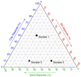 Plotting all the samples
 -
 Ternary triangle plot of soil types sand clay and silt programmed with Mathematica


List of notable ternary diagrams
[edit]- Chromaticity diagram
- de Finetti diagram
- Dalitz plot
- Flammability diagram
- Jensen cation plot
- Piper diagram, used in hydrochemistry
- UIGS Classification diagram for Ultramafic rock
- USDA Soil texture diagram by particle sizes
See also
[edit]- Apparent molar property
- Viviani's theorem
- Barycentric coordinates (mathematics)
- Compositional data
- List of information graphics software
- Earth sciences graphics software
- IGOR Pro
- Origin (data analysis software)
- R has a dedicated package ternary maintained on the Comprehensive R Archive Network (CRAN)
- Sigmaplot
- Project triangle
- Trilemma
References
[edit]- ^ Weisstein, Eric W. "Ternary Diagram". mathworld.wolfram.com. Retrieved 2021-06-05.
- ^ Karl Tuyls, "An evolutionary game-theoretic analysis of poker strategies", Entertainment Computing January 2009 doi:10.1016/j.entcom.2009.09.002, p. 9
- ^ Boyd, S. and Vandenberghe, L., 2004. Convex optimization. Cambridge university press.
- ^ Vaughan, Will (September 5, 2010). "Ternary plots". Archived from the original on December 20, 2010. Retrieved September 7, 2010.
External links
[edit]- "Excel Template for Ternary Diagrams". serc.carleton.edu. Science Education Resource Center (SERC) Carleton College. Retrieved 14 May 2020.
- "Tri-plot: Ternary diagram plotting software". www.lboro.ac.uk. Loughborough University – Department of Geography / Resources Gateway home > Tri-plot. Retrieved 14 May 2020.
- "Ternary Plot Generator – Quickly create ternary diagrams on line". www.ternaryplot.com. Retrieved 14 May 2020.
- Holland, Steven (2016). "Data Analysis in the Geosciences – Ternary Diagrams developed in the R language". strata.uga.edu. University of Georgia. Retrieved 14 May 2020.
Ternary plot
View on GrokipediaFundamentals
Definition and Purpose
A ternary plot, also known as a ternary diagram or de Finetti diagram, is a barycentric coordinate system that visualizes the proportions of three variables, typically denoted as A, B, and C, where A + B + C equals a constant value such as 1 or 100%.[1] This representation is particularly suited for compositional data in mixtures, ensuring that the variables are non-negative and their ratios sum to unity, thereby avoiding the need for negative values in traditional Cartesian plotting.[5] The primary purpose of a ternary plot is to facilitate the analysis of relative abundances in three-component systems, enabling researchers to identify phases, detect trends, and delineate boundaries within constrained datasets.[2] In fields such as chemistry and materials science, it is used to map phase equilibria in alloys or ternary mixtures, while in geology and earth sciences, it helps classify rock compositions, soil types, or sediment proportions based on mineral or chemical end-members.[6] For instance, atmospheric gas mixtures can be plotted to assess proportional changes in components like nitrogen, oxygen, and trace gases.[7] Key advantages of ternary plots include their compact depiction of data subject to a constant sum constraint, which simplifies the visualization of complex interdependencies that would otherwise require higher-dimensional projections.[1] They also support the overlay of contours and isolines to represent additional gradients, such as temperature or pressure, enhancing interpretive depth without expanding the graphical space.[6] The basic structure consists of three axes, each corresponding to one variable and intersecting at 120-degree angles to form an equilateral triangle, with vertices labeled for A, B, and C; points within the plot represent weighted averages of these components based on their distances from the axes.[2]Historical Development
The ternary plot originated in the 18th century within studies of color mixing and photometry. Isaac Newton laid foundational concepts in his 1704 work Opticks, where he described triangular arrangements to represent combinations of primary colors, establishing the barycentric coordinate system implicit in such diagrams.[8] This approach was advanced by Johann Heinrich Lambert in 1770, who employed triangular representations in his Mémoire sur la partie photométrique to quantify light intensities from multiple sources, marking an early formal use of the geometry for compositional analysis.[8] By the mid-19th century, the diagram transitioned to scientific applications beyond optics. James Clerk Maxwell's 1857 paper in the Transactions of the Royal Society of Edinburgh utilized ternary triangles to model color perception through additive mixing of red, green, and blue primaries, influencing later graphical methods in physical sciences.[8] In thermodynamics, J. Willard Gibbs applied the plot in 1873 to depict phase equilibria in ternary systems, as detailed in his Graphical Methods in the Thermodynamics of Fluids, providing a visual tool for representing compositional stability in multi-component mixtures.[8] This thermodynamic framework was extended by H.W.B. Roozeboom in 1893, whose Zeitschrift für physikalische Chemie articles introduced ternary phase diagrams for chemical systems, standardizing their use in analyzing solubility and reactions.[8] The adoption of ternary plots in geology and petrology accelerated in the early 20th century, driven by needs in mineral and rock composition analysis. G.A. Rankin pioneered their geological application in 1915, using a ternary diagram for the CaO-Al₂O₃-SiO₂ system in his American Journal of Science study, which illustrated melting relations and phase boundaries relevant to silicate minerals.[8] Norman L. Bowen further propelled their development in the 1920s through experimental petrology, notably in his 1928 book The Evolution of the Igneous Rocks, where ternary diagrams depicted crystallization paths in systems like diopside-anorthite-forsterite, elucidating magma differentiation processes. These contributions solidified ternary plots as essential for interpreting igneous and metamorphic compositions, influencing classifications in earth sciences. In the latter half of the 20th century, ternary plots evolved with computational advancements, enabling dynamic and interactive representations. During the 1970s, early digital tools emerged alongside phase diagram modeling software, facilitating automated plotting in geochemical research. By the 1980s, programs like TRIGPLOT (1984) allowed interactive ternary diagram generation on basic computers, enhancing accessibility for petrological data analysis.[9] Post-1980s standardization extended their utility to environmental science, where ternary plots became routine for visualizing pollutant mixtures and ecosystem compositions, such as in soil contamination assessments.[10] The shift to digital implementations in the 21st century supported interactive and multidimensional extensions, maintaining the diagram's centrality across disciplines.Construction
Derivation from Cartesian Coordinates
Ternary plots rely on barycentric coordinates to represent the proportions of three components, denoted as , , and , which satisfy the constant sum constraint where . These coordinates express the position of a point as a convex combination of the three vertices of the triangle, weighted by these proportions. This system allows for the visualization of compositional data in a two-dimensional plane while preserving the relative relationships among the components.[11][1] To map these barycentric coordinates to Cartesian coordinates, the vertices of the ternary triangle are assigned specific positions in the plane, typically forming an equilateral triangle for symmetry. Standard vertex placements are: vertex A (corresponding to 100% ) at , vertex B (100% ) at , and vertex C (100% ) at . The Cartesian position of a point with barycentric coordinates is then given by the weighted average:Plotting Techniques
Manual plotting of ternary diagrams begins with constructing an equilateral triangle using a ruler and protractor to ensure 120-degree angles at each vertex.[2] Each vertex represents 100% of one component, while the opposite side is labeled 0%; percentages decrease linearly along each side from the vertex to the base.[2] To plot a data point, normalize the three component values to sum to 100%, then draw lines parallel to the base from the appropriate percentage marks on each axis; the intersection marks the position.[2] Adding grids involves drawing iso-composition lines, typically in 10% or 20% increments, parallel to each side to form a network of constant-proportion contours across the triangle. These lines facilitate interpolation and visualization of composition gradients; for example, lines at 10% intervals create a fine mesh for precise point placement. Overlaying data points uses standard marking techniques, while shaded regions for fields (e.g., phase boundaries) are filled between iso-lines using hatching or color gradients to denote compositional zones. Digital methods streamline construction through specialized software. In Python, the mpltern library extends Matplotlib to handle ternary projections; a basic scatter plot is created by specifying normalized coordinates in a ternary projection.[12] Brief pseudocode for point placement is:import matplotlib.pyplot as plt
import mpltern
fig = plt.figure()
ax = fig.add_subplot(projection="ternary")
ax.scatter([0.3, 0.5], [0.4, 0.3], [0.3, 0.2]) # Ternary coordinates (a, b, c)
plt.show()
ggtern(data, aes(x, y, z)) + geom_point().[14] For Excel, add-ins like XLSTAT enable direct ternary plotting from normalized data tables, automating coordinate conversion and grid addition.[15]
Variations include the right-triangle format, which folds the equilateral triangle into a right-angled coordinate system with orthogonal X and Y axes, preserving proportions but using half the space for compactness in publications.[16] Log scales are handled via isometric log-ratio transformations to address compositional data constraints, enabling analysis of ratios rather than absolute values.[14] For non-constant sums, data is normalized by dividing each component by the total of the three, ensuring the plot represents relative proportions summing to 100%.[2]