Menu bar
Menu bar
Main page
1971780

Menu bar

logo
Community Hub0 subscribers
Read side by side
from Wikipedia
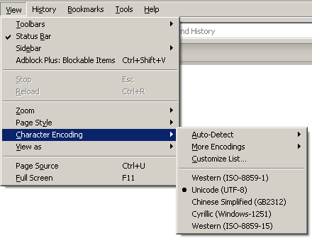
Menu bar of Mozilla Firefox, showing a submenu, in the Tahoma 8pt font

A menu bar is a graphical control element which contains drop-down menus.

The menu bar's purpose is to supply a common housing for window- or application-specific menus which provide access to such functions as opening files, interacting with an application, or displaying help documentation or manuals. Menu bars are typically present in graphical user interfaces that display documents and representations of files in windows and windowing systems but menus can be used as well in command-line interface programs like text editors or file managers where drop-down menu is activated with a shortcut or combination key.

Implementations

[edit]

Through the evolution of user interfaces, the menu bar has been implemented in different ways by different user interfaces and application programs.

Macintosh

[edit]
Menu bar from macOS Big Sur (v11.7)
Menu bar from macOS High Sierra (v10.13.6)
Menu bar from Mac OS X Leopard (v10.5)
Menu bar from Mac OS 9.0.4

In the Macintosh operating systems, the menu bar is a horizontal "bar" anchored to the top of the screen. In macOS, the left side contains the Apple menu, the Application menu (its name will match the name of the current application) and the currently focused application's menus (e.g. File, Edit, View, Window, Help). On the right side, it contains menu extras (for example the system clock, volume control, and the Fast user switching menu (if enabled) and the Spotlight icon. All of these menu extras can be moved horizontally by command-clicking and dragging left or right. If an icon is dragged and dropped vertically it will disappear with a puff of smoke, much like the icons in the dock. In the Classic Mac OS (versions 7 through 9), the right side contains the application menu, allowing the user to switch between open applications. In Mac OS 8.5 and later, the menu can be dragged downwards, which would cause it to be represented on screen as a floating palette.

There is only one menu bar, so the application menus displayed are those of the application that is currently focused. Therefore, for example, if the System Preferences application is focused, its menus are in the menu bar, and if the user clicks on the Desktop which is a part of the Finder application, the menu bar will then display the Finder menus.

Apple experiments in GUI design for the Lisa project initially used multiple menu bars anchored to the bottom of windows, but this was quickly dropped in favor of the current arrangement,[1] as it proved slower to use (in accordance with Fitts's law). The idea of separate menus in each window or document was later implemented in Windows and is the default approach in most Linux desktop environments.

Even before the advent of the Macintosh, the universal graphical menu bar appeared in the Apple Lisa in 1983. It has been a feature of all versions of the Classic Mac OS since the first Macintosh was released in 1984, and is still used today in macOS.

Windows

[edit]

The menu bar in Windows is usually anchored to the top of a window under the title bar; therefore, there can be many menu bars on screen at one time. Menus in the menu bar can be accessed through shortcuts involving the Alt key and the mnemonic letter that appears underlined in the menu title. Additionally, pressing Alt or F10 brings the focus on the first menu of the menu bar.

Linux and UNIX

[edit]
Screenshot of KDE 3.5 showing multiple menu bars
Screenshot of KDE 3.5 configured with a single menu bar

KDE and GNOME[2] allow users to turn Macintosh-style and Windows-style menu bars on and off. KDE can have both types in use at the same time.

The standard GNOME desktop uses a menu bar at the top of the screen, but this menu bar only contains Applications and System menus and status information (such as the time of day); individual programs have their own menu bars as well. The Unity desktop shell shipped with Ubuntu Linux from version 11.04 through 17.04 uses a Macintosh-style menu bar; however, it is hidden unless the mouse pointer hovers over it, similar to the Amiga interface. Starting with 17.10, it defaults to the GNOME desktop environment, using its menu bar.[3]

Other window managers and desktop environments use a similar scheme, where programs have their own menus, but clicking one or more of the mouse buttons on the root window brings up a menu containing, for example, commands to launch various applications or to log out.

Window manager menus in Linux are typically configurable by editing text files or using a desktop-environment-specific Control Panel applet.

Amiga

[edit]
The menu bar of AmigaOS 3.1 in its default state, showing the screen title. Shown here is the Workbench screen, which displays system information in its title.
The menu bar of AmigaOS 3.1 in its opened state. Holding the right mouse button down opens the menus in the menu bar, and releasing the button over a menu item selects that item. Each application can have its own separate menus.

The Amiga used a menu-bar style similar to that of the Macintosh, with the exception that the machine's custom graphics chips allowed each program to have its own "screen", with its own resolution and colour settings, which could be dragged down to reveal the screens of other programs. The title/menu bar would typically sit at the top of the screen, and could be accessed by pressing the right mouse button, revealing the names of the various menus. When the right menu button was not pressed down, the menu/title bar would typically display the name of the program which owned the screen, and some other information such as the amount of memory used. When accessing menus with right mouse buttons pressed, one could select multiple menu entries by clicking the left mouse button, and when right mouse button was released, all actions selected in the menus would be performed in the order they were selected. This was known as multiselect.

The Workbench screen title bar would typically display the Workbench version and the amount of free Chip RAM and Fast RAM.[4] An unusual feature of the Amiga menu system was that the Workbench screen would display a "Workbench" menu instead of a "File" or "Apple" menu, while conforming applications would display "Project" and "Tools" menus (projects and tools being, respectively, the Amiga terms for what in other systems are called files or documents, and programs or applications).

Keyboard shortcuts could be accessed by pressing the "right Amiga" key along with a normal alphanumeric key.[5] (Some early keyboards had a Commodore key to the left of the spacebar instead of a "left-Amiga" key.) The filled-in and hollowed-out designs, respectively, of the left- and right-Amiga (or Commodore and Amiga) keys are similar to the closed-Apple and open-Apple keys of later Apple II keyboards.

NeXTstep

[edit]

The NeXTstep OS for the NeXT machines would display a "menu palette", by default at the top left of the screen. Clicking on the entries in the menu list would display submenus of the commands in the menu. The contents of the menu change depending on whether the user is "in" the Workspace Manager or an application. The menus and the sub-menus can easily be torn off and moved around the screen as individual palette windows.

Power users would often switch off the always-on menu, leaving it to be displayed at the mouse pointer's location when the right mouse button was pressed. The same implementation is used by GNUstep and conforming apps, though applications written for the host operating system or another toolkit will use the menu scheme appropriate to that OS or toolkit.

Atari TOS

[edit]

The TOS operating system for the Atari ST would display menu bars at the top of the screen like Mac OS. Rather than being 'pulled-down' by holding the mouse button, the menu would appear as soon as the pointer was over its heading. This was done to get around an Apple patent on pull-down menus.

RISC OS

[edit]

In RISC OS, clicking the middle button displays a menu list at the location of the mouse pointer. The RISC OS implementation of menus is similar to the context menus of other systems, except that menus will not close if the right mouse button is used to select a menu entry. This allows the user to implement or try out several settings before closing the menu.

Ease-of-use

[edit]

In both Windows and Macintosh operating systems, in other similar desktop environments and in some applications, common functions are assigned keyboard shortcuts (e.g. Control-C or Command-C copies the current selection).

Microsoft-style bars are physically located in the same window as the content they are associated with. However, Bruce Tognazzini, former employee of Apple Inc. and Human–computer interaction professional, claims[6] that the Mac OS's menu bars can be accessed up to five times faster due to Fitts's law: because the menu bar lies on a screen edge, it effectively has an infinite height — Mac users can just "throw" their mouse pointers toward the top of the screen with the assurance that it will never overshoot the menu bar and disappear.

This assumes that the desired menu is currently enabled, however. If another application has "focus", the menu will belong to that application instead, requiring the user to check and see which menu is active before "throwing" the mouse, and often perform an extra step of focusing the desired application before using the menu, which is completely separate from the application it controls. The effectiveness of this technique is also reduced on larger screens or with low mouse acceleration curves, especially due to the time required to travel back to a target in the window after using the menu.[7] On systems with multiple displays, the menu bar may either be displayed on a single "main" display, or on all connected displays. The classic Mac OS, and versions of macOS prior to OS X Mavericks displayed only a single menu bar on the main display; Mavericks added the option to show the bar on all displays.

Some applications, e.g. Microsoft Office 2007, Internet Explorer 7 (by default), and Google Chrome and Mozilla Firefox 4 in Windows and Linux, have effectively removed the menu bar altogether by hiding it until a key is pressed (typically the "alt" key). These applications present options to the user contextually, typically using hyperlinks to select actions.

See also

[edit]
  • IBM Common User Access – the standard that defined several aspects of menu layout commonly used by Windows and several Linux desktop environments today.
  • Menu button – where a pop-up menu is beneath a button.
  • Ribbon (computing) – which combines aspects of menu bars, toolbars, and tabs.

References

[edit]
Revisions and contributorsEdit on WikipediaRead on Wikipedia
from Grokipedia
A menu bar is a graphical user interface (GUI) element consisting of a thin, horizontal bar that typically appears at the top of a window or screen, displaying labels for pull-down menus that organize and provide access to commands, functions, and settings within software applications.[1] It serves as a primary navigation tool in desktop environments, allowing users to interact with features like file operations, editing tools, and help resources through hierarchical submenus.[2] The concept of the menu bar emerged in the late 1970s during early GUI development at Xerox PARC, where researchers like William Newman experimented with on-demand pop-up menus in programs such as Markup.[3] It was first implemented as a persistent row of menu labels in the Xerox Star system in 1981, positioned initially at the bottom of windows before being relocated to the top for better usability based on user feedback.[3] This design was further refined and popularized by Apple in the Lisa computer (1983) and Macintosh (1984), which introduced a single, global menu bar at the top of the screen with pull-down menus, a feature patented by William D. Atkinson.[3] In modern operating systems, menu bar implementations vary to align with platform conventions. On macOS, the menu bar is a fixed, global element at the top of the screen that displays an app's top-level menus (such as File, Edit, and View) when the app is active, ensuring consistent access to commands and supporting standard keyboard shortcuts.[4] On iPadOS, the menu bar appears centered at the top when the app is active and the user moves the pointer to the top edge or swipes down, displaying the app's top-level menus and supporting keyboard shortcuts, though it is hidden by default. In Windows, menu bars are typically embedded within individual application windows at the top, providing per-window context for commands while adhering to guidelines for horizontal layouts and flyout submenus.[5] Linux distributions, depending on the desktop environment, often feature menu bars per application window in environments like KDE or XFCE, though GNOME emphasizes a top bar for system status with app-specific menus integrated via hamburger icons or context menus for a more streamlined interface. These variations reflect ongoing evolution toward touch-friendly and minimalist designs while preserving the menu bar's role in efficient command organization.

Overview

Definition and Purpose

A menu bar is a graphical user interface (GUI) element consisting of a horizontal bar that displays a collection of menu titles, each leading to pull-down or expandable menus containing commands and options.[6] These menus organize application functions hierarchically, such as under categories like File, Edit, and View, allowing users to access a wide range of features without overwhelming the main workspace.[7] The primary purpose of a menu bar is to provide an efficient navigation structure for desktop applications by grouping related commands into logical hierarchies, thereby reducing visual clutter and enabling quick discovery of less frequently used functions.[8] This design facilitates user interaction by presenting top-level options persistently at the top of a window or screen, promoting discoverability while conserving space compared to displaying all commands as individual buttons or icons.[9] Unlike toolbars, which offer direct, icon-based access to frequently used actions, or ribbons, which integrate menus with contextual tabs for broader command exposure, the menu bar emphasizes a menu-driven approach focused on depth and organization rather than immediate visual shortcuts.[9]

Historical Origins

The concept of the menu bar traces its roots to the pioneering graphical user interface (GUI) research conducted at Xerox PARC in the 1970s. Alan Kay, leading the Learning Research Group, developed Smalltalk starting in 1972, which introduced key elements like overlapping windows and pop-up menus controlled by a mouse, laying foundational ideas for menu-based navigation in dynamic environments.[10][11] Larry Tesler, a key researcher at PARC, contributed to modeless interface designs through projects like the Gypsy text editor (1974–1977), emphasizing seamless command access without modal shifts, which influenced early menu systems.[12] These innovations built on the Xerox Alto workstation (1973), the first system to demonstrate bitmap graphics and mouse-driven interactions, though menus remained contextual pop-ups rather than persistent bars.[13] This evolved into the Xerox Star system, released commercially in 1981 as the Xerox 8010 Information System. The Star featured the first persistent row of menu labels, initially positioned at the bottom of windows, providing consistent access to commands across applications. Based on user feedback during development, the menu bar was relocated to the top of the screen for improved usability and visibility.[3] Apple's adoption and refinement of these ideas occurred during the development of the Lisa project, initiated in 1978 and heavily inspired by a 1979 demonstration of PARC technologies to Steve Jobs. By August 18, 1980, Larry Tesler—now at Apple—proposed experimenting with menus positioned at the top or right edge of the screen to centralize access across applications, moving away from per-window attachments.[14] On September 22, 1980, software engineer Bill Atkinson implemented the global menu bar at the top of the screen in a single overnight session, transforming it from experimental sketches into a fixed, screen-wide element that replaced bottom-anchored or window-specific menus for improved discoverability.[14] This design evolved through user testing with non-experts, confirming its intuitive benefits over earlier PARC-style pop-ups.[15] The Apple Lisa, released on January 19, 1983, was the first commercial personal computer to popularize this global menu bar at the top of the screen, integrating it with pull-down menus, icons, and a one-button mouse for office productivity.[16][17] Priced at $9,995, the Lisa's interface marked a shift from the Xerox Star's property sheets and contextual menus to a unified, always-visible bar that simplified multi-application workflows.[17] This innovation directly influenced the Macintosh, launched in January 1984, which retained the top-mounted global menu bar as a core element of its desktop metaphor, enabling rapid adoption by general users.[14] The design's emphasis on centralized, hierarchical menus soon extended to other platforms, including Microsoft Windows 1.0 in 1985, which incorporated a similar persistent menu bar to standardize command access in graphical environments.[18]

Design Principles

Key Components

A menu bar typically consists of a horizontal row of menu titles positioned at the top of a graphical user interface (GUI) window or application, serving as the primary navigation structure for accessing commands and functions. These menu titles, such as "File," "Edit," and "Help," act as entry points to pull-down menus that expand downward upon selection, revealing organized lists of options. Pull-down menus are a core element, designed to display hierarchical content without occupying persistent screen space, and they often include submenus for nested categories to maintain logical grouping of related actions. Menu items within these menus are selectable entries, frequently accompanied by accelerators—keyboard shortcuts like Ctrl+S for saving—that provide alternative access methods. Standard menu categories follow conventional patterns to promote user familiarity across applications. The "File" menu commonly contains operations for document management, including New, Open, Save, Save As, and Print, which handle file creation, retrieval, and output. The "Edit" menu typically includes text and content manipulation tools such as Undo, Redo, Cut, Copy, Paste, and Delete, enabling efficient editing workflows. Other frequent categories like "View" manage display preferences (e.g., zoom levels or toolbars), "Insert" adds elements (e.g., images or tables), "Format" adjusts styles (e.g., font or alignment), and "Help" provides documentation or support resources, ensuring a consistent framework for command organization. Variations in menu bar layout allow flexibility while preserving usability, such as fixed menus that remain static across the interface versus contextual menus that appear dynamically based on the active element or mode. Separators—horizontal lines within menus—divide groups of related items for better visual scanning, while icons alongside menu items can enhance recognition without text overload, though their use is often limited to avoid clutter. These components collectively form a structured yet adaptable system for command access.

Interaction Mechanisms

Users primarily interact with the menu bar through mouse-based actions, where clicking on a menu title opens the corresponding dropdown or pull-down menu, revealing a list of selectable items.[4] Once opened, hovering the mouse over items within the menu can trigger submenus to expand automatically, providing previews of nested options without requiring an additional click; this behavior allows for fluid navigation across related commands.[19] In certain systems, users can also drag the mouse pointer over menu items to select them, with the menu persisting open during the drag operation to facilitate selection of distant or multiple options.[20] Keyboard navigation provides an alternative interaction pathway, enabling access without relying on the mouse. On platforms like Microsoft Windows, pressing the Alt key activates the menu bar by highlighting the first menu title, after which arrow keys (left/right for top-level menus, up/down for items within an open menu) allow traversal, and the Enter key executes the selected item.[20] Similarly, in macOS, the Control-F2 (or Fn-Control-F2) shortcut focuses the menu bar for keyboard access, with arrow keys navigating titles and items, while Command-key combinations serve as direct shortcuts for common actions like Copy (Command.[21] Submenus opened via keyboard follow the same arrow-key logic, with the right arrow key entering nested levels and the left arrow or Escape key retreating.[21] Menu bars adhere to consistent behavioral rules to ensure predictable interactions. Menus typically persist on screen until the user explicitly dismisses them—via a click outside the menu, pressing Escape, or selecting an item that closes the hierarchy—preventing accidental closure during navigation.[20] Nested submenus maintain this persistence independently, remaining open for selection even if parent items change state, though they are limited to shallow depths (often one or two levels) to avoid overwhelming users.[19] These mechanisms, rooted in early graphical user interface standards, balance discoverability with efficiency by responding dynamically to user input without requiring constant re-activation.[22]

Platform-Specific Implementations

macOS

In macOS, the menu bar is a persistent, global element positioned at the top of the screen, shared across all applications to provide unified access to system and app controls. This design has been a core feature since the original Macintosh System 1, released in 1984, where it centralized menus for the active application while allowing seamless switching between programs without relocating interface elements. The concept traces its origins to the Apple Lisa project in 1983, which first implemented a static menu bar at the screen's top edge for shared application access. Unlike per-window menus in other systems, this global placement emphasizes a consistent, screen-wide navigation paradigm that integrates deeply with macOS's desktop environment. The leftmost item in the macOS menu bar is the Apple menu, represented by the Apple logo, which offers essential system functions such as viewing hardware details via "About This Mac," accessing System Settings, restarting or shutting down the computer, and managing software updates. To its right are application-specific menus like File, Edit, View, and others, which vary by the foreground app and provide context-sensitive commands for tasks such as saving documents or adjusting preferences. This structure ensures that core operations remain readily available regardless of the active window, promoting efficient workflow in a multi-app environment. The right side of the menu bar hosts status and utility icons known as menu bar extras, including the clock for time and date display, battery indicator for portable Macs showing charge level and estimated remaining time, Wi-Fi signal strength, and volume controls. Users can customize these extras through System Settings > Control Center, enabling or disabling items like Spotlight search or Do Not Disturb status to tailor the bar's utility. For instance, the battery menu allows quick access to power-saving options and detailed usage history. Over time, the menu bar has evolved with visual and functional enhancements, such as enhancements to the translucent effect in macOS Ventura (version 13) in 2022, which applies a subtle translucent effect to blend the bar with the desktop wallpaper while maintaining readability. This update, accessible via Accessibility settings to reduce or adjust transparency for better visibility, enhances the aesthetic integration of the interface. Additionally, on MacBook Pro models equipped with the Touch Bar (introduced in 2016), the menu bar integrates with the Touch Bar by dynamically updating its contextual controls—for example, displaying app-specific buttons like playback controls when a media menu is selected—allowing haptic feedback and touch gestures to complement traditional menu interactions.[23]

Microsoft Windows

In Microsoft Windows, the menu bar has been a per-application feature since the operating system's inception with Windows 1.0 in 1985, where it appeared as a simple, text-based row of drop-down menus positioned directly below each window's title bar to provide access to commands like File, Edit, and View.[24] This design allowed individual applications to maintain their own localized navigation, distinguishing Windows from global menu paradigms and enabling tiled or overlapping windows to each host independent controls.[20] Over time, this per-application approach integrated seamlessly with title bars, supporting keyboard activation via the Alt key for users to toggle visibility and access menus efficiently.[20] The evolution of the menu bar in Windows reflected broader visual and functional shifts, particularly with the introduction of the Aero interface in Windows 7 in 2009, which applied glass-like transparency and subtle depth effects to menu bars, enhancing their integration with window frames for a more immersive, three-dimensional aesthetic while preserving the traditional drop-down structure.[24] In parallel, Microsoft Office applications underwent a significant redesign starting with Office 2007, where the Ribbon interface—a tabbed, contextual toolbar—replaced conventional menu bars to streamline command discovery, reduce nesting levels, and adapt dynamically to tasks, thereby improving productivity by exposing frequently used options more prominently without overwhelming the interface.[25] This change influenced broader Windows ecosystem trends, as elements of the Ribbon appeared in native apps like Paint and WordPad, prioritizing visual hierarchy over static menus.[25] By Windows 11 in 2021, the menu bar embraced minimalism, with reduced visual prominence in favor of centered taskbar elements and simplified window aesthetics, aligning application interfaces with a cleaner, more modern layout that de-emphasizes layered controls in favor of touch-friendly and adaptive designs.[24] System-level menu elements, such as the Start menu and taskbar notifications, further shaped this progression by providing centralized access to applications and alerts, indirectly influencing how per-app menu bars handle overflow and integration with OS-wide navigation.[26]

Linux and Unix-like Systems

In Linux and Unix-like systems, the menu bar's implementation draws from the foundational X Window System, developed in 1984 at MIT, which provided low-level support for graphical elements including menu bars managed by window managers to handle user interactions like pulling down menus upon clicks.[27] This heritage enabled early Unix graphical interfaces to incorporate menu bars as standard components for application navigation, with the X protocol specifying facilities for rendering and event handling in bitmap displays.[28] Subsequent widget toolkits built on X extended menu bar functionality for broader Unix compatibility. The GTK toolkit, widely used in GNOME environments, includes the GtkMenuBar class as a core subclass of GtkMenuShell, allowing developers to create horizontal menu bars containing GtkMenuItems for pull-down menus in applications.[29] Similarly, the Qt toolkit, prevalent in KDE, offers the QMenuBar class to construct menu bars with addMenu() methods for integrating pull-down items, ensuring cross-platform rendering on Unix systems including Linux.[30] Desktop environments in Linux exhibit varied menu bar approaches rooted in their design philosophies. GNOME, since its version 2 release in June 2002, integrates application menus into a top panel that serves as a global navigation bar, featuring items like the Applications menu alongside system status indicators, diverging from traditional per-window placements to emphasize a unified desktop experience.[31] In contrast, KDE Plasma employs per-window menu bars by default, where each application window includes its own menubar for File, Edit, and other common operations, complemented by customizable panel widgets that can incorporate global menu elements or shortcuts.[32] The transition to Wayland compositors in modern Linux distributions has influenced menu bar rendering, as Wayland's protocol lacks native X11-style global menu support and relies on compositor-specific extensions for features like app menus.[33] For instance, KDE Plasma uses the KDE AppMenu protocol extension to enable global menus in Wayland sessions, allowing menu bars to detach from windows and integrate into panels, while GNOME leverages Mutter's extensions for similar top-bar menu adaptations, though compatibility varies across applications and requires explicit protocol implementation.[34]

Other Systems

In AmigaOS, introduced in 1985 with the Amiga 1000 computer, the Workbench graphical user interface featured a menu bar positioned at the top of the screen, activated by pressing the right mouse button to support multitasking operations.[35] This design integrated gadgets—interactive elements like sliders and buttons—directly into the interface, allowing users to manage multiple applications simultaneously through pull-down menus for tasks such as file operations and window control, a pioneering aspect of preemptive multitasking in personal computing GUIs.[36] The system's emphasis on efficient resource allocation enabled seamless gadget interactions without halting other processes, distinguishing it from contemporary cooperative multitasking environments.[37] NeXTSTEP, released in 1988 for NeXT workstations, employed object-oriented menu bars as part of its Application Kit framework, built on Objective-C to facilitate reusable and modular interface components.[38] The menu bar, typically located at the top of the screen in the upper left corner, supported submenus, keyboard shortcuts, and detachable panels, with rendering handled by Display PostScript for consistent, high-quality vector graphics across displays and printers.[39] This approach influenced subsequent object-oriented GUI designs by enabling dynamic updates and event handling through a responder chain, where menu items sent action messages to target objects for efficient command execution.[38] Atari TOS, launched in 1985 with the Atari ST series, utilized the GEM (Graphics Environment Manager) AES for menu bars that appeared at the top of the screen for the active application, supporting per-window interactions through resource-defined menus loaded via .RSC files.[40] These menus allowed developers to create application-specific drop-down options, with functions like MENU_BAR for display control and MENU_IENABLE for item toggling, adapting to the focused window's context in a single-tasking environment.[41] Similarly, RISC OS, debuting in 1987 on Acorn Archimedes computers, introduced an icon-driven bar at the bottom of the screen—known as the Icon Bar—for task management, featuring context-sensitive pop-up menus activated by the middle mouse button and extensive drag-and-drop support for file and application operations.[42] This bar represented running tasks as icons, enabling users to drag objects onto them for actions like launching programs or appending data, a novel paradigm for intuitive navigation in resource-constrained hardware.[43]

Usability and Accessibility

Ease of Use

The top placement of menu bars in desktop graphical user interfaces exploits Fitts's Law by positioning the menu along the screen's upper edge, which serves as an infinite boundary that prevents overshooting and minimizes cursor movement time for frequent access.[44] This ergonomic advantage is particularly beneficial in traditional monitor setups, where users' hands rest near the keyboard and mouse, allowing rapid upward flicks to initiate commands without precise aiming.[45] Hierarchical organization within menu bars reduces cognitive load by grouping related commands into logical categories, enabling users to scan and select from smaller subsets rather than scanning extensive lists.[46] Human-computer interaction studies demonstrate that this structure facilitates faster task completion compared to flat toolbars, as it limits visual search efforts and leverages users' ability to recognize familiar groupings, with empirical models showing performance gains for command sets exceeding simple linear arrangements.[47] Keyboard shortcuts can further enhance this efficiency by providing direct access to nested items, bypassing mouse navigation when needed.[48] However, deep nesting in menu bars can lead to disorientation and increased cognitive load, as users struggle to track their position across multiple levels.[49] Best practices recommend limiting items per menu to approximately 7 ± 2, drawing from Miller's Law on working memory capacity, to prevent overwhelming users and maintain quick decision-making.[50] This constraint, applied judiciously, balances hierarchy depth with usability, as evidenced by trade-off analyses favoring shallower structures for optimal retrieval speed.[51]

Accessibility Features

Menu bars incorporate various accessibility features to support users with visual, motor, and cognitive impairments, ensuring navigable and perceivable interfaces in alignment with established standards such as WCAG 2.2. Screen reader compatibility is a core aspect, particularly through the use of ARIA (Accessible Rich Internet Applications) labels in cross-platform applications and web-based menu implementations. These labels provide descriptive names for menu elements, enabling screen readers to announce menu structures and items clearly to users who rely on auditory feedback for navigation.[52] On macOS, VoiceOver integrates seamlessly with the menu bar, allowing users to open menus with VO-Space bar and navigate items using VO-Down Arrow or VO-Up Arrow commands, which verbalize menu hierarchies and options for blind or low-vision users.[53] To accommodate visual impairments, menu bars support high-contrast modes that enhance text and background differentiation, meeting WCAG 2.2 Success Criterion 1.4.3 for a minimum contrast ratio of 4.5:1. Resizable text options allow users to scale menu fonts up to 200% without loss of functionality, adhering to WCAG 2.2 Success Criterion 1.4.4, which improves readability for those with low vision. For motor impairments, sticky keys functionality enables sequential key presses for menu shortcuts—such as Alt+F for file menus—rather than simultaneous combinations, reducing physical strain and supporting users with limited dexterity as outlined in accessibility guidelines for physical disabilities.[54][55][56] Platform-specific implementations further enhance these features. In Microsoft Windows, Narrator supports menu bar navigation by reading aloud menu items and submenus, with users employing Caps Lock plus arrow keys to move through options and Enter to select, facilitating access for screen reader users. On Linux systems using GNOME, the Orca screen reader supports menu bar navigation in GTK-based applications, providing verbal announcements of menu contents for visually impaired users. These adaptations collectively promote inclusive interaction with menu bars across diverse assistive technologies.[57][58]

Modern Developments and Alternatives

Evolution in Contemporary Interfaces

In the shift toward touch-centric interfaces, mobile operating systems like iOS and Android have largely supplanted traditional menu bars with gesture-based navigation since the late 2000s. Apple's iOS, launched with the original iPhone in 2007, pioneered a full-screen paradigm without persistent menu bars, relying instead on multitouch gestures—such as swiping from the edge to return or pinching to zoom—for intuitive interaction across apps. Similarly, Android evolved from hardware navigation buttons in its 2008 debut to optional gesture navigation by Android 10 in 2019, which eliminates the bottom navigation bar to maximize screen immersion while supporting swipes for back, home, and recent apps functions.[59] This transition prioritized natural hand movements over static UI elements, enhancing usability on touchscreens but challenging users accustomed to visible controls.[60] In web and cross-platform applications, responsive design principles have accelerated the replacement of full menu bars with compact alternatives like the hamburger menu, particularly for mobile and hybrid environments. The hamburger icon—three stacked horizontal lines—collapses navigation options into a slide-out panel, conserving screen space in fluid layouts that adapt to device size.[61] This approach is prevalent in web apps and those built with Electron, a framework for desktop apps using web technologies; for instance, Slack's Electron-based client employs a hamburger-style sidebar to streamline access to channels and settings without a traditional top menu bar.[62] Such designs facilitate seamless cross-platform consistency, though they can obscure options until activated, prompting ongoing debates about discoverability.[63] Recent desktop OS updates reflect a partial revival of menu bar concepts to accommodate hybrid input methods blending mouse, keyboard, touch, and remote access. In Windows 11, Microsoft announced refinements to context menus—which extend menu bar functionalities via right-click—in November 2025, introducing nested sub-menus and a "Split Context Menu" design expected to reduce visual clutter by up to 38% in WinUI apps while better supporting touch gestures alongside traditional inputs.[64] Likewise, macOS Sonoma (2023) enhanced remote access through Screen Sharing with low-latency audio, high frame rates, and support for up to two virtual displays to enable hybrid workflows; menu bar customization options, including rearranging status menus and auto-hiding the bar, allow for more streamlined interfaces.[65][66] These adaptations aim to balance legacy desktop paradigms with modern, versatile interaction models.

Alternative Navigation Paradigms

In contemporary user interfaces, particularly in desktop and mobile applications, several paradigms have emerged as alternatives to the traditional menu bar, emphasizing visual, gestural, or verbal interactions to streamline access to commands and reduce hierarchical navigation depth. These approaches prioritize discoverability, efficiency, and adaptability to input methods like touch and voice, often supplanting menu bars in favor of more direct or contextual controls.[67] One prominent alternative is the ribbon interface, introduced by Microsoft in Office 2007, which organizes commands into tabbed panels with icons and grouped tools for immediate visual exposure. This design replaces the conventional menu bar and toolbars by surfacing frequently used features in a contextual, glanceable format, thereby minimizing the need to drill down through cascading menus and enhancing productivity for visual learners.[68] The ribbon's adoption in applications like Microsoft Word and Excel demonstrated a shift toward command-centric layouts, where tabs adapt to the active context, such as document editing or data analysis, fostering quicker task completion without relying on hidden menu structures.[68] Gesture and voice controls represent non-hierarchical alternatives, particularly in mobile operating systems, where swipe gestures and natural language commands bypass traditional menus altogether. Apple's Siri, launched in 2011 with the iPhone 4S, enables users to navigate and perform actions via spoken queries, such as setting reminders or controlling device settings, using voice as the primary interface instead of on-screen hierarchies.[69] Similarly, Amazon's Alexa, introduced in 2014 alongside the Echo device, integrates voice commands for seamless control of apps and smart home functions, allowing direct invocation of tasks without menu traversal and promoting hands-free interaction in diverse environments.[70] Swipe gestures in iOS and Android further exemplify this paradigm, enabling fluid transitions like pulling down for notifications or swiping up for home screens, which provide intuitive, body-relative navigation suited to touch devices and reducing dependence on persistent menu elements.[60] Bottom navigation bars, as standardized in Google's Material Design guidelines since their 2016 update, offer thumb-friendly access on touch-enabled devices by placing 3-5 key destinations at the screen's bottom edge. This pattern facilitates one-handed use on smartphones, where users can tap icons for primary sections like home, search, or profile, avoiding the reach challenges of top-placed menus and promoting persistent, low-commitment navigation.[71] Unlike menu bars, which often require precise cursor or finger targeting higher on the screen, bottom bars align with ergonomic thumb zones, improving usability in mobile contexts by keeping essential controls within easy reach during natural holding postures.[72]

References

User Avatar
No comments yet.