
Kerning
View on Wikipedia


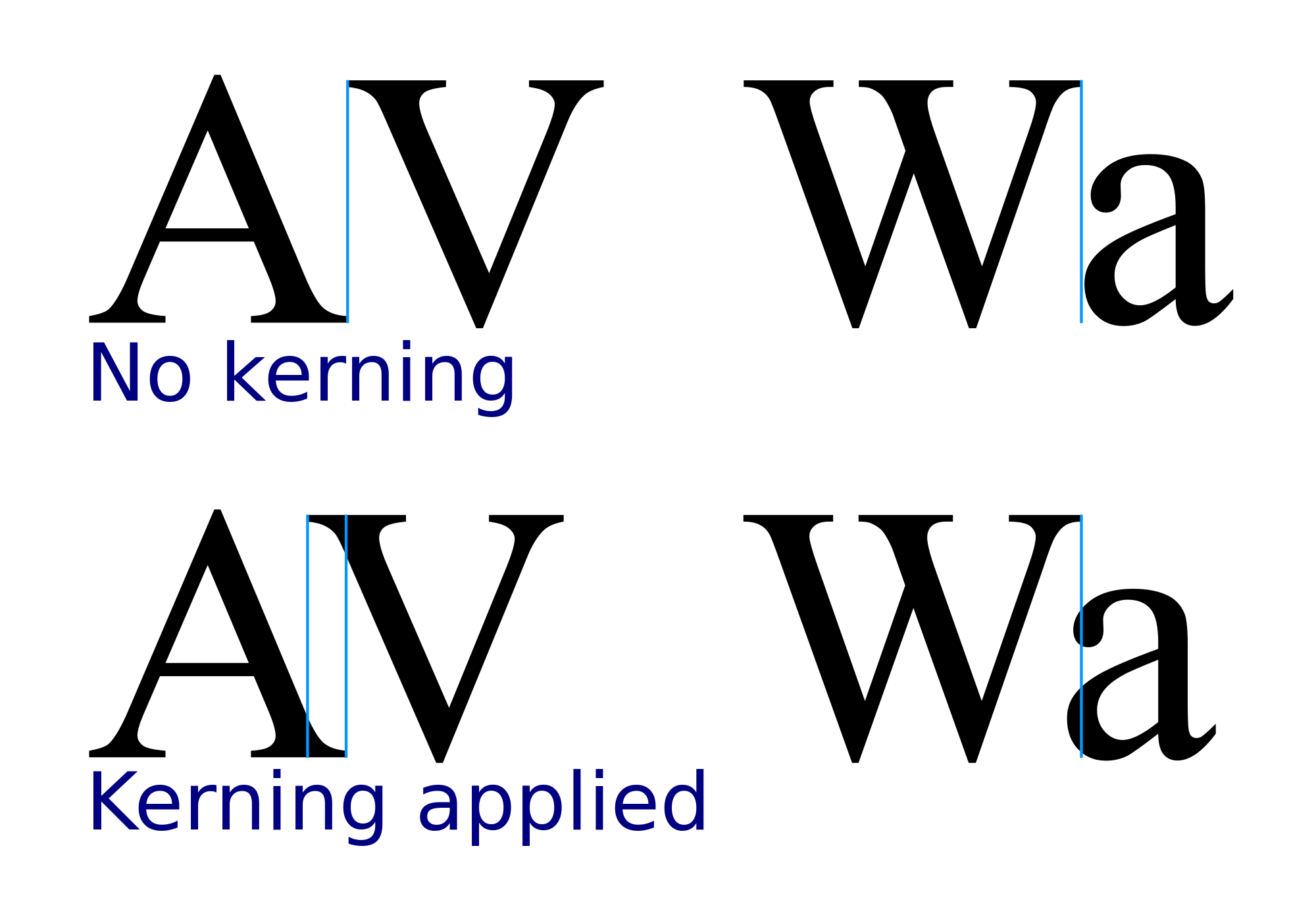
In typography, kerning is the process of adjusting the space between two specific characters, or letterforms, in a font. It is not to be confused with tracking, by which spacing is adjusted uniformly over a range of characters.[1]
In a well-kerned font, the two-dimensional blank spaces between each pair of characters all have a visually similar area. The term "keming" is sometimes used humorously to refer to poor kerning (the letters r and n placed too closely together being easily mistaken for the letter m).[2]
The related term kern denotes a part of a typed letter that overhangs the edge of the type block.[3]
Metal typesetting
[edit]
The source of the word kern is from the French word carne, meaning "projecting angle, quill of a pen". The French term originated from the Latin cardo, cardinis, meaning "hinge".[4] In the days when all type was cast metal, the parts of a typecasting sort that needed to overlap adjacent letters hung off the sort slug's edge. Those overhanging metal pieces were called kerns. At that time, the word kerning only referred to manufacturing the sorts with kerns, while adjusting space between letters during compositing was called inter-spacing or letter spacing.
Because this method was not well-suited to some pairs of letters, ligatures were supplied for those glyph combinations, such as the French L’, or the combinations ff, fi, fl, ffi, ffl, and others.
Digital typography
[edit]In metal typesetting, kerning was labor-intensive and expensive because the matrices had to be physically modified. It was therefore only employed on letter combinations that needed it the most, such as VA or AV. With the arrival of digital fonts, it became much easier to kern many glyph combinations.
Kerning values
[edit]In digital typography, kerning is usually applied to letter pairs as a number by which the default character spacing should be increased or decreased: a positive value for an increase, a negative value for a decrease. The number is expressed in font units, one unit being a certain fraction of an em (one em is the type size currently used). Different fonts may use other units, but common values are 1000 and 2048 units/em. Thus, for 1000 units/em, a kerning value of 15 means an increase in character spacing by 0.015 of the current type size. (The kerning units for a given font are the same as the units used to express the character widths in that font.)
Most kerning adjustments are negative, and negative adjustments are generally larger than positive ones. Adjustments for different pairs within a given font can range from a tiny 2 to over 100 (when expressed as 1000 units/em). The adjustments for a given pair vary greatly from one font to another.
Negative kerning is widely used to fit capital letters such as T, V, W, and Y closer to some other capital letters on either side, especially A, and to some lower case letters on the right side, such as the combinations Ta, Te, and To. It is also used to fit a period (full stop) or a comma closer to these and to F and P and the lowercase letters r, v, w, and y. Some other combinations that use negative kerning are FA, LT, and LY, and letters like A, L, and h followed by a quotation mark.
Positive kerning is used mainly in conjunction with special characters and punctuation (for example, the lower case letter f followed by right parenthesis or quotation mark). Depending on the font, some small positive kerning may also be required for accented letters and pairs like Bo, Dw, and TY.
The table below contains a few exemplifying kerning pairs and their values. These values are based on 1000 units/em and the kerning pairs are ordered from the most negative to the most positive kerning value. The samples are taken from the kerning tables of the Minion Pro font. In other fonts the kerning may be very different.
| A” −146 | W. −144 | P, −139 | L” −135 | VA −123 | F. −110 | YA −104 | Te −98 |
| AV −97 | Vr −86 | PA −85 | m” −82 | a” −79 | FA −78 | UA −78 | w. −73 |
| Yt −72 | LT −64 | r, −63 | Xv −54 | Ku −46 | D, −40 | D” −36 | OA −36 |
| Hv −33 | T: −32 | DY −30 | c” −25 | my −23 | Ru −21 | aj −19 | bv −16 |
| Sp −14 | ro −13 | SR −12 | lp −12 | ot −11 | tt −10 | am −9 | fe −9 |
| vo −8 | xc −8 | yo −8 | Ix −6 | e, −6 | st −5 | he −4 | Fw −3 |
| us −3 | Ak +3 | la +3 | Oj +5 | il +5 | CO +7 | bc +9 | Xf +10 |
| fr +10 | F” +12 | wb +12 | YW +13 | So +14 | Co +15 | VT +16 | cv +16 |
| Dv +17 | OC +18 | Bc +20 | RX +20 | T” +22 | gy +24 | r: +24 | XA +25 |
| ry +29 | w; +31 | f? +76 | f” +121 |
Which letters need to be kerned depends on which language the font is to be used with. Since some combinations of letters are not used in normal words in any language, kerning these is not necessary. Non-proportional (monospaced) fonts do not use kerning, since their characters always have the same spacing.
Kerning tables
[edit]In older font formats, such as Apple’s TrueType, the kerning values are specified in a simple kern table where each entry consists of a pair of characters and their kerning value.[5] TrueType fonts typically have several hundred pairs, but some have more than a thousand.
Since OpenType is a superset of TrueType kern tables are still supported for TrueType fonts packed as OpenType; however, PostScript-based (CFF) OpenType fonts do not have this option. OpenType introduced a new, uniform way of specifying, among other things, kerning, via the Glyph Positioning Table (GPOS).[6] The more recent font releases by Adobe no longer have kern tables at all, but only specify kerning via GPOS.[7]
Since an OpenType font may include thousands of glyphs, and consequently a huge number of pairs of characters that need kerning, OpenType fonts may have an elaborate system of tables and subtables, designed to minimize the overall storage space. (Kerning is treated as part of a broad range of new glyph positioning features which are stored in GPOS.[8]) The system is based on the concept of glyph classes: instead of a one-dimensional table where each entry corresponds to a pair of characters, there are two-dimensional tables where each entry corresponds to a pair of classes of glyphs. A class includes several characters whose right-hand outline (and right side-bearing) is identical for kerning purposes or several characters whose left-hand outline (and left side-bearing) is identical. All pairs of characters where the first one is from the first class and the second one is from the second class will require the same kerning value, so this value needs to be specified only once in the table. The rows in the two-dimensional table correspond to first-character classes, and the columns correspond to second-character classes. The kerning value for a given pair of characters is found in the table at the intersection of the classes to which they belong.
This system is very economical, but is necessarily limited. For example, many of the classes may be quite small. Also, a font with many types of glyphs may require several such tables. Finally, many pairs remain that cannot be represented through classes. For them, simpler, one-dimensional tables are provided: each table is for a particular character that is the first in many pairs, and the entries contain the characters that are the second in these pairs, together with the corresponding kerning values.
Here are a few examples of glyph classes in the Minion Pro font for the first character in a kerning pair: (d i l u), (h m n), (j q), (b o p), (v w y), (D O Q), (H I), (V W); and for the second character in a pair: (f i m n r), (h k l), (j p t u), (c d e o q), (v w y), (C G O Q), (B D E F H I K L N P R).
A category of letters that lend themselves well to class-based kerning is those with diacritical marks. These letters can be added to the class of the base letter, and can stay together whether they are the first or second character in a pair: (a à á â), (e è é ê), etc. A letter cannot be included in the class if its kerning is different from the others in certain pairs (for example, Yá vs. Yä).
Most modern office and desktop publishing systems support OpenType features, and hence class-based kerning.
Automatic and manual kerning
[edit]
Automatic kerning refers to the kerning applied automatically by a program, as opposed to no kerning at all, or the kerning applied manually by the user. There are two types of automatic kerning: metric and optical. With metric kerning, the program directly uses the values found in the kerning tables included in the font file. Most systems with typographic features today provide this type of kerning. Optical kerning, on the other hand, is available only in the more advanced systems. With optical kerning, the program uses an algorithm to calculate, from their outlines, the optimal spacing for each pair of consecutive characters. With both types of automatic kerning, the system usually permits the user to specify a minimum font size for applying kerning, if the user feels that kerning is unnecessary for smaller font sizes.
With metric kerning, in a text that uses several fonts, the program must decide which kerning table to use when two consecutive characters belong to different fonts — the table from the font of the first character, or the second one — or to avoid kerning altogether. In this case, optical kerning is preferable. A common situation occurs when italic text ends with a roman symbol (right parenthesis or quotation mark, question mark, etc.) and the last letter's slant clashes with the symbol.
Manual kerning, available in some systems, permits the user to override the automatic kerning and to apply any kerning value directly to a pair of characters in a particular place in the text. When not available, this feature can be simulated by using, for those two characters, the function that modifies the space between characters in a block of text (usually called tracking).
When employed by a skilled person, manual kerning will usually give better results than optical kerning; for example, some characters that may appear to an algorithmic comparison to be spaced very closely together may appear to a human reader too far apart, especially when the only element of a glyph that is “too close” is a diacritic mark. Manual kerning may even be better than the metric kerning built into the kerning table by the font's designer, since these tables often have errors or omissions, or the difference may simply be a matter of personal preference.[citation needed]
Contextual kerning
[edit]
Contextual kerning refers to positional adjustment that depends on more than two consecutive glyphs. For example, the spacing of a certain glyph may depend not only on the preceding glyph (as in ordinary kerning) but also on the one following it. Although rarely implemented in ordinary documents, contextual kerning is a concern in quality typography.
An example of a situation that demands contextual kerning in the Minion Pro font is the sequence of three characters f.” (f, period, quotation mark), as is often found at the end of a quotation. Using the font's kerning tables, the quotation mark is too close to the f, although without the period between them their spacing is adequate. The period, in other words, reduces their spacing instead of increasing it. The explanation is this: without the period, their kerning is a positive 121 (expressed as 1,000 units/em). The period's width is 228, but the kerning between f and the period is −5, and between the period and the quotation mark −138. The total is a positive 85, as opposed to the original 121: a net loss of 36 units, which explains why the quotation mark is now closer to the f. Contextual kerning would recognize the sequence of three characters, and would increase one or both inter-character spaces. A similar problem exists with the letters F, P, T, V, W, and Y; with comma rather than period; or with single rather than double quotation mark.
Contextual kerning is supported by the OpenType font format, but few font designers implement it, and probably no desktop publishing systems can currently use it. When important, the solution for a user is to employ manual kerning instead.
Kerning of subscripts and superscripts
[edit]While the OpenType math standard does not include support for kerning of subscripts or superscripts, Microsoft's implementation adds extensions to support this feature as of Office 2007.[9][10]
Kerning tools
[edit]Font editors allow the user to modify the properties of a font, including its kerning table (if the font license permits it). They accomplish this by modifying the table found in the actual font file. The user can change the kerning value in existing pairs, or add new pairs.
A few desktop publishing systems[which?] allow the user to change or add kerning pairs without modifying the font file itself. The system merely applies to the user's document the new kerning values, in place of the values found in the font file.
Whether modifying the font file with a font editor or overriding it in a particular system, the user is limited to the existing kerning features. Thus, if one needs features like optical kerning, or contextual kerning, or kerning a pair of characters that belong to different fonts, and if the system lacks these features, other means must be employed.
Some desktop publishing systems permit developers to create plug-ins (extensions that perform a variety of functions that the system itself lacks), and this capability has also been used for kerning. In general, these plug-ins permit the user to apply a kerning change automatically to a certain character pair throughout an entire document, instead of applying it by searching manually for those pairs. So far only basic kerning features have been implemented through plug-ins, and it is unclear whether the more advanced features can be effectively implemented in this manner.
Instead of adding functionality to a desktop publishing system, a different approach is to export the document and process it outside that system. Any kerning features can then be applied to the document using tools ranging from ordinary text editors to programs specially developed for this task. The modified document is then imported back into the desktop publishing system. Many systems permit this operation, either by converting the document with import and export functions, or by making their internal document format an open standard. The benefit of this approach is that some complex typesetting functions that may be hard to implement through plug-ins (kerning in particular) may be relatively easy to implement through separate tools.
Kerning in browsers
[edit]The CSS property text-rendering: optimizeLegibility; enables kerning in Firefox, Chrome, Safari,[11] Opera, and the Android Browser.[12] Another CSS property, font-feature-settings, also enables kerning in Internet Explorer 10+, Chrome, Edge, Firefox, and the Android Browser.[13][14] There is also a CSS3 property font-kerning,[15] which is supported in the major browsers.[16] The CSS3 recommendation suggests that kerning should always be enabled for OpenType fonts.[15]
Some critics have proposed to replace (at least some) OpenType-style GPOS kerning with spacer glyphs using OpenType's Glyph Substitution Table (GSUB).[17]
Perception
[edit]
The human perception of kerning can vary with the intraword and interword spacing during reading.[18] Even without complete kerning control, the effect can be simulated by slight modifications to the space between letters.[19] For instance, on webpages with CSS1, a standard dating back to 1996, the letter-spacing property offers options for "lost" or "enhanced kerning perception" by simply making the space between letters non-uniform. The newer CSS3 standard includes the font-kerning property, which allows a complete control of kerning.[15]
Having too little space between certain pairs of letters can lead to mis-reading the two as a different single letter. The term "keming" is sometimes used informally to refer to poor kerning (the letters r and n placed too closely together being easily mistaken for the letter m).[2] Other examples include the letters L and I merging to become U, and c and l merging to become d.
See also
[edit]References
[edit]- ^ "Fonts: Type topics: Glossary". Adobe. Retrieved 2011-09-16.
- ^ a b McGinnie, Louise (2013-11-28). "Kerning, spacing, leading: the invisible art of typography". The Conversation. Retrieved 2023-12-16.
- ^ "kern | Definition of kern in English". Oxford Dictionaries. Archived from the original on July 13, 2018. Retrieved 2018-07-13.
- ^ "kern". dictionary.reference.com. Dictionary.com. Retrieved 13 November 2012.
- ^ Hoefler, Jonathan. "Adventures in Kerning, Part II". typography.com. Hoefler & Co. Retrieved 24 June 2023.
- ^ "The Kerning Table". microsoft.com. Microsoft. 2010-05-28. Retrieved 2014-08-07.
- ^ Pesala, Bhikkhu. "FontCreator". softerviews.org. Retrieved 2014-08-07.
- ^ "Developer Resources". partners.adobe.com. Adobe. 2009-07-14. Archived from the original on 2016-09-01. Retrieved 2014-08-07.
- ^ "Special Capabilities of a Math Font". msdn.com. 2010-01-12.
- ^ "Method and system of character placement in opentype fonts" – via Google Patents.
- ^ "Cross-browser kerning-pairs & ligatures". aestheticallyloyal.com. Archived from the original on 2012-11-06. Retrieved 2014-08-07.
- ^ "Can I use Improved kerning pairs & ligatures". caniuse.com. Retrieved 2014-08-07.
- ^ "Kerning on the Web". typekit.com. Retrieved 2019-02-08.
- ^ "font-feature-settings". developer.mozilla.org. Mozilla. Retrieved 2019-02-08.
- ^ a b c "6.3. Kerning: the font-kerning property". CSS Fonts Module Level 3: W3C Recommendation. World Wide Web Consortium. 20 September 2018. Retrieved 2026-05-11 – via w3.org.
- ^ "CSS3 font-kerning". caniuse.com. Retrieved 2023-07-03.
- ^ Kumar, Vinod (2006-07-01). "Kerning or Positioning Using Spacer Glyphs. Positioning with Spacers". Document Numérique. 9 (3–4): 69–85. doi:10.3166/dn.9.3-4.69-85 (inactive 12 July 2025). S2CID 13609756 – via semanticscholar.org.
{{cite journal}}: CS1 maint: DOI inactive as of July 2025 (link) Also at this page via cairn.info - ^ Slattery, Timothy J.; Rayner, Keith (2013). "Effects of intraword and interword spacing on eye movements during reading: Exploring the optimal use of space in a line of text" (PDF). Attention, Perception, & Psychophysics. 75 (6). Springer: 1275–1292. doi:10.3758/s13414-013-0463-8. PMID 23709061. S2CID 30122450.
- ^ Brumberger, Eva (2004). "The Rhetoric of Typography: Effects on Reading Time, Reading Comprehension, and Perceptions of Ethos". Technical Communication. 51 (1): 13–24.
External links
[edit]
- Shaw, Paul (October 31, 2011). "The Kerning Game". printmag.com.
| Page | |||||||||||
|---|---|---|---|---|---|---|---|---|---|---|---|
| Paragraph | |||||||||||
| Character |
| ||||||||||
| Typeface classifications |
| ||||||||||
| Punctuation (List) | |||||||||||
| Typesetting | |||||||||||
| Typographic units | |||||||||||
| Digital typography | |||||||||||
| Typography in other writing systems | |||||||||||
| Related articles | |||||||||||
| Related template | |||||||||||

Kerning
View on GrokipediaHistory
Metal Typesetting
In metal typesetting, kerning originated as a technique to adjust the spacing between characters for improved visual balance and readability, with the term itself deriving from the French word carne, meaning a projecting angle or corner, referring to the overhanging elements of type that allowed letters to interlock.[6] This practice dates back to the invention of movable type in the 15th century, where early printers like Johannes Gutenberg employed logotypes—pre-cast combinations of letters—to mimic the tight connections seen in medieval manuscripts and address irregular gaps between characters such as "f" and "i".[7] Techniques for kerning in metal type primarily involved creating mortised letters, where metal was physically removed from the body of a type piece to allow adjacent letters to fit more closely without excessive space, or casting letters with protruding elements that extended beyond their standard body width. For instance, compositors would use specialized tools like kerning files to shave away material, enabling pairs like uppercase "T" or "V" to nest with lowercase "a", "e", or "o" for a more even appearance. Ligatures, such as "ff", "fi", and "fl", were also cast as single units to inherently kern problematic combinations, reducing the need for manual adjustments during composition.[7] Historical fonts often featured kerned pairs like "AV", "To", "TA", "PA", "VA", and "WA", where the diagonal strokes of one letter overlapped with the curves or counters of another; compositors manually positioned these physical type pieces on a composing stick, sometimes supporting fragile overhangs with adjacent type shoulders to prevent breakage during printing.[7] In the 18th century, French typefounder Pierre-Simon Fournier advanced these kerned designs through his innovative punch-cutting and casting methods, as detailed in his Manuel Typographique, where he thoroughly explored kerning techniques to enhance typographic harmony in transitional-style faces.[8][9] Fournier's work at his own foundry emphasized precise spacing adjustments, influencing subsequent metal type production across Europe.[10]Transition to Phototypesetting and Early Digital
Phototypesetting emerged in the mid-20th century as a pivotal shift from hot metal composition, beginning with systems like the Lumitype developed by René Higonnet and Louis Moyroud in collaboration with Deberny & Peignot, introduced commercially in the late 1950s.[11] This technology, also marketed as Photon in the United States, projected character images onto photographic film or paper using light exposure, allowing for greater flexibility in type sizes and styles compared to fixed metal type.[12] Kerning in these systems was achieved through manual adjustments via photographic overlays or variable spacing mechanisms, where operators could fine-tune letter positions during exposure to create overlapping or tightened pairs, enhancing visual harmony beyond the constraints of physical slugs.[13] The transition to early digital typography in the 1970s and 1980s built on these foundations, introducing computational methods for spacing control. Donald Knuth's TeX typesetting system, first released in 1978, incorporated basic pair kerning through explicit commands like \kern, which allowed users to specify adjustments between specific character pairs, integrated into its algorithmic line-breaking model to optimize readability.[14] Adobe's PostScript page description language, launched in 1982, further advanced this by enabling programmable font metrics that included predefined kerning pairs, permitting scalable vector-based adjustments without manual intervention for each instance.[15] This evolution presented significant challenges, particularly the loss of tactile manual control from metal type systems like Linotype, where compositors physically arranged and kerned characters. Phototypesetting and early digital methods initially relied on fixed grids or algorithmic approximations, often resulting in inconsistent quality that fell short of hot metal precision, as operators adapted to photographic or screen-based previews amid union disputes and technological retraining.[13] A key milestone came with the 1984 release of the Apple Macintosh, which provided the first widespread screen-based previews of kerned type in a graphical user interface, allowing designers to visually iterate spacing in real-time using bitmap fonts like Chicago.[16]Core Concepts
Definition and Purpose
Kerning is the process of adding or subtracting space between specific pairs of characters, or glyphs, in a typeface to achieve visually balanced word shapes.[1] This adjustment targets individual letter combinations rather than uniform spacing across text, distinguishing it from tracking, which applies consistent adjustments to the space between all letters in a block of text.[1] It also differs from leading, the vertical space between lines of type measured from baseline to baseline.[17] The primary purpose of kerning is to improve optical evenness in typography, addressing irregularities caused by the shapes of letterforms that can create awkward gaps or overlaps.[2] By fine-tuning these spaces, kerning enhances legibility and aesthetic appeal, ensuring that text flows smoothly without distracting visual inconsistencies.[18] For instance, in the combination "AV," the converging diagonal strokes of the letters can leave excessive white space if unadjusted, while "WA" often requires negative kerning to close the gap formed by the wide, protruding forms of the W and A.[19] Kerning contributes to the overall typographic rhythm by creating a harmonious visual cadence across words and lines, where the eye perceives even spacing despite varying glyph widths.[18] Poor kerning, humorously termed "keming" since its coinage in 2008, can lead to comical misreadings, such as "vermin" appearing as "verm|n" due to excessive space between the "r" and "n."[20] A simple illustrative comparison might show the word "WA" unkerned with a prominent gap resembling two separate elements, versus kerned where the space is reduced for seamless integration, highlighting how such adjustments prevent perceptual disruptions.[2]Types of Kerning
Kerning methods in typography are broadly categorized into metric, optical, and contextual approaches, each employing distinct mechanisms to adjust inter-character spacing for improved legibility and aesthetic balance.[1] Metric kerning relies on predefined adjustments stored within the font file, typically as pairs of glyphs with associated values measured in em units. For instance, the pair "AV" might have a kerning value of -50/1000 em, indicating a reduction in space to compensate for the overlapping visual forms of the letters. These values are created by the font designer during font development and are applied automatically by software that supports them, ensuring consistent spacing across uses of the font. The actual adjustment in output space, such as points or pixels, is calculated as follows:Digital Implementation
Kerning Values and Tables
Kerning values represent the adjustments applied to the spacing between specific pairs of glyphs in a font, typically expressed as signed integers in the font's design units. These units are scaled relative to the em square, which is conventionally set to 1000 units in most digital fonts, allowing for precise control over inter-glyph spacing. Negative values, which are the most common, reduce the space between glyphs to compensate for optical illusions where shapes appear farther apart than intended, such as in the pair of an uppercase "A" followed by a right double quotation mark, where a value like -146 units might be applied. Positive values, though rarer, increase spacing in cases where glyphs naturally overlap or require separation, for instance, a value of +121 units between a lowercase "f" and a right double quotation mark to avoid collision.[23][24] Kerning tables organize these values within font files, varying by format to balance efficiency and flexibility. In TrueType fonts, the 'kern' table uses simple pair-based subtables, such as Format 0, which lists individual glyph pairs with their corresponding values in a sorted array. OpenType fonts, particularly those with CFF outlines, prefer the Glyph Positioning (GPOS) table for kerning, implemented as Pair Adjustment Positioning lookups that support more advanced features. Unlike the flat structure of TrueType's 'kern' table, GPOS employs class-based adjustments for greater efficiency; glyphs are grouped into classes—such as all vowels or punctuation marks—and a two-dimensional array maps adjustments between classes, reducing redundancy. For example, a GPOS subtable might group lowercase diagonals like "v", "w", and "y" in one class and apply a uniform -50 unit adjustment when followed by a comma or period.[21][24][23] Data storage in these tables follows a pairwise model, where each entry maps a left glyph ID and a right glyph ID to a kerning value, often covering only the most visually disruptive combinations to minimize file size. A typical font includes 500 to 2000 such pairs, focusing on common Latin characters like "AV", "To", or "Wa", while rarer combinations rely on default spacing. This selective coverage ensures broad applicability without excessive storage demands.[21][25] In font editing software, such as FontLab or Glyphs, kerning tables appear as editable grids or lists for Latin pairs, allowing designers to view glyph IDs alongside values—for instance, displaying the "A" and "V" pair with a -50 unit adjustment—and modify them directly to refine optical balance. These interfaces often highlight classes in GPOS tables, enabling batch edits across grouped glyphs like uppercase letters with serifs.[26][27]Automatic and Manual Kerning
Automatic kerning in typography software applies predefined spacing adjustments between character pairs on-the-fly during text composition. In applications like Adobe InDesign, metrics kerning reads kerning tables embedded in the font file, such as those in CFF-based OpenType fonts, to apply values for specific pairs like "LA" or "To" without manual intervention.[1] If kerning tables are absent or insufficient—particularly when mixing typefaces or using fonts without robust pairs—the software falls back to optical kerning, an algorithmic method that analyzes character outlines and shapes to estimate optimal spacing dynamically.[1] This approach ensures consistent results across diverse text scenarios, prioritizing efficiency in layout processes. Manual kerning, in contrast, involves designers making targeted overrides to automatic settings for customized precision. In tools like FontLab, this process entails selecting specific glyph pairs and adjusting their spacing point-by-point via numerical inputs or keyboard shortcuts, often using glyph-to-glyph overrides that supersede class-based or automatic values. Designers typically preview adjustments at multiple point sizes to verify visual balance, ensuring adjustments hold across scales from small body text to large displays.[28] This hands-on method is essential for bespoke applications, such as logo text where unique character interactions demand fine-tuned harmony beyond standard tables. The workflows for automatic and manual kerning differ significantly based on text scale and project demands. Automatic kerning suits body text in extensive layouts, enabling rapid application across thousands of characters with minimal designer input, thus saving substantial time compared to per-pair adjustments.[2] Manual kerning is preferred for headlines and display type, where visual impact at larger sizes requires iterative, eye-based refinements to achieve rhythmic flow, though it demands far more effort—often hours for a single page versus seconds for automated processing.[22] In book design, manual kerning serves as a critical intervention to address flaws in vendor-supplied fonts, such as inconsistent pair spacing that disrupts readability in long-form print. For instance, designers may override problematic pairs in chapter titles or running heads to correct optical imbalances in off-the-shelf typefaces, ensuring professional polish without redesigning the entire font.[29]Contextual Kerning
Contextual kerning involves adjustments to inter-glyph spacing that account for sequences of three or more glyphs, enabling finer control over visual relationships beyond simple pairwise interactions. For instance, the spacing between "L" and "A" may require additional tightening when an apostrophe intervenes, as in "L'A", to prevent collisions that pairwise kerning alone cannot resolve. This approach leverages OpenType's Glyph Positioning Table (GPOS) through the 'kern' feature, utilizing contextual lookups to apply adjustments based on surrounding glyphs.[24] Implementation occurs primarily via GPOS lookup type 8, Chained Contexts Positioning, which defines backtrack (preceding), input (target), and lookahead (following) sequences to trigger specific positioning values, such as kerning offsets. In this subtable, formats 1 through 3 support glyph, class, or coverage-based matching, allowing chained applications of simpler positioning lookups like pair adjustments within the broader context. An example is adjusting the sequence involving a numeral, period, and another numeral, such as "7.9", where the period's placement needs even distribution to avoid uneven optical spacing influenced by the numerals' shapes. This mechanism contrasts with basic pair kerning by incorporating environmental factors for more accurate rendering.[30] Despite its precision, contextual kerning remains rare in font design due to the significant complexity involved in defining and testing multi-glyph rules, which can inflate font file sizes and processing demands. It is supported in advanced text shaping engines like HarfBuzz, which handles GPOS chained contexts efficiently, but is not implemented as a standard in the vast majority of commercial or system fonts.[24][31] The capability for contextual kerning first emerged with the OpenType format in the late 1990s, extending beyond the limitations of earlier pairwise-only systems in TrueType and PostScript fonts. Developments in the 2020s, particularly in engines like HarfBuzz, have improved multi-glyph handling through optimized caching and faster lookup processing, making such features more viable for complex scripts without compromising performance.[32]Special Cases: Subscripts, Superscripts, and Ligatures
Subscripts and superscripts present unique kerning challenges due to their reduced size and offset positioning, with level 1 typically scaled to 80% and level 2 (deeper nesting) to 60% of the base font size in mathematical or scientific notation.[33] These elements require specialized adjustments to maintain optical spacing with adjacent base characters, as standard kerning tables may not account for their altered proportions and baselines. In OpenType fonts, the 'subs' and 'sups' features handle glyph substitution and positioning, but kerning often relies on dedicated structures to avoid disproportionate gaps or overlaps, such as in expressions like H₂O where the subscript "2" must align closely with "H" and "O."[34] Microsoft introduced extensions to the OpenType specification in 2007 specifically for mathematical typesetting in Office applications, incorporating the MATH table to support height-dependent kerning for subscripts and superscripts.[35] This table includes the MathKernInfo subtable, which defines separate kerning values for interactions between base glyphs and scaled variants at specific vertical positions, ensuring consistent readability in formulas.[33] For instance, kerning pairs like those in "H₂O" are adjusted using bounding box calculations at the subscript's top and the base's bottom, preventing visual crowding. These extensions enable fonts to provide variant kerning tables tailored to scaled glyphs, often activated via the OpenType 'size' feature for optical sizing, which selects appropriate tables based on font size ranges.[33][36] In non-mathematical contexts, such as chemical formulas or footnotes, separate kerning classes or GPOS lookups extend these principles to ensure subscripts integrate seamlessly without relying solely on general pair tables.[32] Ligatures, as pre-composed glyphs combining multiple characters (e.g., "fi" as a single unit), demand kerning values defined for the entire composite rather than its components to prevent overlaps or excessive spacing.[37] For example, the pair "fiA" requires a dedicated kern entry for the ligature glyph against "A", distinct from separate "f i A" adjustments, as applying component-level kerning could result in double adjustments and visual distortion.[21] OpenType handles this through the 'liga' feature in GSUB for substitution, followed by kern table coverage treating the ligature as a unitary glyph with optimized sidebearings that inherently avoid intra-component kerning.[38] This approach ensures the ligature's external spacing aligns optically with surrounding text, maintaining rhythm without redundant overlaps.[39] Accented characters and diacritics in Latin script extensions, such as "á" or "ê", often share kerning classes with their base letters (e.g., "a" or "e") to simplify tables while accommodating the added marks' influence on adjacent spacing.[40] These composites require explicit pair definitions where the diacritic alters the glyph's effective width or height, as in kerning "âV" to adjust for the circumflex's protrusion; standard practice groups similar accents (e.g., acute, grave) into classes for efficient coverage in the kern table.[21] In Latin extensions, this extends to multilingual support, previewing adaptations like tighter kerning for vowel-diacritic pairs in accented European languages, though full non-Latin handling (e.g., for Cyrillic or Arabic overlays) involves script-specific GPOS features.[40] Contextual kerning may briefly reference these for sequence-aware refinements, but primary adjustments remain size- and form-based.[32]Kerning Tools
Font editors are essential tools for creating and editing kerning pairs and classes during font development. FontForge, a free and open-source editor available since the early 2000s, provides a dedicated Kerning Pairs dialog for viewing and adjusting all kerning in a font or for specific glyphs, along with a Metrics window that allows precise editing using keyboard shortcuts like arrow keys for incremental changes.[41][42] It also integrates auto-hinting features to ensure kerning compatibility across rendering environments.[43] Glyphs, a professional macOS editor introduced in the 2010s, offers intuitive kerning tools including a dedicated kerning view for pairwise adjustments, class-based kerning, and contextual lookups via OpenType features, with keyboard shortcuts for fine-tuning values.[27][44] RoboFont, a Python-scriptable editor for macOS also from the 2010s, enables kerning through its Groups Editor for creating left and right kerning classes, alongside scripting support for automated pair generation and integration with auto-hinting libraries.[45][46] Layout software facilitates on-the-fly manual kerning adjustments during design workflows. In Adobe InDesign, the Character panel allows selection of metrics or optical kerning modes, with manual tweaks via the kerning field, while the Story Editor provides previews of pair adjustments across text blocks.[1] Adobe Illustrator features a Metrics panel (Window > Type > Metrics) that displays and edits kerning values between selected characters, supporting real-time previews in point text or area text.[47][48] Open-source options expand accessibility for kerning tasks. Birdfont, a free cross-platform editor, includes a kerning tab for pairwise and class-based adjustments, with support for exporting kerning data in TTF, OTF, and SVG formats. FontLab's Kerning panel, part of its comprehensive suite, lists all pairs and classes for editing, with drag-based adjustments and auto-suggestions for consistency.[28][49] In the 2020s, many editors have added native support for variable fonts, enabling interpolated kerning across axes like weight or width; for instance, Glyphs and RoboFont handle variable kerning classes seamlessly, while FontForge and Birdfont combine with tools like fontmake for full OpenType variable font output.[50][51] Best practices for kerning in these tools emphasize testing at contrasting sizes, such as 72pt for display purposes to assess optical balance and 12pt for body text to verify readability, ensuring adjustments scale appropriately.[52] Export considerations include preferring OTF over TTF for kerning, as OTF's GPOS table better supports class kerning and advanced features, whereas TTF relies on the legacy kern table with potential compatibility issues in some renderers.[53][54]Modern Applications
Kerning in Web Browsers and CSS
In web browsers, kerning is primarily controlled through CSS properties that interact with OpenType font features, allowing developers to adjust glyph spacing for improved typographic quality. Thefont-kerning property, introduced in the CSS Fonts Module Level 3 specification, enables or disables the use of kerning data embedded in fonts.[55] This property accepts three values: auto (the default, where the user agent decides based on factors like text size and performance), normal (applies kerning using the font's adjustment data, such as the OpenType kern feature), and none (disables kerning entirely).[56] When set to normal, it activates the kern table or equivalent Glyph Positioning (GPOS) data in OpenType fonts, ensuring adjustments occur before any letter-spacing is applied.[57]
For finer control, especially with OpenType fonts, the font-feature-settings property can explicitly enable the kern feature using the syntax font-feature-settings: 'kern' 1;, where 1 turns it on (equivalent to on). This low-level descriptor passes the value directly to the text layout engine, overriding defaults if the font supports it, and is particularly useful for ensuring consistent kerning across varying font formats.[58] Browser support for these properties has achieved broad parity in the 2020s: Chrome and Edge have provided full support since version 33 (2014) and 79 (2020), respectively; Firefox since version 34 (2014, with initial enablement via preferences); and Safari since version 7.1 (2014).[59] However, inconsistencies arise in subpixel rendering scenarios, where browsers round fractional pixel adjustments from kerning values to whole pixels, potentially causing uneven spacing on high-DPI displays or during zooming.[60]
An additional mechanism for enhancing kerning in web text is the text-rendering property with the value optimizeLegibility, which instructs supported browsers to prioritize typographic fidelity over speed or precision. This mode enables kerning pairs and ligatures by simulating optical adjustments, particularly effective for fonts under 20px where default rendering might skip them.[61] It is supported in Chrome (from version 33 on Windows), Firefox, Safari, and Opera 15+, though it has no effect in older Internet Explorer versions.[62] For web fonts in WOFF format, kerning failures often occur if conversion tools strip or mishandle the kern or GPOS tables during optimization, leading to uniform spacing instead of paired adjustments—such as excessive gaps between "A" and "V" in script faces.[63]
The evolution of these standards has improved kerning reliability through W3C updates, with CSS Fonts Module Level 4 (February 2024) refining feature resolution to better handle OpenType GPOS tables for positioning, including synthetic support for legacy kern data in fonts lacking full GPOS implementation.[64] Browsers like Chrome and Android leverage the HarfBuzz shaping engine for robust GPOS kerning, processing complex pair adjustments efficiently since its integration around 2012, with ongoing enhancements for cross-script consistency.[65] This has led to near-universal enablement of kerning by default in modern environments, reducing the need for manual overrides while maintaining performance.[66]