Community hub
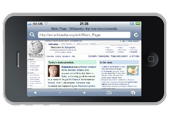
Mobile browser
View on Wikipedia.png)
A mobile browser is a web browser designed for use on a mobile device such as a mobile phone, PDA, smartphone, or tablet. Mobile browsers are optimized to display web content most effectively on small screens on portable devices. Some mobile browsers, especially older versions, are designed to be small and efficient to accommodate the low memory capacity and low bandwidth of certain wireless handheld devices. Traditional smaller feature phones use stripped-down mobile web browsers; however, most current smartphones have full-fledged browsers that can handle the latest web technologies, such as CSS 3, JavaScript, and Ajax.
Websites designed to be usable in mobile browsers may be collectively referred to as the mobile web. Today, over 75% of websites are "mobile friendly",[citation needed] by detecting when a request comes from a mobile device and automatically creating a "mobile" version of the page, designed to fit the device's screen and be usable with a touch interface.
Underlying technology
[edit]The mobile browser usually connects via the cellular network, or increasingly via Wireless LAN, using standard HTTP over TCP/IP and displays web pages written in HTML. Historically, early feature phones were restricted to only displaying pages specifically designed for mobile use, written in XHTML Mobile Profile (WAP 2.0), or WML (which evolved from HDML). WML and HDML are stripped-down formats suitable for transmission across limited bandwidth, and wireless data connection called WAP. In Japan, DoCoMo defined the i-mode service based on i-mode HTML, which is an extension of Compact HTML (C-HTML), a simple subset of HTML.
WAP 2.0 specifies XHTML Mobile Profile plus WAP CSS, subsets of the W3C's standard XHTML and CSS with minor mobile extensions.
Smartphone mobile browsers are full-featured Web browsers capable of HTML, CSS, ECMAScript, as well as mobile technologies such as WML, i-mode HTML, or cHTML. To accommodate small screens, they use Post-WIMP interfaces.
History
[edit]The first mobile browser for a PDA was PocketWeb[1][2] for the Apple Newton created at TecO in 1994, followed by the first commercial product NetHopper released in August 1996.[3]
The so-called "microbrowser" technologies such as WAP, NTTDocomo's i-mode platform and Openwave's HDML platform fueled the first wave of interest in wireless data services.
The first deployment of a mobile browser on a mobile phone was probably in 1997 when Unwired Planet (later to become Openwave) put their "UP.Browser" on AT&T handsets to give users access to HDML content.[4][5]
A British company, STNC Ltd., developed a mobile browser (HitchHiker) in 1997 that was intended to present the entire device UI. The demonstration platform for this mobile browser (Webwalker) had 1 MIPS total processing power. This was a single core platform, running the GSM stack on the same processor as the application stack. In 1999 STNC was acquired by Microsoft[6] and HitchHiker became Microsoft Mobile Explorer 2.0,[7] not related to the primitive Microsoft Mobile Explorer 1.0. HitchHiker is believed to be the first mobile browser with a unified rendering model, handling HTML and WAP along with ECMAScript, WMLScript, POP3 and IMAP mail in a single client. Although it was not used, it was possible to combine HTML and WAP in the same pages although this would render the pages invalid for any other device. Mobile Explorer 2.0 was available on the Benefon Q, Sony CMD-Z5, CMD-J5, CMD-MZ5, CMD-J6, CMD-Z7, CMD-J7 and CMD-J70. With the addition of a messaging kernel and a driver model, this was powerful enough to be the operating system for certain embedded devices. One such device was the Amstrad e-m@iler[8] and e-m@iler 2. This code formed the basis for MME3.
Multiple companies offered browsers for the Palm OS platform. The first HTML browser for Palm OS 1.0 was HandWeb by Smartcode software, released in 1997. HandWeb included its own TCP/IP stack, and Smartcode was acquired by Palm in 1999. Mobile browsers for the Palm OS platform multiplied after the release of Palm OS 2.0, which included a TCP/IP stack. A freeware (although later shareware) browser for the Palm OS was Palmscape, written in 1998 by Kazuho Oku in Japan, who went on to found Ilinx. It was still in limited use as late as 2003. Qualcomm also developed the Eudora Web browser, and launched it with the Palm OS based QCP smartphone. ProxiWeb[9] was a proxy-based Web browsing solution, developed by Ian Goldberg and others[10] at the University of California, Berkeley and later acquired by PumaTech.
Released in 2001, Mobile Explorer 3.0 added iMode compatibility (cHTML) plus numerous proprietary schemes.[11] By imaginatively combining these proprietary schemes with WAP protocols, MME3.0 implemented OTA database synchronisation, push email, push information clients (not unlike a 'Today Screen') and PIM functionality. The cancelled Sony Ericsson CMD-Z700 was to feature heavy integration with MME3.0. Although Mobile Explorer was ahead of its time in the mobile phone space, development was stopped in 2002.
Also in 2002, Palm, Inc. offered Web Pro on Tungsten PDAs based upon a Novarra browser. PalmSource offered a competing Web browser based on Access NetFront.
Opera software pioneered with its Small Screen Rendering and Medium Screen Rendering technology. The Opera web browser is able to reformat regular web pages for optimal fit on small screens and medium-sized (PDA) screens. It was also the first widely available mobile browser to support Ajax and the first mobile browser to pass the Acid2 test.
Distinct from a mobile browser is a web-based emulator, which uses a "Virtual Handset" to display WAP pages on a computer screen, implemented either in Java or as an HTML transcoder.
Popular mobile browsers
[edit]The following are some of the more popular mobile browsers. Some mobile browsers are really miniaturized web browsers, so some mobile device providers also provide browsers for desktop and laptop computers.
| Source | Date | Android Browser |
Chrome | Internet Explorer |
Safari | Opera Mini | UC Browser |
Samsung Internet |
Huawei Browser |
|---|---|---|---|---|---|---|---|---|---|
| StatCounter[12] | May 2022 | 1.14% | 64.23% | -- | 25.24% | 1.68% | 1.21% | 4.65% | -- |
| StatCounter[13] | June 2017 | 4.24% | 47.26% | 0.59% | 21.17% | 5.01% | 14.16% | 6.03% | 1.09% |
| StatCounter[14] | June 2015 | 15.81% | 30.67% | 1.76% | 24.64% | 10.37% | 12.95% | -- | 3.79% |
| NetApplications[15] | June 2014 | 22.77% | 16.67% | 2.01% | 47.06% | 7.82% | -- | -- | 4.69% |
Default browsers for mobile and tablet (current and defunct)
[edit]| Browser | Creator | FOSS | Current browser engine | Software license | Notes |
|---|---|---|---|---|---|
| Amazon Silk | Amazon | Some | Blink | Proprietary and LGPL | Uses split architecture whereby all processing is performed on Amazon's servers |
| Huawei browser | Huawei | Some | WebKit | Proprietary and LGPL | Browser included with EMUI version 10.0 to version 14.2 and Harmony OS version 2.0 to version 4.2. |
| Android browser | Yes | WebKit | BSD and LGPL | Browser included with Android version 1.5 to version 4.1[16] | |
| BlackBerry Browser | BlackBerry | Some | Mango (ver 4.5, 4.6, 4.7, 5.0) WebKit (ver 6.0+) |
Proprietary and LGPL | - |
| Blazer | Palm | No | NetFront[17] | Proprietary | Installed on all newer Palm Treos and PDAs. Now discontinued. |
| Chrome | Some | WebKit, Blink (versions 28+) | Freeware under Google Chrome Terms of Service, but uses components from the Chromium (web browser) project.[18] | Installed as default on Google devices shipping with Android versions 4.1 (Jelly Bean) or higher | |
| Clipper | Palm | No | Custom | Proprietary | Installed on Palm VII series devices, or via Palm's Mobile Internet Kit |
| Dolphin Browser | MoboTap | No | WebKit | Proprietary | Installed on all Bada |
| Firefox for Mobile | Mozilla | Yes | Gecko, WebKit (iOS version only) | MPL | Currently released for Android and iOS, but default browser for Firefox OS devices |
| Internet Explorer Mobile | Microsoft | No | MSHTML | Proprietary | Now discontinued |
| Iris Browser | Torch Mobile | Some | WebKit | Proprietary and LGPL | Acquired by Research in Motion - No longer supports Windows Mobile or Linux |
| Kindle web browser | Amazon | No | NetFront | Proprietary | Labeled "experimental" |
| Microsoft Edge [Legacy] | Microsoft | No | EdgeHTML | Proprietary | On Windows 10 Mobile |
| Myriad Browser | Myriad Group | Some | Magellan (ver. 6.x) Fugu (ver 7.x) WebKit (ver 9)[19] |
Proprietary and LGPL | Acquired from Openwave in 2008 |
| NetFront | ACCESS | Yes | NetFront | Proprietary | - |
| Nokia Series 40 Browser | Nokia | Some | WebKit[20] | Proprietary and LGPL | |
| Openwave | Unwired Planet | No | Proprietary | Proprietary | HDML, WAP, WML |
| Opera Mini | Opera | No | Presto | Proprietary | Capable of pre-processing web pages and formatting for small screens |
| Opera Mobile | Opera | No | Presto, Blink (versions 15+) | Proprietary | Capable of reading HTML and can reformat for small screens |
| PlayStation Portable web browser | Sony | Yes | NetFront | Proprietary | - |
| Polaris Browser | Infraware Inc. | Some | Lumi (Ver. 6.x) WebKit (Ver. 7.x) |
Proprietary and LGPL | Nokia, Samsung, Kyocera and other phones sold in the United States, China, South Korea, etc. |
| QQ browser | Tencent | Some | WebKit, MSHTML | Proprietary | |
| S60 web browser | Nokia | Yes | WebKit | LGPL | On S60 phones (predominantly Nokia). Now discontinued. |
| Safari | Apple | Some | WebKit (WebCore) | Proprietary and LGPL[21] | On iOS (iPhone, iPod Touch and iPad) |
| Skyfire Mobile Browser | Skyfire | Some | WebKit | Proprietary and LGPL | Discontinued on 2014 |
| WebOS Browser | Some | WebKit | Proprietary and LGPL | The last WebOS, 3.0.5, was released on January 12, 2012 | |
| Browser | Creator | FOSS | Current browser engine | Software license | Notes |
User-installable mobile browsers (current and defunct)
[edit]| Browser | Creator | Current browser engine | Platforms | Software license | Notes |
|---|---|---|---|---|---|
| 360 Web Browser | Digital Poke | iOS | |||
| BOLT browser | Bitstream | WebKit | Java ME, BlackBerry | Proprietary | Discontinued December 2011 |
| Brave | Brave | Blink | iOS, Android | Open-source | Privacy-focused, built on Chromium. |
| Cốc Cốc | Cốc Cốc | Blink | iOS, Android | Proprietary | |
| Cake Browser | Cake Technologies, Inc. | WebKit | iOS, Android | Swipeable mobile browser created in 2018[22] | |
| Google Chrome | Blink, V8, WebKit (iOS) | Android, iOS | Proprietary under Google Chrome Terms of Service | ||
| Chromium | Blink, V8 | Android, Linux | BSD-3 and others[23] | Primary code-base of Chrome. | |
| Classilla | Cameron Kaiser | Clecko (modified Gecko) | Mac OS 8.6, Mac OS 9 | MPL/GPL/LGPL | Although desktop, uses a mobile user agent by default due to the older machines it services. |
| Deepfish | Microsoft | Windows Mobile | Proprietary | Proxy-rendering browser (discontinued) | |
| Dolphin Browser | MoboTap | WebKit | Android, iOS | ||
| DuckDuckGo | DuckDuckGo | Blink, WebKit (iOS) | Android, iOS | Apache 2.0 | |
| Firefox for mobile | Mozilla | Gecko, WebKit (iOS) | Android, Firefox OS (discontinued), iOS | MPL | Includes HTML5 support, Firefox Sync, add-ons support and tabbed browsing.[24] |
| Firefox Focus/Klar | Mozilla | Gecko, WebKit (iOS) | Android, iOS | MPL 2.0 | |
| GNU IceCat | GNU Project | Gecko | Android, Linux | MPL 2.0, GPLv3+ | |
| JioSphere | Jio | WebKit, Blink | Android | Proprietary | |
| Links | Twibright Labs | PlayStation Portable | GPL | Unofficial port, requires custom firmware | |
| Mercury Browser | iLegendSoft, Inc. | Android, iOS | Proprietary | ||
| Micromax Browser | Micromax Informatics | Android | |||
| Minimo | Mozilla Foundation | Gecko | Linux, Windows CE | MPL/GPL/LGPL | Discontinued |
| NetFront | ACCESS | NetFront, WebKit | Linux, S60, BREW, Android, Windows Mobile, others | Proprietary | |
| Opera Mini | Opera | Presto | Java ME, Android, Windows Mobile, iOS, BlackBerry, S60, others | Proprietary | Supports most features of stand-alone Opera, but can run on less capable phones by offloading memory-intensive rendering to proxy server (based on Opera Mobile running on a server) |
| Opera Mobile | Opera | Presto, Blink | Android, Maemo, BREW, S60, Windows Mobile | From version 14 it is based on Chromium. | |
| Pale Moon | Moonchild Productions | Android | Proprietary | Built on Firefox code | |
| Pixo | Sun Microsystems | ||||
| QQ browser | Tencent | WebKit, MSHTML | Windows, Mac OS X, Android, iOS | Proprietary | |
| Skweezer | |||||
| Skyfire | Skyfire Labs, Inc. | WebKit (ver 2.x+), Gecko (ver 1.x) | Android, iOS | Supports Flash and Ajax. As of December 2010[update], it no longer supports Symbian OS or Windows Mobile | |
| Sleipnir | Fenrir Inc | WebKit | Android, iOS, Windows Mobile | ||
| Steel | WebKit | Android | Discontinued | ||
| Teashark | Java ME | Proprietary | |||
| Tor Browser | The Tor Project, Guardian Project | Gecko | Android, Linux | MPL 2.0 | |
| UC Browser | UC Mobile | U3 (based on WebKit) | S60, Java ME, Android, iOS, Windows Mobile, Bada | Proprietary | Proxy-rendering in Java and Symbian. U3 engine in Android. |
| Vision Mobile Browser | Novarra | Java ME, BREW | Proprietary | ||
| Vivaldi | Vivaldi Technologies | Blink, V8 | Android, Linux, iOS | BSD-3, Proprietary | |
| WinWAP | Winwap Technologies | Windows Mobile | Proprietary | ||
| Arc | The Browser Company | WebKit | iOS | Proprietary | |
| Browser | Creator | Current browser engine | Platforms | Software license | Notes |
Mobile HTML transcoders
[edit]Mobile transcoders reformat and compress web content for mobile devices and must be used in conjunction with built-in or user-installed mobile browsers. The following are several leading mobile transcoding services.
- Openwave Web Adapter - used by Vodacom
- Vision Mobile Server
- Skweezer - used by Orange, Etisalat, JumpTap, Medio, Miva, and others
- Opera Mini
Defunct transcoders or sites with removed transcoding functionality
[edit]- Smartphone site — The last extant snapshot of the site is from 5 September 2012.
- Device-Browser combinations on Cloud
- Finch[25] — The last snapshot of a functional Finch site is from 28 February 2009.[26] This defunct service should not be confused with Finch (software). Finch the transcoder became Squeezr!Beta as early as 8 December 2009.[27]
- Squeezr!Beta — The last functional Squeezr!Beta page is dated 13 February 2010.[28] As of 28 August 2010, Squeezr!Beta had closed;[29] the last page of Squeezr as authored by Adam Brenecki is dated 2 January 2012.[30] Since 2013, squeezr.net redirected to squeezr.it, which is a different service, and not related to Adam Brenecki.
- Microsoft Bing[31] — the option to enable or disable "Optimize web pages for your phone" in "Search settings" is not visible in Bing's mobile version as of March 2018. (The mobile version can be accessed with a phone or tablet, or when setting a web browser to identify itself with a mobile-based user agent string.)
- MobileLeap Transcoding Engine, by MobileLeap Inc. As of March 2018, web page source code includes JavaScript from the domain parking company Sedo)[32] — The site would not allow entry without a cookie, so a typical crawler would be redirected to mlvb's cookiecheck page, the last snapshot of which is from 12 October 2017.
- Mowser (mowser.com)[33] — Alternately marketed with the mowser.mobi domain name, which is now a permanent deadlink. The last snapshot of a working page is dated 22 September 2017.[34] As of 30 March 2018, the site has been shut down.[35]
See also
[edit]References
[edit]- ^ Gessler, Stefan; Kotulla, Andreas (1995). "PDAs as mobile WWW browsers". Computer Networks and Isdn Systems. 28 (1–2): 53–59. doi:10.1016/0169-7552(95)00093-6.
- ^ Lauff, Markus; Gellersen, Hans-Werner (1997). "Multimedia client implementation on Personal Digital Assistants". Interactive Distributed Multimedia Systems and Telecommunication Services. Lecture Notes in Computer Science. Vol. 1309. pp. 283–295. CiteSeerX 10.1.1.6.6059. doi:10.1007/BFb0000360. ISBN 978-3-540-63519-2.
- ^ "NetHopper 2.0: First true web browser for Newton". Pen Computing Magazine. July 1996. Archived from the original on June 11, 2011. Retrieved October 13, 2009.
- ^ "About Us". Openwave Mobility. 2009. Archived from the original on March 15, 2016. Retrieved June 8, 2016.
- ^ "The Weather Underground brings weather service to mobile phone user". The Weather Underground. 1997. Archived from the original on June 6, 2009. Retrieved February 26, 2009.
- ^ "Microsoft Acquires STNC, a Leader in Digital Cellular Software" (Press release). Microsoft. 21 July 1999. Archived from the original on 13 May 2011. Retrieved 14 April 2011.
- ^ "Microsoft Introduces Microsoft Mobile Explorer" (Press release). Microsoft. 8 December 1999. Archived from the original on 14 November 2010. Retrieved 14 April 2011.
- ^ "The previous e-m@iler..." Amstrad. 5 October 2002. Archived from the original on 9 February 2006.
- ^ "Experience With Top Gun Wingman: A Proxy-Based Graphical Web Browser for the 3Com PalmPilot" (PDF). uwaterloo.ca. Retrieved 4 May 2018.
- ^ "About Top Gun Wingman". The University of California, Berkeley BARWAN Research Project CDROM. Archived from the original on May 5, 2018. Retrieved 4 May 2018.
- ^ "Microsoft Mobile Explorer 3.0 Provides Tomorrow's WAP 2.0 Functionality Today" (Press release). Microsoft. 19 February 2001. Archived from the original on 1 April 2011. Retrieved 14 April 2011.
- ^ "Top 9 Mobile & Tablet Browsers". StatCounter Global Stats. May 2022.
- ^ "Top 9 Mobile & Tablet Browsers". StatCounter Global Stats. June 2017.
- ^ "Top 9 Mobile & Tablet Browsers". StatCounter Global Stats. June 2015.
- ^ "Windows 8.x, Internet Explorer both flatline in June". Ars Technica. 2014-07-02.
- ^ Android 4.1 vs Android 4.2 -- The Jelly Bean Brothers. January 23, 2013, Alvin Ybañez, Android Authority
- ^ "palmOne Selects ACCESS NetFront Browser Engine to Power New Blazer 4.0 Mobile Browser, Expand Collaboration". ACCESS. 2004-12-08. Archived from the original on 2010-05-28. Retrieved 2010-06-13.
- ^ "FAQ - Mobile Chrome". Chrome Developers. 28 February 2014. Archived from the original on 28 May 2014. Retrieved 7 May 2014.
- ^ "Mobile Browsers". Myriad Group. 2010. Archived from the original on 2010-08-01. Retrieved 2010-12-15.
- ^ "Series 40 Platform". Forum Nokia. 2010-06-04. Archived from the original on 2010-05-23. Retrieved 2010-07-29.
- ^ "Open Source". Apple Developer.
- ^ Perez, Sarah (30 January 2018). "Cake raises $5 million for a swipeable mobile browser". TechCrunch. Retrieved 2018-06-03.
- ^ "Chromium Terms and Conditions". Google Code. 2 September 2008. Archived from the original on 22 October 2008. Retrieved 27 April 2021.
- ^ "Firefox for Mobile". Mozilla. Retrieved 2012-06-26.
- ^ Purdy, Kevin (2008-10-13). "Finch Formats Web Sites for Really Slow Connections". Lifehacker. Retrieved 2013-03-30.
- ^ Brenecki, Adam (2009). "Finch". Archived from the original on 2009-02-28.
- ^
- Brenecki, Adam (2009). "squeezr!beta". Archived from the original on 2009-12-08.
- Brenecki, Adam (2010). "Finch is now... squeezr!beta". Archived from the original on 2010-06-13.
- ^ Brenecki, Adam (2010). "squeezr!beta". squeezr.net. Archived from the original on 2010-02-13.
- ^ Brenecki, Adam (2010). "squeezr!beta is closed :(". squeezr.net. Archived from the original on 2010-08-28.
- ^ Brenecki, Adam. "squeezr!beta is closed :(". squeezr.net. Archived from the original on 2012-01-02.
- ^ "Bing". m.bing.com. Retrieved 4 May 2018.
- ^ mlvb.net[permanent dead link]
- ^ "About". Mowser. afilias.tech. 2011. Archived from the original on 2017-02-05.
- ^ "mowser.mobi". Mowzer. 2011. Archived from the original on 2017-09-22.
- ^ "Mowser.com has been shut down!". Republic of Ireland: Afilias Plc. 2017. Retrieved 2018-03-31.
External links
[edit]
- W3C Mobile Web Initiative — “The Mobile Web Initiative's goal is to make browsing the Web from mobile devices a reality”, explains Tim Berners-Lee, W3C Director and inventor of the Web.
- Compact HTML for Small Information Appliances — W3C NOTE 9 February 1998
- Open Mobile Alliance
- Blackberry Browser Developer site
Mobile browser
View on GrokipediaOverview and Fundamentals
Definition and Key Characteristics
A mobile browser is an on-device, client-side application resident on a mobile device, such as a smartphone or tablet, that enables access to web content and applications from the internet.[1] It is specifically designed to operate within the constraints of mobile hardware, including smaller screen sizes, touch-based input methods, and limited computational resources, allowing users to browse web pages optimized for portable devices.[5] Key characteristics of mobile browsers include robust support for responsive web design, which enables web pages to adapt dynamically to varying screen sizes and orientations using techniques like CSS media queries. They incorporate gesture-based controls, such as pinch-to-zoom for scaling content and swipe gestures for navigation, to facilitate intuitive interaction on touchscreens.[6] Additionally, mobile browsers provide offline capabilities through service workers, which act as proxies to cache resources and enable functionality without an active internet connection.[7] Integration with device sensors, such as GPS via the Geolocation API, allows browsers to deliver location-aware content, enhancing features like mapping or personalized services with user permission.[8] In contrast to desktop browsers, mobile browsers must account for hardware limitations like constrained battery life and lower processing power, which influence optimizations for energy efficiency and reduced computational demands during rendering and JavaScript execution.[9] For instance, mobile browsers often prioritize lightweight resource loading to minimize power drain, as evidenced by studies showing significant variations in energy consumption across browsing tasks.[10] At their core, mobile browsers handle basic functionality by rendering HTML, CSS, and JavaScript to display web content. These browsers typically rely on rendering engines, such as those implementing web standards, to parse and display content efficiently on resource-limited devices.[11]Importance in Mobile Computing
Mobile browsers have become central to the internet ecosystem, accounting for over 60% of global web traffic as of mid-2025, surpassing desktop usage and enabling seamless access to web content on portable devices worldwide.[12] This dominance is particularly evident in the rise of progressive web apps (PWAs), which mobile browsers support through features like service workers and offline caching, delivering app-like experiences without native app downloads and reducing reliance on app stores.[13] By prioritizing mobile-optimized interfaces, these browsers facilitate faster loading times and touch-friendly interactions, making web services more accessible on the go. Economically, mobile browsers drive significant growth in mobile commerce, with global sales projected to reach $2.52 trillion in 2025, fueled by optimized e-commerce sites that cater to on-device shopping.[14] They also underpin social media platforms and remote work tools, allowing users to engage in real-time communication and productivity apps via web interfaces, which has accelerated business operations in hybrid environments. For instance, e-commerce sites designed with mobile responsiveness in mind achieve up to 40% higher conversion rates compared to non-optimized versions, boosting revenue through intuitive browsing and checkout processes.[15] On a societal level, mobile browsers play a key role in bridging the digital divide, especially in developing regions where 84% of adults own a mobile phone, often as the primary internet access point despite 2.6 billion people remaining offline globally.[16][17] Affordable data plans and low-end devices compatible with lightweight browsers have expanded access in these areas, enabling education, healthcare, and financial services via the web. Furthermore, the adoption of mobile-first design principles has reshaped content creation, encouraging developers to prioritize concise, essential information that loads efficiently on smaller screens, thereby influencing global web standards toward inclusivity and brevity.[18] Mobile browsers integrate deeply with device ecosystems, supporting features like automatic updates tied to operating system releases and seamless cross-platform consistency, such as syncing bookmarks and tabs across phones, tablets, and computers through cloud services.[19] This connectivity enhances user productivity by maintaining a unified browsing experience, while also interfacing with app stores to promote web-based alternatives like PWAs, reducing fragmentation in software distribution.Technical Foundations
Rendering Engines and Standards
Rendering engines are the foundational software components in mobile browsers responsible for parsing HTML, CSS, and JavaScript to construct and display web pages. These engines transform markup and styles into a visual layout, handling tasks such as document object model (DOM) construction, style computation, layout calculation, and painting. The three dominant rendering engines in contemporary mobile browsers are Blink, WebKit, and Gecko. Blink, maintained by Google as part of the Chromium project, powers Google Chrome and many Android browsers, including derivatives like Samsung Internet and Microsoft Edge Mobile. WebKit, originally developed by Apple, serves as the engine for Safari on iOS and iPadOS, and is mandated for all third-party browsers on these platforms due to App Store policies outside the European Economic Area (EEA), though alternative engines are permitted in the EEA since iOS 17.4 in March 2024.[20] Gecko, developed by Mozilla, underpins Firefox for Android, emphasizing open standards and extensibility.[21][22][23] Mobile-specific adaptations in these engines address the constraints of battery life, limited processing power, and smaller memory footprints typical of handheld devices. For JavaScript execution, integrated engines like V8 (in Blink), JavaScriptCore (in WebKit), and SpiderMonkey (in Gecko) employ just-in-time (JIT) compilation to dynamically translate scripts into optimized native code, reducing overhead compared to interpretation while adapting to varying device capabilities. Hardware acceleration is a key optimization, leveraging the device's GPU for rendering complex graphics, compositing layers, and animations, which minimizes CPU load and conserves energy; for instance, Blink uses the Skia library to interface with OpenGL ES on Android for efficient 2D and 3D drawing. These techniques enable smoother performance on low-end hardware, such as entry-level smartphones, by prioritizing incremental rendering and lazy loading of non-visible elements.[24][25][21][26] Compliance with web standards ensures that mobile browsers can render modern web content consistently across devices. All major engines support HTML5 for semantic structure and embedded media, CSS3 features like media queries to adapt layouts responsively to screen sizes and orientations, and the WebGL API for hardware-accelerated 3D graphics without plugins. For example, media queries allow developers to apply device-specific styles, such as adjusting font sizes or hiding elements on small viewports, promoting fluid user experiences. However, legacy standards like WAP 2.0, based on XHTML Mobile Profile, pose challenges; designed for early 2G networks with limited bandwidth, it struggles with compatibility on modern HTML5 sites, often requiring fallbacks or transcoding that fragment the mobile web ecosystem.[27] The evolution of these engines has been marked by forking events that influence mobile browsing uniformity. In 2013, Google forked Blink from WebKit to diverge from Apple's priorities, enabling faster iteration on features like multiprocess rendering suited to Android's diversity. This split has impacted cross-browser consistency, as divergent implementations—such as differing CSS selector matching or JavaScript API behaviors—can lead to rendering discrepancies between Blink-based Android browsers and WebKit-based iOS ones, necessitating developer testing across engines. Gecko's independent path, including integrations like Quantum CSS for parallel styling, further diversifies the landscape but promotes competition in standards adherence.[28]User Interface and Accessibility Adaptations
Mobile browsers incorporate user interface adaptations tailored to touchscreen interactions, prioritizing thumb-friendly navigation to accommodate one-handed use on smaller devices. According to Apple's Human Interface Guidelines, essential controls such as the address bar and navigation buttons are positioned at the bottom of the screen to align with natural thumb reach, reducing the need for awkward stretching. Similarly, Google's Material Design recommends touch targets of at least 48dp (density-independent pixels) to ensure tappable elements are easily accessible within the thumb zone, typically the lower half of the screen for right-handed users holding devices in portrait mode. Gesture support further enhances usability; for instance, swipe-to-refresh allows users to pull down on a page to reload content, a standard implemented in Safari on iOS and Chrome on Android, promoting intuitive interactions without relying on buttons.[29] To optimize for limited screen real estate, mobile browsers employ viewport meta tags in HTML to control how content scales and renders on varying display sizes. The viewport meta tag, such as<meta name="viewport" content="width=device-width, initial-scale=1.0">, instructs the browser to match the page width to the device's screen width, preventing desktop-optimized sites from appearing zoomed out or requiring horizontal scrolling on mobiles. Responsive design breakpoints, defined via CSS media queries (e.g., @media (max-width: 768px)), enable layouts to adapt fluidly, rearranging elements like sidebars into stacked formats for smaller viewports. Full-screen modes, activated through the Fullscreen API (document.documentElement.requestFullscreen()), allow browsers like Chrome and Safari to hide UI chrome—such as the address bar and tabs—during video playback or reading, maximizing visible content area while preserving quick-access gestures to exit.
Accessibility adaptations in mobile browsers ensure inclusivity for users with disabilities, aligning with Web Content Accessibility Guidelines (WCAG) 2.1 success criteria for mobile contexts. Screen reader integration is a core feature; on iOS, Safari works seamlessly with VoiceOver, which announces page elements via gestures like rotor navigation for headings and links, enabling blind users to explore web content audibly. On Android, Chrome integrates with TalkBack, providing spoken feedback for touch interactions and supporting Explore by Touch for linear content traversal. High-contrast modes, triggered by system settings or CSS media queries like @media (prefers-contrast: high), enhance visibility by amplifying color differences, complying with WCAG 2.1's 4.5:1 contrast ratio for text. Font scaling respects user preferences through CSS properties such as text-size-adjust: 100% and dynamic type in iOS, allowing enlargement up to 200% without breaking layouts, thus meeting WCAG requirements for resizable text.[30]
Input methods in mobile browsers adapt to diverse interaction styles beyond touch. Virtual keyboards appear automatically when focusing on form fields, with autocorrect and predictive text integrated via OS APIs to improve typing efficiency; for example, Gboard in Chrome on Android suggests corrections in real-time based on context. Support for stylus input leverages the Pointer Events API to distinguish between touch, pen, and mouse, enabling precise interactions like drawing on canvas elements in browsers such as Samsung Internet. Voice input is facilitated by the Web Speech API (SpeechRecognition), allowing dictation in text fields across compatible browsers like Chrome, where users can speak to populate forms hands-free.