Community hub
Button (computing)
View on Wikipedia | This article needs additional citations for verification. (April 2011) |

In computing, a button (sometimes known as a command button or push button) is a graphical control element that provides the user a simple way to trigger an event, like searching for a query at a search engine, or to interact with dialog boxes, like confirming an action.[1]
Overview
[edit]A typical button is a rectangle or rounded rectangle, wider than it is tall, with a descriptive caption in its center.[2] However, a button is not always restricted to a rectangular shape. Other buttons may be square or round, with simple icons.
The most common method of pressing a button is clicking it with a pointer controlled by a mouse or touchpad, but other inputs such as keystrokes can be used to execute the command of a button.
The sole requirement of button interaction is that the user can execute a command by a click action. Thus, pictures and background areas can be programmed as buttons. When pressed, in addition to performing a predetermined task, buttons often undergo a graphical change to mimic a mechanical button being depressed.
Depending on the circumstance, buttons may be designated to be pushed only once and execute a command, while others may be used to receive instant feed back and may require the user to click more than once to receive the desired result. Other buttons are designed to toggle behavior on and off like a check box.[3] These buttons will show a graphical clue (such as staying depressed after the mouse is released) to indicate the state of the option. Such a button may be called a latch button or a latching switch.
A button often displays a tooltip when a user moves the pointer over it, especially if the button's content is a standalone icon. The tooltip serves as built-in documentation that briefly explains the purpose of the button. If you hover your mouse over the blue window button below (without clicking it or moving your mouse), it will display a text saying "Window (computing)."
Some very common incarnations of the button widget are:
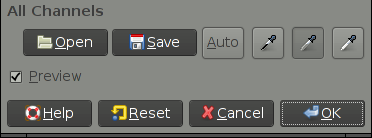
- An OK button for confirming actions and closing the windows
- A Cancel button for canceling actions and closing the window
- An Apply button for confirming actions without closing the window
- A Close button for closing windows after changes have already been applied
Appearance
[edit]macOS
[edit] | This section needs to be updated. (June 2015) |
Buttons in macOS's Aqua interface are usually depicted as rounded-rectangles of crystallized glass. Normally these buttons are light grey in color and turn blue when pressed. The button with keyboard focus (selectable with the spacebar) appears with a blue glow surrounding it. The default button in an active window (selectable with the return key) animates between a bright blue and a darker blue (the same color as a pressed button).
Also used, primarily within application toolbars, are slightly rounded rectangles with a light grey metallic appearance. These buttons appear darker and "pushed inward" when pressed.
Window management controls appear in the top left corner of each window. These buttons are similar in style to standard aqua buttons, but are color-coded as a memory aid. From left to right, these are: "Close Window", shown in red; "Minimize Window", shown in yellow; and "Zoom", shown in green, which causes the window to resize to best fit its contents.
Windows shell
[edit]Buttons in Microsoft Windows are usually rectangular, with mildly rounded corners in Windows XP, Vista, and 7, in Windows 11. In Windows 8, the buttons are rectangular with sharp corners. A button with active focus is shown with a black dotted line just inside the border of the button. In addition, more recent versions, the default button is shown with a blue border. In Windows Vista and Windows 7, the default button will slowly fade between its normal appearance and the blue border. Window management controls are in the upper right-hand corner of the application window, and, from left to right: "minimize" the window (causing it to disappear into the taskbar at the bottom of the screen); maximize the window (causing it to expand to cover the whole screen; if the window is already maximized, the button will restore it to its previous size and position); and close the window.
Linux and other Unix-like systems
[edit]The appearance and behavior of buttons in Linux and other Unix-like operating systems is defined primarily by which widget toolkit is being employed, the most popular being GTK and Qt, though other toolkits are used as well. The use of multiple toolkits can lead to less uniform look and feel across applications. Most widget toolkits also have theming capabilities, so there is no single standard appearance as there is with Mac OS and Windows.
HTML
[edit]Buttons appear as elements of HTML forms to carry out actions such as clearing user input or submitting the form contents to the server. Buttons specified in HTML may be rendered by web browsers in different ways, typically either using the native button appearance of the underlying OS, or by using a button definition from within the browser. Buttons may also be styled by the developer of the web site the form appears on by using cascading style sheets.
HTML links are sometimes represented by a graphic closely resembling a button. Sometimes this type of link is used in advertisements to induce the user to click the ad and visit the advertiser's site.
References
[edit]- ^ button at FOLDOC
- ^ "Mozilla button description". Archived from the original on 2012-04-02. Retrieved 2009-09-18.
- ^ checkState button attribute in Mozilla's XUL Archived 2012-04-02 at the Wayback Machine
Button (computing)
View on Grokipedia<button> element supports custom functionality, and native controls in Windows Forms or WPF for desktop apps, ensuring responsive event handling like the Click event.[1][9] By facilitating immediate, predictable responses to user input, buttons remain indispensable for enhancing usability and reducing cognitive load in digital experiences.[10]
Definition and Fundamentals
Definition
In computing, a button is an interactive graphical control element within a user interface that initiates a specific action when activated by user input, such as clicking with a mouse, tapping on a touchscreen, or pressing a key while focused.[11][10][3] It serves as a fundamental component in graphical user interfaces (GUIs), enabling users to trigger events or commands without navigating to new pages or adjusting continuous values. Unlike hardware buttons on physical devices like keyboards or mice, which provide direct input to the system, software buttons are rendered digitally and respond to software-defined interactions.[11] Key characteristics of a button include its visual representation, typically as a rectangular or rounded shape containing a label (text or icon) that describes the action, and its support for multiple states to provide feedback during interaction. Common states are normal (enabled and idle), hover (when the cursor is over it), pressed (during activation), and disabled (unavailable for interaction, often grayed out to indicate inactivity).[10][3][12] These states enhance usability by visually confirming the user's intent and the system's response, such as subtle color changes or animations on hover and press. Buttons play a central role in event-driven programming, where activation generates events (e.g., a "click" event) that developers handle via code to execute associated functions, such as updating the interface or processing data.[13] Buttons differ from similar elements like hyperlinks, which primarily facilitate navigation to another resource or page rather than triggering an immediate in-place action, and sliders, which allow users to select from a continuous range of values (e.g., volume adjustment) instead of providing binary or discrete triggers.[3][14] For instance, a hyperlink might load a new webpage, while a button performs tasks like validating input without leaving the current view. This distinction ensures semantic clarity in UI design and accessibility, as screen readers interpret buttons as actionable controls separate from navigational links.[15] Basic use cases for buttons include submitting forms to send user-entered data to a server, opening contextual menus for additional options, and toggling the visibility of elements like expanding a panel or switching between modes.[10][11] In form submission, a button might validate and transmit information upon activation, while a menu-opening button reveals sub-options without reloading content, and a toggle button switches states like showing/hiding details to streamline user workflows.[3]Core Functionality
In graphical user interfaces, buttons are primarily activated through mouse clicks, where the primary mouse button is pressed and released within the button's bounds, triggering the interaction. Keyboard shortcuts, such as pressing the Enter or Space key when the button has focus, provide an alternative activation method, ensuring accessibility for users unable to rely on pointing devices. On touch-enabled devices, activation occurs via gestures like taps with a finger or stylus, with minimum hit regions recommended at 44x44 points for iOS and macOS to accommodate precise input. In advanced systems, buttons can also respond to voice commands, integrating with speech recognition for hands-free operation. The event handling process begins with the detection of user input by the underlying system or framework, such as a pointer event in web browsers or a mouse/keyboard event in desktop applications. Upon detection, the input triggers callbacks or event listeners associated with the button; for instance, in .NET applications, the button raises a Click event via a delegate like EventHandler, invoking subscribed methods to execute actions such as function calls or state updates. In web environments, developers attach handlers using methods like addEventListener("click", callback), where the callback processes the event object containing details like the input type and coordinates, enabling the execution of predefined actions like form submission or navigation. Buttons provide essential feedback to confirm interactions and guide users, including visual state changes such as color shifts or highlighting on hover and press to indicate responsiveness. Animations, like subtle scaling or ripple effects on activation, along with auditory cues such as click sounds, further reinforce the interaction's success and prevent perceived unresponsiveness during processing delays. These mechanisms, including activity indicators for ongoing operations, ensure users receive immediate confirmation of their input. By facilitating direct manipulation—where users interact with visible representations of objects through intuitive controls like buttons—interfaces become more comprehensible and predictable, as articulated in foundational work on the paradigm. This approach reduces cognitive load by minimizing the need for abstract commands, allowing users to perform actions through immediate, reversible operations that mirror real-world interactions.[16]Historical Development
Early Concepts
The concept of buttons in computing originated in the mid-20th century as rudimentary selection and control mechanisms in early computer systems, predating graphical user interfaces. During the 1950s, hardware-software hybrids emerged in projects like the Whirlwind computer at MIT, which featured toggle switches and control consoles for direct operator input and programming. These physical switches allowed users to set binary states or trigger operations on the system's cathode-ray tube display, serving as early analogs to digital buttons by enabling discrete selections in real-time interactions.[17][18] Complementing these were pointing devices such as light pens and light guns, developed for the Whirlwind in the early 1950s, which permitted operators to select screen positions by detecting phosphor glow on the CRT. The light gun, created by Robert Everett around 1952, was initially used for diagnostic spot detection but evolved into a tool for interactive selection, foreshadowing clickable elements. Similarly, the light pen, refined by Ben Gurley in 1957 at MIT Lincoln Laboratory, allowed precise pointing to graphical elements, integrating hardware triggers with software responses in a hybrid fashion that influenced later button designs.[19] By the 1960s, as batch processing systems gave way to command-line interfaces (CLIs), selection mechanisms became more abstract, often metaphorical for "button-like" choices in non-graphical environments. Batch processing relied on punched cards or switch panels for predefined command selections, while emerging CLIs on terminals, starting around 1964 with systems like CTSS at MIT, introduced interactive text-based commands as proxies for direct activation, reducing reliance on physical hardware. These developments emphasized user-initiated selections over sequential batch jobs, laying theoretical groundwork for buttons as intuitive activators.[20] A pivotal advancement came with Ivan Sutherland's Sketchpad system in 1963, developed as his MIT PhD thesis on the TX-2 computer. Sketchpad introduced interactive graphical elements using a light pen for direct manipulation of drawings—such as creating, moving, or deleting lines and circles—combined with physical push buttons to issue commands like "draw" or "erase." Toggle switches further controlled functions like constraint application, enabling users to point at and modify on-screen objects in real time, which served as direct precursors to software buttons by blending hardware inputs with visual feedback. This system demonstrated the feasibility of graphical communication between humans and machines, influencing subsequent interactive computing paradigms.[21] Key milestones in button-like interactivity culminated in Douglas Engelbart's oN-Line System (NLS) demonstrated in 1968 at the Fall Joint Computer Conference, often called the "Mother of All Demos." Engelbart, working at SRI International, introduced the first computer mouse—a wooden, three-button device patented in 1970—to navigate and activate clickable areas on a bitmapped display, including hypertext links and windows that responded to selections akin to modern buttons. Paired with a chord keyset for simultaneous inputs, the mouse enabled efficient pointing and triggering of actions, such as editing text or jumping between document sections, marking a shift toward pointer-based button interactions in collaborative computing environments.[22][23]Evolution in Graphical User Interfaces
The evolution of buttons in graphical user interfaces (GUIs) began with pioneering work at Xerox PARC, where the Alto computer, prototyped in 1973, introduced the first bitmap display supporting clickable elements controlled by a three-button mouse. This system allowed users to interact with on-screen menus and icons by pointing and clicking, establishing buttons as fundamental interactive components in a WYSIWYG environment. The Alto's design emphasized direct manipulation, influencing subsequent GUI developments by demonstrating how buttons could enable intuitive control over windows and applications.[24][25] These innovations from PARC directly shaped commercial GUIs, particularly Apple's Lisa released in 1983 and the Macintosh in 1984, which adopted mouse-driven buttons for tasks like selecting icons and activating menus, making graphical interactions accessible to non-technical users. The Lisa's interface, inspired by PARC demonstrations to Apple executives in 1979, featured dialog boxes with labeled buttons that provided clear affordances for actions such as confirming or canceling operations. Similarly, the Macintosh popularized these elements through its consistent use of buttons in the Finder and applications, setting a precedent for button standardization in personal computing.[4] In the late 1980s and 1990s, buttons achieved broader standardization across operating systems. The X Window System, developed in 1984 at MIT as part of Project Athena, provided a network-transparent foundation for Unix GUIs, with toolkits like Xt (introduced in 1987) enabling the creation of widget-based buttons that developers could customize for events like clicks and presses. Meanwhile, the Windows 3.x series, with Windows 3.0 launched in 1990 and 3.1 in 1992, popularized buttons in consumer operating systems through its enhanced GUI, featuring 3D-embossed push buttons in Program Manager and dialog boxes that improved visual feedback and usability, contributing to over 10 million copies sold by 1993. These advancements solidified buttons as a core, interoperable element in diverse computing environments.[26][27][28] The rise of mobile computing in the 2000s shifted button design toward touch-optimized interfaces. Apple's iOS, introduced with the iPhone in 2007, replaced physical buttons with large, gesture-responsive on-screen elements that scaled to finger interactions, emphasizing multi-touch for actions like tapping and swiping in apps such as Mail and Safari. Google's Android, debuting in 2008 on the HTC Dream, followed suit by integrating touch-friendly buttons into its home screen and navigation, initially combining soft keys with hardware for back, home, and menu functions to support varied device form factors. These platforms prioritized larger hit areas and haptic feedback, adapting buttons to capacitive touchscreens and reducing reliance on precise mouse pointing.[29][30] In the post-2010 era, buttons have evolved further with responsive and adaptive designs that dynamically adjust to device contexts. Responsive web design, formalized in 2010, enables buttons to fluidly resize and reposition across screen sizes using CSS media queries, ensuring usability on desktops, tablets, and mobiles without separate layouts.[31] These trends reflect a move toward intelligent, user-centric interactions that build on historical foundations while addressing modern multi-device ecosystems.Types and Variations
Standard Push Buttons
Standard push buttons represent the most fundamental and ubiquitous type of button in graphical user interfaces, designed primarily for initiating a single, discrete action without maintaining any ongoing state.[32] These buttons are characterized by their simplicity, providing users with a clear, immediate way to execute commands such as confirming an action or dismissing a prompt.[33] Unlike more complex variants, they do not toggle or cycle through multiple states, focusing instead on one-off triggers that respond directly to user input.[3] In terms of structure, standard push buttons are typically rectangular in shape, featuring a text label, an icon, or a combination of both to indicate their function.[32] The label often uses concise, action-oriented phrasing, such as imperative verbs starting with a capital letter, while icons draw from standardized symbol sets for quick recognition.[3] These buttons support essential states, including enabled (fully interactive) and disabled (visually dimmed and non-responsive to prevent unintended actions).[34] The rectangular form allows for flexibility in integration, with borders or backgrounds that provide subtle visual affordances like elevation or outlines to signal pressability.[35] The behavior of a standard push button centers on a single-action trigger, where activation—via click, tap, or keyboard input like Enter—prompts an immediate response from the application, such as closing a window or submitting data.[32] Upon activation, the button typically sends a command notification to the parent interface, ensuring the action executes without delay or persistent visual change.[34] Common examples include "OK" buttons that confirm dialog selections and "Cancel" buttons that abort operations, often with the default option (e.g., OK) accessible via the Enter key for efficient keyboard navigation.[3] Standard push buttons find widespread applications in dialog boxes for user confirmations, toolbars for quick command access, and forms for submitting inputs, all scenarios requiring a discrete action without altering the button's state post-execution.[32] In these contexts, they enable streamlined interactions, such as validating form data or initiating a save operation, where the goal is to complete a task and return focus to the primary interface.[34] Variations in labeling for standard push buttons include text-only designs for clarity in verbose environments, icon-only for space-constrained or intuitive visual cues, and hybrid approaches combining both for enhanced accessibility and recognition.[3] Sizing adapts to context, with desktop implementations using compact dimensions for dense layouts, while mobile versions employ larger touch targets—typically a minimum of 44 to 48 points or density-independent pixels—to accommodate finger interactions comfortably.[35] This scalability ensures usability across devices without compromising the button's core single-action purpose.[3]Specialized Button Types
Specialized button types extend beyond the simple, stateless activation of standard push buttons by incorporating state management, grouping, or expanded interactions to handle more complex user choices in graphical user interfaces. These variants are essential for tasks requiring persistent selections, mutual exclusivity, or hierarchical options, enhancing efficiency in forms, settings, and navigation without overwhelming the interface.[36] Toggle buttons, also known as switches, allow users to alternate between two mutually exclusive states, such as on and off, with the selection persisting until changed. Unlike standard push buttons that trigger a one-time action, toggles maintain a visual indication of the current state, often using sliders or binary icons that slide or fill upon interaction, and apply changes immediately without requiring submission. This mechanic is particularly suited for binary preferences, where the default state provides an initial setting, and users can toggle to override it. For instance, in mobile apps like iOS Settings, toggles control features like Bluetooth, ensuring instant feedback and reducing cognitive load compared to multi-step confirmations.[36][37] Radio buttons enable selection of one option from a predefined group of two or more mutually exclusive choices, where selecting one deselects others automatically to enforce singularity. They appear as small circles that fill when chosen, grouped visually or programmatically to indicate relatedness, and typically start with no selection to prompt deliberate choice, though a default can be set. This design prevents invalid states by design, making it ideal for scenarios with 2–8 visible options, such as priority levels in a form (e.g., High/Medium/Low). In Windows applications, radio buttons support keyboard navigation for accessibility, and grouping via containers ensures logical association, avoiding confusion from adjacent unrelated sets.[38][39] Checkboxes permit users to select zero, one, or multiple independent options from a group, toggling each between checked and unchecked states without impacting others. They are visualized as square boxes that display a checkmark or fill when selected, and in advanced implementations support a third indeterminate state (e.g., a dash) for partial or hierarchical selections like parent-child groups. Unlike radio buttons, checkboxes allow non-exclusive choices and often require a separate submit action to apply changes, making them suitable for scenarios like selecting multiple items in a list (e.g., dietary preferences in a form). Grouping enhances clarity, with support for keyboard and screen reader accessibility to indicate independent toggling.[40][41] Dropdown buttons integrate a button's direct action with a menu expansion, revealing a list of options upon activation to conserve space while providing access to multiple choices. Clicking the button—often marked with a downward arrow—displays a temporary flyout or list of mutually exclusive items, where selection closes the menu and updates the button's label to reflect the choice. This hybrid approach combines the immediacy of a button with the expandability of a menu, suitable for commands or attributes with more than a few options, such as font styles in Microsoft Word. In ribbon interfaces, dropdown buttons group related actions efficiently, with the primary button area executing the default option and the arrow accessing alternatives, optimizing for frequent single-click use while supporting discovery.[42][43] These specialized types find prominent use cases in structured environments to guide logical user flows through grouping and state control. Toggle buttons excel in settings panels for persistent binary controls, like enabling dark mode in applications, where immediate effect and clear on/off visuals maintain user awareness without disrupting workflow. Radio buttons and checkboxes are staples in forms for exclusive or multiple decisions, such as gender or payment method selection in e-commerce checkouts, ensuring data integrity by limiting or allowing choices within a themed group. Dropdown buttons support navigation and configuration tasks, like user profile menus in web apps, where space constraints demand compact expansion to related sub-options, fostering intuitive progression from broad to specific interactions. Overall, grouping these elements—via visual proximity or logical containers—reinforces their role in creating coherent, error-resistant interfaces that align with user expectations for decision-making.[36][38][42]Design and Appearance
General Design Principles
Effective button design in computing interfaces prioritizes visibility to ensure users can easily locate and interact with them. A key visibility rule is the minimum touch target size, recommended at 44 by 44 CSS pixels for pointer inputs to accommodate finger-based interactions and reduce accidental activations, as outlined in WCAG 2.1 Success Criterion 2.5.5 (Level AAA).[44] For enhanced usability, guidelines suggest larger sizes for critical actions. Contrast ratios are equally vital; text and images within buttons must achieve at least a 4.5:1 ratio against adjacent colors for normal text, dropping to 3:1 for large text (18pt or 14pt bold), per WCAG 1.4.3 Success Criterion.[45] Non-text elements, such as button borders or indicators, require a 3:1 contrast minimum under WCAG 1.4.11 to distinguish them from surrounding backgrounds.[46] Placement follows logical user flows, positioning buttons near related content with sufficient spacing—such as at least 8dp between elements in Material Design—to guide attention without cluttering the interface.[47] Consistency across an interface fosters familiarity and reduces cognitive load. Buttons typically employ standard shapes like rounded rectangles or subtle corner radii to convey interactivity, aligning with ergonomic principles in systems like Material Design, where shapes adapt slightly based on button size for visual harmony.[47] Color schemes emphasize hierarchy: primary actions often use prominent fills (e.g., brand accent colors like blue for affirmation), while secondary actions employ outlines or tonal variants to denote lower priority, ensuring high visual impact only for essential tasks.[47] Typography for labels should be concise (1–3 words), use title case, and maintain readability with bold weights and sufficient font sizes, starting with action-oriented verbs to clearly communicate purpose.[3] Feedback mechanisms provide immediate confirmation of user interactions, minimizing errors and building trust. Hover effects, such as subtle background darkening or cursor changes, signal potential clickability within 150–200ms, particularly for mouse inputs.[12] Press animations, like slight scaling or color shifts appearing in 100–150ms, acknowledge activation and deter repeated clicks.[12] Disabled states deemphasize non-interactive buttons through desaturated colors, reduced opacity, or gray tones with at least 3:1 contrast to adjacent areas, often paired with tooltips explaining unavailability to guide users.[12] These states ensure clear communication without relying solely on color, supporting diverse input methods. Cross-platform considerations focus on adapting buttons to varied input modalities, such as touch versus pointer devices, by maintaining scalable touch targets (e.g., 48x48dp minimum) and responsive states that function across screens without altering core functionality.[47] This approach promotes seamless experiences by prioritizing universal ergonomics over device-specific aesthetics.Platform-Specific Implementations
In macOS, buttons adhere to the Human Interface Guidelines, featuring rounded corners on push buttons for a consistent, modern appearance that aligns with the system's overall aesthetic. These buttons, such as those using the flexible push bezel style, incorporate subtle gradients in square variants to denote actions like view initiation, enhancing visual hierarchy without overwhelming the interface. Post-2010s updates in macOS Big Sur and later introduced vibrancy effects, which apply translucent materials to buttons for better integration with underlying content, providing depth and adaptability to light or dark modes while maintaining the legacy Aqua influence of fluid, water-like subtlety. As of June 2025, Apple updated button style and content guidelines, incorporating the new Liquid Glass design language for more expressive and translucent experiences across software.[3][48][49] Windows buttons have evolved through distinct design paradigms, with the earlier Metro style introduced in Windows 8 (2012) emphasizing flat, typography-focused elements that minimized skeuomorphism for a clean, content-centric look. In contrast, the Fluent Design System, implemented since Windows 11 (2021), adopts a flat aesthetic with rounded edges on buttons to promote fluidity and accessibility across devices. This system incorporates acrylic materials, which apply translucent blur effects to button surfaces and transient UI elements like popups, creating perceived depth and visual focus while adapting to themes and hardware constraints.[50][51][52] Button implementations in Linux and Unix environments vary significantly by desktop environment, reflecting the modular nature of open-source toolkits like GTK and Qt. In GNOME, utilizing the GTK toolkit, the default Adwaita theme renders buttons with colorful accents and integrated icons to emphasize usability and vibrancy, often featuring subtle borders and hover states that highlight interactive elements without heavy ornamentation. Conversely, KDE Plasma, built on Qt, employs the Breeze theme, which favors a balanced, optimistic design with buttons featuring subtle borders and hover states in a light, flat profile with clean lines and icon support to ensure consistency across applications.[53][54] Mobile adaptations further differentiate button designs to suit touch interactions. iOS follows Human Interface Guidelines that recommend capsule- or pill-shaped buttons for certain contexts, such as inline or text-only variants, providing a 44–52 point tappable area with rounded ends for intuitive finger targeting and clear affordances. As of June 2025, Apple updated button style and content guidelines, incorporating the new Liquid Glass design language for more expressive and translucent experiences. Android's Material Design, meanwhile, employs elevation-based shadows on buttons to simulate depth, with elevated buttons casting dynamic shadows that increase on press to indicate interactivity, using rounded corners and tonal fills for a layered, responsive feel across sizes from extra small to extra large. The May 2025 Material Design 3 Expressive update expanded button capabilities, introducing toggle buttons that change shape (e.g., from round to square when selected), a wider variety of shapes and sizes, and enhanced adaptive sizing.[3][55][49][56][57][47]Implementation in Software
Desktop and Mobile Applications
In desktop applications, buttons are typically implemented using widget toolkits that provide pre-built components for graphical user interfaces. For cross-platform development, the Qt framework offers the QPushButton class, which inherits from QAbstractButton and supports properties like text, icons, and toggle states, allowing developers to create standard push buttons with minimal code. Similarly, the GTK toolkit, commonly used in Linux environments, utilizes the GtkButton widget, which can be constructed with gtk_button_new() and customized via CSS for styling, ensuring integration with the GNOME desktop environment. On macOS, Apple's AppKit framework provides the NSButton class, part of the Cocoa API, which handles button creation through methods like initWithFrame: and supports various control sizes and bezel styles for native appearance. For Windows applications, the Win32 API or frameworks like WinUI 3 (for desktop apps using the Windows App SDK) or UWP (using WinUI 2) provide the Button control in XAML, enabling event-driven interactions via the Click event handler. Mobile applications rely on platform-specific UI frameworks to render buttons that adhere to touch-based interactions and device constraints. In iOS development, UIKit's UIButton class allows creation via code with UIButton(type: .system) or Interface Builder, supporting states like normal, highlighted, and disabled, with automatic adaptation to trait collections for dynamic type and accessibility. For Android, Jetpack Compose introduces the Button composable function, which uses Material Design principles and can be invoked with parameters like onClick for immediate event binding, promoting declarative UI construction over imperative views. Earlier Android apps used the legacy Button view from android.widget, extended with attributes in XML layouts, but Compose has become the recommended approach since its stable release in 2021 for better performance in modern apps. Event integration in these frameworks involves binding buttons to handler functions that respond to user actions without blocking the UI thread. In Android's Jetpack Compose, the onClick parameter of Button launches a lambda expression that executes on the main thread for UI updates, while for computationally intensive tasks, developers use coroutines with Dispatchers.IO to offload work and prevent ANRs (Application Not Responding errors). Qt employs the clicked() signal, connected via QObject::connect() to a slot function, which by default runs on the main event loop but can be dispatched to worker threads using QThread for non-blocking operations like network calls. In SwiftUI for iOS, the Button view takes an action closure that executes synchronously on the main actor, ensuring thread safety through Swift's concurrency model introduced in iOS 15, where async/await can be used for background tasks without manual threading. GTK buttons emit the "clicked" signal, handled by g_signal_connect() in C or equivalents in bindings like Python's PyGObject, with GLib's main loop managing events and GTask for asynchronous operations to maintain responsiveness. Native features enhance button usability by leveraging platform APIs for theming and system responsiveness. On macOS, NSButton automatically conforms to the system's appearance, such as switching to dark mode via the effectiveAppearance property, which updates button colors and images based on NSAppearance.currentDrawingAppearance. Android's Material Theming system in Jetpack Compose applies dynamic colors from the system's wallpaper or accent palette through MaterialTheme, allowing buttons to inherit elevations and ripples that respond to Android 12's Material You design language. iOS buttons in UIKit or SwiftUI respect user interface styles set in Settings, using traitCollection.userInterfaceStyle to toggle between light and dark variants, ensuring compliance with Apple's Human Interface Guidelines for consistent visual feedback. Cross-platform portability presents challenges in button implementation, often addressed by frameworks like Flutter, which uses the ElevatedButton or TextButton widgets built on the Material or Cupertino libraries to mimic native looks across iOS and Android. In Flutter, button lifecycle management involves disposing of controllers in StatefulWidgets to prevent memory leaks, with setState() or Riverpod for state updates that trigger rebuilds without platform-specific code. Developers must handle platform channels for native features like haptic feedback, using MethodChannels to invoke iOS's UIFeedbackGenerator or Android's Vibrator API, ensuring buttons provide tactile responses consistent with each OS. Tools like Qt for Mobile or Xamarin further aid portability by abstracting widget differences, though they require careful management of platform-specific overrides to avoid inconsistencies in button sizing and touch targets during app updates.Web and Browser-Based Buttons
In web development, buttons are primarily implemented using HTML elements that provide interactive controls within browser environments. The<button> element represents a clickable button that can trigger actions such as form submission or custom JavaScript functions, and it supports rich content like text, images, or other HTML elements inside its opening and closing tags.[58] Key attributes include type, which specifies the button's behavior—such as submit for form submission (default), reset to clear form data, or button for no default action; value, which sets the data sent with the form if the button is successful; and disabled, a boolean attribute that makes the button non-interactive and visually grayed out.[58] In contrast, the <input type="button"> element creates a simpler button without opening and closing tags, relying on the value attribute for its label text, and it does not support nested HTML content, making <button> preferable for complex designs. Both elements can be associated with forms using the form attribute, allowing buttons outside form boundaries to interact with them.[58]
Styling web buttons is achieved through CSS, which overrides default browser appearances to ensure consistent and visually appealing designs across devices. Common properties include background-color to set the button's fill, border-radius for rounded corners (e.g., border-radius: 4px; to create subtle curves), and padding for internal spacing to improve touch targets. Pseudo-classes enhance interactivity: :hover applies styles when the cursor is over the button, such as changing background-color: hotpink;, while :active targets the pressed state, for instance, background-color: blue; during a click. For responsiveness, media queries adjust properties based on screen size, like reducing padding on mobile devices with @media (max-width: 600px) { button { padding: 8px 16px; } } to optimize for smaller viewports.
JavaScript adds dynamic behavior to web buttons by attaching event listeners, enabling responses to user interactions without page reloads. The addEventListener method is commonly used to handle clicks, as in button.addEventListener('click', function(event) { /* action */ });, where the event object provides details like the target element. To prevent default actions, such as form submission, developers invoke event.preventDefault() within the handler. For asynchronous operations, the Fetch API (modern successor to AJAX) facilitates dynamic updates, exemplified by fetch('/api/action').then(response => response.json()).then(data => { /* update UI */ }); after a button click, allowing seamless content refresh.
Browser compatibility for web buttons is robust, with the <button> element supported in Chrome since version 4, Firefox since version 2, Safari since 3.1, and Edge since 12, with full support across all major browsers.[58] Rendering variations are minimal but can occur in default styles— for example, Chrome and Edge may apply more rounded native appearances on Windows, while Firefox emphasizes flat designs—necessitating CSS resets for uniformity.[58] Progressive enhancement ensures core functionality works in older browsers by starting with semantic HTML and layering JavaScript and CSS, while prioritizing accessibility features like keyboard navigation to maintain usability across assistive technologies.[58]