Heat map generated from DNA microarray data reflecting gene expression values in several conditions (Eisen et al.)Shaded matrix display from Toussaint Loua (1873)A heat map showing the RF coverage of a drone detection system
A heat map (or heatmap) is a two-dimensional data visualization technique that represents the magnitude of individual values within a dataset as a color. The variation in color may be by hue or intensity.
In some applications such as crime analytics or website click-tracking, color is used to represent the density of data points rather than a value associated with each point.
"Heat map" is a relatively new term, but the practice of shading matrices has existed for over a century.[1]
Heat maps originated in 2D displays of the values in a data matrix. Larger values were represented by small dark gray or black squares (pixels) and smaller values by lighter squares. The earliest known example dates to 1873, when Toussaint Loua used a hand-drawn and colored shaded matrix to visualize social statistics across the districts of Paris.[1] The idea of reordering rows and columns to reveal structure in a data matrix, known as seriation, was introduced by Flinders Petrie in 1899. In 1950, Louis Guttman developed the Scalogram, a method for ordering binary matrices to expose a one-dimensional scale structure. In 1957, Peter Sneath displayed the results of a cluster analysis by permuting the rows and the columns of a matrix to place similar values near each other according to the clustering. This idea was implemented by Robert Ling in 1973 with a computer program called SHADE. Ling used overstruck printer characters to represent different shades of gray, one character-width per pixel.[1]Leland Wilkinson developed the first computer program in 1994 (SYSTAT) to produce cluster heat maps with high-resolution color graphics. The Eisen et al. display shown in the figure is a replication of the earlier SYSTAT design.[1]
Software designer Cormac Kinney trademarked the term 'heat map' in 1991 to describe computer software used to display real-time financial market information.[2] In 1998 the trademark was acquired by SS&C Technologies, Inc., but the company did not extend the license, so it was annulled in 2006.[3]
Spatial Heat Map Example: Displays atmospheric carbon across a world image with red being the highest and blue being the lowest concentration of CO2 (5 April 2019).
There are two primary categories of heat maps: spatial and grid. Additionally, there are over ten various types of heat maps.
A spatial heat map displays the magnitude of a spatial phenomenon as color, usually cast over a map. In the image labeled "Spatial Heat Map Example," temperature is displayed by color range across a map of the world. Color ranges from blue (cold) to red (hot).
A grid heat map displays magnitude as color in a two-dimensional matrix, with each dimension representing a category of trait and the color representing the magnitude of some measurement on the combined traits from each of the two categories. For example, one dimension might represent year, and the other dimension might represent month, and the value measured might be temperature. This heat map would show how temperature changed over the years in each month. Grid heat maps are further categorized into two different types of matrices: clustered, and correlogram.[citation needed]
Clustered heat map: The example of the monthly temperature by year is a clustered heat map.
Correlogram: A correlogram is a clustered heat map that has the same trait for each axis in order to display how the traits in the set of traits interact with each other. The correlogram is a triangle instead of a square because the combination of A-B is the same as the combination of B-A and so does not need to be expressed twice.
In a grid heat map, colors are presented in a grid of a fixed size, with every cell in the grid also being an equal size and shape. The goal is to detect clustering, or suggest the presence of clusters.
A spatial heat map is often used on maps or satellite imagery (see GIS), where there is no concept of cells, and instead the colors vary continuously.
Type
Description
Applications
Basic Matrix Heat Map
Displays values in a 2D grid with color encoding. Simple structure without clustering or hierarchy.
Heat maps have a wide range of possibilities amongst applications due to their ability to simplify data and make for visually appealing to read data analysis. Many applications using different types of heat maps are listed below.
Warming stripes graphics are one-dimensional heat maps that show global warming's yearly progress—in this example, since 1850. To represent cooler and warmer temperatures, the design's originator, climatologist Ed Hawkins, chose the 8 most saturated blues and reds of the ColorBrewer 9-class single hue palette.
Business Analysis: Heat maps are used in business analytics to give a visual representation about a company's current functioning, performance, and the need for improvements. Heat maps are a way to analyze a company's existing data and update it to reflect growth and other specific efforts. Heat maps visually appeal to team members and clients of the business or company.
Websites: There are many different ways heat maps are used within websites to determine a visiting users actions. Typically, there are multiple heat maps used together to determine insight to a website on what are the best and worst performing elements on the page. Some specific heat maps used for website analysis are listed below.
Mouse Tracking: Mouse tracking heat maps or hover maps, are used to visualize where the user of the site hovers their cursor.
Eye tracking: Eye tracking heat maps measure the eye position of the website's users and gathers measurements such as eye fixation volume, eye fixation duration, and areas of interest.
Click Tracking: Click tracking heat maps or touch maps, are similar to mouse tracking heat maps, but instead of hover actions, these types of heat maps help visualize the users click actions. Click tracking heat maps not only allow for visual cues on clickable components on a webpage, such as buttons or dropdown menus, but these heat maps also allow for tracking on non-clickable objects anywhere on the page.
AI-Generation Attention: AI-generated attention heat maps help visualize where the visiting user's attention will go on a certain section of a webpage. These types of heat maps are implemented using a created software algorithm to determine and predict the attention actions of the user.
Scroll Tracking: Scroll tracking heat maps are used to represent the scrolling behavior of the website's users. This helps produce visual cues to what section on the website the user spends the most time at.[4]
Data Analysis Heat Map Example: Displays the normalized linkage disequilibrium of Genomic Windows within the Hist1 region of a mouse (Mus musculus).Data Analysis Heat Map Example: Subgraph of one of five hub nodes with a large degree of centrality in a genomic region in mice (Mus musculus) called the Hist1 region, where each cell in the graph represents one edge in the genomic network.
Exploratory Data Analysis: Working with small and large data sets, data scientists and data analysts look at and determine essential relationships and characteristics amongst different points in a data set as well as features of those data points. Data scientists and analysts work with a team of others in different professions. The use of heat maps make for a visually easy way to summarize findings and main components. There are other ways to represent data, however heat maps can visualize these data points and their relationships in a high dimensional space without becoming too compact and visually unappealing. Heat maps in data analysis, allow for specific variables of rows and/or columns on the axes and even on the diagonal.
Biology: In the biological field, heat maps are used to visually represent large and small sets of data. The focus is towards patterns and similarities in DNA, RNA, gene expression, etc. Working with these sets of data, data scientists in bioinformatics, focus on different concepts, some of which being community detection, association and correlation, and the concept of centrality, where heat maps are a compelling way to visually summarize results and to share amongst other professions not in the field of biology or bioinformatics. The two heat maps to the right, labeled "Data Analysis Heat Map Example," show different ways in which one may present genomic data over a specific region (Hist1 region) to someone outside the field of biology so they have a better understanding of the general concept a biologist or data scientist are trying to present.[5]
Financial Analysis: The values of different product and assets fluctuate both rapidly and/or gradually over time. The need to log changes to the daily markets is imperative. It allows for the ability to draw predictions from patterns while being able to revisit past numerical data. Heat maps are able to remove the tedious process and enable the user to visualize data points and compare amongst the different performers.[6]
Geographical Visualization: Heat maps are used to visualize and display a geographic distribution of data. Heat maps represent different densities of data points on a geographical map to help users see the intensities of certain phenomena and to show items of most or least importance. Heat maps used in geographical visualization are sometimes confused with choropleth maps, but the difference comes with how certain data is presented which differentiate the two.[7]
Sports: Heat maps can be used in many sports and can influence manager's and/or coaches decisions based on high and low densities of data displayed. Users can identify patterns within the game, the strategies of opponents and one's own team, make more informed decisions benefitting the player, team, and business, and can enhance performance in different areas by identifying enhancement is needed. Heat maps also visualize comparisons and relationships amongst different teams in the same sport or between different sports all together.[6]
Cybersecurity: In intrusion detection systems and log analysis, heat maps are used to highlight unusual access patterns, port scanning attempts, and malicious IP clustering. They help SOC (Security Operations Center) analysts quickly spot anomalies in large datasets.[8]
Urban Planning: Heat maps are used in urban planning to visualize traffic congestion, pedestrian flow, and environmental conditions for data-driven infrastructure development (Batty et al., 2012). Environmental heat maps track air quality and urban heat islands, guiding green space planning (EEA, 2021). Noise pollution heat maps aid zoning and mitigation near residential areas (EEA, 2020). Commercial planners use foot traffic heat maps to optimize retail layouts (SmartSantander, 2014). Integrated in smart city systems, these maps enhance livability, sustainability, and safety (Batty et al., 2012).[9][10][11][12]
Many different color schemes can be used to illustrate the heat map, with perceptual advantages and disadvantages for each. Choosing a good color scheme is integral to accurately and effectively displaying data, whereas a poor color scheme can lead viewers to inaccurate conclusions or exclude those with color deficiencies from proper analysis of said data.[13]
Combination of surface plot and heat map, where the surface height represents the amplitude of the function, and the color represents the phase angle.
Rainbow color maps, while a common choice, suffer from both accessibility and data continuity concerns.[14] Rainbow maps pose a challenge for users with color vision deficiencies, particularly in those with issues distinguishing red and green – a condition affecting a significant portion of the population.[14] In addition to accessibility issues, rainbow heat map colors are not perceptually uniform; equal increments in data values do not correspond to equal changes in color.[15] The lack of uniformity can create misleading visual effects, like an artificial boundary or gradient.[15] These effects can compromise the accuracy of effectiveness of the visualization. This example of the amplitude with the colors showcasing the phase angle can be hard to interpret with the entire rainbow of colors. In this case, the rainbow color scheme may cloud interpretation for those with color vision deficiencies or create confusion by some of the hard color boundaries across the diagram.[15] To address these challenges, perceptually uniform color sets have been created to accommodate visual impairments and maintain consistent color differences proportional to differences in data.[16]
Rainbow vs Viridis scheme heat maps
Perceptually uniform color schemes are carefully designed to maintain consistent perceptual differences and offer a better viewing experience for viewers with color vision deficiencies. When implementing these color schemes into a heat map, designers must consider the data context and intended emphasis. These schemes follow three main patterns: sequential gradients (varying intensity of a single hue), diverging palettes (two contrasting hues with a neutral midpoint), and qualitative sets for categorical data.[17] Scientific visualization has produced several perceptually uniform color sets (like Viridis, Magma, and Cividis) that address both uniformity and accessibility concerns.[18]
Virdis scheme heatmap to illustrate the use of perceptually uniform color sets
Device limitations can also significantly affect heat map visualization effectiveness. When displayed on low-resolution screens, highly detailed color gradients may appear pixelated or banded, reducing the quality of the visualization; this is known as color quantization, which can obscure or wrongly emphasize pieces of data. To mitigate these effects, designers should consider all devices that will display their heat map, and their color limitations. Comprehensive testing and using a scheme with few colors is the safest bet when creating a heat map that will be viewed across multiple device types.
grey-scale heat map generated using python package seaborn
Grey-scale compatibility is essential for heat map accessibility, especially when considering print media, black and white only displays, or monochromatic vision. When converting to grey-scale, many color schemes will lose their distinctive data mappings, allowing for different values to appear identical in luminescence. Grey-scale friendly color schemes are designed to incorporate contrast between data points even when color is removed, such as the "virdis" family.[18]
A heat map showing the average temperature in the Southern Rockies from 1950 to 2020 using the "Blues" color palette from the Color Brewer library
Dave Green's 'cubehelix' colour scheme provides resources for a colour scheme that prints as a monotonically increasing greyscale on black and white postscript devices.[23]
Openlayers3 can render a heat map layer of a selected property of all geographic features in a vector layer.[24]
Python, a widely used language for data analysis and visualization, supports several libraries for creating heat maps:
Matplotlib'simshow() function visualizes 2D numerical arrays as color-coded images, with control over color mapping and axes.[31]
Seaborn'sheatmap() function provides an aesthetically refined heat map with minimal code, often used with Pandas DataFrames.[32]
Plotly'sgo.Heatmap() function creates interactive HTML-based heat maps. It allows for x- and y-axis labels, 2D matrices, custom color scales, and detailed hover information.[33]
Java, heat maps can be created using graphics libraries such as JavaFX, Swing, or third-party charting libraries.
This heatmap visualizes normalized linkage disequilibrium (D′) between genomic windows, showing how often alleles are inherited together. Using JavaFX Canvas APIJavaFX Canvas API allows drawing grid-based heat maps by manually coloring rectangular cells based on data values. The GraphicsContext.fillRect() and Color classes enable full control over rendering.[34]
JFreeChart supports heat map-style visualizations using XYBlockRenderer with customizable color scales and axis labeling, suitable for plotting matrix-style data.[35]
HeatChart (a lightweight Java library) generates basic heat maps with minimal configuration, using a 2D array and producing a BufferedImage that can be embedded in Swing GUIs.[36]
XChart provides support for creating charts in Java, including color-mapped scatter plots that resemble heat maps; useful for lightweight applications without JavaFX.[37]
Processing (Java-based) is used in interactive data visualizations, including real-time heat maps for sensor data and simulations, with easy color interpolation methods.[38]
heatmap of genomic data comparing 27 NPs (nuclear profiles) across 81 genomic windows Optimal clusters within the Hist1 region were identified and refined using k-means clustering, visualized through Seaborn in PythonC, heat maps can be created using low-level image manipulation, graphics libraries, or bindings to rendering engines for data visualization.
PPM (Portable Pixmap Format) allows for the simplest form of heat map generation in C by writing color-coded pixel values directly to a file. It is a plain-text or binary format that can be manually implemented without external libraries.[39]
libpng enables the creation of compressed, high-quality PNG heat maps by mapping data values to RGB and writing image buffers. It supports alpha transparency and is suitable for scientific visualization.[40]
SDL2 (Simple DirectMedia Layer) allows for real-time heat map rendering in a window. It supports pixel-level manipulation, making it ideal for interactive visualizations or sensor data maps.[41]
OpenGL, via C bindings (e.g., GLUT or GLFW), provides GPU-accelerated heat map rendering with texture mapping and shaders. This is used in high-performance or simulation-based applications.[42]
A choropleth map visualizing United States population density by state.
Choropleth maps and heat maps are often used in place of one another incorrectly when referring to data visualized geographically.[43] Both techniques show the proportion of a variable of interest, but the two differ in how the boundaries for the variable's data aggregations are constructed. If the data were collected and aggregated using irregular boundaries, such as administrative units, then a heat map displaying that data will be the same as a choropleth map, encouraging confusion about how the two differ.
Choropleth maps show data grouped by geographic boundaries like countries, states, provinces or even floodplains. Each region has a singular value, visualized by color intensity, shading or pattern. The figure on the right displaying a choropleth map showing the United States' population density by state may be used as an example. The figure illustrates a singular value (population) denoted by blue color intensity proportionate to the state's value relative to all other states' values, bounded by each state's border.
A heat map visualizing population density per square kilometer around the world in 1994.
Similarly, heat maps may also visualize data over a geographic region. However, unlike choropleth maps, heat maps show the proportion of a variable over an arbitrary, but usually small grid size, independent of geographic boundaries.[44][45] The figure on the right displaying a heat map of world population is an example. The figure illustrates a single value (population) bounded in an arbitrary grid (square kilometers) with each cell in the grid represented by a color intensity proportionate to the value of the cell relative to all other cells. Some heat maps that are created using approximated regional data may show familiar geographic borders in the visualization where none really exist. The illusion of geographic borders is due to the existence of patterns within the dataset rather than the visualization technique. The figure on the right displaying a heat map of world population also contains this occurrence. Areas in rural parts of the United States and South America may closely resemble familiar geographic borders in those regions.
Lake effect snow – weather radar information is usually shown using a heat map.
Another example of a heatmap over a geographic area is a visualization of lake effect snow around Buffalo, New York, in mid-October 2006. This figure shows another usage of heat maps with geographic areas, and how useful they can be in showcasing the effects of weather on specific areas as opposed to countries or states.
Bertin J (1967). Sémiologie Graphique. Les diagrammes, les réseaux, les cartes [Graphic semiotics. Diagrams, networks, maps] (in French). Gauthier-Villars. OCLC2656278.
Friendly M (March 1994). "Mosaic Displays for Multi-Way Contingency Tables". Journal of the American Statistical Association. 89 (425): 190–200. doi:10.1080/01621459.1994.10476460. JSTOR2291215.
A heat map is a two-dimensional data visualization technique that represents the magnitude of values in a dataset using color variations, often in a matrix or spatial format where higher intensities correspond to warmer or more saturated colors.[1][2]
The foundational concept emerged in the 19th century through shaded matrix displays, with French statistician Toussaint Loua pioneering their use in 1873 to aggregate social statistics—such as nationality, profession, and age—across Paris arrondissements in a single visual summary derived from 40 separate maps.[3]
The term "heat map" originated in 1991, coined by software designer Cormac Kinney to depict real-time financial market information through color-coded two-dimensional displays.[4]
Contemporary applications span genomics for clustered gene expression matrices, web analytics for user interaction densities, geospatial density estimation, and statistical correlationanalysis, enabling rapid detection of patterns, gradients, and anomalies in multivariate data.[3][2][5]
While effective for revealing structure in large datasets, heat maps require careful color scale selection to avoid perceptual biases, such as overemphasizing extremes due to non-linear human color perception.[5]
Definition and Fundamentals
Core Definition
A heat map is a two-dimensional graphical representation of data in which numerical values are encoded by variations in color, typically within a matrix, grid, or spatial layout, to convey magnitude, density, or intensity.[1][6] Colors are selected such that differences in hue, saturation, or brightness correspond directly to data values, often employing sequential schemes like grayscale (darker shades for higher values) or divergent palettes (e.g., blue-to-red gradients) to highlight patterns, clusters, or outliers.[7][2]This visualization technique facilitates the identification of trends and correlations in large datasets by leveraging human perceptual strengths in color differentiation, though effectiveness depends on color perceptionaccessibility and avoiding perceptual biases like isoluminant schemes that hinder discrimination.[5] In statistical applications, heat maps often overlay a data matrix where rows and columns represent variables or observations, with cell colors scaled relative to a chosen metric such as correlation coefficients or frequencies.[6] Unlike univariate bar charts, heat maps inherently bivariate or multivariate by design, compressing multidimensional information into a compact, interpretable form without aggregation loss in the visual encoding.[8]
Visual Encoding Principles
Visual encoding in heat maps maps data values to color variations across a grid, where position encodes categorical or spatial dimensions and color intensity or hue represents magnitude.[7] This approach leverages human preattentive processing for rapid pattern detection, as color differences allow quick discrimination of high and low values without sequential scanning.[9] Effective encoding prioritizes perceptual accuracy, ensuring that visual changes correspond linearly to data differences to avoid misinterpretation of trends or clusters.[10]Core principles emphasize colormap selection for perceptual uniformity, where equal increments in data produce equally perceived color steps, primarily through monotonic changes in lightness rather than hue or saturation alone.[11] Sequential colormaps, progressing from dark/low to light/high values, suit non-negative ordered data like densities or correlations, while diverging colormaps highlight deviations around a neutral midpoint (e.g., zero) using contrasting hues like blue-white-red.[12]Rainbow or cyclic colormaps are discouraged due to non-uniform perceptual steps that introduce artificial boundaries and hinder accurate magnitude comparison, as evidenced by studies showing slower and less precise judgments with such schemes.[13] Perceptually uniform alternatives, such as viridis or cividis, maintain consistent lightness gradients and color-vision deficiency compatibility, reducing errors in value estimation by up to 20-30% in user tests.[14]Data normalization underpins encoding fidelity; raw values are often scaled to [0,1] or z-scores to facilitate cross-row comparisons in matrix heat maps, preventing dominance by absolute scales.[15] Ordering and dendrograms augment color by grouping similar rows or columns, enhancing cluster visibility through spatial proximity, a principle rooted in Gestalt laws of continuity and proximity.[16] Overly saturated colors or poor contrast can induce illusions like the Chebyshev illusion, where aligned high-contrast cells appear misaligned; thus, mid-tones should avoid sharp transitions.[17] For spatial heat maps, kernel density estimation smooths values before encoding to mitigate grid artifacts, ensuring color reflects underlying distributions rather than sampling noise.[5] Accessibility requires testing against protanopia/deuteranopia simulations, favoring isoluminant alternatives only for categorical distinctions, not quantitative scales.[18]
Historical Development
Early Origins
The earliest documented use of a heat map-like visualization occurred in 1873, when French statistician Toussaint Loua created a shaded matrix display to summarize social statistics across Paris's 20 arrondissements.[3] This hand-drawn grid employed varying shades of gray to represent aggregated data from 40 separate thematic maps, covering variables such as population density, birth rates, professions, and housing conditions.[19] Loua's atlas, titled Atlas statistique de la ville de Paris, aimed to condense complex urban demographic information into a single, comparative view, facilitating the identification of patterns like correlations between socioeconomic factors and geographic areas.[20]Loua's matrix predates computational graphics by more than a century and exemplifies the principles of visual encoding through intensity variation, akin to modern heat maps.[21] By using a rectangular array where rows denoted arrondissements and columns represented metrics, the display allowed for rapid cross-variable and spatial comparisons without requiring multiple overlaid maps.[3] This approach addressed the limitations of contemporaneous cartographic methods, which often struggled with multivariate representation in static formats.[19]While shaded matrices appeared sporadically in statistical literature prior to Loua, his 1873 work stands as the foundational example of a systematic heat map for urban analysis, influencing later developments in graphical statistics.[22] The technique's reliance on perceptual ordering of shades ensured interpretability, though it lacked the hierarchical clustering of later variants.[3]
Mid-20th to Late 20th Century Innovations
In the mid-20th century, statistical methods advanced matrix-based visualizations through permutation techniques to uncover latent structures in data. Louis Guttman's 1950 introduction of the Guttman scalogram represented a key innovation, employing row and column reordering of binary matrices to reveal unidimensional scales, particularly in social science applications where cumulative patterns were sought.[3] This approach laid groundwork for visualizing hierarchical relationships via reordered displays. Concurrently, Peter Sneath's 1957 work on numerical taxonomy incorporated shading in association matrices to highlight cluster similarities, facilitating early graphical interpretation of multivariate data in biological classification.[3]Jacques Bertin's 1967 Semiology of Graphics formalized the reorderable matrix as a fundamental graphic method, advocating manual or algorithmic permutation of rows and columns alongside value-based shading to expose patterns such as seriation and clustering in datasets ranging from demographic to geographic.[3] Bertin's framework emphasized the matrix's dissociative properties for independent variable manipulation, influencing subsequent statistical graphics by prioritizing visual reorderability over fixed layouts. By the 1970s, computational tools enabled automated implementations; Robert Ling's 1973 SHADE program used character printer over-strikes to generate shaded similarity matrices, allowing denser representations of correlation structures. John Hartigan's 1974 block clustering algorithm further innovated by directly displaying partitioned matrix blocks, supporting two-way clustering for exploratory data analysis in statistics.[3]The 1980s saw integration of hierarchical elements with matrix shading. John Gower and Peter Digby's 1981 methods appended dendrograms—tree-like cluster diagrams—to row and column margins of association matrices, providing a visual scaffold for interpreting partitions without altering the core tiled display. Leland Wilkinson's 1984 advancements in SYSTAT software implemented two-way hierarchical clustering with grayscale shading for rectangular matrices, enabling scalable analysis of asymmetric data like contingency tables.[3] These developments bridged manual permutation with algorithmic efficiency, as computers processed larger datasets.Toward the late 20th century, color encoding enhanced discriminability. Wilkinson's 1994 SYSTAT manual featured the first documented cluster heat map using continuous color gradients to represent matrix values, applied to social statistics, which improved perceptual rendering of fine gradations compared to monochrome shading. This innovation synthesized prior elements—permutation, clustering, dendrograms, and intensity mapping—into a compact form suitable for high-dimensional data, presaging widespread adoption in fields like genomics.[3] Parallel efforts in thermal imaging from the 1950s onward produced literal heat maps via infrared detection, but metaphorical data visualizations dominated statistical innovations.[23]
21st Century Advancements
The advent of high-throughput sequencing and microarray technologies in the early 2000s propelled heat maps into central roles in bioinformatics, where they facilitated the visualization of vast gene expression datasets comprising thousands of genes across numerous samples. These advancements enabled hierarchical clustering algorithms to reveal patterns in complex biological data, with tools like R's heatmap function gaining prominence for scalable matrix representations.[24] By 2011, interactive heat map interfaces emerged, allowing users to filter, search, and dynamically explore genomic data matrices, addressing limitations in static visualizations for large-scale analyses.[25]Subsequent developments in the 2010s focused on web-based interactivity and efficiency for big data. In 2017, Clustergrammer introduced a platform supporting zooming, panning, filtering, and enrichment analysis on matrices with millions of data points, leveraging JavaScript for browser-based rendering without proprietary software dependencies.[26] Concurrently, optimizations for low-memory rendering addressed challenges in genomics, enabling heat maps of ultra-large datasets—such as those from single-cell RNA sequencing—while preserving readability of gene labels through adaptive scaling and compression techniques.[27]Further innovations included enhanced clustering and annotation capabilities, as seen in the ComplexHeatmap R package released around 2014, which integrated multiple data layers, custom dendrograms, and pattern detection to uncover correlations across omics datasets.[28] In applied domains like sports analytics, platforms such as Strava's 2017 global heat map processed billions of GPS data points using Apache Spark for distributed computation, generating density visualizations of activity hotspots at unprecedented scales.[29] These tools emphasized perceptual uniformity in color scales and real-time interactivity, improving causal inference in data exploration by highlighting outliers and trends without perceptual distortions.Explorations into multidimensional extensions, such as 3D heat maps for virtual reality environments, emerged by the mid-2020s, allowing integration of additional metrics like stock volatility or spatial coverage beyond traditional 2D grids, though adoption remains limited by rendering complexity.[30] Overall, these 21st-century strides, driven by open-source software and cloud computing, have transformed heat maps from static summaries into dynamic instruments for hypothesis generation in data-intensive fields.
Types of Heat Maps
Matrix and Cluster Heat Maps
Matrix heat maps visualize the values of a rectangular data matrix using color gradients, where each cell's color encodes the magnitude of the corresponding value, facilitating the identification of patterns across rows and columns.[31] This approach is commonly employed in statistical analysis to represent correlation matrices, distance matrices, or other pairwise metrics, with colors typically scaled from low (e.g., cool tones like blue) to high values (e.g., warm tones like red).[15] The matrix structure preserves the relational order of variables unless reordered, emphasizing absolute or relative intensities without inherent grouping.[32]Cluster heat maps, also known as clustered or hierarchical heat maps, augment matrix heat maps by integrating hierarchical clustering algorithms to reorder rows and columns based on similarity, thereby revealing emergent clusters of related data points.[33] Hierarchical clustering, often agglomerative, computes distances (e.g., Euclidean or correlation-based) between elements and iteratively merges the most similar pairs into a dendrogram—a tree diagram depicting the clustering hierarchy—which is displayed adjacent to the heat map axes.[34] This reordering groups similar rows or columns contiguously, enhancing pattern detection; for instance, in a gene expression matrix, co-expressed genes cluster together, with dendrogram branches indicating divergence levels.[35] Double dendrograms, one for rows and one for columns, enable simultaneous clustering of both dimensions, as formalized in tools like NCSS software for two-way displays.[36]Construction of cluster heat maps involves preprocessing the matrix for normalization (e.g., z-scoring rows to mitigate scale differences), applying distance metrics and linkage criteria (e.g., complete or average linkage), and rendering the reordered matrix with color scales chosen for perceptual uniformity, such as viridis, to avoid misleading interpretations from non-linear color responses.[37] These methods originated in bioinformatics for high-dimensional datasets but extend to fields like genomics, where they analyze thousands of features across samples; for example, in microarray studies, cluster heat maps have identified cancer subtypes by grouping patient profiles since the late 1990s.[38]In data analysis, matrix heat maps suit static overviews of moderate-sized matrices, such as visualizing covariance in financial portfolios, while cluster variants excel in exploratory analysis of large, unstructured data, uncovering subgroups without predefined categories—evident in applications like single-cell RNA sequencing, where they delineate cell types via expression profiles.[39] Limitations include sensitivity to clustering parameters, potential overinterpretation of visual artifacts, and challenges with very large matrices requiring dimensionality reduction prior to visualization.[40] Despite these, their utility persists in revealing causal structures in multivariate data, as validated in peer-reviewed workflows for pattern discovery.[41]
Spatial and Density Heat Maps
Spatial heat maps visualize the intensity or density of phenomena across geographic areas by overlaying color gradients on base maps, where warmer colors indicate higher values such as temperature, elevation, or event concentrations. Unlike choropleth maps, which aggregate data within fixed boundaries like administrative regions, spatial heat maps generate continuous surfaces suitable for point or irregular data distributions.[42][43] They are commonly implemented in geographic information systems (GIS) software to reveal patterns not apparent in discrete representations.[44]Density heat maps, often a specialized form of spatial heat maps, represent the concentration of point-based events or features, transforming scattered data into smoothed intensity fields. These are typically constructed using kernel density estimation (KDE), where a kernel function—such as a Gaussian bell curve—is centered at each data point and summed across a raster grid, with the bandwidth parameter determining the degree of smoothing and influencing perceived hotspots.[45][46] The resulting output yields density values in units like features per square kilometer, enabling visualization of clustering without predefined zones.[47]In practice, density heat maps aggregate neighborhoods around points, weighting contributions inversely by distance to produce raster outputs where pixel colors encode density magnitudes. For line features, such as roads or rivers, the method extends by treating segments as distributed points, calculating densityperpendicular to the line.[45] This approach mitigates overplotting in high-density datasets, as seen in applications like visualizing daily streamflow logs along rivers, where logarithmic scaling highlights variations in cubic meters per second.[48]Key applications span public safety, environmental monitoring, and urban analysis. Law enforcement employs them for crime hotspot detection, identifying areas with elevated incident rates to inform patrol deployments; for instance, concentrations of reported events are mapped to prioritize interventions.[48][49] In meteorology, spatial heat maps depict phenomena like lake-effect snow accumulation or temperature gradients, aiding forecast models.[50] Epidemiological studies use them to track disease incidences, overlaying syndromic data as KDE heat maps to reveal outbreak epicenters relative to population baselines.[51] Additionally, they support geospatial analytics in fields like wildlife tracking or satellite-derived earth observations, such as NASA's global temperature anomaly maps from aggregated sensor data.[52] These visualizations excel in revealing spatial autocorrelation and gradients but require careful bandwidth selection to avoid under- or over-smoothing, which can distort true clustering.[53]
Behavioral and Interaction Heat Maps
Behavioral and interaction heat maps represent aggregated user actions on digital interfaces, using color intensity to denote frequency or density of behaviors such as clicks, scrolls, hovers, and attention focus. These visualizations aggregate session data from multiple users to identify patterns of engagement, revealing hotspots of activity and areas of neglect without relying on individual session logs.[1][54]Click heat maps specifically overlay interaction densities on page elements, with warmer colors indicating higher click volumes; for example, e-commerce sites use them to assess promotional banner efficacy, where dense clusters signal effective calls-to-action.[55] Scroll heat maps depict vertical engagement progression, fading from red (high view time) to blue (low), helping quantify content drop-off rates—studies show average scroll depths rarely exceed 50% on long-form pages.[56] Movement or hover heat maps trace cursor trajectories, highlighting exploratory behaviors and potential confusion zones, as mouse paths often precede clicks and correlate with decision-making delays.[57][58]Attention heat maps, derived from eye-tracking or inferred from dwell times, prioritize visual fixation over physical interactions, with tools like Microsoft Clarity aggregating gaze equivalents to map cognitive focus.[59] Engagement zone variants integrate multiple metrics, such as clicks with scroll depth, to holistically assess user friction; for instance, Glassbox reports these combined views expose discrepancies between visible and interactive elements, informing redesigns that boost conversion by up to 20% in tested applications.[60]Applications span web analytics and UX optimization, where behavioral heat maps inform A/B testing by pinpointing underutilized features—VWO's 2025 analysis of industry cases found click heat maps reduced bounce rates by identifying misaligned navigation.[61] In mobile apps, interaction heat maps adapt to touch gestures, revealing swipe patterns; Userpilot's examples demonstrate their role in SaaS interfaces for mitigating churn through targeted UI adjustments based on low-engagement zones.[56] Limitations include aggregation masking individual variances and sensitivity to traffic biases, necessitating complementary session replays for causal inference.[62]
Construction and Design
Data Preparation and Normalization
Data preparation for heat maps requires transforming raw datasets into a structured numerical matrix, where rows typically represent observations (e.g., samples or entities) and columns represent variables (e.g., features or time points), ensuring compatibility with visualization algorithms. This process includes data cleaning to remove or impute missing values—often via mean imputation or exclusion of incomplete rows/columns if they exceed 10-20% of the dataset—and outlier detection using statistical thresholds like the interquartile range method to prevent distortion of color gradients. Aggregation techniques, such as averaging replicates or binning continuous spatial data, further condense information into discrete cells while preserving relative intensities.[63][64]Normalization follows preparation to rescale values, mitigating biases from differing magnitudes or variances that could otherwise cause high-variance features to dominate the visual representation and obscure subtler patterns. In matrix-based heat maps, row-wise or column-wise normalization is standard; for instance, z-score standardization computes $ z = \frac{x - \mu}{\sigma} $ per row, centering data to a mean of zero and standard deviation of one, which emphasizes deviations from row-specific baselines rather than absolute values, as commonly applied in gene expression analyses to account for technical variability. Min-max normalization, scaling values to the [0,1] interval via $ \frac{x - \min}{\max - \min} $, suits bounded data but can amplify outliers, while log transformation precedes scaling for skewed distributions like counts in microbiome studies.[64][65][66]Choice of method depends on data characteristics and analytical goals; for example, quantile normalization equalizes distributions across samples to reduce batch effects in high-throughput data, ensuring comparable percentile ranks without altering relative orders within groups. In spatial or density heat maps, normalization by reference metrics like population or area (e.g., incidents per capita) prevents overemphasis on densely populated regions. Failure to normalize can lead to misleading interpretations, as unscaled variables with larger ranges absorb disproportionate color spectrum shares, a risk mitigated by verifying post-normalization distributions for uniformity.[64][67][68]
Color Selection and Perceptual Considerations
Color selection in heat maps directly influences the viewer's ability to discern data patterns accurately, as human visual perception interprets color gradients non-linearly in RGB space.[10] Perceptually uniform colormaps, where equal increments in data values correspond to equal perceived color differences, are preferred to avoid distortions in intensity judgment.[69] These are typically constructed in perceptually linear spaces like CIE Lab*, ensuring monotonic changes in lightness while minimizing hue-induced artifacts.[70]Sequential colormaps, ranging from low to high values (e.g., dark blue to yellow), suit univariate positive data in heat maps, with lightness providing the primary cue for magnitude.[71] Diverging colormaps, centered on a neutral midpoint (e.g., white flanked by blue and red), highlight deviations from a reference value, but require careful balancing to prevent perceptual bias toward one extreme.[18] Varying saturation or chroma secondary to lightness enhances discriminability without overwhelming the primary perceptual channel.[11]Rainbow colormaps, cycling through hues without uniform lightness progression, create illusory bands and uneven perceptual steps, leading to misestimation of data gradients.[72] For instance, transitions from green to yellow appear sharper than adjacent hues, distorting quantitative comparisons in scientific visualizations.[73] Such maps also exacerbate issues for the approximately 8% of males with red-green color vision deficiency, rendering distinctions indecipherable.[14]Recommended alternatives include viridis, a perceptually uniform sequential map designed for both dark and light backgrounds, which maintains consistent lightness ramps and accessibility.[10] Cividis extends this for full colorblind compatibility by avoiding confusing hue shifts.[14] Empirical tests confirm these outperform traditional schemes in tasks requiring precise gradient estimation, with users detecting subtle variations more reliably.[74] Designers should validate colormaps via tools assessing perceptual uniformity and simulate color deficiencies to ensure broad interpretability.[75]
Applications and Uses
Scientific and Analytical Domains
In bioinformatics and genomics, clustered heat maps are widely employed to visualize high-dimensional data such as gene expression profiles from microarray or RNA sequencing experiments, where rows represent genes or features, columns denote samples or conditions, and color gradients encode normalized expression levels to reveal co-expression patterns and hierarchical clusters.[76] These visualizations facilitate the identification of differentially expressed genes across biological conditions, as demonstrated in studies of cancer genomics and microbial communities, enabling pattern recognition that informs hypothesis generation for functional genomics.[77] Similarly, in Hi-C chromatin interaction analyses, heat maps display contact frequencies between genomic loci, highlighting topologically associating domains and structural variations in chromatin architecture relevant to generegulation and disease states.[78]In climate science, heat maps depict spatial and temporal variations in surface temperature anomalies, with color scales representing deviations from long-term averages to illustrate global warming trends; for instance, NASA's visualizations use white for normal conditions and reds for elevated anomalies, drawing from datasets like those from 1850 onward to quantify heatwave intensities and regional disparities.[79] Berkeley Earth's 2024 global temperature report employed such maps to confirm that year as the warmest since instrumental records began, with anomalies exceeding 1.5°C above pre-industrial levels in multiple regions, aiding causal attribution of extreme weather to anthropogenic factors through integrated reanalysis data.[80]Statistical applications leverage heat maps for correlation matrices, where matrix elements are colored by Pearson correlation coefficients ranging from -1 to 1, allowing rapid assessment of variable interdependencies in multivariate datasets; this is particularly valuable in exploratory data analysis for fields like econometrics and social sciences, as implemented in tools like JMP software for pairwise relationship scrutiny.[6] In epidemiology, spatial heat maps apply kernel density estimation to incidence data, visualizing disease hotspots and transmission gradients—such as COVID-19 facility clusters in South Korea—to support real-time surveillance and resource allocation, with color intensity proportional to case density per geographic unit.[81]In physics, particularly spectroscopy, heat maps encode uncertainties in molecular transition energies and line strengths from spectroscopic databases, using color to prioritize experimental designs that reduce errors in high-resolution spectra for atmospheric modeling and quantum chemistry.[82] These representations integrate line-by-line data to highlight sparse or imprecise regions, guiding targeted measurements that enhance predictive accuracy in radiative transfer simulations.[83]
Business, UX, and Risk Assessment
In business analytics, heat maps visualize geographic sales data or market density to guide resource allocation and expansion decisions; for instance, retailers use them to pinpoint high-demand regions based on transaction volumes, as seen in analyses where color intensity correlates with revenueper capita.[84] Similarly, in financial trading, heat maps display order book depth or volume activity across price levels, allowing traders to detect liquidity concentrations and potential price movements in real-time, with darker shades indicating higher trading intensity.[85] In search engine optimization (SEO), heat maps are used to visualize various user engagement metrics on web pages, guiding future content strategy.[86] These applications stem from heat maps' ability to condense multidimensional data into intuitive spatial representations, though their effectiveness depends on accurate data normalization to avoid misleading intensity gradients.[87]For user experience (UX) design, heat maps capture aggregated user behaviors on websites and applications, such as click density, scroll depth, and mouse hover patterns, enabling designers to optimize layouts by identifying underutilized elements or friction points.[88] Tools like those from Contentsquare or VWO generate these overlays, where red zones denote frequent interactions—revealing, for example, that users often click non-interactive images mistaken for buttons, prompting redesigns that increased conversion rates by up to 20% in e-commerce case studies.[89] By quantifying engagement heat, UX teams iteratively refine interfaces, prioritizing empirical interaction data over assumptions, which has proven particularly valuable in mobile app testing where touch heat maps expose gesture-based usability issues.[90]In risk assessment, heat maps serve as matrices plotting risks by likelihood (x-axis) and impact (y-axis), with color coding—typically green for low, yellow for medium, and red for high—to prioritize mitigation efforts in domains like finance, project management, and cybersecurity.[91] For example, enterprise risk frameworks from organizations like ISACA use them to evaluate threats such as cyber vulnerabilities, where a high-likelihood, high-impact risk (e.g., data breaches) appears in the upper-right quadrant, facilitating board-level decisions on capital allocation.[92] In project management, they integrate qualitative scores from probability-impact grids, helping teams like those in construction forecast delays from supply chain disruptions, though critics note that subjective scoring can inflate perceived precision without quantitative validation.[93] Empirical validation, such as back-testing against historical incidents, enhances their reliability in dynamic environments like financial portfolios.[94]
Emerging Uses in AI and Machine Learning
Heat maps have gained prominence in explainable artificial intelligence (XAI) for visualizing the internal decision-making processes of deep neural networks, particularly by highlighting regions of input data that influence model predictions.[95] In convolutional neural networks (CNNs), techniques such as Gradient-weighted Class Activation Mapping (Grad-CAM) generate heat maps that overlay saliency scores on input images, indicating which features—such as edges or textures—contribute most to classifications, as demonstrated in applications for abnormality detection in medical radiographs where heat maps provide transparent rationales for AI outputs.[95] These visualizations address the "black box" nature of models by enabling causal inference about feature importance, though their reliability depends on the faithfulness of the attribution method to the model's gradients.[96]In transformer-based architectures, prevalent in natural language processing and computer vision since their introduction in 2017, attention heat maps depict the weight matrices from self-attention mechanisms, revealing how tokens or image patches interact during inference. For instance, row-column heat maps show query-key attention distributions, where brighter cells indicate stronger dependencies, aiding interpretation of phenomena like long-range dependencies in sequences; this has been applied to explain customer recommendation systems by tracing attention flows across user-item embeddings.[97] Emerging extensions include interactive tools for vision transformers, allowing users to probe attention across layers and heads to assess model generalization, as in analyses of models like DINOv2 where heat maps expose patch-wise focus patterns.[98]Beyond interpretability, heat maps facilitate quantitative evaluation of XAI methods themselves, such as part-based analysis that segments heat maps into regions to measure localization accuracy against ground-truth objects, revealing limitations in methods like Grad-CAM++ for handling complex scenes.[99] In machine learning pipelines, correlation heat maps visualize feature covariances for dimensionality reduction and multicollinearity detection, with color gradients encoding Pearson coefficients to guide preprocessing in datasets exceeding thousands of variables.[100]Confusion matrices rendered as heat maps similarly quantify classification performance across classes, using intensity to highlight imbalances, as implemented in libraries like Seaborn for post-training diagnostics.[63] These applications underscore heat maps' role in iterative model refinement, though perceptual biases in color scales can distort interpretations unless mitigated by sequential palettes.[63]
Advantages
Strengths in Data Representation
Heat maps provide an effective means of encoding two-dimensional data through color intensity, enabling the simultaneous representation of multiple variables and their interactions in a compact visual format. This method transforms tabular or matrix data into a perceivable continuum of values, where darker or warmer colors typically indicate higher magnitudes, facilitating rapid pattern recognition without sequential reading.[2][87]A primary strength lies in handling large-scale datasets, such as correlation matrices or spatial densities involving thousands of points, where heat maps aggregate information to reveal clusters, gradients, and outliers that might be obscured in line charts or scatter plots. For instance, in genomic analysis, they display gene expression levels across samples, highlighting co-expression patterns through contiguous color blocks.[101][102]By exploiting preattentive visual processing of color and contrast, heat maps enhance interpretive efficiency, allowing users to intuitively grasp data distributions and anomalies—such as hotspots in user click data or temporal trends in streamflow measurements—far more readily than numerical summaries alone. This perceptual advantage supports exploratory analysis, where subtle variations in intensity convey relative magnitudes across the entire dataset instantaneously.[103][104]
Limitations and Criticisms
Perceptual and Interpretive Challenges
Heat maps rely on color gradients to encode data magnitudes, but human color perception introduces significant challenges, as variations in luminance and hue are not uniformly interpreted across observers.[71] The brain prioritizes contrasts between adjacent cells over absolute values or non-adjacent comparisons, leading viewers to overestimate differences in neighboring regions while underappreciating global patterns.[105] This perceptual bias stems from pre-attentive visual processing, where local edges dominate attention, potentially distorting the overall data structure.[71]Color vision deficiencies (CVD), affecting approximately 8% of males and 0.5% of females worldwide, exacerbate these issues, particularly with red-green deficient viewers who struggle to distinguish common heatmap palettes.[106] Traditional rainbow colormaps, which cycle through spectral hues, create non-monotonic perceived intensity, introducing artificial contours and maxima that misrepresent smooth data gradients.[73] Studies confirm that such schemes hinder accurate value estimation and cluster detection, with empirical tests showing higher error rates in tasks requiring precise magnitude judgment compared to perceptually uniform alternatives like viridis.[107]Interpretive challenges arise from the ambiguity in mapping color to quantitative scales, where discrete binning can imply sharper transitions than exist in continuous data, fostering erroneous causal inferences.[108] Without explicit legends or normalized scales, viewers may conflate color salience with data importance, as larger areas of uniform color appear more prominent regardless of underlying values.[71] This effect, combined with the absence of numerical context, promotes oversimplification, where subtle variations are overlooked, and spurious patterns—such as those induced by poor normalization—are accepted as evidence of trends.[109] For instance, manipulating bin widths or color thresholds can alter apparent hotspots, leading to biased interpretations that favor confirmatory narratives over empirical fidelity.[109]
Risks of Misuse and Oversimplification
Heat maps risk oversimplifying complex datasets by condensing multidimensional variables—such as probability distributions, uncertainty ranges, and interdependencies—into ordinal color scales that lack mathematical validity for aggregation or comparison. This reduction can obscure outliers, statistical significance, and probabilistic nuances, prompting viewers to infer robust patterns from visual clusters without verifying underlying data rigor. For instance, in risk analysis, heat maps often represent likelihood and impact on arbitrary axes without quantifying potential loss magnitudes, leading to prioritization errors where high-visibility "red zones" dominate despite lower expected costs compared to aggregated low-visibility threats.[110]Misuse frequently stems from subjective design choices, including non-linear color gradients and binning, which introduce bias and inconsistency across visualizations. Arbitrary scales can inflate or deflate perceived intensities, fostering decisions driven by perceptual heuristics rather than empirical metrics; studies on risk matrices, a close analog, demonstrate how such tools yield unreliable rankings due to scale manipulation, with agreement on high-risk classifications dropping below 50% among assessors using the same data. In scientific contexts like genomics or correlation matrices, improper normalization or clustering algorithms can fabricate artificial groupings, misleading interpretations of relationships as causal when they reflect artifacts of dimensionality reduction.[110][111]Perceptual limitations compound these issues, as human vision struggles with precise differentiation along color continua, often overestimating differences in warm tones while underappreciating cool ones, and excluding color-deficient viewers from accurate readings. Aggregated representations, such as in eye-tracking heat maps, further deceive by smoothing individual variations into homogeneous "hot spots," hiding contradictory behaviors—like simultaneous attention to competing elements—that require disaggregated analysis to reveal. Without safeguards like statistical overlays or quantitative backups, heat maps thus promote overconfidence in intuitive judgments, undermining causal realism in favor of illusory correlations.[112][109]
Software and Implementation
Open-Source Libraries
Several prominent open-source libraries facilitate the creation of heat maps across programming languages, particularly in Python, R, and JavaScript, enabling data visualization in scientific, analytical, and web applications. In Python, Matplotlib provides foundational functions such as imshow and pcolormesh for rendering matrix-based heat maps, supporting customizable colormaps and interpolation methods for static plots.[113] Seaborn, built atop Matplotlib, extends this with a high-level heatmap function that integrates seamlessly with pandas DataFrames, automatically handling clustering, annotations, and masking for more expressive visualizations.[113]Plotly offers interactive heat maps via its px.imshow or go.Heatmap modules, allowing zooming, hovering, and export to HTML, with support for large datasets through WebGL rendering.[114][113]In R, the base stats package includes a heatmap function for basic clustered heat maps, but specialized packages like ComplexHeatmap enable advanced layouts with multiple tracks, annotations, and split matrices, optimized for genomic and high-dimensional data.[115] heatmaply builds interactive versions using plotly, supporting dendrograms, zooming, and export to standalone HTML files, which enhances explorability for cluster analysis.[116][117] iheatmapr further modularizes construction for layered, interactive heat maps with subplot integration.[118]For JavaScript-based web implementations, heatmap.js delivers lightweight, canvas-rendered dynamic heat maps suitable for real-time data overlays, such as geographic or mouse-tracking visualizations, with plugin extensibility.[119] simpleheat provides a minimal canvas alternative focused on performance for point-based density heat maps.[120]Plotly.js supports matrix heat maps with interactivity akin to its Python counterpart, while Cal-Heatmap specializes in calendar-style time-series representations.[121][122] These libraries often prioritize performance and customization, though selection depends on dataset scale and interactivity needs, with Python and R dominating in statistical contexts due to ecosystem integration.[123]
Commercial Tools and Integrations
Tableau, a commercial business intelligence platform acquired by Salesforce in 2019, supports heat map creation through highlight tables for categorical data comparisons and density maps for spatial point distributions, utilizing color gradients to encode values or densities.[124][125] These features integrate with over 100 data connectors, including SQL databases, cloud services like AWS and Google BigQuery, and APIs for real-time dashboardembedding in web applications.Microsoft Power BI, part of the Microsoft Azure ecosystem, enables matrix visuals with conditional formatting to produce color-coded heat maps from tabular data and Azure Maps visuals for geographic density heat maps, aggregating point data into raster-like representations.[126][127] It integrates natively with Microsoft tools such as Excel, SQL Server, and Power Automate, supporting scheduled refreshes and embedding in Power Apps or Teams for enterprise workflows.Esri's ArcGIS Pro, a proprietarygeographic information system, provides heat map symbology that renders point features as dynamic density surfaces, with parameters for radius, method (e.g., kernel density), and color ramps to highlight clustering.[42] This tool integrates with enterprise geodatabases, REST APIs, and extensions like ArcGIS Online for web-based sharing and analysis of large spatial datasets.[128]SAS Visual Analytics, a component of the SAS suite, generates heat maps via the HEATMAP statement in PROC SGPLOT, binning X-Y data into color-coded rectangles for correlation matrices or multivariate patterns, with options for clustering and discrete color scales.[129] It connects to Hadoop, Teradata, and cloud platforms like AWS S3, enabling scalable processing and integration into SAS Viya for automated reporting.[130]Qlik Sense offers heat map extensions and native charting for matrix and geographic visualizations, emphasizing associative data models to dynamically filter heat map interactions.[131] Integrations include QlikData Integration for ETL pipelines and APIs for embedding in custom applications, supporting on-premises and SaaS deployments.[132]These platforms prioritize proprietary algorithms for performance in large-scale environments, often requiring licensing fees starting from hundreds to thousands of dollars per user annually, and provide vendor support for custom integrations.[133]
Comparisons
Heat Maps Versus Choropleth Maps
Heat maps and choropleth maps both employ color gradients to visualize spatial data variations, but they differ fundamentally in structure and application. Heat maps typically represent data intensity through continuous color transitions overlaid on a base map or grid, often derived from point data via kernel density estimation to highlight concentrations or "hot spots" without predefined boundaries.[134][135] In contrast, choropleth maps shade discrete geographic polygons—such as counties, states, or countries—based on aggregated values like averages or totals per unit, emphasizing relative differences across enumerated areas.[136][137]A primary distinction lies in handling data continuity and boundaries. Heat maps excel at depicting smooth gradients for phenomena like population density or event occurrences, avoiding the modifiable areal unit problem (MAUP) inherent in choropleths, where arbitrary polygon aggregations can distort patterns by smoothing intra-area variations or inflating boundary effects.[134][135] Choropleth maps, by relying on fixed administrative units, risk misrepresenting data through classification schemes (e.g., equal intervals or quantiles), which can create artificial perceptual clusters, and through visual bias from unequal polygon sizes—larger areas may dominate viewer attention despite lower per-unit densities.[136][138]
Aspect
Heat Maps
Choropleth Maps
Data Representation
Continuous intensity from point or raster data; no fixed boundaries.
Aggregated values within discrete polygons; boundary-defined.
Strengths
Reveals local hotspots and gradients; mitigates aggregation bias.
Simplifies comparison across standard regions; intuitive for totals/averages.
Limitations
Can obscure exact values without interaction; sensitive to bandwidth in density estimation.
Prone to MAUP and area-size bias; generalizes intra-unit variation.
Best Use Cases
Density of events (e.g., crime incidents) or fluid phenomena.
Regional summaries (e.g., GDP per state) where units are meaningful.
Heat maps are preferable for exploratory analysis of unevenly distributed point data, as they preserve spatial nuance, whereas choropleths suit policy or administrative reporting tied to jurisdictional aggregates, though users must normalize data (e.g., by area or population) to avoid raw total distortions.[139][140] Misapplication arises when choropleths are labeled as heat maps, conflating bounded shading with continuous rendering, which perpetuates interpretive errors in geographic visualization.[4]
Heat Maps Versus Alternative Visualizations
Heat maps offer advantages over scatter plots when datasets contain numerous points that would otherwise result in overplotting and obscured patterns. In such cases, heat maps aggregate data into color-encoded bins, revealing density and correlations more effectively than individual point markers.[108] For instance, with continuous variables and high overlap, heat maps provide a clearer view of relationships compared to scatter plots, which may require mitigation techniques like transparency or jittering.[141]Compared to bar charts, heat maps are preferable for visualizing matrices of categorical or binned data across multiple dimensions, as they reduce clutter from numerous bars and facilitate quick identification of patterns or outliers through color gradients. Stacked bar charts, while useful for part-to-whole compositions, can become visually repellent with increasing categories, whereas heat maps maintain readability by encoding values solely via color in a grid format.[142] This makes heat maps particularly suitable for comparing cluster sizes or values in large datasets, avoiding the linear constraints of bar lengths.[143]In contrast to contour plots and surface plots, heat maps present data in a two-dimensional plane without the perceptual distortions introduced by three-dimensional rendering or line isolines. Surface plots may appeal visually but often obfuscate precise value comparisons due to perspective and occlusion effects, while contour plots require interpolation assumptions that can mislead interpretations of gradients.[144] Heat maps, by mapping values directly to color intensity on a flat grid, enable easier side-by-side comparisons, especially for discrete or matrix data, though they sacrifice the topological insights contours provide for continuous fields.[145]Versus line charts, heat maps serve as an alternative for displaying concentrations or static snapshots rather than temporal trends, using color to highlight variations in a tabular or spatial layout where position along an axis might otherwise dominate.[146] For non-numeric groupings or purely numeric matrices, heat maps outperform line charts by accommodating irregular data structures without forcing sequential ordering.[147] However, for sparse datasets with few points, alternatives like scatter plots remain superior for precise point-level accuracy over aggregated color representations.[148]
Notable Examples
Classic and Scientific Examples
One of the earliest documented examples of a heatmap precursor is the shaded matrix display created by French statistician Toussaint Loua in 1873. In his Atlas statistique de la proportion des crimes, Loua summarized social statistics across 20 districts of Paris using a grid of shaded squares, where shading intensity represented variables such as population density, crime rates, and occupations relative to 40 separate maps.[3] This manual gray-scale approach allowed for compact comparison of multivariate data, prefiguring modern color-encoded heatmaps by emphasizing visual intensity for quantitative variation.[21]In scientific applications, heatmaps became instrumental in bioinformatics with the advent of high-throughput data. A seminal example is the 1998 work by Michael B. Eisen and colleagues on clustering genome-wide expression patterns from DNA microarray hybridization experiments. Their method displayed gene expression levels across samples in a color-coded matrix, typically using red for high expression, green for low, and black for intermediate, combined with hierarchical clustering to reveal co-expression patterns and functional gene groups.[149] This visualization, applied to yeast cell cycle data among others, enabled identification of temporal regulatory modules, influencing subsequent genomic analyses by providing an intuitive means to detect subtle correlations in thousands of variables.[3]Another classic scientific use appears in signal processing, where spectrograms function as heatmaps of frequency content over time. For instance, short-time Fourier transform (STFT) magnitude is plotted with color intensity representing acoustic energy, as in visualizations of human voice spectrograms that highlight formants and harmonics for phonetic analysis.[150] These displays, rooted in 20th-century audio engineering, underscore heatmaps' utility in transforming multidimensional spectral data into interpretable patterns without aggregation loss.[8]
Contemporary and Web-Based Examples
In web user experience (UX) analysis, heat maps have become standard for visualizing aggregated user interactions on websites and applications, enabling real-time insights into behavior patterns. Tools such as Contentsquare and Hotjar produce click heat maps that overlay color gradients on page elements to indicate click density, with red hues typically denoting high-frequency areas and cooler tones for low activity; for example, e-commerce sites use these to pinpoint underperforming call-to-action buttons, revealing that users often click non-interactive images mistaking them for links. Scroll heat maps complement this by displaying vertical engagement gradients, where color intensity reflects the percentage of users reaching page depths—data from 2024 analyses show average scroll rates dropping below 50% beyond initial folds on mobile sites, informing content prioritization.[151][61]Move or attention heat maps track mouse cursor paths and hover durations, approximating visual focus; studies using these on SaaS dashboards indicate that prolonged hovers correlate with decision-making friction, as users linger on confusing navigation menus for up to 20% longer than intuitive ones. Rage click heat maps, a specialized variant, highlight frustration clusters where repeated rapid clicks occur, often on unresponsive elements—Contentsquare reports these identifying 15-30% conversion leaks in A/B tests for form submissions. These web-based implementations, integrated via JavaScript libraries like Leaflet for spatial overlays, process millions of sessions daily, with privacy-compliant aggregation ensuring data anonymity under GDPR standards adopted since 2018.[151][152][153]In business intelligence platforms, interactive heat maps render dynamic matrices for multivariate analysis, such as Sigma Computing's web dashboards displaying sales variances across 1,000+ product-region combinations, where cell colors scale logarithmically to detect outliers like a 25% regional dip tied to supply disruptions in 2023 data. Financial websites employ correlation heat maps for asset portfolios; for instance, platforms like TradingView generate real-time grids showing pairwise correlations (e.g., stocks versus commodities ranging from -0.8 to 0.9), aiding traders in diversification strategies amid 2022-2024 market volatility.[15][154]Scientific web applications extend heat maps to collaborative exploration, with Clustergrammer—a JavaScript-based tool launched in 2017—enabling browser-based rendering of large datasets like gene expression matrices from over 10,000 samples, featuring row/column clustering via hierarchical algorithms and interactive panning for 100 million+ cell views without server dependency. Heatmapper2, updated in 2025, offers a no-install web interface for generating heat maps from uploaded tabular data (e.g., microbiome abundances), supporting clustering methods like k-means and exportable SVGs, used in over 50,000 sessions annually for fields including ecology and proteomics. These tools mitigate perceptual biases by allowing user-defined color scales and dendrogram toggles, contrasting static prints.[26][155]


 Human voice visualized with a spectrogram; a heat map representing the magnitude of the STFT. An alternative visualization is the waterfall plot.
 Example showing the relationships between a heat map, surface plot, and contour lines of the same data
 Score of each contiguous region of a dartboard (not to scale)
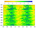 Log10 of Mississippi River streamflow in cubic meters per second measured daily at Vicksburg MS USA.


