
Community hub
Recent from talks
Contribute something
Nothing was collected or created yet.
Color scheme
View on Wikipedia
In color theory, a color scheme is a combination of 2 or more colors used in aesthetic or practical design. Aesthetic color schemes are used to create style and appeal. Colors that create a harmonious feeling when viewed together are often used together in aesthetic color schemes. Practical color schemes are used to inhibit or facilitate color tasks, such as camouflage color schemes or high visibility color schemes. Qualitative and quantitative color schemes are used to encode unordered categorical data and ordered data, respectively. Color schemes are often described in terms of logical combinations of colors on a color wheel or within a color space.[1][2][3]
Harmonious schemes
[edit]
Harmonious color schemes are designed to accomplish an aesthetic color task and enhance color harmony. They do not represent any underlying variable. The color scheme of a logo is typically purely aesthetic. A color scheme in marketing is referred to as a trade dress and can sometimes be protected by trademark or trade dress laws, as is the pink color of Owens Corning fiberglass.[4]
Achromatic
[edit]Any color that lacks strong chromatic content is said to be unsaturated, achromatic, or near neutral. Pure achromatic colors include black, white, all grays and beiges; near neutrals include browns, tans, pastels, and darker colors. Near neutrals can be of any hue or lightness. For example, the "Achromatic" use of a white background with black text is an example of a basic and commonly default color scheme in web design.
Neutrals are obtained by mixing pure colors with white, black or gray, or by mixing two complementary colors. In color theory, neutral colors are colors easily modified by adjacent more saturated colors and they appear to take on the hue complementary to the saturated color. Next to a bright red couch, a gray wall will appear distinctly greenish.
Black and white have long been known to combine well with almost any other colors; black decreases the apparent saturation or brightness of colors paired with it, and white shows off all hues to equal effect.[5]
Monochromatic
[edit]
Monochromatic color schemes may contain all the colors (tints, tones, and shades) of a single hue, i.e. the base hue modified by the addition of black, gray and white. As a result, the energy is more subtle and peaceful due to a lack of contrast of hue.[citation needed]
Complementary
[edit]A complementary color scheme comprises two colors that combine to form gray, i.e. they are on opposite sides of the color wheel. Fully saturated complementary colors maximize color contrast.
A split-complementary (also called compound harmony) color scheme comprises three colors, namely a base color and two colors that are 150 degrees and 210 degrees apart from the base color. The split-complementary color scheme has the same sharp visual contrast as the complementary color scheme but has less pressure.[further explanation needed]
Analogous
[edit]Analogous color schemes (also called dominance harmony) are groups of colors that are adjacent to each other on the color wheel, with one being the dominant color, which tends to be a primary or secondary color, and two on either side complementing, which tend to be tertiary. This usually translates to a three-color combination consisting of a base color and two colors that are 30 degrees and 330 degrees apart from the base color. A analogous color scheme tends to have a consistent temperature, comprising only warm or only cool colors.[citation needed] An analogous color scheme creates a rich, semi-monochromatic look. However, the scheme also lacks contrast and is less vibrant than complementary schemes.[citation needed] Red, reddish-orange, orange, yellow-orange is one example of a set of analogous colors.
A near-analogous color scheme comprises three colors, namely a base color and two colors that are 60 degrees and 300 degrees apart from the base color. The near-analogous color scheme has the same consistency as the analogous color scheme but has more contrast in comparison. One example of a near-analogous color scheme would be red, yellow, and magenta.
An accented analogous color scheme adds the complementary color of an analogous color scheme as the accent color, used to create a dominant color grouping of three similar colors accented with the direct complement (or the near complement) of one of them. The complementary accent color creates an interesting contrast against the dominant color grouping. This scheme is frequently used to put a warm accent color with a cool analogous color palette, or a cool accent color with a warm palette.[citation needed]
Triadic
[edit]
The triadic color scheme is a three-color combination consisting of base color and two colors that are 120 degrees and 240 degrees apart from the base color.[6] Triadic color schemes tend to be quite vibrant. Even when using pale or unsaturated versions of hues, it offers a higher degree of contrast while also retaining the color harmony. This scheme is trendy among artists because it provides sharp visual contrast while maintaining balance, and color richness. The triadic scheme is not as contrasting as the complementary scheme, but it is easier to accomplish balance and harmony with these colors.
Tetradic
[edit]The tetradic (also called double complementary) color scheme is considered the richest because it uses four colors arranged into two complementary color pairs. This scheme is hard to harmonize and requires a color to dominate or subdue the colors; if all four colors are used in equal amounts, the color scheme may look unbalanced.
- The rectangle color scheme is a four-color combination consisting of a base color and three colors that are 60 degrees, 180 degrees, and 240 degrees apart from the base color.[7] Rectangle color schemes work best when one color is dominant.
- The square color scheme is a four-color combination consisting of a base color and three colors that are 90 degrees apart from the base color.[8] Square color schemes are rich in color and offer variations.
Hexadic
[edit]The hexadic (also called triple complementary, or double triadic) color scheme is the color scheme with the most distinct colors possible. It is a six-color combination consisting of base color and five colors that are 60, 120, 180, 240 and 300 degrees apart from the base color. This color scheme is the most varied color scheme because it uses six colors which are arranged into three complementary color pairs, or it could be seen as two color schemes that are complementary to each other—such as two triadic color schemes or two near-analogous color schemes—or adding a complementary pair to a rectangular tetradic color scheme. An example of this color scheme is red, yellow, green, cyan, blue, and magenta—which also happens to be the roster of the two sets of modern primary colors in both pigment and light.
Wave method
[edit]This method was discovered in 2017.[9] The wave method of building harmonious color palette based on the relationship of color and acoustic waves and the concept of consonance in music theory. Additional colors are selected to the base color depending on the wavelength ratio. This ratio must satisfy the concept of consonance in music theory.
Practical schemes
[edit]Practical color schemes combine colors outside typical aesthetic media and context for purely practical reasons, generally focusing on maximizing or minimizing contrast, instead of color harmony. The most common practical color scheme is black-and-white, which generally maximizes contrast. This may be used for black text on a white background or prison uniforms. Enhancing contrast against a background motivates some practical color schemes, such as high visibility color schemes, while inhibiting contrast against a background motivates others, as in camouflage.
-
 high contrast black-on-white text
 -
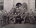 Black-and-white prison uniforms
 -
 Various camouflage color schemes suited to different background terrain types.


Qualitative schemes
[edit]Qualitative color schemes represent categorical variables, where the possible values of the variable are discrete and unordered. An example of a categorical variable is U.S. states, which has 50 unordered values. A qualitative color scheme is generally also called a color code. Generally, the number of colors in a qualitative color scheme is equal to the number of possible values for the categorical variable, where each value is encoded to one color. However, the number of total colors can be decreased by encoding each value with multiple colors, as in the 25-pair color code, which encodes 25 values using only 10 colors, by assigning each value a color each from group A and group B, each consisting of 5 colors.
A qualitative color scheme can be designed similarly to a harmonious color scheme. However, the goal of a qualitative color scheme is to solve a comparative color task rather than an aesthetic color task, so enhancing color difference between the colors in the color scheme is generally more important than color harmony.
Quantitative schemes
[edit]Quantitative color schemes (sometimes color maps) represent quantitative data, where the possible values of the variable are ordered, and may be discrete or continuous:[10]
- Continuous: Color schemes that have a smooth color gradient. Continuous color schemes are intended to display sets of continuous, ordered data and can represent both small and large data variations. Continuous color schemes generally use more than a hundred individual color values.
- Discrete: Color schemes that feature only a certain subset of a continuous color scheme, that are clearly distinguishable from each other. Color schemes in discrete form are intended to visualise a set or range of discrete data points, but are also often used with continuous datasets.
Quantitative schemes are fundamental to Thematic maps, charts, data science, spreadsheets, and other tools which use graphical means to visualize quantitative data. They are common in heat maps, choropleths and other forms of visualization. These color schemes can be categorized into different classes, depending on the nature of the underlying data. Each of these color schemes can be continuous or discrete:[10]


- Sequential schemes are typical color schemes that form a color gradient between a minimum and maximum value. The color gradient may be parallel to one of the axes of a 3D color space, such as hue/saturation/luminance, or may change two of these parameters at once. This yields some common sequential schemes:
- Monochrome schemes use tints of a single hue or shades of gray. Studies have shown that while humans are capable of seeing hundreds of shades of most colors, they can only distinguish 5–8 for practical use (i.e., matching shade on the map to the corresponding shade in the legend).[11]
- Spectral schemes use a gradient along the spectral colors or along the full range of hues, generally with no variation in value. Spectral schemes can be difficult to interpret with most data because hues do not naturally look like "more" or "less" than other hues.
- Part-spectral schemes use a subset of the spectral scheme, which reduces perceptual density, but tend to be more intuitive. They also often superimpose a luminosity gradient on to the hue gradient, with examples like light yellow to dark green or light orange to dark red.
- Scientific schemes use perceptually uniform color gradients and maximize color blind accessibility by simultaneously adjusting the luminosity and blue-yellow channels of a color space like CIELAB along the gradient. More information on scientific schemes below.
- Diverging schemes represent data that has a minimum and maximum, as well as some meaningful center value, which may represent zero, the median, parity, etc. A diverging scheme comprises two different sequential schemes (monochrome or part-spectral), sharing a common color (usually white), which represents the center value, and the darkest colors at the maximum and minimum. Their primary use is to emphasize (by the principles of visual hierarchy) the relationship to the center value.
- Cyclic schemes represent data that has no minimum or maximum, namely periodic data sets like angular data, terrain aspect, wind direction, seasonality, or data from Synthetic Aperture Radar (SAR) interferometry, which is used to display Earth's surface displacement. Cyclic schemes use color gradients that have neither a beginning nor an end, so are often represented by a spectral scheme, which can map directly onto the hue dimension of the color wheel.
Scientifically derived schemes
[edit]
Scientifically derived color schemes (or scientific color maps) seek to improve on traditional color schemes (spectral schemes such as rainbow or jet) by incorporating a uniform color gradient and color blind accessibility.[10] In the 1990s, Cynthia Brewer performed a number of experiments on various color schemes for data visualization in maps, especially working with those with color blindness.[12][11] Eventually, this work led to a palette of several dozen color schemes designed to be reproducible on multiple devices and usable by the color blind, which was collected into an interactive tool known as ColorBrewer[13][14] in 2002.[15][16] This palette quickly gained wide acceptance due to its reliable usability by non-experts, and has become a standard built into GIS and mapping software and other visualization tools.[17][18][19] Other pre-made scientific color schemes that are distributed directly to users, but also frequently built into common visualisation toolboxes include:[10]
- MPL (Matplotlib) color maps (including default Viridis) developed by Stéfan van der Walt and Nathaniel Smith.[20]
- Cividis color map developed by Jamie R. Nuñez and colleagues.[21]
- CMOcean color maps developed by Kristen M. Thyng and colleagues.[22]
- CET color maps developed by Peter Kovesi.[23]
- Scientific color maps developed by Fabio Crameri.[24][25]
Multivariate schemes
[edit]Bivariate or trivariate schemes use two or three orthogonal sequential schemes to represent separate (but usually related) variables, with the various blended colors representing different combinations of values. This scheme tends to work best when the hues for each axis are primary colors: RGB on a black background, CMY on a white background, so that the mixed colors are as clear as possible. When crafted well, and with advantageous geography (in which the variables tend to have broadly consistent patterns), these color schemes are very effective at visualizing correlations and other patterns between the variables. In other situations, they can produce a seemingly random confusion of color.[26]
Connotative schemes
[edit]
Connotative color schemes use colors that reference a specific cultural meaning. Red and green color schemes are connotative of Christmas. In some countries, a red, white and blue color scheme connotes the Flag of the United States. Even the ubiquitous Traffic light color scheme (red, yellow, green) that was originally a qualitative color scheme, has transformed into a connotative color scheme as "red means stop" and "green means go" have solidified in culture, and through their meaning have been adopted in non-transportation related encoding like the Traffic Light Protocol or stop light parties.
In culture
[edit]In hotel room designs, the relationship between preferences of color schemes and gender was detected. Male guests tend to prefer masculine color schemes, while female guests favor feminine color schemes.[27]
See also
[edit]References
[edit]- ^ Stephen Quiller (2002). Color Choices. Watson–Guptill. ISBN 0-8230-0697-2. Archived from the original on 24 December 2017.
- ^ Jackie Shaw (1994). The Big Book of Decorative Painting: How to paint if you don't know how – and how to improve if you do. Watson–Guptill. p. 49. ISBN 0-8230-0265-9.
monochromatic split-complementary analogous color-scheme.
- ^ Edith Anderson Feisner (2006). Colour: How to Use Colour in Art and Design. Laurence King Publishing. ISBN 1-85669-441-0. Archived from the original on 24 December 2017.
- ^ Gordon V. Smith and Russell L. Parr (2005). Intellectual Property: Valuation, Exploitation, and Infringement Damages. John Wiley and Sons. ISBN 0-471-72433-5. Archived from the original on 2 January 2014.
- ^ "Theory of Color". zedbi.com/. Archived from the original on 24 October 2014. Retrieved 23 October 2014.
- ^ "Triadic Color Scheme". Tiger Color. Archived from the original on 6 July 2005. Retrieved 30 July 2020.
- ^ "Rectangle (Tetradic) Color Scheme". Tiger Color. Archived from the original on 4 February 2013. Retrieved 30 July 2020.
- ^ "Square Color Scheme". Tiger Color. Archived from the original on 6 July 2005. Retrieved 30 July 2020.
- ^ Sabo, I. I.; Lagoda, H. R. (2017). "The wave method of building color palette and its application in computer graphics". arXiv:1709.04752 [cs.GR].
- ^ a b c d Crameri, Fabio; Shephard, Grace E.; Heron, Philip J. (December 2020). "The misuse of colour in science communication". Nature Communications. 11 (1): 5444. Bibcode:2020NatCo..11.5444C. doi:10.1038/s41467-020-19160-7. ISSN 2041-1723. PMC 7595127. PMID 33116149.
- ^ a b Brewer, Cynthia A.; MacEachren, Alan M.; Pickle, Linda W.; Herrmann, Douglas (1997). "Mapping Mortality: Evaluating Color Schemes for Choropleth Maps". Annals of the Association of American Geographers. 87 (3): 411–438. Bibcode:1997AAAG...87..411B. doi:10.1111/1467-8306.00061.
- ^ Brewer, Cynthia A. (1996). "Guidelines for Selecting Colors for Diverging Schemes on Maps". The Cartographic Journal. 33 (2): 79–86. Bibcode:1996CartJ..33...79B. doi:10.1179/caj.1996.33.2.79.
- ^ "Cindy Brewer". www.personal.psu.edu. Archived from the original on 19 July 2018. Retrieved 8 December 2020.
- ^ axismaps/colorbrewer, Axis Maps, 8 December 2020, retrieved 8 December 2020
- ^ Brewer, Cynthia A.; Hatchard, Geoffrey W.; Harrower, Mark A. (2003). "Color Brewer in Print: A Catalog of Color Schemes for Maps". Cartography and Geographic Information Science. 30 (1): 5–32. Bibcode:2003CGISc..30....5B. doi:10.1559/152304003100010929. S2CID 129427665.
- ^ Harrower, Mark; Brewer, Cynthia A. (2003). "Color Brewer.org: An Online Tool for Selecting Colour Schemes for Maps". The Cartographic Journal. 40 (1): 27–37. Bibcode:2003CartJ..40...27H. doi:10.1179/000870403235002042. S2CID 140173239.
- ^ Carto.com, Color in Map Design Part 2, Carto.com
- ^ Kenneth Field, Brewing a new color palette for ArcGIS Pro, ArcGIS Blog, esri, 2014
- ^ Jon Peltier, Create a Heat Map Using Excel's Conditional Formatting, Peltier Tech Blog, September 23, 2013
- ^ "matplotlib colormaps". bids.github.io. Retrieved 25 December 2020.
- ^ Nuñez, Jamie R.; Anderton, Christopher R.; Renslow, Ryan S. (1 August 2018). "Optimizing colormaps with consideration for color vision deficiency to enable accurate interpretation of scientific data". PLOS ONE. 13 (7) e0199239. arXiv:1712.01662. Bibcode:2018PLoSO..1399239N. doi:10.1371/journal.pone.0199239. ISSN 1932-6203. PMC 6070163. PMID 30067751.
- ^ Thyng, Kristen; Greene, Chad; Hetland, Robert; Zimmerle, Heather; DiMarco, Steven (1 September 2016). "True Colors of Oceanography: Guidelines for Effective and Accurate Colormap Selection". Oceanography. 29 (3): 9–13. Bibcode:2016Ocgpy..29c...9T. doi:10.5670/oceanog.2016.66. ISSN 1042-8275.
- ^ Kovesi, Peter (December 2015). "Bad Colour Maps Hide Big Features and Create False Anomalies". Aseg Extended Abstracts. 2015 (1): 1–4. Bibcode:2015ASEGA2015ab107K. doi:10.1071/aseg2015ab107. ISSN 2202-0586.
- ^ Crameri, Fabio (6 January 2020), Scientific colour maps, doi:10.5281/zenodo.1243862, retrieved 25 December 2020
- ^ Crameri, Fabio (29 June 2018). "Geodynamic diagnostics, scientific visualisation and StagLab 3.0". Geoscientific Model Development. 11 (6): 2541–2562. Bibcode:2018GMD....11.2541C. doi:10.5194/gmd-11-2541-2018. hdl:10852/71195. ISSN 1991-9603.
- ^ , Elmer, M.E. 2013. "Symbol Considerations for Bivariate Thematic Maps." In Proceedings of the 26th International Cartography Conference. August 25–30, Dresden, Germany
- ^ Bogicevic, Vanja; Bujisic, Milos; Cobanoglu, Cihan; Feinstein, Andrew Hale (12 February 2018). "Gender and age preferences of hotel room design". International Journal of Contemporary Hospitality Management. 30 (2): 874–899. doi:10.1108/IJCHM-08-2016-0450. ISSN 0959-6119.
External links
[edit]Color topics | ||||||||||
|---|---|---|---|---|---|---|---|---|---|---|
| Color science |
|  | ||||||||
| Color philosophy |
| |||||||||
| Color terms |
| |||||||||
| Color organizations | ||||||||||
| Names |
| |||||||||
| Related | ||||||||||
| Authority control databases: National |
|---|