Community hub
Recent from talks
Contribute something
Nothing was collected or created yet.
Text box
View on Wikipedia | This article needs additional citations for verification. (February 2017) |


A text box, also called an input box, text field or text entry box, is a control element of a graphical user interface (GUI) that allows users to enter text for processing by a program.[1][2]
A typical text box is a rectangle, possibly with a border that separates the text box from the rest of the interface. Text boxes may contain horizontal and vertical scrollbars. Text boxes usually display a text cursor (commonly a blinking vertical line), indicating the current region of text being edited. It is common for the mouse cursor to change its shape when it hovers over a text box.[3]
Standard functionality
[edit]Although most operating systems and GUI frameworks provide text box controls with extensive built-in functionality, some applications, such as video games, may implement simplified versions.
Enter text
[edit]When keys are pressed on a keyboard, the text is added at the caret location. Some very simple text boxes may not show a caret, which would suggest that new characters typed in will appear at the end of the current text.
Navigate and manipulate text
[edit]Using a mouse:
- Change the caret position by clicking the desired point with a mouse cursor;
- Select a portion of text by pressing the main mouse button while pointing the cursor at one end of the desired part of the text and dragging the cursor to the other end while holding the button pressed.
Using the keyboard:
- Pressing arrow keys changes the caret position by one character or line
- Pressing Home / End keys (Microsoft's Windows OS) or ⌘ Command-left arrow / Command-right arrow (Apple's Mac OS) moves the caret to the beginning / end of the line
- Pressing Page Up / Page Down moves the caret a page (the number of lines that can be displayed in the text box at a time) backward / forward (Windows) or moves the scrollbar thumb a page backward / forward without changing the caret position (Mac OS)
- Holding the Ctrl key (Windows) while pressing arrow keys or Home / End keys makes the caret move at larger steps, e.g. words, paragraphs or beginning / end of document
- Holding the ⌥ Option (Mac OS) while pressing arrows moves the caret whole words or paragraphs
- Holding the Command key while pressing up or down arrows (Mac OS) or holding the Ctrl key while pressing Home / End (Windows) moves the caret to the beginning or end of the document
- Holding the Shift key while changing the caret position with a mouse or keyboard selects the text between the caret position from when Shift was first pressed and its current position
- Pressing Control+A (Windows) selects all text
Edit text
[edit]Work in insert or overwrite mode, typically switched using Insert key. In insert mode if there is a character to the right of the caret, the new character will be inserted before it, while in overwrite mode typing a new character will replace (overwrite) the character to the right of the caret position.
Typing in text while some part of the text already entered is selected will replace the selected text.
Delete / ← Backspace keys remove one character right / left of current caret position, while pressing them together with the Ctrl or command key removes one word.
Edit the text using standard clipboard operations.
Edits can be undone and redone with Ctrl+Z / Ctrl+Y (Windows) or ⌘ Command+Z / ⌘ Command+⇧ Shift+Z (Mac OS)
Alternative meanings
[edit]The term "text box" is also used in typography, desktop publishing and print design to describe a visually distinct container for text. These text boxes are typically bordered or shaded regions used to highlight quotations, sidebars or supplementary information. They are common in magazines, newspapers, textbooks and technical documentation. This usage predates digital interfaces and remains common in print and layout design, although it may also be used in website design.
In this context, a text box may:
- Be floated to the side of the main content, with surrounding text wrapping around it.
- Include a border, background color or other visual styling.
- Serve as a callout, pull quote or sidebar.
See also
[edit]References and notes
[edit]- ^ "What does text box mean?". www.definitions.net. Retrieved 2020-08-08.
- ^ "Text Box Definition". techterms.com. Retrieved 2020-08-08.
- ^ "Text box - Windows apps". Microsoft Learn. Retrieved 2025-06-22.
Text box
View on GrokipediaDefinition and History
Definition
A text box is a rectangular graphical control element that allows users to input, display, or edit text in single or multiple lines within software applications.[1][2][4] Key characteristics of a text box include support for keyboard input, visual boundaries such as borders and padding to define the editable area, and integration with form validation mechanisms to ensure data accuracy.[1][3] It contrasts with non-editable elements like labels, which display static text, or buttons, which trigger actions without text entry.[2][6] Common use cases for text boxes encompass data entry in web or desktop forms, search fields for querying information, and status displays showing dynamic textual updates.[1][4][7] Text boxes evolved from command-line interfaces, where users entered text directly into terminal prompts, to bounded graphical elements in modern GUIs, enhancing usability through visual containment and mouse interaction.[8][9]Historical Development
The origins of the text box as a graphical user interface (GUI) element trace back to the early 1970s at Xerox PARC, where the Alto personal computer, introduced in 1973, featured innovative software like the Bravo text editor. Bravo was the first WYSIWYG (what you see is what you get) document preparation program, enabling users to input and edit text directly within a bitmapped display using a mouse for selection and manipulation, marking a shift from command-line interfaces to interactive visual fields for text entry.[10][8] In the 1980s, text boxes gained widespread adoption through commercial operating systems. Apple's Macintosh, released in 1984, integrated text edit fields into its GUI, allowing users to enter and modify text in applications like MacWrite and dialog boxes via keyboard input and mouse interactions, revolutionizing personal computing accessibility.[11] Similarly, Microsoft Windows 1.0, launched in 1985, introduced edit controls as standard widgets for single-line text input in windows and dialogs, building on earlier GUI concepts to support form-like interactions in desktop software. The web era brought text boxes to the broader internet with the development of HTML forms. In 1993, the NCSA Mosaic browser supported early HTML extensions for interactive forms, including the element, which allowed users to type into on-screen fields for submitting data to servers, popularizing web-based input alongside inline images and hyperlinks.[12] This was formalized in subsequent standards, with the W3C's HTML 4.01 specification in 1999 defining as a core control for user text entry, ensuring cross-browser consistency and accessibility features like labeling.[13] Post-2000 advancements enhanced text box interactivity and usability. Google Instant, introduced in 2010, added real-time autocomplete predictions to search text fields, dynamically suggesting completions as users typed to speed up queries without full submission.[14] The rise of mobile computing further evolved text boxes with touch-friendly designs; Apple's iPhone in 2007 debuted a virtual QWERTY keyboard for on-screen text input in apps like SMS, enabling multitouch gestures for efficient entry on capacitive screens.[15] Android followed suit, with its 1.0 release in 2008 supporting soft keyboards on touchscreen devices like the HTC Dream, adapting text fields for gesture-based navigation and predictive text to suit portable interfaces.[16]Types and Variations
Single-Line Text Boxes
Single-line text boxes, also known as single-line input fields, are UI elements designed to capture short, linear text entries without allowing line breaks or vertical expansion. They maintain a fixed height equivalent to one line of text, preventing automatic wrapping to ensure content remains in a single row.[17][18] Key design features include a predefined width, often controlled by thesize attribute which specifies the visible character length, and the maxlength attribute to cap input at a specific number of characters, such as 255 for username fields to align with common database limits. These fields inherently block newline characters like LF or CR during input, enforcing their single-line constraint through browser rendering.[18]
Common use cases encompass compact form inputs requiring brief responses, such as username fields in login forms, email address entries in registration dialogs, or search bars in web applications where users type queries like product names or keywords. In browser interfaces, they facilitate quick searches, as seen in address bars that accept single-line URL or phrase inputs.[19][20][21]
Visual elements enhance usability, including the placeholder attribute for hint text like "Enter search term" that appears faintly until focused, and focus indicators such as a glowing border or color change to signal active state. Many implementations incorporate auto-suggest functionality via the list attribute linked to a <datalist>, displaying dropdown options as the user types, or the autocomplete attribute for browser-suggested values like previous emails.[17][22][20]
Limitations arise from their rigid structure: without vertical scrolling, they cannot accommodate lengthy text, leading to overflow where content exceeding the width is typically handled by horizontal scrolling within the field or truncation if CSS like overflow: hidden and text-overflow: ellipsis is applied, though default browser behavior favors scrolling to preserve full input. This design suits short entries but requires careful width planning to avoid user frustration with hidden text.[17][18]
Multi-Line Text Boxes
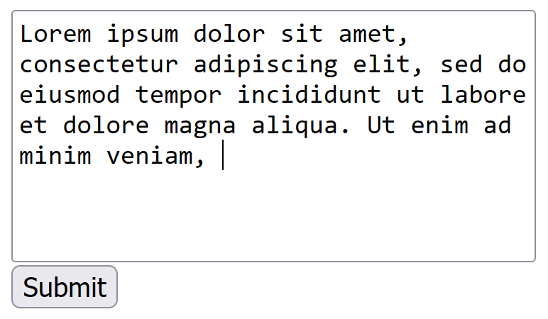
Multi-line text boxes are user interface components that enable the input and display of text across multiple lines, making them ideal for capturing extended free-form content such as paragraphs or structured notes. In web development, the HTML<textarea> element serves as the standard implementation, representing a multi-line plain-text edit control whose contents form its raw value. This element supports key attributes like rows, which specifies the number of visible text lines (defaulting to a user-agent-defined value, often 2), and cols, which sets the approximate width in average character widths (defaulting to 20). For instance, the markup <textarea rows="10" cols="50"></textarea> initializes a box approximately 10 lines tall and 50 characters wide, providing a starting dimension that can be adjusted via CSS for consistency across browsers.
These controls typically incorporate expandable height and vertical scrolling to accommodate growing content; when text exceeds the visible area, a scrollbar emerges automatically, and modern browsers allow resizing via a drag handle in the bottom-right corner, governed by the CSS resize property (e.g., resize: both for bidirectional adjustment). In native platforms, analogous features appear in components like iOS text views, which display multiline editable content with automatic scrolling and leading-edge alignment for wrapped text. Such design elements ensure users can efficiently manage longer inputs without horizontal constraints.
Common use cases for multi-line text boxes include comment fields on web forms for user feedback, email composition areas for drafting messages, and code editors in integrated development environments (IDEs) for writing scripts or programs. In Windows applications, they capture multiline data like addresses or descriptions, enhancing form usability for complex entries.
Behavioral aspects include configurable word wrapping: the wrap attribute in HTML offers "soft" wrapping (visual line breaks without altering the submitted value, the default), "hard" wrapping (inserting actual newlines into the data), or non-standard "off" for horizontal scrolling instead. Resize handles permit on-the-fly dimension changes, while some advanced implementations, such as the editor in Visual Studio Code, provide line numbering support—displayed by default along the left margin to aid precise navigation and debugging, with options to toggle or hide them. Basic navigation techniques, like arrow keys for moving between lines, remain consistent across these behaviors.
Performance considerations arise when handling large text volumes, potentially up to thousands of lines, where unoptimized rendering can cause input lag or sluggish scrolling; for example, excessive DOM size from voluminous content impacts interactivity in browsers, prompting optimizations like content-visibility CSS to skip off-screen rendering. In accessibility scenarios, such as with screen readers enabled, large text areas may exhibit visible delays in scrolling, highlighting the need for efficient implementation in web applications.
Specialized Text Boxes
Specialized text boxes incorporate targeted constraints or features to manage specific input types, enhancing security, validation, or functionality beyond standard text entry. Password text boxes, implemented via the HTML<input type="password"> element, mask user input by replacing characters with symbols such as asterisks or dots, thereby obscuring the content from casual observation. This design serves as a one-line plain-text edit control dedicated to password entry, as defined in the HTML Living Standard.[23] The masking primarily counters shoulder surfing, where unauthorized viewers might glimpse the input visually, though browsers may briefly reveal typed characters or offer a toggle to plain text for verification.
Numeric text boxes utilize the <input type="number"> attribute to confine input to numerical values, automatically rejecting non-numeric entries through built-in validation. They support attributes like min and max to enforce value ranges, and step to define increment granularity, often accompanied by browser-provided spinner controls featuring up/down arrows for precise adjustments. For instance, setting step="0.1" enables decimal increments, ensuring data integrity for quantitative fields.
Email and URL text boxes leverage specialized input types for format-specific validation. The <input type="email"> element requires a properly structured email address, including an "@" symbol and domain, validating the input before form submission and supporting multiple addresses via the multiple attribute. Similarly, <input type="url"> enforces a valid URL format, mandating a scheme such as "http://" or "https://", with automatic checks to prevent invalid submissions.[24] These types apply regex-like patterns natively, streamlining user input without custom code.[25]
Additional variants address display or advanced editing needs. Read-only text boxes apply the readonly boolean attribute to input and textarea elements, rendering the content immutable to user edits while permitting focus, selection, and copying. This prevents modifications but allows scripted updates, distinguishing it from the disabled attribute by maintaining form participation.
Security considerations for these specialized boxes emphasize protection during input and handling. Password fields must use HTTPS to secure transmission, as unencrypted forms expose data to interception.[26] Masking in password inputs mitigates shoulder surfing but offers no defense against malware like keyloggers; thus, avoiding clipboard storage of sensitive values prevents unintended leaks.[27] For constrained fields like numeric or email, validation reduces injection risks, aligning with OWASP guidelines for input sanitization.
Core Functionality
Text Input and Entry
Text input and entry into a text box primarily occurs through keyboard typing, where users press keys to insert characters sequentially at the current cursor position. This mechanism relies on the operating system's keyboard input handling, which translates key presses into text events that the text box processes in real time. Paste operations, typically invoked via keyboard shortcuts like Ctrl+V on Windows or Cmd+V on macOS, allow users to insert blocks of text from the clipboard directly into the text box, appending or replacing content based on the selection. Drag-and-drop text insertion enables users to select and drag text from external sources, such as other applications or web pages, and drop it into the text box, where it is inserted at the drop location while supporting standard data transfer formats like plain text.[28] Character handling in text boxes ensures compatibility with diverse writing systems through Unicode support, which allows the storage and display of characters from virtually all languages and scripts without loss of information. For non-Latin scripts, Input Method Editors (IMEs) provide essential functionality by converting sequences of keystrokes—such as Romanized input for Chinese pinyin—into the appropriate complex characters, with the text box composing and confirming the output inline. This process often involves a composition window within or adjacent to the text box, enabling real-time preview and selection from candidate lists before final insertion.[29][30][31] Modern text boxes also support alternative input methods, such as voice dictation using APIs like the Web Speech API in web applications or system-level speech recognition on desktop and mobile platforms, allowing hands-free text entry. Emoji and special character insertion is facilitated through dedicated pickers or shortcuts, enhancing expressiveness in user input.[32] Text boxes typically begin in an empty state, ready for user input, or pre-filled with default values via attributes like the HTML value property to guide or prompt the user. Activation for input requires focusing the text box, which can be achieved by clicking on it with a mouse or pointer device, or by navigating to it using the Tab key in keyboard-driven interfaces, thereby displaying a cursor and enabling text entry.[33] During entry, error handling provides immediate feedback for invalid characters, such as restricting input to alphanumeric only; this may manifest as visual highlighting of the erroneous input, rejection of the character without insertion, or an audible beep from the system. Such mechanisms, often implemented via input constraints like the maxlength attribute, prevent overflow and maintain data integrity without interrupting the flow of valid input.[34]Navigation and Selection
In text boxes, navigation relies on standard keyboard controls to position the insertion point, or cursor, precisely within the entered content. The left and right arrow keys move the cursor one character at a time horizontally, while the up and down arrow keys shift it to the adjacent line in multi-line text boxes, such as<textarea> elements in web forms. The Home key jumps the cursor to the beginning of the current line, and the End key moves it to the end of the line; in multi-line contexts, these may extend to the start or end of the entire content when combined with modifiers like Ctrl on Windows or Cmd on macOS. For larger movements in multi-line text boxes, the Page Up and Page Down keys scroll the visible content up or down by one viewport page, facilitating efficient traversal of longer inputs without altering the cursor's absolute position.[35][36]
Text selection techniques build on these navigation controls to highlight ranges for subsequent operations. Holding the Shift key while pressing arrow keys extends the selection from the current cursor position, character by character or line by line, creating a highlighted span of text. Mouse-based selection includes double-clicking on a word to highlight it entirely, and triple-clicking to select an entire line or paragraph, depending on the platform—such as in Microsoft Office applications or Apple Pages.[37][38]
Visual feedback enhances usability during navigation and selection. The text cursor, often rendered as a vertical blinking bar, typically pulses at a rate of 530 milliseconds in Windows environments to indicate active input focus without causing distraction. Selected text is commonly highlighted with a blue background color, providing clear contrast against the surrounding content.[39]
Advanced interaction methods extend these basics to diverse input devices. Dragging the mouse from one point to another selects a contiguous range of text, with dynamic highlighting updating in real time. On mobile devices, touch gestures predominate: a long press positions the cursor or selects a word, followed by dragging resize handles to expand the selection, as implemented in iOS text fields. Similar patterns apply in Android, where long press initiates selection and drag adjusts the range for copy-paste operations.[40][41]
Editing and Manipulation
Editing and manipulation of text within a text box involve a range of operations that allow users to modify entered content efficiently, typically acting on selected portions of the text. These operations rely on standard keyboard shortcuts and interface elements to facilitate quick changes, with cut (Ctrl+X on Windows, Command+X on macOS), copy (Ctrl+C/Command+C), and paste (Ctrl+V/Command+V) enabling the removal, duplication, and insertion of text segments, respectively. These commands interact with the system clipboard to transfer content between text boxes or applications, supporting interprocess communication in user interfaces.[42][43] Undo (Ctrl+Z/Command+Z) and redo (Ctrl+Y/Command+Y) provide mechanisms to reverse or reapply recent actions, maintaining a history stack that records modifications such as insertions, deletions, or formatting changes. This stack is often limited to manage memory usage, with the exact limit varying by application.[44][45] Text transformations enhance precision in editing, including find and replace functions (accessible via Ctrl+F/Command+F for search and Ctrl+H/Command+Option+F for replace in many environments) that locate specific strings and substitute them across the content. Spell-checking integration, often indicated by red underlines beneath erroneous words, offers real-time suggestions and corrections, enabled through attributes like HTML'sspellcheck for browser-based text boxes. Case conversion operations allow bulk reformatting of selected text to standardize appearance, such as using Shift+F3 in Microsoft Word to toggle between uppercase, lowercase, and title case.[46][47][48]
In rich text boxes, which support styled content unlike plain text variants, formatting options like bold, italic, and underline can be applied to selections via toolbar buttons or keyboard shortcuts (e.g., Ctrl+B/Command+B for bold), historically implemented through APIs such as execCommand in web technologies (now deprecated as of 2015), with modern approaches using the Clipboard API, Selection API, or contenteditable with custom event handling. These apply semantic or visual styles while preserving the underlying text structure. Bulk actions further streamline manipulation, with select all (Ctrl+A/Command+A) highlighting the entire content for comprehensive operations and clear functions (via Delete or Backspace on selections) removing all or targeted text. These editing features operate on text selected through cursor movements or drag gestures.[49]
Technical Implementation
In Web Technologies
In web technologies, text boxes are primarily implemented using HTML elements that integrate seamlessly with CSS for styling and JavaScript for interactivity. The<input type="text"> element serves as the standard for single-line text input, allowing users to enter short strings of text, while the <textarea> element is used for multi-line input, accommodating longer free-form content such as comments or messages. Both elements support key attributes like value to set or retrieve the current text content, placeholder to display hint text that disappears on focus, and required to enforce mandatory input during form submission.
CSS enables extensive customization of text boxes to enhance visual appeal and user experience. Properties such as border-radius can round the corners of input borders for a modern look, while font-family specifies the typeface to ensure readability across devices. The :focus pseudo-class allows developers to apply styles like background color changes or outline enhancements when a text box receives keyboard or mouse focus, providing clear visual feedback. For responsive design, media queries adjust text box dimensions and layouts based on viewport size; for instance, a query like @media (max-width: 600px) can reduce padding or width on smaller screens to maintain usability.[50]
JavaScript enhances text box functionality through event listeners that respond to user actions. The oninput event triggers as the user types, enabling real-time validation such as checking character limits or format compliance, while the onblur event fires when the element loses focus, ideal for final checks like confirming email validity.[51] In modern frameworks, these interactions are streamlined; for example, React uses controlled components where the text box's value is bound to component state, and changes are handled via an onChange handler to maintain unidirectional data flow.[52]
Framework-specific implementations further simplify text box management. In Vue.js, the v-model directive provides two-way data binding, automatically syncing the input value with a reactive data property and updating the UI on changes. Angular employs reactive forms, where text boxes are linked to FormControl instances in the component class, allowing programmatic validation and value manipulation through methods like setValue().[53] Accessibility is integrated via ARIA attributes; the aria-label provides a textual description for screen readers when no visible label exists, ensuring text boxes are navigable for users with disabilities.[54]
In Native Applications
In native applications, text boxes are implemented through platform-specific APIs that integrate directly with the operating system's user interface framework, enabling efficient text input and editing. On Windows, the Edit control, part of the Win32 API, serves as the primary component for single-line or multi-line text entry, allowing developers to create rectangular windows for user input via functions like CreateWindow with the EDIT class.[55] This control supports styles such as ES_MULTILINE for extended text handling and maintains an internal buffer for the text content, facilitating operations like insertion and deletion without external dependencies.[56] For macOS, the NSTextField class in the AppKit framework provides editable text fields, configurable with properties like isEditable and bezelStyle to control appearance and behavior, while integrating with the system's text system for display and input.[57] On Android, the EditText widget, extending the View class, handles text input with attributes like android:inputType to specify formats such as text, number, or password, ensuring appropriate keyboard display and validation.[58] Event handling in these native text boxes relies on platform callbacks to respond to user interactions. In Windows applications, the WM_KEYDOWN message is dispatched to the window procedure when a key is pressed, allowing developers to process virtual key codes for custom actions like navigation or validation before the Edit control updates its buffer.[59] On macOS, NSTextField uses the target-action pattern and delegates to notify of events such as text changes or return key presses. For iOS, the UITextField class employs the UITextFieldDelegate protocol to manage events like editing began or ended, and supports gesture recognition by allowing developers to attach UIGestureRecognizer instances, such as UITapGestureRecognizer, to handle touches beyond standard keyboard input.[60][61] Performance optimizations in native text boxes stem from their tight integration with the OS, enabling direct memory management for text data. The Windows Edit control, for instance, allocates and accesses a contiguous buffer for text storage, supporting efficient large-text operations up to system limits without intermediate layers.[56] Similarly, Android's EditText leverages native JNI calls to the underlying platform text views for low-latency rendering and input processing, while iOS UITextField uses Core Text frameworks for optimized string handling and display. These approaches avoid the overhead of interpreted rendering seen in web technologies, resulting in smoother scrolling and editing for extensive content.[60] Cross-platform development tools abstract these native APIs to provide consistent text box behavior across operating systems. Qt's QLineEdit widget, for single-line input, and QTextEdit for multi-line, wrap platform-specific controls like Win32 Edit or Cocoa NSTextField, ensuring uniform event handling and styling via Qt's event system.[62] Flutter's TextField widget compiles to native ARM or x86 code, rendering text using the Skia engine while interfacing with platform input methods for performance comparable to native controls, though it may introduce minor overhead in complex layouts.[63]Usability and Accessibility
User Interface Best Practices
In user interface design, layout guidelines for text boxes emphasize optimal sizing to accommodate expected input while maintaining visual balance and usability. Text boxes should be sized to match the expected length of input, for example, around 25 characters for email addresses based on average lengths, to guide users intuitively without wasting space.[64] Alignment with labels is crucial; labels should be positioned above or to the left of the text box, aligned to the leading edge for readability, and spaced evenly to create a logical flow in forms. On mobile devices, touch targets for text boxes must be at least 44x44 points to ensure thumb-friendly interaction, as specified in Apple's Human Interface Guidelines, preventing accidental taps and supporting comfortable one-handed use. Feedback mechanisms enhance user confidence by providing immediate visual cues during interaction. Real-time error messages should appear inline adjacent to the text box upon validation, using high-contrast indicators like red text for issues and green checkmarks for valid input, to minimize cognitive load and allow quick corrections without form resubmission.[65] For features like auto-complete, a subtle loading spinner or progress indicator should display briefly while suggestions are fetched, signaling system responsiveness and setting expectations for delays under 10 seconds.[66] These mechanisms should prioritize late validation—triggering on field blur rather than keystroke—to avoid interrupting the user's typing flow, except for high-risk inputs like passwords where instant strength meters are beneficial.[67] Consistency in text box design aligns with established platform conventions to leverage user familiarity and reduce learning curves. On iOS, adhere to the Human Interface Guidelines by using standard text field components with placeholder text for hints and secure variants for sensitive data, ensuring vertical stacking and consistent spacing across apps. For Android, follow Material Design principles, selecting either filled or outlined styles uniformly within sections—filled for high emphasis in primary forms—and adapting widths to the screen size, avoiding full span on large screens to prevent overcrowding.[68] This platform-specific adherence promotes predictable behavior, such as automatic keyboard summoning and error icon integration, fostering seamless cross-app experiences. Testing approaches like A/B experiments validate design choices, particularly comparing placeholders against persistent labels, where studies show labels improve error detection and completion rates by maintaining visibility throughout input.[69] Avoid common pitfalls such as hidden overflow, which occurs when fixed-width text boxes clip content like long URLs; instead, apply CSS properties likeoverflow-wrap: break-word to allow natural wrapping and prevent horizontal scrolling or lost text.[70] Usability testing should focus on these elements iteratively, measuring task completion time and error rates to refine layouts for efficiency.
Accessibility Standards
Accessibility standards for text boxes emphasize ensuring that these interactive elements are perceivable, operable, and understandable for users with disabilities, primarily guided by the Web Content Accessibility Guidelines (WCAG) 2.2 at Level AA.[71] Success Criterion 1.3.1 (Info and Relationships) requires that information and relationships conveyed through presentation, such as labels associated with text input fields, be programmatically determinable to assist screen readers in announcing the purpose of each field accurately.[72] For instance, form labels must be explicitly linked to their corresponding text boxes using HTML attributes like<label for="id"> or ARIA labeling techniques to maintain semantic structure.[73] Additionally, Success Criterion 1.4.3 (Contrast Minimum) mandates a contrast ratio of at least 4.5:1 between text and its background in text boxes, and 3:1 for large text (18 point or 14 point bold), to ensure readability for users with low vision.[74] WCAG 2.2 also introduces Success Criterion 2.5.8 (Target Size (Minimum)), requiring interactive controls like text boxes to have a minimum size of 24x24 CSS pixels (with exceptions for inline or voice-activated elements), to improve touch accessibility.[75]
To enhance compatibility with assistive technologies, Accessible Rich Internet Applications (ARIA) attributes play a crucial role in text boxes. The aria-required attribute indicates whether user input is mandatory before form submission, allowing screen readers to alert users proactively to required fields.[76] Similarly, aria-invalid="true" signals validation errors in text inputs, enabling screen readers to convey the erroneous state and focus attention on the issue without relying on visual cues alone.[77] For dynamic text boxes that update content in real-time, such as auto-complete suggestions, ARIA live regions (e.g., aria-live="polite") notify screen reader users of changes without interrupting their workflow.
Keyboard navigation is essential for users with motor impairments or those relying on alternative input methods, as outlined in WCAG Success Criterion 2.1.1 (Keyboard). Text boxes must receive focus via the Tab key in a logical reading order, with visible focus indicators to show the current active element, and support activation through Enter or Space without requiring mouse interactions.[78] WCAG 2.2 Success Criterion 2.4.13 (Focus Appearance, Level AAA) further requires focus indicators to have sufficient contrast (at least 3:1) and not be confined to a 2 CSS pixel border.[79] This ensures full operability for keyboard-only users. Furthermore, integration with voice input technologies, such as the Web Speech API for speech recognition, allows users to dictate text into boxes hands-free, improving accessibility for those unable to use traditional keyboards.[80] Operating systems often provide accommodations like Sticky Keys, which enable sequential key presses for shortcuts (e.g., Ctrl+C), benefiting users with limited dexterity when interacting with text box interfaces.[81]
Testing text box accessibility involves both automated and manual methods to verify compliance. Tools like WAVE evaluate pages for WCAG conformance, highlighting issues such as missing labels or insufficient contrast in text inputs.[82] Screen readers including JAWS and NVDA are used for manual testing, simulating how users with visual impairments perceive and interact with text boxes, such as announcing labels and handling focus shifts.[83] These practices ensure that text boxes accommodate diverse disabilities, from visual and auditory to motor challenges.