

Community hub
Recent from talks
Contribute something
Nothing was collected or created yet.
Times New Roman
View on Wikipedia
 | |
| Category | Serif |
|---|---|
| Classification | Transitional Old-style |
| Designers | Stanley Morison Victor Lardent |
| Commissioned by | The Times |
| Foundry | Monotype |
| Date released | 1931[1] |
| License | Proprietary |
| Design based on | Plantin |
| Metrically compatible with | Tinos |
Times New Roman is a serif typeface commissioned for use by the British newspaper The Times in 1931. It has become one of the most popular typefaces of all time and is installed on most personal computers. The typeface was conceived by Stanley Morison, the artistic adviser to the British branch of the printing equipment company Monotype, in collaboration with Victor Lardent, a lettering artist in The Times's advertising department.
Asked to advise on a redesign, Morison recommended that The Times change their body text typeface from a spindly nineteenth-century face to a more robust, solid design, returning to traditions of printing from the eighteenth century and before. This matched a common trend in printing tastes of the period. Morison proposed an older Monotype typeface named Plantin as a basis for the design, and Times New Roman mostly matches Plantin's dimensions. The main change was that the contrast between strokes was enhanced to give a crisper image. The new design made its debut in The Times on 3 October 1932. After one year, the design was released for commercial sale. In Times New Roman's name, Roman is a reference to the regular or roman style (sometimes also called Antiqua), the first part of the Times New Roman typeface family to be designed. Roman type has roots in Italian printing of the late 15th and early 16th centuries, but Times New Roman's design has no connection to Rome or to the Romans.
The Times stayed with the original Times New Roman for 40 years. The paper subsequently has switched typefaces five times between 1972 and 2007 to different variants of the original due to new production techniques and a format change from broadsheet to tabloid in 2004.
Design
[edit]
Times New Roman has a robust colour on the page and influences of European early modern and Baroque printing.[3][a] As a typeface designed for newspaper printing, Times New Roman has a high x-height, short descenders to allow tight linespacing and a relatively condensed appearance.[5][b] (Although Hutt,[6] and most other authors, describe Times New Roman as having a higher x-height than Plantin, Tracy reports based on published Monotype dimensions that in the original small metal-type sizes the difference was not great.[7])

The roman style of Plantin was loosely based on a metal type created in the late sixteenth century by the French artisan Robert Granjon and preserved in the collection of the Plantin-Moretus Museum of Antwerp.[8][9][10][11] This style is sometimes categorised as part of the "old-style" of serif fonts (from before the eighteenth century).[12][13][14][c] (The 'a' of Plantin was not based on Granjon's work: the Plantin-Moretus Museum's type had a substitute 'a' cut later.[16]) Indeed, the working title of Times New Roman was "Times Old Style".[15] However, Times New Roman modifies the Granjon influence further than Plantin due to features such as its 'a' and 'e', with very large counters and apertures, its ball terminal detailing, a straight-sided 'M' and an increased level of contrast between thick and thin strokes, so it has often been compared to fonts from the late eighteenth century, the so-called 'transitional' genre, in particular the Baskerville typeface of the 1750s.[17][18] Historian and sometime Monotype executive Allan Haley commented that compared to Plantin "serifs had been sharpened...contrast was increased and character curves were refined," while Lawson described Times's higher-contrast crispness as having "a sparkle [Plantin] never achieved".[19][20]
Italic and bold
[edit]
Morison described the companion italic as also being influenced by the typefaces created by the Didot family in the late 18th and early 19th centuries: a "rationalistic italic that owed nothing to the tradition of the sixteenth or seventeenth centuries. It has, indeed, more in common with the eighteenth century."[21][22][23] Morison had several years earlier attracted attention for promoting the radical idea that italics in book printing were too disruptive to the flow of text, and should be phased out.[24][25] He rapidly came to concede that the idea was impractical, and later wryly commented to historian Harry Carter that 'Times italic' "owes more to Didot than dogma."[10] Morison wrote in a personal letter of Times New Roman's mixed heritage that it "has the merit of not looking as if it had been designed by somebody in particular."[26][27][d]

Rather than creating a companion boldface with letterforms similar to the roman style, Times New Roman's bold has a different character, with a more condensed and more upright effect caused by making the horizontal parts of curves consistently the thinnest lines of each letter, and making the top serifs of letters like 'd' purely horizontal.[30] This effect is not found in sixteenth-century typefaces (which, in any case, did not have bold versions); it is most associated with the Didone, or "modern" type of the early nineteenth century (and with the more recent 'Ionic' styles of type influenced by it that were offered by Linotype, discussed below).[20][31][32][33][34] Some commentators have found 'Times bold' unsatisfactory and too condensed, such as Walter Tracy.[29]
Historical background
[edit]
During the nineteenth century, the standard roman types for general-purpose printing were "Modern" or Didone designs,[f] and these were standard in all newspaper printing.[36][37] Designs in the nineteenth-century style remain a common part of the aesthetic of newspaper printing; for example in 2017 digital typeface designer Tobias Frere-Jones wrote that he kept his Exchange family, designed for the Wall Street Journal, based on the nineteenth-century model as it "had to feel like the news."[38] According to Mosley and Williamson the modern-face used by The Times was Monotype's Series 7 or "Modern Extended", based on typefaces by Miller and Richard.[39][40]

By the 1920s, some in the publishing industry felt that the modern-face model was too spindly and high-contrast for optimal legibility at the small sizes and punishing printing techniques of newspaper printing.[41][g] In 1925, the Mergenthaler Linotype Company, Monotype's main competitor, launched a new newspaper typeface called Ionic, which became the first in a series known as the Legibility Group.[43][33] These kept to the nineteenth-century model but greatly reduced the contrast of the letterform.[44] The thinnest strokes of the letter were made thicker and strokes were kept as far apart as possible to maximise legibility. It proved extremely successful: Allen Hutt, Monotype's newspaper printing consultant in the late 1930s,[45] later noted that it "revolutionised newspaper text setting...within eighteen months it was adopted by 3,000 papers."[43] Although Times New Roman does not in any way resemble it, Walter Tracy, a prominent type designer who worked on a redesign of Times in the 1970s and wrote an analysis of its design in his book Letters of Credit (1986), commented that its arrival must at least have influenced the decision to consider a redesign.[46]
The development of Times New Roman was relatively involved due to the lack of a specific pre-existing model – or perhaps a surfeit of possible choices. Morison wrote in a memo that he hoped for a design that would have relatively sharp serifs, matching the general design of the Times' previous font, but on a darker and more traditional basic structure. Bulked-up versions of Monotype's pre-existing but rather dainty Baskerville and Perpetua typefaces were considered for a basis, and the Legibility Group designs were also examined. (Perpetua, which Monotype had recently commissioned from sculptor Eric Gill at Morison's urging, is considered a 'transitional' design in aesthetic, although it does not revive any specific model.) Walter Tracy, who knew Lardent, suggested in the 1980s that "Morison did not begin with a clear vision of the ultimate type, but felt his way along."[47]
.jpg)
Morison's biographer Nicolas Barker has written that Morison's memos of the time wavered over a variety of options before it was ultimately concluded that Plantin formed the best basis for a condensed font that could nonetheless be made to fill out the full size of the letter space as far as possible.[48] (Morison ultimately conceded that Perpetua, which had been his pet project, was 'too basically circular' to be practical to condense in an attractive way.[h])
Walter Tracy and James Moran, who discussed the design's creation with Lardent in the 1960s, found that Lardent himself had little memory of exactly what material Morison gave him as a specimen to use to design the typeface, but he told Moran that he remembered working on the design from archive photographs of vintage type; he thought this was a book printed by Christophe Plantin, the sixteenth-century printer whose printing office the Plantin-Moretus Museum preserves and is named for.[49] Moran and Tracy suggested that this actually might have been the same specimen of type from the Plantin-Moretus Museum that Plantin had been based on,[50] and Barker notes that this is likely to be correct, as although Plantin is based on a Granjon type in the collection of the museum, that specific type was only acquired by Plantin's heirs after his death,[9] and Times and Plantin both copy an 'a' not added to the type after Plantin's death.[51] The sharpened serifs somewhat recall Perpetua, although Morison's stated reason for them was to provide continuity with the previous Didone design and the crispness associated with the Times' printing; he also cited as a reason that sharper serifs looked better after stereotyping or printed on a rotary press.[52] Although Morison may not have literally drawn the design, his influence on its concept was sufficient that he felt he could call it "my one effort at designing a font" in a letter to Daniel Berkeley Updike, a prominent American printing historian with whom he corresponded frequently.[i] Morison's several accounts of his reasoning in designing the concept of Times New Roman were somewhat contradictory and historians of printing have suggested that in practice they were mostly composed to rationalise his pre-existing aesthetic preferences: after Morison's death Allen Hutt went so far as to describe his unsigned 1936 article on the topic[3] as "rather odd...it can only be regarded as a piece of Morisonian mystification".[53]
Lardent's original drawings are according to Rhatigan lost, but photographs exist of his drawings. Rhatigan comments that Lardent's originals show "the spirit of the final type, but not the details."[54][55] The design was adapted from Lardent's large drawings by the Monotype drawing office team in Salfords, Surrey, which worked out spacing and simplified some fine details.[47][56][57][58][59] Further changes were made after manufacturing began (the latter a difficult practice, since new punches and matrices had to be machined after each design change).[47]
Morison continued to develop a close connection with the Times that would last throughout his life. Morison edited the History of the Times from 1935 to 1952, and in the post-war period, at a time when Monotype effectively stopped developing new typefaces due to pressures of austerity, took a post as editor of the Times Literary Supplement which he held from 1945 to 1948.[60] Times New Roman remained Morison's only type design; he designed a type to be issued by the Bauer Type Foundry of Frankfurt but the project was abandoned due to the war. Morison told his friend Ellic Howe that the test type sent to him just before the war was sent to the government to be "analysed in order that we should know whether the Hun is hard up for lead or antimony or tin."[61] Brooke Crutchley, Printer to Cambridge University,[62] recorded in his diary a more informal discussion of the design's origins from a conversation in August 1948:
SM thought that Dreyfus might in time be able to design a mathematical font but he would first have to get out of his system a lot of personal ideas and searching for effects. He, Morison, had to do all this before he could design the Times font. Will Carter came in to consult M about a new type for the Radio Times, on which he had been invited to experiment. M said that the answer was really Times and that if he worked out the problem from the bottom that was the sort of answer he would get...Will has been experimenting with Plantin, but it doesn't come out well when printed from plates on rotaries, perhaps a face based on Plantin would do the trick. M said that was just how he got to Times.[52]
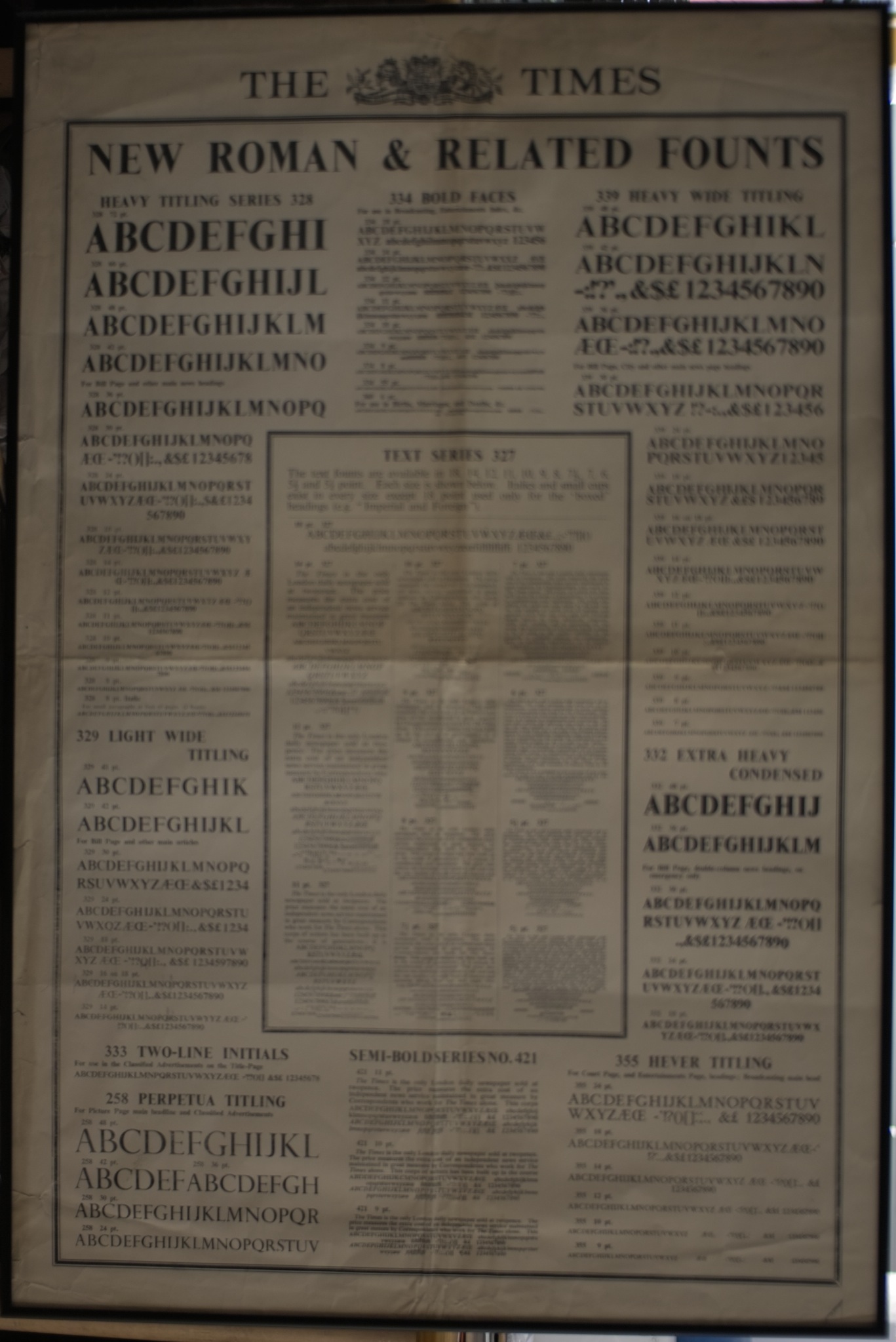
Metal type versions
[edit]A large number of variants of Times were cut during the metal type period, in particular headline weights and families of titling capitals for headlines.[63][64] Walter Tracy in Letters of Credit, Allen Hutt and others have discussed these extensively in their works on the family.[65][66][64] (Morison felt in 1953 that the most important part of The Times's redesign that introduced Times New Roman was not the body text at all, but introducing headline fonts that matched the text type.[67])
Titling
[edit]Monotype created some caps-only titling designs to match Times New Roman itself.[68] These are not sold by Monotype in digital format, although Linotype's Times Eighteen in the same style (see below) is.[69]
Times Hever Titling
[edit]
An elegant titling caps design, quite different from Times New Roman with a Caslon-style A (with a serif at top left of the letter, suggesting a stroke written with a quill) and old-style C and W; Tracy suggests Monotype's previous Poliphilus design as an influence.[70] Named after Hever Castle, the home of the Times' owner Lord Astor and designed early on, it was used by the Times for headings in the lighter sections such as society pages, arts and fashion.[66][71] It has not been digitised.
Times Wide (1938, series 427)
[edit]A variant intended for book printing, avoiding the slight condensation of the original Times New Roman.[72] Although it was popular in the metal type period for book printing, it was apparently never digitised. Monotype also created a version, series 627, with long descenders more appropriate to classic book typography.[73] Optional text figures were also available.[74]
Series 727 and 827
[edit]Monotype also produced Series 727, in which the heavier strokes of upper-case letters were made slightly thinner.[75] This was done to produce a lighter effect in which capital letters do not stand out so much, and was particularly intended for German use, since in the German language capitals are far more common since they appear at the start of each noun.[75] Series 827 modified some letters (notably the R) to correspond to their appearance in other typefaces popular in French printing. This production of what are now called stylistic alternates to suit national tastes was common at the time, and many alternates were also offered for Gill Sans for use in Europe.[75]
Claritas (1951)
[edit]A modified 43⁄4 point size of Times Roman was produced by Monotype for use in printing matter requiring a very small size of type.[76] Listed as Times Newspaper Smalls, available as either Series 333 or 335, it was also referred to by the name Claritas.[21]
Times 4-line Mathematics Series 569
[edit]This is a variant designed for printing mathematical formulae, using the 4‑line system for mathematics developed by Monotype in 1957.[77][78] This modified version of Times Roman was designed for use as part of Monotype's 4-line Mathematics system. The major changes to the Times Roman typeface itself were a reduction in the slope of italic characters to 12 degrees from 16 degrees, so as to reduce the need for kerning, and a change in the form of italic 'v' and 'w' so that italic 'v' could be more easily distinguished from a Greek nu.[77]
The 4-line system involved casting characters for 10-point Times Roman on 6-point bodies. The top of the character would overhang the slug, forming a kern which was less fragile than the normal kerns of foundry type, as it was on a slab of cast metal. This technique had been in previous use on Monotype machines, usually involving double-height matrices, to allow the automatic setting of "advertising figures" (numbers that occupy two or more lines, usually to clearly indicate a price in an advertisement set in small type). This meant that the same matrix could be used for both superscript and subscript numbers. More importantly, it allowed a variable or other item to have both a superscript and a subscript at the same time, one above the other, without inordinate difficulty.[77]
Previously, while the Monotype system, due to its flexibility, was widely used for setting mathematical formulas, Monotype's Modern Series 7 was usually used for this purpose.[39][79] Because of the popularity of Times Roman at the time, Monotype chose to design a variant of Times Roman suited to mathematical composition, and recut many additional characters needed for mathematics, including special symbols as well as Greek and Fraktur alphabets, to accompany the system instead of designing it around the typeface that was being used, for which characters were already available.[77] Matrices for some 700 characters were available as part of Times Roman Series 569 when it was released in 1958, with new characters constantly being added for over a decade afterwards (thus, in 1971, 8,000 characters were included, and new ones were being added at a rate of about 5 per week).[77]
Others
[edit]The Times also used a sans-serif wood type for printing newbills which had no connection to Times New Roman. It was similar to Kabel Bold Condensed.[80]
Besides Monotype versions, Times New Roman was also available in metal type from Linotype, discussed below, and Intertype.[81][82][j]
Usage
[edit]
Times New Roman's popularity rapidly expanded beyond its original niche, becoming popular in book printing and general publishing. Monotype promoted the typeface in their trade magazine, The Monotype Recorder, and took advantage of this popularity by cutting a widened version, Series 427, for book publishing, although many books ultimately used the original version.[84] The first known book published in Times New Roman (the original 327 Monotype series) was Minnow Among Tritons, published by the Nonesuch Press and printed by R&R Clark in 1934.[85] (Because the cover of the Monotype Recorder compared the new "Times New Roman" with a sample of the previous type labelled as "Times Old Roman", some writers have assumed that the Times' previous typeface was actually called this, which it was not.[86][40])
An early user of Times New Roman outside its origin was by Daniel Berkeley Updike, an influential historian of printing with whom Morison carried an extensive correspondence. Impressed by the design, he used it to set his book Some Aspects of Printing, Old and New.[87][88][89] It then was chosen by the Crowell-Collier magazines Woman's Home Companion and then its sister publications such as Collier's.[90][91][92] A brochure was published to mark the change along with a letter from Morison hoping that the redesign would be a success.[83] Ultimately it became Monotype's best-selling metal type of all time.[93][94]
Walter Tracy, who worked on a redesign, however noted that the design's compression and fine detail extending to the edge of the matrices was not ideal in the aggressive conditions of most newspaper printing, in which the Times was unusual for its particularly high standard of printing suiting its luxury market. Users found that in the hot metal period it was common for the molten metal to rapidly eat through the matrices as type was being cast, and so it did not become popular among other newspapers: "Times Roman achieved its popularity chiefly in general printing, not in newspaper work."[29] He described it as particularly used in "book work, especially non-fiction" such as the Encyclopaedia Britannica.[29][k] Hutt also commented that Times New Roman's relative condensation was less useful than might be expected for newspaper printing, since in a normal newspaper column frequent paragraph breaks tend to provide area that can absorb the space of wider letters without increasing the number of lines used–but The Times, whose house style in the 1930s was to minimise the number of paragraph breaks, was an exception to this.[53][96]
A number of early reviews of Times New Roman were published in Morison's lifetime that discussed aspects of its design.[97] Most were appreciative (Morison was an influential figure in publishing) but several noted that it did not follow conventional expectations of newspaper typeface design.[97][98] One article that discussed its design was Optical Scale in Typefounding, written by Harry Carter and published in 1937, which discussed the differences between small and large-size typeface designs. He commented "The small sizes of Plantin embody what are supposed to be the requirements of a good small type [but] Times Roman, which most people find the easiest to read of small text-types, runs counter to some of them...[Morison] avoided blunt serifs and thickened hairlines because he found they wore down more noticeably than sharper-cut features."[42]
Times New Roman remains popular in publishing, helped by the extremely large range of characters available for international and mathematics printing.[73][99] For example, the American Psychological Association suggests using Times New Roman in papers written in its APA style.[100][101]
The U.S. Department of State used Times New Roman as the standard font in its official documents from 2004 to 2023, before switching to Calibri.[102][103]
The Australian Government logo used Times New Roman Bold as a wordmark for departments and agencies are required to use common branding on their websites and print publications.[104]
Linotype design (Times Roman)
[edit]
.jpg)

Monotype originally created Times New Roman for its typesetting machines, but its rival, Linotype, rapidly began to offer its version of the typeface with subtle differences. A key reason is that many newspapers, including The Times, also used Linotype equipment for production. Linotype referred to its design as Times or Times Roman. Monotype and Linotype have since merged, but the lineage of Times has been split into two subtly different designs since its earliest days.
Although Times New Roman and Times are very similar, various differences developed between the versions marketed by Linotype and Monotype when the master fonts were transferred from metal to photo and digital media. For example, Linotype has slanted serifs on the capital S, while Monotype's are vertical, and Linotype has an extra serif on the number 5.[106] Most of these differences are invisible in body text at normal reading distances, or 10pts at 300 dpi. Subtle competition grew between the two foundries, as the proportions and details, as well as the width metrics for their version of Times, grew apart.[108] Differences between the two versions do occur in the lowercase z in the italic weight (Times Linotype has a curl also followed in the STIX revival, Times New Roman is straight),[29] and in the percent sign in all weights (Linotype and STIX have a stroke connecting up the left-hand zero with a slash, Times New Roman does not). Monotype's 'J' is non-descending, but Linotype's in the bold weight descends below the baseline. Linotype's metal version of Times had a shrunken 'f' due to a technical limitation of the Linotype system—it could not cast a kerning 'f', one that extended into the space of surrounding letters.[109] This restriction was removed in the digital version.[109]
Linotype licensed its version to IBM, Xerox, and subsequently to Adobe and Apple, guaranteeing its importance in digital printing by making it one of the core fonts of the PostScript page description language.[110][111] This digital iteration of Times Roman was derived from the 12pt metal type, similar to the phototype version. Microsoft's version of Times New Roman is licensed from Monotype, hence the original name. For compatibility, Monotype had to subtly redraw its design to match the widths from the Adobe/Linotype version.[112] Versions of Times New Roman from Monotype (discussed below) exist that vary from the PostScript metrics. Linotype applied for registration of the trademark name Times Roman and received registration status in 1945.[108]
Modern releases
[edit]Monotype variants
[edit]Monotype has released at least eight digital typefaces under the name Times New Roman.[113]
Times New Roman
[edit]Since Windows 3.1, all versions of Microsoft Windows include Times New Roman.[114] Version 6.87 of this typeface is available for purchase under the name Times New Roman OS (see below).[115] The current 7.03 version of Windows' Times New Roman includes small capitals, text figures, and italic swash capitals.[116][117] It omits automatic ligature insertion, but enabling the "discretionary ligatures" feature will provide ligatures for "fi" and "Th". More complex Unicode ligatures like "ffi" and "ft" are also available.[118] A previous version of Times New Roman was also distributed as part of Microsoft's Core Fonts for the Web package.[119]
When the system font Times New Roman was expanded to support Arabic script, it was complemented with the Arabic character set from Simplified Arabic, a typeface that Compugraphic Corporation had plagiarized from Linotype and leased to Microsoft.[120] Times New Roman with support for Arabic was first published in the Arabic version of Windows 3.1x.[120]
Times New Roman OS
[edit]Also known as Times New Roman World, this is originally based on the version of Times New Roman bundled with Windows Vista.[121] It includes fonts in WGL character sets, Hebrew and Arabic characters. Similar to Helvetica World, Arabic in italic fonts are in roman positions.[clarification needed]
Others
[edit]Monotype further sells a wider range of styles and optical sizes in order to meet the needs of newspapers and books which print at a range of text sizes.[21]
- Times New Roman Pro and Times New Roman Std are the basic releases, which include Regular, Medium, Semi Bold, and Bold weights with matching italics, along with Extra Bold and Condensed (in regular, italic and bold).[122] Times New Roman Pro and Std provide standard ligature for "fi".
- Times New Roman Seven is for smaller text and includes Regular and Bold with their italics.[123]
- Times New Roman Small Text includes Regular, Italic, and Bold.[124]
Linotype variants
[edit]Times
[edit]
This is the digitalisation of Linotype's Times (see above). It is pre-installed on macOS but not on iOS,[125] and is also widely available for purchase. Times provides standard ligature for "fi", but it does not provide any ligature for "Th".
Others
[edit]Like Monotype, Linotype released additional versions of Times for different text sizes. These include:
- Times Ten is a version specially designed for smaller text (12-point and below). It features wider characters and stronger hairlines.[126][127] In 2004 prominent typeface designer Erik Spiekermann said that he believed that it was the best Times New Roman digitisation then available.[128]
- Times Eighteen, a headline version for point sizes of 18 and larger. The characters are subtly condensed and the hairlines are finer. The current version has no italics, but does have a lower case (whereas some Times titling fonts were capitals only).[69]
- Times Europa Office, a 2006 adaptation of The Times's 1972 design Times Europa (see below). This is a complete family of designs intended for use on poor-quality paper. The updating, created by Akira Kobayashi, contains tabular numbers, mathematical signs, and currency symbols. Each character has the same advance width in all the fonts in the family so that changing from regular to bold or italic does not affect word wrap.[129]
Later typefaces used by The Times
[edit]
The Times newspaper has commissioned various successors to Times New Roman:
- Times Europa was designed by Walter Tracy in 1972 for The Times, as a sturdier alternative to the Times font family, designed for the demands of faster printing presses and cheaper paper.[130] It has been released commercially by Adobe, among others, recently in an updating by Linotype as Times Europa Office (discussed above).[131][129]
- Times Roman replaced Times Europa on 30 August 1982.[132]
- Times Millennium was made in 1991, drawn by Gunnlaugur Briem on the instructions of Aurobind Patel, composing manager of News International.[132][133]
- Times Classic first appeared in 2001.[134][135][136][137][138][139] Designed as an economical face by Dave Farey and Richard Dawson,[140] it took advantage of the new PC-based publishing system at the newspaper; the new typeface included 120 letters per font.[132][141][142]
- Times Modern was unveiled on 20 November 2006, as the successor of Times Classic.[132] Designed for improving legibility in smaller font sizes, it uses 45-degree angled bracket serifs. It was designed by Research Studios, led by designer Neville Brody with input from Ben Preston, deputy editor of The Times.[143][144] (Other designs have been released called Times Modern; see below.) During the Times New Roman period The Times also sometimes used Perpetua Titling.[10][68]
William Starling Burgess
[edit]In 1994 the printing historian Mike Parker published claims that the design of Times New Roman's roman or regular style was based on a 1904 design of William Starling Burgess.[145] This theory remains controversial.[27] Parker and his friend Gerald Giampa, a Canadian printer who had bought up the defunct American branch of Lanston Monotype, claimed that, in 1904, Burgess created a type design for company documents at his shipyard in Marblehead, Massachusetts, and hired Lanston Monotype to issue it.[145] However, Burgess abandoned the idea and Monotype shelved the sketches, ultimately reusing them as a basis for Times New Roman. Giampa claimed that he stumbled upon original material in 1987, after he had purchased Lanston Monotype, and that some of the papers that had been his evidence had been lost in a flood at his house, while Parker claimed that an additional source was material in a section of the Smithsonian now closed due to asbestos contamination.[145][146] Giampa asked Parker to complete the type from the limited number of surviving letters, which was issued in June 2009 by Font Bureau under the name of 'Starling'.[27][147][148]
Reception to the claims was sceptical, with dismissal from Morison's biographer Nicolas Barker and Luc Devroye among others; Barker suggested that the material had been fabricated in order to aid Giampa in embarrassing Monotype's British branch, while Devroye and Thomas Phinney of FontLab suggested that the claim had begun as a prank.[146][51][149][150] In 2010, Mark Owens[151] described Parker's article in retrospect as "the scantest of evidence" and a "fog of irrelevant details"[152] and Simon Loxley that it "doesn't really have a leg to stand on".[153][l] Monotype executive Dan Rhatigan described the theory as implausible in 2011: "I'll admit that I tend to side with the more fully documented (both in general, and in agreement with what little I can find within Monotype to support it) notion that Times New Roman was based on Plantin...I won't rule out the possibility that Starling Burgess drew up the concept first, but Occam's razor makes me doubt it."[86]
The Times Online web site credits the design to "Stanley Morrison, Victor Lardent and perhaps Starling Burgess".[156]
Designs inspired by Times New Roman
[edit].jpg)

In the phototypesetting and digital typesetting periods many font designs have been published inspired by Times New Roman. Although the digital data of Monotype and Linotype releases of Times New Roman are copyrighted, and the name Times is trademarked,[157] the design itself is in many countries not copyrightable. Notably, the United States allows alternative interpretations if they do not reuse digital data.[158][159]
- Times Modern was a condensed and bold display variant published by, among others, Elsner+Flake. It was withdrawn from sale due to trademark disputes with the Times newspaper, which owns its own unrelated design named 'Times Modern' (see above).[160]
- CG Times is a variant of Times family made by Compugraphic.
- Pelham is a version of Times Roman by DTP Types of Britain, which also designed an infant version with single-storey 'a' and 'g'.[161]

- In the mid-1960s, a derivative of Times New Roman known as 'Press Roman' was used as a font for the IBM Composer.[162] This was an ultra-premium electric 'golfball' typewriter system, intended to be used for producing high-quality office documents or copy to be photographically enlarged for small-scale printing projects.[162] Unlike most typewriters, the Composer produced proportional type, rather than monospaced letters. Ultimately the system proved a niche product, as it competed with increasingly cheap phototypesetting, and then in the 1980s was largely displaced by word processors and general-purpose computers.[163][164][m]
- Among many digital-period designs loosely inspired by Times, Kris Sowersby's popular Tiempos family is a loose Times New Roman revival; it was created for a Spanish newspaper ('tiempo' is Spanish for 'time').[167][168]
- Maxitype designed the Rhymes typeface, which also inspired from the Times New Roman typeface, comprises Display and Text.[169]
- In 2018, art collective MSCHF released a typeface titled Times Newer Roman, which has the same design as Times New Roman but is 10–15% wider.[170]
Free alternatives
[edit]
There are some free software fonts used as alternatives, including metric-compatible designs used for font substitution.[171][172][173][174]
- URW++ produced a version of Times New Roman called Nimbus Roman in 1982. Nimbus Roman No9 L, URW's PostScript variant, was released under the GNU General Public License in 1996,[175][176] and is included with some free and open source software. Various adapted versions exist including FreeSerif,[171][177] TeX Gyre Termes[178] and TeX Gyre Termes Math.[179][180] Like Times New Roman, many additional styles of Nimbus Roman exist that are only sold commercially, including condensed and extra-bold styles. URW also developed Nimbus Roman No. 4, which is metrically compatible with the slightly different CG Times.[181]
- Linux Libertine was developed in 2003 and released under the GNU General Public License and the SIL Open Font License. In 2010, it was adopted for the redesign of the Wikipedia logo.
- The Libertinus family of fonts was forked from Linux Libertine in 2012 and continues to be maintained and developed (2024).

The Wikipedia wordmark in Linux Libertine


- The STIX Fonts project is a four-style set of open-source fonts. They were created for scientific publishing by the Scientific and Technical Information Exchange consortium of publishers, but are also very suitable for general use, including Greek and Cyrillic support.[182] The original version is installed by default on Mac OS X, and adapted as XITS. In 2016, a completely redesigned version was released by Ross Mills and John Hudson of Tiro Typeworks. Unlike the previous version, it is an original design, with a higher x-height than Monotype's Times digitisation.[183][184]
- Liberation Serif by Steve Matteson is metrically equivalent to Times New Roman.[185] It was developed by Ascender Corp. and published by Red Hat in 2007 under the GPL with the font exception.[186] Widths aside, it does not particularly resemble Times New Roman, being much squarer in shape with less fine detail and blunt ends rather than ball terminals.[187][188] Google's Tinos in the Croscore fonts package is a derivative of Liberation Serif.[188]
Non-Latin fonts using Times New Roman's Latin-alphabet glyphs
[edit]Some fonts intended for typesetting multiple writing systems use Times New Roman as a model for Latin-alphabet glyphs:
- Bitstream Cyberbit is a roman-only font released by Bitstream with an expanded character range intended to cover a large proportion of Unicode for scholarly use, with European alphabets based on Times New Roman.[189][190] Bitstream no longer offers the font, but it remains downloadable from the University of Frankfurt.[191]
- Doulos SIL is a serif typeface developed by SIL International.[192]
- The Russian Astra Linux operating system includes PT Astra Serif, a derivative of PT Serif metrically compatible with Times New Roman.[193][194]
- Jomolhari is a Tibetan script Uchen font created by Christopher J. Fynn, freely available under the Open Font License. It supports text encoded using the Unicode Standard and the Chinese national standard for encoding characters of the Tibetan script (GB/T20524-2006 "Tibetan Coded Character Set"). The design of the font is based on Bhutanese manuscript examples[195] and it is suitable for text in Tibetan, Dzongkha and other languages written in the Tibetan script.
- Two typefaces in the National Fonts project (specifically Kinnari and Norasi) based their Latin character glyphs from Times New Roman. Typefaces in the National Fonts project were intended to be public alternatives to the widely used, yet licence-restricted, commercial typefaces that came bundled with major operating systems and applications.[196] Later on, Thai Linux Working Group (TLWG) released these 2 typefaces alongside 11 others as free and open-source software.[197][198]
Notes
[edit]- ^ "The Changing Newspaper" articles in the Monotype Recorder are unsigned, but Monotype's newspaper consultant Allen Hutt, who co-authored the issue, attributes them to Morison.[4]
- ^ While Times is often described as being quite "condensed" this is relative to its high x-height: typefaces with lower x-height, such as many versions of Garamond, Caslon and Bembo, are narrower at equalised cap height.
- ^ Times New Roman was called "Times Old Style" in an early stage of its development.[15]
- ^ Morison continued: "– Mr. Goudy for instance."[28] This refers to Frederic Goudy, one of the leading American type designers of the period. Morison considered his very organic tastes in letter design somewhat florid and self-indulgent.
- ^ Walter Tracy felt that in the roman style the high serifs of the 'v' do not sit well with the lower shape of the 'i', and that the designers should have tested words like 'divide' and 'jump' to spot this.[29]
- ^ Excluding some countries, such as Germany, where blackletter types were still very popular for extended text into the nineteenth century. For some higher-class literary printing eighteenth-century Caslon types, or more often Old Style faces in imitation of it, were common in Britain.[35]
- ^ Although it praised many—though not all—aspects of Times' design, so cannot be considered entirely unbiased, a 1937 article by the historian of printing Harry Carter, who had been a draughtsman at the Monotype factory, commented in 1937 that modern faces at 9-point size made for "a very fine engineer's job, but a poor design for reproduction on so small a scale."[42]
- ^ Dreyfus shows proofs of the experimental recut of Perpetua with shortened descenders to allow tighter linespacing.[15] Morison later commented that "it stared at the reader".
- ^ Spelling here, and elsewhere in the article, modernised to avoid confusion. Morison wrote "fount", the usual spelling in British English at the time.[28]
- ^ Crutchley noted being told in 1948 by Will Carter that Intertype were not keen to offer an Intertype version of Times because "Monotype have made such a splash of Times and Intertype don't want to look like mere copycats".[52]
- ^ According to Hutt, in the period after it was introduced, "two 'class' journals, the Observer and the Financial Times, with high production standards, installed it", as well as "a number of local papers, both dailies and weeklies", but they had problems with matrix breakdown.[95]
- ^ Among the few prominent figures in typography to express even qualified support for the idea was Tiro Typeworks owner John Hudson, Giampa's neighbour on Vancouver Island. He wrote in 2008 that he had examined Giampa's claimed patterns and that they looked as if they were made using an early Monotype production process obsolete by 1931: "the material evidence of the two-part patterns and their numbering -- if they are genuine --, suggests very strongly a design that significantly pre-dates 1931...The patterns are either deliberate hoax or they are historical artefacts" and that he was "unconvinced that this is a hoax";"[154] but in 2019, after Giampa and Parker's deaths, he said "I do think it entirely possible that the whole thing was a hoax."[150] The claims did convince Walter Tracy, who had written a major analysis of Times New Roman's genesis in his book Letters of Credit; however he died in April 1995, before Parker's finalised publication, and did not live to see the extensive rebuttals.[155] Designer Jim Rimmer wrote that "Mr Giampa gave me a set of punches for use in numbering my own matrices. The design of these numerals is identical to those used to stamp “54” on the patterns".[146]
- ^ The system returned to public attention in 2004, during the Killian documents controversy, when some documents apparently from the 1970s and presenting the future U.S. president George W. Bush's military service in an unfavourable light were presented by the American news network CBS. The documents were typeset in a form of Times New Roman. As the documents looked unlike most typewritten documents, having proportional spacing rather than the monospacing of almost all typewritten documents, some defenders of the documents suggested that they might have been typed using this method. It is now accepted that they were forged on a modern computer, according to digital font expert Thomas Phinney in the Linotype version of Times New Roman.[165][166]
References
[edit]- ^ Clarke, C.F.O. (1946). "The Times: A Revolution in Newspaper Printing". Graphis. pp. 362–375. Archived from the original on 27 February 2021. Retrieved 15 December 2016.
- ^ Printing the Times: A record of the changes introduced in the issue for October 3, 1932. London: Times. 1932.
- ^ a b Morison, Stanley (1936). "Monotype Recorder: The Changing Newspaper" (PDF). Monotype Recorder. 35 (1).
- ^ Hutt 1970, p. 263.
- ^ Williamson 1956, p. 117.
- ^ Hutt 1970, p. 261.
- ^ Tracy 2003, p. 197.
- ^ Mann, Meredith. "Where Did Times New Roman Come From?". New York Public Library. Retrieved 2 February 2016.
- ^ a b Vervliet, Hendrik D. L. (2008). The Palaeotypography of the French Renaissance: Selected Papers on Sixteenth-century Typefaces. BRILL. pp. 226–7. ISBN 978-90-04-16982-1.
- ^ a b c Morison, Stanley (7 June 1973). A Tally of Types. CUP Archive. pp. 22–24, 106, 124 etc. ISBN 978-0-521-09786-4.
- ^ Mosley, James. "Comments on Typophile thread". Typophile (archived). Archived from the original on 13 October 2011. Retrieved 16 December 2016.
The consensus appears to be that not only the wrong-fount a in the cases at Antwerp but also the italic that Monotype adapted for their Plantin (which can be seen on that first page of the 1905 specimen) may be the work of Johann Michael Schmidt (died 1750), also known as J. M. Smit or Smid.
- ^ Haley, Allan (1992). "Stanley Morison". Typographic Milestones. Hoboken, NJ: John Wiley & Sons. pp. 99–107. ISBN 9780471288947.
- ^ Haley, Allen (1990). ABC's of type. Watson-Guptill Publications. p. 86. ISBN 9780823000531.
Times looks like Plantin on a diet.
- ^ Morison, Stanley (2009). "Chapter 8: Leipzig as a Centre of Type-Founding". In McKitterick, David (ed.). Selected essays on the history of letterforms in manuscript and print (Paperback reissue, digitally printed version ed.). Cambridge: Cambridge University Press. pp. 149–170. ISBN 978-0-521-18316-1.
- ^ a b c Dreyfus 1973, p. 166.
- ^ Mosley, James (2003). "Reviving the Classics: Matthew Carter and the Interpretation of Historical Models". In Mosley, James; Re, Margaret; Drucker, Johanna; Carter, Matthew (eds.). Typographically Speaking: The Art of Matthew Carter. Princeton Architectural Press. pp. 31–34. ISBN 9781568984278.
Plantin was a recreation of one of the old types held at the Plantin-Moretus Museum in Antwerp, of which a specimen, printed in 1905, had been acquired by Pierpont on a visit. The type from which the specimen was printed was not only centuries old and worn almost beyond use, but it was contaminated with wrong-font letters (notably the letter 'a') and the italic did not even belong to the roman. The revival, derived by Monotype from an indirect and confused original, is [nonetheless] as sound a piece of type-making as was ever created in the 20th century...behind the foggy image of the roman type lies the...'Gros Cicero' Roman of Robert Granjon, acquired by the Plantin printing office after the death of its founder.
- ^ Clair, Kate; Busic-Snyder, Cynthia (2005). A typographic workbook a primer to history, techniques, and artistry (2nd ed.). Hoboken, N.J.: Wiley. p. 171. ISBN 9781118399880.
- ^ Haralambous, Yannis (2007). Fonts & Encodings. Translated by Scott, P. (1st ed.). Sebastopol, Calif.: O'Reilly Media. p. 417. ISBN 9780596102425.
- ^ Allan Haley (15 September 1992). Typographic Milestones. John Wiley & Sons. p. 106. ISBN 978-0-471-28894-7.
- ^ a b Lawson, Alexander (1990). Anatomy of a Typeface. New York: David R. Godine. pp. 270–294. ISBN 9780879233334.
- ^ a b c Morison, Stanley. "Changing the Times". Eye. Retrieved 28 July 2015.
- ^ Barr, John (1971). Stanley Morison: A Portrait. British Museum. p. 33.
- ^ Mosley, James. "Comments on Typophile thread". Typophile (archived). Archived from the original on 13 March 2013. Retrieved 27 March 2017.
One of the distinctive things about French calligraphy of [the 1680s] is that the lead-in stroke of letters like i, m, n and so on have flat, rather 'roman', serifs, making them look a bit like a 'sloped roman'...Fournier used it fifty years later in his 'new style' italics, and later so did Firmin Didot. And that French flat serif also turns up in...the italic to Times New Roman.
- ^ Wardle, Tiffany (2000). The story of Perpetua (PDF). University of Reading. p. 5. Archived from the original (PDF) on 10 November 2006. Retrieved 26 March 2009.
- ^ Mosley, James. "Eric Gill's Perpetua Type". Fine Print.
- ^ Simon Loxley (12 June 2006). Type: The Secret History of Letters. I.B.Tauris. p. 134. ISBN 978-1-84511-028-4.
- ^ a b c Alas, Joel (1 August 2009). "The history of the Times New Roman typeface". Financial Times. Retrieved 26 August 2009.
- ^ a b Updike, Daniel Berkeley; Morison, Stanley (1979). McKitterick, David (ed.). Stanley Morison & D.B. Updike: selected correspondence. Moretus Press. pp. 184–6. ISBN 9780896790018.
- ^ a b c d e Tracy 2003, p. 204.
- ^ Hare, Steve. "By printers, for printers". Eye Magazine. Retrieved 2 February 2016.
[Shown are] overlays from the article 'The Evolution of Times New Roman' by John Dreyfus. He writes: 'These drawings demonstrate how severely the bowl of "p" has been reduced in the bold version, because mainstrokes have been thickened without drawing the bold version any wider.'
- ^ Lang 1946, p. 17.
- ^ Middendorp, Jan (2004). Dutch type. Rotterdam: 010 Publishers. p. 94. ISBN 9789064504600.
- ^ a b Miklavčič, Mitja (2006). "Three chapters in the development of Clarendon/Ionic typefaces" (PDF). MA Thesis (University of Reading). Archived from the original (PDF) on 25 November 2011. Retrieved 14 August 2015.
- ^ Coles, Stephen (10 March 2013). "Times Bold Modified". Flickr. Retrieved 26 January 2016.
- ^ Ovink, G.W. (1971). "Nineteenth-century reactions against the didone type model - I". Quaerendo. 1 (2): 18–31. doi:10.1163/157006971x00301.
- ^ Tracy 2003, p. 181.
- ^ Unger, Gerard (1 January 1981). "Experimental No. 223, a newspaper typeface, designed by W.A. Dwiggins". Quaerendo. 11 (4): 302–324. doi:10.1163/157006981X00274.
- ^ Frere-Jones, Tobias. "Decompiled & Remixed History: The Making of Exchange". Frere-Jones Type. Retrieved 1 August 2017.
- ^ a b Williamson 1956, p. 97.
- ^ a b Mosley, James. "Comments on Typophile thread". Typophile. Archived from the original on 12 June 2012. Retrieved 27 July 2015.
- ^ Hutt 1960, p. 54.
- ^ a b Carter, Harry (1937). "Optical scale in type founding". Typography. 4. Archived from the original on 8 March 2021. Retrieved 15 September 2019.
- ^ a b Hutt 1960, p. 55.
- ^ a b Gaultney, Victor. "Balancing typeface legibility and economy Practical techniques for the type designer". University of Reading (MA thesis). Retrieved 13 October 2017.
- ^ Pimlott, Herbert (February 2013). "The Radical Type? G. Allen Hutt, the Communist Party and the politics of journalistic practice". Journalism Practice. 7 (1): 81–95. doi:10.1080/17512786.2012.685556. S2CID 142731478.
- ^ Tracy 2003, p. 194.
- ^ a b c Tracy 2003, p. 202.
- ^ Barker 1972, pp. 286–302.
- ^ Tracy 2003, p. 196.
- ^ Tracy 2003, p. 199.
- ^ a b Barker, Nicolas (2003). "Starling Burgess: No Type Designer". Form and Meaning in the History of the Book : selected essays. London: British Library. pp. 371–390. ISBN 0-7123-4777-1.
- ^ a b c Crutchley 1990, p. 129.
- ^ a b Hutt 1970, p. 264.
- ^ Rhatigan, Dan. "Time and Times again". Ultrasparky. Retrieved 10 July 2025.
- ^ Rhatigan, Dan (2 December 2022). "My assumption that the Lardent..." Mastodon. Retrieved 28 May 2023.
My assumption that the Lardent drawings for TNR are lost comes from two things: 1) Knowing for sure that no trace of them existed at Salfords, much to the company's dismay 2) Robin Nicholas' own frustration at never finding a trace of them, or hearing about them from anyone at the Times. I suspect that the reproduction of the drawings in "printing of the Times" may have been an enlargement of one of the reference photos originally made of Lardent's drawings.
- ^ Savoie, Alice (1 December 2020). "The women behind Times New Roman". Journal of Design History. 33 (3): 209–224. doi:10.1093/jdh/epaa025.
- ^ Archived at Ghostarchive and the Wayback Machine: Ross, Fiona; Savoie, Alice (14 September 2018). "Women in Type". YouTube. ATypI. Retrieved 13 October 2021.
- ^ Savoie, Alice (21 September 2020). "Women in type: the contribution of type drawing offices to twentieth century type-making with Alice Savoie". Vimeo. Retrieved 13 October 2021.
- ^ Archived at Ghostarchive and the Wayback Machine: Savoie, Alice (23 June 2021). "Alice Savoie : Présentation du projet de recherche Women in Type". YouTube. CRAL - Centre de Recherches sur les arts et le langage. Retrieved 13 October 2021.
- ^ Carter, H. G. (2004). Morison, Stanley Arthur (1889–1967). Vol. Oxford Dictionary of National Biography. rev. David McKitterick. Oxford University Press.
- ^ Crutchley 1990, p. 123.
- ^ Carter, Sebastian (5 September 2003). "Obituary: Brooke Crutchley". The Guardian. Retrieved 27 March 2022.
- ^ Williamson 1956, p. 39.
- ^ a b Hutt 1960, pp. 106–108.
- ^ Hutt 1970, p. 270.
- ^ a b Tracy 2003, p. 207.
- ^ Morison 1953, pp. 70–71.
- ^ a b "Linotype Times Eighteen". MyFonts. Retrieved 14 July 2015.
- ^ Tracy 2003, p. 208.
- ^ Savoie, Alice; Hudson, John. "Comments on Typophile thread". Typophile. Archived from the original on 17 July 2014. Retrieved 16 September 2015.
- ^ "Typographic Problems of the Illustrated Book" (PDF). Monotype Recorder. 37 (2): 31. 1938.
Some types look larger, size for size, than others, because they have unusually short descenders and ascenders. This allows more room for the 'x' or the middle part of the lower-case [but] a 'large x' is bound to waste space horizontally...the imperceptible condensation of Monotype Times New Roman puts it in a class by itself as a news face. In the wider book measure, however, condensation is no asset.
- ^ a b Williamson 1956, p. 102.
- ^ "Composition matrices". Effra Press. Archived from the original on 26 March 2023. Retrieved 10 April 2020.
- ^ a b c "Modifications and extensions of a single series" (PDF). Monotype Recorder. 40 (3): 14. 1956. Retrieved 27 July 2015.
- ^ Morison 1953, p. 72.
- ^ a b c d e Rhatigan, Daniel. "The Monotype 4-Line System for Setting Mathematics". Type Culture. Retrieved 17 August 2018.
- ^ Rhatigan, Daniel. "Three typefaces for mathematics" (PDF). University of Reading (MA thesis). Retrieved 2 February 2016.
- ^ Chaundy, Theodore William; Barrett, P. R.; Batey, Charles (1954). The Printing of Mathematics: Aids for Authors and Editors and Rules for Compositors and Readers at the University Press, Oxford. Oxford: Oxford University Press.
- ^ Righyni, S. L. (1946). "News Bills: A Retrospectus". Alphabet & Image (2): 34–49.
- ^ Morison 1953, p. 68.
- ^ Intertype Times Roman. Amsterdam: Lettergieterij "Amsterdam".
- ^ a b Heller, Steven (10 August 2015). "Happiness is Times New Roman". Print magazine. Retrieved 15 December 2016.
- ^ Williamson 1956, p. 103.
- ^ Monotype Corporation 1934.
- ^ a b Rhatigan, Dan. "It was never called Times Old Roman". Ultrasparky. Retrieved 10 July 2025.
- ^ Blackwell, Lewis (2004). 20th-century Type. Laurence King Publishing. pp. 76–9. ISBN 978-1-85669-351-6.
- ^ Lawson, Alexander S. "D.B. Updike Set Standard of Great Craftsmanship". The Alexander S. Lawson Archive (Internet Archive backup). Archived from the original on 20 December 2016. Retrieved 6 May 2020.
- ^ Lawson, Alexander S. "Stanley Morison: Significant Historian (obituary)". The Alexander S. Lawson Archive. Archived from the original on 27 May 2016. Retrieved 14 May 2016.
- ^ Dreyfus 1973, p. 172.
- ^ Alexander S. Lawson (January 1990). Anatomy of a Typeface. David R. Godine Publisher. pp. 270–294. ISBN 978-0-87923-333-4.
- ^ "Crowell-Collier adopts a Type Developed by London Times". Inland Printer and American Lithographer. 111.
- ^ Badaracco, Claire (1991). "Innovative Industrial Design and Modern Public Culture: The Monotype Corporation, 1922–1932" (PDF). Business & Economic History. 20 (second series). Business History Conference: 226–233. Retrieved 19 December 2015.
- ^ Whittington Press [@whittingtonpres] (14 April 2016). "Sales chart of Monotype die cases" (Tweet) – via Twitter.
- ^ Hutt 1960, p. 61.
- ^ Hutt 1960, p. 74-75.
- ^ a b Lang 1946.
- ^ Hutchings, R. S. (1963). The Western Heritage of Type Design. London: Cory, Adams & Mackay. pp. 56–7.
Times New Roman...was based on a fresh evaluation of the optical and technical problems of news composition. It derives from the old face tradition but its design characteristics were determined solely by utilitarian considerations.
- ^ Bergmann, Christopher (16 March 2014). "Es gilt das gesprochene Wort: Schriftarten für IPA-Transkriptionen". Isoglosse. Retrieved 14 November 2018.
- ^ Lee, Chelsea. "Fonts of Knowledge". APA Style Blog. American Psychological Association. Retrieved 14 November 2018.
- ^ Perea, Manuel (2013). "Why Does the APA Recommend the Use of Serif Fonts?". Psicothema. 25 (1): 13–17. doi:10.7334/psicothema2012.141. hdl:11162/97665. PMID 23336537.
- ^ John Hudson; Annabelle Timsit (18 January 2023). "A font feud brews after State Dept. picks Calibri over Times New Roman". The Washington Post.
- ^ Gillespie, Brandon (18 January 2023). "CALIBRI CRISIS: Biden State Department focuses on 'accessible' font choices amid world instability". Fox News.
- ^ "Australian Government Branding Guidelines". Digital Transformation Agency. Retrieved 19 December 2023.
- ^ "Pencil To Pixel – Monotype". Charli Luc. 23 November 2012. Retrieved 2 April 2019.
- ^ a b Strizver, Ilene (14 October 2009). "TypeTalk: Times Roman vs Times New Roman". CreativePro.com.
- ^ Sluiter, Matthijs; Hardwig, Florian (24 December 2018). "Low←tech Magazine website". Fonts in Use. Retrieved 2 April 2019.
- ^ a b Bigelow, Charles (1994). "Times (New) Roman and its part in the Development of Scalable Font Technology". Retrieved 4 July 2011.
- ^ a b Felici, James (2 January 2013). "Ligatures: Is This Trip Really Necessary?". CreativePro. Retrieved 11 June 2020.
- ^ Shaw, Paul. "Some history about Arial". Paul Shaw Letter Design. Retrieved 22 May 2015.
- ^ Hitchcock, Greg. "Thirty Years of Monotype's Times New Roman and Arial on Windows". LinkedIn. Retrieved 30 November 2020.
- ^ Simonson, Mark (21 February 2001). "Monotype's Other Arials". Mark Simonson Studio. Retrieved 14 July 2015.
- ^ "MyFonts". Retrieved 22 December 2021.
- ^ "Times New Roman font family". Retrieved 22 December 2021.
- ^ "Times New Roman OS". Retrieved 22 December 2021.
- ^ Times New Roman, v. 6.96 (Font digitisation). 16 July 2016.
- ^ Thiago; Hardwig, Florian (10 February 2019). "New Roman Times – Camper Van Beethoven". Fonts in Use. Retrieved 2 April 2019.
- ^ ""Times New Roman" Enhanced CSS Font Stack". getButterfly. 19 May 2021. Retrieved 8 March 2022.
- ^ Jose Vilches (3 August 2007). "Microsoft and Apple extend font licensing agreement". Retrieved 25 June 2011.
- ^ a b Nemeth, Titus (2017). Arabic type-making in the Machine Age. The influence of technology on the form of Arabic type, 1908-1993. Brill. ISBN 978-90-04-30377-5. OCLC 993032900.
- ^ "Times New Roman OS". Linotype. Monotype. Retrieved 14 July 2015.
- ^ "Times New Roman". Retrieved 22 December 2021.
- ^ "Times New Roman Seven". Retrieved 22 December 2021.
- ^ "Times New Roman Small Text". Retrieved 22 December 2021.
- ^ "System Fonts". Retrieved 12 December 2021.
- ^ "Linotype Times Ten". MyFonts. Retrieved 14 July 2015.
- ^ "Adobe Times Ten". MyFonts. Archived from the original on 15 July 2015. Retrieved 14 July 2015.
- ^ Shaw, Paul. "State Department bans Courier New 12, except for treaties". AIGA. Retrieved 27 December 2018.
- ^ a b "Times Europa Office Font Family". Linotype.com. Retrieved 21 September 2013.
- ^ Hutt, Allen (1973). "Walter Tracy, type designer". The Penrose Annual: 101–115.
- ^ "Adobe Times Europa". MyFonts. Archived from the original on 15 July 2015. Retrieved 14 July 2015.
- ^ a b c d Driver, David (2006). "After 221 years, the world's leading newspaper shows off a fresh face". The Times. Retrieved 9 April 2020.
- ^ Briem, Gunnlaugur. "BriemTimes". Gunnlaugur SE Briem. Retrieved 27 July 2015.
- ^ Hall, Peter. "The Typography of News: Bigger, faster, better". FontShop. Archived from the original on 15 April 2012. Retrieved 21 September 2013.
- ^ Shaw, Susan (17 April 2002). "A big impression in a narrow column". The Times. p. 33.
- ^ Baines, Phil. "Face lift: new cuts at The Times". Eye. Retrieved 10 May 2019.
- ^ Berry, John (12 April 2004). "dot-font: The Typographic Texture of the News". Creative Pro. Retrieved 10 May 2019.
- ^ Berry, John (29 March 2004). "dot-font: News on Paper in the Digital Age". Creative Pro. Retrieved 10 May 2019.
- ^ "Housestyle is just the type for redesign of The Times newspaper". Design Week. 14 February 2002. Retrieved 10 May 2019.
- ^ Farey, Dave (2011). "Type For the Times". Parenthesis. 20. Cambridge: Fine Press Book Association: 32.
- ^ Farey, Dave (2014). "A Life and Times, Part 1". Ultrabold (16): 16–25.
- ^ Farey, Dave (2014). "A Life and Times, Part 2". Ultrabold (15): 3–13.
- ^ "Neville Brody's Research Studios Creates New Font and Design Changes for The Times as Compact Format Continues to Attract Loyal Readership". London: PR Newswire UK. 15 November 2006. Archived from the original on 23 May 2012. Retrieved 21 September 2013.
- ^ Formby-Jackson, Alan (21 November 2006). "A conversation with Times Modern designer Luke Prowse". Visual Editors. Archived from the original on 8 February 2007. Retrieved 2 April 2019.
- ^ a b c Parker, Mike (1994). "W. Starling Burgess, Type Designer?". Printing History. 31/32: 52–108.
- ^ a b c Loxley, Simon. "Stanley Morison and Times New Roman". Ultrabold. Archived from the original on 13 March 2016. Retrieved 8 March 2016.
- ^ "Starling". The Font Bureau. 2009. Archived from the original on 5 January 2010.
- ^ Morison, Stanley (2009). "Starling: A Revival for Our Times" (PDF). type.co.uk. Archived from the original (PDF) on 26 February 2024. Retrieved 26 February 2024.
- ^ Devroye, Luc. "William Starling Burgess". Type Design Information. Retrieved 8 March 2016.
- ^ a b Hudson, John; Phinney, Thomas (6 March 2019). "Comments on TypeDrawers thread". TypeDrawers. Retrieved 10 April 2020.
- ^ "Writing". Mark Owens. Retrieved 28 May 2023.
- ^ Owens, Mark (2010). A Note on the Type (PDF). Carnegie Museum of Art. pp. 268–270.
- ^ Loxley, Simon (2009). "[Editorial]". Ultrabold: The Journal of St Bride Library: 2–3.
- ^ Hudson, John. "Comments on Typophile thread". Typophile (archived). Archived from the original on 8 September 2011. Retrieved 30 March 2019.
- ^ Tracy, Walter (1995). "Letters of Credit: A Correction". Journal of the Printing Historical Society: 2–3.
- ^ "FAQ: infrequently asked questions". Times Online. 25 January 2007. Archived from the original on 7 September 2008. Retrieved 26 August 2009.
- ^ Justus, Dana; Estoesa, Ivy Clarice. ""Types" of Protection for Font and Typeface Designs". The National Law Review. Retrieved 10 April 2020.
- ^ "Compendium of U.S. Copyright Office Practices, § 906.4 ("Typeface, Typefont, Lettering, Calligraphy, and Typographic Ornamentation")" (PDF). United States Copyright Office. 22 December 2014. p. 13. Archived from the original (PDF) on 23 December 2014. Retrieved 22 December 2014.
The copyright law does not protect typeface or mere variations of typographic ornamentation or lettering.
- ^ Coles, Stephen. "The Last Time the US Considered Copyright Protection for Typefaces". Typographica. Retrieved 25 April 2020.
- ^ Coles, Stephen (10 March 2013). "Times Modern". Fonts in Use. Retrieved 14 July 2015.
- ^ "Pelham Infant". Type.co.uk. Retrieved 10 April 2020.
- ^ a b Osterer, Heidurn; Stamm, Philipp; Frutiger, Adrian (2009). Adrian Frutiger - Typefaces: The Complete Works (English ed.). Basel: Birkhäuser. p. 192. ISBN 978-3764385811.
- ^ Kalmbach, James Robert (1997). The Computer and the Page: Publishing, Technology, and the Classroom. Greenwood Publishing Group. pp. 65–6. ISBN 978-1-56750-211-4.
- ^ McEldowney, Dennis (1 October 2013). A Press Achieved: the Emergence of Auckland University Press, 1927-1972. Auckland University Press. pp. 102–5. ISBN 978-1-86940-671-4.
- ^ Phinney, Thomas (3 August 2006). "Bush Guard memos used Times Roman, not Times New Roman". The Typekit Blog. Retrieved 20 April 2015.
- ^ Dobbs, Michael; Kurtz, Howard (14 September 2004). "Expert Cited by CBS Says He Didn't Authenticate Papers". The Washington Post. Retrieved 20 February 2007.
- ^ Sowersby, Kris. "Tiempos Design Information". Klim Type Foundry. Retrieved 21 January 2019.
- ^ Thomson, Mark; Sowersby, Kris. "Reputations: Kris Sowersby". Eye. Retrieved 12 September 2019.
- ^ "Rhymes typeface". Maxitype. Retrieved 23 May 2023.
- ^ Gartenberg, Chaim (18 September 2018). "Times Newer Roman is a sneaky font designed to make your essays look longer". The Verge. Retrieved 10 November 2024.
- ^ a b "GNU FreeFont - Why do we need free outline UCS fonts?". 4 October 2009. Retrieved 2 July 2010.
- ^ "A simple introduction to Font Licensing". Keystone. Retrieved 7 June 2019.
- ^ "Times New Roman Font Family License". Fonts.com. Retrieved 7 June 2019.
- ^ "EULA - Monotype". monotype.com. Retrieved 7 June 2019.
- ^ "Finally! Good-quality free (GPL) basic-35 PostScript Type 1 fonts" (TXT). Retrieved 6 May 2010.
- ^ "ghostscript-fonts-std-4.0.tar.gz - GhostScript 4.0 standard fonts - AFPL license". 28 June 1996. Archived from the original (TAR.GZ) on 24 April 2011. Retrieved 6 May 2010.
- ^ "GNU FreeFont - Design notes". 4 October 2009. Retrieved 2 July 2010.
- ^ "TeX Gyre Termes – GUST Web Presence". Retrieved 20 May 2018.
- ^ "README-TeX-Gyre-Termes-Math.txt – GUST Web Presence". Retrieved 6 October 2018.
- ^ "TeX Gyre Termes Font Free by GUST e-foundry". fontsquirrel.com. Retrieved 17 June 2020.
- ^ "PCL Fonts (WF-C5290)". Epson. Retrieved 10 April 2020.
- ^ "STIX Project". Scientific and Technical Information Exchange. Retrieved 16 September 2015.
- ^ "Tweet". Twitter. Tiro Typeworks. Retrieved 10 December 2016.
The original STIX fonts were based on a Times New Roman clone. The new #STIX2 faces are redesigned, inspired by 10pt metal Times fonts.
- ^ Twardoch, Adam. "New "STIX Two" opensource fonts by Tiro: stixfonts.org". Facebook. Retrieved 10 December 2016.
The new design is fantastic – it can be described as "the better Times New Roman". It's somewhat similar to Times, but with a touch of Fleischmann. Its lower contrast, enlarged x-height and less inclined italic all contribute to superb(!) readability, in both web and print. STIX Text is a neutral, non-invasive text face for continuous reading.
- ^ Middendorp, Jan. "Creative Characters: Steve Matteson". MyFonts. Retrieved 27 March 2020.
- ^ Webbink, Mark (9 May 2007). "Liberation Fonts". Red Hat.
- ^ Bean, Jonathan (27 April 2015). "The Times New Roman lie". Interactions. 22 (3): 24–25. doi:10.1145/2742938. S2CID 40707590.
- ^ a b Strukov, Mikhail; Ostromentsky, Yury; Ruderman, Ilya. "Cyrillic on Google Fonts: transitional serifs". Type.today Journal. Retrieved 19 December 2024.
- ^ "Titus Unicode". Department of Empirical Linguistics. University of Frankfurt. Archived from the original on 9 July 2007. Retrieved 22 February 2016.
- ^ "pub/communicator/extras/fonts/windows". Netscape. Archived from the original on 7 September 2008. Retrieved 22 February 2016.
- ^ "Titus Is Testing Unicode Script-management". University of Frankfurt. Retrieved 22 February 2016.
- ^ "Doulos SIL". software.sil.org. 2 October 2014. Retrieved 19 April 2021.
- ^ "ПараТайп Новости - Информация о новых гарнитурах и о различных шрифтовых событиях". www.paratype.ru (in Russian). Archived from the original on 4 October 2018. Retrieved 25 April 2020.
- ^ "PT Astra Serif". www.paratype.ru (in Russian). Retrieved 25 April 2020.
- ^ "Free Tibetan Fonts Project". Savannah. Free Tibetan Fonts Project. Retrieved 25 May 2013.
- ^ Pracha Suveeranont. "ฟอนต์แห่งชาติ". ๑๐ ตัวพิมพ์ กับ ๑๐ ยุคสังคมไทย (10 Faces of Thai Type and Thai Nation) (in Thai). Thaifaces. Retrieved 22 May 2020. Originally exhibited 18–31 October 2002 at the Jamjuree Art Gallery, Chulalongkorn University, and published in Sarakadee. 17 (211). September 2002.
- ^ Thai Linux Working Group. "Fonts-TLWG". Retrieved 24 June 2024.
- ^ Thai Linux Working Group. "tlwg/fonts-tlwg". GitHub. Retrieved 24 June 2024.
Cited literature
[edit]- Barker, Nicolas (1972). Stanley Morison. Harvard University Press. ISBN 9780674834255.
- Baudin, Fernand, ed. (1966). Stanley Morison en de typografische traditie.
- Crutchley, Brooke (1990). "From a Cambridge Diary". Matrix. 10. Whittington Press.
- Dreyfus, John (1973). "The Evolution of Times New Roman". The Penrose Annual. 66.
- Dreyfus, John (1995). "Stanley Morison, Typographer". Into Print: Selected Writings on Printing History, Typography and Book Production (1st hardcover ed.). Boston: David R. Godine. pp. 198–207. ISBN 9781567920451.
- Hutt, Allen (1960). Newspaper Design. Oxford University Press.
- Hutt, Allen (1970). "Times Roman: a re-assessment". Journal of Typographic Research. 4 (3). Archived from the original on 5 March 2017. Retrieved 5 March 2017.
- Lang, Peggy (1946). "Times Roman: a revaluation". Alphabet & Image. 2: 5–17.
- Monotype Corporation (October 1934). "Book Printed in The Times New Roman". Monotype Newsletter. 15.
- Moran, James (1971). Stanley Morison: His Typographical Achievement. London: Lund Humphries.
- Morison, Stanley (1953). Printing The Times Since 1785. London: The Times.
- Morison, Stanley (1980). "Memorandum on a proposal to revise the typography of 'The Times' (1930)". In McKitterick, David (ed.). Selected essays on the history of letter-forms in manuscript and print. Cambridge University Press. pp. 295–371. ISBN 0521224578.
- Moran, James (1971). Stanley Morison: His Typographic Achievement. London: Lund Humphries. ISBN 0853313008.
- Tracy, Walter (2003). Letters of Credit: A View of Type Design. D.R. Godine. ISBN 978-1-56792-240-0.
- Williamson, Hugh (1956). Methods of Book Design. Oxford University Press.
Monotype typefaces | |
|---|---|
| 1900s |
|
| 1910s |
|
| 1920s |
|
| 1930s |
|
| 1940s |
|
| 1950s |
|
| 1960s |
|
| 1970s |
|
| 1980s | |
| 1990s |
|
| 2000s |
|
| 2010s |
|
macOS typefaces | |||||||||
|---|---|---|---|---|---|---|---|---|---|
| Latin, Greek, Cyrillic |
| ||||||||
| Non-alphabetic | |||||||||