Community hub
Recent from talks
Contribute something
Nothing was collected or created yet.
Wikipedia logo
View on Wikipedia
The logo of the online encyclopedia known as Wikipedia depicts a white, incomplete globe-shaped jigsaw puzzle, each jigsaw piece inscribed with a glyph from a different writing system. As displayed on the web pages of the English-language edition of the project, there is the wordmark "WIKIPEDIA" (styled as WikipediA (in small caps, with the leading W and trailing A taller than the other letters)) beside the globe, and below that, the text "The Free Encyclopedia" in the open-source Linux Libertine font.[2][3]
The unfinished puzzle symbolizes the project's state as a perpetual work in progress.
Design and history
[edit]Early logos (2001)
[edit]In January 2001, Jimmy Wales used the flag of the United States as a placeholder logo for Wikipedia's UseModWiki instance.[4] Wikipedia's first true logo was an image originally submitted by Bjørn Smestad – under the username Bjornsm – for a Nupedia logo competition which took place in 2000.[5] It was used provisionally as Wikipedia's logo until the end of 2001.[6]
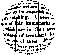
The logo included a quote from the preface of the 1879 book Euclid and his Modern Rivals by Lewis Carroll. It utilized the fisheye effect to make the text appear to be wrapped onto a sphere, leaving only part of it readable. The used text was (visible text in bold):[6]
In one respect this book is an experiment, and may chance to prove a failure: I mean that I have not thought it necessary to maintain throughout the gravity of style which scientific writers usually affect, and which has somehow come to be regarded as an 'inseparable accident' of scientific teaching. I never could quite see the reasonableness of this immemorial law: subjects there are, no doubt, which are in their essence too serious to admit of any lightness of treatment – but I cannot recognise Geometry as one of them. Nevertheless it will, I trust, be found that I have permitted myself a glimpse of the comic side of things only at fitting seasons, when the tired reader might well crave a moment's breathing-space, and not on any occasion where it could endanger the continuity of the line of argument.
In November 2001, Wikipedia users began suggesting new logos for the website. A list of 24 leading candidates was chosen in the contest, which took place from November to December 2001. The winner was the last logo (#24), contributed by the user The Cunctator.[6]
The logo included the quote, taken from Thomas Hobbes's 1651 book Leviathan, from chapter VI of part I, placed within the circle and distorted by the fisheye effect. Underneath it was written "Wikipedia" in the capital letters, with W and A being slightly taller than the others. Beneath that was placed the motto of Wikipedia: The Free Encyclopedia.[6] The text used for the logo was (visible text in bold):
Desire to know why, and how, curiosity; such as is in no living creature but man: so that man is distinguished, not only by his reason, but also by this singular passion from other animals; in whom the appetite of food, and other pleasures of sense, by predominance, take away the care of knowing causes; which is a lust of the mind, that by a perseverance of delight in the continual and indefatigable generation of knowledge, exceedeth the short vehemence of any carnal pleasure.

As the logo utilized text in English language, its usage was not favored by other-language versions of Wikipedia. Some websites used similar designs with texts in their own languages. For example, Dutch Wikipedia used text from Multatuli's 1860 Max Havelaar classic book.[7] Other websites used the logo with English text, painted in the colours of the national flags. Such design was used for example by Danish and Swedish versions, using the flags of Denmark and Sweden, respectively.[8][9] The other option used by some versions of Wikipedia was to design their own distinct logos, for example the French Wikipedia, which used the green circle with a white dove on it, as its logo.[10] Additionally, some websites used a logo with English text in it, with the motto "The Free Encyclopedia" translated to their languages. It was done, for example, by the German Wikipedia.[11]
Puzzle globe (2003)
[edit]Contest
[edit]In 2003, following a suggestion by Erik Möller, known under the username Eloquence, an international logo contest was conducted to find a new logo that was suitable for all language versions of Wikipedia.[12][13] After a two-stage voting process, a design by Paul Stansifer, at the time known under username Paullusmagnus, won with considerable support. His project depicted an unfinished globe constructed of puzzle pieces, of multiple colors. It was covered by text with links in various languages and writing systems, to symbolize the continuous construction and development of the project. It was made in POV-Ray, using a puzzle image wrapped around a sphere.[13]
A ratification vote was held soon after, to confirm community consensus. As a result, twelve direct adaptations of the design were created by members of the community. One of the propositions made by David Friedland, known under username Nohat, was chosen. Friedland removed the color and changed the overlaid text into one letter or symbol per puzzle piece. His design included various characters from various writing systems. The writing in the logo used Hoefler Text font.
Before being officially released, the logo slightly lightened up and had replaced nearly obsolete kana wi (ヰ) from katakana script with modern kana wa (ワ) and small i (ィ). A smooth breathing mark before the Greek omega (Ω) was deleted and Russian Short I (Й) replaced by Russian I (И). It was adopted by the English Wikipedia on 26 September 2003.[13]
Final version
[edit]The logo included 16 characters from 16 different writing scripts, many of which, but not all, chosen to represent due to their similarity to the letter W from the English language, as in the name Wikipedia. The alphabets represented were as follows:[13]
| — | — | — | |
| — | |||
.svg) Tibetan wa + i(ཝི, transcription: wi) Tibetan wa + i(ཝི, transcription: wi)
|
 Latin capital W Latin capital W
|
 Arabic isolated yodh(ي, transcription: y) Arabic isolated yodh(ي, transcription: y)
| |
 Hangul/Chosongul wicombined letters ieung, u and i(위, transcription: wi) Hangul/Chosongul wicombined letters ieung, u and i(위, transcription: wi)
| |||
 Mongolian Todo I (rotated 90 degrees)(ᡅ, transcription: i) Mongolian Todo I (rotated 90 degrees)(ᡅ, transcription: i)
|
 Thai chà(ฉ, transcription: ch) Thai chà(ฉ, transcription: ch)
|
| Version with Ω and И | Version with Ώ and Й | |
|---|---|---|
| (and with ワィ) | (and with ウィ) | |
| Examples:Portuguese |
Examples:Polish |
Examples:French |
| English |
Chinese
|
English |
| ΩGreek capital omega(Ω, transcription: o) | ΏGreek capital omega with tonos(Ώ, transcription: ó) | |
| ИCyrillic capital I(И, transcription: i) | ЙCyrillic capital Short I(Й, transcription: y) | |
The logo included several mistakes. Due to a formatting error:
- letters va + i (वि) from Devanagari script were rendered incorrectly, being reversed in the process, showing as (वि).
- In the combined letters va + i (ವಿ) from Kannada script, the diacritic was attached to the wrong place.
- In the case of the Japanese katakana, a wrong kana was used: wa (ワ) was mistakenly used instead of kana u (ウ), forming wai (ワィ), instead of wi (ウィ), which is present in the Japanese name of the website, Wikipedia (ウィキペディア).[13]
Redesign (2010)
[edit]In late 2009, the Wikimedia Foundation undertook the efforts to fix the errors and generally update the puzzle globe logo. Among other concerns, the original logo did not scale well and some letters appeared distorted.[14] For the new logo, the Wikimedia Foundation defined which characters appear on the "hidden" puzzle pieces, and had a three-dimensional computer model of the globe created to allow the generation of other views.[15]
The new design was published in May 2010. It features the new 3D rendering of the puzzle globe, as well as correct versions of previously wrong characters, including fixed versions of letters from Kannada and Devanagari, and usage of correct Japanese katakana characters. Additionally, several letters had been replaced by others. It included:[16][2]
- ini (Ի) being replaced with vev (Վ), both originating from the Armenian alphabet;
- letter lo (ល) being replaced with combined letters vo and i (វិ), both originating from the Khmer script;
- combined letters wa and i (ཝི) from Tibetan script being replaced by short u (উ) letter from Bengali–Assamese script, while Tibetan character was moved elsewhere;
- letter Todo I (ᡅ) from Mongolian script being replaced by letter vini (ვ) from the Georgian Mkhedruli script;
- radical 145+5 strokes (袓) from Simplified Chinese script being replaced by radical 120+8 strokes (維) from the Traditional Chinese script.
- letter resh (ר) being replaced by letter waw (ו), both originating from the Hebrew alphabet;
- r () from Klingon pIqaD script being replaced by letter wə (ው) from the Geʽez script;
- letter yodh (ي) being replaced by letter waw (و), both originating from the Arabic script;
- letter cho (ฉ) being replaced by combined letters wo waen and sara i (วิ), both originating from the Thai script.
The wordmark has been modified from the Hoefler Text font to the open-source Linux Libertine font, and the subtitle was no longer italicized. The "W" character, which was used in various other places in Wikipedia, such as the favicon, and was seen as a distinctive part of the Wikipedia brand, was stylized as crossed V's in the original logo, while the W in Linux Libertine was rendered with a single line. To provide the traditional appearance of the Wikipedia "W", a "crossed" W was added as an OpenType variant to the Linux Libertine font.[2]
Glyphs in the Wikipedia logo redesign (2010)
[edit]For the new logo, the entire surface of its globe was designed, including puzzle pieces hidden on the non-visible parts of the logo. In total, there were designed 51 puzzle pieces, of which 18 were visible in the logo. There were 21 empty spaces left, for the missing puzzle pieces.
The visible puzzle pieces are:[13][17]
- in the leftmost column, from the top down: capital letter vev (Վ, transcription: v) from the Armenian alphabet, combined letters vo and i (វិ, transcription: vi) from the Khmer script, letter short u (উ, transcription: u) from the Bengali alphabet, combined letters va and i (वि, transcription: vi) from Devanagari script, letter vini (ვ, transcription: v) from Georgian Mkhedruli script;
- in the middle-left column, from the top down: capital letter omega (Ω, transcription: o) from the Greek alphabet, the Radical 120 with 8 additional strokes (維) from the Traditional Chinese script, letter vi (ವಿ, transcription: vi) from the Kannada script, combined letters wa and i (ཝི, transcription: wi) from the Tibetan script;
- in the middle-right column, from the top down: kanas u and small i (ウィ, romanization: wi) from the katakana script, capital letter W from the Latin script, capital letter i (И, transcription: i) from the Cyrillic script, letter waw (ו, transcription: v) from the Hebrew alphabet, combined letters va and i (வி, transcription: vi) from the Tamil script;
- in the rightmost column, from the top down: letter wə (ው, transcription: wə) from the Geʽez script, isolated letter waw (و, transcription: w) from the Arabic alphabet, combined letters ieung, u and i (위, transcription: wi) from the Hangul/Chosongul script, combined letters wo waen and sara i (วิ, transcription: vi) from the Thai script.
The puzzle pieces from the not visible portion of the logo are:[13][17]
- in the central left column, from the top down: capital letter V from the Latin script, combined letters yodh and aleph (يا, transcription: yā) from the Arabic alphabet;
- in the first row to the left from the central left column, from the top down: capital letter wi (Ꮻ, transcription: wi) from the Cherokee syllabary, letter wa (ᥝ, transcription: v) from the Tai Le script, capital letter pi (Π, transcription: p) from the Greek alphabet;
- in the second row to the left from the central left column, from the top down: combined letters va and i (వి, transcription: vi) from the Telugu script, capital letter E-acute (É) from the Latin script, combined letters v and i (ဝီ, transcription: vi) from the Mon–Burmese script, letter o (ᐅ, transcription: o) from the Canadian Aboriginal syllabics, combined letters wa and i (ᤘᤡ) from the Limbu script;
- in the third row to the left from the central left column, from the top down: letter uuinne (𐍅, transcription: w) from the Gothic alphabet, letter wi (ୱି, transcription: wi) from the Odia script, combined letters va and i (വി, transcription: vi) from the Malayalam script, letter wa (ᠸ, transcription: w) from the Mongolian script;
- in the fourth row to the left from the central left column, from the top down: combined letters va and i (વિ, transcription: vi) from the Gujarati script, combined letters wa and i (ᨓᨗ, transcription: wi) from the Lontara script, letter vedi (Ⰲ, transcription: vi) from the Glagolitic script, capital letter U from the Latin script;
- in the central right column, from the top down: capital letter de (Д, transcription: d) from the Cyrillic script, capital dotted I (İ) from the Latin script;
- in the first row to the right from the central right column: combined letters va and i (වි, transcription: vi) from the Sinhala script;
- in the second row to the right from the central right column, from the top down: combined letters vava and sihari (ਵਿ, transcription: vi) from the Gurmukhi script, combined letters vaavu and i (ވި, transcription: vi) from the Thaana script, capital letter H from the Latin script, capital letter A-umlaut (Ä) from the Latin script;
- in the third row to the right from the central right column, from the top down: capital letter ya (Я, transcription: ya), combined letters w and i (ວິ, transcription: vi) from the Lao script, capital letter u (У, transcription: u) from the Cyrillic script, radical 12 with additional 6 strokes (典, pinyin: diǎn) from the Traditional Chinese script;
- in the fourth row to the right from the central right column, from the top down: combined letters wa and i (ꦮꦶ, transcription: wi) from the Javanese script, isolated letter waw (ܘ, transcription: w) from the Syriac alphabet, capital letter ve (В, transcription: v) from the Cyrillic script, letter wi (, transcription: wi) from the Baybayin script.
| — | — | — | |||||||
| — | — | — | |||||||
| — | — | — | — |  Armenian vev(Վ) Armenian vev(Վ)
|
— | — | — | — | — |
| — | — | — | .svg) Telugu va + (i)(వి) Telugu va + (i)(వి)
|
 Khmer vo + i(វិ) Khmer vo + i(វិ)
|
— |  Katakana u + small i(ウィ) Katakana u + small i(ウィ)
|
 Gəʿəz wə(ው) Gəʿəz wə(ው)
|
— | — |
 Javanese wa + i(ꦮꦶ) Javanese wa + i(ꦮꦶ)
|
 Gujarati va + i(વિ) Gujarati va + i(વિ)
|
 Gothic winja(𐍅) Gothic winja(𐍅)
|
 Latin E-acute(É) Latin E-acute(É)
|
 Bengali short u(উ) Bengali short u(উ)
|
 Greek omega(Ω) Greek omega(Ω)
|
Latin W
|
 Arabic waw(و) Arabic waw(و)
|
 Gurmukhī vava + sihari(ਵਿ) Gurmukhī vava + sihari(ਵਿ)
|
![the last letter of names of most Wikipedias using the Cyrillic Alphabet[citation needed]](https://en.wikipedia.org/wiki/File:Cyrillic_%D0%AF.svg) Cyrillic ya(Я) Cyrillic ya(Я)
|
 Syriac wāw(ܘ) Syriac wāw(ܘ)
|
 Lontara w + i(ᨓᨗ) Lontara w + i(ᨓᨗ)
|
 Oriya w + i(ୱି) Oriya w + i(ୱି)
|
 Burmese script v + i(ဝီ) Burmese script v + i(ဝီ)
|
 Devanagari va + i(वि) Devanagari va + i(वि)
|
 Traditional Chinese維 Traditional Chinese維
|
 Cyrillic i(И) Cyrillic i(И)
|
 Hangul/Chosongul wi(위) Hangul/Chosongul wi(위)
|
 Tāna vaavu + (i)(ވި) Tāna vaavu + (i)(ވި)
|
 Laotian w + i(ວິ) Laotian w + i(ວິ)
|
 Cyrillic ve(В) Cyrillic ve(В)
|
 Glagolitic vědě(Ⰲ) Glagolitic vědě(Ⰲ)
|
 Malayalam va + short i(വി) Malayalam va + short i(വി)
|
 Inuktitut short u(ᐅ) Inuktitut short u(ᐅ)
|
 Georgian vini(ვ) Georgian vini(ვ)
|
.svg) Kannada va + (i)(ವಿ) Kannada va + (i)(ವಿ)
|
 Hebrew vav(ו) Hebrew vav(ו)
|
 Thai wo waen + sara i(วิ) Thai wo waen + sara i(วิ)
|
 Latin H Latin H
|
 Cyrillic u(У) Cyrillic u(У)
|
 Tagalog Baybayin wi() Tagalog Baybayin wi()
|
 Latin U Latin U
|
 Mongolian wa(ᠸ) Mongolian wa(ᠸ)
|
 Limbu wa + i(ᤘᤡ) Limbu wa + i(ᤘᤡ)
|
 Cherokee wi(Ꮻ) Cherokee wi(Ꮻ)
|
Tibetan wa + (i)(ཝི)
|
.svg) Tamil va + (i)(வி) Tamil va + (i)(வி)
|
 Sinhala va + i(වි) Sinhala va + i(වි)
|
 Latin A-umlaut(Ä) Latin A-umlaut(Ä)
|
 Chinese character典 Chinese character典
|
 Tai Le wa(ᥝ) Tai Le wa(ᥝ)
|
 Latin V Latin V
|
 Cyrillic de(Д) Cyrillic de(Д)
|
|||||||
 Greek pi(Π) Greek pi(Π)
|
 Arabic yāʾ + ʾalif(يا) Arabic yāʾ + ʾalif(يا)
|
 Latin dotted I(İ) Latin dotted I(İ)
|
|||||||
Anniversary logos
[edit]10th anniversary logo
[edit]On 15 January 2011, a special logo replaced the standard globe on the English Wikipedia in order to mark the tenth anniversary of Wikipedia's founding. The logo depicts a single black jigsaw piece, representing the addition of another piece to the puzzle. On it is written "10 years".[18]
20th anniversary logos
[edit]
On 14 January 2021, a four-sectioned logo was used instead of the puzzle globe on the English Wikipedia, in order to mark the 20th anniversary of Wikipedia. The four sections, depict, in clockwise order, starting from the top-left:
- yellow background, a woman in a hijab reading a book with the letter "W" on the cover, signifying Wikipedia;
- blue background, a computer showing a blue screen with the letter "W" on it, signifying Wikipedia;
- green background, the normal Wikipedia globe, in blue, but with most letters aside from the "W" being replaced with various other objects and symbols.
- red background, a phone showing a blue screen with the letter "W" on it, signifying Wikipedia.[19][20]
On 22 January 2021, the previous anniversary logo was replaced with a less striking version, consisting of the normative Wikipedia globe above the text "20 years of Wikipedia – Over One Billion Edits"[21] to commemorate the concurrent milestone of reaching one billion recorded edits to the English Wikipedia.
Physical recreations
[edit]In 2009, the Wikimedia Foundation put a 3D printed sign depicting half of the Wikipedia globe in its headquarters in San Francisco, California, United States. It was made by Because We Can, a design firm based in Oakland, California.[22] It is based on the redesigned logo.
On 22 October 2014, in the town of Słubice, Poland, was unveiled the Wikipedia Monument, a statue by sculptor Mihran Hakobyan honoring Wikipedia contributors. The monument depicts four nude figures holding aloft a globe based on the Wikipedia logo, reaching over two metres (6 ft 7 in) up, made out of the fiber and resin. It is the world's first monument to the online encyclopedia.[23][24][25][26]
On 29 September 2017, the sculpture of the logo of Wikipedia was submerged to the bottom of Lake Sevan in Armenia, to form an artificial reef. It was done thanks to the joint efforts of the Wikimedia Armenia community and ArmDiving divers' club. The 2 metre-wide and 2 metre-high (6 ft 7 in by 6 ft 7 in) sculpture (the largest depiction of Wikipedia logo in the world) was made in Armenia for the annual meeting of the Central and Eastern Europe Wikimedia affiliates, Wikimedia CEE Meeting that the country hosted in August 2016 in Dilijan.[27]
-
 The signage of the Wikipedia logo at the Wikimedia Foundation headquarters in San Francisco, California, in 2009
 -

-
 The sculpture of the logo of Wikipedia, prior to being submerged in Lake Sevan in Armenia, in 2016


Trademark and copyright
[edit]
The 2010 logo is registered with the Madrid system under registration numbers 1221024,[28] 1221826,[29] and 1238122.[30]
In the United States, the 2003 and 2010 logos are registered trademarks under registration numbers 3594356 and 4710546, respectively.
The 2003 and 2010 logos are registered as a Community Trade Mark of the European Union by the Wikimedia Foundation. The 2003 logo bears a filing date of 31 January 2008 and a registration date of 20 January 2009.[31][32] The 2010 logo bears a filing date of 28 March 2014 and a registration date of 22 August 2014.[33]
On 24 October 2014, the Wikimedia Foundation released the logo, along with all other logos belonging to the Foundation, under the Creative Commons Attribution-ShareAlike 3.0 license.[34]
On 1 January 2021, the 2003 and 2010 logos were granted UK trademark numbers as a result of Brexit.[35]
Gallery of logos
[edit]Historical logos
[edit]-
 2001 (prototype)
 -
 2001–2003
 -
 Logo of the French Wikipedia (2002–2003)
 -
 Logo of the Dutch Wikipedia (2002–2003)
 -
 Logo of the Spanish Wikipedia (2002–2003)
 -
 Logo of the Swedish Wikipedia (2003)
 -
 2003–2010
 -
 2010–present
.png)
.png)
Special logos
[edit]Anniversaries
[edit]-
 Fifth anniversary of the Hebrew Wikipedia (2006)
 -
 Fourth anniversary of the Asturian Wikipedia (2008)
 -
 Tenth anniversary of Wikipedia (2011)
 -
 Tenth anniversary of Wikipedia celebrated on the Azerbaijani Wikipedia (2011)
 -
 Tenth anniversary of Wikipedia celebrated on the Basque Wikipedia (2011)
 -
 Tenth anniversary of Wikipedia celebrated on the Belarusian Taraškievica Wikipedia (2011)
 -
 Tenth anniversary of Wikipedia celebrated on the Chinese edition. Traditional Chinese red variant (2011)
 -
 Tenth anniversary of Wikipedia celebrated on the Chinese edition. Traditional Chinese black variant (2011)
 -
 Tenth anniversary of Wikipedia celebrated on the Chinese edition. Traditional Chinese black corner variant (2011)
 -
 Tenth anniversary of Wikipedia celebrated on the Chinese edition. Traditional Chinese orange variant (2011)
 -
 Tenth anniversary of Wikipedia celebrated on the Chinese edition. Simplified Chinese red variant (2011)
 -
 Tenth anniversary of Wikipedia celebrated on the Chinese edition. Simplified Chinese black variant (2011)
 -
 Tenth anniversary of the Basque Wikipedia (2011)
 -
 Tenth anniversary of the Polish Wikipedia (2011)
 -
 Tenth anniversary of the Greek Wikipedia (2012)
 -
 Tenth anniversary of the Alemannic Wikipedia (2013)
 -
 Tenth anniversary of the Aragonese Wikipedia (2014)
 -
 Tenth anniversary of the Asturian Wikipedia (2014)
 -
 Tenth anniversary of the Ukrainian Wikipedia (2014)
 -
 Tenth anniversary of the Aragonese Wikipedia (2015)
 -
 Tenth anniversary of the Cantonese Wikipedia (2016)
 -
 Tenth anniversary of the Belarusian Wikipedia (2017)
 -
 Fifteenth anniversary of the Azerbaijani Wikipedia (2019)
 -
 Fifteenth anniversary of the Ukrainian Wikipedia (2019)
 -
 Sixteenth anniversary of the Ukrainian Wikipedia (2020)
 -
 1st logo for twentieth anniversary of Wikipedia on English edition (2021)
 -
 2nd logo for twentieth anniversary of Wikipedia on English edition (2021)
 -
 Twentieth anniversary of Wikipedia on Chinese edition (2021)
 -
 Twentieth anniversary of the Polish Wikipedia (2021)
 -
 Twentieth anniversary of the Spanish Wikipedia (2021)
 -
 Twentieth anniversary of the Russian Wikipedia (2021)
 -
 Twentieth anniversary of the Vietnamese Wikipedia (2021)
 -
 Seventeenth anniversary of the Ukrainian Wikipedia (2021)
 -
 Eighteenth anniversary of the Ukrainian Wikipedia (2022)
 -
 Twentieth anniversary of the Greek Wikipedia (2022)
 -
 Twentieth anniversary of the Turkish Wikipedia (2022)
 -
 Twentieth anniversary of the Indonesian Wikipedia (2023)


Milestone commemorations
[edit]-
 1 000 articles on the Aragonese Wikipedia (2005)
 -
 50 000 articles on the Chinese Wikipedia (2005)
 -
 50 000 articles on the Italian Wikipedia (2005)
 -
 100 000 articles on the Italian Wikipedia (2005)
 -
 15 000 articles on the Romanian Wikipedia (2005)
 -
 14 000 articles on the Serbian Wikipedia (2005)
 -
 15 000 articles on the Serbian Wikipedia (2005)
 -
 100 articles on the Udmurt Wikipedia (2005)
 -
 20 000 articles on the Arabic Wikipedia (2006)
 -
 5 000 articles on the Aragonese Wikipedia (2006)
 -
 30 000 articles on the Korean Wikipedia (2006)
 -
 10 000 articles on the Vietnamese Wikipedia (2006)
 -
 30 000 articles on the Arabic Wikipedia (2007)
 -
 50 000 articles on the Arabic Wikipedia (2007)
 -
 10 000 articles on the Asturian Wikipedia (2007)
 -
 150 000 articles on the Chinese Wikipedia (2007)
 -
 20 000 articles on the Greek Wikipedia (2007)
 -
 30 000 articles on the Greek Wikipedia (2007)
 -
 50 000 articles on the Turkish Wikipedia (2007)
 -
 40 000 articles on the Korean Wikipedia (2007)
 -
 60 000 articles on the Arabic Wikipedia (2008)
 -
 10 000 articles on the Aragonese Wikipedia (2008)
 -
 100 000 articles on the Catalan Wikipedia (2008)
 -
 200 000 articles on the Chinese Wikipedia (2008)
 -
 100 000 articles on the Czech Wikipedia (2008)
 -
 100 000 articles on the Esperanto Wikipedia (2008)
 -
 100 000 articles on the Hungarian Wikipedia (2008)
 -
 50 000 articles on the Korean Wikipedia (2008)
 -
 60 000 articles on the Korean Wikipedia (2008)
 -
 70 000 articles on the Korean Wikipedia (2008)
 -
 80 000 articles on the Korean Wikipedia (2008)
 -
 100 000 articles on the Turkish Wikipedia (2008)
 -
 100 000 articles on the Ukrainian Wikipedia (2008)
 -
 30 000 articles on the Vietnamese Wikipedia (2008)
 -
 50 000 articles on the Vietnamese Wikipedia (2008)
 -
 75 000 articles on the Vietnamese Wikipedia (2008)
 -
 250 000 articles on the Chinese Wikipedia (2009)
 -
 1 million articles on the German Wikipedia (2009)
 -
 50 000 articles on the Greek Wikipedia (2009)
 -
 100 000 articles on the Korean Wikipedia (2009)
 -
 10 000 articles on the Malayalam Wikipedia (2009)
 -
 500 000 articles on the Portuguese Wikipedia (2009)
 -
 400 000 articles on the Russian Wikipedia (2009)
 -
 100 000 articles on the Serbian Wikipedia (2009)
 -
 150 000 articles on the Ukrainian Wikipedia (2009)
 -
 100 000 articles on the Vietnamese Wikipedia (2009)
 -
 10 000 articles on the Armenian Wikipedia (2010)
 -
 50 000 articles on the Basque Wikipedia (2010)
 -
 100 000 articles on the Bulgarian Wikipedia (2010)
 -
 250 000 articles on the Catalan Wikipedia (2010)
 -
 90 000 articles on the Croatian Wikipedia (2010)
 -
 300 000 articles on the Chinese Wikipedia (2010)
 -
 150 000 articles on the Czech Wikipedia (2010)
 -
 1 million articles on the French Wikipedia (2010)
 -
50 000 articles on the Greek Wikipedia (2010)
-
 700 000 articles on the Italian Wikipedia (2010)
 -
 150 000 articles on the Korean Wikipedia (2010)
 -
 100 000 articles on the Lithuanian Wikipedia (2010)
 -
 100 000 articles on the Persian Wikipedia (2010)
 -
 500 000 articles on the Russian Wikipedia (2010)
 -
 600 000 articles on the Russian Wikipedia (2010)
 -
 150 000 articles on the Turkish Wikipedia (2010)
 -
 200 000 articles on the Ukrainian Wikipedia (2010)
 -
 25 000 articles on the Aragonese Wikipedia (2011)
 -
 50 000 articles on the Azerbaijani Wikipedia (2011)
 -
 150 000 articles on the Esperanto Wikipedia (2011)
 -
 200 000 articles on the Vietnamese Wikipedia (2011)
 -
 200 000 articles on the Arabic Wikipedia (2012)
 -
 200 000 articles on the Korean Wikipedia (2012)
 -
 500 000 articles on the Swedish Wikipedia (2012)
 -
 250 000 articles on Vietnamese Wikipedia (2012)
 -
 500 000 articles on Vietnamese Wikipedia (2012)
 -
500 000 articles on the Swedish Wikipedia (2012)
-
 100 000 articles on the Armenian Wikipedia (2013)
 -
 150 000 articles on the Hebrew Wikipedia (2013)
 -
 250 000 articles on the Korean Wikipedia (2013)
 -
 100 000 articles on the Latin Wikipedia (2013)
 -
 50 000 articles on the Latvian Wikipedia (2013)
 -
 1 million articles on the Russian Wikipedia (2013)
 -
 1 million articles on the Swedish Wikipedia (2013)
 -
 750 000 articles on the Vietnamese Wikipedia (2013)
 -
 100 000 articles on the Azerbaijani Wikipedia (2014)
 -
 200 000 articles on the Esperanto Wikipedia (2014)
 -
 100 000 articles on the Greek Wikipedia (2014)
 -
 400 000 articles on the Persian Wikipedia (2014)
 -
 1 million articles on the Vietnamese Wikipedia (2014)
 -
 400 000 articles on the Arabic Wikipedia (2015)
 -
 50 000 articles on the Asturian Wikipedia (2015)
 -
 100 000 articles on the Belarusian Wikipedia (2015)
 -
 300 000 articles on the Korean Wikipedia (2015)
 -
 200 000 articles on the Slovak Wikipedia (2015)
 -
 2 million articles on the Swedish Wikipedia (2015)
 -
 200 000 articles on the Armenian Wikipedia (2016)
 -
 500 articles on the Atikamekw Wikipedia (2016)
 -
 1000 articles on the Atikamekw Wikipedia (2016)
 -
 400 000 articles on the Finnish Wikipedia (2016)
 -
 2 million articles on the French Wikipedia (2016)
 -
 2 million articles on the German Wikipedia (2016)
 -
 400 000 articles on the Hungarian Wikipedia (2016)
 -
 5 000 articles on the Kashubian Wikipedia (2016)
 -
 500 000 articles on the Persian Wikipedia (2016)
 -
 3 million articles on the Swedish Wikipedia (2016)
 -
 400 000 articles on the Korean Wikipedia (2017)
 -
 300 000 articles on the Turkish Wikipedia (2017)
 -
 150 000 articles on the Belarusian Wikipedia (2018)
 -
 250 000 articles on the Esperanto Wikipedia (2018)
 -
 1.5 million articles on the Russian Wikipedia (2018)
 -
 150 000 articles on the Azerbaijani Wikipedia (2019)
 -
 200 000 articles on the Belarusian Wikipedia (2020)
 -
 6 million articles on the English Wikipedia (2020)
 -
 100 000 articles on the Latvian Wikipedia (2020)
 -
 500 000 articles on the Korean Wikipedia (2020)
 -
 1 million articles on the Ukrainian Wikipedia (2020)
 -
 1 250 000 articles on the Vietnamese Wikipedia (2020)
 -
 1 500 000 articles on the Polish Wikipedia (2021)
 -
 500 000 articles on the Hungarian Wikipedia (2022)
 -
 600 000 articles on the Korean Wikipedia (2022)
 -
 500 000 articles on the Turkish Wikipedia (2022)
 -
 2 000 000 articles on the Russian Wikipedia (2024)
 -
 3 000 000 articles on the German Wikipedia (2025)


.png)


.svg)


Events
[edit]-
 Latvian Wikipedia logo displayed in memory of the victims of the Zolitūde shopping centre roof collapse (23–26 November 2013)
 -
 Turkish Wikipedia logo after being blocked in Turkey (2017)
 -
 Turkish Wikipedia logo used during the #WeMissTurkey campaign to lift block of the website in Turkey (2018)
 -
 The protest on Spanish Wikipedia against Directive on Copyright in the Digital Single Market (2018)
 -
 Turkish Wikipedia logo displayed after the second anniversary of the ban, with the message "2 yıldır özlüyoruz" (English: "missing you for two years") (2019)
 -
 Turkish Wikipedia logo following the lifting of the block of the website in Turkey with the message "kavuştuk" (English: "reunited") (2020)
 -
 Day of Remembrance of the Heroes of the 2020 Nagorno-Karabakh war on the Armenian Wikipedia (2020)
 -
 The logo of the Ukrainian Wikipedia, used since 4 March 2022, in support of Ukraine and its population, in the Russian invasion of Ukraine
 -
 Turkish Wikipedia logo displayed in memory of the victims of 2023 Turkey–Syria earthquake (2023)
 -
 Arabic Wikipedia logo displayed in solidarity with the Gaza Strip during the ongoing Gaza war (2023–present)
 -
 Additional logo displayed on Arabic Wikipedia in solidarity with the Gaza Strip during the ongoing Gaza war, showing the puzzle ball alongside a Palestinian keffiyeh (2023–present)
 -
 Egyptian Wikipedia logo in solidarity with the campaign to revive Egyptian identity and prove Egyptian heritage.


Holidays
[edit]-
 Christmas and New Year at the Russian Wikipedia (2006–2007, 2007–2008, 2008–2009, 2009–2010, 2011–2012, 2012–2013)
 -
 Persian Wikipedia logo for Nowruz (March 2015)
 -
 Persian Wikipedia logo for Nowruz (March 2016)
 -
 Persian Wikipedia logo for Nowruz (March 2017)
 -
 National Day of Aragon at the Aragonese Wikipedia (2008)
 -
 New Year at the Vietnamese Wikipedia (2008)
 -
 National Day of Aragon at the Aragonese Wikipedia (2009)
 -
 National Day of Aragon at the Aragonese Wikipedia (2010)
 -
 New Year at the Vietnamese Wikipedia (2010)
 -
 National Day of Aragon at the Aragonese Wikipedia (2011)
 -
 New Year at the Vietnamese Wikipedia (2012)
 -
New Year and 250 000 articles at the Vietnamese Wikipedia (2012)
-
 New Year at the Vietnamese Wikipedia (2013)
 -
 Christmas and New Year at the Russian Wikipedia (2013–2014)
 -
 New Year at the Vietnamese Wikipedia (2014)
 -
 Christmas and New Year at the Russian Wikipedia (2014–2015, 2015–2016)
 -
 New Year at the Vietnamese Wikipedia (2015)
 -
 New Year at the Vietnamese Wikipedia (2016)
 -
 Christmas and New Year at the Russian Wikipedia (2016–2017)
 -
 New Year at the Vietnamese Wikipedia (2017)
 -
 Christmas and New Year at the Russian Wikipedia (2017–2018)
 -
 New Year at the Vietnamese Wikipedia (2018)
 -
 Christmas and New Year at the Armenian Wikipedia (2018–2019)
 -
 Christmas and New Year at the Russian Wikipedia (2018–2019, 2021–2022, 2023–2024, 2024–2025)
 -
 New Year at the Vietnamese Wikipedia (2019)
 -
 Christmas and New Year at the Russian Wikipedia (2019–2020)
 -
 Christmas and New Year at the Armenian Wikipedia (2019–2020)
 -
 New Year at the Vietnamese Wikipedia (2020)
 -
 Christmas and New Year at the Russian Wikipedia (2020–2021)
 -
 New Year at the Vietnamese Wikipedia (2021)
 -
 New Year at the Vietnamese Wikipedia (2025)


_%D0%92%D0%B8%D0%BA%D0%B8%D0%BF%D0%B5%D0%B4%D0%B8%D0%B8_%D0%BD%D0%B0_%D0%9D%D0%BE%D0%B2%D1%8B%D0%B9_%D0%93%D0%BE%D0%B4.png)


References
[edit]- ^ "Wikipedia's new sound logo: Winner of The Sound of All Human Knowledge contest announced". Wikimedia Foundation. 2023-03-28. Archived from the original on 2023-04-06. Retrieved 2023-05-02.
- ^ a b c Poll, Philipp H. "New Wikipedia-Logo using LinuxLibertine". Libertine Open Fonts Project. Archived from the original on 2010-06-30. Retrieved 2018-08-09.
- ^ Oma L Gallaga (May 23, 2010), New Globe, User Interface For Wikipedia, NPR, archived from the original on April 19, 2015, retrieved January 6, 2019
- ^ "OldWikiPediaLogo". meta.wikimedia.org. Archived from the original on 2022-11-04. Retrieved 2022-12-28.
- ^ "Submitted Logos". nupedia.com. Archived from the original on 2000-08-29. Retrieved 2022-12-28.
- ^ a b c d Phoebe Ayers; Charles Matthews; Ben Yates (2008). How Wikipedia Works. No Starch Press. p. 47. ISBN 978-1-59327-176-3. LCCN 2008023350. OCLC 185698411. OL 21812405M. Wikidata Q2763515.
- ^ "Hoofdpagina". Dutch Wikipedia (in Dutch). 8 August 2003. Archived from the original on 8 August 2003. Retrieved 28 December 2022.
- ^ "Forside". Danish Wikipedia (in Danish). 6 August 2003. Archived from the original on 6 August 2003. Retrieved 28 December 2022.
- ^ "Huvudsida". Swedish Wikipedia (in Swedish). 2 February 2002. Archived from the original on 2 February 2003. Retrieved 28 December 2022.
- ^ "Accueil". French Wikipedia (in French). 7 February 2003. Archived from the original on 7 February 2003. Retrieved 28 December 2022.
- ^ "Hauptseite". German Wikipedia (in German). 7 February 2003. Archived from the original on 7 February 2003. Retrieved 28 December 2022.
- ^ Moeller, Erik (14 June 2003). "[Wikipedia-l] Do we need a new logo contest?". lists.wikimedia.org. Archived from the original on 2022-03-26. Retrieved 2022-12-28.
- ^ a b c d e f g Cohen, Noam (June 25, 2007). "Some Errors Defy Fixes: A Typo in Wikipedia's Logo Fractures the Sanskrit". The New York Times. Archived from the original on September 5, 2017. Retrieved February 23, 2017.
- ^ Armin (May 17, 2010). "Around the World in 51 Characters". Brand New. UnderConsideration. Archived from the original on 2012-06-29. Retrieved 2010-11-12.
- ^ Walsh, Jay (13 May 2010). "Wikipedia in 3d". Wikimedia blog. Archived from the original on 2016-06-06. Retrieved 2010-11-12.
- ^ Jay Walsh (13 May 2010). "Wikipedia in 3D". Diff. Archived from the original on 8 December 2022. Retrieved 28 December 2022.
- ^ a b "About the official Marks". Wikimedia Foundation Governance Wiki. Archived from the original on 2022-12-26. Retrieved 2022-12-28.
- ^ Bayer, Tilman (17 January 2011). "Anniversary celebrations; Foundation reports; local language problems; brief news". The Signpost. Wikipedia. Archived from the original on 2022-10-24. Retrieved 2022-12-28.
- ^ "Celebrating 20 years of Wikipedia". Wikimedia Foundation. Archived from the original on 2022-12-24. Retrieved 2022-12-28.
- ^ "Main Page". en.wikipedia.org. 15 January 2021. Archived from the original on 15 January 2021. Retrieved 28 December 2022.
- ^ "Main Page". en.wikipedia.org. 23 January 2021. Archived from the original on 23 January 2021. Retrieved 28 December 2022.
{{cite web}}: CS1 maint: bot: original URL status unknown (link) - ^ "The Wikipedia Globe, now in 3D!". bwcarchitects.com. 30 October 2009. Archived from the original on 28 December 2022. Retrieved 28 December 2022.
- ^ "Poland to Honor Wikipedia With Monument". ABC News. 9 October 2014. Archived from the original on 11 October 2014. Retrieved 9 October 2014.
- ^ Day, Matthew (10 October 2014). "Polish town to build statue honouring Wikipedia". The Daily Telegraph. Archived from the original on 22 June 2018. Retrieved 11 October 2014.
- ^ "W nowosolskim Malpolu powstaje pierwszy na świecie pomnik Wikipedii" (in Polish). 10 October 2014. Archived from the original on 14 October 2014. Retrieved 13 October 2014.
- ^ "Poland to unveil world's first Wikipedia monument". Polskie Radio. Archived from the original on 11 October 2014. Retrieved 9 October 2014.
- ^ "World's largest Wikipedia logo now sits on bottom of Lake Sevan". Archived from the original on 2017-10-04. Retrieved 2017-10-03.
- ^ "1221024- W". Madrid Monitor. World Intellectual Property Organization. Archived from the original on 2023-03-14. Retrieved 2023-03-14.
- ^ "1221826- W". Madrid Monitor. World Intellectual Property Organization. Archived from the original on 2023-03-14. Retrieved 2023-03-14.
- ^ "1238122- W". Madrid Monitor. World Intellectual Property Organization. Archived from the original on 2023-03-14. Retrieved 2023-03-14.
- ^ "Case details for Community Trade Mark E6671838". ipo.gov.uk. UK Intellectual Property Office. January 20, 2009. Archived from the original on January 15, 2021. Retrieved December 18, 2013.
- ^ "EUTM file information (Trade mark without text) 006671838". eSearch. European Union Intellectual Property Office. Archived from the original on 2017-08-23. Retrieved 2023-03-14.
- ^ "EUTM file information W 012738555". eSearch. European Union Intellectual Property Office. Archived from the original on 2017-08-23. Retrieved 2023-03-14.
- ^ "Wikimedia Logos Have Been Freed! « Wikimedia blog". Diff. 25 October 2014. Archived from the original on 2017-04-24. Retrieved 2015-04-30.
- ^ "EU trade mark protection and comparable UK trade marks". GOV.UK. 2020-01-30. Archived from the original on 2023-03-14. Retrieved 2023-03-14.
External links
[edit]- Wikimedia Blog: Wikipedia in 3D – 3D version of the Wikipedia logo unveiled; description of the new puzzle globe logo
- Wikimedia Blog: A new look for Wikipedia
- Wikipedia:Wikipedia logos
Wikipedia logo
View on GrokipediaHistorical Development
Early logos (2001)
Wikipedia was launched on January 15, 2001, as a collaborative online encyclopedia project initiated by Jimmy Wales and Larry Sanger, initially using the United States flag as a provisional logo selected by Wales.[6][7] This minimalist depiction featured red stripes and black rectangles on a white background, without framing or stars, serving as a quick placeholder amid the site's rapid startup phase.[8] The choice reflected the American origins of its founders but drew implicit criticism for implying national bias in a project intended for global knowledge compilation.[4] ![The Cunctator logo, winner of Wikipedia's first logo contest in late 2001][float-right] By mid-2001, Wikipedia adopted its first dedicated logo, originally submitted by user Bjørn Smestad for a 2000 Nupedia logo competition, depicting a circular arrangement of glyphs evoking a nascent globe.[9] This design marked a shift toward encyclopedic symbolism but remained temporary. In November 2001, the community initiated its first logo contest to replace placeholders with a more permanent, internationally representative emblem, culminating in December with the selection of "The Cunctator"'s design—a stylized sphere incorporating diverse scripts—which was implemented shortly thereafter and used until 2003.[3] The contest addressed concerns over the U.S.-centric flag's unsuitability for a multilingual, worldwide endeavor, prioritizing designs that avoided national connotations.[4]Introduction of the puzzle globe (2003)
![Original Wikipedia puzzle globe logo (2003)][float-right] In 2003, Wikipedia held a logo design contest to establish a lasting visual identity, soliciting submissions to represent the project's global, collaborative ethos. The competition attracted numerous entries, with Paul Stansifer's (username Paullusmagnus) concept of an unfinished jigsaw puzzle globe emerging as the winner. This design depicted a three-dimensional sphere assembled from interlocking puzzle pieces in varied colors, intentionally leaving gaps to signify the perpetual incompleteness of human knowledge and the ongoing contributions needed to expand it.[2][1] Stansifer's submission emphasized universality through the inclusion of glyphs from diverse writing systems etched onto the visible puzzle pieces, underscoring Wikipedia's multilingual scope and commitment to encompassing all human knowledge. The globe's puzzle motif drew from the idea of collective puzzle-solving, where users worldwide add pieces to build a comprehensive yet ever-evolving repository. Following the contest, this emblem was adopted as the official logo for the English Wikipedia on September 26, 2003, replacing prior provisional designs and solidifying its role as the project's enduring symbol.[10][2] The initial implementation featured a rendered 3D appearance to convey depth and globality, with the puzzle pieces' edges and contours highlighting interconnectivity. This version, prior to later vector refinements, captured the raw, constructive spirit of Wikipedia's early growth phase under the Wikimedia Foundation's emerging oversight.[1]Refinements in 2010
In May 2010, the Wikimedia Foundation unveiled a refined version of the Wikipedia puzzle globe logo, designated as "version 2.0," to address limitations in the original 2003 design amid the site's expanding global audience and increasing visual demands.[11][12] The updates focused on improving aesthetic clarity and glyph readability without modifying the core incomplete-globe symbolism, which represents the collaborative, ongoing nature of knowledge compilation; this included better exposure of puzzle piece contours that were previously obscured in certain renderings and corrections to character inaccuracies on select glyphs to enhance legibility across diverse scripts.[12][13] Technically, the refinements involved creating a new 3D model with fully surfaced geometry for the globe, replacing earlier approximations that hid internal puzzle facets, alongside recalibrated lighting and shading to produce a more polished, realistic depth effect.[13] These modifications were executed using Blender software for modeling and rendering, ensuring the updated SVG output remained compatible with legacy 2D implementations and prior localization variants used in non-English Wikipedias.[13] The changes, developed over preceding months, preserved the logo's vector scalability for high-resolution displays while minimizing rendering artifacts that had become more apparent with higher traffic volumes exceeding hundreds of millions of monthly visitors by 2010.[11][12]Variant and Special Logos
Anniversary and milestone editions
For the 10th anniversary on January 15, 2011, the English Wikipedia displayed a temporary logo replacing the standard puzzle globe with a single jigsaw piece inscribed with the numeral "10" rendered in an unfinished script style consistent with the site's glyphs.[14] This adaptation highlighted the project's decade of collaborative editing, which by then encompassed over 3.5 million articles in English alone, while preserving the incomplete puzzle motif to signify ongoing contributions.[15] Various language editions created localized variants incorporating similar subtle alterations, such as integrated anniversary numerals or script-specific designs, to mark the global milestone without permanent redesign.[16] These served to commemorate cumulative edit counts exceeding 500 million across editions and community-driven growth, emphasizing volunteer efforts in building free knowledge resources.[15] The 20th anniversary in January 2021 featured temporary logos on select pages, including a version with the standard globe positioned above the text "20" for a subdued overlay effect.[17] An initial variant used four thematic sections in place of the full globe, representing elements like glyphs, input devices, references, and innovation symbols to evoke the platform's evolution from 2001 inception to over 55 million total articles.[18] These non-permanent changes aimed to honor sustained article expansion, billions of monthly views, and persistent community involvement in content curation and verification.[19] Such anniversary editions across editions maintain core design integrity, deploying overlays or modular replacements solely for celebratory periods to reflect quantitative achievements like edit volumes and linguistic diversity spanning 300 languages, fostering awareness of the project's reliance on decentralized, evidence-based editing.[19]Event, holiday, and commemorative variants
Wikipedia occasionally modifies its standard logo for temporary use during specific events, holidays, and commemorations, applying changes such as color alterations, added decorative elements, or subtle structural tweaks to the puzzle globe while preserving its fundamental unfinished sphere design. These variants are developed through community proposals on Wikimedia project pages, like village pumps or meta-wikis, and deployed briefly on main pages or project interfaces to mark the occasion without altering the permanent logo files.[20] Holiday variants, particularly for Christmas, have included recoloring the globe in red and green hues or incorporating seasonal graphics like snowflakes and festive patterns overlaid on the puzzle pieces, with over 50 such archived examples dating back to at least 2013. These adaptations reflect cultural observances in various language editions, appearing on front pages during December to enhance thematic relevance.[21] Commemorative variants for non-anniversary events post-2010, such as Wikimedia conferences or project milestones, often feature event-specific badges or color schemes integrated into the globe, proposed via affiliate chapters or event organizers and limited to conference sites or temporary banners. For instance, the Wikimedia Conference has utilized stylized logo derivatives with added text or icons to denote the gathering, maintaining compatibility with Wikimedia branding guidelines.[22][23] In the case of broader commemorations like the 2021 20th anniversary across editions, variants replaced the standard globe with segmented designs—such as a four-sectioned form on the English Wikipedia on January 14—symbolizing collaborative evolution, before reverting to the default. This demonstrates the logo's adaptability for global, time-bound celebrations coordinated through Wikimedia's decentralized structure.[19]Symbolism and Design Elements
Intended symbolism
The unfinished puzzle globe at the center of the Wikipedia logo symbolizes the incompleteness of human knowledge and the ongoing collaborative effort to expand and refine it through user contributions. This design choice reflects the encyclopedia's ethos of openness, where the absence of pieces at the top invites participation, underscoring that Wikipedia is a work in progress rather than a finished authoritative compendium.[2][4] The structure counters traditional top-down models of knowledge production by visualizing content as assembled piecemeal from diverse inputs, prioritizing empirical aggregation from a global community over centralized curation. Each puzzle piece bears a glyph from a different writing system, including representations in scripts such as Armenian, Arabic, Chinese, Devanagari, Greek, Hebrew, Japanese, Khmer, Korean, Mongolian, Thai, and Tibetan, among others. These elements intentionally highlight Wikipedia's multilingual character and commitment to inclusivity across cultures and languages, aiming to encompass knowledge from all human societies.[1][2] The selection of glyphs, finalized by the Wikimedia Foundation for the 2010 refinement, emphasizes universality without favoring any single linguistic tradition.[4] This symbolism aligns with core Wikipedia principles, such as neutral point of view and verifiability, by portraying knowledge as dynamically verifiable through collective scrutiny rather than decreed. The logo's conceptual foundation promotes a bottom-up approach to information assembly, acknowledging the potential for errors in crowdsourced systems but valuing the causal realism of emergent accuracy from widespread empirical input over insulated expertise.[2][24]Glyph representations and technical details
The Wikipedia logo's central element is an incomplete spherical globe assembled from jigsaw puzzle pieces, with each visible and hidden piece inscribed with a glyph selected to approximate phonetic elements of "Wikipedia," such as the /w/ or /wi/ sounds, drawn from 16 distinct writing systems including Latin, Arabic, Chinese, Cyrillic, Devanagari, Greek, Hebrew, Kannada, Khmer, Mongolian, Thai, Tibetan, and others.[4] These glyphs are rendered on the irregular surfaces of the puzzle pieces to evoke linguistic diversity and global collaboration in content creation.[2] The 2010 redesign, executed by 3D modeler Philip Metschan, produced a comprehensive three-dimensional computer model of the full globe, specifying glyph placements on all pieces—including those obscured in the standard frontal view—to enable accurate, consistent visualizations from multiple angles and prevent inconsistencies in reproductions.[13] This update originated from the 2003 logo contest, where the puzzle globe concept was selected to replace text-heavy predecessors, emphasizing scalability and adaptability for digital media.[25] Technically, the logo employs scalable vector graphics (SVG) for resolution-independent rendering, supporting vector paths that define the curved puzzle edges, glyph contours, and shading gradients without degradation at different sizes or zooms. The color scheme uses achromatic tones: white fills for puzzle faces, black strokes for outlines (typically 1-2 pt width in vector terms), and subtle grayscale gradients for depth illusion, with transparency for the background to facilitate overlay on varied surfaces. Open-source software facilitated the modeling and export, ensuring cross-platform fidelity in web browsers and print applications.[13][2]Reception and Criticisms
Positive reception and cultural impact
The Wikipedia logo's puzzle globe design has demonstrated strong global recognizability, with aided brand awareness for Wikipedia measured at 72% in the Wikimedia Foundation's Brand Health Tracker (seventh wave), positioning it third among major online platforms for information access behind only YouTube and Google.[26] This high awareness level, steady at around 77% in global tracking, correlates with associations of reliability, neutrality, and breadth of content, particularly among demographics seeking factual resources.[26] A 2007 brand analysis further indicated that over 98% of respondents worldwide linked Wikimedia Foundation properties directly to Wikipedia, highlighting the logo's effectiveness in establishing visual dominance for the encyclopedia's mission of open knowledge dissemination.[27] In educational contexts, the logo has been endorsed as a symbol of accessible learning, with programs like Wiki Education integrating Wikipedia into higher education curricula across multiple countries to enhance literacy and research skills.[28] Educators value its representation of collaborative, verifiable content, as evidenced by decade-long implementations showing improved student engagement with structured editing tasks.[28] This reception underscores the logo's role in promoting decentralized knowledge production, where volunteer contributions fill an "unfinished" globe, contrasting with traditional gatekept encyclopedias. Culturally, the logo has permeated media and online spaces through parodies that affirm its ubiquity, such as Uncyclopedia's "puzzle potato" variant, which mocks yet reinforces the original's puzzle motif to satirize encyclopedic formats.[29] Its influence extends to broader internet memes and references in audiovisual media, where spoofed versions appear in comedic sketches and digital art to evoke instant recognition of crowd-sourced information tropes.[30] The logo's adaptability has supported Wikimedia's explosive growth, with all Wikipedia editions collectively garnering over 130 billion page views annually by 2024, driven by the visual shorthand for free, empirical knowledge access.[31]Design flaws, errors, and critiques
The original 2003 Wikipedia logo incorporated glyphs from diverse scripts intended to approximate the "W" of "Wikipedia," but several suffered from typographical inaccuracies. The Devanagari glyph, meant to represent "wi," used an incorrect composite form that deviated from standard orthography, as highlighted in contemporaneous analyses by script experts.[32] Likewise, the Kannada "va + i" combination featured a misaligned matra, distorting the letter's proper structure and rendering it fractured.[33] These errors extended to the Japanese Katakana element, where a substitution for "wa" (ワ) or possibly "ku" (ク) failed to accurately convey the target phoneme.[34] Such flaws, documented in media reports on June 25, 2007, underscored broader concerns about the logo's technical rigor, including poor scalability and distortion in visible pieces.[35] [36] The 2010 redesign rectified these by adopting a revised 3D model with corrected glyphs and enhanced vector rendering.[37] Nonetheless, residual critiques target the persistent use of composite approximations in non-Latin scripts; for example, the current Japanese glyph relies on "wa" plus a small "i" (ワィ), a digraph workaround absent a native "wi" equivalent, while Tibetan employs "wa + i" (ཝི) with potential diacritic alignment variances across fonts. The logo's unfinished puzzle globe, with absent pieces at the "north pole," has drawn dissent for embedding visual imperfection into the brand identity. Proponents of redesigns argue that completing the sphere would project maturity commensurate with Wikipedia's scale—over 6.7 million English articles as of October 2024—rather than perpetual humility.[2] Certain conservative commentators interpret this incompleteness as emblematic of relativism, paralleling documented left-leaning skews in article coverage, such as underrepresentation of right-leaning viewpoints in political topics per peer-reviewed analyses. This design choice, retained post-2010, is seen by detractors as evading causal accountability for lingering representational gaps.[38]Legal and Practical Aspects
Trademark, copyright, and intellectual property
The Wikipedia logo, featuring the unfinished puzzle globe, is a registered trademark owned by the Wikimedia Foundation to safeguard the project's branding and prevent consumer confusion. The current iteration, adopted in 2010, was filed for registration as a Community Trade Mark in the European Union on March 28, 2014, and registered on August 22, 2014. Earlier versions, including the 2003 design, have also been protected under trademark law since at least 2006, when "Wikipedia" itself became a Foundation trademark. This protection extends across multiple jurisdictions, with the Foundation maintaining a portfolio exceeding 2,600 filings in over 120 countries to cover core marks like the logo.[39][40] Copyright protection for the logo's graphical elements is limited, as the design's simplicity—comprising basic geometric shapes and glyphs—renders it ineligible for robust copyright in many contexts, placing core components effectively in the public domain. However, the Foundation's visual identity guidelines and trademark policy govern reuse, permitting non-commercial applications such as community events, merchandise like t-shirts, or remixes for milestones without prior approval, provided they include attribution and avoid implying endorsement. Commercial or potentially confusing uses require explicit licensing, and while Creative Commons licenses apply to Wikimedia-hosted content broadly, they do not override trademark restrictions on logos, as advised against by Creative Commons itself for such assets.[41][42] The Foundation enforces these rights to defend the collaborative, non-proprietary ethos of Wikipedia against commercial enclosure or dilution, issuing cease-and-desist notices and pursuing Uniform Domain-Name Dispute Resolution Policy actions—74 complaints filed since 2009, resulting in 118 domain transfers. Specific logo infringement cases are infrequent, focusing instead on domain squatting or mimicking sites that could mislead users, with resolutions often achieved through negotiation or opposition to similar trademark applications rather than litigation. This approach prioritizes preserving the mark's association with free knowledge over aggressive proprietary claims.[43][41]Physical and digital recreations
In 2009, the Wikimedia Foundation installed a 3D-printed globe featuring removable puzzle pieces at its San Francisco headquarters to physically represent the logo's incomplete sphere.[44] That same year, a custom 3D sign globe was constructed for the organization's offices at 149 New Montgomery Street, approximating the logo's curved, glyph-inscribed tiles.[45] Community-driven projects have further enabled physical reproductions; for instance, a 2017 initiative reverse-engineered and shared 3D-printable models of the globe, allowing users to fabricate tangible versions up to several inches in diameter.[46] Replicating the logo's 3D curvature and interlocking puzzle geometry in physical form presents technical hurdles, particularly in additive manufacturing. Initial 3D printing attempts often distorted the base due to improper support structures, which adhered poorly and required post-processing removal.[46] Refined models address this by recommending inverted printing orientations and zigzag supports to preserve the spherical contour and glyph legibility, though topology around letter edges can still introduce minor artifacts in low-resolution prints.[47] Large-scale versions, such as LED displays or event sculptures, similarly approximate the design but sacrifice fine curvature for visibility and structural stability. Digitally, the logo's vector-based SVG format supports optimizations for web rendering, including scalable exports that retain the 2010-updated glyph precision without pixelation.[45] Post-2010 adaptations include inverted color variants for dark mode interfaces, rolled out officially across desktop and mobile sites in July 2024 to reduce eye strain while preserving the original white-on-transparent aesthetic.[48] Animated recreations, such as 360-degree rotations revealing all 37 glyphs in sequence, have been produced for applications and media, demonstrating the design's robustness in dynamic contexts without deviating from core specifications.[49] These implementations affirm the logo's versatility, enabling consistent brand representation across media while verifying its geometric fidelity under varied rendering constraints.References
- https://meta.wikimedia.org/wiki/Logo/History
- https://foundation.wikimedia.org/wiki/Legal:Wikimedia_trademarks/About_the_official_marks
- https://foundation.wikimedia.org/wiki/Legal:Visual_identity_guidelines
- https://commons.wikimedia.org/wiki/File:English_Wikipedia_tenth_anniversary_logo.png
- https://commons.wikimedia.org/wiki/Category:Wikipedia_10_logos
- https://meta.wikimedia.org/wiki/Wikipedia_20
- https://www.mediawiki.org/wiki/Skin:Vector/Customizing_the_logo_for_special_events
- https://commons.wikimedia.org/wiki/Category:Christmas_Wikipedia_logos
- https://commons.wikimedia.org/wiki/File:Wikimedia_Conference_logo_svg.svg
- https://meta.wikimedia.org/wiki/Category:Logos
- https://meta.wikimedia.org/wiki/Wikimedia_Foundation/Communications/Research/Brand_Health_Tracker
- https://meta.wikimedia.org/wiki/Wikimedia_brand_survey
- https://meta.wikimedia.org/wiki/Wikipedia/Logo
- https://meta.wikimedia.org/wiki/Wikimedia_timeline
- https://foundation.wikimedia.org/wiki/Policy:Wikimedia_Foundation_Trademark_Policy
- https://wiki.creativecommons.org/wiki/frequently_asked_questions
- https://commons.wikimedia.org/wiki/File:Wikipedia_logo_puzzle_globe_spins_horizontally_and_vertically%2C_revealing_the_contents_of_all_of_its_puzzle_pieces_%284K_resolution%29_%28VP9%29.webm