
Community hub
Book frontispiece
View on Wikipedia
A frontispiece in books is a decorative or informative illustration facing a book's title page, usually on the left-hand, or verso, page opposite the right-hand, or recto page of a book.[1] In some ancient editions or in modern luxury editions the frontispiece features thematic or allegorical elements, in others is the author's portrait that appears as the frontispiece. In medieval illuminated manuscripts, a presentation miniature showing the book or text being presented (by whom and to whom varies) was often used as a frontispiece.
Etymology
[edit]The word comes from the French frontispice, which derives from the late Latin frontispicium,[2] composed of the Latin frons ('forehead') and specere ('to look at'). It was synonymous with 'metoposcopy'. In English, it was originally used as an architectural term, referring to the decorative facade of a building. In the 17th century, in other languages as in Italian,[3] the term came to refer to the title page of a book, which at the time was often decorated with intricate engravings that borrowed stylistic elements from architecture, such as columns and pediments.
Over the course of the 17th century, the title page of a book came to be accompanied by an illustration on the facing page (known in Italian as antiporta), so that in English the term took on the meaning it retains today as early as 1682. By then, the English spelling had also morphed, by way of folk etymology, from 'frontispice' to 'frontispiece' ('front' + 'piece').[4]
Examples gallery
[edit]-
 A frontispiece and title page of Matthias Klostermayr's biography (1772)
 -
 A portrait of Yung Wing used as the frontispiece of his 1909 book My Life in China and America
 -
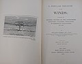 Frontispiece to A popular treatise on the winds: Comprising the general motions of the atmosphere, monsoons, cyclones, tornadoes, waterspouts, hail-storms, etc. by William Ferrel (1904)
 -
 Title page and frontispiece to Telliamed by Benoît de Maillet (1749)
 -
 Title page and frontispiece to volume I1 of Joannis Kepleri Astronomi Opera Omnia by Johannes Kepler (1858)
 -
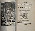 Frontispiece and title page to De Rerum Natura by Titus Lucretius Carus (1754)
 -
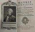 Frontispiece and title page to volume I of Histoire Naturelle, Générale et Particulière by Georges-Louis Leclerc, Comte de Buffon (1774)
 -
 Frontispiece illustration from Johann Bode's Anleitung zur Kentniss des Gestirnten Himmels (1772)
 -
 Frontispiece of the first edition of the memoirs of Pierre Victor, Baron de Besenval de Brunstatt, showing his portrait (1805)
 -
 Frontispiece of the seventh edition of Germain Brice's Paris travel guide (1717). This is a special print dedicated to August Wilhelm, Herzog von Braunschweig-Wolfenbüttel


See also
[edit]References
[edit]- ^ Franklin H. Silverman, Self-Publishing Textbooks and Instructional Materials, Ch. 9, Atlantic Path Publishing, 2004.
- ^ Wedgwood, Hensleigh (1855). "On False Etymologies". Transactions of the Philological Society (6): 68–69.
- ^ Since 1619. Cf. Cortelazzo, Manlio; Zolli, Paolo (1980). Dizionario etimologico della lingua italiana (in Italian). Vol. II. Bologna: Zanichelli. p. 461.
- ^ Michael Quinion, World Wide Words Entry
External links
[edit]- Prints & People: A Social History of Printed Pictures, an exhibition catalog from The Metropolitan Museum of Art (fully available online as PDF), which contains material on book frontispieces
- Marika Sardar, “Frontispiece,” Khamseen: Islamic Art History Online, published 3 September 2021.

| International | |
|---|---|
| National | |
| Other | |