
Roman lettering
View on Wikipedia
Roman lettering or Trajan lettering[a] refers to the use by artists and signwriters of Roman square capitals in modern lettering, particularly in Britain.[10][11][12][13][14][3]
Around the early twentieth century, British artists in the Arts and Crafts movement led by Edward Johnston came to see the proportions of Roman square capitals as an attractive, timeless form of letters, the ideal for artistic use.[15][16][17][18] Artists who worked in this style included Johnston's pupils Eric Gill, Graily Hewitt, Percy Delf Smith[b] and MacDonald Gill,[19] as well as Reynolds Stone and many other professional signwriters and letter engravers.[20] Roman capitals were used along with lower case, Arabic numerals, italics and calligraphy in a complementary style.[21]
The style has been used for lettering where a feeling of timelessness was wanted, for example on First World War memorials and government buildings, but also on shopfronts, posters, maps, and other general uses.[22][23][24][25] The popular name "Trajan" for this style of lettering came from the lettering on the base of the Trajan Column, copies of which were often used (in theory, at least) as models by lettering artists.[22][26][3] Phil Baines commented that it became "Britain's standard style of official lettering".[27]
Use
[edit].jpg)
.jpg)
_(cropped).jpg)
The main source studying the history of Trajan lettering in Britain is Professor James Mosley's 1964 article Trajan Revived;[30][31] and research by Dr. John Nash[20][32][33][34] and biographers of individual artists.[35]
Roman capitals were one of the main forms of lettering of the ancient world. During the Renaissance, there was considerable interest in Roman capitals,[36] with typefaces based on them.[37] However, in the eighteenth and nineteenth century types and lettering in the Didone or modern serif style tended to a style with sharp contrast in stroke width and capital letters of near equal width, the opposite of the Roman capital model where capitals had widely varying width.[38][26][39][40] These proportions were copied into display typefaces and lettering of the time, like fat faces[41] and sans-serifs.[38][42][43][44]
Johnston and his pupils
[edit]
The use of Roman capitals in lettering grew out of the Arts and Crafts movement, which promoted individual craftsmanship and traditional styles of art with respect for the past.[c]
On 11 April 1898, the architect and historian William Lethaby offered Edward Johnston a job teaching illuminating and calligraphy at the Central School of Arts and Crafts in London, and Johnston began to teach classes on 21 September 1899.[46] Lethaby was keen to increase students' interest in the aesthetic value of letters.[d] Johnston rapidly built up a school of pupils very impressed with his work.[50][e]
According to M. C. Oliver, Lethaby introduced the Trajan's Column inscription to Johnston[f] and as professor of design at the Royal College of Art put casts of the inscription of Trajan's Column as a standard for students to follow.[46][g] (At the time it was normal to use custom lettering for signs because of the inflexibility of printing and reproducing large fonts before the arrival of computer font technologies.[h])
Mass use
[edit].jpg)
_(cropped).jpg)
In his 1906 textbook Writing and Illuminating and Lettering, Johnston commented "the Roman Capitals have held the supreme place among letters for readableness and beauty. They are the best forms for the grandest and most important inscriptions" and more pithily "when in doubt, use Roman Capitals."[56] Lettering based on Roman capitals rapidly began to appear in many design manuals as a model.[57][58] Nicolete Gray commented that in the early twentieth century "it was taught in all art schools".[3][59]
Johnston himself generally did not do monumental and inscription design: he tended to prefer calligraphy and many of his commissions were creating documents, like charters, ornamental record books and certificates.[60] However, his pupils such as Eric Gill and Percy Delf Smith rapidly secured commissions creating lettering in the Roman capital style that were widely seen, for example Gill created standard lettering for W. H. Smith used on their storefronts from about 1904.[61][62][63][64]
The lettering used by British artists did not always follow the Trajan capital model, often adding changes such as serifs on the top of the 'M' and 'N',[65][66][67] and of course the lower case, Arabic numerals and italics which the Romans did not have.[68][i] Phil Baines commented in 2007 that "it is difficult for us now to realise how fresh the Trajan letter–with its light colour and capitals of varying width–must have appeared at that time...it swept [other designs] away and became the norm within a very short space of time."[70]
.jpg)
.jpg)
A reason for this codification to come soon after was the First World War, where savage loss of life led to the creation of many monuments and memorials. The job of designing a standard alphabet for the war grave headstones for military casualties went to Johnston pupil MacDonald "Max" Gill, and he designed an alphabet in the Roman style.[72][j] Many of the collective monuments erected by British communities to First World War and later Second World War casualties also used Roman lettering, often designed by Johnston's pupils or people they had taught or worked with.[27] The style was used very widely, however;[73] Nash comments that "the English tradition in lettering and typography...owed a great deal to its charismatic pioneers, such as Lethaby, Johnston, Gill and [Stanley] Morison. However its strength lay in the army of unsung craftsmen and women who absorbed their ideas".[74][k][l]
_(cropped).jpg)
Roman-style lettering also became used for major institutions such as the Post Office,[77][78] and (later) by the Ministry of Works,[13] on many British street signs, using a design by David Kindersley,[79][80] and on London blue plaques.[81][82][83]
Gallery
[edit]-
 Inscription, The Cenotaph, London
 -
 War Memorial, Brighton
 -
 War Memorial, King's Lynn
 -
 Royal Engineers memorial, Paisley Abbey
 -
 Building society foundation stone, Woolwich
 -
 Foundation stone of London Central Mosque, 1937
 -
 Plaque, Gimingham, Norfolk
 -
 Memorial to Nevile Henderson
 -
 Ceramic plaque, London
 -
 Memorial to Matthew Torrance, Magdalen Laver
 -
 Second World War memorial, Farley
 -
 Memorial to William Henry and Florence Abbey, Nuthurst
 -
 Memorial bronze, Westminster Hall
 -
 Date stone showing italic for small text, London, 1957
 -
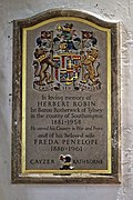 Memorial to Herbert and Freda Penelope Cayzer
 -

-
 Blue plaque designed by Henry Hooper, 1976[84]
 -
 Plaque, Felsted
 -
 Plaque for Arthur and Edyth Rackham, Amberley


_-_geograph.org.uk_-_4451822.jpg)
.jpg)
.JPG)
_diplomat_memorial.jpg)


.jpg)


.jpg)


Printing types and lettering models
[edit]
Some lettering artists who worked in the Roman lettering style designed typefaces. Johnston was commissioned in 1915 to design a sans-serif typeface for London Underground, which it still uses.[86] Gill designed several serif typefaces for clients and for Monotype such as Perpetua, as well as his Gill Sans sans-serif typeface.[87] Other designers who created typefaces in the style included Reynolds Stone[88][89] and (more loosely) Will Carter.[90]
Other designers such as Delf Smith created lettering manuals,[91] or models for their students and assistants.[92][93] In the United States, Frederic Goudy also designed several typefaces based on Roman capitals.[94] Other typefaces based on the style have been published as digital fonts (see below).
In other countries
[edit]
Roman capitals were widely used throughout the Roman Empire, and the property of no designer or country. The wide use of Roman capitals as a "house style" dominating design in the first half of the twentieth century was limited to the UK; Nicolete Gray commented in 1960 that "it has been a purely English movement, and one sees no traces of it on the Continent. One does, however, see many examples in [the] U.S.A. where apart from English influence the work of the letter carver John Howard Benson has been important."[2][m]
However, other artists in the previous century had followed similar directions. In 1846 printer Louis Perrin in Lyon introduced his "Caractères Augustaux" typeface, based on Roman capitals in local collections, and added a lower case in a complementary style inspired by old-style serif typefaces from before the nineteenth century.[96][97] Other typefaces reproducing Roman capitals were produced in France in the nineteenth century, for instance for scholarly publications.[98]
In the twentieth century there was also interest in Roman capitals in other countries, including Russia.[11]
Modern situation
[edit].jpg)

Examples of Roman-style lettering can be seen in many places across Britain.[100] Kindersley's street sign font is one of the most common designs for street signs in Britain.[79] Use of the Trajan style of lettering has declined somewhat due to changing tastes, with a desire for new styles of lettering.[101] Additionally, custom lettering and signwriting in general has declined in use due to the arrival of phototypesetting and desktop publishing, making it possible to print from a computer font at any size.[102][53][103][104][105] Meanwhile, some lettering artists who do create artistic work have switched to other more expressive styles, including sans-serifs.[106][107][n] Among historians of lettering, Gray and Mosley both were interested in other styles of lettering, with Mosley particularly arguing for the importance and beauty of the "vernacular" lettering styles that Trajan-style lettering tended to replace.[110][111][112][113][114][o]
Among digital fonts, Adobe Systems' digital typeface Trajan by Carol Twombly is one of its most popular typefaces.[117][118][119][120][121] Several digital fonts specifically based on use of Trajan lettering by Arts and Crafts movement artists have also been published.[122][24][123][124][125][126][127][80][128]
Notes
[edit]- ^ "Trajan" was often used as a shorthand for the style of lettering, or at least the capitals, especially later on, see for example Nash, who says that "what was beginning to be called the 'Trajan letter' [became] a basic form to be taught to art schools",[1] Nicolete Gray, who comments that "Trajan is now also a trade term"[2] and "to avoid confusion, I shall refer to this letter as 'Trajan'".[3] However, especially by those who introduced the style, the more accurate term "Roman lettering" or similar was used, for example by Johnston (Roman capitals),[4] Evetts ("Roman Lettering"),[5] Delf Smith, who called his workshop the Roman Lettering Company,[6] and Lubell, who describes the style as "the revival of the classic Roman Inscriptional capitals in early twentieth century England"[7] and "adherence to a Roman exemplar",[8] although this can be confused with Roman capitals in general or with Roman type. Nash describes it as the "Johnston-Gill tradition".[9]
- ^ Percy Delf Smith was born Percy John Smith, taking his wife's surname of Delf after his marriage. For consistency, this article refers to him as Delf Smith throughout.
- ^ Categorising the artists who worked in the Roman lettering style as Arts and Crafts movement is of course a simplification, as they came later than early figures in that trend such as William Morris who were very interested in medieval art: Nash comments that "Gill, who spent much of his life scorning that very movement and considered himself nothing if not forward-looking, would have been most irritated."[45]
- ^ Lethaby had written in an education report shortly before meeting Johnston for the first time that students' lettering was "almost without exception bad. Such students as endeavour to apply lettering harmoniously to their designs seem to endeavour to invent new and contorted forms out of their heads."[47][48] Johnston was offered the job on 11 April 1898, but because of Johnston's lack of confidence and difficulties in starting the class it began the following year.[49]
- ^ Johnston's teaching notes have survived: pupils present on 21 September included Noel Rooke and Florence Kingsford Cockerell, with T. J. Cobden-Sanderson, Graily Hewitt and Percy Delf Smith taking classes with him from 1900 and Eric Gill from 1901.[49]
- ^ The Trajan Column inscription was accessible in London because of a cast in the Victoria and Albert Museum, which had been presented by Napoleon III.[51] In Mosley's view, it became a model as the "sole antique inscription of which casts were readily available" in London.[51]
- ^ Mosley notes that this was the recollection of Oliver, but cautioned that another pupil at the Central School, A. H. Verstage, "never heard Lethaby refer to the Trajan inscription".[52]
- ^ For example plotters, wide-format printers and CNC machining.[53][54][55]
- ^ Gill commented that "while we may remember Trajan lovingly in the museum, we must forget all about him in the workshop."[68][69] and that art schools were dominated by "Trajan snobbery".[67]
- ^ Max Gill was Eric Gill's brother, and later married Johnston's daughter, although the commission may have came from past work he had done for prominent architect Edwin Lutyens, who designed many First World War memorials.[72]
- ^ Nash has highlighted as a later illustration of the diversity of the style Modern Lettering and Calligraphy (1954), which shows lettering work by a huge range of artists such as William Sharpington, many little-known.[75][45]
- ^ Not everyone was impressed by the academic training of British lettering around this time. When graphic designer Becky Astbury interviewed her father George Astbury, a successful Liverpool signwriter who began his career in 1957, he commented "I was asked in the past 'are you going to night school?' and my answer was 'what the bleeding hell for'...[you'd get] taught how to create serifs with a compass. It's best to judge it by eye and get it done quickly."[76]
- ^ American writer John Nash also concurs, following James Mosley, writing that "The Roman inscriptional capital thrived particularly during three periods: in the Empire of the second century AD; in sixteenth century Italy (principally Rome); and in early twentieth century England".[95]
- ^ Nash's article on the career of Will Carter is an example of this trend: born in 1912, while his work closely followed the Johnston-Gill style he had been brought up on into his fifties, he also experimented with blunter and bolder styles, commenting in 1982 that "the cut off serif, which was extensively used in what James Mosley so aptly calls the 'English Vernacular' period...has become a great feature of my work because it never disappears from sight as soon as you stand away from it".[108] An interesting reading list illustrating what books on lettering twentieth-century lettering artists used is a catalogue of the books owned by Michael Harvey, which was listed for sale as a group after his 2013 death.[109]
- ^ Mosley also argues that Trajan lettering has been used in historically inappropriate places, such as on the eighteenth-century ship HMS Victory.[115][116]
References
[edit]- ^ Nash 2002, p. 22.
- ^ a b Gray 1960, p. 13.
- ^ a b c d Gray 2005, p. 8.
- ^ Johnston 1906, pp. 268–269.
- ^ Evetts, L. C. Roman Lettering.
- ^ Nash 2002, p. 19.
- ^ Lubell 2010, p. 22.
- ^ Lubell 2010, p. 25.
- ^ Nash 2002, p. 27.
- ^ Gregory, Richard. "The English Signwriting Tradition". Richard Gregory Signwriter. Retrieved 26 August 2023.
- ^ a b Zhukov, Maxim. "The Trajan Letter in Russia and America". Typejournal.ru. Retrieved 4 March 2017.
- ^ Tam, Keith (2002). Calligraphic tendencies in the development of sanserif types in the twentieth century (PDF). Reading: University of Reading (MA thesis). Archived from the original (PDF) on 2015-09-06. Retrieved 2016-10-18.
- ^ a b Mosley, James. "Number Ten". Typefoundry (blog). Retrieved 27 August 2023.
- ^ Griffith, Heather. "The Lettering Arts Trust Journeyman Scheme: Trajan Alphabet". Heather Griffith: Stonecarving. Retrieved 26 August 2023.
- ^ Mosley 1964, pp. 29–31.
- ^ Howes 2000, pp. 26–27.
- ^ Shaw, Paul (August 2003). "What distinguishes a good letter from a bad one?". Reed Magazine. Retrieved 3 September 2023.
- ^ Lommen, Mathieu. "'Simply phenomenal': de kapitalen op de zuil van Trajanus". Allard Pierson Museum. Retrieved 19 October 2023.
- ^ Walker, Caroline (25 December 2019). "Biography - MacDonald Gill". MacDonald Gill. Retrieved 26 August 2023.
- ^ a b Nash 2002.
- ^ Delf Smith 1936, p. 2.
- ^ a b Mosley 1964, pp. 31–35.
- ^ Gray 1960.
- ^ a b Ross, David Jonathan (29 August 2018). "August's font of the month: Map Roman". Font of the Month Club. DJR. Retrieved 26 August 2023.
- ^ Frere-Jones, Tobias. "Mallory: drawn out from memory". Frere-Jones Type. Retrieved 29 August 2023.
- ^ a b Mosley, James. "Eric Gill's R: the Italian connection". Type Foundry. Retrieved 26 August 2023.
- ^ a b Baines 2007, p. 23.
- ^ Specimen of Plain & Ornamental Types from the Foundry of V. & J. Figgins. London. 1845. Retrieved 27 October 2017.
- ^ Shewring, Walter, ed. (1948). The Letters of Eric Gill. Devin-Adair. pp. 435–8.
As perhaps you know, I was a pupil of Edward Johnston and was living almost next door to him when he was designing the LPTB sans-serif. It was a revolutionary thing and as you know, it redeemed the whole business of sans-serif from its nineteenth-century corruption. It was not until 1927 that I was asked by the Monotype Corporation to do a sans-serif for them.
- ^ Mosley 1964.
- ^ Nash 2002, p. 15.
- ^ Clinton, Jane (5 May 2017). "Expert who hones his skills to the letter". Camden New Journal. Retrieved 26 August 2023.
- ^ "John Nash". The Lettering Arts Trust. 12 April 2018. Retrieved 26 August 2023.
- ^ "John Nash". The Art Workers’ Guild. Retrieved 26 August 2023.
- ^ Mosley, James. "RBS Preliminary Reading List: James Mosley, Type, Lettering, and Calligraphy, 1830-1940 (and Beyond)". Rare Book School. Retrieved 26 August 2023.
- ^ Shaw 2017, p. 19.
- ^ Vervliet 2008, pp. 66, 77.
- ^ a b Gehlhaar, Jens. "Neuwelt: An optimistic transatlantic sans serif type family — Jens Gehlhaar". Jens Gehlhaar. Retrieved 15 December 2021.
- ^ Shaw 2017, p. 102.
- ^ Johnston, Edward. Writing, Illuminating and Lettering. p. 233.
[In the] nineteenth-century style...it was customary to make every letter occupy the same space and look as much like its neighbour as possible.
- ^ Shaw 2017, p. 121.
- ^ Majoor, Martin (29 November 2004). "My Type Design Philosophy". Typotheque. Retrieved 12 November 2015.
- ^ Tankard, Jeremy. "The design of Pembroke". Jeremy Tankard Typography. Retrieved 26 August 2023.
- ^ Berry, John D. "A Neo-Grotesque Heritage". Adobe Systems. Retrieved 26 August 2023.
- ^ a b Nash 2002, p. 26.
- ^ a b Mosley 1964, p. 29.
- ^ Keeble, p. 23.
- ^ Keeble, Brian (2009). God and Work: Aspects of Art and Tradition. World Wisdom, Inc. ISBN 978-1-933316-68-0. Retrieved 23 September 2023.
- ^ a b Howes, Justin. "Edward Johnston's first class at the Central School on 21 September 1899". Edward Johnston Foundation Journal: 11–14.
- ^ Nash 2002, pp. 18–19.
- ^ a b Mosley 1963, p. 49.
- ^ Mosley 1964, p. 30.
- ^ a b Simonson, Mark. "Not a font". Mark Simonson Studio (blog). Retrieved 14 December 2016.
- ^ Gregory, Richard. "The Machine Age". Richard Gregory Signwriter. Retrieved 23 September 2023.
- ^ Gregory, Richard. "The Modern Age". Richard Gregory Signwriter. Retrieved 23 September 2023.
- ^ Johnston 1906, p. 269.
- ^ Mosley 1964, pp. 30–31.
- ^ Payne 1921.
- ^ Gibbs, Jon (2007). "Teaching Roman Letters". The Edward Johnston Foundation Journal. 11: 2–6.
- ^ Lovett, Patricia. "A Wonderful Edward Johnston Book". Patricia Lovett. Retrieved 27 January 2025.
- ^ Howes 2000, p. 26.
- ^ Nash 2002, p. 18.
- ^ Morrison, Kathryn A. (10 July 2025). "Smith & Jones: A Brief History of W. H. Smith's High Street Shops". Retrieved 2 March 2026.
- ^ Morrison, Kathryn A. (23 March 2017). "Smith & Jones: A Spotter's Guide to W. H. Smith's". Retrieved 2 March 2026.
- ^ Delf Smith 1936, p. 28.
- ^ Delf Smith 1946, pp. 20–21.
- ^ a b Gill, Eric. "Alphabet and Numerals". Tate. Retrieved 20 September 2023.
- ^ a b Nash 2002, p. 24.
- ^ Gill 1936, p. 58.
- ^ Baines 2007, p. 22.
- ^ Day, Michael. "A Museum Clerk at the Battle of the Somme". British Library. Retrieved 27 August 2023.
- ^ a b Musson, Jeremy (23 October 2020). "Charting a Life: MacDonald Gill, who designed the inscriptions that form an egalitarian monument to the British and Commonwealth fallen of two world wars". The Art Newspaper. Retrieved 2 September 2023.
- ^ Vanson, Arthur. "Essendine". Bucks Signs. Retrieved 4 September 2023.
- ^ Nash 1989, p. 13.
- ^ Holme, Rathbone; Frost, Kathleen M. (eds.). Modern Lettering and Calligraphy. The Studio Publications.
- ^ Astbury, p. 33.
- ^ Stamp, Gavin (9 April 2012). "Architects who put their stamp on the Post Office (letter)". The Guardian. Retrieved 10 September 2023.
- ^ Mansell 1931, pp. 31, 34.
- ^ a b Hall, Alastair (11 February 2022). "London street name fonts". We Made This. Retrieved 18 September 2023.
- ^ a b "Type design". The Cardozo Kindersley Workshop. Retrieved 18 September 2023.
- ^ Gibbs 2005b, pp. 6–7.
- ^ Gibbs, Jon (23 March 2005). "Obituary: Henry Hooper". The Independent. Retrieved 21 September 2023.
- ^ "The Changing Face of Blue Plaques". English Heritage. Retrieved 21 September 2023.
- ^ Gibbs 2005b, p. 7.
- ^ Delf Smith 1946, p. 31.
- ^ Howes 2000, p. 28.
- ^ Mosley, James. "Eric Gill and the Cockerel Press". Upper & Lower Case. International Typeface Corporation. Archived from the original on 29 July 2012. Retrieved 7 October 2016.
{{cite web}}: CS1 maint: bot: original URL status unknown (link) - ^ Devroye, Luc. "Reynolds Stone". Type Design Information. Luc Devroye.
- ^ "The legacy of Reynolds Stone". BBC News. 21 September 2009. Retrieved 18 September 2023.
- ^ Devroye, Luc. "Will Carter". Type Design Information. Luc Devroye.
- ^ Delf Smith 1946, p. 21.
- ^ Nash 1989, p. 14.
- ^ Sharpington, William. "Roman and Italic capitals". Crafts Study Centre. Retrieved 27 August 2023.
- ^ Goudy, Frederic (1936). The Trajan Capitals. Oxford University Press.
- ^ Nash 2002, p. 11.
- ^ Ovink, G.W. (1971). "Nineteenth-century reactions against the didone type model - I". Quaerendo. 1 (2): 18–31. doi:10.1163/157006971x00301. Retrieved 20 February 2016.
- ^ Mosley, James (2003). "Reviving the Classics: Matthew Carter and the Interpretation of Historical Models". In Mosley, James; Re, Margaret; Drucker, Johanna; Carter, Matthew (eds.). Typographically Speaking: The Art of Matthew Carter. Princeton Architectural Press. p. 31. ISBN 9781568984278. Retrieved 3 September 2023.
- ^ Mazé, Charles (29 June 2021). "Abîmées". ABYME. Retrieved 3 September 2023.
- ^ Nash 2002, p. 25.
- ^ Nash 2002, passim.
- ^ Shaw 2015, p. 133.
- ^ Astbury, p. 36.
- ^ Johnston, Alastair. "The Misery of Edwin Drood". Booktryst. Retrieved 14 December 2016.
- ^ Shinn, Nick. "The Golden Age of Hand Lettering in American Advertising". Type Culture. Retrieved 1 April 2017.
- ^ Dormer, Peter (16 December 1992). "Architecture: Is the writing on the wall for public inscriptions?". The Independent. Retrieved 23 September 2023.
- ^ Mosley 1964, p. 35.
- ^ Nash 2002, pp. 26–31.
- ^ Nash 2007, p. 36.
- ^ "Michael Harvey: The Art of Lettering" (PDF). Janette Ray Rare and Out of Print Books. Retrieved 3 September 2023.
- ^ Mosley 1963, pp. 49–52.
- ^ Mosley, James. "Working Letters – an affectionate view of the vernacular". Letter Exchange. Retrieved 11 May 2023.
- ^ Walters, John L. "Review: Letters from Bologna". Eye Magazine. Retrieved 4 December 2023.
- ^ Mosley, James. "English vernacular (2006)". Type Foundry (blog). Retrieved 27 August 2023.
- ^ Mosley, James. Memory of Roman Letters.
- ^ Mosley, James. "A British National Letter". Typefoundry (blog). Retrieved 27 August 2023.
- ^ Mosley, James (14 January 2007). "HMS Victory". Typefoundry (blog). Retrieved 27 August 2023.
- ^ Berry, John. "Trajan 3 Pro specimen" (PDF). Adobe Systems. Retrieved 18 October 2016.
- ^ Riggs, Tamye (12 June 2014). "The Adobe Originals Silver Anniversary Story: Stone, Slimbach, and Twombly launch the first Originals".
- ^ Riggs, Tamye. "The Adobe Originals Silver Anniversary Story: A community perspective on the Originals program". Typekit. Adobe Systems. Retrieved 4 March 2017.
- ^ "TYPO Talks » Blog Archiv » Yves Peters: Trajan in Movie Posters". Archived from the original on 2018-07-06. Retrieved 2018-07-06.
- ^ Brown, Tim (21 March 2012). "Inscriptional faces from Adobe Type".
- ^ Smith, Jamie. "English Engravers Roman". MyFonts. Smith Hands. Retrieved 26 August 2023.
- ^ Studden, John. "Classic Roman 2". Letterhead Fonts. Retrieved 26 August 2023.
- ^ Vanson, Arthur. "Essendine 2". Letterhead Fonts. Retrieved 26 August 2023.
- ^ Summerour, Neil. "Kurosawa Serif". T26 Type Foundry. Retrieved 26 August 2023.
- ^ Summerour, Neil. "Kurosawa Serif Font". MyFonts. T26. Retrieved 26 August 2023.
- ^ Dooley, Jeremy. "Winsel". MyFonts. Insigne Design. Retrieved 18 September 2023.
- ^ Davenport, Connor. "Greenstone". Sharp Type. Retrieved 7 October 2023.
Cited literature
[edit]- Astbury, Becky. Have Brush Will Travel: the Past, Present and Future of Signwriting (Thesis). Retrieved 26 August 2023.
- Baines, Phil (2007). "Changing the World". In Clayton, Ewan (ed.). Edward Johnston: Lettering and Life. Ditchling Museum. ISBN 9780951622483.
- Bartram, Alan (1986). The English Lettering Tradition from 1700 to the present day (1st ed.). Lund Humphries. ISBN 9780853315124.
- Bostock, James. Roman Lettering for Students. The Studio Publications.
- Carter, Harry (2008). A View of Early Typography Up to About 1600. Hyphen Press. pp. 6–12. ISBN 9780907259213.
- Delf Smith, Percy (1908). Lettering & Writing. London: B. T. Batsford.
- Delf Smith, Percy (1936). Lettering: a handbook of modern alphabets. London: Adam & Charles Black.
- Delf Smith, Percy (1946). Civic and Memorial Lettering. London: Adam & Charles Black.
- The Dryad Lettering Cards. Leicester: The Dryad Press.
- Gill, Eric (1936). An Essay on Typography (2nd ed.). Sheed and Ward. p. 58.
- Gibbs, Jon (2005b). "Henry Hooper: Lettering Craftsman". The Edward Johnston Foundation Journal: 3–8.
- Gray, Nicolete (1960). Lettering on Buildings. London: Architectural Press.
- Gray, Nicolete (2005). "The Newberry alphabet and the revival of the roman capital in fifteenth-century Italy". In Stiff, Paul (ed.). Typography Papers 6. London: Hyphen Press. pp. 5–16. ISBN 9780907259299. Retrieved 26 August 2023.
- Hewitt, Graily. Lettering for Students & Craftsmen. London: Seely Service & Co.
- Holliday, Peter (2007). Skinner, Susan (ed.). Edward Johnston: Master Calligrapher. British Library.
- Howes, Justin (2000). Johnston's Underground Type. Harrow Weald, Middlesex: Capital Transport. ISBN 1-85414-231-3.
- Johnston, Edward (1906). Writing & Illuminating & Lettering. Macmillan. pp. 268–269, 384, 391.
- Keeble, Brian. "Archetype as Letterform: the 'Dream' of Edward Johnston" (PDF). The Edward Johnston Foundation Journal. Archived from the original on October 29, 2007. Retrieved 23 September 2023.
- Kindersley, Lida Lopes Cardozo (2009). The Annotated Capital: on the thinking behind the capital letter of the Cardozo Kindersley Workshop. Cambridge: Cambridge University Press. ISBN 9780521197229.
- Lubell, Stephen (2010). "William Sharpington: a man of letters". Ultrabold: The Journal of St Bride Library (8): 22–27.
- Mansell, George (1931). "The Planning and Lettering of Public Notices and Signs". Journal of the Royal Society of Arts. 80 (4122): 23–45. ISSN 0035-9114. JSTOR 41358918.
- Mosley, James (1963). "English Vernacular". Motif: 3–56.
- Mosley, James (1964). "Trajan Revived". Alphabet. 1: 17–48.
- Nash, John (1989). "English Brush Lettering: The Workshop of William Sharpington". The Scribe: 13–15.
- Nash, John (2002). "In Defence of the Roman Letter" (PDF). The Edward Johnston Foundation Journal. Archived from the original on October 29, 2007. Retrieved 13 October 2016.
- Nash, John (2007). "The Lettering Work of Will Carter". The Edward Johnston Foundation Journal: 26–39.
- Ovenden, Mark (2016). Johnston & Gill: very British types. London: Lund Humphries. ISBN 978-1-84822-176-5.
- Payne, Arthur E. (1921). Lettering: a Handbook for Artists, Architects, Designers, Signwriters & Craftsmen. London: B. T. Batsford.
- Seaby, Allen W. (1925). The Roman Alphabet and its Derivatives. London: B. T. Batsford.
- Shaw, John (1988). "Percy John Delf Smith R.D.I". Calligraphy Review: 17–26.
- Shaw, John (2007). "Percy John Delf Smith R.D.I. 1882-1948: Calligrapher, Lettering Artist and Craftsman". The Edward Johnston Foundation Journal: 2–10.
- Shaw, Paul, ed. (2015). The Eternal Letter: two millennia of the classical Roman capital. Cambridge, Mass.: The MIT Press. ISBN 9780262029018.
- Shaw, Paul (18 April 2017). Revival Type: Digital Typefaces Inspired by the Past. Thames & Hudson. ISBN 978-0-500-24151-6.
- Vervliet, Hendrik D. L. (2008). The Palaeotypography of the French Renaissance: Selected Papers on Sixteenth-century Typefaces. BRILL. ISBN 978-90-04-16982-1.
External links
[edit]- Lettering Arts Trust charity, UK
- Letter Exchange
Roman lettering
View on GrokipediaOrigins and Early Development
Ancient Roman Capitals
Ancient Roman capitals, known as capitalis monumentalis, originated as a monumental uppercase script primarily used for inscriptions on stone, serving as the foundational model for the Roman alphabet in classical antiquity.[6] This script evolved from earlier influences, with the Etruscans adopting and adapting the Euboean Greek alphabet around the 7th century BCE to transcribe their language, writing from right to left and reversing some Greek letter forms.[7] As Roman dominance expanded, the Latin alphabet derived from this Etruscan script, incorporating 21 letters while discarding others like the Etruscan F, Q, and S variants, leading to a more standardized form by the late Republic.[8] Exemplary instances of capitalis monumentalis appear in imperial inscriptions, such as the dedication on Trajan's Column, completed in 113 CE to commemorate Emperor Trajan's Dacian campaigns.[9] The column's base inscription, reading "SENATVS POPVLVSQVE ROMANVS IMP(ERATORI) TRAIANO AVG(VSTO) GER(MANICO) DAC(ICO) P(ONTIFICI) M(AXIMO) TRIB(POTESTATE) XVII IMP(ERATOR) VI CO(n)S(ULI) VI P(ATRIAE) P(ATRI)," features elegant, precisely carved letters sketched initially with a flat brush before incision.[2] Similarly, the Arch of Titus, dedicated in 81 CE by the Senate and people of Rome to the deified Titus, bears the inscription "SENATVS POPVLVSQVE ROMANVS DIVO TITO DIVI VESPASIANI F(ILIO) VESPASIANO AVGVSTO," showcasing the script's use in honorific arches to glorify Flavian victories.[10] The Pantheon’s pediment inscription, "M·AGRIPPA·L·F·COS·TERTIVM·FECIT," dates to its Hadrianic reconstruction around 125 CE, though attributing the original temple to Agrippa (c. 27–25 BCE), and exemplifies the script's application in architectural dedications.[11] Key characteristics of these capitals include serifs formed by the slight thickening at stroke ends from chisel incisions, creating a sense of weight and stability, while the forms blend square proportions in letters like the O (height-to-width ratio of approximately 1:1) with taller, rectangular ones for the I (height-to-width ratio of about 8:1 to 9:1).[12] Vertical strokes are typically twice the thickness of horizontals, with overall letter heights measuring 8.5 to 9 times the vertical stroke width, ensuring balanced, readable proportions optimized for distant viewing on monuments.[2] These features, combining sharp straight lines, supple curves, and angled stressing, reflect the script's evolution for durability on marble and travertine, distinguishing square capitalis quadrata variants from more rounded rustic forms in less formal contexts.[12] This monumental style profoundly influenced Renaissance typefaces, such as those by Nicholas Jenson, which emulated its proportions for printed books.[13]Transition to Lowercase and Medieval Scripts
As the Roman Empire declined in the late 4th and 5th centuries CE, handwriting practices evolved from the monumental square capitals used in inscriptions toward more fluid scripts suited to the production of books on parchment. Capitalis rustica, emerging around the 4th century CE, served as an intermediate form, characterized by narrower, elongated letters that allowed for quicker writing in literary manuscripts while retaining a capital appearance. This script, often employed in codices, marked a shift from the rigid geometry of ancient Roman capitals toward cursive influences, facilitating the copying of texts in administrative and scholarly contexts across the fading empire.[3] By the 5th to 9th centuries CE, uncial script became the dominant form for book handwriting in both Latin and Greek manuscripts, featuring rounded letterforms that reduced the number of strokes required per character, thereby increasing writing speed. Unlike the angular ancient capitals, uncials exhibited uniform stroke widths in a near 1:1 ratio, creating a smooth, even appearance ideal for sustained production in monastic scriptoria. Half-uncial, a variant emerging in the 6th century, further adapted these forms by introducing smaller letters confined to a four-line system, with initial ascenders and descenders that foreshadowed modern lowercase distinctions. This script, faster than full uncials, spread through Christian communities and directly influenced subsequent minuscule developments.[14] The fall of the Western Roman Empire in the 5th century CE disrupted centralized learning centers, leading to the rise of insular scripts in Ireland, where monastic traditions preserved classical knowledge amid continental decline. These scripts, blending half-uncial elements with local innovations, produced masterpieces like the Book of Kells (c. 9th century), an illuminated Gospel manuscript showcasing intricate, rounded majuscules and minuscules in a distinctive Irish style. Insular half-uncial, with its fluent curves and varied letter heights, served as a key precursor to modern lowercase by emphasizing vertical extensions and rhythmic flow.[15][14] Under Charlemagne's reforms (c. 780–814 CE), the Carolingian minuscule was introduced around 780–900 CE as a standardized lowercase script, promoting uniformity across Frankish scriptoria to enhance legibility and cultural revival. This script featured distinct ascenders and descenders, more modulated stroke widths (varying beyond the 1:1 uniformity of uncials), and a consistent baseline, drawing from half-uncial and insular influences while echoing the clarity of ancient Roman forms. By the early 9th century, it had become the prevailing book hand in Western Europe, laying the foundation for medieval typography.[16][17]Typographic Characteristics
Proportions and Geometric Forms
Roman lettering, particularly the classical capitals, exhibits pronounced vertical stress, where the thicker strokes align vertically due to the angled application of chisel or brush during inscription, creating a rhythmic contrast between horizontal and vertical elements.[18] The cap height, defined as the height of uppercase letters, serves as the primary unit of proportion, often standardized to a square module for uniformity in monumental carvings like those on Trajan's Column. In lowercase forms emerging from later scripts, the x-height—measured from baseline to midline—typically occupies about two-thirds of the cap height, fostering a balanced hierarchy that enhances readability while echoing the monumental scale of capitals.[19] The geometric construction of Roman letters relies on fundamental shapes derived using compass and square, as systematized in Felice Feliciano's 1463 treatise Alphabetum Romanum, the earliest known effort to reconstruct classical epigraphy through geometry. Feliciano posited that ancient Romans formed letters from a circumscribed circle and inscribed square, with the circle determining curved forms like the O—perfectly circular for optical evenness—and the square providing the baseline for angular letters such as the A, constructed from an equilateral triangle base with diagonal crossbars. This modular approach ensured proportional consistency, with letter widths approximating the cap height (often in a 1:1 ratio for widest forms like M) and inter-letter spacing adjusted to maintain visual flow, sometimes nearing golden ratio approximations (1:1.618) in Renaissance adaptations for aesthetic harmony.[20][21][22] Humanist typography revived these principles in the 15th century, as seen in the Bembo typeface (cut in 1495 by Francesco Griffo for Aldus Manutius), which draws from manuscript hands to incorporate subtle stroke modulation—thinner horizontals relative to verticals—while preserving geometric ideals like bracketed serifs and even counters. Bembo's proportions emphasize an open x-height and ascender/descender ratios that approximate classical balance, promoting legibility in printed text without rigid geometric rigidity. Serifs in Roman lettering function as transitional elements, bridging stroke endings to prevent visual abruptness; according to Edward M. Catich's analysis, they originate from the tapered brushstrokes used to outline letters on stone before chiseling, evolving from practical carving necessities rather than mere decoration.[23][24]Serif Variations and Humanist Influences
Serif variations in Roman lettering evolved significantly from the Renaissance onward, distinguishing bracketed styles in early forms from the unbracketed designs of later periods. Old-style serifs, prominent in typefaces from the late 15th to mid-18th centuries, feature bracketed terminals—curved transitions connecting the serif to the stroke—that provide a subtle, organic flow reminiscent of handwritten forms. These serifs often exhibit a gentle taper, with head serifs angled to achieve optical balance, ensuring even visual weight across letters despite the diagonal stress axis typical of the period.[25] Exemplified by Claude Garamond's typeface developed in the 1530s, old-style serifs emphasize moderate contrast between thick and thin strokes, fostering readability in extended text.[23] Transitional serifs emerged in the mid-18th century as a bridge between old-style warmth and greater refinement, with flatter, less curved brackets and increased stroke contrast for a more vertical axis. John Baskerville's typeface, released in 1757, exemplifies this shift, incorporating sharper serifs that retain some bracketing while introducing a crisper, more geometric precision to enhance clarity on smoother paper stocks.[23] By contrast, modern serifs, developed in the late 18th century, abandon bracketing entirely for abrupt, unbracketed terminals—thin, hairline extensions at right angles to the stroke—creating high vertical contrast and a stark elegance suited to formal display. Giambattista Bodoni's designs from this era, such as his 1788 typeface, prioritize uniformity and sharpness, with serifs that taper minimally to maintain a mechanical poise.[23] Humanist influences profoundly shaped these serif evolutions, reviving calligraphic warmth in printed Roman forms during the 15th century. Konrad Sweynheym and Arnold Pannartz's Subiaco types, introduced in 1465 near Rome, represent an early proto-Roman style that blended the roundness of medieval uncial scripts with the structural firmness of classical capitals, laying groundwork for more fluid, readable letterforms.[26] This hybrid approach influenced subsequent designers by softening rigid geometries in favor of manuscript-like grace. Nicolas Jenson's Roman typeface of 1470, cut in Venice, further advanced humanist principles by adapting contemporary humanistic scripts—elegant, slanted handwriting akin to early italics—into metal type, with balanced proportions that prioritized text flow and legibility over strict geometric ideals.[27] Jenson's design, featuring long ascenders and descenders alongside refined serifs, became a model for old-style typefaces, embedding humanist readability into the serif tradition.[27]Historical Applications
In Printing and Type Design
The invention of movable-type printing by Johannes Gutenberg in Mainz reached a milestone with the 42-line Bible printed around 1455, which utilized a Textura Quadrata typeface derived from late-medieval liturgical scripts to closely emulate handwritten manuscripts.[28] Although this blackletter style dominated early European printing, Gutenberg's innovations in typecasting and press operation laid the groundwork for the broader adoption of Roman typefaces by enabling scalable production of diverse letterforms.[29] A pivotal advancement occurred in Venice in 1470, when punchcutter Nicolas Jenson produced the first true Roman typeface for his own printing establishment, drawing from ancient Roman capitals and 15th-century humanist minuscules to create balanced, legible forms with subtle bracketed serifs.[30] Early Roman designs exhibited variations in serifs, often thicker at the base and tapering elegantly to reflect inscriptional influences.[27] Typefounding for these Roman faces relied on punch-cutting, where skilled artisans engraved hardened steel punches for individual glyphs to strike reusable copper matrices, ensuring precision and consistency in letter shapes.[31] The type metal alloy, composed primarily of lead (around 75-80%) alloyed with tin (for fluidity) and antimony (for hardness and durability against wear in the press), allowed for sharp impressions and longevity in high-volume printing.[32] Key developments further propelled Roman type's integration into book production, as seen in Aldus Manutius's 1501 introduction of an italic typeface by Francesco Griffo as a slanted companion to his Roman fonts, designed to save space and enhance the portability of his compact octavo editions of classical texts.[33] In France, the Estienne family advanced Roman typography during the 16th century; Henri Estienne's 1509 Quincuplex Psalterium, for instance, was set entirely in Roman fonts adapted from Italian models, while Robert Estienne later commissioned refined Roman types from punchcutters like Claude Garamond for scholarly works.[34] The dissemination of these Roman designs accelerated through influential workshops in Mainz and Basel, major hubs of printing diffusion from the late 15th century, where by the 1500s Roman type had standardized forms and increasingly displaced blackletter in secular and classical publications across Europe.[35]In Inscriptions and Architectural Lettering
Roman lettering found its most enduring application in inscriptions carved into stone for monuments, temples, and public buildings, where the capital forms—characterized by their geometric precision and serifs—ensured legibility from a distance. In ancient Rome, the primary techniques were incised carving, where letters were cut into the surface to a depth of 0.5–2 cm depending on the stone, and relief carving, where letters were raised above the surface for added prominence. Incised letters, the more common method for public monuments due to their durability and clarity, were executed using chisels and hammers, with fine-tipped or nib-pointed chisels shaping the serifs at stroke ends to enhance elegance and readability.[36] Relief letters, often used for prestigious dedications, were sometimes cast in bronze and gilded before attachment, as seen on arches like those of Titus and Septimius Severus.[36] Layout and spacing followed rigorous rules to maintain uniformity and visual harmony, with guidelines often scratched into the stone prior to carving. Vertical stems were typically proportioned at a 1:10 ratio of width to height, serving as a modular unit for the entire inscription, while inter-letter spacing was typically equal to the width of a vertical stem, adjusted proportionally for curved forms to avoid crowding.[37][36] These practices originated from ancient capital forms but were refined in workshops (officinae) by skilled lapidarii, who drafted texts on wax tablets before transferring them to stone.[36] During the Renaissance, Roman lettering techniques were revived in architectural contexts to evoke classical antiquity, with incised capitals used in marble inscriptions to commemorate patrons, featuring precise serifs and balanced proportions.[38] In the neoclassical era, this tradition persisted, with the Jefferson Memorial in Washington, D.C. (dedicated 1943), featuring interior and frieze inscriptions in Roman capitals that directly echo the Trajan inscription's monumental style for timeless authority.[39] Adaptations addressed environmental challenges, such as weathering, which accelerated erosion in engraved areas due to crack-enhanced processes in marble, potentially reducing legibility over centuries unless protected by depth or material choice.[40] In Roman forums, gilding bronze letters provided emphasis and visibility, as on the Basilica Aemilia's facade, where golden hues highlighted dedications amid urban bustle before many were looted or melted down.[41] Specific monumental examples underscore the scale of these applications, including the Pantheon pediment in Rome (2nd century CE), originally bearing gilded bronze letters approximately 70 cm (2.3 feet) high to proclaim Agrippa's dedication across its vast portico.[11] By the 19th century, Roman capitals became standardized on cemetery monuments in Europe and North America, with incised forms on marble headstones reflecting neoclassical ideals of permanence and restraint, as seen in sites like Belvedere Roman Catholic Cemetery in Newfoundland.[42]Modern Revivals and Uses
Edward Johnston and Early 20th-Century Reforms
Edward Johnston, a pivotal figure in the early 20th-century revival of calligraphy in Britain, began his formal training in the art in 1899 at the Central School of Arts and Crafts in London, where he was influenced by the ongoing calligraphy revival within the Arts and Crafts movement.[43] His approach emphasized returning to classical sources, particularly Roman square capitals, which he viewed as the finest model for legible and beautiful lettering due to their clarity, proportions, and timeless elegance.[44] In 1906, Johnston published Writing & Illuminating & Lettering, a seminal handbook that advocated the study and adaptation of Roman capitals for modern penmanship, arguing that they provided an ideal foundation for both writing and decorative arts, surpassing earlier medieval forms in legibility and delicacy.[44] The book, illustrated with diagrams and examples by Johnston and his collaborator Noel Rooke, became a cornerstone text for the revival, promoting the idea that well-formed lettering could elevate everyday writing from ugliness to beauty.[45] Johnston's teaching career at the Central School of Arts and Crafts, spanning from 1899 into the 1940s, established a rigorous curriculum centered on Roman lettering principles, training a generation of influential calligraphers and type designers.[46] Among his key pupils were Eric Gill, who later drew inspiration from Johnston's methods to design the sans-serif typeface Gill Sans in 1928, and Noel Rooke, who co-illustrated Johnston's book and continued teaching wood-engraving and lettering at the school.[46] Johnston developed the "Foundational Hand," a script that blended the geometric proportions of Roman uppercase letters with the humanistic lowercase forms derived from Carolingian minuscules and half-uncials, aiming to create a versatile, readable style suitable for both formal inscriptions and everyday use.[44] This hand, practiced with broad-nibbed pens to emphasize stroke construction, reflected the Arts and Crafts emphasis on craftsmanship and historical authenticity, influencing the broader typographic reforms of the era.[44] A landmark project in Johnston's career was his design of the sans-serif typeface for the London Underground in 1916, commissioned by Frank Pick to unify the system's signage and branding.[43] Rooted in classical Roman proportions—such as the balanced widths and seriffed forms studied from ancient inscriptions and Renaissance examples—Johnston's typeface adapted these elements into a clean, modern sans-serif suitable for rapid reading in public spaces, while retaining the underlying geometric harmony of Roman capitals.[43] First implemented in wooden block letters for posters, it marked a practical application of Johnston's revivalist ideals, bridging historical lettering traditions with early 20th-century industrial design needs.[43] Through such works, Johnston not only revived Roman lettering in Britain but also laid the groundwork for its integration into modern typography.[46]Mass Adoption in Public Signage and Typography
The widespread adoption of Roman lettering in public signage accelerated in the mid-20th century, building on Edward Johnston's foundational influence in standardizing classical proportions for modern use. In Britain, the nationalized British Railways implemented Gill Sans—a sans-serif typeface inspired by Roman capitals—for station signage and corporate identity starting in 1948, emphasizing clarity and uniformity across the network during the 1950s and 1960s.[47] Similarly, in the United States, the inaugural 1935 edition of the Manual on Uniform Traffic Control Devices (MUTCD) established national standards for highway signage, specifying clear, uppercase Roman-style lettering to ensure legibility at high speeds, which influenced subsequent revisions and widespread implementation on interstate systems.[48] In commercial printing, Roman lettering gained prominence for its superior readability in dense text formats. The 1932 introduction of Times New Roman, commissioned by The Times newspaper and supervised by Stanley Morison, prioritized economical space usage and enhanced legibility through subtle adjustments to classical Roman forms, leading to its rapid adoption in newspapers and periodicals worldwide for body text.[49] This typeface's design, with balanced serifs and proportions derived from 15th-century Roman models like Plantin, addressed the demands of high-volume news printing while maintaining aesthetic refinement.[49] Post-World War II efforts further standardized Roman lettering across Europe, promoting it as a symbol of modernity and accessibility in public and institutional contexts. Reconstruction initiatives emphasized uniform typographic systems, with governments and organizations shifting toward Roman types for official documents and infrastructure to facilitate international communication and legibility.[50] By 1920, the proliferation of foundry types had resulted in numerous variants of Roman faces available from major producers like American Type Founders, reflecting the era's demand for adaptable designs in printing and signage.[51] To optimize performance across scales, type designers employed optical scaling techniques, such as increasing the x-height in smaller sizes to counteract visual compression and improve readability—for instance, text faces at 8–12 points often featured x-heights up to 50–60% of the cap height, compared to 40–45% in display variants.[52][53] These adjustments ensured Roman lettering's versatility in mass-produced applications, from billboards to books.[54]Global and Contemporary Adaptations
Adaptations in Non-Western Contexts
In Asia, Roman lettering underwent significant adaptations during Japan's Meiji era (1868–1912), where a movement emerged to replace traditional scripts with rōmaji, the Roman alphabet, as part of broader Westernization efforts.[55] Although full adoption did not occur, rōmaji blended with katakana in signage and printing, using phonetic representations to incorporate foreign terms and enhance visual communication in advertisements and official labels.[55] The Hepburn romanization system, standardized in 1886, facilitated this integration by providing a consistent method for transliterating Japanese sounds into Roman forms, which appeared on road signs, train stations, and packaging to bridge linguistic gaps.[55] During the British colonial period in Hong Kong (1841–1997), Roman lettering was adapted into bilingual public signage, often merging with Chinese characters in neon displays that reflected East-West cultural hybrids.[56] Neon signs, introduced in 1929 and peaking in the 1960s–1970s with over 80,000 installations, employed Roman letters in Art Deco styles—characterized by geometric boldness—for English names on shops, restaurants, and factories, juxtaposed against calligraphic Chinese elements to accommodate multilingual audiences.[56] This adaptation emphasized functional readability, with Roman forms simplified post-1937 under influences from Shanghai émigré artisans, creating eclectic tri-lingual designs including Japanese.[56] In the Middle East and Africa, Roman lettering influenced script reforms, notably through the 1928 Ottoman Turkish alphabet reform, which replaced the Perso-Arabic script with a Latin-based system to modernize literacy and align with European standards.[57] This shift, enacted on November 3, 1928, via state law, prompted debates in Arabic-speaking regions like Egypt, where romanization proposals drew on Turkish examples to suggest rapid adoption—potentially within 2–3 months—for educational and publishing efficiency, integrating Roman forms into advertising and official documents.[57] In Ethiopia, the Ge'ez script, an ancient alphasyllabary, saw indirect Latin influences from 17th-century Catholic missionaries, who added new syllabographs (e.g., for Portuguese loanwords) to accommodate Roman-script interactions, though core forms remained distinct.[58] By the late 20th century, some Ethiopian languages like Oromo adopted Roman-based orthographies (e.g., Qubee since 1991) for socio-cultural autonomy, reflecting broader colonial-era pressures to hybridize scripts.[58] Key examples of these adaptations appear in 19th-century Indian railway signage, where Roman lettering mixed with Devanagari and Urdu scripts on infrastructure like bridges and carriages to serve multilingual populations under British rule.[59] From the first train in 1853, signs incorporated English (Roman) alongside Marathi in Devanagari and Persian/Urdu, evolving by 1866 to include regional variants like Gujarati for local accessibility, as seen on structures such as the Frere Bridge.[59] In Brazil, during the Portuguese colonial period from the 1500s onward, the Roman alphabet was imposed for administrative public works, including sesmaria land grants and missionary records, to document and control indigenous Tupi oral traditions, though without major formal modifications to the script itself.[60] These non-Western integrations often required typographic adjustments, such as increased letter spacing in bilingual layouts to balance visual harmony and prevent optical crowding between differing character densities.[61] Such modifications ensured legibility in multi-script environments, prioritizing proportional alignment over rigid classical forms.[61]Current Digital and Design Practices
In contemporary digital typography, Roman lettering—characterized by its classical serif forms and proportional elegance—benefits from robust Unicode support, which has enabled seamless integration across global software and devices since the standard's inception. The Unicode Consortium's version 1.0, released in October 1991, included the Basic Latin block encoding core Roman capital and lowercase letters (A-Z, a-z), providing a foundational set for digital text rendering without compatibility issues. Subsequent expansions, such as the Latin Extended-A block introduced in version 1.0 and the Latin Extended-B block in version 1.1 (June 1993), added variants like accented forms and ligatures derived from historical Roman scripts, ensuring comprehensive coverage for modern applications as of 2025.[62][63] Digital metrics for Roman lettering fonts emphasize precise adjustments to enhance readability on screens and in print. Kerning, the fine-tuning of space between character pairs, is crucial for serif designs; for instance, common pairs like "AV" or "TA" often require negative adjustments to avoid visual gaps caused by diagonal strokes overlapping serifs. In Adobe Caslon Pro, a 1990 digital revival of William Caslon's 18th-century types, metrics kerning is built into the OpenType format to automatically apply these pairs, improving legibility in body text. Hinting instructions, embedded in the font's outlines, further optimize pixel alignment for low-resolution screens; Adobe Caslon employs TrueType hinting to maintain stroke contrast and serif clarity during rasterization, preventing blurring at sizes below 12pt.[64][65] A key trend in 2025 digital practices is the adoption of variable fonts under the OpenType specification, finalized in 2016, which allows Roman lettering to vary along axes like weight and width within a single file for efficient web and app loading. These fonts enable designers to interpolate between light and bold weights while preserving classical Roman proportions, such as even counterforms and subtle serifs, reducing file sizes by up to 50% compared to static font families. In UI/UX design, Apple's San Francisco typeface (introduced in 2014) draws on Roman-inspired humanist principles—rooted in classical letter proportions from ancient inscriptions—for its optical sizing and legibility across devices, though rendered as a sans-serif to suit modern screens.[66][67][68] Sustainability has emerged as a priority in eco-design, with low-ink Roman forms minimizing resource use in both digital previews and printed outputs. Serif fonts like Times New Roman, a direct descendant of Roman lettering traditions, require approximately 30% less ink than sans-serifs due to thinner strokes and open counters, making them ideal for environmentally conscious branding and publishing. Specialized eco-fonts, such as Ryman Eco (a 2010 release inspired by 19th-century Roman revivals), achieve up to 33% ink savings through optimized glyph designs that reduce solid areas without sacrificing readability.[69][70] In the 2020s, Roman lettering has seen a revival in branding, particularly in luxury and fashion sectors, where high-contrast serifs evoke timeless elegance. Bodoni, a late-18th-century typeface with Roman neoclassical roots, has been prominently featured in editorial and logo designs for its dramatic stroke variations, as seen in ongoing applications by publications like Vogue, which employs a customized variant for headlines to convey sophistication. Tools for digital creation, including extensions like Fontself for Adobe Illustrator, facilitate the generation of custom Roman variants by allowing designers to draw and export glyphs as OpenType fonts, streamlining workflows for branding projects.[71][72][73]Notable Examples
Key Typefaces and Models
One of the earliest influential Roman typefaces was Nicolas Jenson's design, cut in 1470 for printing in Venice, which introduced balanced proportions and serifs inspired by classical Roman inscriptions, setting a benchmark for legibility in early printed books.[74] In the 1530s, Claude Garamond developed refined old-style Roman faces in Paris, characterized by moderate stroke contrast and flowing italics that enhanced readability for extended text, influencing book typography across Europe. William Caslon's Roman typeface, released in 1722 by his London foundry, featured subtle serifs and even stroke weights with low to moderate contrast, making it a staple for English printing and American colonial documents due to its versatile clarity.[75] Transitional Roman typefaces marked a shift toward sharper forms and increased legibility. Times New Roman, commissioned by The Times of London and developed in 1932 by Stanley Morison with Victor Lardent for Monotype, exemplifies this category with greater stroke contrast between thin and thick lines—typically more pronounced than in old styles but less extreme than modern serifs—along with a vertical stress axis for efficient newsprint use; Monotype has retained ownership and licensing rights since its creation.[76][77] Key models for Roman-inspired lettering emerged in the 20th century, often adapting serif principles to sans-serif forms. Edward Johnston's Underground typeface, designed in 1916 for London Underground signage, drew directly from his studies of Roman capitals and Renaissance lettering, emphasizing readability, beauty, and character in a clean sans-serif structure that influenced public transit branding.[43] Eric Gill's Gill Sans, released in 1928 by Monotype, built on Johnston's model as a semi-Roman sans-serif with humanist proportions and subtle variations in stroke width, achieving widespread adoption in British design and corporate identity.[78] Contemporary Roman typefaces prioritize digital adaptability while honoring historical models. Georgia, designed by Matthew Carter in 1993 and released by Microsoft in 1996, optimizes transitional Roman serifs for low-resolution screens through taller x-heights, subtle stroke contrast, and influences from 19th-century Scotch Romans, ensuring legibility in web and digital text.[79] Crimson Text, an open-source old-style Roman typeface created by Sebastian Kosch and released in 2010 via Google Fonts, revives Garamond-like elegance with balanced serifs and moderate contrast for book production, freely available under the Open Font License to support accessible typography.[80]Visual Gallery of Forms
This visual gallery presents a curated selection of 8–10 representative images and diagrams illustrating key forms and variations of Roman lettering across its historical development, chosen for their clarity in demonstrating structural evolution, proportional systems, and stylistic traits. Selections prioritize high-contrast examples that highlight chisel-induced serifs in ancient inscriptions, rounded forms in early scripts, and geometric precision in later revivals, spanning from imperial Roman capitals to modern interpretations. All images are described with captions noting unique visual characteristics, drawing from high-resolution digitized archives for accuracy and accessibility; alt-text equivalents are provided in parentheses for each. Figure 1: Inscription on Trajan's Column (c. 113 CE)A high-resolution photograph of the monumental inscription at the base of Trajan's Column in Rome, showcasing classical Roman square capitals (capitalis quadrata) carved in marble. The letters feature subtle bracketed serifs formed by the stonecutters' chisel marks, with modulated stroke widths that taper elegantly for optical balance on curved surfaces. (Alt-text: Close-up of tall, serifed capitals like "TRAIANO" in shallow relief against white marble, evoking imperial grandeur.)[81][82] Figure 2: Side-by-Side Comparison of Trajan Capitals and Bodoni Capitals (c. 113 CE vs. 1798)
A diagrammatic overlay comparing the A, V, and I letters from Trajan's inscription with their counterparts in Giambattista Bodoni's typeface. Trajan's forms display organic, low-contrast strokes and flared serifs adapted to stone carving, while Bodoni's exhibit extreme vertical stress, hairline-thin serifs, and high stroke contrast for printed clarity, illustrating the transition from epigraphic to typographic refinement. (Alt-text: Split-image grid showing ancient carved letters next to sharp, modern printed versions, highlighting increased thin-thick variation.)[81][83] Figure 3: Uncial Script Excerpt from Codex Bezae (c. 400 CE)
Digitized folio from the Cambridge University Library's Codex Bezae Cantabrigiensis (MS Nn.2.41), displaying Latin uncial script in a bilingual Gospel manuscript. The rounded, majuscule forms connect fluidly with minimal ascenders/descenders, featuring broad strokes suited to vellum writing, as seen in the word "EVANGELIVM" where letters like U and S adopt a calligraphic swell absent in square capitals. (Alt-text: Parchment page with bold, curved capitals in black ink, alternating Latin and Greek text under red rubrication.)[84][85] Figure 4: Proportion Grid for Roman Capital 'A' (Based on Imperial Models)
A geometric diagram superimposing the Roman capital A on a modular grid, derived from inscriptional proportions where the letter fits within a near-square module (height-to-width ratio approximately 1:0.8), with crossbar placement at the optical midpoint and serifs extending baseline alignment. This grid underscores the modular harmony in classical forms, as analyzed in typographic studies. (Alt-text: Black outline of serifed A aligned to horizontal and vertical lines forming a rectangular grid, demonstrating balanced asymmetry.)[86][12] Figure 5: Rustic Capitals from Vergil Manuscript (c. 5th Century CE)
High-resolution scan of rustic capitals (capitalis rustica) from a late antique Vergil codex, such as the Vergilius Vaticanus (Vatican Library, Vat. lat. 3225), where elongated, narrow letters like the I and L stretch vertically for economical page use, with minimal serifs and a hurried, book-hand stroke contrasting the monumentality of square capitals. (Alt-text: Fragment of text in slim, upright capitals on aged vellum, evoking speed in manuscript production.)[85][3] Figure 6: Half-Uncial Forms in Irish Manuscript (c. 700 CE)
Excerpt from the British Library's Cotton MS Nero D IV (Lindisfarne Gospels), showing half-uncial script with proto-lowercase traits, such as the rounded 'a' and 'g' descending below the baseline, bridging uncial majuscules to minuscule forms through softer curves and ligatures. (Alt-text: Illuminated page detail with flowing, mixed-height letters in insular style, gold and purple inks on purple vellum.)[85][87] Figure 7: 7x5 Grid Diagram for Humanist Lowercase 'a' (Inspired by Roman Models, c. 15th Century)
A pixel-like grid diagram plotting the lowercase 'a' from early humanist scripts (e.g., Petrarchan influences), divided into a 7-unit height by 5-unit width matrix, where the counter and bowl align to grid intersections for proportional consistency, reflecting Renaissance adaptations of Roman inscriptional rhythms to cursive forms. (Alt-text: Simple line drawing of rounded 'a' overlaid on a dotted 7-row by 5-column grid, illustrating modular construction.)[88][89] Figure 8: Visual Timeline of Roman Lettering Evolution (c. 100 CE–1900 CE)
Infographic timeline charting key forms: square capitals (Trajan, 113 CE) evolving to uncials (c. 400 CE), Carolingian minuscules (c. 800 CE), humanist romans (Jenson, 1470), and modern didones (Bodoni, 1798), with arrowed progression showing stroke modulation and serif refinement across eras. (Alt-text: Horizontal timeline bar with icons of letter samples at dated markers, color-coded by script type.)[90][91] Figure 9: Carolingian Minuscule Proportion Overlay (c. 9th Century)
Diagram from a Charlemagne-era manuscript scan (e.g., British Library Add MS 11850), overlaying minuscule letters on a baseline grid where x-height occupies 4/5 of capital height, with ascenders/descenders extending equally, standardizing Roman-inspired forms for legibility in codices. (Alt-text: Sample text in small, even letters with grid lines marking stem heights and baselines.)[85][92] Figure 10: Modern Revival in Gill Sans Capitals (1928, Referencing Roman Proportions)
High-resolution rendering of Eric Gill's sans-serif capitals, adapted from Roman inscriptional widths (e.g., broader M/N vs. narrower I), stripped of serifs yet retaining vertical emphasis and grid-based spacing for signage, as a 20th-century echo of classical balance. (Alt-text: Clean, bold uppercase letters in geometric sans style, aligned to implied proportional modules.)[93][90]