Hubbry Logo
logo
Color calibration
Community hub

Color calibration

logo
0 subscribers
Read side by side
from Wikipedia

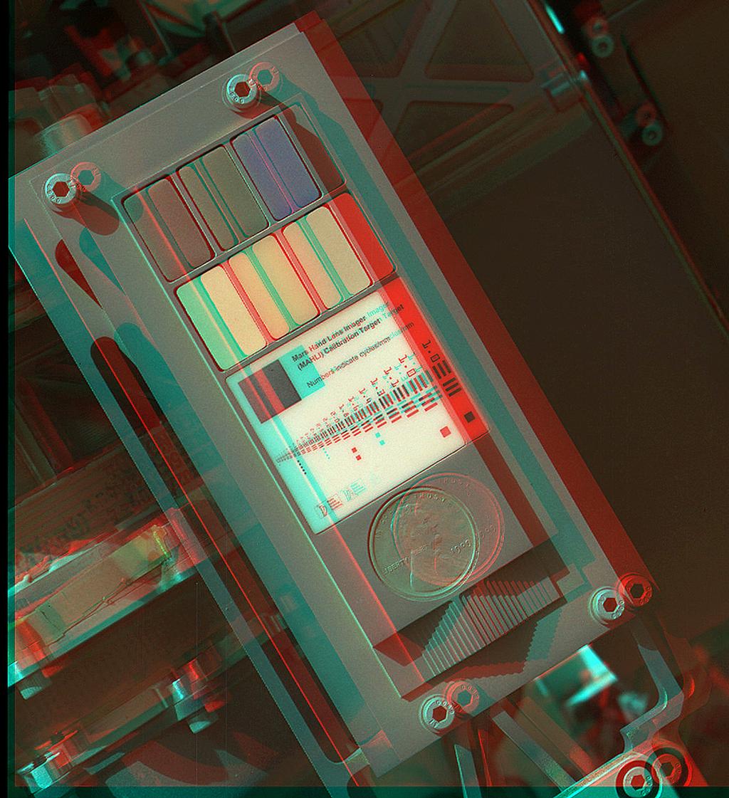
The aim of color calibration is to measure and/or adjust the color response of a device (input or output) to a known state.[1] In International Color Consortium (ICC) terms, this is the basis for an additional color characterization of the device and later profiling.[2] In non-ICC workflows, calibration sometimes refers to establishing a known relationship to a standard color space[3] in one go. The device that is to be calibrated is sometimes known as a calibration source; the color space that serves as a standard is sometimes known as a calibration target.[citation needed] Color calibration is a requirement for all devices taking an active part in a color-managed workflow and is used by many industries, such as television production, gaming, photography, engineering, chemistry, medicine, and more.

Information flow and output distortion

[edit]

Input data can come from device sources like digital cameras, image scanners, or any other measuring devices. Those inputs can be either monochrome (in which case only the response curve needs to be calibrated, though in a few select cases, one must also specify the color or spectral power distribution that that single channel corresponds to) or specified in multidimensional color, most commonly in the three-channel red-green-blue model. Input data is, in most cases, calibrated against a profile connection space (PCS).[4]

One of the most important factors to consider when dealing with color calibration is having a valid source. If the color measuring source does not match the display's capabilities, the calibration will be ineffective and give false readings.

The main distorting factors on the input stage stem from the amplitude nonlinearity of the channel responses, and in the case of a multidimensional datastream, the non-ideal wavelength responses of the individual color separation filters, most commonly a color filter array, in combination with the spectral power distribution of the scene illumination.

After this, the data is often circulated in the system and translated into a working space RGB for viewing and editing.

In the output stage, when exporting to a viewing device such as a cathode ray tube, liquid crystal display screen, or digital projector, the computer sends a signal to the computer's graphic card in the form of RGB [Red, Green, Blue]. The dataset [255,0,0] signals only a device instruction, not a specific color. This instruction [R,G,B]=[255,0,0] then causes the connected display to show Red at the maximum achievable brightness [255], while the Green and Blue components of the display remain dark [0]. The resultant color being displayed, however, depends on two main factors:

  • the phosphors or another system actually producing a light that falls inside the red spectrum;
  • the overall brightness of the color, resulting in the desired color perception: an extremely bright light source will always be seen as white, irrespective of spectral composition.

Hence, every output device will have its own unique color signature, displaying a certain color according to manufacturing tolerances and material deterioration through use and age. If the output device is a printer, additional distorting factors are the qualities of a particular batch of paper and ink.

The conductive qualities and standards-compliance of connecting cables, circuitry, and equipment can also alter the electrical signal at any stage in the signal flow. (A partially inserted VGA connector can result in a monochrome display, for example, as some pins are not connected.)

Color perception

[edit]
Display adjustment process on DisplayCAL, here adjusting white point

Color perception is subject to ambient light levels, and the ambient white point; for example, a red object looks black in blue light. It is therefore not possible to achieve calibration that will make a device look correct and consistent in all capture or viewing conditions. The computer display and calibration target will have to be considered in controlled, predefined lighting conditions.

Calibration techniques and procedures

[edit]
Calibration Target of the "Mars Hand Lens Imager (MAHLI)" on the Mars Curiosity rover (September 9, 2012) (3-D image)

The most common form of calibration aims at adjusting cameras, scanners, monitors, and printers for photographic reproduction. The aim is that a printed copy of a photograph appears identical in saturation and dynamic range to the original or a source file on a computer display. This means that three independent calibrations need to be performed:

  • The camera or scanner needs a device-specific calibration to represent the original's estimated colors in an unambiguous way.
  • The computer display needs a device-specific calibration to reproduce the colors of the image color space.
  • The printer needs a device-specific calibration to reproduce the colors of the image color space.

These goals can either be realized via direct value translation from source to target, or by using a common known reference color space as middle ground. In the most commonly used color profile system, ICC, this is known as the PCS or "Profile Connection Space".

Camera

[edit]

The camera calibration needs a known calibration target to be photographed and the resulting output from the camera to be converted to color values. A correction profile can then be built using the difference between the camera result values and the known reference values. When two or more cameras need to be calibrated relatively to each other, to reproduce the same color values, the technique of color mapping can be used.

Scanner

[edit]
An IT8.7 Target by LaserSoft Imaging

For creating a scanner profile it needs a target source, such as an IT8-target, an original with many small color fields, which was measured by the developer with a photometer. The scanner reads this original and compares the scanned color values with the target's reference values. Taking the differences of these values into account an ICC profile is created, which relates the device-specific color space (RGB color space) to a device-independent color space (L*a*b* color space). Thus, the scanner is able to output with color fidelity to what it reads.

Display

[edit]
Color calibration of a monitor using ColorHug2, an open source colorimeter, placed on the screen

For calibrating the monitor a colorimeter is attached flat to the display's surface, shielded from all ambient light. The calibration software sends a series of color signals to the display and compares the values that were actually sent against the readings from the calibration device. This establishes the current offsets in color display. Depending on the calibration software and type of monitor used, the software either creates a correction matrix (i.e. an ICC profile) for color values before being sent to the display or gives instructions for altering the display's brightness/contrast and RGB values through the OSD. This tunes the display to reproduce fairly accurately the in-gamut part of a desired color space. The calibration target for this kind of calibration is that of print stock paper illuminated by D65 light at 120 cd/m2.

Printer

[edit]

The ICC profile for a printer is created by comparing a test print result using a photometer with the original reference file. The test chart contains known CMYK colors, whose offsets to their actual L*a*b* colors scanned by the photometer result in an ICC profile. Another possibility to ICC profile a printer is to use a calibrated scanner as the measuring device for the printed CMYK test chart instead of a photometer. A calibration profile is necessary for each printer/paper/ink combination.

See also

[edit]

References

[edit]
Revisions and contributorsEdit on WikipediaRead on Wikipedia
from Grokipedia
Color calibration is the process of measuring and adjusting the color characteristics of imaging devices, such as monitors, printers, scanners, and cameras, to ensure they accurately reproduce colors according to predefined standards, thereby achieving consistency across the color reproduction workflow.[1][2] This adjustment typically involves hardware tools like colorimeters or spectrophotometers to assess device performance against a reference color space, followed by software-based corrections to align the device's output with international standards.[3] In the broader context of color management, calibration serves as a foundational step to minimize discrepancies in color perception caused by varying device gamuts—the range of colors each device can produce or display.[4] It enables reliable color transfer from image capture through editing and output, which is essential in fields like digital photography, graphic design, and commercial printing to prevent costly errors such as mismatched proofs or unintended color shifts.[1][5] The process often integrates with the International Color Consortium (ICC) framework, where calibration data informs the creation of ICC profiles—standardized files that describe a device's color behavior and facilitate conversions between device-dependent color spaces (e.g., a printer's CMYK) and device-independent spaces (e.g., CIE XYZ or sRGB).[6][4] Key standards like sRGB for web and displays, or Adobe RGB for professional photography, provide benchmarks for calibration, ensuring interoperability across vendors and applications.[7][8] Common methods include hardware calibration for precision in professional environments and software-based tools for general use, with ongoing advancements focusing on wide-gamut displays and automated profiling to handle modern high-dynamic-range content.[3]

Fundamentals of Color Calibration

Definition and Purpose

Color calibration is the process of measuring and adjusting the color response of imaging devices, including displays, printers, cameras, and scanners, to a known standard, ensuring consistent and accurate color reproduction across different devices and output media.[2][9] Specifically for displays, without calibration, colors can distort due to screen aging, where components such as the backlight and LCD panel degrade over time, altering luminance and color gamut, or due to factory settings that often fail to account for manufacturing variations, graphics card differences, and user-specific setups.[10][11] Calibration addresses these issues by adjusting parameters and creating an ICC profile—a file that characterizes the display's color output—to match displayed colors to standards like sRGB.[10][12] This involves setting device parameters such as white point, gamma, and luminance to align outputs with predefined specifications, often followed by profiling to characterize the device's color behavior.[2][13] Software tools like Datacolor Spyder, Calibrite PROFILER, and DisplayCAL guide this process by measuring color patches and generating ICC profiles, as outlined in their manufacturer documentation.[12][14][15] The primary purpose of color calibration is to minimize discrepancies in color perception arising from variations in device manufacturing, environmental lighting conditions, and operational tolerances, thereby enabling precise color representation in professional applications.[16] In fields such as photography and graphic design, it ensures that colors captured or designed on one device appear faithfully on another, preventing mismatches between digital previews and final prints.[17][18] For medical imaging, calibration maintains display stability over time and uniformity across systems, which is critical for accurate diagnosis from color-encoded visuals like endoscopy or histopathology slides.[5] Color calibration emerged prominently in the 1990s alongside the rise of digital imaging technologies, with a key milestone being the 1993 founding of the International Color Consortium (ICC) by eight industry vendors to standardize color management systems.[19] The ICC developed open, vendor-neutral profiles that facilitate color data translation between devices, addressing the need for cross-platform consistency in an increasingly digital workflow.[19] A fundamental metric in color calibration is the Delta E (ΔE) value in CIELAB color space, which quantifies the perceptual difference between a device's output and a reference color:
ΔE=(ΔL)2+(Δa)2+(Δb)2 \Delta E = \sqrt{(\Delta L^*)^2 + (\Delta a^*)^2 + (\Delta b^*)^2}
Here, ΔL* represents the difference in lightness, Δa* the red-green axis shift, and Δb* the yellow-blue axis shift; values below 1 indicate differences imperceptible to the human eye, guiding adjustments for accuracy.[16] Calibration often targets standard color spaces such as sRGB for broad compatibility.[13]

Importance in Imaging and Reproduction

Color calibration plays a pivotal role in prepress printing by ensuring accurate and consistent color reproduction across devices, enabling reliable proofs that match final outputs and minimizing discrepancies between digital designs and printed materials.[20] In digital photography, it maintains color fidelity from camera capture through editing and printing, producing true-to-life images that preserve the intended aesthetic and details.[21] For web design, calibration achieves consistent color appearance across diverse devices and screens, preventing variations that could alter user experience or brand perception.[22] In scientific visualization, such as satellite imagery and medical scans, it is essential to ensure correct color and intensity representation, avoiding misinterpretation of data like vegetation health in remote sensing or tissue anomalies in diagnostics.[23][5] The benefits of color calibration extend to operational efficiencies in production pipelines, where it reduces rework by streamlining processes and minimizing trial-and-error adjustments, thereby lowering material waste and operating costs.[24][25] It enhances viewer trust in media by ensuring displayed colors are reliable and accurate, fostering confidence in the authenticity of visual content from photographs to videos.[26] In e-commerce, inaccurate depiction of colors in product images contributes to returns; for instance, 22% of returns are due to products appearing different from their images, frequently because of color discrepancies.[27][28] A notable case in the transition to digital workflows occurred in medical imaging post-2000s, where uncalibrated displays in digital pathology led to inconsistent color rendering across scanners, causing diagnostic errors and necessitating rescans or re-evaluations. Calibration addressed this by standardizing outputs, thereby improving diagnostic consistency across systems. In the graphic arts industry, calibration via standards like those from the International Digital Enterprise Alliance (IDEAlliance) supports cost savings by enhancing efficiency; for instance, implementing G7 methodology reduces waste in time and resources during multi-platform printing.[29] Overall, these practices can reduce production time by optimizing color matching and minimizing errors in standardized printing workflows.[25] Color spaces, such as sRGB or CMYK, further define reproduction accuracy by providing a standardized framework for these calibrated processes.[22]

Color Science Prerequisites

Color Models and Spaces

Color models provide mathematical frameworks for representing colors in digital imaging and reproduction systems. Device-dependent models, such as RGB and CMYK, are tied to specific hardware characteristics and mixing principles. The RGB model employs additive color mixing, where red, green, and blue primaries combine to produce a wide range of colors suitable for displays like monitors and projectors.[30] In contrast, the CMYK model uses subtractive mixing with cyan, magenta, yellow, and black inks, primarily for printing processes where colors are formed by absorbing light from a white substrate.[31] Device-independent models, including CIE XYZ and CIELAB, aim to describe colors based on human visual response rather than device specifics, facilitating consistent representation across different media. The CIE XYZ model, established in 1931, serves as a foundational tristimulus space derived from experimental data on color matching functions.[4] CIELAB, developed in 1976, builds on XYZ to create a perceptually uniform space using lightness (L*) and opponent color dimensions (a* for red-green, b* for yellow-blue), which is widely used in color difference calculations.[32] Specific color spaces instantiate these models with defined primaries, white points, and gamma curves to standardize color reproduction. The sRGB space, introduced in 1996 and formalized in IEC 61966-2-1, defines a standard RGB gamut optimized for web and consumer displays, assuming a D65 illuminant and a gamma of approximately 2.2 for efficient encoding.[33] Adobe RGB (1998), developed by Adobe Systems, extends the gamut beyond sRGB—covering about 50% more colors in the green and cyan regions—to better support professional printing workflows with high-fidelity color reproduction.[34] ProPhoto RGB, originally designed by Kodak for digital photography, offers an even larger gamut that encompasses nearly the entire visible spectrum, making it ideal for high-end capture and editing where preserving subtle tonal variations is critical, though it requires 16-bit depth to avoid banding.[35] Conversions between these spaces, particularly from device-dependent RGB to device-independent XYZ, rely on linear transformation matrices derived from the primaries' chromaticities and white point. For sRGB, the forward RGB-to-XYZ matrix is:

$$ \begin{pmatrix} X \ Y \ Z \end{pmatrix}

\begin{pmatrix} 0.4124 & 0.3576 & 0.1805 \ 0.2126 & 0.7152 & 0.0722 \ 0.0193 & 0.1192 & 0.9505 \end{pmatrix} \begin{pmatrix} R \ G \ B \end{pmatrix} $$ where R, G, B are linear values (after gamma correction), and the matrix coefficients reflect sRGB's primaries under the D65 white point.[36] The gamut of a color space refers to the three-dimensional volume of colors it can represent within the CIE XYZ framework, bounded by the primaries and white point. Larger gamuts, like those in Adobe RGB or ProPhoto RGB, allow for richer color reproduction but introduce challenges during cross-space workflows.[37] Gamut clipping occurs when colors from a source space exceed the destination gamut, requiring mapping techniques to compress or remap out-of-gamut hues while minimizing perceptual distortion, such as desaturation or hue shifts.[38] A key concept in these frameworks is the white point, which defines the neutral reference for color balancing during calibration. The D65 standard, simulating average daylight with a correlated color temperature of 6500 K, is widely adopted as the illuminant in spaces like sRGB and Adobe RGB to ensure consistent achromatic reproduction across devices.[39] This choice aligns with typical viewing conditions in imaging pipelines, providing a stable benchmark for gamut definitions and transformations.[40]

Metamerism and Color Constancy

Metamerism refers to the phenomenon in which two colors with different spectral power distributions appear identical under one illuminant but differ under another, arising from the selective absorption and reflection of wavelengths by materials.[41] This occurs because human vision and typical tristimulus measurements integrate spectral data into three values (red, green, blue), masking underlying differences in composition.[42] There are two primary types: illuminant metamerism, where colors match under one light source but mismatch under a different one due to varying spectral outputs, and observer metamerism, which stems from inter-individual variations in spectral sensitivity, leading to different color matches among viewers.[43][44] Metamerism can be quantified using indices in the CIELAB color space, which calculate differences in perceived color under reference illuminants.[45] Color constancy is the perceptual mechanism by which the human visual system maintains stable color appearance for objects despite changes in illumination, such as perceiving a white surface as white even under yellowish light.[46] This adjustment compensates for shifts in the spectral composition of light, ensuring that object colors correlate reliably with their intrinsic reflectance properties across illuminants.[47] A key computational model for color constancy is the von Kries adaptation, proposed in 1902 and refined over time, which assumes independent scaling of cone responses (long-wavelength L, medium-wavelength M, and short-wavelength S) to normalize for illuminant changes.[48][49] Under this model, post-adaptation cone responses are obtained by multiplying the original responses by a factor derived from the ratio of target to source illuminant white points for each cone type.[50] Mathematically, for a cone response $ R $ (where $ R $ represents L, M, or S), the adapted response $ R' $ is given by:
R=R×DtargetDsource R' = R \times \frac{D_{\text{target}}}{D_{\text{source}}}
applied separately to each cone's response, with $ D_{\text{target}} $ and $ D_{\text{source}} $ as the illuminant values for that cone.[51] This diagonal transformation stabilizes color signals but does not fully account for all perceptual effects.[52] In color calibration, metamerism and imperfect color constancy pose significant challenges, as tristimulus values alone cannot predict appearance shifts across illuminants, necessitating full spectral measurements to capture power distributions for accurate matching.[53] For instance, fabric dyes calibrated to match under D50 daylight simulation may exhibit visible mismatches when viewed under fluorescent lighting, due to differing emission spectra that reveal metameric pairs.[54] Such discrepancies underscore the need for spectral-based workflows in industries like textiles and imaging to ensure consistency beyond standardized viewing conditions.[55]

Human Visual Perception

Physiology of Color Vision

Human color vision is mediated by the retina's photoreceptor cells, primarily through the trichromatic theory, which posits that perception arises from three types of cone cells sensitive to different wavelength ranges. These include long-wavelength-sensitive (L) cones peaking at approximately 564 nm (corresponding to reddish hues), medium-wavelength-sensitive (M) cones peaking at 534 nm (greenish hues), and short-wavelength-sensitive (S) cones peaking at 420 nm (bluish hues).[56] The overlapping spectral sensitivities of these cones enable the encoding of a wide spectrum of colors via differential activation.[57] Complementing the trichromatic mechanism, the opponent process theory describes how color information is processed post-receptorially through antagonistic channels: red-green, blue-yellow, and black-white. This organization, originally proposed by Ewald Hering, accounts for phenomena such as negative afterimages and the impossibility of perceiving reddish-green or bluish-yellow simultaneously.[58] Color blindness variants, like protanomaly, result from defects in L-cone function, disrupting the red-green opponent channel and leading to confusion between reds and greens.[59] The retina also contains rods, which are far more numerous (about 120 million versus 6-7 million cones) but lack color sensitivity, functioning primarily for achromatic vision in low-light conditions (scotopic vision).[60] Cones dominate in the fovea centralis, the region of highest visual acuity, where their high density (up to 200,000 per mm²) supports photopic color vision and fine spatial resolution.[61] Individual variations in color vision arise from genetic and age-related factors. Approximately 8% of males exhibit red-green color deficiency due to X-linked inheritance affecting cone opsins, compared to 0.5% of females.[59] With aging, the crystalline lens yellows, absorbing shorter wavelengths and shifting perception toward warmer tones, which impairs discrimination of blues and violets.[62]

Perceptual Factors in Calibration

Perceptual factors play a crucial role in color calibration by influencing how humans judge and interpret colors beyond mere physical measurements, ensuring that calibrated outputs align with subjective visual experiences. These factors arise from the interaction between the visual system's processing—rooted briefly in cone cell responses to light wavelengths—and contextual elements, leading to variations in perceived color that must be accounted for in calibration workflows. For instance, calibration targets often incorporate adjustments for such effects to minimize discrepancies between device-rendered colors and human perception. Simultaneous contrast is a key perceptual phenomenon where the appearance of a color is altered by adjacent colors, causing a target color to shift in hue, lightness, or saturation due to induction from its surroundings. A classic example is a gray patch appearing lighter when placed against a black background than against a white one, as the surrounding luminance influences the perceived relative brightness. This effect extends to chromatic interactions, where surrounding colors induce complementary shifts in the target. Complementing this, the Helmholtz-Kohlrausch effect describes how highly saturated colors are perceived as brighter than achromatic stimuli of equivalent luminance, with the perceived brightness increasing nonlinearly with saturation, particularly pronounced in bluish hues. These interactions necessitate calibration profiles that simulate contextual environments to predict and correct for perceptual shifts in imaging applications. Memory color bias further complicates calibration, as observers tend to perceive familiar objects with hues closer to their prototypical or expected colors rather than their actual measured values, even in neutral viewing setups. For example, human skin tones are often idealized toward warmer, more saturated yellows or pinks in memory, leading to adjustments in calibration for photographic or display reproduction to match these expectations. This bias interacts with chromatic adaptation, where prolonged exposure to specific viewing conditions, such as varying surround luminance, shifts sensitivity to maintain color constancy, making a color appear more neutral after adaptation to a dominant illuminant. Calibration processes thus incorporate adaptation models to normalize these cognitive influences, ensuring consistency across sessions. Standardized viewing conditions are essential to mitigate environmental perceptual variations during calibration evaluation. The ISO 3664 standard specifies conditions for graphic arts, including the use of CIE standard illuminant D50 at 2000 lux (±500 lux) illumination, with controlled surround and uniformity to replicate daylight for accurate color assessment.[63] Additionally, the Color Rendering Index (CRI) evaluates light sources by comparing their ability to render a set of test colors relative to a reference illuminant, with values closer to 100 indicating higher fidelity in revealing subtle hue differences. These metrics guide calibration by standardizing the perceptual context, reducing observer variability. The just-noticeable difference (JND) quantifies the smallest perceptible change in color, approximated by Weber's law, which posits that the detectable difference is proportional to the stimulus magnitude. In color science, this translates to a ΔE value (using metrics like CIEDE2000) below 1 typically being imperceptible to the human eye under controlled conditions, serving as a threshold for acceptable calibration accuracy in systems where perceptual uniformity is paramount.

Calibration Methods and Tools

General Workflow

The general workflow for color calibration establishes a standardized process to ensure accurate color reproduction across imaging and reproduction systems. It begins with preparing a controlled environment to minimize external influences on measurements, followed by characterizing the device's behavior, adjusting it to a reference standard, and verifying the results. This iterative approach refines accuracy by repeating measurements and adjustments as needed to achieve perceptual uniformity.[64][18] The first step involves environment control, where ambient lighting is dimmed or neutralized to prevent reflections and color casts that could skew readings, and temperature is stabilized to avoid thermal drift in device performance. Daylight or colored surroundings must be excluded, as they significantly alter perceived colors during assessment.[65][66] Next, device profiling measures the system's response curve by capturing output data from a series of test patches, creating a characterization of its current color behavior without altering it. This differs from calibration, which actively adjusts the device to match a predefined standard like sRGB or Adobe RGB; profiling provides the data model for those adjustments, often using instruments such as colorimeters for precise spectral analysis. Spectrophotometers may also be referenced briefly for high-accuracy profiling in controlled setups. The process is iterative, with repeated profiling after adjustments to confirm improvements in fidelity.[64][18][67] Target selection follows, choosing reference patterns like gray ramps to evaluate and correct gamma, which defines the tonal transition from black to white. These targets ensure the device aligns with industry norms, such as gamma 2.2 for standard viewing conditions.[68] Adjustment then applies corrections via Look-Up Tables (LUTs) for real-time mapping or ICC profiles to transform input signals, embedding the characterization data into the system for consistent output.[69][70] Finally, validation uses test patterns, such as color bars or gamma verification grids, to measure deviations and confirm the calibration holds, aiming for a color difference metric of ΔE < 2 in professional workflows, where values below this threshold are imperceptible to the trained eye. Common pitfalls include neglecting warm-up periods of 15-30 minutes, which stabilizes output, and using outdated drivers that introduce inconsistencies in color rendering.[71][11][72]

Hardware and Software Tools

Hardware tools for color calibration primarily include colorimeters and spectrophotometers, which measure light output or reflection to create device profiles. Colorimeters, such as the X-Rite i1Display Pro (now rebranded as Calibrite ColorChecker Display), function by filtering light into RGB channels to assess display luminance and chromaticity, enabling accurate profiling for monitors and projectors with high precision across various screen technologies.[73][74] However, colorimeters are limited to emissive surfaces and cannot perform full spectral analysis, potentially introducing errors from filter mismatches or metamerism effects under different viewing conditions.[75][76] Spectrophotometers provide more comprehensive spectral data by capturing the full wavelength distribution of light, making them suitable for reflective surfaces like printed materials. The Eye-One series (now evolved into X-Rite's i1Pro), for instance, measures spectral reflectance from printers and other output devices to generate ICC profiles that account for ink and substrate variations.[77][78] Their limitations include slower measurement times compared to colorimeters and higher sensitivity to ambient light, requiring controlled environments for reliability.[79] Integrating spheres complement these by ensuring uniform illumination during measurements; they diffuse light across a reflective inner surface to eliminate directional biases, providing consistent backlighting for targets in display or print profiling setups.[80][81] Software tools facilitate the analysis and application of hardware measurements to build calibration profiles. DisplayCAL, an open-source platform, integrates with colorimeters via Argyll CMS to offer versatile monitor profiling, supporting hardware calibration and verification reports for precise white point and gamma adjustments.[15] Adobe Color Management Module (CMM) in Creative Cloud suites, such as Photoshop and Premiere Pro, handles ICC-based transformations to maintain color consistency across workflows, embedding profiles directly into documents for cross-application fidelity.[82][83] For printers, utilities like Canon's ColorSync integration allow selection of device-specific profiles or system-level color matching, bypassing double profiling to ensure accurate output rendering.[84] Calibration targets standardize measurements across tools. The Macbeth ColorChecker, introduced in the 1970s as a 24-patch chart with painted samples representing natural colors and grays, serves as a benchmark for evaluating device reproduction accuracy due to its stable, matte finish and known spectral properties.[85][86] Synthetic gradients, such as grayscale ramps or color sweeps, assess uniformity by revealing inconsistencies like banding or tint shifts in displays and prints, aiding in the detection of spatial variations without physical charts.[87][88] Recent advancements include AI-assisted tools emerging post-2020 for automated profiling, which use machine learning to optimize color corrections from spectral data, reducing manual iterations in applications like pathology imaging.[89] Portable USB spectrometers, such as compact models from X-Rite or Thorlabs, enhance field usability by connecting directly to laptops for on-the-go measurements, though they trade some lab-grade precision for mobility.[90][91] These tools integrate into broader workflows by generating profiles that align devices with standardized color spaces.

Device-Specific Techniques

Display Calibration

Display calibration involves adjusting monitors and televisions to reproduce colors accurately according to established standards, ensuring consistency with input signals and human perception. Without proper calibration, colors can distort due to factors such as screen aging, where components like the backlight and LCD panel degrade over time, leading to shifts in luminance, color temperature, and gamut, or due to inaccurate factory settings, which are often optimized for showroom appeal rather than precise color accuracy. Calibration addresses these issues by creating an ICC profile, a file that describes the monitor's color reproduction characteristics, enabling the color management system to match displayed colors to established standards like sRGB or DCI-P3. Software tools such as Datacolor Spyder, Calibrite PROFILER, and DisplayCAL are commonly used, often in conjunction with a colorimeter, to measure the display and generate these ICC profiles.[10][92][93][94][15] The process typically begins by setting key parameters such as the white point to D65 (approximately 6500K) to match daylight illumination, gamma to 2.2 for sRGB compatibility, and luminance to around 120 cd/m² to suit typical editing environments without causing eye strain.[95][96] These targets align the display's output with industry norms for digital imaging and video production.[18] The calibration procedure employs test patterns to fine-tune black levels and color balance. For black level adjustment, patterns like PLUGE (Picture Line-Up Generator for Exacting) or near-black gradients are displayed, allowing users to set brightness so that subtle dark shades are visible without crushing details into pure black. Color balance is achieved using color bars or sweeps, where red, green, and blue channels are adjusted to eliminate tints and achieve neutral grays at various intensities. This workflow, applied to emissive displays, relies on hardware sensors or external colorimeters for precise measurements.[97][98] Hardware-specific considerations differ between technologies like LCD and OLED. LCD panels, often using LED backlights, can achieve good color accuracy but may suffer from backlight bleed affecting black levels. In contrast, OLED displays provide superior black reproduction by individually controlling pixels, enabling infinite contrast ratios, though they carry a risk of burn-in from prolonged static test patterns during calibration. Professional monitors, such as the Eizo ColorEdge series, support hardware calibration through internal 16-bit look-up tables (LUTs), which directly adjust the panel's electronics for more stable and repeatable results compared to software-only methods. Hardware calibration is particularly important for wide-gamut displays to ensure Delta E values below 1-1.3 for precise color reproduction, preventing oversaturation or mismatch with target devices like DCI-P3 displays; out-of-box modes are often vivid-biased, requiring tools like X-Rite i1Display Pro for professional accuracy in editing workflows.[99][100][101][102][73][103] For televisions, professional calibration is particularly recommended to achieve natural image quality with neutral and accurate colors, optimize brightness for HDR content and viewing in bright rooms, ensure deep black tones and high contrast without detail loss, and fully support HDR formats including Dolby Vision. This process uses specialized equipment to fine-tune settings like white balance and color space, aligning the TV's output with studio standards for a more realistic viewing experience.[104][105] Challenges in display calibration include panel-type limitations and environmental factors. TN (Twisted Nematic) panels exhibit significant color and gamma shifts at off-axis viewing angles, making uniform calibration difficult for multi-user setups. Many modern displays incorporate ambient light compensation modes, which dynamically adjust luminance and white point based on room lighting to maintain perceived accuracy, though these require verification to avoid overcompensation.[106][107] Verification ensures the calibration's effectiveness through tools like softproofing in Adobe Photoshop, where a profile simulates output on another device to check color fidelity. Uniformity across the screen is assessed by measuring color deviation with ΔE metrics, targeting values below 1 for professional work, indicating imperceptible differences from the ideal.[108]

Multi-Monitor and Collaborative Calibration

Multi-monitor setups, common in professional editing workstations, often exhibit color discrepancies between screens even if identical models, due to panel variations, backlight differences, and independent drift over time. Calibration addresses this by profiling each display individually to common targets (e.g., D65/6500K white point, 120 cd/m² brightness, 2.2 gamma) using hardware colorimeters and software like DisplayCAL or vendor tools. For perceptual matching beyond numerical targets, manual OSD adjustments (brightness, contrast, RGB gains) may supplement ICC profiles, especially when metamerism causes shifts under shared lighting. In collaborative contexts—design teams, post-production houses, or remote contributors—consistent calibration ensures all members see comparable results, minimizing feedback loops from perceived differences. Teams benefit from agreed standards, reference images for verification, and color-managed applications (Adobe suite, DaVinci Resolve) that honor profiles, reducing errors in shared files and improving efficiency across local or distributed workflows.

Printer Calibration

Printer calibration ensures consistent color reproduction on output devices such as inkjet and laser printers by adjusting for variations in ink application, substrate properties, and device behavior to match intended color specifications.[109] This process is essential in subtractive color systems like CMYK, where inks absorb light to form images, and involves both hardware maintenance and software-driven adjustments to achieve predictable results across print runs.[110] The calibration procedure begins with linearization of ink channels, which corrects nonlinear responses in ink deposition to ensure even tone reproduction from input signals to output densities.[110] For inkjet printers, nozzle checks are performed to detect and clear clogs in print heads, printing test patterns that reveal missing or deflected ink droplets for immediate cleaning.[111] Media-specific profiles are then created or selected, accounting for differences in paper types; for instance, glossy papers support wider color gamuts and higher gloss compared to matte papers, requiring tailored ICC profiles to optimize ink laydown and color accuracy.[112] Raster Image Processor (RIP) software is utilized for halftoning, converting continuous-tone images into dot patterns that simulate shades, with algorithms adjusted during calibration to minimize banding and ensure uniform halftone dot gain.[113] Ink and paper interactions are addressed through gamut mapping for CMYK printing, which compresses or expands color ranges to fit the printer's reproducible gamut while preserving perceptual uniformity.[114] Overprint simulation verifies how overlapping inks blend, preventing unintended color shifts in multi-layer prints.[115] Density measurements using densitometers quantify ink film thickness and dot area, guiding adjustments to solid ink density and tone value increase for consistent output.[31] Spectrophotometers may be referenced briefly for spectral ink profiling to refine these measurements.[31] Challenges in printer calibration include ink drying time, which can alter measured densities if prints are evaluated before full stabilization, leading to inaccurate profiles.[116] Substrate variability, such as differing absorption rates in recycled papers due to fiber composition and porosity, further complicates uniformity, as higher absorption can cause ink bleeding or reduced color vibrancy.[117] Standards like SWOP (Specifications for Web Offset Publications) provide guidelines for press matching in offset printing, specifying ink densities, paper types, and proofing tolerances to ensure color consistency across production.[118] Post-2010, workflows have shifted toward PDF/X standards, such as PDF/X-4, which support advanced color management and device-independent data exchange for streamlined prepress processes.[119]

Input Device Calibration

Input device calibration ensures that devices such as digital cameras and scanners accurately capture color information from real-world scenes, minimizing distortions introduced by sensor characteristics and optical systems. This process involves adjusting the device's response to light and color to align with standardized color spaces, enabling faithful reproduction of scene colors in digital form. For cameras, calibration targets the raw sensor data to correct for variations in illumination and sensor sensitivity, while for scanners, it addresses uniformity and artifact removal in reflective or transmissive captures. Camera calibration begins with custom white balance, which compensates for the color temperature of the light source by adjusting the gains of red, green, and blue channels in the raw RGB data to neutralize casts, such as those from tungsten or daylight lighting. This step is typically performed by photographing a neutral gray card under the target illumination and computing scalar multipliers for each channel to map it to achromatic values. Following white balance, lens shading correction addresses vignetting and cosine-fourth falloff at image edges, often using a pixel-wise multiplicative correction matrix derived from uniform field captures to restore even illumination across the sensor plane. RAW profiling further refines color accuracy by characterizing the camera's spectral sensitivity using standardized charts like the X-Rite ColorChecker, which contains 24 swatches of known colors. The process involves capturing the chart under controlled D50 lighting, then deriving a color correction matrix or lookup table that transforms the camera's raw RGB values to a device-independent space like CIE XYZ, thereby helping to reduce metamerism errors in typical workflows. For exposure control, histogram matching analyzes the distribution of tonal values in the captured image against a reference histogram from a calibrated exposure, adjusting gain or integration time to optimize dynamic range utilization without clipping highlights or losing shadow detail. Scanner calibration focuses on achieving uniform response across the scan bed, particularly for flatbed models where LED illumination can vary laterally, leading to density gradients. Uniformity correction involves scanning a blank white target and applying a flat-field division to normalize pixel values, ensuring consistent brightness and color across the field with deviations reduced to under 2%. IT8 targets, such as the IT8.7/1 reflective or IT8.7/2 transmissive charts, are used to calibrate the density range by measuring the scanner's response to a series of gray steps and color patches, enabling the creation of input device profiles that extend the effective dynamic range to match the target's 2.4D max density while maintaining colorimetric accuracy within ΔE < 3 units. Dust and Newton ring removal are critical post-capture corrections in scanner workflows; dust appears as speckles from particles on the platen or film, mitigated by software algorithms like adaptive thresholding that detect and inpaint anomalies based on local variance, while Newton rings—interference patterns from film-scanner glass contact—are prevented using anti-Newton glass or fluid mounting and removed via frequency-domain filtering that suppresses circular moiré patterns. Key challenges in input device calibration include sensor noise in low-light conditions, where thermal and shot noise amplify in underexposed shadows, degrading signal-to-noise ratios below 20 dB and requiring noise models for subtraction during RAW processing. Dynamic range limitations arise from the analog-to-digital converter (ADC) bit depth; for instance, a 12-bit ADC provides approximately 12 stops of range (about 72 dB), insufficient for high-contrast scenes, whereas 14-bit ADCs extend this to 14 stops (84 dB), allowing better preservation of subtle tones but increasing data volume and processing demands. Additionally, flare from lens elements scatters stray light, compressing the dynamic range by up to 2 stops in bright-field scenarios and necessitating veiling glare subtraction models calibrated with uniform light sources. In cinema applications, digital negatives from cameras like the ARRI Alexa and RED Epic, introduced post-2010, incorporate DCP-compliant profiles adhering to SMPTE standards for wide-gamut color spaces such as DCI-P3, ensuring captured RAW data supports high-dynamic-range (up to 16 stops) encoding for Digital Cinema Packages with minimal color shifts during post-production conform.

Standards and Advanced Topics

Color Management Systems

Color management systems (CMS) provide an integrated framework for maintaining color consistency across the entire imaging workflow, from device capture to final output. The International Color Consortium (ICC) framework serves as the foundational standard, defining profiles that characterize color behavior for input devices like scanners and cameras, display devices such as monitors, and output devices including printers.[6] These profiles enable transformations between device-specific color spaces and a device-independent Profile Connection Space (PCS), typically CIE XYZ or CIE LAB, to ensure accurate color reproduction.[120] ICC profiles can be embedded directly into image files to preserve color intent throughout processing and sharing. For instance, in TIFF files, profiles are stored using specific tags that allow applications to interpret and apply the embedded color data without loss.[121] To handle gamut mismatches during color conversions, CMS employs rendering intents, which dictate how out-of-gamut colors are mapped. The perceptual intent simulates the overall color appearance by compressing the source gamut into the destination, preserving relative relationships for natural-looking results, while relative colorimetric intent clips out-of-gamut colors to the nearest in-gamut equivalent and preserves white point neutrality for precise reproduction.[122] In practical workflows, CMS integrates these profiles to link capture, editing, and output stages seamlessly. Open-source libraries like Little CMS facilitate end-to-end color management by applying ICC transformations from input profiles (e.g., camera RAW) through display proofing to print output, supporting high-performance conversions in applications ranging from image editors to browsers.[123] For proofing, raster image processors (RIPs) such as Fiery XF incorporate CMS to simulate final print results on displays or proof printers, using device links and spot color handling to verify consistency before production runs.[124] Despite their effectiveness, CMS face limitations that can impact usability. Embedded ICC profiles contribute to file bloat, as larger profiles increase storage demands and transmission times, particularly in workflows with multiple high-fidelity profiles.[125] Cross-platform inconsistencies arise due to differing operating system implementations; for example, Windows relies on the Color Management Module (CMM) for ICC handling, while macOS uses ColorSync, leading to variations in profile application and gamut mapping that may alter color appearance between systems.[126] Post-2020 developments have shifted toward cloud-based CMS for enhanced collaboration. Adobe Creative Cloud, for instance, enables synchronized color settings across applications via Adobe Bridge, allowing teams to share calibrated profiles and maintain consistency in distributed workflows without manual profile exchanges.[127]

Industry Standards and Profiles

The International Color Consortium (ICC) developed the ICC profile format as a standardized way to describe color characteristics of devices and viewing conditions. Version 2 (v2) of the ICC profile specification was first published in June 1994 and finalized in April 2001 as ICC.1:2001-04, establishing the foundational structure for color management profiles. Version 4 (v4), introduced in December 2001 as ICC.1:2001-12 and later updated to version 4.4 in 2022, enhanced functionality by reducing ambiguities, adding support for parametric curves, and enabling better handling of wide-gamut colors while maintaining backward compatibility with v2 profiles.[128][129] ICC profiles employ a tag-based structure to encode color transformations, with key elements including the A2B (device to PCS, or appearance) and B2A (PCS to device) tags that facilitate bidirectional color conversions. These tags typically incorporate lookup tables (LUTs) for multi-dimensional interpolation, 3x3 matrices for linear transformations, and tone reproduction curves (TRCs) to model device behavior across different rendering intents, such as perceptual or relative colorimetric. Validation of ICC profiles is supported by tools like the ICC Profile Inspector, a free utility that examines header information, tag tables, and data integrity to ensure compliance with the specification, though it focuses on structural verification rather than full functional testing.[130][131] Sector-specific standards build on these profiles to ensure consistent color reproduction in printing. In European offset printing, FOGRA's ProcessStandard Offset (PSO) certification aligns with the ISO 12647 series, standardizing parameters from data preparation to final output using certified inks, papers, and testing methods to achieve color-reliable production across over 300 certified facilities in more than 50 countries. For US offset printing, the GRACoL specification from Idealliance defines reference conditions for sheet-fed processes using ISO 12647-2 compliant CMYK inks, including expanded gamut options with orange, green, and violet (OGV) for seven-color printing on coated substrates like clay coated news back (CCNB). The ISO 12647 standard itself provides comprehensive process control for half-tone color separations and production prints in offset lithography, specifying parameters such as ink densities, dot gains, and trapping for sheet-fed and web-fed applications on various substrates, including packaging materials. Pantone's Matching System (PMS) serves as a proprietary standard for spot colors, offering a universal numbering system (e.g., PMS 185 C) with over 9,000 reproducible colors to maintain brand consistency in graphics, packaging, and print without relying solely on process CMYK.[132][133][134][135] In the 2020s, standards have evolved to address wide-gamut capabilities and sustainability. ISO 12646:2015 specifies conformance levels for display characteristics in color proofing, emphasizing uniformity and electro-optical stability to support soft proofing of wide-gamut images, with a 2022 review confirming its relevance for modern high-fidelity displays. Sustainability efforts include the adoption of vegetable-based inks in printing standards, which reduce volatile organic compound (VOC) emissions and environmental impact while maintaining color stability, as seen in formulations that minimize ink consumption by up to 50% without compromising gamut.[136][137] Certification programs ensure adherence to these standards across devices. The G7 methodology, defined in ANSI/CGATS TR 015 by Idealliance, provides a device-independent calibration approach using the neutral print density curve (NPDC) and gray balance targets to achieve visual similarity in grayscale and color reproduction, applicable to proofing, offset, and digital presses. G7 certification qualifies experts and workflows for proof-to-press matching, integrating with ISO standards through metrics like ISO 12647-7 control wedges. Automated compliance is facilitated by tools such as the ICC Profile Inspector, which supports expert-level verification of profile integrity in production environments.[138][131]

References

User Avatar
No comments yet.