

Community hub
Recent from talks
Contribute something
Nothing was collected or created yet.
Visual analytics
View on Wikipedia |
| Information mapping |
|---|
| Topics and fields |
| Node–link approaches |
|
| See also |
Visual analytics is a multidisciplinary science and technology field that emerged from information visualization and scientific visualization. It focuses on how analytical reasoning can be facilitated by interactive visual interfaces.[1]
Overview
[edit]Visual analytics is "the science of analytical reasoning facilitated by interactive visual interfaces."[2] It can address problems whose size, complexity, and need for closely coupled human and machine analysis may make them otherwise intractable.[3] Visual analytics advances scientific and technological development across multiple domains, including analytical reasoning, human–computer interaction, data transformations, visual representation for computation and analysis, analytic reporting, and the transition of new technologies into practice.[4] As a research agenda, visual analytics brings together several scientific and technical communities from computer science, information visualization, cognitive and perceptual sciences, interactive design, graphic design, and social sciences.
Visual analytics integrates new computational and theory-based tools with innovative interactive techniques and visual representations to enable human-information discourse. The design of the tools and techniques is based on cognitive, design, and perceptual principles. This science of analytical reasoning provides the reasoning framework upon which one can build both strategic and tactical visual analytics technologies for threat analysis, prevention, and response. Analytical reasoning is central to the analyst's task of applying human judgments to reach conclusions from a combination of evidence and assumptions.[2]
Visual analytics has some overlapping goals and techniques with information visualization and scientific visualization. There is currently no clear consensus on the boundaries between these fields, but broadly speaking the three areas can be distinguished as follows:
- Scientific visualization deals with data that has a natural geometric structure (e.g., MRI data, wind flows).
- Information visualization handles abstract data structures such as trees or graphs.
- Visual analytics is especially concerned with coupling interactive visual representations with underlying analytical processes (e.g., statistical procedures, data mining techniques) such that high-level, complex activities can be effectively performed (e.g., sense making, reasoning, decision making).
Visual analytics seeks to marry techniques from information visualization with techniques from computational transformation and analysis of data. Information visualization forms part of the direct interface between user and machine, amplifying human cognitive capabilities in six basic ways:[2][5]
- by increasing cognitive resources, such as by using a visual resource to expand human working memory,
- by reducing search, such as by representing a large amount of data in a small space,
- by enhancing the recognition of patterns, such as when information is organized in space by its time relationships,
- by supporting the easy perceptual inference of relationships that are otherwise more difficult to induce,
- by perceptual monitoring of a large number of potential events, and
- by providing a manipulable medium that, unlike static diagrams, enables the exploration of a space of parameter values
These capabilities of information visualization, combined with computational data analysis, can be applied to analytic reasoning to support the sense-making process.
History
[edit]As an interdisciplinary approach, visual analytics has its roots in information visualization, cognitive sciences, and computer science. The term and scope of the field was defined in the early 2000s through researchers such as Jim Thomas, Kristin A. Cook, John Stasko, Pak Chung Wong, Daniel A. Keim and David S. Ebert. As a reaction to the September 11, 2001 attacks the United States Department of Homeland Security was established in late 2002, combining dozens of previously separated government agencies. Building upon earlier work on visual data mining by Daniel A. Keim starting in th elate 1990s, this simultaneously lead to the development of a research agenda for visual analytics. [6] [7] As part of these efforts the National Visualization and Analytics Center (NVAC) at Pacific Northwest National Laboratory was established in 2004, whose charter was to develop system to mitigate information overload after the September 11, 2001 attacks in the intelligence community. Their research work determined core challenges, posed open research questions, and positioned visual analytics as a new research domain, in particular through the 2005 research agenda Illuminating the Path.[2] In 2006, the IEEE VIS community led by Pak Chung Wong and Daniel A. Keim launched the annual IEEE Conference on Visual Analytics Science and Technology (VAST), providing a dedicated venue for research into visual analytics, which in 2020 merged to form the IEEE Visualization conference. In 2008, scope and challenges of visual analytics were conceptually defined by Daniel A. Keim and Jim Thomas in their influential book about visual data mining.[8] The domain was further refined as part of the European Commissions FP7 VisMaster program in the late 2000s.[9]
Topics
[edit]Scope
[edit]Visual analytics is a multidisciplinary field that includes the following focus areas:[2]
- Analytical reasoning techniques that enable users to obtain deep insights that directly support assessment, planning, and decision making
- Data representations and transformations that convert all types of conflicting and dynamic data in ways that support visualization and analysis
- Techniques to support production, presentation, and dissemination of the results of an analysis to communicate information in the appropriate context to a variety of audiences.
- Visual representations and interaction techniques[10] that take advantage of the human eye's broad bandwidth pathway into the mind to allow users to see, explore, and understand large amounts of information at once.
Analytical reasoning techniques
[edit]Analytical reasoning techniques are the method by which users obtain deep insights that directly support situation assessment, planning, and decision making. Visual analytics must facilitate high-quality human judgment with a limited investment of the analysts’ time. Visual analytics tools must enable diverse analytical tasks such as:[2]
- Understanding past and present situations quickly, as well as the trends and events that have produced current conditions
- Identifying possible alternative futures and their warning signs
- Monitoring current events for emergence of warning signs as well as unexpected events
- Determining indicators of the intent of an action or an individual
- Supporting the decision maker in times of crisis.
These tasks will be conducted through a combination of individual and collaborative analysis, often under extreme time pressure. Visual analytics must enable hypothesis-based and scenario-based analytical techniques, providing support for the analyst to reason based on the available evidence.[2]
Data representations
[edit]Data representations are structured forms suitable for computer-based transformations. These structures must exist in the original data or be derivable from the data themselves. They must retain the information and knowledge content and the related context within the original data to the greatest degree possible. The structures of underlying data representations are generally neither accessible nor intuitive to the user of the visual analytics tool. They are frequently more complex in nature than the original data and are not necessarily smaller in size than the original data. The structures of the data representations may contain hundreds or thousands of dimensions and be unintelligible to a person, but they must be transformable into lower-dimensional representations for visualization and analysis.[2]
Theories of visualization
[edit]Theories of visualization include:[3]
- Jacques Bertin's Semiology of Graphics (1967)
- Nelson Goodman's Languages of Art (1977)
- Jock D. Mackinlay's Automated design of optimal visualization (APT) (1986)
- Leland Wilkinson's Grammar of Graphics (1998)
- Hadley Wickham's Layered Grammar of Graphics (2010)
Visual representations
[edit]Visual representations translate data into a visible form that highlights important features, including commonalities and anomalies. These visual representations make it easy for users to perceive salient aspects of their data quickly. Augmenting the cognitive reasoning process with perceptual reasoning through visual representations permits the analytical reasoning process to become faster and more focused.[2]
-
 Bar chart representing the relative distribution of job satisfaction
 -
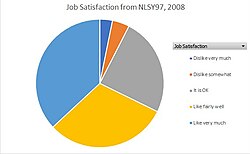 Pie chart representing the relative distribution of job satisfaction according to the National Longitudinal Survey of Youth, 1997 cohort, survey year 2008


Process
[edit]The input for the data sets used in the visual analytics process are heterogeneous data sources (i.e., the internet, newspapers, books, scientific experiments, expert systems). From these rich sources, the data sets S = S1, ..., Sm are chosen, whereas each Si , i ∈ (1, ..., m) consists of attributes Ai1, ..., Aik. The goal or output of the process is insight I. Insight is either directly obtained from the set of created visualizations V or through confirmation of hypotheses H as the results of automated analysis methods. This formalization of the visual analytics process is illustrated in the following figure. Arrows represent the transitions from one set to another one.
More formally the visual analytics process is a transformation F: S → I, whereas F is a concatenation of functions f ∈ {DW, VX, HY, UZ} defined as follows:
DW describes the basic data pre-processing functionality with DW : S → S and W ∈ {T, C, SL, I} including data transformation functions DT, data cleaning functions DC, data selection functions DSL and data integration functions DI that are needed to make analysis functions applicable to the data set.
VW, W ∈ {S, H} symbolizes the visualization functions, which are either functions visualizing data VS : S → V or functions visualizing hypotheses VH : H → V.
HY, Y ∈ {S, V} represents the hypotheses generation process. We distinguish between functions that generate hypotheses from data HS : S → H and functions that generate hypotheses from visualizations HV : V → H.
Moreover, user interactions UZ, Z ∈ {V, H, CV, CH} are an integral part of the visual analytics process. User interactions can either effect only visualizations UV : V → V (i.e., selecting or zooming), or can effect only hypotheses UH : H → H by generating a new hypotheses from given ones. Furthermore, insight can be concluded from visualizations UCV : V → I or from hypotheses UCH : H → I.
The typical data pre-processing applying data cleaning, data integration and data transformation functions is defined as DP = DT(DI(DC(S1, ..., Sn))). After the pre-processing step either automated analysis methods HS = {fs1, ..., fsq} (i.e., statistics, data mining, etc.) or visualization methods VS : S → V, VS = {fv1, ..., fvs} are applied to the data, in order to reveal patterns as shown in the figure above.[11]
In general the following paradigm is used to process the data:
Analyse First – Show the Important – Zoom, Filter and Analyse Further – Details on Demand[8]
See also
[edit]Related subjects
[edit]Related scientists
[edit]Related software
[edit]- imc FAMOS (1987), graphical data analysis
References
[edit]- ^ Pak Chung Wong and J. Thomas (2004). "Visual Analytics". in: IEEE Computer Graphics and Applications, Volume 24, Issue 5, Sept.-Oct. 2004 Page(s): 20–21.
- ^ a b c d e f g h i James J. Thomas and Kristin A. Cook (Ed.) (2005). Illuminating the Path: The R&D Agenda for Visual Analytics National Visualization and Analytics Center.
- ^ a b Robert Kosara (2007). Visual Analytics. ITCS 4122/5122, Fall 2007. Retrieved 28 June 2008.
- ^ Kielman, J. and Thomas, J. (Guest Eds.) (2009). "Special Issue: Foundations and Frontiers of Visual Analytics". in: Information Visualization, Volume 8, Number 4, Winter 2009 Page(s): 239-314.
- ^ Stuart Card, J.D. Mackinlay, and Ben Shneiderman (1999). "Readings in Information Visualization: Using Vision to Think". Morgan Kaufmann Publishers, San Francisco.
- ^ Keim, Daniel A. (2001). "Visual exploration of large data sets". Communications of the ACM, 44(8), p. 38-44.
- ^ Perl, Raphael (2004). "The Department of Homeland Security: Background and Challenges", Terrorism—reducing Vulnerabilities and Improving Responses, Committee on Counterterrorism Challenges for Russia and the United States, Office for Central Europe and Eurasia Development, Security, and Cooperation Policy and Global Affairs, in Cooperation with the Russian Academy of Sciences, page 176. National Academies Press. ISBN 0-309-08971-9.
- ^ a b Keim D A, Mansmann F, Schneidewind J, Thomas J, Ziegler H: Visual analytics: Scope and challenges. Visual Data Mining: 2008, S. 82.
- ^ EU Cordis: VisMaster - Visual Analytics - Mastering the Information Age (2008-2010)
- ^ A. Kerren and F. Schreiber. Toward the Role of Interaction in Visual Analytics. In Proceedings of the 2012 Winter Simulation Conference (WSC '12), pages 420:1-420:13, Berlin, Germany, 2012. IEEE Computer Society Press.
- ^ Daniel A. Keim, Florian Mansmann, Jörn Schneidewind, Jim Thomas, and Hartmut Ziegler (2008). "Visual Analytics: Scope and Challenges"
Further reading
[edit]- Boris Kovalerchuk and James Schwing (2004). Visual and Spatial Analysis: Advances in Data Mining, Reasoning, and Problem Soving
- Guoping Qiu (2007). Advances in Visual Information Systems: 9th International Conference (VISUAL).
- IEEE, Inc. Staff (2007). Visual Analytics Science and Technology (VAST), A Symposium of the IEEE 2007.
- May Yuan, Kathleen and Stewart Hornsby (2007). Computation and Visualization for Understanding Dynamics in Geographic Domains.
- Daniel Keim, Gennady Andrienko, Jean-Daniel Fekete, Carsten Görg, Jörn Kohlhammer, and Guy Melançon (2008). Visual Analytics: Definition, Process, and Challenges. In Andreas Kerren, John T. Stasko, Jean-Daniel Fekete, and Chris North (Eds.), Information Visualization - Human-Centered Issues and Perspectives, pages 154–175, Lecture Notes in Computer Science 4950, Springer Berlin Heidelberg.
- Mastering the Visualization Age: Solving Problems with Visual Analytics (2010) (pdf)
- Kawa Nazemi (2014). Adaptive Semantics Visualization. Eurographics Association [1]. TU Darmstadt Dissertation. Eurographics.
External links
[edit] Media related to Visual analytics at Wikimedia Commons