

Community hub
Recent from talks
Contribute something
Nothing was collected or created yet.
Misleading graph
View on Wikipedia.png)
| Part of a series on Statistics |
| Data and information visualization |
|---|
 |
| Major dimensions |
| Important figures |
| Information graphic types |
| Related topics |
In statistics, a misleading graph, also known as a distorted graph, is a graph that misrepresents data, constituting a misuse of statistics and with the result that an incorrect conclusion may be derived from it.
Graphs may be misleading by being excessively complex or poorly constructed. Even when constructed to display the characteristics of their data accurately, graphs can be subject to different interpretations, or unintended kinds of data can seemingly and ultimately erroneously be derived.[1]
Misleading graphs may be created intentionally to hinder the proper interpretation of data or accidentally due to unfamiliarity with graphing software, misinterpretation of data, or because data cannot be accurately conveyed. Misleading graphs are often used in false advertising. One of the first authors to write about misleading graphs was Darrell Huff, publisher of the 1954 book How to Lie with Statistics.
Data journalist John Burn-Murdoch has suggested that people are more likely to express scepticism towards data communicated within written text than data of similar quality presented as a graphic, arguing that this is partly the result of the teaching of critical thinking focusing on engaging with written works rather than diagrams, resulting in visual literacy being neglected. He has also highlighted the concentration of data scientists in employment by technology companies, which he believes can result in the hampering of the evaluation of their visualisations due to the proprietary and closed nature of much of the data they work with.[2]
The field of data visualization describes ways to present information that avoids creating misleading graphs.
Misleading graph methods
[edit][A misleading graph] is vastly more effective, however, because it contains no adjectives or adverbs to spoil the illusion of objectivity, there's nothing anyone can pin on you.
— How to Lie with Statistics (1954)[3]
There are numerous ways in which a misleading graph may be constructed.[4]
Excessive usage
[edit]The use of graphs where they are not needed can lead to unnecessary confusion/interpretation.[5] Generally, the more explanation a graph needs, the less the graph itself is needed.[5] Graphs do not always convey information better than tables.[6]
Biased labeling
[edit]The use of biased or loaded words in the graph's title, axis labels, or caption may inappropriately prime the reader.[5][7]
Fabricated trends
[edit]Similarly, attempting to draw trend lines through uncorrelated data may mislead the reader into believing a trend exists where there is none. This can be both the result of intentionally attempting to mislead the reader or due to the phenomenon of illusory correlation.
Pie chart
[edit]- Comparing pie charts of different sizes could be misleading as people cannot accurately read the comparative area of circles.[8]
- The usage of thin slices, which are hard to discern, may be difficult to interpret.[8]
- The usage of percentages as labels on a pie chart can be misleading when the sample size is small.[9]
- Making a pie chart 3D or adding a slant will make interpretation difficult due to distorted effect of perspective.[10] Bar-charted pie graphs in which the height of the slices is varied may confuse the reader.[10]
Comparing pie charts
[edit]Comparing data on barcharts is generally much easier. In the image below, it is very hard to tell where the blue sector is bigger than the green sector on the piecharts.

3D Pie chart slice perspective
[edit]A perspective (3D) pie chart is used to give the chart a 3D look. Often used for aesthetic reasons, the third dimension does not improve the reading of the data; on the contrary, these plots are difficult to interpret because of the distorted effect of perspective associated with the third dimension. The use of superfluous dimensions not used to display the data of interest is discouraged for charts in general, not only for pie charts.[11] In a 3D pie chart, the slices that are closer to the reader appear to be larger than those in the back due to the angle at which they're presented.[12] This effect makes readers less performant in judging the relative magnitude of each slice when using 3D than 2D [13]
Comparison of pie charts Misleading pie chart Regular pie chart 


Item C appears to be at least as large as Item A in the misleading pie chart, whereas in actuality, it is less than half as large. Item D looks a lot larger than item B, but they are the same size.
Edward Tufte, a prominent American statistician, noted why tables may be preferred to pie charts in The Visual Display of Quantitative Information:[6]
Tables are preferable to graphics for many small data sets. A table is nearly always better than a dumb pie chart; the only thing worse than a pie chart is several of them, for then the viewer is asked to compare quantities located in spatial disarray both within and between pies – Given their low data-density and failure to order numbers along a visual dimension, pie charts should never be used.
Improper scaling of pictograms
[edit]Using pictograms in bar graphs should not be scaled uniformly, as this creates a perceptually misleading comparison.[14] The area of the pictogram is interpreted instead of only its height or width.[15] This causes the scaling to make the difference appear to be squared.[15]
Improper scaling of 2D pictogram in a bar graph Improper scaling Regular Comparison 


In the improperly scaled pictogram bar graph, the image for B is actually 9 times as large as A.
2D shape scaling comparison Square Circle Triangle 


The perceived size increases when scaling.
The effect of improper scaling of pictograms is further exemplified when the pictogram has 3 dimensions, in which case the effect is cubed.[16]

The graph of house sales (left) is misleading. It appears that home sales have grown eightfold in 2001 over the previous year, whereas they have actually grown twofold. Besides, the number of sales is not specified.
An improperly scaled pictogram may also suggest that the item itself has changed in size.[17]
Misleading Regular 


Assuming the pictures represent equivalent quantities, the misleading graph shows that there are more bananas because the bananas occupy the most area and are furthest to the right.
Confusing use of logarithmic scaling
[edit]Logarithmic (or log) scales are a valid means of representing data. But when used without being clearly labeled as log scales or displayed to a reader unfamiliar with them, they can be misleading. Log scales put the data values in terms of a chosen number (often 10) to a particular power. For example, log scales may give a height of 1 for a value of 10 in the data and a height of 6 for a value of 1,000,000 (106) in the data. Log scales and variants are commonly used, for instance, for the volcanic explosivity index, the Richter scale for earthquakes, the magnitude of stars, and the pH of acidic and alkaline solutions. Even in these cases, the log scale can make the data less apparent to the eye. Often the reason for the use of log scales is that the graph's author wishes to display vastly different scales on the same axis. Without log scales, comparing quantities such as 1000 (103) versus 109 (1,000,000,000) becomes visually impractical. A graph with a log scale that was not clearly labeled as such, or a graph with a log scale presented to a viewer who did not know logarithmic scales, would generally result in a representation that made data values look of similar size, in fact, being of widely differing magnitudes. Misuse of a log scale can make vastly different values (such as 10 and 10,000) appear close together (on a base-10 log scale, they would be only 1 and 4). Or it can make small values appear to be negative due to how logarithmic scales represent numbers smaller than the base.
Misuse of log scales may also cause relationships between quantities to appear linear whilst those relationships are exponentials or power laws that rise very rapidly towards higher values. It has been stated, although mainly in a humorous way, that "anything looks linear on a log-log plot with thick marker pen" .[18]
Comparison of linear and logarithmic scales for identical data Linear scale Logarithmic scale 


.png)
Both graphs show an identical exponential function of f(x) = 2x. The graph on the left uses a linear scale, showing clearly an exponential trend. The graph on the right, however uses a logarithmic scale, which generates a straight line. If the graph viewer were not aware of this, the graph would appear to show a linear trend.
Truncated graph
[edit]A truncated graph (also known as a torn graph) has a y axis that does not start at 0. These graphs can create the impression of important change where there is relatively little change.
While truncated graphs can be used to overdraw differences or to save space, their use is often discouraged. Commercial software such as MS Excel will tend to truncate graphs by default if the values are all within a narrow range, as in this example. To show relative differences in values over time, an index chart can be used. Truncated diagrams will always distort the underlying numbers visually. Several studies found that even if people were correctly informed that the y-axis was truncated, they still overestimated the actual differences, often substantially.[19]
Truncated bar graph Truncated bar graph Regular bar graph 
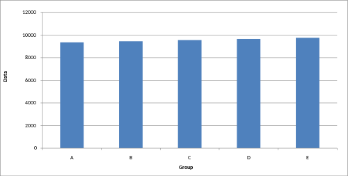


These graphs display identical data; however, in the truncated bar graph on the left, the data appear to show significant differences, whereas, in the regular bar graph on the right, these differences are hardly visible.
There are several ways to indicate y-axis breaks:
Indicating a y-axis break 


Axis changes
[edit]Changing y-axis maximum Original graph Smaller maximum Larger maximum 


Changing the y-axis maximum affects how the graph appears. A higher maximum will cause the graph to appear to have less volatility, less growth, and a less steep line than a lower maximum.
Changing ratio of graph dimensions Original graph Half-width, twice the height Twice width, half-height


Changing the ratio of a graph's dimensions will affect how the graph appears.
More egregiously, a graph may use different Y axes for different data sets, which makes the comparison between the sets misleading (the following graph uses a distinct Y axis for the "U.S." only, making it seem as though the U.S. has been overtaken by China in military expenditures, when it actually spends much more):

A graph that uses a distinct Y-axis for one of its many lines

No scale
[edit]The scales of a graph are often used to exaggerate or minimize differences.[20][21]
Misleading bar graph with no scale Less difference More difference 


The lack of a starting value for the y axis makes it unclear whether the graph is truncated. Additionally, the lack of tick marks prevents the reader from determining whether the graph bars are properly scaled. Without a scale, the visual difference between the bars can be easily manipulated.
Misleading line graph with no scale Volatility Steady, fast growth Slow growth 


Though all three graphs share the same data, and hence the actual slope of the (x, y) data is the same, the way that the data is plotted can change the visual appearance of the angle made by the line on the graph. This is because each plot has a different scale on its vertical axis. Because the scale is not shown, these graphs can be misleading.
Improper intervals or units
[edit]The intervals and units used in a graph may be manipulated to create or mitigate change expression.[12]
Omitting data
[edit]Graphs created with omitted data remove information from which to base a conclusion.
Scatter plot with missing categories Scatter plot with missing categories Regular scatter plot 


In the scatter plot with missing categories on the left, the growth appears to be more linear with less variation.
In financial reports, negative returns or data that do not correlate with a positive outlook may be excluded to create a more favorable visual impression.[citation needed]
3D
[edit]The use of a superfluous third dimension, which does not contain information, is strongly discouraged, as it may confuse the reader.[10]
-
 The third dimension may confuse readers.[10]
 -
 The blue column in the front appears larger than the green column in the back due to perspective, despite having the same value.
 -
 When scaling in three dimensions, the effect of the change is cubed.


Complexity
[edit]Graphs are designed to allow easier interpretation of statistical data. However, graphs with excessive complexity can obfuscate the data and make interpretation difficult.
Poor construction
[edit]Poorly constructed graphs can make data difficult to discern and thus interpret.
Extrapolation
[edit]Misleading graphs may be used in turn to extrapolate misleading trends.[22]
Measuring distortion
[edit]Several methods have been developed to determine whether graphs are distorted and to quantify this distortion.[23][24]
Lie factor
[edit]
where

A graph with a high lie factor (>1) would exaggerate change in the data it represents, while one with a small lie factor (>0, <1) would obscure change in the data.[25] A perfectly accurate graph would exhibit a lie factor of 1.
Graph discrepancy index
[edit]
where


The graph discrepancy index, also known as the graph distortion index (GDI), was originally proposed by Paul John Steinbart in 1998. GDI is calculated as a percentage ranging from −100% to positive infinity, with zero percent indicating that the graph has been properly constructed and anything outside the ±5% margin is considered to be distorted.[23] Research into the usage of GDI as a measure of graphics distortion has found it to be inconsistent and discontinuous, making the usage of GDI as a measurement for comparisons difficult.[23]
Data-ink ratio
[edit]
The data-ink ratio should be relatively high. Otherwise, the chart may have unnecessary graphics.[25]
Data density
[edit]
The data density should be relatively high, otherwise a table may be better suited for displaying the data.[25]
Usage in finance and corporate reports
[edit]Graphs are useful in the summary and interpretation of financial data.[26] Graphs allow trends in large data sets to be seen while also allowing the data to be interpreted by non-specialists.[26][27]
Graphs are often used in corporate annual reports as a form of impression management.[28] In the United States, graphs do not have to be audited, as they fall under AU Section 550 Other Information in Documents Containing Audited Financial Statements.[28]
Several published studies have looked at the usage of graphs in corporate reports for different corporations in different countries and have found frequent usage of improper design, selectivity, and measurement distortion within these reports.[28][29][30][31][32][33][34] The presence of misleading graphs in annual reports has led to requests for standards to be set.[35][36][37]
Research has found that readers with poor levels of financial understanding have a greater chance of being misinformed by misleading graphs.[38] Those with financial understanding, such as loan officers, may still be misled.[35]
Academia
[edit]The perception of graphs is studied in psychophysics, cognitive psychology, and computational visions.[39]
See also
[edit]References
[edit]- ^ Kirk, p. 52
- ^ Burn-Murdoch, John (24 July 2013). "Why you should never trust a data visualisation". theguardian.com. Retrieved 18 April 2025.
- ^ Huff, p. 63
- ^ Nolan, pp. 49–52
- ^ a b c "Methodology Manual: Data Analysis: Displaying Data - Deception with Graphs" (PDF). Texas State Auditor's Office. Jan 4, 1996. Archived from the original on 2003-04-02.
{{cite web}}: CS1 maint: bot: original URL status unknown (link) - ^ a b Tufte, Edward R. (2006). The visual display of quantitative information (4th print, 2nd ed.). Cheshire, Conn.: Graphics Press. p. 178. ISBN 9780961392147.
- ^ Keller, p. 84
- ^ a b Whitbread, p. 150
- ^ Soderstrom, Irina R. (2008), Introductory Criminal Justice Statistics, Waveland Press, p. 17, ISBN 9781478610342.
- ^ a b c d Whitbread, p. 151
- ^ Few, Stephen (August 2007). "Save the Pies for Dessert" (PDF). Visual Business Intelligence Newsletter. Perceptual Edge. Retrieved 28 June 2012.
- ^ a b Rumsey, p. 156.
- ^ Siegrist, Michael (1996). "The use or misuse of three-dimensional graphs to represent lower-dimensional data". Behaviour & Information Technology. 15 (2): 96–100. doi:10.1080/014492996120300.
- ^ Weiss, p. 60.
- ^ a b Utts, pp. 146–147.
- ^ Hurley, pp. 565–566.
- ^ Huff, p. 72.
- ^ "Akin's Laws of Spacecraft Design". spacecraft.ssl.umd.edu. Retrieved 2021-03-14.
- ^ Hanel, Paul H.P.; Maio, Gregory R.; Manstead, Antony S. R. (2019). "A New Way to Look at the Data: Similarities Between Groups of People Are Large and Important". Journal of Personality and Social Psychology. 116 (4): 541–562. doi:10.1037/pspi0000154. PMC 6428189. PMID 30596430.
- ^ Smith, Karl J. (1 January 2012). Mathematics: Its Power and Utility. Cengage Learning. p. 472. ISBN 978-1-111-57742-1. Retrieved 24 July 2012.
- ^ Moore, David S.; Notz, William (9 November 2005). Statistics: Concepts And Controversies. Macmillan. pp. 189–190. ISBN 978-0-7167-8636-8. Retrieved 24 July 2012.
- ^ Smith, Charles Hugh (29 Mar 2011). "Extrapolating Trends Is Exciting But Misleading". Business Insider. Retrieved 23 September 2018.
- ^ a b c Mather, Dineli R.; Mather, Paul R.; Ramsay, Alan L. (July 2003). "Is the Graph Discrepancy Index (GDI) a Robust Measure?". doi:10.2139/ssrn.556833.
- ^ Mather, Dineli; Mather, Paul; Ramsay, Alan (1 June 2005). "An investigation into the measurement of graph distortion in financial reports". Accounting and Business Research. 35 (2): 147–160. doi:10.1080/00014788.2005.9729670. S2CID 154136880.
- ^ a b c Craven, Tim (November 6, 2000). "LIS 504 - Graphic displays of data". Faculty of Information and Media Studies. London, Ontario: University of Western Ontario. Archived from the original on 24 June 2011. Retrieved 9 July 2012.
- ^ a b Fulkerson, Cheryl Linthicum; Marshall K. Pitman; Cynthia Frownfelter-Lohrke (June 1999). "Preparing financial graphics: principles to make your presentations more effective". The CPA Journal. 69 (6): 28–33.
- ^ McNelis, L. Kevin (June 1, 2000). "Graphs, An Underused Information Presentation Technique". The National Public Accountant. 45 (4): 28–30.[permanent dead link](subscription required)
- ^ a b c Beattie, Vivien; Jones, Michael John (June 1, 1999). "Financial graphs: True and Fair?". Australian CPA. 69 (5): 42–44.
- ^ Beattie, Vivien; Jones, Michael John (1 September 1992). "The Use and Abuse of Graphs in Annual Reports: Theoretical Framework and Empirical Study" (PDF). Accounting and Business Research. 22 (88): 291–303. doi:10.1080/00014788.1992.9729446.
- ^ Penrose, J. M. (1 April 2008). "Annual Report Graphic Use: A Review of the Literature". Journal of Business Communication. 45 (2): 158–180. doi:10.1177/0021943607313990. S2CID 141123410.
- ^ Frownfelter-Lohrke, Cynthia; Fulkerson, C. L. (1 July 2001). "The Incidence and Quality of Graphics in Annual Reports: An International Comparison". Journal of Business Communication. 38 (3): 337–357. doi:10.1177/002194360103800308. S2CID 167454827.
- ^ Mohd Isa, Rosiatimah (2006). "The incidence and faithful representation of graphical information in corporate annual report: a study of Malaysian companies". Technical Report. Institute of Research, Development and Commercialization, Universiti Teknologi MARA. Archived from the original on 2016-08-15. Also published as: Mohd Isa, Rosiatimah (2006). "Graphical Information in Corporate Annual Report: A Survey of Users and Preparers Perceptions". Journal of Financial Reporting and Accounting. 4 (1): 39–59. doi:10.1108/19852510680001583.
- ^ Beattie, Vivien; Jones, Michael John (1 March 1997). "A Comparative Study of the Use of Financial Graphs in the Corporate Annual Reports of Major U.S. and U.K. Companies" (PDF). Journal of International Financial Management and Accounting. 8 (1): 33–68. doi:10.1111/1467-646X.00016.
- ^ Beattie, Vivien; Jones, Michael John (2008). "Corporate reporting using graphs: a review and synthesis". Journal of Accounting Literature. 27: 71–110. ISSN 0737-4607.
- ^ a b Christensen, David S.; Albert Larkin (Spring 1992). "Criteria For High Integrity Graphics". Journal of Managerial Issues. 4 (1). Pittsburg State University: 130–153. JSTOR 40603924.
- ^ Eakin, Cynthia Firey; Timothy Louwers; Stephen Wheeler (2009). "The Role of the Auditor in Managing Public Disclosures: Potentially Misleading Information in Documents Containing Audited Financial Statements" (PDF). Journal of Forensic & Investigative Accounting. 1 (2). ISSN 2165-3755. Archived from the original (PDF) on 2021-02-24. Retrieved 2012-07-09.
- ^ Steinbart, P. (September 1989). "The Auditor's Responsibility for the Accuracy of Graphs in Annual Reports: Some Evidence for the Need for Additional Guidance". Accounting Horizons: 60–70.
- ^ Beattie, Vivien; Jones, Michael John (2002). "Measurement distortion of graphs in corporate reports: an experimental study" (PDF). Accounting, Auditing & Accountability Journal. 15 (4): 546–564. doi:10.1108/09513570210440595.
- ^ Frees, Edward W; Robert B Miller (Jan 1998). "Designing Effective Graphs" (PDF). North American Actuarial Journal. 2 (2): 53–76. doi:10.1080/10920277.1998.10595699. Archived from the original on 2012-02-16.
{{cite journal}}: CS1 maint: bot: original URL status unknown (link)
Books
[edit]- Huff, Darrell (1954). How to lie with statistics. pictures by Irving Geis (1st ed.). New York: Norton. ISBN 0393052648.
{{cite book}}: ISBN / Date incompatibility (help) - Hurley, Patrick J. (2000). A Concise Introduction to Logic. Wadsworth Publishing. ISBN 9780534520069.
- Keller, Gerald (2011). Statistics for Management and Economics (abbreviated, 9th ed.). Mason, OH: South-Western. ISBN 978-1111527327.
- Kirk, Roger E. (2007). Statistics: An Introduction. Cengage Learning. ISBN 978-0-534-56478-0. Retrieved 28 June 2012.
- Nolan, Susan; Heinzen, Thomas (2011). Statistics for the Behavioral Sciences. Macmillan. ISBN 978-1-4292-3265-4. Retrieved 28 June 2012.
- Rumsey, Deborah (2010). Statistics Essentials For Dummies. John Wiley & Sons. ISBN 978-0-470-61839-4. Retrieved 28 June 2012.
- Weiss, Neil A. (1993). Elementary statistics. Addison-Wesley. ISBN 978-0-201-56640-6. Retrieved 28 June 2012.
- Tufte, Edward (1997). Visual Explanations: Images and Quantities, Evidence and Narrative. Cheshire, CT: Graphics Press. ISBN 978-0961392123.
- Utts, Jessica M. (2005). Seeing through statistics (3rd ed.). Belmont: Thomson, Brooks/Cole. ISBN 9780534394028.
- Wainer, Howard (2000). Visual Revelations: Graphical Tales of Fate and Deception From Napoleon Bonaparte To Ross Perot. Psychology Press. ISBN 978-0-8058-3878-7. Retrieved 19 July 2012.
- Whitbread, David (2001). The design manual (2nd ed.). Sydney: University of New South Wales Press. ISBN 0868406589.
Further reading
[edit]- A discussion of misleading graphs, Mark Harbison, Sacramento City College
- Robbins, Naomi B. (2005). Creating more effective graphs. Hoboken, N.J.: Wiley-Interscience. ISBN 9780471698180.
- Durbin CG, Jr (October 2004). "Effective use of tables and figures in abstracts, presentations, and papers". Respiratory Care. 49 (10): 1233–7. PMID 15447809.
- Goundar, Nadesa (2009). "Impression Management in Financial Reports Surrounding CEO Turnover" (PDF). Masters Dissertation. Unitec Institute of Technology. hdl:10652/1250. Retrieved 9 July 2012.
- Huff, Darrell; Geis, Irving (17 October 1993). How to Lie With Statistics. W. W. Norton & Company. ISBN 978-0-393-31072-6. Retrieved 28 June 2012.
- Bracey, Gerald (2003). "Seeing Through Graphs". Understanding and using education statistics: it's easier than you think. Educational Research Service. ISBN 9781931762267.
- Harvey, J. Motulsky (June 2009). "The Use and Abuse of Logarithmic Axes" (PDF). GraphPad Software Inc. Archived from the original on 2010-11-23.
{{cite web}}: CS1 maint: bot: original URL status unknown (link) - Chandar, N.; Collier, D.; Miranti, P. (15 February 2012). "Graph standardization and management accounting at AT&T during the 1920s". Accounting History. 17 (1): 35–62. doi:10.1177/1032373211424889. S2CID 155069927.
- Mather, Paul; Ramsay, Alan; Steen, Adam (1 January 2000). "The use and representational faithfulness of graphs in Australian IPO prospectuses". Accounting, Auditing & Accountability Journal. 13 (1): 65–83. doi:10.1108/09513570010316144. Archived from the original on 2012-07-09.
- Beattie, Vivien; Jones, Michael John (1996). Financial graphs in corporate annual reports: a review of practice in six countries. London: Institute of Chartered Accounants in England and Wales. ISBN 9781853557071.
- Galliat, Tobias (Summer 2005). "Visualisierung von Informationsräumen" (PDF). Fachhochschule Köln, University of Applied Sciences Cologne. Archived from the original (PDF) on 2006-01-04. Retrieved 9 July 2012.
- Carvalho, Clark R.; McMillan, Michael D. (September 1992). "Graphic Representation in Managerial Decision Making: The Effect of Scale Break on the Dependent Axis" (PDF). AIR FORCE INST OF TECH WRIGHT-PATTERSON AFB OH. Archived (PDF) from the original on April 23, 2019.
- Johnson, R. Rice; Roemmich, R. (October 1980). "Pictures that Lie: The Abuse of Graphs in Annual Reports". Management Accounting: 50–56.
- Davis, Alan J. (1 August 1999). "Bad graphs, good lessons". ACM SIGGRAPH Computer Graphics. 33 (3): 35–38. doi:10.1145/330572.330586. S2CID 31491676. Archived from the original on 2000-03-05.
- Louwers, T.; Radtke, R; Pitman, M. (May–June 1999). "Please Pass the Salt: A Look at Creative Reporting in Annual Reports". Today's CPA: 20–23.
- Beattie, Vivien; Jones, Michael John (May 2001). "A six-country comparison of the use of graphs in annual reports". The International Journal of Accounting. 36 (2): 195–222. doi:10.1016/S0020-7063(01)00094-2.
- Wainer, Howard (1984). "How to Display Data Badly". The American Statistician. 38 (2): 137–147. doi:10.1080/00031305.1984.10483186.
- Lane, David M.; Sándor, Anikó (1 January 2009). "Designing better graphs by including distributional information and integrating words, numbers, and images" (PDF). Psychological Methods. 14 (3): 239–257. doi:10.1037/a0016620. PMID 19719360.
- Campbell, Mary Pat (Feb 2010). "Spreadsheet Issues: Pitfalls, Best Practices, and Practical Tips". Actuarial Practice Forum. Archived from the original on 2019-04-23.
- Arocha, Carlos (May 2011). "Words or Graphs?". The Stepping Stone. Archived from the original on 2019-04-23.
- Raschke, Robyn L.; Steinbart, Paul John (1 September 2008). "Mitigating the Effects of Misleading Graphs on Decisions by Educating Users about the Principles of Graph Design". Journal of Information Systems. 22 (2): 23–52. doi:10.2308/jis.2008.22.2.23.
External links
[edit]Misleading graph
View on GrokipediaDefinition and Principles
Core Definition
A misleading graph is any visual representation of data that distorts, exaggerates, or obscures the true relationships within the data, leading viewers to draw incorrect conclusions about proportions, scales, or trends.[6] This can occur through manipulations such as altered scales or selective omission, violating fundamental standards of accurate data portrayal.[7] Core principles of effective graphing emphasize that visual elements must directly and proportionally reflect the underlying data to avoid deception. For example, the physical measurements on a graph—such as bar heights or line slopes—should correspond exactly to numerical values, without embellishments like varying widths or 3D effects that alter perceived magnitudes.[8] Deception often stems from breaches like non-proportional axes, which compress or expand trends misleadingly, or selective data inclusion that omits context, thereby misrepresenting variability or comparisons.[6] Basic examples illustrate these issues simply: a bar graph with uneven bar widths might make a smaller value appear more significant due to broader visual area, implying false equivalences between categories.[3] Similarly, pie charts exploit cognitive biases, where viewers tend to underestimate acute angles and overestimate obtuse ones, distorting part-to-whole judgments even without intentional alteration.[9] Misleading graphs can be intentional, as in propaganda to sway opinions, or unintentional, resulting from poor design choices that inadvertently amplify errors in perception.[3]Psychological and Perceptual Factors
Human perception of graphs is shaped by fundamental perceptual principles, such as those outlined in Gestalt psychology, which describe how the brain organizes visual information into meaningful wholes. The law of proximity, for instance, leads viewers to group elements that are spatially close, allowing designers to misleadingly cluster data points to imply stronger relationships than exist. Similarly, the principle of continuity can be exploited by aligning elements in a way that suggests false trends, as seen in manipulated line graphs where irregular data is smoothed visually to appear linear. These principles, first articulated in the early 20th century, are inadvertently or intentionally violated in poor graph design to distort interpretation, with studies showing that educating users on them reduces decision-making errors.[10] Cognitive biases further amplify the deceptive potential of graphs by influencing how information is processed and retained. Confirmation bias, the tendency to favor data aligning with preexisting beliefs, causes viewers to overlook distortions in graphs that support their views while scrutinizing those that do not, thereby reinforcing erroneous conclusions. This bias is particularly potent in data visualization, where subtle manipulations like selective highlighting can align with user expectations, leading to uncritical acceptance. Complementing this, the picture superiority effect enhances the persuasiveness of misleading visuals, as people recall images 65% better than text after three days, making distorted graphs more memorable and thus more likely to shape lasting opinions even when inaccurate. In advertising contexts, this effect has been shown to mislead consumers by prioritizing visually compelling but deceptive representations over factual content.[11][12] Visual illusions inherent in graph elements can also lead to systematic misestimations. The Müller-Lyer illusion, where lines flanked by inward- or outward-pointing arrows appear unequal in length despite being identical, applies to graphical displays like charts with angled axes or grid lines, causing viewers to misjudge scales or distances. In graph reading specifically, geometric illusions distort point values based on surrounding line slopes, with observers overestimating heights when lines slope upward and underestimating when downward, an effect persisting across age groups.[13] Empirical research underscores these perceptual vulnerabilities through targeted studies. In three-dimensional graphs, perspective cues can lead to overestimation of bar heights, particularly for foreground elements, due to depth misinterpretation.[14] Eye-tracking investigations reveal that low graph literacy correlates with overreliance on intuitive spatial cues in misleading visuals, with participants fixating longer on distorted features like truncated axes and spending less time on labels, thus heightening susceptibility to deception. High-literacy users, conversely, allocate more gaze to numerical elements, mitigating errors.[15][16]Historical Development
Early Examples
One of the earliest documented instances of graphical representations that could mislead through scaling choices emerged in the late 18th century with William Playfair's pioneering work in statistical visualization. In his 1786 publication The Commercial and Political Atlas, Playfair introduced line graphs to illustrate economic data, such as British trade balances over time, marking the birth of modern time-series charts. However, these innovations inherently involved scaling decisions that projected three-dimensional economic phenomena onto two dimensions, introducing distortions that could alter viewer perceptions of magnitude and trends, as noted in analyses of his techniques.[17] Playfair's atlas, one of the first to compile such graphs systematically, foreshadowed common pitfalls in visual data display.[18] A notable early example of potential visual distortion in specialized charts appeared in 1858 with Florence Nightingale's coxcomb diagrams, also known as rose or polar area charts, used to depict mortality causes during the Crimean War. Nightingale designed these to highlight preventable deaths from disease—accounting for over 16,000 British soldier fatalities—by making the area of each wedge proportional to death rates, with radius scaled accordingly to avoid linear misperception. Despite their persuasive intent to advocate for sanitation reforms, polar area charts in general pose known perceptual challenges, as viewers often misjudge areas by radius rather than true area, potentially exaggerating the visual impact of larger segments. This issue was compounded by contemporary pamphlets accusing Nightingale of inflating death figures, which her diagrams aimed to refute through empirical visualization.[19] In the 19th century, political cartoons and propaganda increasingly incorporated distorted maps and rudimentary graphs to manipulate public opinion, particularly during conflicts like the American Civil War (1861–1865). Cartoonists exaggerated territorial claims or army strengths—such as inflating Confederate forces to demoralize Union supporters—using disproportionate scales and omitted details to evoke fear or bolster recruitment. These tactics built on earlier cartographic traditions, where accidental errors from incomplete surveys had inadvertently misled, but shifted toward deliberate distortions in economic and military reports to influence policy and investment. For instance, pre-war propaganda maps blatantly skewed geographic boundaries to justify expansionism, marking a transition from unintentional inaccuracies in exploratory cartography to intentional graphical persuasion in partisan contexts.[20][21]Evolution in Modern Media
The 20th century marked a significant milestone in the recognition and popularization of misleading graphs through Darrell Huff's 1954 book How to Lie with Statistics, which became a bestseller with more than 500,000 copies sold and illustrated common distortions like manipulated scales and selective data presentation to deceive audiences.[22] This work shifted public and academic awareness toward the ethical pitfalls of statistical visualization, influencing journalism and education by providing accessible examples of how graphs could exaggerate or minimize trends. During World War II, propaganda efforts by various nations incorporated visual distortions to amplify perceived threats or successes, as documented in broader analyses of wartime visual rhetoric.[23] The digital era from the 1980s to the 2000s accelerated the proliferation of misleading graphs with the introduction of user-friendly software like Microsoft Excel in 1985, which included built-in charting tools that often defaulted to formats prone to distortion, such as non-zero starting axes or inappropriate trendlines, enabling non-experts to generate deceptive visuals without rigorous statistical oversight.[24] Scholarly critiques highlighted Excel's statistical flaws, including inaccurate logarithmic fittings and polynomial regressions that could mislead interpretations of data patterns, contributing to widespread use in business reports and media during this period.[25] By the post-2010 era, social media platforms amplified these issues, as algorithms prioritized engaging content, allowing misleading infographics to spread rapidly and reach millions, often outpacing factual corrections.[26] Key events underscored the societal risks of such evolutions. More prominently, during the 2020 COVID-19 pandemic, public health dashboards frequently used logarithmic scales to depict case and death trends, which studies showed confused non-expert audiences by compressing exponential growth and leading to underestimations of severity, affecting policy support and compliance.[27] These scales, while mathematically valid for certain analyses, were often unlabeled or unexplained, exacerbating misinterpretation in real-time reporting.[28] This trend continued into the 2020s, with the rise of AI-generated visuals during events like the 2024 U.S. presidential election introducing new forms of distortion, such as fabricated infographics that mimicked authentic data presentations and spread via social media.[29] The societal impact has been profound, with increased prevalence of misleading infographics on platforms like Twitter (now X) driving viral misinformation campaigns, as seen in health and political debates where distorted graphs garnered higher engagement than accurate ones, eroding trust in data-driven discourse.[26] This amplification has prompted calls for better digital literacy, as false visuals can influence elections, public health responses, and economic decisions on a global scale.[30]Categories of Misleading Techniques
Data Manipulation Methods
Data manipulation methods involve altering, selecting, or presenting the underlying dataset in ways that distort its true representation, often to support a preconceived narrative or agenda. These techniques target the integrity of the data itself, independent of how it is visually rendered, and can lead viewers to erroneous conclusions about trends, relationships, or magnitudes. Unlike visual distortions, which warp legitimate data through scaling or layout, data manipulation undermines the foundational evidence, making detection reliant on access to the complete dataset or statistical scrutiny. Common methods include selective omission, improper extrapolation, biased labeling, and fabrication or artificial smoothing of trends.[11] Omitting data, often termed cherry-picking, occurs when subsets of information are selectively presented to emphasize favorable outcomes while excluding contradictory evidence, thereby concealing overall patterns or variability. For instance, a graph might display only periods of rising temperatures to suggest consistent global warming, ignoring intervals of decline or stabilization that would reveal natural fluctuations. This technique exploits incomplete disclosure, as the absence of omitted data is not immediately apparent, leading audiences to infer continuity or inevitability from the partial view. Research analyzing deceptive visualizations on social media platforms found cherry-picking prevalent, where posters highlight evidence aligning with their claims but omit broader context that would invalidate the inference, such as full time series data showing no net trend.[31][11][32] Extrapolation misleads by extending observed patterns beyond the range of available data, projecting trends that may not hold due to unmodeled changes in underlying processes. A classic case involves applying a linear fit to data that follows an exponential curve, such as projecting constant population growth indefinitely, which overestimates future values as real-world factors like resource limits intervene. In statistical graphing of interactions, end-point extrapolation can falsely imply interaction effects by selecting extreme values outside the data's central tendency, distorting interpretations of moderated relationships. Studies emphasize that such projections generate highly unreliable predictions, as models fitting historical data often diverge sharply once environmental or behavioral shifts occur beyond the observed scope.[33][34] Biased labeling introduces deception through titles, axis descriptions, or annotations that frame the data misleadingly, often implying unsupported causal links or exaggerated significance. For example, a chart showing temporal correlation between two variables might be captioned to suggest causation, such as labeling a rise in ice cream sales alongside drownings as evidence of a direct effect, despite the confounding role of seasonal heat. This method leverages linguistic cues to guide interpretation, overriding the data's actual limitations like lack of controls or confounding variables. Analyses of data visualizations reveal that such labeling fosters false assumptions of causality, particularly in time-series graphs where sequence implies directionality without evidentiary support.[35] Fabricated trends arise from inserting fictitious data points or applying excessive smoothing algorithms to manufacture patterns absent in the original dataset, creating illusory correlations or directions. Smoothing techniques, like aggressive moving averages, can eliminate legitimate noise to fabricate a steady upward trajectory from volatile or flat data, as seen in manipulated economic reports smoothing out recessions to depict uninterrupted growth. While outright fabrication is ethically condemned and rare in peer-reviewed work, subtle alterations like selective data insertion occur in persuasive contexts to bolster claims. Investigations into statistical manipulation highlight how such practices distort meaning, with graphs used to imply trends that evaporate upon inspection of raw data.[36]Visual and Scaling Distortions
Visual and scaling distortions in graphs occur when the representation of data through axes, proportions, or visual elements misrepresents the underlying relationships, even when the data itself is accurate. These techniques exploit human perceptual biases, such as the tendency to judge magnitudes by relative lengths or areas, leading viewers to overestimate or underestimate differences. Research shows that such distortions can significantly alter interpretations, with studies indicating that truncated axes mislead viewers in bar graphs.[37] One common form is the truncated graph, where the y-axis begins above zero, exaggerating small differences between data points. For instance, displaying sales figures from 90 to 100 units on a scale starting at 90 makes a 5-unit increase appear dramatic, potentially misleading audiences about growth rates. Empirical studies confirm that this truncation persistently misleads viewers, with participants significantly overestimating differences compared to full-scale graphs, regardless of warnings.[38][37] Axis changes, such as using non-linear or reversed scales without clear labeling, further distort perceptions. A logarithmic axis, if unlabeled or poorly explained, can make exponential growth appear linear, causing laypeople to underestimate rapid increases; experiments during the COVID-19 pandemic found that logarithmic scales led to less accurate predictions of case growth compared to linear ones.[39] Similarly, reversing the y-axis in line graphs inverts trends, making declines appear as rises, which a meta-analysis identified as one of the most deceptive features, significantly increasing misinterpretation rates in visual tasks.[7][40] Improper intervals or units across multiple graphs enable false comparisons by creating inconsistent visual references. When comparing economic indicators, for example, using a y-axis interval of 10 for one chart and 100 for another can make similar proportional changes appear vastly different, leading to erroneous conclusions about relative performance. Academic analyses highlight that such inconsistencies violate principles of graphical integrity, with viewers showing higher error rates in cross-graph judgments when scales differ without notation.[3][11] Graphs without numerical scales rely solely on relative sizes or positions, amplifying ambiguity and bias. In pictograms or unlabeled bar charts, the absence of axis values forces reliance on visual estimation, which research demonstrates can substantially distort magnitude judgments, as perceptual accuracy decreases without quantitative anchors.[41] This technique, often seen in infographics, assumes data integrity but undermines it through vague presentation, as confirmed in studies on visual deception where scale-less designs consistently produced high rates of perceptual error.[42]Complexity and Presentation Issues
Complexity in graph presentation arises when visualizations incorporate excessive elements that obscure rather than clarify the underlying data. Overloading a single graph with too many variables, such as multiple overlapping lines or datasets without clear differentiation, dilutes key insights and increases cognitive load on the viewer, making it difficult to discern primary trends.[43] This issue is exacerbated by intricate designs featuring unnecessary decorative elements, often termed "chartjunk," which include gratuitous colors, patterns, or 3D effects that distract from the data itself. Such elements not only reduce the graph's informational value but can also lead to misinterpretation, as they prioritize aesthetic appeal over analytical precision.[43] Poor construction further compounds these problems by introducing practical flaws that hinder accurate reading. Misaligned axes, for instance, can shift the perceived position of data points, while unclear legends—lacking explicit variable identification or using ambiguous symbols—force viewers to guess at meanings, potentially leading to erroneous conclusions.[43] Low-resolution rendering, common in digital or printed formats, blurs fine details like tick marks or labels, amplifying errors in data extraction. These construction shortcomings, often stemming from hasty design or inadequate tools, undermine the graph's reliability without altering the data.[43] Even appropriate scaling choices, such as logarithmic axes, can mislead if not adequately explained. Logarithmic scales compress large values and expand small ones, which is useful for exponential data but distorts lay judgments of growth rates and magnitudes when viewers lack familiarity with the transformation. Empirical studies during the COVID-19 pandemic demonstrated that logarithmic graphs led to underestimation of case increases, reduced perceived threat, and lower support for interventions compared to linear scales, with effects persisting even among educated audiences unless clear explanations were provided.[44] To mitigate this, logarithmic use requires explicit labeling and contextual guidance to prevent perceptual overload akin to that from excessive complexity.[44]Specific Techniques by Chart Type
Pie Charts
Pie charts divide a circular area into slices representing proportions of a whole, but they are prone to perceptual distortions that can mislead viewers. The primary challenge lies in comparing slice angles, as human perception struggles to accurately judge angular differences, particularly when slices are similar in size. For instance, distinguishing between slices representing 20% and 25% often leads to errors, with viewers underestimating or overestimating proportions due to the nonlinear nature of angle perception.[45] This issue is compounded when slices of nearly equal size are presented, implying false equivalence in importance despite minor differences, as the visual similarity masks subtle variations in data.[46] Comparing multiple pie charts side-by-side exacerbates these problems, as differences in overall chart sizes, orientations, or color schemes can exaggerate or obscure shifts in data composition. Viewers must mentally align slices across charts while matching labels, which increases cognitive load and error rates in proportion judgments. For example, a slight increase in one category's share might appear dramatically larger if the second pie is scaled smaller or rotated, leading to misinterpretations of trends.[45] Three-dimensional pie charts introduce additional distortions through perspective and depth, where front-facing slices appear disproportionately larger due to foreshortening effects on rear slices. This creates a false sense of volume, as the added depth dimension misleads viewers into perceiving projected areas rather than true angular proportions, with studies showing accuracy dropping significantly—up to a medium effect size with odds ratios around 4.228 for misjudgment.[7] Exploded 3D variants, intended to emphasize slices, further amplify these errors by altering relative visibilities.[46] To mitigate these issues, experts recommend alternatives like bar charts, which facilitate more accurate proportion judgments through linear alignments and easy visual scanning. Bar charts allow direct length comparisons, reducing reliance on angle estimation and enabling clearer differentiation of small differences without the distortions inherent in circular representations.[45]Bar, Line, and Area Graphs
Bar graphs, commonly used for categorical comparisons, can introduce distortions through unequal bar widths or irregular gaps between bars, which may imply false categories or exaggerate differences. Varying bar widths significantly skews viewer perception, leading to a mean bias of 3.11 in judgments compared to 2.46 for uniform widths, as viewers unconsciously weigh wider bars more heavily.[47] Similarly, random ordering of bars combined with gaps increases perceptual error by disrupting expected sequential comparisons, with interaction effects amplifying bias when paired with coarse scaling (p < .000).[47] Three-dimensional effects in bar graphs further mislead by adding illusory height through extraneous depth cues, reducing estimation accuracy by approximately 0.5 mm in height judgments, though this impact lessens with delayed viewing.[48] Line graphs, effective for showing trends over time or sequences, become deceptive when lines connect unrelated data points, fabricating a false sense of continuity and trends where none exist. This practice violates core visualization principles, as it implies unwarranted interpolation between non-sequential or categorical data, leading to misinterpretation of relationships.[49] Dual y-axes exacerbate confusion by scaling disparate variables on the same plot, often creating illusory correlations or false crossings; empirical analysis shows this feature has a medium deceptive impact, reducing comprehension accuracy with an odds ratio of approximately 6.262.[7] Such manipulations, including irregular x-axis intervals that distort point connections, yield even larger distortions, with odds ratios up to 15.419 for impaired understanding.[7] Area graphs, which fill space under lines to represent volumes or accumulations, are particularly prone to distortion in stacked formats where multiple series overlap cumulatively. In stacked area charts, lower layers' contributions appear exaggerated relative to their actual proportions due to the compounding visual weight of overlying areas, hindering accurate assessment of individual trends amid accumulated fluctuations across layers.[50] This perceptual challenge arises because the baseline for upper layers shifts dynamically, making it difficult to isolate changes in bottom segments without mental unstacking, which foundational studies identify as a key source of error in multi-series time data.[51] A common pitfall across bar, line, and area graphs involves the choice of horizontal versus vertical orientation, which can mislead perceptions of growth or magnitude. Vertical orientations leverage the human eye's heightened sensitivity to vertical changes, often amplifying the visual impact of increases and implying stronger growth than horizontal layouts, where length comparisons feel less emphatic.[52] This orientation bias ties into broader scaling distortions, such as non-zero axes, but remains a subtle yet consistent perceptual trap in linear representations.[53]Pictograms and Other Visual Aids
Pictograms, also known as icon charts or ideograms, represent data through symbolic images where the size or number of icons corresponds to quantitative values. A common distortion arises from improper scaling, where icons are resized in two dimensions (area) to depict a linear change in data, leading to perceptual exaggeration. For instance, if a value increases threefold, scaling the icon's height by three times results in an area nine times larger, causing viewers to overestimate the change by a factor related to the square of the scale.[54][3] This issue intensifies with three-dimensional icons, such as cubes, where volume scales cubically, amplifying distortions even further for small data increments.[3] Other visual aids, like thematic maps, introduce distortions through projection choices that prioritize certain properties over accurate representation. The Mercator projection, developed in 1569 for navigation, preserves angles but severely exaggerates areas near the poles, making landmasses like Greenland appear comparable in size to Africa despite Africa being about 14 times larger.[55] Similarly, timelines or Gantt charts can mislead when intervals are unevenly spaced, compressing or expanding perceived durations and trends; for example, plotting annual data alongside monthly points without proportional axis spacing can falsely suggest abrupt accelerations in progress.[56] The selection of icons in pictograms can also bias interpretation by evoking unintended connotations or emotional responses unrelated to the data. Research on risk communication shows that using human-like figures instead of abstract shapes in pictographs increases perceived severity of threats, as viewers anthropomorphize the symbols and recall information differently based on icon familiarity and cultural associations.[57] In corporate reports, such techniques often manifest as oversized or volumetrically scaled icons to inflate achievements, like depicting revenue growth with ballooning 3D coins that visually overstate gains and potentially mislead investors about financial health.[3] These practices highlight the need for proportional, neutral representations to maintain fidelity in symbolic visualizations.Quantifying Distortion
Lie Factor
The Lie Factor (LF) is a quantitative measure of distortion in data visualizations, introduced by statistician Edward Tufte to evaluate how faithfully a graphic represents changes in the underlying data. It is defined as the ratio of the slope of the effect shown in the graphic to the slope of the effect in the data, where the slope represents the proportional change. Mathematically, A value of LF greater than 1 indicates that the graphic exaggerates the data's change, while LF less than 1 indicates understatement.[58] To calculate the Lie Factor, identify the change in the data value and the corresponding change in the visual representation. For instance, in a bar graph, the slope of the data is the difference in data values between two points, and the slope of the graphic is the difference in bar heights (or another visual dimension) for those points. If the data increases by 10 units but the bar height rises by 50 units, then LF = 50 / 10 = 5, meaning the graphic amplifies the change fivefold. This method applies similarly to line graphs or other scaled visuals, focusing on linear proportions.[58][59] Lie Factors near 1 demonstrate representational fidelity, with Tufte recommending that values between 0.95 and 1.05 are acceptable for minor variations. Deviations beyond these thresholds—such as LF > 1.05 (overstatement) or LF < 0.95 (understatement)—signal substantial distortion that can mislead viewers about the magnitude of trends or differences. For example, a New York Times graph depicting a 53% increase in fuel efficiency as a 783% visual expansion yields an LF of 14.8, grossly inflating the effect.[58][59] While effective for detecting scaling distortions in straightforward changes, the Lie Factor is limited to proportional misrepresentations and does not capture non-scaling issues, such as truncated axes, misleading baselines, or contextual omissions in complex graphics. It performs best with simple, univariate comparisons where visual dimensions directly map to data values.[58]Graph Discrepancy Index
The Graph Discrepancy Index (GDI), introduced by Paul J. Steinbart in 1989, serves as a quantitative metric to evaluate distortion in graphical depictions of numerical data, with a focus on discrepancies between visual representations and underlying values. It is particularly applied in analyzing financial and corporate reports to identify manipulations that exaggerate or understate trends. The index originates from adaptations of Edward Tufte's Lie Factor and is computed for trend lines or segments within graphs, often aggregated across multiple elements such as data series to yield an overall score for the visualization.[60][61] The GDI primarily assesses distortions arising from scaling issues, such as axis truncation or disproportionate visual emphasis, by comparing the relative changes in graphical elements to those in the data. Its core components include the calculation of percentage changes for visual heights or lengths (e.g., bar heights or line slopes) versus data values, with aggregation via averaging for multi-series graphs. The formula is given by: where represents the percentage change in the graphical representation and the percentage change in the actual data; values range from -100% (complete understatement) to positive infinity (extreme exaggeration), with 0 indicating perfect representation. For complex graphs, discrepancies are summed or averaged across elements, normalized by the number of components to produce a composite score. This Lie Factor serves as a foundational sub-component in the GDI's distortion assessment.[60][62] In practice, the GDI is applied to detect holistic distortions in elements like scale and proportion. For instance, in a truncated bar graph where data shows a 10% increase but the visual bar height rises by 30% due to a compressed y-axis starting above zero, the GDI calculates as , signaling high distortion; if the graph includes multiple bars, individual GDIs are averaged for the total. Such calculations reveal how truncation amplifies perceived growth, contributing to an overall index that quantifies cumulative misleading effects.[63][64] The GDI's advantages lie in its ability to capture multifaceted distortions beyond simple slopes, providing a robust, replicable tool for forensic data analysis in auditing and impression management studies. It enables researchers to systematically evaluate how visual manipulations across graph components mislead interpretations, with thresholds like |GDI| > 10% often deemed material in regulatory contexts.[65][66]Data-Ink Ratio and Data Density
The data-ink ratio (DIR), a principle introduced by Edward Tufte, measures the proportion of graphical elements dedicated to portraying data relative to the total visual elements in a chart.[67] It is calculated using the formulawhere data-ink represents the non-erasable core elements that convey quantitative information, such as lines, points, or bars directly showing values, and total ink includes all printed or rendered elements, including decorations.[68] To compute DIR, one first identifies and isolates data-ink by erasing non-essential elements like excessive gridlines or ornaments without losing informational content; then, the ratio is derived by comparing the areas or pixel counts of the remaining data elements to the original total, ideally approaching 1 for maximal efficiency, though values above 0.8 are often considered effective in practice.[69] Tufte emphasized maximizing this ratio to eliminate "non-data-ink," such as redundant labels or frames, which dilutes the viewer's focus on the data itself.[67] Low DIR values can contribute to misleading graphs by introducing visual clutter that obscures underlying trends, a phenomenon Tufte termed "chartjunk"—decorative elements that distract rather than inform.[70] For instance, a bar chart burdened with heavy gridlines and ornate borders might yield a DIR of 0.4, where 60% of the visual space serves no data purpose, potentially hiding subtle variations in the bars and leading viewers to misinterpret the data's scale or significance.[71] This clutter promotes deception indirectly by overwhelming the audience, making it harder to discern accurate patterns and thus amplifying the graph's potential for miscommunication.[72] Complementing DIR, data density (DD) evaluates the informational efficiency of a graphic by assessing the number of data points conveyed per unit area of the display space.[67] The formula is
where data entries refer to the individual numbers or observations in the underlying dataset, and area is measured in square units (e.g., inches or pixels) of the chart's data portrayal region.[68] Calculation involves counting the dataset's elements—such as time points in a line graph—and dividing by the graphic's dimensions, excluding margins; high DD values, typically exceeding 1, indicate compact and clear representations that enhance comprehension, while low values suggest wasteful empty space that could imply or enable misleading sparsity. In misleading contexts, low DD exacerbates chartjunk effects by spreading data thinly, which distracts from key insights and allows subtle distortions to go unnoticed.[73]