Hubbry Logo
Run chartRun chartMain
Open search
Run chart
Community hub
Run chart
logo
8 pages, 0 posts
0 subscribers
Be the first to start a discussion here.
Run chart
Run chart
from Wikipedia
A simple run chart showing data collected over time. The median of the observed data (73) is also shown on the chart.

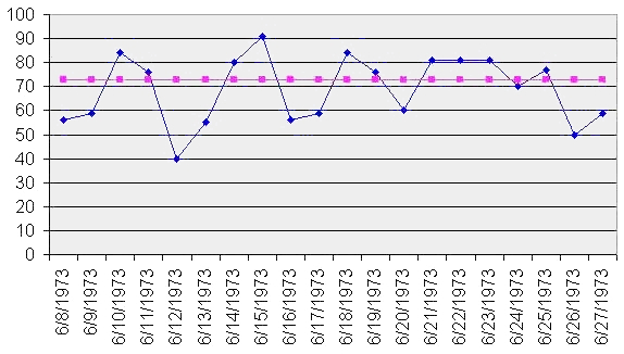
A run chart, also known as a run-sequence plot is a graph that displays observed data in a time sequence. Often, the data displayed represent some aspect of the output or performance of a manufacturing or other business process. It is therefore a form of line chart.

Overview

[edit]

Run sequence plots[1] are an easy way to graphically summarize a univariate data set. A common assumption of univariate data sets is that they behave like:[2]

  • random drawings;
  • from a fixed distribution;
  • with a common location; and
  • with a common scale.

With run sequence plots, shifts in location and scale are typically quite evident. Also, outliers can easily be detected.

Run chart of eight random walks in one dimension starting at 0. The plot shows the current position on the line (vertical axis) versus the time steps (horizontal axis).

Examples could include measurements of the fill level of bottles filled at a bottling plant or the water temperature of a dishwashing machine each time it is run. Time is generally represented on the horizontal (x) axis and the property under observation on the vertical (y) axis. Often, some measure of central tendency (mean or median) of the data is indicated by a horizontal reference line.

Run charts are analyzed to find anomalies in data that suggest shifts in a process over time or special factors that may be influencing the variability of a process. Typical factors considered include unusually long "runs" of data points above or below the average line, the total number of such runs in the data set, and unusually long series of consecutive increases or decreases.[1]

Run charts are similar in some regards to the control charts used in statistical process control, but do not show the control limits of the process. They are therefore simpler to produce, but do not allow for the full range of analytic techniques supported by control charts.

References

[edit]

Further reading

[edit]
[edit]
Revisions and contributorsEdit on WikipediaRead on Wikipedia
from Grokipedia
A run chart is a simple line graph that displays observed data points in sequential time order to monitor and analyze process performance, revealing trends, shifts, cycles, or other non-random patterns that may indicate special causes of variation. It plots measurements on the vertical axis against time or sequence on the horizontal axis, often including a central line such as the median to facilitate interpretation of deviations from expected random variation. The run chart's use in statistical process control originated from Walter A. Shewhart's work at Bell Telephone Laboratories in 1924, where he developed the control chart—a run chart enhanced with statistical control limits—to distinguish between common cause and special cause variation in manufacturing processes. Unlike control charts, run charts do not require assumptions about process stability or normality, making them accessible for initial data exploration without advanced statistical software. Run charts are widely applied in fields like healthcare, manufacturing, and public health for quality improvement projects, such as tracking patient wait times, production outputs, or infection rates over time. Their advantages include ease of construction using basic tools like spreadsheets and real-time monitoring capabilities, though they are most effective when combined with other statistical process control methods for confirmation.

Introduction

Definition

A run chart is a simple line graph that displays individual data points collected sequentially over time, with the horizontal axis representing time or order of occurrence and the vertical axis representing the measured variable or process output. This visualization connects the points with straight lines to highlight the progression and fluctuations in the data without any averaging or summarization. A defining feature of the run chart is the absence of control limits or statistical boundaries, such as upper and lower bounds calculated from standard deviations, which differentiates it from more advanced tools like control charts. Instead, it relies solely on the raw sequence of observations to depict temporal variation, allowing users to observe the natural behavior and stability of a process over its duration. For example, in manufacturing, a run chart could plot daily production output values—such as units produced each day—to reveal day-to-day fluctuations and overall patterns without grouping the data into weekly or monthly averages. This emphasis on individual, chronologically ordered measurements sets the run chart apart from aggregated plots, like bar graphs of mean values, which lose the granularity of sequential changes and potential non-random shifts in the data.

Purpose

Run charts serve as a fundamental tool in data analysis and process monitoring by visualizing variation in data points plotted over time, enabling practitioners to distinguish between common cause variation, which represents inherent random fluctuations in a stable process, and special cause variation, indicated by non-random patterns such as shifts or trends. This temporal representation helps identify potential process instabilities, including sustained shifts, trends, or cyclical behaviors, allowing for early detection of deviations that may require intervention. By focusing on sequential data ordering, run charts provide an intuitive means to assess whether observed changes are due to random noise or systematic factors, supporting informed decision-making in quality improvement efforts. The primary benefits of run charts lie in their simplicity, requiring no complex statistical calculations such as means or standard deviations, which makes them accessible for quick insights into process performance without specialized software or expertise. This straightforward approach facilitates hypothesis generation by highlighting potential areas for improvement, such as the impact of interventions, and is particularly valuable for ongoing monitoring in resource-limited environments where advanced analytical tools may not be feasible. For instance, in healthcare settings, run charts enable teams to track key measures like patient wait times over weeks or months, revealing patterns that guide targeted adjustments. Within quality improvement methodologies, run charts play a crucial role in Plan-Do-Study-Act (PDSA) cycles by providing a visual method to study the effects of tested changes during the "Study" phase, helping teams evaluate whether interventions lead to sustained improvements. They support iterative testing by displaying data in real-time, allowing for rapid assessment of progress toward goals. Additionally, run charts aid in detecting process stability prior to applying more advanced tools like control charts, thereby reducing false alarms from over-analysis and ensuring resources are directed toward genuine issues. This preliminary stability check is essential for avoiding unnecessary complexity in initial project stages.

History

Origins in Statistical Process Control

The origins of run charts trace back to the early 20th century within the field of statistical process control (SPC), emerging in the 1920s at Bell Laboratories where physicist and engineer Walter A. Shewhart pioneered time-plotting techniques to visualize process data sequentially. These methods served as foundational precursors to more formalized control charts, focusing on simple line graphs of measurements or attributes plotted against time to reveal patterns in variation without initially incorporating statistical limits. Shewhart's approach emphasized observing natural fluctuations in manufacturing outputs to distinguish routine from anomalous behavior, laying the groundwork for run charts as accessible tools in quality monitoring. A pivotal moment came in Shewhart's May 1924 memorandum to his supervisor at Bell Laboratories, in which he proposed plotting data points over time to monitor manufacturing processes and assess variability. In this document, Shewhart illustrated the technique using sequential data from production runs, advocating for an initial evaluation of variation through temporal visualization before applying control boundaries, which highlighted the utility of unadorned time series plots for early process assessment. This memo marked the conceptual birth of run charts within SPC, prioritizing chronological representation to identify shifts or trends in process performance without predefined thresholds. Shewhart's innovations drew on contemporaneous statistical theories, including those addressing process variability developed by figures such as William Sealy Gosset, known as "Student," whose work on small-sample inference and error analysis in industrial contexts contributed to broader statistical thought. Gosset's contributions to understanding random variation in production, drawn from his role at Guinness Brewery, aligned with efforts to quantify and mitigate inconsistencies in manufacturing. These theoretical foundations enabled Shewhart to adapt probabilistic models for practical time-based plotting, bridging academic statistics with industrial application. In a concrete application, Shewhart deployed these early charts at Western Electric's Hawthorne factory, a key site for telephone hardware production affiliated with Bell Laboratories, to track defects chronologically in components like armature windings. By plotting defect rates over successive production periods starting around 1924, Shewhart demonstrated how run chart-like visualizations could reveal temporal patterns in quality issues, such as sporadic increases due to equipment faults, establishing them as essential, straightforward instruments in SPC for defect monitoring without complex computations. This implementation at the Hawthorne facility underscored the technique's role in preempting waste in telephone manufacturing, influencing subsequent quality control practices.

Development and Popularization

Following World War II, W. Edwards Deming's lectures in Japan from 1950 onward played a pivotal role in expanding the use of run charts as part of statistical process control within total quality management (TQM) frameworks. Deming emphasized simple statistical tools, including run charts, to detect variation and specific causes in production processes, influencing Japanese firms to integrate them into quality circles and ongoing improvement efforts. Toyota Motor Corporation, in particular, adopted these methods during the 1950s, incorporating run charts alongside other statistical techniques into its production system as early as 1951 through quality control training programs, which contributed to the company's receipt of the Deming Application Prize in 1965. In the West, run charts gained traction in manufacturing during the 1950s and 1960s through Deming's seminars, though widespread adoption accelerated in the 1980s amid recognition of Japan's quality successes. By then, the tools had become integral to process monitoring in industries seeking to emulate TQM principles. Their revival in healthcare emerged in the late 1980s and 1990s, driven by growing emphasis on outcome measurement and variation reduction, with the Institute for Healthcare Improvement (IHI), founded in 1991, promoting run charts as accessible tools for assessing process changes and improvement sustainability. A key in standardizing run charts for came with the 2011 publication of The Health Care Guide: Learning from for by Lloyd Provost and Sandra Murray, which detailed their application in for healthcare, including graphical methods like run charts to evaluate variation without complex assumptions. By the 1990s, run charts had become foundational in and Lean methodologies, originating from Motorola's 1986 initiative and expanding globally, where they served to track time-ordered for identifying trends and shifts in process performance. Software such as Minitab, which incorporated run chart functionality to support these approaches, further facilitated their integration into quality workflows during this period.

Components and Construction

Essential Elements

A run chart is composed of a horizontal x-axis representing the time sequence of observations, such as days, weeks, or months, which provides the chronological order of data collection. The vertical y-axis depicts the measured variable, such as counts, rates, or proportions, scaled to encompass the range of data without introducing distortion. Individual data points, each corresponding to a single observation at a specific time, are plotted on the chart and connected sequentially by straight lines to illustrate the continuity and flow of the process over time. This connection emphasizes trends or shifts in the data without implying interpolation between points. At the center of the chart runs a horizontal centerline, calculated as the median of all data points, which serves as a reference for assessing natural variation around the typical process level. The median is determined by ordering the dataset and selecting the middle value (or the average of the two middle values for even-sized datasets), providing a robust measure less affected by outliers than the mean. median=middle value in the ordered dataset\text{median} = \text{middle value in the ordered dataset} Unlike control charts, run charts do not include upper or lower control limits, focusing instead on simple visualization of time-based variation. Optional annotations, such as labels for significant time periods or external events, may be added sparingly to provide context without overwhelming the chart's clarity.

Steps to Create a Run Chart

Creating a run chart involves a systematic process to visualize time-ordered data and identify variation patterns. The following steps outline the construction from raw data, ensuring the chart serves as a simple tool for process monitoring.
  1. Collect sequential time-ordered data: Begin by gathering data points in their natural chronological order, representing measurements from a process over time, such as daily production rates or patient wait times. Aim for at least 10-15 data points to ensure reliability in detecting patterns, though 20-25 points are recommended for more robust analysis. Ensure the data is collected at consistent intervals, like weekly or monthly, for accurate representation; if intervals are unequal or data is missing, note gaps on the chart to avoid misleading connections between points.
  2. Calculate the median of the dataset: Sort the data values in ascending order to find the median, which acts as the centerline for the chart. For an odd number of points, select the middle value; for an even number, average the two middle values to position the line such that approximately half the points fall above and half below. This median provides a stable reference unaffected by extreme values, as detailed in the essential elements of run charts. Use at least 8-12 baseline points for this calculation to establish a meaningful centerline.
  3. Plot the axes and data points: Draw a horizontal x-axis labeled with time or sequence (e.g., dates or periods) and a vertical y-axis scaled to the measurement values, extending about 20% beyond the data range for clarity (e.g., from 0 to the maximum if applicable). Mark each data point in chronological order on the plot and connect consecutive points with straight lines to form a time series graph.
  4. Draw the horizontal median line: Extend a straight horizontal line across the entire plot at the calculated median value to serve as the centerline, providing a visual benchmark for variation assessment.
  5. Label and annotate the chart: Add a descriptive title, clearly label both axes with units, and include any relevant annotations such as interventions or external events that may influence the data. For automation, utilize software tools like Microsoft Excel templates, R with packages such as qcc, or Python libraries like matplotlib to generate the chart efficiently from entered data.

Interpretation

Identifying Non-Random Patterns

Run charts enable the visual identification of non-random patterns, which signal potential process changes or instability beyond inherent random variation. These patterns include trends, shifts, cycles, and outliers, discerned by scanning the plot for deviations from the expected random fluctuation around the median line. Such visual cues as clustering of points tightly around the median versus wider dispersion, or abrupt jumps in data values, can indicate interventions or external influences affecting the process. A trend appears as five or more consecutive points consistently ascending or descending, suggesting a gradual shift in the process level over time. A shift manifests as six or more consecutive points entirely on one side of the median, indicating a sudden relocation of the process average. Cycles are observed as oscillating patterns where data points repeatedly cross the median in a rhythmic manner, potentially reflecting periodic influences. Outliers, or astronomical points, are extreme values that stand out markedly from the surrounding data, often due to unique events. These non-random patterns distinguish between common cause variation, which represents predictable, inherent randomness in a stable process, and special cause variation, which arises from assignable anomalies or external factors requiring investigation. Common cause variation produces a random, sawtooth appearance in the chart, while special cause introduces instability through the aforementioned patterns. For instance, in a run chart tracking patient wait times, a downward trend following a new triage policy would visually signal process improvement attributable to that change. The presence of such patterns prompts targeted inquiry into underlying causes, even without applying statistical tests, to guide quality enhancements.

Run Rules and Tests

Run rules and tests offer objective, probability-based criteria for detecting non-random signals in run charts, adapted from Walter Shewhart's foundational work on runs theory in statistical process control. These rules enable analysts to identify special cause variation with reduced subjectivity, focusing on patterns like shifts, trends, cycles relative to the median line. They are designed for application after 12-20 data points have been plotted, allowing sufficient observations for the median to stabilize and for patterns to emerge reliably, while minimizing false alarms from small samples. The primary rule for a shift involves identifying 6 or more consecutive points on one side of the median, signaling a potential abrupt change in the process level (use 8 points if 20 or more total data points). To determine run length, consecutive points are counted as those strictly above or below the median; points exactly on the median are excluded, as they neither extend nor interrupt the run. This rule, with others, achieves low false-positive rates for detecting shifts in datasets of 20 or more points. A trend is indicated by 5 or more points in a row monotonically increasing or decreasing, reflecting a gradual, sustained directionality in the data that suggests systematic or degradation (use 6 points if 20 or more total data points). Monotonicity requires each subsequent point to be higher (or lower) than the previous, ignoring ties by repeats only once. The number of runs test detects cycles or mixtures through patterns of oscillation or clumping. A run is a sequence of consecutive points on the same side of the median. The total number of runs is one more than the number of median crossings. Too many runs (e.g., 14 or more points alternating up and down around the median) may indicate oscillation due to periodic influences like seasonal effects. Too few runs suggest shifts or trends already covered by other rules. Expected runs approximate n/2 ± sqrt(n/4) for n useful observations, or use tables for precise limits (e.g., for 20 points, 6-16 runs expected). Deviations from expected signal non-randomness. Additional tests include checking for no points near the median (stratification), such as too few runs indicating bimodal tendencies, and examining runs of similar size, where consecutive runs are roughly equal in length, suggesting overcontrol or measurement issues rather than natural variation. These supplementary checks enhance the rules' ability to uncover subtler non-randomness, though they are applied judiciously to avoid overinterpretation.

Applications

In Quality Improvement

In quality improvement initiatives, particularly within manufacturing and process enhancement, run charts serve as a foundational tool for visualizing time-series data to detect variations and trends in key performance metrics. They are especially valuable in the Six Sigma DMAIC framework, where they monitor defect rates and cycle times during the Control phase to track sustained improvements, with predefined thresholds (e.g., 1% for delamination) triggering corrective actions to maintain stability post-intervention. For instance, in analyzing production defects like delamination or scratches, run charts plot monthly data points to reveal averages such as 6.1% for delamination, enabling teams to quantify common cause variation before deeper analysis. A notable case study involves Toyota's application of run charts within its lean production system, particularly through the Toyota Kata methodology. In the Improvement Kata, run charts are an essential practice for visualizing process performance over time. This approach aligns with Toyota's emphasis on continuous improvement, where run charts help eliminate waste by highlighting trends that static reports might overlook, ultimately enhancing overall line throughput. Run charts integrate seamlessly with the Plan-Do-Study-Act (PDSA) cycle, providing a simple method to evaluate interventions in enhancement efforts. Prior to implementing changes, a baseline run chart plots historical with a centerline to capture the current state of variation; following the "Do" and "Study" steps, a post-intervention chart compares new data points to assess sustainability, such as detecting shifts through non-random patterns like eight or more consecutive points on one side of the . This iterative use ensures that improvements, such as reduced cycle times in manufacturing, are not fleeting but embedded in the . For example, in a call center quality improvement project, a run chart might plot monthly error rates before and after staff training, revealing a downward shift—such as points consistently below the baseline median—indicating the reduction of special causes like procedural inconsistencies. This visual evidence supports decisions to standardize the training, thereby lowering overall error incidence in customer interactions.

In Healthcare and Other Sectors

In healthcare, run charts are integral to the Institute for Healthcare Improvement's (IHI) Model for Improvement, where they are employed to track key performance metrics over time, such as patient readmission rates and hospital-acquired infection rates, enabling teams to assess the impact of interventions on process stability. For instance, run charts have been used to monitor 30-day readmission rates before and after quality improvement initiatives, revealing shifts in performance that inform adjustments to care protocols. In the UK's National Health Service (NHS) England, run charts facilitate the analysis of elective waiting times, often highlighting cyclical patterns linked to seasonal staffing fluctuations, which guide resource allocation decisions. A practical application in hospitals involves plotting seasonal vaccination rates, such as for influenza, before and after targeted campaigns to detect non-random shifts, as demonstrated in quality improvement projects that increased administration rates from baseline levels through process changes like staff education and electronic reminders. These charts are particularly valuable in healthcare settings for their simplicity in visualizing time-series data, allowing frontline teams to identify trends without advanced statistical expertise. Beyond healthcare, run charts have been adapted for use in education to monitor student performance metrics over semesters, such as test scores or attendance rates, helping educators evaluate the effectiveness of instructional interventions in continuous improvement frameworks. In the finance sector, they are applied to track trends in transaction error rates or compliance metrics over time, aiding in the detection of process variations that could indicate systemic issues like fraud risks or operational inefficiencies. This adaptability extends to service industries with irregular data intervals, such as episodic financial reporting or semester-based educational assessments, where run charts accommodate non-uniform time points while maintaining focus on variation patterns. One challenge in these sectors involves privacy regulations that may limit full disclosure of longitudinal records, requiring aggregated or anonymized plotting to comply with standards like HIPAA. In education and finance, similar privacy concerns arise with individual performance or transaction data, necessitating robust data governance to ensure accurate yet ethical visualization.

Comparison with Other Visualization Tools

Versus Control Charts

Run charts and control charts both visualize process data over time to detect variation, but they differ fundamentally in their analytical depth and application. A run chart plots sequential data points connected by lines, typically with a central median line for reference, offering a simple way to observe trends and shifts without statistical limits. In contrast, control charts incorporate upper and lower control limits calculated as the process mean (xˉ\bar{x}) plus or minus three times the standard deviation (ss), providing statistically derived thresholds to distinguish common-cause variation from special-cause variation. The formula for control limits in a Shewhart control chart, xˉ±3s\bar{x} \pm 3s, assumes approximate normality of the data to ensure the limits capture about 99.7% of variation under stable conditions, a feature absent in run charts which rely solely on visual inspection relative to the median. This addition makes control charts more precise for signaling out-of-control conditions, but run charts remain preferable for initial screening of processes or when data volume is limited, as they require no such assumptions or complex calculations. Control charts, however, are escalated to when precise alarm thresholds are needed for ongoing monitoring, such as in manufacturing where subtle deviations could impact quality. Run charts offer advantages in simplicity and accessibility, avoiding the normality assumption that control charts require, which can lead to misleading limits if data is non-normal; however, this ease comes at the cost of lower sensitivity, as run charts may overlook small, gradual shifts that control charts detect reliably. For instance, in a production process showing a subtle upward drift over 20 data points, a run chart might appear stable around the median, while a control chart would flag points exceeding the upper limit, prompting timely intervention. Shewhart control charts evolved from foundational run chart principles, as detailed in Walter A. Shewhart's 1931 publication Economic Control of Quality of Manufactured Product, which formalized statistical limits to enhance variation detection beyond basic plotting.

Versus Standard Line Graphs

Run charts differ from standard line graphs primarily in their strict requirement for time-sequential data, enabling the analysis of process variation and stability over time, whereas standard line graphs can plot any two continuous variables, such as non-temporal relationships like sales volume against geographic regions. This temporal ordering in run charts facilitates the detection of non-random patterns, such as shifts or trends, that indicate changes in a process's behavior, in contrast to the correlational or exploratory focus of standard line graphs, which often emphasize overall trends or fitted lines without regard for sequential variation. The process-oriented emphasis of run charts promotes a focus on stability and common-cause variation in sequential data, allowing users to assess whether a system is predictable over time, while standard line graphs typically serve purposes like visualizing bivariate relationships or smoothing data for pattern recognition without this stability lens. For instance, a standard line graph plotting temperature against humidity might explore environmental correlations, but a run chart of daily temperatures would instead highlight shifts in weather patterns through raw sequential points. A key feature distinguishing run charts is their avoidance of data smoothing techniques, such as moving averages, to preserve the raw signals of variation and prevent masking of true process changes, unlike standard line graphs that may incorporate interpolation or averaging for visual clarity. Run charts typically include a median centerline to reference central tendency without implying statistical control, a element not standard in general line graphs. Practitioners should select run charts for ongoing sequential monitoring of processes where detecting variation is critical, such as tracking performance metrics in quality improvement, whereas standard line graphs are more suitable for non-temporal or exploratory visualizations that do not require time-based variation analysis.

References

Add your contribution
Related Hubs
User Avatar
No comments yet.