Recent from talks
Nothing was collected or created yet.
Beige
View on Wikipedia| Beige | |
|---|---|
| Hex triplet | #F5F5DC |
| sRGBB (r, g, b) | (245, 245, 220) |
| HSV (h, s, v) | (60°, 10%, 96%) |
| CIELChuv (L, C, h) | (96, 19, 86°) |
| Source | X11 |
| ISCC–NBS descriptor | Pale yellow green |
| B: Normalized to [0–255] (byte) | |

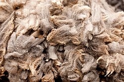
Beige (/beɪʒ/, BAY-ZH) is variously described as a pale sandy fawn color,[1] a grayish tan,[2] a light-grayish yellowish brown, or a pale to grayish yellow.[3] It takes its name from French, where the word originally meant natural wool that has been neither bleached nor dyed, hence also the color of natural wool.[4][5]
The word "beige" has come to be used to describe a variety of light tints chosen for their neutral or pale warm appearance.
Beige began to commonly be used as a term for a color in France beginning approximately 1855–1860; the writer Edmond de Goncourt used it in the novel La Fille Elisa in 1877. The first recorded use of beige as a color name in English was in 1887.[6]
Beige is notoriously difficult to produce in traditional offset CMYK printing because of the low levels of inks used on each plate; often it will print in purple or green and vary within a print run.[citation needed]
Beige is also a popular color in clothing, such as for men's trousers, as well as for interior design.
Various beige colors
[edit]| Cosmic latte | |
|---|---|
| Hex triplet | #FFF8E7 |
| sRGBB (r, g, b) | (255, 248, 231) |
| HSV (h, s, v) | (42°, 9%, 100%) |
| CIELChuv (L, C, h) | (98, 15, 70°) |
| Source | pha.jhu.edu[7] |
| ISCC–NBS descriptor | Pale yellow green |
| B: Normalized to [0–255] (byte) | |
Cosmic latte
[edit]Cosmic latte is a name assigned in 2002 to the average color of the universe (derived from a sampling of the electromagnetic radiation from 200,000 galaxies), given by a team of astronomers from Johns Hopkins University.
| Cream | |
|---|---|
| Hex triplet | #FFFDD0 |
| sRGBB (r, g, b) | (255, 253, 208) |
| HSV (h, s, v) | (57°, 18%, 100%) |
| CIELChuv (L, C, h) | (98, 33, 84°) |
| Source | [Unsourced] |
| ISCC–NBS descriptor | Light yellow green |
| B: Normalized to [0–255] (byte) | |
Cream
[edit]Cream is the color of the cream produced by cattle grazing on natural pasture with plants rich in yellow carotenoid pigments, some of which are incorporated into the cream, to give a yellow tone to white.
The first recorded use of cream as a color name in English was in 1590.[8]
| Unbleached silk | |
|---|---|
| Hex triplet | #FFDDCA |
| sRGBB (r, g, b) | (255, 221, 202) |
| HSV (h, s, v) | (22°, 21%, 100%) |
| CIELChuv (L, C, h) | (90, 29, 40°) |
| Source | JTC |
| ISCC–NBS descriptor | Pale orange yellow |
| B: Normalized to [0–255] (byte) | |
Unbleached silk
[edit]Unbleached silk is one of the Japanese traditional colors in use since beginning in 660 CE in the form of various dyes that are used in designing kimonos.[9][10] The name of this color in Japanese is shironeri.
| Tuscan | |
|---|---|
| Hex triplet | #FAD6A5 |
| sRGBB (r, g, b) | (250, 214, 165) |
| HSV (h, s, v) | (35°, 34%, 98%) |
| CIELChuv (L, C, h) | (88, 47, 56°) |
| Source | ISCC-NBS[11] |
| ISCC–NBS descriptor | Light yellow |
| B: Normalized to [0–255] (byte) | |
Tuscan
[edit]The first recorded use of Tuscan as a color name in English was in 1887.[12]
| Buff | |
|---|---|
| Hex triplet | #DAA06D |
| sRGBB (r, g, b) | (218, 160, 109) |
| HSV (h, s, v) | (28°, 50%, 85%) |
| CIELChuv (L, C, h) | (70, 60, 43°) |
| Source | [Unsourced] |
| ISCC–NBS descriptor | Light yellow |
| B: Normalized to [0–255] (byte) | |
Buff
[edit]Buff is a pale yellow-brown color that got its name from the color of buffed leather.[13]

According to the Oxford English Dictionary, buff as a descriptor of a color was first used in the London Gazette of 1686, describing a uniform to be "A Red Coat with a Buff-colour'd lining".[14]
| Desert sand | |
|---|---|
| Hex triplet | #EDC9AF |
| sRGBB (r, g, b) | (237, 201, 175) |
| HSV (h, s, v) | (25°, 26%, 93%) |
| CIELChuv (L, C, h) | (83, 34, 44°) |
| Source | Crayola |
| ISCC–NBS descriptor | Pale orange yellow |
| B: Normalized to [0–255] (byte) | |
Desert sand
[edit]The color desert sand may be regarded as a deep shade of beige. It is a pale tint of a color called desert. The color name "desert" was first used in 1920.[15]

In the 1960s, the American Telephone & Telegraph Company (AT&T) marketed desert sand–colored telephones for offices and homes. However, they described the color as "beige". It is therefore common for many people to refer to the color desert sand as "beige".
| Ecru | |
|---|---|
| Hex triplet | #C2B280 |
| sRGBB (r, g, b) | (194, 178, 128) |
| HSV (h, s, v) | (45°, 34%, 76%) |
| CIELChuv (L, C, h) | (73, 39, 71°) |
| Source | ISCC-NBS[16] |
| ISCC–NBS descriptor | Grayish yellow |
| B: Normalized to [0–255] (byte) | |
Ecru
[edit]Originally in the 19th century and up to at least 1930, the color ecru meant exactly the same color as beige (i.e. the pale cream color shown above as beige),[17] and the word is often used to refer to such fabrics as silk and linen in their unbleached state. Ecru comes from the French word écru, which means literally "raw" or "unbleached".
Since at least the 1950s, however, the color ecru has been regarded as a different color from beige, presumably in order to allow interior designers a wider palette of colors to choose from.[18]
| Khaki | |
|---|---|
| Hex triplet | #C3B091 |
| sRGBB (r, g, b) | (195, 176, 145) |
| HSV (h, s, v) | (37°, 26%, 76%) |
| CIELChuv (L, C, h) | (73, 28, 61°) |
| Source | HTML/CSS |
| ISCC–NBS descriptor | Grayish yellow |
| B: Normalized to [0–255] (byte) | |
Khaki
[edit]Khaki was designated in the 1930 book A Dictionary of Color, the standard for color nomenclature before the introduction of computers.
The first recorded use of khaki as a color name in English was in 1848.[19]
| French beige | |
|---|---|
| Hex triplet | #A67B5B |
| sRGBB (r, g, b) | (166, 123, 91) |
| HSV (h, s, v) | (26°, 45%, 65%) |
| CIELChuv (L, C, h) | (55, 41, 41°) |
| Source | ISCC-NBS[20] |
| ISCC–NBS descriptor | Light brown |
| B: Normalized to [0–255] (byte) | |
French beige
[edit]| Light French beige | |
|---|---|
| Hex triplet | #C8AD7F |
| sRGBB (r, g, b) | (200, 173, 127) |
| HSV (h, s, v) | (38°, 36%, 78%) |
| CIELChuv (L, C, h) | (72, 41, 60°) |
| Source | Pourpre.com |
| ISCC–NBS descriptor | Grayish yellow |
| B: Normalized to [0–255] (byte) | |
The first recorded use of French beige as a color name in English was in 1927.[21]
The normalized color coordinates for French beige are identical to café au lait and Tuscan tan, which were first recorded as color names in English in 1839[22] and 1926,[23] respectively.
| Mode beige | |
|---|---|
| Hex triplet | #967117 |
| sRGBB (r, g, b) | (150, 113, 23) |
| HSV (h, s, v) | (43°, 85%, 59%) |
| CIELChuv (L, C, h) | (50, 58, 58°) |
| Source | ISCC-NBS[24] |
| ISCC–NBS descriptor | Light olive brown |
| B: Normalized to [0–255] (byte) | |
Mode beige
[edit]Mode beige is a very dark shade of beige.
The first recorded use of mode beige as a color name in English was in 1928.[25]
The normalized color coordinates for mode beige are identical to the color names drab, sand dune, and bistre brown, which were first recorded as color names in English, respectively, in 1686,[26] 1925,[27] and 1930.[28]
In nature
[edit]In culture
[edit]Personal computers
[edit]
In the 1970s, 1980s, and early 1990s, personal computers and other office electronics were often colored beige. The trend began in Germany, where workplaces commonly required beige- or gray-colored equipment, and later spread worldwide. Beige's popularity was superseded by black starting in the 1990s, with the release of black computers like the IBM ThinkPad.[29]
Metaphor
[edit]Beige is sometimes used as a metaphor for something that is bland, boring, conventional, or even sad. In this sense, it is used in contradistinction to more vibrant and exciting (or more individual) colors.[30]
See also
[edit]References
[edit]- ^ Oxford English Dictionary
- ^ Webster's New World Dictionary of the English Language, 1964
- ^ Macmillan On-Line Dictionary.
- ^ Le Petit Robert Dictionnaire.
- ^ Harper, Douglas. "beige". Online Etymology Dictionary.
- ^ Maerz and Paul (1930). A Dictionary of Colour. New York, McGraw-Hill, p. 190; Color Sample of Beige: p. 45 Plate 11 Color Sample C2. The color shown above matches the color sample in the book.
- ^ Glazebrook, Karl; Baldry, Ivan (2004-12-28). "The Cosmic Spectrum and the Color of the Universe". Archived from the original on 2006-01-04. Retrieved 2009-02-06.
- ^ Maerz and Paul A Dictionary of Color New York:1930 McGraw-Hill p. 206; Color Sample of Cream: p. 41 Plate 9 Color Sample D4 The color shown above matches the color sample in the book.
- ^ Nagasaki, Seiki. Nihon no dentoshoku : sono shikimei to shikicho, Seigensha, 2001. ISBN 4-916094-53-0
- ^ Nihon Shikisai Gakkai. Shinpen shikisai kagaku handobukku, Tokyo Daigaku Shuppankai, 1985. ISBN 4-13-061000-7
- ^ ISCC-NBS
- ^ Maerz and Paul A Dictionary of Color New York:1930 McGraw-Hill p. 206; Color Sample of Tuscan: p. 43 Plate 10 Color Sample E5
- ^ Paterson, Ian (2003), A Dictionary of Colour (1st paperback ed.), London: Thorogood (published 2004), p. 73, ISBN 1-85418-375-3, OCLC 60411025
- ^ "buff, adj.1". Oxford English Dictionary. OUP. Retrieved 21 April 2011.[dead link]
- ^ Maerz and Paul A Dictionary of Color New York: 1930 McGraw-Hill p. 194; Color Sample of Desert: p. 47 Plate 12 Color Sample I7
- ^ ISCC-NBS
- ^ Maerz and Paul A Dictionary of Color New York:1930 McGraw-Hill p. 149—Discussion of the color Beige (shown in this book's color sample as being the same color that is displayed as "beige" in the Wikipedia color box shown above) notes that beige is exactly the same color as Ecru.
- ^ "ISCC-NBS Dictionary of Colo(u)r Names (1955): Ea through Ez". Retsof. Archived from the original on 2012-11-22. Retrieved 2007-10-23.[unreliable source?]
- ^ Maerz and Paul A Dictionary of Color New York:1930 McGraw-Hill p. 197; Color Sample of Khaki: p. 49 Plate 13 Color Sample J7
- ^ ISCC-NBS
- ^ Maerz and Paul A Dictionary of Color New York:1930 McGraw-Hill p. 195; Color Sample of French beige: p. 49 Plate 13 Color Sample A7
- ^ Maerz and Paul A Dictionary of Color New York:1930 McGraw-Hill p. 191; Color Sample of Cafe au Lait: p. 47 Plate 12 Color Sample A6
- ^ Maerz and Paul A Dictionary of Color New York:1930 McGraw-Hill p. 206; Color Sample of Tuscan tan: p. 49 Plate 13 Color Sample C8
- ^ ISCC-NBS
- ^ Maerz and Paul A Dictionary of Color New York:1930 McGraw-Hill p. 199; Color Sample of Mode Beige: p. 47 Plate 14 Color Sample B5
- ^ Maerz and Paul A Dictionary of Color New York:1930 McGraw-Hill p. 194
- ^ Maerz and Paul A Dictionary of Color New York:1930 McGraw-Hill p. 204; Color Sample of Sand Dune: p. 47 Plate 14 Color Sample B5
- ^ Maerz and Paul A Dictionary of Color New York: 1930 McGraw-Hill p. 53 Plate 15 Color Sample C9
- ^ Hussain, Shaz (20 April 2018). "50 Shades of Beige". Science Museum Blog. Science Museum, London. Retrieved 8 August 2025.
- ^ St. Clair, Kassia (2016). The Secret Lives of Colour. London: John Murray. pp. 58–59. ISBN 9781473630819. OCLC 936144129.
External links
[edit]Beige
View on GrokipediaEtymology and History
Origin of the Term
The term "beige" derives from the French word beige, which originally denoted a fine woolen fabric left in its natural, undyed state, typically a pale yellowish-gray hue resembling unbleached wool or cotton.[4][3] This usage emerged in the French textile industry during the early 19th century, where the fabric was prized for its subtle, neutral tone before the widespread adoption of synthetic dyes.[4] The word entered English around the mid-19th century, with the first recorded use as a noun in 1858, referring specifically to the fabric itself as "a French coarse cloth" in trade contexts.[4] By 1879, it had evolved to describe the color of undyed wool, appearing in English publications as "a shade of colour like that of undyed and unbleached wool; yellowish-grey."[4] This adoption was heavily influenced by the French textile trade, which exported such materials to Britain and the United States, introducing the term through fashion and commercial channels.[3] Beige thus became distinguished from artificially dyed shades by its direct tie to the raw, natural tones of animal fibers like wool or cotton, emphasizing authenticity in an era of industrial dyeing innovation.[4] This origin underscores its role as a descriptor for unaltered, earthy neutrality in early textile nomenclature.[3]Historical Development
The term "beige" entered English usage in the mid-19th century from French "beige," referring to the natural, undyed color of wool, which laid the groundwork for its recognition as a distinct hue.[7] During the Victorian era (1837–1901), beige emerged prominently in fashion and interior design as a neutral tone symbolizing simplicity and naturalness, particularly in the 1840s onward when muted shades like gold-tan-ivory dominated women's daywear and home furnishings to evoke understated elegance amid the period's ornate trends.[8] By the 1890s, beige fabrics such as linen, pongee, and seersucker became staples for summer attire and interiors, valued for their light, breathable qualities that aligned with ideals of practicality and restraint in an era of industrial excess.[9] In the 20th century, beige gained widespread popularity through mid-century modern aesthetics (roughly 1940s–1960s), where it served as a foundational neutral in furniture, walls, and textiles to emphasize clean lines and functional simplicity.[10] This era's embrace of beige underscored a move toward democratic, uncluttered living that prioritized harmony and accessibility.[11] Global trade during the colonial era significantly influenced beige's standardization, as natural undyed textiles from Asia and Africa—often in beige tones from cotton and silk—were imported to Europe, blending into Western palettes and production methods. In Africa, Yoruba weavers in Nigeria produced sányán cloths from undyed silk and cotton, creating beige fabrics that symbolized morality and were traded as status items, with colonial networks amplifying their reach.[12] From Asia, Indian cotton textiles in natural tans and beiges dominated 16th–19th century Atlantic trade, their lightweight, undyed qualities inspiring European imitations and contributing to beige's establishment as a reliable, exportable neutral.[13][14]Color Characteristics
Definition and Properties
Beige is a light, warm neutral color characterized by low saturation, evoking a sense of subtlety and versatility in visual perception. It is typically represented by the hexadecimal code #F5F5DC and is commonly described as having a sandy or creamy appearance, bridging the gap between pale yellows and soft browns.[1][2] In terms of optical properties, beige demonstrates a high lightness value of approximately 91% in the HSL color model, which contributes to its bright yet subdued presence. This high lightness is paired with a hue of 60°, reflecting subtle yellow undertones, and a saturation level around 55%, ensuring its desaturated, neutral quality. The warmth of beige arises from these faint yellow or brown inflections, distinguishing it from cooler tones while maintaining an overall gentle luminosity.[1] Beige differentiates from similar neutrals through its specific balance of warmth and desaturation; off-white tends to be cooler with minimal color deviation from pure white, often incorporating subtle gray hues for a crisper effect. In contrast, taupe is darker and more muted, leaning toward gray-brown with reduced warmth and lower lightness, making beige appear lighter and more inviting by comparison.[15][16]Representation in Color Models
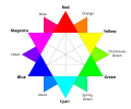
In digital displays and web design, beige is commonly represented in the RGB color model as (245, 245, 220), corresponding to the hexadecimal value #F5F5DC, which provides a light, neutral tone suitable for backgrounds and interfaces.[17] This additive color space emphasizes equal high intensities in red and green channels with a slightly lower blue, achieving the pale yellowish appearance.[18] For print media, beige is approximated in the CMYK subtractive model as (0%, 0%, 10%, 4%), where minimal cyan and magenta are absent, a small yellow component adds warmth, and low black ensures lightness.[2] This formulation accounts for ink mixing on paper, though exact reproduction may vary due to substrate and press conditions.[19] In perceptual models like HSL and HSV, standard beige aligns with a hue of 60° indicating a yellow base, saturation ranging from 10% in HSV to around 56% in HSL for subtle desaturation, and high lightness or value of 91-96% to maintain its pale quality.[1] These cylindrical representations facilitate intuitive adjustments, with HSL emphasizing relative lightness for design workflows.[20]| Color Model | Values for Standard Beige |
|---|---|
| RGB | (245, 245, 220) |
| CMYK | (0%, 0%, 10%, 4%) |
| HSL | (60°, 56%, 91%) |
| HSV | (60°, 10%, 96%) |


