
Community hub
Recent from talks
Contribute something
Nothing was collected or created yet.
User interface
View on Wikipedia

In the industrial design field of human–computer interaction, a user interface (UI) is the space where interactions between humans and machines occur. The goal of this interaction is to allow effective operation and control of the machine from the human end, while the machine simultaneously feeds back information that aids the operators' decision-making process. Examples of this broad concept of user interfaces include the interactive aspects of computer operating systems, hand tools, heavy machinery operator controls and process controls. The design considerations applicable when creating user interfaces are related to, or involve such disciplines as, ergonomics and psychology.
Generally, the goal of user interface design is to produce a user interface that makes it easy, efficient, and enjoyable (user-friendly) to operate a machine in the way which produces the desired result (i.e. maximum usability). This generally means that the operator needs to provide minimal input to achieve the desired output, and also that the machine minimizes undesired outputs to the user.
User interfaces are composed of one or more layers, including a human–machine interface (HMI) that typically interfaces machines with physical input hardware (such as keyboards, mice, or game pads) and output hardware (such as computer monitors, speakers, and printers). A device that implements an HMI is called a human interface device (HID). User interfaces that dispense with the physical movement of body parts as an intermediary step between the brain and the machine use no input or output devices except electrodes alone; they are called brain–computer interfaces (BCIs) or brain–machine interfaces (BMIs).
Other terms for human–machine interfaces are man–machine interface (MMI) and, when the machine in question is a computer, human–computer interface. Additional UI layers may interact with one or more human senses, including: tactile UI (touch), visual UI (sight), auditory UI (sound), olfactory UI (smell), equilibria UI (balance), and gustatory UI (taste).
Composite user interfaces (CUIs) are UIs that interact with two or more senses. The most common CUI is a graphical user interface (GUI), which is composed of a tactile UI and a visual UI capable of displaying graphics. When sound is added to a GUI, it becomes a multimedia user interface (MUI). There are three broad categories of CUI: standard, virtual and augmented. Standard CUI use standard human interface devices like keyboards, mice, and computer monitors. When the CUI blocks out the real world to create a virtual reality, the CUI is virtual and uses a virtual reality interface. When the CUI does not block out the real world and creates augmented reality, the CUI is augmented and uses an augmented reality interface. When a UI interacts with all human senses, it is called a qualia interface, named after the theory of qualia.[citation needed] CUI may also be classified by how many senses they interact with as either an X-sense virtual reality interface or X-sense augmented reality interface, where X is the number of senses interfaced with. For example, a Smell-O-Vision is a 3-sense (3S) Standard CUI with visual display, sound and smells; when virtual reality interfaces interface with smells and touch it is said to be a 4-sense (4S) virtual reality interface; and when augmented reality interfaces interface with smells and touch it is said to be a 4-sense (4S) augmented reality interface.
Overview
[edit]
The user interface or human–machine interface is the part of the machine that handles the human–machine interaction. Membrane switches, rubber keypads and touchscreens are examples of the physical part of the Human Machine Interface which we can see and touch.[1]
In complex systems, the human–machine interface is typically computerized. The term human–computer interface refers to this kind of system. In the context of computing, the term typically extends as well to the software dedicated to control the physical elements used for human–computer interaction.
The engineering of human–machine interfaces is enhanced by considering ergonomics (human factors). The corresponding disciplines are human factors engineering (HFE) and usability engineering (UE) which is part of systems engineering.
Tools used for incorporating human factors in the interface design are developed based on knowledge of computer science, such as computer graphics, operating systems, programming languages. Nowadays, we use the expression graphical user interface for human–machine interface on computers, as nearly all of them are now using graphics.[citation needed]
Multimodal interfaces allow users to interact using more than one modality of user input.[2]
Terminology
[edit]
There is a difference between a user interface and an operator interface or a human–machine interface (HMI).
- The term "user interface" is often used in the context of (personal) computer systems and electronic devices.
- Where a network of equipment or computers are interlinked through an MES (Manufacturing Execution System)-or Host to display information.
- A human–machine interface (HMI) is typically local to one machine or piece of equipment, and is the interface method between the human and the equipment/machine. An operator interface, on the other hand, is the interface method by which multiple pieces of equipment, linked by a host control system, are accessed or controlled.
- The system may expose several user interfaces to serve different kinds of users. For example, a computerized library database might provide two user interfaces, one for library patrons (limited set of functions, optimized for ease of use) and the other for library personnel (wide set of functions, optimized for efficiency).[3]
- The user interface of a mechanical system, a vehicle or an industrial installation is sometimes referred to as the human–machine interface (HMI).[4] HMI is a modification of the original term MMI (man–machine interface).[5] In practice, the abbreviation MMI is still frequently used[5] although some may claim that MMI stands for something different now.[citation needed] Another abbreviation is HCI, but is more commonly used for human–computer interaction.[5] Other terms used are operator interface console (OIC) and operator interface terminal (OIT).[6] However it is abbreviated, the terms refer to the 'layer' that separates a human that is operating a machine from the machine itself.[5] Without a clean and usable interface, humans would not be able to interact with information systems.
In science fiction, HMI is sometimes used to refer to what is better described as a direct neural interface. However, this latter usage is seeing increasing application in the real-life use of (medical) prostheses—the artificial extension that replaces a missing body part (e.g., cochlear implants).[7][8]
In some circumstances, computers might observe the user and react according to their actions without specific commands. A means of tracking parts of the body is required, and sensors noting the position of the head, direction of gaze and so on have been used experimentally. This is particularly relevant to immersive interfaces.[9][10]
History
[edit]The history of user interfaces can be divided into the following phases according to the dominant type of user interface:
1945–1968: Batch interface
[edit]
In the batch era, computing power was extremely scarce and expensive. User interfaces were rudimentary. Users had to accommodate computers rather than the other way around; user interfaces were considered overhead, and software was designed to keep the processor at maximum utilization with as little overhead as possible.
The input side of the user interfaces for batch machines was mainly punched cards or equivalent media like paper tape. The output side added line printers to these media. With the limited exception of the system operator's console, human beings did not interact with batch machines in real time at all.
Submitting a job to a batch machine involved first preparing a deck of punched cards that described a program and its dataset. The program cards were not punched on the computer itself but on keypunches, specialized, typewriter-like machines that were notoriously bulky, unforgiving, and prone to mechanical failure. The software interface was similarly unforgiving, with very strict syntaxes designed to be parsed by the smallest possible compilers and interpreters.

Once the cards were punched, one would drop them in a job queue and wait. Eventually, operators would feed the deck to the computer, perhaps mounting magnetic tapes to supply another dataset or helper software. The job would generate a printout, containing final results or an abort notice with an attached error log. Successful runs might also write a result on magnetic tape or generate some data cards to be used in a later computation.
The turnaround time for a single job often spanned entire days. If one was very lucky, it might be hours; there was no real-time response. But there were worse fates than the card queue; some computers required an even more tedious and error-prone process of toggling in programs in binary code using console switches. The very earliest machines had to be partly rewired to incorporate program logic into themselves, using devices known as plugboards.
Early batch systems gave the currently running job the entire computer; program decks and tapes had to include what we would now think of as operating system code to talk to I/O devices and do whatever other housekeeping was needed. Midway through the batch period, after 1957, various groups began to experiment with so-called "load-and-go" systems. These used a monitor program which was always resident on the computer. Programs could call the monitor for services. Another function of the monitor was to do better error checking on submitted jobs, catching errors earlier and more intelligently and generating more useful feedback to the users. Thus, monitors represented the first step towards both operating systems and explicitly designed user interfaces.
1969–present: Command-line user interface
[edit]
Command-line interfaces (CLIs) evolved from batch monitors connected to the system console. Their interaction model was a series of request-response transactions, with requests expressed as textual commands in a specialized vocabulary. Latency was far lower than for batch systems, dropping from days or hours to seconds. Accordingly, command-line systems allowed the user to change their mind about later stages of the transaction in response to real-time or near-real-time feedback on earlier results. Software could be exploratory and interactive in ways not possible before. But these interfaces still placed a relatively heavy mnemonic load on the user, requiring a serious investment of effort and learning time to master.[11]
The earliest command-line systems combined teleprinters with computers, adapting a mature technology that had proven effective for mediating the transfer of information over wires between human beings. Teleprinters had originally been invented as devices for automatic telegraph transmission and reception; they had a history going back to 1902 and had already become well-established in newsrooms and elsewhere by 1920. In reusing them, economy was certainly a consideration, but psychology and the rule of least surprise mattered as well; teleprinters provided a point of interface with the system that was familiar to many engineers and users.

The widespread adoption of video-display terminals (VDTs) in the mid-1970s ushered in the second phase of command-line systems. These cut latency further, because characters could be thrown on the phosphor dots of a screen more quickly than a printer head or carriage can move. They helped quell conservative resistance to interactive programming by cutting ink and paper consumables out of the cost picture, and were to the first TV generation of the late 1950s and 60s even more iconic and comfortable than teleprinters had been to the computer pioneers of the 1940s.
Just as importantly, the existence of an accessible screen—a two-dimensional display of text that could be rapidly and reversibly modified—made it economical for software designers to deploy interfaces that could be described as visual rather than textual. The pioneering applications of this kind were computer games and text editors; close descendants of some of the earliest specimens, such as rogue(6), and vi(1), are still a live part of Unix tradition.
1985: SAA user interface or text-based user interface
[edit]In 1985, with the beginning of Microsoft Windows and other graphical user interfaces, IBM created what is called the Systems Application Architecture (SAA) standard which include the Common User Access (CUA) derivative. CUA successfully created what we know and use today in Windows, and most of the more recent MS-DOS or Windows Console Applications will use that standard as well.
This defined that a pulldown menu system should be at the top of the screen, status bar at the bottom, shortcut keys should stay the same for all common functionality (F2 to Open for example would work in all applications that followed the SAA standard). This greatly helped the speed at which users could learn an application so it caught on quick and became an industry standard.[12]
1968–present: Graphical user interface
[edit]

- 1968 – Douglas Engelbart demonstrated NLS, a system which uses a mouse, pointers, hypertext, and multiple windows.[13]
- 1970 – Researchers at Xerox Palo Alto Research Center (many from SRI) develop WIMP paradigm (Windows, Icons, Menus, Pointers)[13]
- 1973 – Xerox Alto: commercial failure due to expense, poor user interface, and lack of programs[13]
- 1979 – Steve Jobs and other Apple engineers visit Xerox PARC. Though Pirates of Silicon Valley dramatizes the events, Apple had already been working on developing a GUI, such as the Macintosh and Lisa projects, before the visit.[14][15]
- 1981 – Xerox Star: focus on WYSIWYG. Commercial failure (25K sold) due to cost ($16K each), performance (minutes to save a file, couple of hours to recover from crash), and poor marketing
- 1982 – Rob Pike and others at Bell Labs designed Blit, which was released in 1984 by AT&T and Teletype as DMD 5620 terminal.
- 1984 – Apple Macintosh popularizes the GUI. Super Bowl commercial shown twice, was the most expensive commercial ever made at that time
- 1984 – MIT's X Window System: hardware-independent platform and networking protocol for developing GUIs on UNIX-like systems
- 1985 – Windows 1.0 – provided GUI interface to MS-DOS. No overlapping windows (tiled instead).
- 1985 – Microsoft and IBM start work on OS/2 meant to eventually replace MS-DOS and Windows
- 1986 – Apple threatens to sue Digital Research because their GUI desktop looked too much like Apple's Mac.
- 1987 – Windows 2.0 – Overlapping and resizable windows, keyboard and mouse enhancements
- 1987 – Macintosh II: first full-color Mac
- 1988 – OS/2 1.10 Standard Edition (SE) has GUI written by Microsoft, looks a lot like Windows 2
Interface design
[edit]Primary methods used in the interface design include prototyping and simulation.
Typical human–machine interface design consists of the following stages: interaction specification, interface software specification and prototyping:
- Common practices for interaction specification include user-centered design, persona, activity-oriented design, scenario-based design, and resiliency design.
- Common practices for interface software specification include use cases and constrain enforcement by interaction protocols (intended to avoid use errors).
- Common practices for prototyping are based on libraries of interface elements (controls, decoration, etc.).
Principles of quality
[edit]In broad terms, interfaces generally regarded as user friendly, efficient, intuitive, etc. are typified by one or more particular qualities. For the purpose of example, a non-exhaustive list of such characteristics follows:
- Clarity: The interface avoids ambiguity by making everything clear through language, flow, hierarchy and metaphors for visual elements.
- Concision:[16] However ironically, the over-clarification of information—for instance, by labelling the majority, if not the entirety, of items displayed on-screen at once, and regardless of whether or not the user would in fact require a visual indicator of some kind in order to identify a given item—can, and, under most normal circumstances, most likely will lead to the obfuscation of whatever information.
- Familiarity:[17] Even if someone uses an interface for the first time, certain elements can still be familiar. Real-life metaphors can be used to communicate meaning.
- Responsiveness:[18] A good interface should not feel sluggish. This means that the interface should provide good feedback to the user about what's happening and whether the user's input is being successfully processed.
- Consistency:[19] Keeping your interface consistent across your application is important because it allows users to recognize usage patterns.
- Aesthetics: While you do not need to make an interface attractive for it to do its job, making something look good will make the time your users spend using your application more enjoyable; and happier users can only be a good thing.
- Efficiency: Time is money, and a great interface should make the user more productive through shortcuts and good design.
- Forgiveness: A good interface should not punish users for their mistakes but should instead provide the means to remedy them.
Principle of least astonishment
[edit]The principle of least astonishment (POLA) is a general principle in the design of all kinds of interfaces. It is based on the idea that human beings can only pay full attention to one thing at one time,[20] leading to the conclusion that novelty should be minimized.
Principle of habit formation
[edit]If an interface is used persistently, the user will unavoidably develop habits for using the interface. The designer's role can thus be characterized as ensuring the user forms good habits. If the designer is experienced with other interfaces, they will similarly develop habits, and often make unconscious assumptions regarding how the user will interact with the interface.[20][21]
A model of design criteria: User Experience Honeycomb
[edit]
Peter Morville of Google designed the User Experience Honeycomb framework in 2004 when leading operations in user interface design. The framework was created to guide user interface design. It would act as a guideline for many web development students for a decade.[23]
- Usable: Is the design of the system easy and simple to use? The application should feel familiar, and it should be easy to use.[23][22]
- Useful: Does the application fulfill a need? A business's product or service needs to be useful.[22]
- Desirable: Is the design of the application sleek and to the point? The aesthetics of the system should be attractive, and easy to translate.[22]
- Findable: Are users able to quickly find the information they are looking for? Information needs to be findable and simple to navigate. A user should never have to hunt for your product or information.[22]
- Accessible: Does the application support enlarged text without breaking the framework? An application should be accessible to those with disabilities.[22]
- Credible: Does the application exhibit trustworthy security and company details? An application should be transparent, secure, and honest.[22]
- Valuable: Does the end-user think it's valuable? If all 6 criteria are met, the end-user will find value and trust in the application.[22]
Types
[edit]
- Attentive user interfaces manage the user attention deciding when to interrupt the user, the kind of warnings, and the level of detail of the messages presented to the user.
- Batch interfaces are non-interactive user interfaces, where the user specifies all the details of the batch job in advance to batch processing, and receives the output when all the processing is done. The computer does not prompt for further input after the processing has started.
- Command line interfaces (CLIs) prompt the user to provide input by typing a command string with the computer keyboard and respond by outputting text to the computer monitor. Used by programmers and system administrators, in engineering and scientific environments, and by technically advanced personal computer users.
- Conversational interfaces enable users to command the computer with plain text English (e.g., via text messages, or chatbots) or voice commands, instead of graphic elements. These interfaces often emulate human-to-human conversations.[24]
- Conversational interface agents attempt to personify the computer interface in the form of an animated person, robot, or other character (such as Microsoft's Clippy the paperclip), and present interactions in a conversational form.
- Crossing-based interfaces are graphical user interfaces in which the primary task consists in crossing boundaries instead of pointing.
- Direct manipulation interface is a general class of user interfaces that allow users to manipulate objects presented to them, using actions that correspond to the physical world, at least loosely.
- Gesture interfaces are graphical user interfaces which accept input in a form of hand gestures, or mouse gestures sketched with a computer mouse or a stylus.
- Graphical user interfaces (GUI) accept input via devices such as a computer keyboard and mouse and provide articulated graphical output on the computer monitor.[25] There are at least two different principles widely used in GUI design: Object-oriented user interfaces (OOUIs) and application-oriented interfaces.[26]
- Hardware interfaces are the physical, spatial interfaces found on products in the real world from toasters, to car dashboards, to airplane cockpits. They are generally a mixture of knobs, buttons, sliders, switches, and touchscreens.
- Holographic user interfaces provide input to electronic or electro-mechanical devices by passing a finger through reproduced holographic images of what would otherwise be tactile controls of those devices, floating freely in the air, detected by a wave source and without tactile interaction.
- Intelligent user interfaces are human–machine interfaces that aim to improve the efficiency, effectiveness, and naturalness of human–machine interaction by representing, reasoning, and acting on models of the user, domain, task, discourse, and media (e.g., graphics, natural language, gesture).
- Motion tracking interfaces monitor the user's body motions and translate them into commands, some techniques of which were at one point patented by Apple.[27]
- Multi-screen interfaces, employ multiple displays to provide a more flexible interaction. This is often employed in computer game interaction in both the commercial arcades and more recently the handheld markets.
- Natural-language interfaces are used for search engines and on webpages. User types in a question and waits for a response.
- Non-command user interfaces, which observe the user to infer their needs and intentions, without requiring that they formulate explicit commands.[28]
- Object-oriented user interfaces (OOUI) are based on object-oriented programming metaphors, allowing users to manipulate simulated objects and their properties.
- Permission-driven user interfaces show or conceal menu options or functions depending on the user's level of permissions. The system is intended to improve the user experience by removing items that are unavailable to the user. A user who sees functions that are unavailable for use may become frustrated. It also provides an enhancement to security by hiding functional items from unauthorized persons.
- Reflexive user interfaces where the users control and redefine the entire system via the user interface alone, for instance to change its command verbs. Typically, this is only possible with very rich graphic user interfaces.
- Search interface is how the search box of a site is displayed, as well as the visual representation of the search results.
- Tangible user interfaces, which place a greater emphasis on touch and physical environment or its element.
- Task-focused interfaces are user interfaces which address the information overload problem of the desktop metaphor by making tasks, not files, the primary unit of interaction.
- Text-based user interfaces (TUIs) are user interfaces which interact via text. TUIs include command-line interfaces and text-based WIMP environments.
- Touchscreens are displays that accept input by touch of fingers or a stylus. Used in a growing amount of mobile devices and many types of point of sale, industrial processes and machines, self-service machines, etc.
- Touch user interface are graphical user interfaces using a touchpad or touchscreen display as a combined input and output device. They supplement or replace other forms of output with haptic feedback methods. Used in computerized simulators, etc.
- Voice user interfaces, which accept input and provide output by generating voice prompts. The user input is made by pressing keys or buttons, or responding verbally to the interface.
- Zero-input interfaces get inputs from a set of sensors instead of querying the user with input dialogs.[29]
- Zooming user interfaces are graphical user interfaces in which information objects are represented at different levels of scale and detail, and where the user can change the scale of the viewed area in order to show more detail.
Gallery
[edit]-
 Historic HMI in the driver's cabin of a German steam locomotive
 -
 Modern HMI in the driver's cabin of a German Intercity-Express high-speed train
 -
 The HMI of a toilette (in Japan)
 -

-
 HMI for audio mixing
 -
 HMI for video production
 -
 HMI of a machine for the sugar industry with pushbuttons
 -
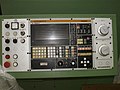 HMI for a computer numerical control (CNC)
 -
 Slightly newer HMI for a CNC-machine
 -
 Emergency switch/panic switch
 -
 DMD 5620 terminal


See also
[edit]References
[edit]- ^ "Eurotherm Parker SSD Link Hardware L5392 | Automation Industrial". l5392.com. Retrieved 11 January 2024.
- ^ Cohen, Philip R. (1992). "The role of natural language in a multimodal interface". Proceedings of the 5th annual ACM symposium on User interface software and technology - UIST '92. pp. 143–149. doi:10.1145/142621.142641. ISBN 0897915496. S2CID 9010570.
- ^ "The User Experience of Libraries: Serving The Common Good User Experience Magazine". uxpamagazine.org. 7 May 2017. Retrieved 23 March 2022.
- ^ Griffin, Ben; Baston, Laurel. "Interfaces" (Presentation): 5. Archived from the original on 14 July 2014. Retrieved 7 June 2014.
The user interface of a mechanical system, a vehicle or an industrial installation is sometimes referred to as the human–machine interface (HMI).
{{cite journal}}: Cite journal requires|journal=(help) - ^ a b c d "User Interface Design and Ergonomics" (PDF). Course Cit 811. NATIONAL OPEN UNIVERSITY OF NIGERIA: SCHOOL OF SCIENCE AND TECHNOLOGY: 19. Archived (PDF) from the original on 14 July 2014. Retrieved 7 June 2014.
In practice, the abbreviation MMI is still frequently used although some may claim that MMI stands for something different now.
- ^ "Introduction Section". Recent advances in business administration. [S.l.]: Wseas. 2010. p. 190. ISBN 978-960-474-161-8.
Other terms used are operator interface console (OIC) and operator interface terminal (OIT)
- ^ Cipriani, Christian; Segil, Jacob; Birdwell, Jay; Weir, Richard (2014). "Dexterous control of a prosthetic hand using fine-wire intramuscular electrodes in targeted extrinsic muscles". IEEE Transactions on Neural Systems and Rehabilitation Engineering. 22 (4): 828–36. doi:10.1109/TNSRE.2014.2301234. ISSN 1534-4320. PMC 4501393. PMID 24760929.
Neural co-activations are present that in turn generate significant EMG levels and hence unintended movements in the case of the present human machine interface (HMI).
- ^ Citi, Luca (2009). "Development of a neural interface for the control of a robotic hand" (PDF). Scuola Superiore Sant'Anna, Pisa, Italy: IMT Institute for Advanced Studies Lucca: 5. Retrieved 7 June 2014.
{{cite journal}}: Cite journal requires|journal=(help)[permanent dead link] - ^ Jordan, Joel. "Gaze Direction Analysis for the Investigation of Presence in Immersive Virtual Environments" (Thesis submitted for the degree of Doctor of Philosophy). University of London: Department of Computer Science: 5. Archived (PDF) from the original on 14 July 2014. Retrieved 7 June 2014.
The aim of this thesis is to investigate the idea that the direction of gaze may be used as a device to detect a sense-of-presence in Immersive Virtual Environments (IVE) in some contexts.
{{cite journal}}: Cite journal requires|journal=(help) - ^ Ravi (August 2009). "Introduction of HMI". Archived from the original on 14 July 2014. Retrieved 7 June 2014.
In some circumstance computers might observe the user, and react according to their actions without specific commands. A means of tracking parts of the body is required, and sensors noting the position of the head, direction of gaze and so on have been used experimentally. This is particularly relevant to immersive interfaces.
- ^ "HMI Guide". Archived from the original on 20 June 2014.
- ^ Richard, Stéphane. "Text User Interface Development Series Part One – T.U.I. Basics". Archived from the original on 16 November 2014. Retrieved 13 June 2014.
- ^ a b c McCown, Frank. "History of the Graphical User Interface (GUI)". Harding University. Archived from the original on 8 November 2014.
{{cite journal}}: Cite journal requires|journal=(help) - ^ "The Xerox PARC Visit". web.stanford.edu. Retrieved 8 February 2019.
- ^ "apple-history.com / Graphical User Interface (GUI)". apple-history.com. Retrieved 8 February 2019.
- ^ Raymond, Eric Steven (2003). "11". The Art of Unix Programming. Thyrsus Enterprises. Archived from the original on 20 October 2014. Retrieved 13 June 2014.
- ^ C. A. D'H Gough; R. Green; M. Billinghurst. "Accounting for User Familiarity in User Interfaces" (PDF). Retrieved 13 June 2014.
{{cite journal}}: Cite journal requires|journal=(help) - ^ Sweet, David (October 2001). "9 – Constructing A Responsive User Interface". KDE 2.0 Development. Sams Publishing. Archived from the original on 23 September 2013. Retrieved 13 June 2014.
- ^ John W. Satzinger; Lorne Olfman (March 1998). "User interface consistency across end-user applications: the effects on mental models". Journal of Management Information Systems. Managing virtual workplaces and teleworking with information technology. 14 (4). Armonk, NY: 167–193. doi:10.1080/07421222.1998.11518190.
- ^ a b Raskin, Jef (2000). The human interface : new directions for designing interactive systems (1. printing. ed.). Reading, Mass. [u.a.]: Addison Wesley. ISBN 0-201-37937-6.
- ^ Udell, John (9 May 2003). "Interfaces are habit-forming". Infoworld. Archived from the original on 4 April 2017. Retrieved 3 April 2017.
- ^ a b c d e f g h "User Interface & User Experience Design | Oryzo | Small Business UI/UX". Oryzo. Retrieved 19 November 2019.
- ^ a b c Wesolko, Dane (27 October 2016). "Peter Morville's User Experience Honeycomb". Medium. Retrieved 19 November 2019.
- ^ Errett, Joshua. "As app fatigue sets in, Toronto engineers move on to chatbots". CBC. CBC/Radio-Canada. Archived from the original on 22 June 2016. Retrieved 4 July 2016.
- ^ Martinez, Wendy L. (23 February 2011). "Graphical user interfaces: Graphical user interfaces". Wiley Interdisciplinary Reviews: Computational Statistics. 3 (2): 119–133. doi:10.1002/wics.150. S2CID 60467930.
- ^ Lamb, Gordana (2001). "Improve Your UI Design Process with Object-Oriented Techniques". Visual Basic Developer magazine. Archived from the original on 14 August 2013.
Table 1. Differences between the traditional application-oriented and object-oriented approaches to UI design.
- ^ appleinsider.com Archived 2009-06-19 at the Wayback Machine
- ^ Jakob Nielsen (April 1993). "Noncommand User Interfaces". Communications of the ACM. 36 (4). ACM Press: 83–99. doi:10.1145/255950.153582. S2CID 7684922. Archived from the original on 10 November 2006.
- ^ Sharon, Taly, Henry Lieberman, and Ted Selker. "A zero-input interface for leveraging group experience in web browsing Archived 2017-09-08 at the Wayback Machine." Proceedings of the 8th international conference on Intelligent user interfaces. ACM, 2003.
External links
[edit]- Conference series – covering a wide area of user interface publications
- Chapter 2. History: A brief history of user interfaces
| International | |
|---|---|
| National | |
| Other | |
User interface
View on GrokipediaFundamentals
Definition and Scope
A user interface (UI) serves as the medium through which a human user interacts with a machine, system, or device, enabling the bidirectional exchange of information to achieve intended tasks. This interaction point encompasses the mechanisms that translate user intentions into machine actions and vice versa, forming the foundational layer of human-machine communication.[12] The scope of user interfaces is broad, spanning digital computing environments—such as software applications and hardware peripherals—and extending to non-digital contexts, including physical controls on everyday appliances like stoves and washing machines, as well as instrument panels in vehicles that provide drivers with essential operational feedback. Over time, UIs have evolved from predominantly physical affordances, such as mechanical switches and dials, to increasingly virtual and multimodal forms that support seamless integration across these domains.[13] At its core, a UI comprises input methods that capture user commands, including traditional devices like keyboards and pointing devices, as well as modern techniques such as touch gestures and voice recognition; output methods that deliver system responses, ranging from visual displays and textual readouts to auditory cues and tactile vibrations; and iterative feedback loops that confirm user actions, highlight discrepancies, or guide corrections to maintain effective dialogue between user and system.[2] While closely related, UI must be distinguished from user experience (UX), which addresses the holistic emotional, cognitive, and behavioral outcomes of interaction; UI specifically denotes the concrete, perceivable elements and pathways of engagement that users directly manipulate.[14]Key Terminology
In user interface (UI) design, affordance refers to the perceived and actual properties of an object or element that determine possible actions a user can take with it, such as a button appearing clickable due to its raised appearance or shadow. This concept, originally from ecological psychology and adapted to HCI by Donald Norman, emphasizes how design cues signal interaction possibilities without explicit instructions. A metaphor in UI design is a conceptual mapping that leverages familiar real-world analogies to make abstract digital interactions intuitive, such as the desktop metaphor where files appear as icons that can be dragged like physical documents.[15] This approach reduces cognitive load by transferring users' existing knowledge to the interface, as outlined in foundational HCI literature.[16] An interaction paradigm describes a fundamental style of user engagement with a system, exemplified by direct manipulation, where users perform operations by directly acting on visible representations of objects, such as resizing a window by dragging its edge, providing immediate visual feedback.[17] Coined by Ben Shneiderman in 1983, this paradigm contrasts with indirect methods like command-line inputs and has become central to graphical interfaces.[18] UI-specific jargon includes widget, an interactive control element in graphical user interfaces, such as buttons, sliders, or menus, that enables user input or displays dynamic information.[19] Layout denotes the spatial arrangement of these elements on the screen, organizing content hierarchically to guide attention and navigation, often using grids or flow-based systems for responsiveness. State represents the current configuration of the interface, encompassing data, visibility, and properties of elements that dictate rendering and behavior at any moment, such as a loading spinner indicating ongoing processing.[20] Key distinctions in UI discourse include UI versus UX, where UI focuses on the tangible elements users interact with—the "what" of buttons, layouts, and visuals—while UX encompasses the overall emotional and practical experience—the "how it feels" in terms of ease, satisfaction, and efficiency.[21] Similarly, front-end refers to the client-facing layer of development handling UI rendering via technologies like HTML, CSS, and JavaScript, whereas back-end manages server-side logic, data storage, and security invisible to users.[22] The Xerox Alto computer, developed at Xerox PARC in 1973, introduced overlapping resizable windows as a core component of its pioneering graphical user interface, enabling multitasking through spatial organization of content.[23]Historical Evolution
Early Batch and Command-Line Interfaces (1945–1980s)
The earliest user interfaces in computing emerged during the post-World War II era with batch processing systems, which dominated from the mid-1940s to the 1960s. These systems relied on punched cards or tape as the primary input medium for programs and data, processed offline in non-real-time batches on massive mainframe computers. The ENIAC, completed in 1945 as the first general-purpose electronic digital computer, used plugboards and switches for configuration, but subsequent machines like the UNIVAC I (delivered in 1951) standardized punched cards for job submission, where operators would queue decks of cards representing entire programs for sequential execution without user intervention during runtime.[24] This approach maximized hardware efficiency on expensive, room-sized machines but enforced a rigid, one-way interaction model, with output typically printed on paper after hours or days of processing. The transition to command-line interfaces began in the 1960s with the advent of time-sharing systems, enabling multiple users to interact interactively via teletype terminals connected to a central mainframe. The Compatible Time-Sharing System (CTSS), developed at MIT in 1961 under Fernando Corbató, ran on an IBM 709 and allowed up to 30 users to edit and execute programs concurrently through typed commands, marking a shift from batch queues to real-time responsiveness.[25] This model influenced subsequent systems, culminating in UNIX, initiated in 1969 at Bell Labs by Ken Thompson and Dennis Ritchie as a lightweight, multi-user operating system written initially in assembly language. UNIX's command-line paradigm emphasized a shell for interpreting text-based commands, fostering modular tools like pipes for chaining operations, which streamlined programmer workflows on PDP-7 and later minicomputers.[26] Key advancements in the 1970s further refined command-line access, including the Bourne shell, introduced in 1977 by Stephen Bourne at Bell Labs as part of UNIX Version 7. This shell provided structured scripting with variables, control structures, and job control, serving as the default interface for issuing commands like file manipulation (e.g.,ls for listing directories) and process management, thereby standardizing interactive sessions across UNIX installations.[27] DARPA's ARPANET, operational since its first connection in 1969, extended remote access by linking university and research computers over packet-switched networks, allowing users to log in from distant terminals and execute commands on remote hosts via protocols like Telnet, which democratized access to shared resources beyond local facilities.[28]
Despite these innovations, early batch and command-line interfaces suffered from significant limitations, including a profound lack of visual feedback—users received no immediate graphical confirmation of actions, relying instead on text output or printouts that could take extended periods to appear, often leading to debugging delays. Error proneness was rampant due to the unforgiving nature of punched cards, where a single misalignment or punch error invalidated an entire job deck, necessitating manual re-entry and resubmission in batch systems.[24] Command-line errors, such as mistyped syntax in CTSS or UNIX shells, provided terse feedback like "command not found," exacerbating issues without intuitive aids, and required users to memorize opaque syntax without on-screen hints.[29]
In social context, these interfaces were explicitly designed for expert programmers and engineers rather than general end-users, reflecting the era's view of computers as specialized tools for scientific and military computation. High learning curves stemmed from the need for deep knowledge of machine architecture and low-level syntax, with interactions optimized for batch efficiency or terminal throughput over accessibility—non-experts were effectively excluded, as systems like ENIAC demanded physical reconfiguration by technicians, and even time-sharing prioritized resource allocation for skilled operators.[30] This programmer-centric focus, prevalent through the 1980s, underscored a paradigm where usability was secondary to raw computational power, limiting broader adoption until subsequent interface evolutions.[30]
Emergence of Graphical and Text-Based Interfaces (1960s–1990s)
The emergence of graphical user interfaces (GUIs) in the 1960s marked a pivotal shift from purely text-based interactions, enabling direct manipulation of visual elements on screens. Ivan Sutherland's Sketchpad system, developed in 1963 as part of his MIT doctoral thesis, introduced foundational concepts such as interactive drawing with a light pen, constraint-based object manipulation, and zoomable windows, laying the groundwork for modern vector graphics and user-driven design tools.[31] This innovation demonstrated how users could intuitively create and edit diagrams, influencing subsequent research in human-computer interaction. Building on this, Douglas Engelbart's oN-Line System (NLS) at the Stanford Research Institute in 1968 showcased the "Mother of All Demos," featuring a mouse-driven interface with hypertext links, shared screens, and collaborative editing capabilities that foreshadowed networked computing environments. The 1970s saw further advancements at Xerox PARC, where the Alto computer, released in 1973, integrated windows, icons, menus, and a pointer—core elements of the emerging WIMP (windows, icons, menus, pointer) paradigm—allowing users to manage multiple applications visually on a bitmap display.[32] Developed by researchers like Alan Kay and Butler Lampson, the Alto emphasized object-oriented programming and desktop metaphors, such as file folders represented as icons, which made abstract computing tasks more accessible to non-experts.[31] These systems, though experimental and limited to research labs, proved GUIs could enhance productivity by reducing reliance on memorized commands. Parallel to graphical innovations, text-based interfaces evolved toward greater standardization in the 1980s to improve consistency across applications. Microsoft's MS-DOS, introduced in 1981 for the IBM PC, provided a command-line environment with rudimentary text menus and batch processing, enabling early personal computing but still requiring users to type precise syntax.[33] IBM's Systems Application Architecture (SAA), launched in 1987, addressed fragmentation by defining common user interface standards for menus, dialogs, and keyboard shortcuts across its DOS, OS/2, and mainframe systems, promoting interoperability in enterprise software like early word processors such as WordPerfect.[34] This framework influenced text UIs in productivity tools, making them more predictable without full graphical overhead. The commercialization of GUIs accelerated in the mid-1980s, with Apple's Lisa computer in 1983 introducing the first affordable GUI for office use, featuring pull-down menus, icons, and a mouse on a monochrome display.[35] Despite its high cost of $9,995, the Lisa's bitmapped screen and desktop metaphor drew from Xerox innovations to support drag-and-drop file management. The Apple Macintosh, released in 1984 at a more accessible $2,495, popularized these elements through its "1984" Super Bowl advertisement and intuitive design, rapidly expanding GUI adoption among consumers and small businesses.[36] The WIMP paradigm, refined at Xerox PARC and implemented in these systems, became the dominant model, emphasizing visual feedback and pointer-based navigation over text commands.[35] Despite these breakthroughs, early GUIs faced significant challenges from hardware constraints and adoption hurdles. Low-resolution displays, such as the Alto's 72 dpi bitmap screen or the Macintosh's 72 dpi monochrome monitor, limited visual fidelity and made complex interactions cumbersome, often requiring users to tolerate jagged graphics and slow redraws.[37] In enterprise settings, resistance stemmed from the high cost of GUI-capable hardware—exemplified by the Lisa's failure to sell beyond 100,000 units due to pricing—and entrenched preferences for efficient text-based systems that conserved resources on mainframes.[35] Outside the West, Japan's research contributed uniquely; for instance, NEC's PC-8001 series in the late 1970s incorporated early graphical modes for word processing with kanji support, adapting GUI concepts to handle complex scripts amid the rise of dedicated Japanese text processors like the Epson QX-10 in 1979.[38] These developments helped bridge cultural and linguistic barriers, fostering GUI experimentation in Asia during the personal computing boom.Modern Developments (2000s–Present)
The 2000s marked a transformative era for user interfaces with the advent of mobile and touch-based systems, shifting interactions from physical keyboards and styluses to direct, intuitive finger inputs. Apple's iPhone, released in 2007, pioneered a multi-touch display that supported gestures like tapping, swiping, and multi-finger pinching, enabling users to manipulate on-screen elements in a fluid, natural manner without intermediary tools.[39] This innovation drew from earlier research in capacitive touch sensing but scaled it for consumer devices, fundamentally altering mobile computing by prioritizing gesture over command-line or button-based navigation. Google's Android platform, launched in 2008, complemented this by introducing an open-source ecosystem that emphasized UI customization, allowing users to modify home screens, widgets, and themes through developer tools and app integrations, which democratized interface personalization across diverse hardware. The transition from stylus-reliant devices, such as PDAs in the 1990s, to gesture-based multitouch exemplified this evolution; the pinch-to-zoom gesture, popularized on the iPhone, permitted effortless content scaling via two-finger spreading or pinching, reducing cognitive load and enhancing accessibility for visual tasks like map navigation or photo viewing.[39] Entering the 2010s, web user interfaces evolved toward responsiveness and dynamism, driven by standards and frameworks that supported seamless cross-device experiences. The HTML5 specification, finalized as a W3C Recommendation in 2014, introduced native support for multimedia, canvas rendering, and real-time communication via APIs like WebSockets, eliminating reliance on plugins like Flash and enabling interactive elements such as drag-and-drop and video playback directly in browsers.[40] This facilitated responsive design principles, where UIs adapt layouts fluidly to screen sizes using CSS media queries, a cornerstone for mobile-first web applications. Concurrently, Facebook's React framework, open-sourced in 2013, revolutionized single-page applications (SPAs) by employing a virtual DOM for efficient updates, allowing developers to build component-based interfaces that render dynamically without full page refreshes, thus improving performance and user engagement on platforms like social media and e-commerce sites.[41] The 2020s have integrated artificial intelligence and multimodal capabilities into user interfaces, fostering adaptive and context-aware interactions that anticipate user needs. Apple's Siri, debuted in 2011 as an iOS voice assistant, leveraged natural language processing to handle queries via speech, marking an early step toward conversational UIs; by 2025, it had evolved into a multimodal system incorporating voice, text, visual cues, and device sensors for integrated responses across apps and ecosystems.[42] In November 2025, Apple reportedly planned to integrate a custom version of Google's Gemini AI model to further enhance Siri's reasoning, context awareness, and multimodal processing while maintaining privacy through on-device and private cloud compute.[43] In parallel, augmented and virtual reality interfaces advanced with zero-touch paradigms, as seen in Apple's Vision Pro headset launched in 2024, which uses eye-tracking, hand gestures, and voice controls for spatial computing—allowing users to manipulate 3D content through natural movements without physical controllers, blending digital overlays with real-world environments for immersive productivity and entertainment.[44][45] Overarching trends in this period include machine learning-driven personalization, where algorithms analyze user data to tailor interfaces—such as recommending layouts or content based on behavior—enhancing relevance but amplifying privacy risks through pervasive tracking. Ethical concerns have intensified around manipulative designs known as dark patterns, which exploit cognitive biases to nudge users toward unintended actions like excessive data sharing or subscriptions; these practices prompted regulatory responses, including the European Union's General Data Protection Regulation (GDPR) enacted in 2018, which enforces transparent consent interfaces and prohibits deceptive UIs to safeguard user autonomy in digital interactions.[46][47]Types of Interfaces
Command-Line and Text-Based Interfaces
Command-line interfaces (CLIs) and text-based user interfaces (TUIs) represent foundational paradigms for interacting with computer systems through textual input and output, primarily via keyboard commands processed in a terminal environment. In CLIs, users enter commands in a sequential, line-by-line format, which the system interprets and executes, returning results as plain text streams to the console. This mechanic enables direct, precise control over system operations without reliance on visual metaphors or pointing devices. For instance, the Bourne Again SHell (Bash), developed by Brian Fox for the GNU Project and first released in 1989, exemplifies this approach by providing an interactive shell for Unix-like systems that processes typed commands and supports command history and editing features.[48] Similarly, Microsoft PowerShell, initially released in November 2006 as an extensible automation engine, extends CLI mechanics to Windows environments, allowing object-oriented scripting and integration with .NET for administrative tasks.[49] These interfaces remain integral to modern computing as of 2025, powering routine operations in Linux distributions and server management.[48] The advantages of CLIs and TUIs lie in their efficiency for experienced users, minimal resource demands, and robust support for automation through scripting. Expert operators can execute complex sequences rapidly by typing concise commands, often outperforming graphical alternatives in speed and precision for repetitive or remote tasks.[50] Unlike graphical interfaces, which require rendering overhead, text-based systems consume fewer computational resources, making them suitable for resource-constrained environments and enabling operation on headless servers.[51] A key enabler of scripting is the piping mechanism in Unix-like systems, invented by Douglas McIlroy and introduced in Version 3 Unix in 1973, which chains command outputs as inputs to subsequent commands (e.g.,ls | [grep](/page/Grep) file), facilitating modular, composable workflows without intermediate files.[52] This Unix philosophy of small, specialized tools connected via pipes promotes reusable automation scripts, enhancing productivity in programming and system administration.[53]
Variants of text-based interfaces include terminal emulators and TUIs that add structure to the basic CLI model. Terminal emulators simulate hardware terminals within graphical desktops, providing a windowed environment for text I/O; xterm, created in 1984 by Mark Vandevoorde for the X Window System, was an early example, emulating DEC VT102 terminals to run legacy applications.[54] TUIs build on this by incorporating pseudo-graphical elements like menus, windows, and forms using text characters, often via libraries such as ncurses. Originating from the original curses library developed around 1980 at the University of California, Berkeley, to support screen-oriented games like Rogue, ncurses (as a modern, portable implementation) enables developers to create interactive, block-oriented layouts in terminals without full graphical support.[55] These variants maintain text-only constraints while improving usability for configuration tools and editors.
In contemporary applications, CLIs and TUIs dominate DevOps practices and embedded systems due to their automation potential and reliability in non-interactive contexts. Tools like the AWS Command Line Interface (AWS CLI), generally available since September 2, 2013, allow developers to manage cloud resources programmatically, integrating with CI/CD pipelines for tasks such as deploying infrastructure as code.[56] In DevOps workflows, AWS CLI commands enable scripted orchestration of services like EC2 and S3, reducing manual intervention and supporting scalable automation.[57] For embedded systems, CLIs provide lightweight debugging and control interfaces over serial connections, allowing engineers to test firmware features without graphical overhead; for example, UART-based shells in microcontrollers facilitate real-time diagnostics and configuration in resource-limited devices like IoT sensors.[58] These uses underscore the enduring role of text-based interfaces in high-efficiency, backend-oriented computing as of 2025.