Hubbry Logo
Visualization (graphics)Visualization (graphics)Main
Open search
Visualization (graphics)
Community hub
Visualization (graphics)
logo
8 pages, 0 posts
0 subscribers
Be the first to start a discussion here.
Visualization (graphics)
from Wikipedia

Visualization of how a car deforms in an asymmetrical crash using finite element analysis

Visualization (or visualisation), also known as graphics visualization, is any technique for creating images, diagrams, or animations to communicate a message. Visualization through visual imagery has been an effective way to communicate both abstract and concrete ideas since the dawn of humanity. Examples from history include cave paintings, Egyptian hieroglyphs, Greek geometry, and Leonardo da Vinci's revolutionary methods of technical drawing for engineering purposes that actively involve scientific requirements.

Visualization today has ever-expanding applications in science, education, engineering (e.g., product visualization), interactive multimedia, medicine, etc. Typical of a visualization application is the field of computer graphics. The invention of computer graphics (and 3D computer graphics) may be the most important development in visualization since the invention of central perspective in the Renaissance period. The development of animation also helped advance visualization.

Overview

[edit]
The Ptolemy world map, reconstituted from Ptolemy's Geographia (circa 150), indicating the countries of "Serica" and "Sinae" (China) at the extreme right, beyond the island of "Taprobane" (Sri Lanka, oversized) and the "Aurea Chersonesus" (Southeast Asian peninsula)
Charles Minard's information graphic of Napoleon's march

The use of visualization to present information is not a new phenomenon. It has been used in maps, scientific drawings, and data plots for over a thousand years. Examples from cartography include Ptolemy's Geographia (2nd century AD), a map of China (1137 AD), and Minard's map (1861) of Napoleon's invasion of Russia a century and a half ago. Most of the concepts learned in devising these images carry over in a straightforward manner to computer visualization. Edward Tufte has written three critically acclaimed books that explain many of these principles.[1][2][3]

Computer graphics has from its beginning been used to study scientific problems. However, in its early days the lack of graphics power often limited its usefulness. The recent emphasis on visualization started in 1987 with the publication of Visualization in Scientific Computing, a special issue of Computer Graphics.[4] Since then, there have been several conferences and workshops, co-sponsored by the IEEE Computer Society and ACM SIGGRAPH, devoted to the general topic, and special areas in the field, for example volume visualization.

Most people are familiar with the digital animations produced to present meteorological data during weather reports on television, though few can distinguish between those models of reality and the satellite photos that are also shown on such programs. TV also offers scientific visualizations when it shows computer drawn and animated reconstructions of road or airplane accidents. Some of the most popular examples of scientific visualizations are computer-generated images that show real spacecraft in action, out in the void far beyond Earth, or on other planets.[citation needed] Dynamic forms of visualization, such as educational animation or timelines, have the potential to enhance learning about systems that change over time.

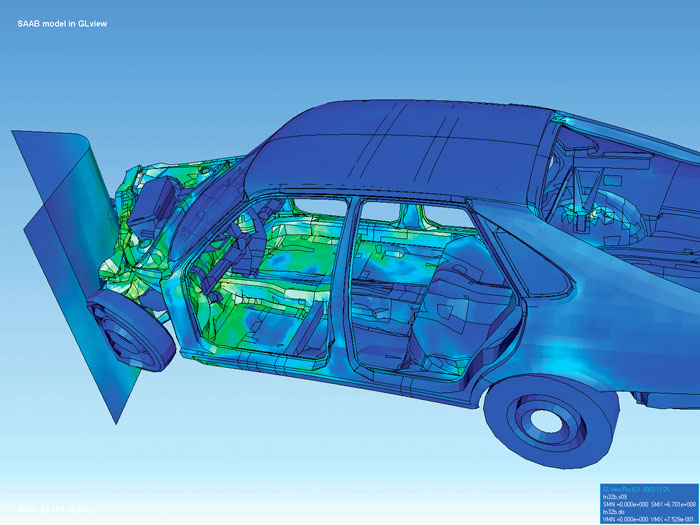
Apart from the distinction between interactive visualizations and animation, the most useful categorization is probably between abstract and model-based scientific visualizations. The abstract visualizations show completely conceptual constructs in 2D or 3D. These generated shapes are completely arbitrary. The model-based visualizations either place overlays of data on real or digitally constructed images of reality or make a digital construction of a real object directly from the scientific data.

Scientific visualization is usually done with specialized software, though there are a few exceptions, noted below. Some of these specialized programs have been released as open source software, having very often its origins in universities, within an academic environment where sharing software tools and giving access to the source code is common. There are also many proprietary software packages of scientific visualization tools.

Models and frameworks for building visualizations include the data flow models popularized by systems such as AVS, IRIS Explorer, and VTK toolkit, and data state models in spreadsheet systems such as the Spreadsheet for Visualization and Spreadsheet for Images.

Applications

[edit]

Scientific visualization

[edit]
Simulation of a Raleigh–Taylor instability caused by two mixing fluids

As a subject in computer science, scientific visualization is the use of interactive, sensory representations, typically visual, of abstract data to reinforce cognition, hypothesis building, and reasoning. Scientific visualization is the transformation, selection, or representation of data from simulations or experiments, with an implicit or explicit geometric structure, to allow the exploration, analysis, and understanding of the data. Scientific visualization focuses and emphasizes the representation of higher order data using primarily graphics and animation techniques.[5][6] It is a very important part of visualization and maybe the first one, as the visualization of experiments and phenomena is as old as science itself. Traditional areas of scientific visualization are flow visualization, medical visualization, astrophysical visualization, and chemical visualization. There are several different techniques to visualize scientific data, with isosurface reconstruction and direct volume rendering being the more common.

Data and information visualization

[edit]
Relative average utilization of IPv4

Data visualization is a related subcategory of visualization dealing with statistical graphics and geospatial data (as in thematic cartography) that is abstracted in schematic form.[7]

Example of information visualization for website monitoring (MusicBrainz server with Grafana)

Information visualization concentrates on the use of computer-supported tools to explore large amount of abstract data. The term "information visualization" was originally coined by the User Interface Research Group at Xerox PARC and included Jock Mackinlay.[citation needed] Practical application of information visualization in computer programs involves selecting, transforming, and representing abstract data in a form that facilitates human interaction for exploration and understanding. Important aspects of information visualization are dynamics of visual representation and the interactivity. Strong techniques enable the user to modify the visualization in real-time, thus affording unparalleled perception of patterns and structural relations in the abstract data in question.

Educational visualization

[edit]

Educational visualization is using a simulation to create an image of something so it can be taught about. This is very useful when teaching about a topic that is difficult to otherwise see, for example, atomic structure, because atoms are far too small to be studied easily without expensive and difficult to use scientific equipment.

Knowledge visualization

[edit]

The use of visual representations to transfer knowledge between at least two persons aims to improve the transfer of knowledge by using computer and non-computer-based visualization methods complementarily.[8] Thus properly designed visualization is an important part of not only data analysis but knowledge transfer process, too.[9] Knowledge transfer may be significantly improved using hybrid designs as it enhances information density but may decrease clarity as well. For example, visualization of a 3D scalar field may be implemented using iso-surfaces for field distribution and textures for the gradient of the field.[10] Examples of such visual formats are sketches, diagrams, images, objects, interactive visualizations, information visualization applications, and imaginary visualizations as in stories. While information visualization concentrates on the use of computer-supported tools to derive new insights, knowledge visualization focuses on transferring insights and creating new knowledge in groups. Beyond the mere transfer of facts, knowledge visualization aims to further transfer insights, experiences, attitudes, values, expectations, perspectives, opinions, and estimates in different fields by using various complementary visualizations. See also: picture dictionary, visual dictionary

Product visualization

[edit]

Product visualization involves visualization software technology for the viewing and manipulation of 3D models, technical drawing and other related documentation of manufactured components and large assemblies of products. It is a key part of product lifecycle management. Product visualization software typically provides high levels of photorealism so that a product can be viewed before it is actually manufactured. This supports functions ranging from design and styling to sales and marketing. Technical visualization is an important aspect of product development. Originally technical drawings were made by hand, but with the rise of advanced computer graphics the drawing board has been replaced by computer-aided design (CAD). CAD-drawings and models have several advantages over hand-made drawings such as the possibility of 3-D modeling, rapid prototyping, and simulation. 3D product visualization promises more interactive experiences for online shoppers, but also challenges retailers to overcome hurdles in the production of 3D content, as large-scale 3D content production can be extremely costly and time-consuming.[11]

Visual communication

[edit]

Visual communication is the communication of ideas through the visual display of information. Primarily associated with two dimensional images, it includes: alphanumerics, art, signs, and electronic resources. Recent research in the field has focused on web design and graphically oriented usability.

Visual analytics

[edit]

Visual analytics focuses on human interaction with visualization systems as part of a larger process of data analysis. Visual analytics has been defined as "the science of analytical reasoning supported by the interactive visual interface".[12]

Its focus is on human information discourse (interaction) within massive, dynamically changing information spaces. Visual analytics research concentrates on support for perceptual and cognitive operations that enable users to detect the expected and discover the unexpected in complex information spaces.

Technologies resulting from visual analytics find their application in almost all fields, but are being driven by critical needs (and funding) in biology and national security.

Interactivity

[edit]

Interactive visualization or interactive visualisation is a branch of graphic visualization in computer science that involves studying how humans interact with computers to create graphic illustrations of information and how this process can be made more efficient.

For a visualization to be considered interactive it must satisfy two criteria:

  • Human input: control of some aspect of the visual representation of information, or of the information being represented, must be available to a human, and
  • Response time: changes made by the human must be incorporated into the visualization in a timely manner. In general, interactive visualization is considered a soft real-time task.

One particular type of interactive visualization is virtual reality (VR), where the visual representation of information is presented using an immersive display device such as a stereo projector (see stereoscopy). VR is also characterized by the use of a spatial metaphor, where some aspect of the information is represented in three dimensions so that humans can explore the information as if it were present (where instead it was remote), sized appropriately (where instead it was on a much smaller or larger scale than humans can sense directly), or had shape (where instead it might be completely abstract).

Another type of interactive visualization is collaborative visualization, in which multiple people interact with the same computer visualization to communicate their ideas to each other or to explore information cooperatively. Frequently, collaborative visualization is used when people are physically separated. Using several networked computers, the same visualization can be presented to each person simultaneously. The people then make annotations to the visualization as well as communicate via audio (i.e., telephone), video (i.e., a video-conference), or text (i.e., IRC) messages.

Human control of visualization

[edit]

The Programmer's Hierarchical Interactive Graphics System (PHIGS) was one of the first programmatic efforts at interactive visualization and provided an enumeration of the types of input humans provide. People can:

  1. Pick some part of an existing visual representation;
  2. Locate a point of interest (which may not have an existing representation);
  3. Stroke a path;
  4. Choose an option from a list of options;
  5. Valuate by inputting a number; and
  6. Write by inputting text.

All of these actions require a physical device. Input devices range from the common – keyboards, mice, graphics tablets, trackballs, and touchpads – to the esoteric – wired gloves, boom arms, and even omnidirectional treadmills.

These input actions can be used to control both the unique information being represented or the way that the information is presented. When the information being presented is altered, the visualization is usually part of a feedback loop. For example, consider an aircraft avionics system where the pilot inputs roll, pitch, and yaw and the visualization system provides a rendering of the aircraft's new attitude. Another example would be a scientist who changes a simulation while it is running in response to a visualization of its current progress. This is called computational steering.

More frequently, the representation of the information is changed rather than the information itself.

Rapid response to human input

[edit]

Experiments have shown that a delay of more than 20 ms between when input is provided and a visual representation is updated is noticeable by most people [citation needed]. Thus it is desirable for an interactive visualization to provide a rendering based on human input within this time frame. However, when large amounts of data must be processed to create a visualization, this becomes hard or even impossible with current technology. Thus the term "interactive visualization" is usually applied to systems that provide feedback to users within several seconds of input. The term interactive framerate is often used to measure how interactive a visualization is. Framerates measure the frequency with which an image (a frame) can be generated by a visualization system. A framerate of 50 frames per second (frame/s) is considered good while 0.1 frame/s would be considered poor. The use of framerates to characterize interactivity is slightly misleading however, since framerate is a measure of bandwidth while humans are more sensitive to latency. Specifically, it is possible to achieve a good framerate of 50 frame/s but if the images generated refer to changes to the visualization that a person made more than 1 second ago, it will not feel interactive to a person.

The rapid response time required for interactive visualization is a difficult constraint to meet and there are several approaches that have been explored to provide people with rapid visual feedback based on their input. Some include

  1. Parallel rendering – where more than one computer or video card is used simultaneously to render an image. Multiple frames can be rendered at the same time by different computers and the results transferred over the network for display on a single monitor. This requires each computer to hold a copy of all the information to be rendered and increases bandwidth, but also increases latency. Also, each computer can render a different region of a single frame and send the results over a network for display. This again requires each computer to hold all of the data and can lead to a load imbalance when one computer is responsible for rendering a region of the screen with more information than other computers. Finally, each computer can render an entire frame containing a subset of the information. The resulting images plus the associated depth buffer can then be sent across the network and merged with the images from other computers. The result is a single frame containing all the information to be rendered, even though no single computer's memory held all of the information. This is called parallel depth compositing and is used when large amounts of information must be rendered interactively.
  2. Progressive rendering – where a framerate is guaranteed by rendering some subset of the information to be presented and providing incremental (progressive) improvements to the rendering once the visualization is no longer changing.
  3. Level-of-detail (LOD) rendering – where simplified representations of information are rendered to achieve a desired framerate while a person is providing input and then the full representation is used to generate a still image once the person is through manipulating the visualization. One common variant of LOD rendering is subsampling. When the information being represented is stored in a topologically rectangular array (as is common with digital photos, MRI scans, and finite difference simulations), a lower resolution version can easily be generated by skipping n points for each 1 point rendered. Subsampling can also be used to accelerate rendering techniques such as volume visualization that require more than twice the computations for an image twice the size. By rendering a smaller image and then scaling the image to fill the requested screen space, much less time is required to render the same data.
  4. Frameless rendering – where the visualization is no longer presented as a time series of images, but as a single image where different regions are updated over time.

See also

[edit]

References

[edit]

Further reading

[edit]
[edit]
Revisions and contributorsEdit on WikipediaRead on Wikipedia
from Grokipedia
Visualization in graphics encompasses the use of computer-generated images, diagrams, and animations to represent abstract or complex , enabling the , , and communication of to foster understanding and . It primarily involves transforming numerical, spatial, or temporal into visual forms through techniques rooted in , distinguishing it from mere artistic rendering by emphasizing data-driven representation and . This field bridges disciplines such as , , and to make invisible phenomena perceptible, often integrating elements like color, shape, and motion to highlight patterns, trends, and anomalies. Key subfields include scientific visualization for spatial and temporal , data visualization for statistical and business , and information visualization for abstract structures. The origins of visualization trace back to prehistoric pictographic systems for communication, evolving through historical examples like John Snow's 1854 cholera outbreak map and Charles Minard's 1869 depiction of Napoleon's Russian campaign, which demonstrated the power of visual mapping for . Computer-based visualization emerged in the 1960s as an extension of early , initially developed as a tool for scientists and engineers at research centers like to interpret simulated and measured data. Key advancements include the establishment of scientific visualization as a formal discipline in the 1980s, driven by improvements in hardware and software that enabled real-time rendering and interactive exploration. These techniques are often supported by tools such as the Visualization Toolkit (VTK), which facilitates , transformation, and display. Applications span diverse domains, from scientific and engineering fields like , , and to in business, education, and . In each case, visualization enhances decision-making by providing intuitive, scalable representations that reveal relationships otherwise obscured in raw data.

Introduction

Definition and Scope

Visualization in graphics refers to the process of representing abstract or through graphical means to facilitate understanding, , and communication. It involves transforming symbolic or numerical into visual forms, such as geometric shapes or spatial arrangements, via techniques that align visual properties with data attributes to reveal patterns, trends, or relationships. This field emphasizes enhancing human by leveraging the strengths of , enabling users to reason about complex datasets more effectively than through textual or numerical means alone. The scope of visualization in centers on creating representations that support into , distinguishing it from related areas like photorealistic rendering or artistic . While rendering focuses on computationally generating realistic images from 3D models—often for or —visualization prioritizes interpretive value over realism, using to encode for decision-making rather than mere aesthetic appeal. For instance, charts mapping quantitative to positions and colors aid in identifying correlations in datasets, whereas 3D models in rendering might simulate physical environments without an emphasis on data-driven discovery. Similarly, in visualization may illustrate temporal changes in to convey dynamics, but it differs from by serving analytical purposes rather than storytelling. Visualization draws from an interdisciplinary foundation, integrating principles from for rendering techniques, human-computer interaction for , and for understanding perceptual limits and biases. This convergence enables the development of tools that bridge computational processing with human interpretive abilities, fostering applications across domains like and . At its core, visualization serves as a bridge between and , providing a that categorizes graphical representations by their role in transformation and task support, without relying on specific implementation details. This positions it as a method for amplifying cognitive capabilities, where visual encodings act as intermediaries to make abstract information accessible and actionable.

Historical Development

The roots of visualization in graphics trace back to the late 18th century, when Scottish engineer and economist introduced foundational graphical methods to represent economic data. In his 1786 The Commercial and Political Atlas, Playfair invented the to depict time-series data, such as exports and imports, enabling clearer comparisons over time compared to textual tables. This innovation marked a shift from numerical listings to visual forms that facilitated intuitive understanding of trends. Building on such manual techniques, advanced thematic mapping in 1858 with her coxcomb diagrams—polar area charts—presented in Notes on Matters Affecting the Health, Efficiency, and Hospital Administration of the English Soldier. These diagrams illustrated mortality causes during the , emphasizing preventable deaths from poor sanitation through proportional shaded sectors, influencing public health reforms. The 20th century saw the advent of computational tools transforming visualization from static drawings to interactive systems. A pivotal milestone was Ivan Sutherland's 1963 Sketchpad system, developed as his MIT PhD thesis, which introduced direct manipulation of graphical elements on a screen using a light pen, laying the groundwork for and interactive graphics. This enabled users to create and modify vector-based drawings in real time, foreshadowing modern graphical user interfaces. Later, statistician formalized in his 1977 book Exploratory Data Analysis, advocating graphical techniques like stem-and-leaf plots and box plots to uncover patterns in data through iterative visual inspection, emphasizing visualization as a tool for hypothesis generation rather than confirmation. From the late 20th century into the early 21st, digital standardization and conceptual innovations propelled visualization forward. At Xerox PARC in the 1970s, Alan Kay's vision, outlined in his 1972 paper "A Personal Computer for Children of All Ages," conceptualized a portable device with graphical interfaces for dynamic information display, influencing the development of overlapping windows and icon-based GUIs that underpin modern visualization software. In 1999, the (W3C) released the first working draft of (SVG), an XML-based standard for describing two-dimensional graphics that could be scaled without quality loss, enabling web-native interactive visualizations. Key figures further refined visualization principles during this era. Edward Tufte, in his 1983 book The Visual Display of Quantitative Information, introduced the data-ink ratio, a metric urging designers to maximize ink devoted to data while minimizing non-essential elements like , to enhance clarity and integrity in graphical presentations. Complementing this, Jock Mackinlay's 1986 APT (A Presentation Tool) system, detailed in his ACM paper, automated the generation of graphical displays from relational data using rule-based methods, demonstrating early computational approaches to effective visual encoding. By the 2010s and into 2025, integrated deeply into visualization, automating design and generation processes. Seminal work like the 2019 Draco system formalized design knowledge as constraints for synthesizing effective charts, enabling scalable recommendation engines. Similarly, VizNet, introduced in 2019, compiled a massive corpus of 31 million datasets and visualizations to train models for automated design evaluation. Commercial tools exemplified this trend; Salesforce's 2019 acquisition of Tableau incorporated Einstein Analytics, evolving into features like Einstein Copilot for Tableau, beta-released in April 2024, which uses and generative AI to automatically create visualizations from user queries. These advancements democratized access to sophisticated graphics, blending human insight with algorithmic efficiency up to the present.

Core Principles

Visual Encoding

Visual encoding is the process of systematically mapping attributes to visual properties, enabling the creation of graphical representations that convey effectively to viewers. This mapping transforms abstract into perceptible forms, such as charts or diagrams, where visual elements serve as proxies for dimensions. The choice of encoding directly influences the accuracy and efficiency with which is decoded, relying on principles derived from graphical perception studies. Key encoding channels include position, color, size, shape, and texture, each suited to representing different aspects of data. Position, particularly along a common scale, ranks highest in perceptual accuracy, allowing precise judgments of quantitative differences, as it aligns with innate abilities to compare aligned marks. encodings, such as bar heights, follow closely, while less accurate channels like area, , color saturation, and hue are better for qualitative distinctions but introduce errors in magnitude estimation. and McGill's , based on experimental tasks involving approximately 50 participants, orders these channels by the logarithmic error in perceptual judgments: position along a common scale (most accurate), position along nonaligned scales, , , area, , , and color. Texture and shape provide additional dimensions for categorical data, though they rank lower for precise quantification due to variability in human interpretation. Mappings vary by data type to optimize clarity. For quantitative data, such as magnitudes or ratios, encodings like or position along an axis preserve proportional relationships, facilitating accurate comparisons; for instance, a line's can represent rates of change. Categorical data, representing discrete groups or classes, is often encoded with color hues or shapes to enable quick differentiation without implying order. Temporal data, like sequences of events, uses position along a horizontal axis to denote progression, aligning with left-to-right reading conventions. These mappings ensure that the visual structure mirrors the data's semantic properties, avoiding distortions such as using for one-dimensional quantities, which exaggerates differences nonlinearly. Effectiveness in visual encoding is guided by criteria that promote accurate and avoid . Bertin's semiotic framework distinguishes selective variables, which allow isolation of elements (e.g., color for filtering categories), from associative variables, which group similar items (e.g., consistent texture for related classes). This framework emphasizes disassociation—separating dimensions to prevent —and proportionality in scaling to maintain truthfulness. Misleading encodings, such as using area to represent linear (e.g., inflating circles by radius instead of area for sizes), violate these principles by nonlinearly distorting perceptions, leading to significant overestimation of larger values in viewer judgments. Representative examples illustrate these principles. Bar charts encode quantitative comparisons via vertical position (length), leveraging high perceptual accuracy for tasks like ranking values, as seen in simple frequency distributions where bar heights directly scale with counts. In contrast, pie charts map proportions to angles or areas, which are less effective for comparing multiple slices due to the lower ranking of these channels; overall, they suit part-to-whole relations with few categories rather than precise inter-slice comparisons.

Perceptual and Cognitive Foundations

The design of effective visualizations relies on principles of human , particularly the Gestalt laws, which describe how the brain organizes visual elements into meaningful wholes. Key principles include proximity, where elements close together are perceived as a group; similarity, where elements sharing attributes like shape or color are grouped; and closure, where incomplete shapes are mentally completed to form coherent objects. These principles guide the of graphical elements to reduce ambiguity and enhance in data displays. Preattentive processing further informs visualization by enabling rapid detection of visual features without focused attention, occurring within 200-500 milliseconds. This parallel processing allows viewers to instantly notice differences in attributes such as color, orientation, or , making it essential for highlighting salient in complex graphics. Colin Ware's studies on color perception emphasize how preattentive cues, like luminance contrast, facilitate quick in visualizations. Cognitive foundations underscore the need to manage mental resources during visualization interpretation. John Sweller's cognitive load theory distinguishes intrinsic load, inherent to the data's complexity, from extraneous load, imposed by poor design choices like clutter or misleading scales, advocating for minimized extraneous elements to preserve learning and comprehension. Human capacity limits this process, typically holding 7 ± 2 chunks of information, as established by George Miller, which constrains the amount of visual detail that can be processed simultaneously without overload. Color selection in visualizations draws from , which posits that operates via antagonistic pairs—red-green, blue-yellow, and black-white—explaining phenomena like afterimages and guiding hue choices to avoid perceptual conflicts. This theory supports accessible designs by recommending color palettes that differentiate along these axes, crucial given that affects approximately 8% of males worldwide, often impairing red-green discrimination. Eye-tracking research reveals typical scan paths in charts, where viewers first fixate on titles and legends before following data axes in a systematic, often left-to-right manner, with saccades jumping between salient points to build understanding. These patterns vary culturally; for instance, left-to-right reading habits in Western cultures bias initial attention to the left side of visuals, while right-to-left readers in or Hebrew contexts exhibit reversed scanning, influencing how spatial layouts are interpreted across diverse audiences.

Techniques

Static Visualization Methods

Static visualization methods in graphics involve non-interactive rendering techniques to depict scientific data in fixed images, leveraging algorithms to represent multidimensional, continuous datasets such as scalar fields, geometries, and simulations. These methods emphasize accurate spatial representation and perceptual clarity for analyzing physical phenomena, often using raster or vector outputs for high-resolution displays in reports, publications, and archival purposes. Core techniques include for visualizing 3D scalar data, where direct volume rendering integrates values along rays to produce photorealistic images of densities or temperatures, as pioneered by Marc Levoy in 1988. extraction identifies and renders surfaces of constant value within volumetric data, with the algorithm, developed by William Lorensen and Harvey Cline in 1987, enabling efficient for smooth in and CFD simulations. Contour plots extend 2D scalar visualization by drawing level sets, useful for topographic or potential field analysis, while glyph-based methods place oriented shapes (e.g., arrows for magnitude and direction) to represent vector data at specific points, aiding in static depictions of force fields or stress distributions. Advanced static approaches handle geometric and hybrid data. Cutting planes slice through volumes to reveal internal structures, often combined with and models from to enhance . Slice-based stacks 2D textures for efficient hardware-accelerated display, particularly on GPUs. These techniques prioritize fidelity to underlying data models, drawing on principles like ray tracing for realism, though simplified for static output to balance computational cost and interpretability. Design principles in static graphics visualization stress minimal and effective perceptual cues. Techniques should maximize data resolution while adhering to visibility guidelines, such as ensuring uniform sampling to avoid in rendered images. Historical examples include early contour maps in from the , evolving to computer-generated isosurfaces in the with hardware advancements. Formats like or support lossless static outputs, ensuring scalability for scientific printing without quality degradation.

Dynamic and Animated Methods

Dynamic and animated methods in visualization graphics utilize time-varying renders and simulations to illustrate evolving scientific processes, such as fluid flows, electromagnetic fields, or structural deformations, enhancing understanding of temporal dynamics through motion cues. These techniques integrate animation pipelines to simulate continuity, often employing real-time or offline rendering for interactive exploration or video presentations. Fundamental animation types include particle , where tracer particles follow paths to animate flows, revealing vortices or in simulations like weather modeling or blood flow. Streamline animations draw integral curves that evolve over time, using methods like line integral convolution (LIC), introduced by Cabral et al. in 1993, to texture lines with flow information for smooth, dense representations. animations deform or move icons (e.g., hedgehogs for vectors) to show field variations, preserving perceptual principles like common fate to group related elements. Coordinated dynamic views enable linked animations across multiple renders, such as brushing a to animate highlights in linked isosurfaces, facilitating discovery in multidimensional . Time-series animations static frames into videos, as in NASA's orbital simulations, where paths are traced over orbital periods. underscores apparent motion's role, with frame rates of 24-60 fps recommended for smooth perception in scientific animations, avoiding change blindness by slowing transitions for complex . Applications highlight these methods' efficacy. Animated visualizes time-dependent CT scans for cardiac motion analysis, with opacity transfers animating to show tissue changes. In , finite element simulations animate stress waves propagating through materials, using particle systems for visualization. Despite advantages, cognitive limits like motion-induced overload necessitate designs aligned with visual , such as limited frame durations to prevent disorientation in high-velocity flows.

Applications

Scientific and Engineering Visualization

Scientific and engineering visualization encompasses techniques designed to represent complex physical phenomena, multidimensional simulations, and volumetric datasets derived from scientific computations and engineering analyses. These methods enable researchers and engineers to interpret intricate data from fields such as , , and , facilitating insights into spatial relationships and dynamic processes that are otherwise opaque in raw numerical form. By transforming scalar and vector fields into perceivable visuals, this domain supports hypothesis testing, , and in real-world applications. Volume rendering stands as a cornerstone technique for depicting 3D scalar fields, where data points represent properties like or across a volume. , a key in this approach, involves rays from the viewpoint through the volume, incrementally sampling values to accumulate color and opacity based on local material properties and gradients. This method simulates light propagation within semi-transparent media, allowing internal structures to be revealed without explicit surface extraction. In , volume rendering has been pivotal for visualizing MRI datasets, enabling clinicians to explore contrasts and anatomical volumes, such as or joint structures, in three dimensions for diagnostic purposes. The seminal formulation of this technique, emphasizing along rays for realistic , was introduced in 1988. Flow visualization addresses vector fields arising from simulations like (CFD), where velocity data describes motion in fluids or gases. Common methods include streamlines, which trace integral curves to illustrate flow paths, and glyphs such as arrows or hedgehogs that encode magnitude and direction at discrete points. These techniques reveal patterns like vortices, , or , aiding engineers in analyzing aerodynamic performance or thermal convection. For instance, in CFD simulations of aircraft wings or ocean currents, streamlines highlight separation zones while glyphs quantify local shear stresses, with placement algorithms ensuring uncluttered representations on unstructured meshes. Early systematic overviews of these approaches for applications emphasized their role in post-processing aerodynamic data. Isosurfaces provide a means to extract and visualize constant-value contours within volumetric data, particularly useful in for delineating subsurface structures. The algorithm processes scalar fields by dividing the volume into cubes and generating triangular meshes at edges where the isosurface intersects, enabling smooth surface approximations from discrete grids. In geological applications, this technique reconstructs mineral deposit boundaries or stratigraphic layers from seismic or density data, as seen in 3D models of ore bodies that guide resource exploration. Introduced in for high-resolution surface construction from medical volumes, has since been adapted for geophysical datasets to visualize fault planes or distributions. In , visualization of finite element analysis (FEA) results has advanced significantly since the , transitioning from tabular outputs to interactive graphical post-processing. These tools display stress contours, deformation modes, and strain fields on models, allowing engineers to identify points in bridges or components. Post- developments integrated color-mapped isosurfaces and vector plots into pre- and post-processors, enhancing model validation and . For example, early interactive systems from the early enabled real-time viewing of structural responses, marking a shift toward visual interpretation in FEA workflows. Domain-specific tools integrate these techniques for specialized applications, such as NASA's visualization of space mission data. The Eyes on the Solar System platform employs 3D trajectory rendering and orbital streamlines to depict Voyager mission paths since its 1977 launch, overlaying vectors on planetary models for mission planning and public outreach. This system processes historical and real-time scalar fields from instruments, rendering interstellar plasma densities or gravitational influences as dynamic isosurfaces.

Data and Information Visualization

Data and information visualization encompasses graphical techniques for representing abstract, statistical, or informational datasets to support , , and communication, distinct from spatial or physical renderings by focusing on non-measurable entities like trends and correlations. This approach aids decision-making by transforming complex information into perceivable forms that highlight patterns otherwise obscured in raw data. Exploratory visualization employs methods such as dashboards to detect patterns in datasets, integrating multiple coordinated views like scatter plots and histograms to reveal outliers, clusters, and relationships. Heatmaps, which encode matrix data with color gradients to visualize intensity and similarity, facilitate pattern detection in multivariate contexts, as demonstrated in early genomic applications where they displayed gene expression profiles to identify co-regulated genes. Network graphs represent relational data as nodes and edges, using layouts like force-directed algorithms to position elements based on simulated physical forces, thereby uncovering community structures and connectivity in abstract networks such as social or citation graphs. Information design in this domain involves narrative visualizations that sequence static graphics to convey insights coherently, guiding viewers through data stories without relying on user-driven interactions. These designs employ annotations, small multiples, and layered charts to build arguments from , as analyzed in case studies of journalistic and educational pieces where visual narratives enhance comprehension of statistical trends. For , dimensionality reduction techniques like (PCA) enable visualization by projecting high-dimensional datasets onto two- or three-dimensional spaces, retaining the principal axes of variance to approximate the original structure conceptually. This method supports exploratory tasks by allowing scatter plots of reduced components to reveal groupings and separations in large-scale statistical data. Representative examples include epidemiological maps, where John Snow's 1854 dot map of cases in pinpointed a contaminated water pump as the outbreak source, establishing spatial clustering as a foundational technique for informational mapping. In finance, line charts depict stock price trends over time, using connected points to illustrate volatility and long-term movements, as exemplified in historical analyses of to inform decisions.

Educational and Knowledge Visualization

Educational and knowledge visualization encompasses graphical representations specifically tailored to support learning processes, conceptual understanding, and the dissemination of abstract ideas in pedagogical settings. These visualizations prioritize clarity and structure to aid cognitive processing, often employing diagrams, maps, and graphs that highlight relationships between concepts rather than . By leveraging visual hierarchies and connections, they help learners build mental models, fostering retention and application of in educational environments such as classrooms and e-learning systems. Concept maps, developed by Joseph Novak in 1972, serve as node-link diagrams that illustrate hierarchical and relational structures among key concepts, typically enclosed in nodes connected by labeled links to denote propositions. Originating from research in science at , these maps enable learners to externalize and refine their understanding by revealing conceptual hierarchies and cross-links, promoting over rote memorization. In practice, concept maps are widely used in curriculum design and assessment to track conceptual change, with studies showing improved knowledge integration when students construct them collaboratively. Closely related, mind maps, popularized by in the 1970s, extend this approach for brainstorming and creative idea generation through radial, branching structures that radiate from a central theme using images, colors, and keywords. Unlike the propositional focus of concept maps, mind maps emphasize nonlinear associations to mimic associative pathways, making them effective for initial planning and in educational contexts. Educational applications include outlining essays or lesson plans, where their visual freedom enhances engagement and recall, as evidenced by improved performance in tasks among students. Instructional graphics in textbooks represent another cornerstone, simplifying complex theories through schematic diagrams that abstract essential elements for pedagogical clarity. A seminal example is Feynman diagrams, introduced by in the late 1940s as pictorial representations of particle interactions in , first published in 1949. These line drawings depict space-time paths of particles, reducing intricate mathematical calculations to intuitive visuals that facilitate teaching advanced physics concepts without overwhelming detail. Their enduring use in educational materials underscores how such graphics bridge abstract theory and comprehension, influencing across scientific disciplines. In knowledge representation, ontologies—formal specifications of domain concepts and their interrelations—are often visualized as graphs to support structured learning in e-learning platforms. These graph-based depictions use nodes for entities and edges for relationships, enabling users to navigate semantic networks interactively. For instance, platforms like those employing personal knowledge graphs personalize content delivery by mapping learner profiles to ontological structures, enhancing adaptive instruction through visual of knowledge domains. Such visualizations aid in forming cognitive maps of complex subjects, reducing disorientation in self-paced learning environments. The effectiveness of these visualizations is grounded in principles of learning, as articulated by Richard Mayer in 2001, which emphasize cognitive processing limitations in educational design. Mayer's coherence principle advocates eliminating extraneous visual elements to focus attention on core ideas, thereby minimizing cognitive overload and improving . Complementing this, the signaling principle highlights the role of cues—such as arrows or bolding in diagrams—to guide learners' attention to relational structures, enhancing comprehension and retention in visual aids. Empirical studies supporting these principles demonstrate that well-designed educational graphics can improve learning outcomes compared to text-only formats, establishing their pedagogical value.

Product and Visual Communication

Product visualization in graphics involves the use of and rendering techniques to create realistic representations of products and prototypes, enabling designers and marketers to showcase concepts without physical production. Emerging prominently in the post-1990s era, this practice evolved from early (CAD) tools, such as , which made digital modeling accessible for architectural and , to advanced software like 3ds Max and Maya that supported photorealistic rendering. By the early 2000s, further enhanced collaboration, allowing global teams to refine prototypes through high-fidelity visuals that simulate materials, lighting, and textures. This shift reduced prototyping costs and accelerated product development cycles in industries like goods and . Infographics represent a key method in , blending text, icons, and graphics to distill complex information into compelling narratives for commercial audiences. Their modern resurgence began with the digital age, where tools for creation became widely available, but they gained explosive popularity in the amid the boom, as platforms like emphasized visual content for rapid sharing and engagement. Infographics facilitate by structuring hierarchically—often using timelines, flowcharts, or metaphors—to persuade viewers, such as in campaigns that highlight product benefits or market trends without overwhelming detail. This format's effectiveness stems from its ability to enhance retention and shareability, with studies showing visual aids increase comprehension compared to text alone. Underpinning these practices is theory, particularly , which examines how signs, , and convey meaning in graphics to influence perception and behavior. In , semiotics draws from Ferdinand de Saussure's signifier-signified model and Charles Peirce's triadic structure (, index, ), where resemble their objects (e.g., a product ), evoke abstract ideas (e.g., a heart for emotional appeal), and indices link through causality. Applied to , this theory enables by leveraging connotations—cultural associations that trigger emotions—such as red hues urgency in sales promotions. For instance, brand logos like ' siren combine iconic and symbolic elements to foster familiarity and loyalty, demonstrating how semiotic analysis guides designers in crafting messages that resonate subconsciously. Practical examples illustrate these concepts in commercial settings, such as dashboards that aggregate key metrics into static visualizations for executive overviews. These dashboards employ clear hierarchies and color coding to communicate performance indicators—like growth or —at a glance, adhering to principles of reduced and goal-centric to support strategic decisions. Similarly, architectural walkthroughs often begin with static renders to provide fixed perspectives of building prototypes, allowing clients to assess spatial flow and before investing in full animations. In , such renders for real estate or consumer goods, like photorealistic appliance models, enhance persuasive pitches by simulating real-world contexts, thereby boosting conversions.

Interactivity

User Control Mechanisms

User control mechanisms in visualization enable users to actively explore and manipulate graphical representations of , facilitating deeper insights through direct interaction. These mechanisms empower users to adjust views, select elements, and tailor displays to their analytical needs, contrasting with passive observation in static visualizations. Fundamental to effective design, they draw from established principles in human-computer interaction to ensure intuitiveness and efficiency. Interaction primitives form the basic building blocks for user control, allowing precise manipulation of visualization elements. Common primitives include zoom and pan, which enable users to magnify specific regions or shift the viewport across large datasets, such as in geospatial maps or time-series plots. Selection tools, like lasso or rectangular brushing, permit users to highlight and isolate data points or subsets, supporting focused analysis without altering the underlying data. Filtering mechanisms, often implemented via sliders, dropdown menus, or dynamic queries, allow users to refine displayed information by applying conditions, such as range thresholds on numerical attributes. These primitives, categorized into intent-based groups like overview, zoom, filter, and select, have been empirically validated as essential for exploratory tasks in information visualization systems. Navigation techniques extend these to handle complex data structures, particularly hierarchies and multi-scale information. Hierarchical involves expanding or contracting nodes in tree-like representations, such as organizational charts or file systems, to reveal nested details or aggregate summaries. This supports progressive disclosure, where users to finer levels or roll up to broader overviews. Complementing this, the overview+detail paradigm, encapsulated in Shneiderman's visual information-seeking mantra—"overview first, zoom and filter, then details-on-demand"—guides by providing a high-level summary alongside focused views, reducing during exploration. For tree and hierarchical data types, expand/contract operations align with this mantra to enable seamless traversal. Customization allows users to personalize visualizations, adapting them to specific workflows or hypotheses. Users can define custom views by reordering axes in scatter plots, for instance, swapping dimensions to reveal correlations not evident in default configurations, or adjusting color scales and layouts to emphasize particular variables. Such flexibility promotes user agency, enabling iterative refinement without requiring programming expertise. In contexts, these options facilitate the creation of tailored analytical environments. Design principles for user control emphasize affordances—perceived properties of interface elements that suggest possible actions—and immediate feedback to confirm interactions. Affordances make controls intuitive, such as magnifying glass icons for zoom or drag handles for panning, signaling their function through familiar cues. Feedback, like visual highlights on selected items or smooth animations during transitions, reassures users of successful inputs and prevents disorientation. These concepts, rooted in , ensure that mechanisms align with users' mental models, enhancing in visualization interfaces.

Response and Feedback Systems

Response and feedback systems in visualization graphics enable interactive experiences by ensuring that user inputs trigger timely and informative updates to the display, enhancing user understanding and control. These systems inputs such as selections or queries and propagate changes across views, while providing immediate cues to confirm actions and guide further exploration. Effective implementation maintains perceptual continuity, avoiding disruptions that could hinder generation. Update mechanisms facilitate coordinated responses to user interactions, allowing changes in one part of the visualization to propagate seamlessly to others. Linked views, a foundational technique, synchronize multiple displays so that selections or filters in one view automatically update related views, revealing patterns across datasets without manual intervention. For instance, brushing in a scatterplot can highlight corresponding elements in a plot, supporting exploratory . This approach, introduced in early systems like IVEE, has become standard in tools for multivariate data exploration. Progressive rendering addresses challenges with large datasets by delivering partial results incrementally, enabling immediate interaction while computations continue in the background. This method chunks data or processes into smaller units, refining the visualization over time—such as starting with low-resolution aggregates and adding detail via sampling or iterative algorithms like t-SNE. Benefits include reduced wait times and the ability to steer analyses mid-process, as users can adjust parameters based on emerging patterns. Surveys highlight its prevalence in 48 publications since 1990, with applications in scatterplots and . Feedback types provide confirmatory responses to user actions, reinforcing successful interactions and aiding . Visual highlighting, such as temporary color changes or borders around selected elements, immediately signals the system's acknowledgment of input, reducing uncertainty in dynamic environments. Animations on selection, like smooth transitions or growth effects, further enhance this by visually linking cause and effect, improving engagement in time-series displays such as races. Foreshadowing techniques, where subtle cues preview upcoming changes, have been shown to increase user enjoyment and attention focus. Non-visual feedback, particularly auditory cues, extends accessibility for users with visual impairments by mapping data interactions to sound. Sonification translates selections or trends into non-speech audio, such as varying pitches for data values or spatial audio for scatterplot positions, allowing screen reader integration. Audio data narratives combine descriptive speech with sonified segments for time-series data, enabling blind users to infer trends and reversals more effectively than standalone sonification. Tools like Susurrus use natural sounds (e.g., bird calls scaled by data magnitude) for bar and line charts, achieving higher accuracy in tasks for low-vision users compared to other sonification methods like those using artificial sounds. Performance metrics emphasize low latency to preserve the illusion of direct manipulation in interactive visualizations. A threshold of under 100 milliseconds for responses ensures users perceive instantaneous continuity, as delays beyond this disrupt cognitive flow during tasks like brushing or panning. Empirical studies confirm that even 500ms latencies reduce user activity, data coverage, and hypothesis generation rates in exploratory analysis, with persistent effects from initial exposures. These guidelines, rooted in human-computer interaction principles, guide system design to maintain fluid exploration. Advanced techniques optimize responses in resource-constrained settings like web-based visualizations. Predictive loading, or prefetching, anticipates user queries by caching likely tiles based on movement patterns or characteristics, minimizing perceived delays during zooming or filtering. Systems employing dynamic prefetching have demonstrated significant reductions in load times for tiled visualizations, improving overall responsiveness without full recomputation. handling for invalid inputs ensures robust feedback, such as reverting views or displaying contextual messages, preventing system crashes and guiding users toward valid interactions in exploratory tools. Recent advancements as of 2025 include AI-assisted , where enables predictive user intent modeling and adaptive feedback in visualization systems.

Tools and Technologies

Software and Libraries

Desktop tools for visualization have become essential for creating interactive dashboards and exploratory analyses, with Tableau emerging as a pioneer in this space. Founded in 2003 from a computer science project aimed at improving data analysis accessibility, Tableau provides a drag-and-drop interface for building visualizations from diverse data sources, supporting features like maps and advanced analytics. 's Power BI, released in general availability on July 24, 2015, complements this by focusing on dashboards, integrating seamlessly with Microsoft ecosystems for real-time data connectivity and AI-driven insights. For open-source alternatives, , an developed by Hadley Wickham and first published in 2005, implements a grammar of graphics for declarative plotting, enabling layered, publication-quality visualizations through concise code. Web-based libraries have revolutionized custom visualization development by leveraging browser technologies for scalability and interactivity. (Data-Driven Documents), released in 2011 by , empowers developers to bind data to elements for dynamic, bespoke graphics, underpinning countless web visualizations through its modular approach to scales, layouts, and transitions. , initiated in 2001 by and Ben Fry at MIT's Media Lab as a tool for and education, facilitates with simple syntax for 2D and 3D graphics, influencing generations of interactive sketches and installations. Programming ecosystems in Python and offer robust libraries for programmatic visualization tailored to and web applications. , created in 2003 by as a MATLAB-inspired plotting tool for Python, supports a wide array of static and animated plots, forming the backbone for scientific graphing with extensive customization options. Built atop , Seaborn—introduced by Michael Waskom in 2012 and detailed in a 2021 Journal of Open Source Software paper—enhances statistical visualizations with built-in themes, color palettes, and high-level interfaces for distributions, relationships, and categorical data. In , Vega-Lite, a high-level released in version 1.0 in 2016 by the University of Washington's Interactive Data Lab, allows declarative specifications in for concise creation of layered views, marks, and encodings, compiling to for rendering. Standards like have enabled hardware-accelerated 3D graphics in browsers, with the WebGL 1.0 specification finalized by the in March 2011, providing a derived from 2.0 for low-level rendering of complex scenes. By 2025, integrations such as Sensei—Adobe's AI and machine learning framework embedded in tools like and XD—have introduced AI-assisted features for automated asset generation, smart cropping, and predictive design suggestions, streamlining visualization workflows in creative and data contexts.

Hardware and Emerging Platforms

Hardware enabling visualization has evolved to support high-fidelity rendering and interactive manipulation of complex data. High-resolution monitors, such as 4K and 8K displays, provide the pixel density necessary for detailed graphics visualization, allowing users to discern fine structures in scientific simulations and data plots without artifacts. Multi-touch surfaces, including large-format tables like those from Ideum, enable simultaneous inputs from multiple users to rotate, zoom, and annotate visualizations collaboratively. GPU acceleration plays a pivotal role in this domain; NVIDIA's platform, launched in 2006, facilitates on graphics processing units to accelerate rendering pipelines, reducing computation times for volumetric data visualization from hours to seconds in applications like . Immersive hardware extends visualization beyond traditional screens into three-dimensional spaces. headsets, beginning with the prototype unveiled in 2012, immerse users in stereoscopic 3D environments, enabling spatial navigation through datasets such as molecular structures or architectural models for intuitive exploration. overlays digital graphics onto the physical world; Microsoft's HoloLens, introduced in 2016, supports engineering visualization by projecting holographic representations of CAD models, allowing designers to interact with scaled prototypes in real-time without physical mockups. Mobile and wearable platforms democratize access to visualization through compact, portable hardware. Smartphones equipped with capacitive touchscreens facilitate gesture-based interactions for data exploration, such as pinching to scale charts or swiping to filter views in mobile analytics apps. Haptic feedback devices enhance these experiences by simulating tactile responses; for example, the 3D Systems Touch X haptic device applies force feedback to users' hands, allowing them to "feel" the contours of virtual objects during 3D model inspection in visualization software. As of 2025, emerging platforms integrate AI-optimized hardware to enable real-time generation of visualizations, with specialized GPUs and tensor processing units accelerating dynamic rendering of AI-driven like procedural terrains or predictive simulations. further advances portable visualization by performing data on-device, minimizing latency for applications on wearables and mobiles, such as real-time AR overlays in field .

Challenges and Future Directions

Current Limitations

One major limitation in visualization graphics is , particularly when handling massive datasets such as those at the petabyte scale, where rendering and interaction often result in performance degradation without sacrificing detail. Current tools struggle with computational demands, leading to increased rendering times and memory usage that hinder real-time exploration. In dense visualizations, exacerbates this issue, as overlapping elements create clutter that obscures patterns and reduces interpretability, especially in scatter plots or network graphs with millions of nodes. Accessibility remains a significant barrier in visualization design, with many graphics failing to accommodate users with deficiencies, such as deuteranomaly affecting about 5% of the male population, due to reliance on color alone for differentiation. incompatibility further limits access, as static images like charts often lack sufficient alt text or structured descriptions, violating (WCAG) 2.1 success criteria for non-text content and perceivable information. Approximately 86% of analyzed visualizations on the web are not rated as very or extremely accessible to users. These issues disproportionately impact users with visual impairments. Ethical concerns in visualization graphics include the potential for misleading representations, such as truncated axes in bar or line charts, which can exaggerate differences and distort perceptions of trends, as seen in reports where small changes appear dramatic. With the rise of AI-generated graphics since 2020, biases inherited from training perpetuate stereotypes; for instance, AI image generators often depict professionals like engineers as predominantly male and white, reinforcing societal inequities. Regulatory frameworks like the EU AI Act (effective 2024) mandate transparency and bias mitigation in AI-generated visuals to address these issues. These biases arise from imbalanced datasets and lack of diverse oversight in model development. Evaluating the effectiveness of visualizations is challenging due to the absence of standardized metrics beyond basic , making it difficult to quantify aspects like user comprehension or insight generation across diverse contexts. While task completion time and error rates are common proxies, they fail to capture perceptual or cognitive impacts, leading to inconsistent assessments in research and practice. This gap complicates comparisons between techniques and hinders the adoption of principles. Recent advancements in (AI) have significantly enhanced visualization graphics through automated insight generation, where AI algorithms analyze datasets to suggest and create relevant charts, graphs, and narratives without manual intervention. For instance, tools like Tableau AI integrate (NLP) to allow users to query data in plain English, generating visualizations dynamically and linking textual descriptions to graphical outputs. This NLP-viz integration has evolved post-2020, enabling more intuitive interactions, such as converting conversational inputs into interactive dashboards that highlight patterns like correlations or anomalies. By 2025, these systems have improved in accuracy for insight detection in complex datasets, reducing creation time from hours to minutes. Immersive technologies, particularly (VR) and (AR), are fostering collaborative visualization by enabling shared virtual spaces where multiple users can interact with 3D data models in real-time. Platforms supporting VR/AR allow teams to manipulate holographic representations of data, such as rotating molecular structures or exploring geospatial , enhancing group decision-making in fields like and . Complementing this, tools like have expanded real-time co-editing capabilities for visualization prototypes, incorporating AR previews that synchronize changes across devices for seamless remote collaboration. These developments, accelerated since 2020, support multi-user sessions with minimal latency, promoting processes. Emerging paradigms in visualization graphics incorporate haptic and multisensory elements to extend beyond visual cues, providing tactile feedback that aligns with graphical representations for more intuitive exploration. Haptic interfaces, such as shape-changing devices, simulate textures or forces in virtual environments, aiding users in comprehending abstract like through touch. Multisensory approaches combine haptics with audio and visual stimuli in VR setups, increasing immersion in user studies, particularly for accessibility in visually impaired scenarios. Additionally, technology ensures in visualizations by creating immutable ledgers that track dataset origins and modifications, preventing tampering in shared and verifying authenticity via cryptographic hashes. This integration, prominent in 2025 applications, enhances trust in collaborative and AI-generated visuals. Key trends shaping visualization graphics include the proliferation of no-code builders, which democratize access by offering drag-and-drop interfaces for creating sophisticated visuals without programming expertise. Platforms like these have seen significant growth in adoption by 2025, empowering non-technical users to build interactive dashboards integrated with AI suggestions. Sustainability efforts focus on low-energy rendering techniques, such as cloud-based farms using and optimized algorithms that reduce GPU usage while maintaining quality, addressing the environmental impact of high-compute graphics. Post-2020, explainable AI (XAI) visualizations have gained traction, employing techniques like attention maps and counterfactual graphs to illustrate model decisions transparently, with tools improving interpretability in applications. These trends collectively drive more accessible, ethical, and efficient visualization practices.

References

Add your contribution
Related Hubs
User Avatar
No comments yet.