
Gaelic type
View on Wikipedia | This article includes a list of general references, but it lacks sufficient corresponding inline citations. (November 2016) |
| Gaelic script | |
|---|---|
 | |
| Script type | |
Period | 1571 – |
| Direction | Left-to-right |
| Languages | Modern Irish, Scots Gaelic |
| Related scripts | |
Parent systems | Latin script
|
| ISO 15924 | |
| ISO 15924 | Latg (216), Latin (Gaelic variant) |
Gaelic type (sometimes called Irish character, Irish type, or Gaelic script) is a family of Insular script typefaces devised for printing Early Modern Irish. It was widely used from the 16th century until the mid-18th century in Scotland and the mid-20th century in Ireland, but is now rarely used. Sometimes, all Gaelic typefaces are called Celtic or uncial although most Gaelic types are not uncials. The "Anglo-Saxon" types of the 17th century are included in this category because both the Anglo-Saxon types and the Gaelic/Irish types derive from the insular manuscript hand.
The terms Gaelic type, Gaelic script and Irish character translate the Modern Irish phrase cló Gaelach (pronounced [ˌkl̪ˠoː ˈɡeːl̪ˠəx]). In Ireland, the term cló Gaelach is used in opposition to the term cló Rómhánach, Roman type.
The Scots Gaelic term is corra-litir (pronounced [ˌkʰɔrˠə ˈliʰtʲɪɾʲ]). Alasdair mac Mhaighstir Alasdair (c. 1698–1770) was one of the last Scottish writers with the ability to write in this script,[1] but his main work, Ais-Eiridh na Sean Chánoin Albannaich, was published in the Roman script.
Characteristics
[edit]
Besides the 26 letters of the Latin alphabet, Gaelic typefaces must include all vowels with acute accents ⟨Áá Éé Íí Óó Úú⟩ as well as a set of consonants with dot above ⟨Ḃḃ Ċċ Ḋḋ Ḟḟ Ġġ Ṁṁ Ṗṗ Ṡṡ Ṫṫ⟩, and the Tironian sign et ⟨⁊⟩, used for agus 'and' in Irish.
Gaelic typefaces also often include insular forms: ⟨ꞃ ꞅ⟩ of the letters ⟨r⟩ and ⟨s⟩, and some of the typefaces contain a number of ligatures used in earlier Gaelic typography and deriving from the manuscript tradition. Lower-case ⟨i⟩ is drawn without a dot (though it is not the Turkish dotless ⟨ı⟩), and the letters ⟨d f g t⟩ have insular shapes ⟨ꝺ ꝼ ᵹ ꞇ⟩.
Many modern Gaelic typefaces include Gaelic letterforms for the letters ⟨j k q v w x y z⟩, and typically provide support for at least the vowels of the other Celtic languages. They also distinguish between ⟨&⟩ and ⟨⁊⟩ (as did traditional typography), though some modern fonts replace the ampersand with the Tironian note ostensibly because both mean 'and'.
History
[edit]
The Irish uncial alphabet originated in medieval manuscripts as an "insular" variant of the Latin alphabet. The first Gaelic typeface was designed in 1571 for Aibidil Gaoidheilge agus Caiticiosma, a catechism commissioned by Elizabeth I to help attempt to convert the Irish Catholic population to Anglicanism.[2][3]
In 1611, Franciscans from Louvain, Belgium, created their own typeface, known as Louvain Irish Type.[2]
Use
[edit]Typesetting in Gaelic script remained common in Ireland until the mid-20th century. Gaelic script is today used merely for decorative typesetting; for example, a number of traditional Irish newspapers still print their name in Gaelic script on the first page, and it is also popular for pub signs, greeting cards, and display advertising. Edward Lhuyd's grammar of the Cornish language used Gaelic-script consonants to indicate sounds like [ð] and [θ].
In 1996 RTÉ created a new corporate logo. The logo consists of a modern take on the Gaelic type face. The R's counter is large with a short tail, the T is roman script while the E is curved but does not have a counter like a lower case E, and the letters also have slight serifs to them. TG4's original logo, under the brand TnaG, also used a modernization of the font, the use of the curved T and a sans-serif A in the word na. Other Irish companies that have used Gaelic script in their logos including the GAA, Telecom Éireann and An Post. The Garda Síochána uses Gaelic Script on its official seal.
In Unicode
[edit]Unicode treats the Gaelic script as a font variant of the Latin alphabet. A lowercase insular g (ᵹ) was added in version 4.1 as part of the Phonetic Extensions block because of its use in Irish linguistics as a phonetic character for [ɣ].
According to Michael Everson, in the 2006 Unicode proposal for these characters:[4]
To write text in an ordinary Gaelic font, only ASCII letters should be used, the font making all the relevant substitutions; the insular letters [proposed here] are for use only by specialists who require them for particular purposes.
Unicode 5.1 (2008) added a capital G (Ᵹ) and both capital and lowercase letters D, F, R, S, T, besides "turned insular G", on the basis that Edward Lhuyd used these letters in his 1707 work Archæologia Britannica as a scientific orthography for Cornish.
- Ꝺ ꝺ Insular D (U+A779, U+A77A)
- ◌ᷘ Combining Small Insular D (U+1DD8) (Used for Old Norse)[5]
- Ꝼ ꝼ Insular F (U+A77B, U+A77C)
- Ᵹ ᵹ Insular G (U+A77D, U+1D79)
- Ꝿ ꝿ Turned insular G (U+A77E, U+A77F)
- Ꞃ ꞃ Insular R (U+A782, U+A783)
- Ꞅ ꞅ Insular S (U+A784, U+A785)
- Ꞇ ꞇ Insular T (U+A786, U+A787)
Unicode 14.0 (2021) added characters, including Insular letters, for the Ormulum:[6]
- Ꟑ ꟑ Closed Insular G (U+A7D0, U+A7D1)
- ◌ᫌ Combining Insular G (U+1ACC)
- ◌ᫍ Combining Insular R (U+1ACD)
- ◌ᫎ Combining Insular T (U+1ACE)
Samples
[edit]

Chuaigh bé mhórshách le dlúthspád fíorfhinn trí hata mo dhea-phorcáin bhig,
Ċuaiġ bé ṁórṡáċ le dlúṫspád fíorḟinn trí hata mo ḋea-ṗorcáin ḃig,
meaning "A maiden of great appetite with an intensely white, dense spade went through my good little porker’s hat".
The second sentence (bottom line) reads:
Duibhlinn/Ceanannas an cló a úsáidtear anseo,
meaning "Duibhlinn/Ceannanas is the typeface used here".
The second sentence uses the short forms of the letters r and s; the first uses the long forms. See: Long s and R rotunda.
Gallery
[edit]-
 Gaelic script used on an information plaque outside City Hall, near Dublin Castle.
 -
 Gaelic script on the gates of the Pontifical Irish College in Rome.
 -
 Gaelic script on a gravestone in County Kerry.
 -
 Gaelic script on an Irish national monument.
 -
 Old road sign, reading Áth na gCasán
 -
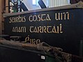 Stencilled Gaelic type
 -
 Poem
Poem


See also
[edit]- Blackletter
- Fraktur
- Irish orthography
- ISO/IEC 8859-14
- Theobald Stapleton (who devised an Antiqua orthography for Irish in 1639)
References
[edit]- ^ Quinnell, Teàrlach (8 July 2009). "Moladh air deagh bhàrd..." Naidheachdan (in Scottish Gaelic). BBC Alba. Retrieved 22 April 2017.
- ^ a b "Cló Gaelach - Irish Script font project". Nine Arrow.
- ^ "Cataloguing older Irish language material: some brief notes on the Cló Gaelach". Libfocus.
- ^ Everson, Michael (6 August 2006). "N3122: Proposal to add Latin letters and a Greek symbol to the UCS" (PDF). ISO/IEC JTC1/SC2/WG2. Retrieved 22 November 2016.
- ^ "N3027: Proposal to add medievalist characters to the UCS" (PDF). ISO/IEC JTC1/SC2/WG2. 30 January 2006.
- ^ Everson, Michael; West, Andrew (5 October 2020). "L2/20-268 Revised proposal to add ten characters for Middle English to the UCS" (PDF). Retrieved 19 September 2022.
Sources
[edit]- Lynam, E. W. 1969. The Irish character in print: 1571–1923. New York: Barnes & Noble. First printed as Oxford University Press offprint 1924 in Transactions of the Bibliographical Society, 4th Series, Vol. IV, No. 4, March 1924.)
- McGuinne, Dermot. Irish type design: A history of printing types in the Irish character. Blackrock: Irish Academic Press. ISBN 0-7165-2463-5
External links
[edit]- Brendan Leen's Four centuries of printing in the Irish character, Cregan Library, St Patrick's College, Drumcondra
- Vincent Morley's An Cló Gaelach (in Irish)
- Mícheál Ó Searcóid's The Irish Alphabet, an article on the origin, history and present-day usage of the Irish typeface, 1990
- Mathew D. Staunton's Trojan Horses and Friendly Faces: Irish Gaelic Typography as Propaganda. La revue LISA. ISSN 1762-6153. Vol. III; n°1. 2005.
- Bunchló GC (in Irish), a Gaelic modern minuscule font in Unicode for non-commercial use.
- Glanchló GC (in Irish), a Gaelic type font in Unicode for non-commercial use.
- Gadelica, a Gaelic traditional minuscule font in Unicode.
- More information about Gaelic fonts

| History | |||||||||
|---|---|---|---|---|---|---|---|---|---|
| Sociolinguistics | |||||||||
| Grammar | |||||||||
| Writing | |||||||||
| Media |
| ||||||||
| Qualifications | |||||||||
| Names | |||||||||
| Page | |||||||||||
|---|---|---|---|---|---|---|---|---|---|---|---|
| Paragraph | |||||||||||
| Character |
| ||||||||||
| Typeface classifications |
| ||||||||||
| Punctuation (List) | |||||||||||
| Typesetting | |||||||||||
| Typographic units | |||||||||||
| Digital typography | |||||||||||
| Typography in other writing systems | |||||||||||
| Related articles | |||||||||||
| Related template | |||||||||||
Gaelic type
View on GrokipediaDesign and Characteristics
Core Graphical Features
Gaelic type, derived from Insular minuscule and half-uncial scripts of medieval Irish manuscripts, exhibits rounded, fluid letterforms with bulbous bowls on letters such as b, d, p, and q, distinguishing it from the angularity of standard Roman type.[2] [3] These forms often feature pen-based strokes emulating scribal traditions, including an angular inverted-v shape for 'a' in some variants, a delta-form 'd' with a triangular ascender, and an 's'-shaped 'g' with a distinctive loop.[3] The letter 'i' appears dotless (ı), while 't' is rounded without an ascender piercing the crossbar, contributing to a cohesive, manuscript-like aesthetic.[3] Diacritical marks form essential graphical elements, with acute accents (fada) placed over vowels—Á á É é Í í Ó ó Ú ú—to indicate long pronunciation, integrated seamlessly into the rounded contours.[4] Lenition is represented by dots over consonants (e.g., ḃ ḋ ġ ṁ ṗ ṫ), altering airflow in speech, or alternatively by adjoining 'h' in modern usage, though traditional printing favored the dots for visual compactness.[2] [5] Variants in design include angular styles with spiky, irregular lines from early manuscript influences and rounder, regularized forms in later typographic adaptations, sometimes incorporating uncial capitals with interlaced patterns for decorative effect.[3] While core letterforms remain consistent across Irish and Scottish Gaelic applications, pseudo-Gaelic types may blend Carolingian elements like bowled 'g', but authentic Gaelic prioritizes Insular purity for readability in vernacular texts.[3] These features ensure legibility in dense typesetting while preserving cultural visual identity tied to Celtic scribal heritage.[2]Distinct Letterforms and Variants
Gaelic typefaces feature several distinct minuscule letterforms derived from Insular half-uncial scripts, setting them apart from standard Roman types. The lowercase d adopts a delta-shaped form with a triangular top, the g incorporates an s-like loop in its descender, the i remains dotless, and the t has a rounded stem without an ascender extending above the crossbar.[3] [6] These shapes emphasize rounded, calligraphic curves suited to quill-based manuscript traditions, contrasting with the angular or straight-lined forms in Carolingian or Roman minuscules.[2] Variants in letterforms arise primarily from stylistic evolutions and regional adaptations, classified into categories such as manuscript (spiky, angular strokes), transitional (intermediate smoothing), and modern (regularized curves).[3] Lowercase r, s, and ṡ (s-dot for lenited s) commonly alternate between short, compact forms in uncial-influenced styles and elongated, descending forms in traditional minuscule designs, with the latter predominant in metal typefaces until around 1913.[7] [6] The ampersand (&) often appears as a Tironian et (a numeral-7-like glyph) in minuscule variants for historical fidelity, versus the standard et-ligature in uncial or modern interpretations.[7] Support for Irish orthography includes glyphs for dotted consonants (e.g., ḃ, ċ, ḋ, ḟ, ġ, ṁ, ṗ, ṫ) and acute-accented vowels (á, é, í, ó, ú), which integrate seamlessly into these forms without altering core shapes.[2] [6] Pseudo-Gaelic fonts, sometimes misclassified as authentic, introduce inauthentic elements like two-stroke b and d, bowled Carolingian g, or a pierced t ascender, diverging from verified historical models.[3] Digital implementations, such as those using Unicode or Latin-8 encoding, preserve these variants via contextual alternates, allowing selection based on traditional or simplified preferences.[6]Historical Development
Origins in Manuscript Traditions
The Insular script, the direct precursor to Gaelic type, emerged in Irish monastic centers during the early Christian era, evolving from Late Roman uncial and half-uncial hands introduced via Christian missionaries around the 5th century. Irish scribes refined these into a distinctive national style characterized by rounded, flowing letterforms suited to vellum and quill pens, initially for Latin liturgical texts before adapting to the vernacular Irish language. This adaptation marked a departure from continental scripts, with Irish half-uncial developing taller ascenders and descenders for enhanced legibility in insular majuscule and minuscule variants.[8][9][10] Among the earliest extant examples is the Cathach of St. Columba, a 6th- or 7th-century psalter attributed to the saint's hand or his school, written in proto-Insular majuscule with compact, angular forms transitional from half-uncial. This manuscript, housed in the Royal Irish Academy, exemplifies the Columban scribal tradition dominant in 7th- and 8th-century Ireland and Scotland, influencing centers like Iona and Derry. By the 8th century, scripts in works like the St. Gall Gospel Book fragments show fuller Insular half-uncial traits, including ligatures and decorative flourishes that presaged the ornate hands of later illuminated codices.[11][12] The Book of Kells, produced circa 800 CE at either Iona or Kells, represents the zenith of Insular script refinement, employing a hybrid half-uncial with exaggerated curves, dotted i's, and variable letter sizes for rhythmic flow. Its script, while primarily Latin, incorporated Irish orthographic features that carried into Gaelic vernacular manuscripts, such as the 11th-century Book of the Dun Cow, which preserved these forms for native literature. These traditions prioritized aesthetic harmony over strict uniformity, fostering the bold, insular letter shapes— like the looped a, dotted e, and thorn-like accents—that Gaelic printers later emulated to evoke cultural continuity.[13][14][15]Introduction to Printing
The introduction of Gaelic type to printing occurred in 1571 with the casting of the first metal typeface specifically designed for the Irish script, commissioned by Queen Elizabeth I and known as Queen Elizabeth's Irish Type.[3] This typeface was developed under the supervision of Seán Ó Cearnaigh, an Irish scribe, to replicate the distinctive features of the traditional Insular hand used in manuscripts, facilitating the mechanical reproduction of Irish-language texts.[16] The punchcutting likely took place in London, reflecting the initial reliance on English expertise for type production before local Irish printing capabilities matured.[17] The inaugural use of this typeface appeared in Aibidil Gaoidheilge agus Caiticiosma, an Irish alphabet primer and catechism printed that same year, primarily to support Protestant evangelization efforts among the predominantly Catholic, Irish-speaking population of Ireland.[18] Commissioned as part of Elizabethan religious policy, the work aimed to teach literacy and doctrine in the vernacular, addressing the barrier posed by Latin and English texts to Gaelic speakers.[19] Printed in a limited edition, it represented a strategic adaptation of print technology to Gaelic orthography, though early production volumes were constrained by the novelty of the type and the scarcity of Irish-speaking printers.[20] Subsequent decades saw Gaelic type employed mainly for religious publications, including biblical translations and primers, as printing presses proliferated in Dublin and abroad.[3] By the early 17th century, additional typefaces like the Louvain variants emerged from Franciscan missions in continental Europe, expanding the repertoire for Irish texts while maintaining fidelity to manuscript aesthetics.[3] This period established Gaelic type as the standard for Irish printing until the 19th century, enabling broader dissemination despite persistent challenges in type availability and scribal preferences for handwritten copies.[21]Expansion and Standardization Efforts
![Gaelic-font-Gaelach.svg.png][float-right]Following the pioneering use of Gaelic type in the 1571 printing of the Aibidil Gaeilge agus Caiticiosma, commissioned by Queen Elizabeth I with type cut in England, expansion ensued through religious publications by both Protestant and Catholic presses.[21] The Irish New Testament appeared in Gaelic type in 1602, printed in Dublin, while Catholic works like the 1616 Douai Bible portions utilized types cast in Paris and Louvain.[3] By the 18th century, Scottish Gaelic printing expanded via the Society in Scotland for Propagating Christian Knowledge (SSPCK), which produced over 50,000 copies of Gaelic books between 1760 and 1800 using adapted Irish type designs.[22] Standardization efforts focused on classifying and refining the diverse letterforms derived from Insular manuscripts to ensure legibility and fidelity in print. Multiple foundries produced variants, resulting in 57 distinct Gaelic typefaces between 1567 and 1964, though without a single enforced standard.[3] In Ireland, 19th-century revivalists and printers like those associated with the Gaelic League promoted consistent usage in newspapers and educational materials, maintaining Cló Gaelach dominance until the mid-20th century.[23] Retrospective classifications, such as Dermot McGuinne's identification of 11 major design families in 1992 and Michael Everson's 2000 typological system, highlighted ongoing attempts to systematize the script's graphical principles.[3] In Scotland, orthographic standardization from the 1750s influenced type usage but preceded an earlier shift away from Gaelic script by the mid-18th century.[22]